lighting

Design a Beautiful Dining Room You’ll Use Year-Round by Margaret Chambers

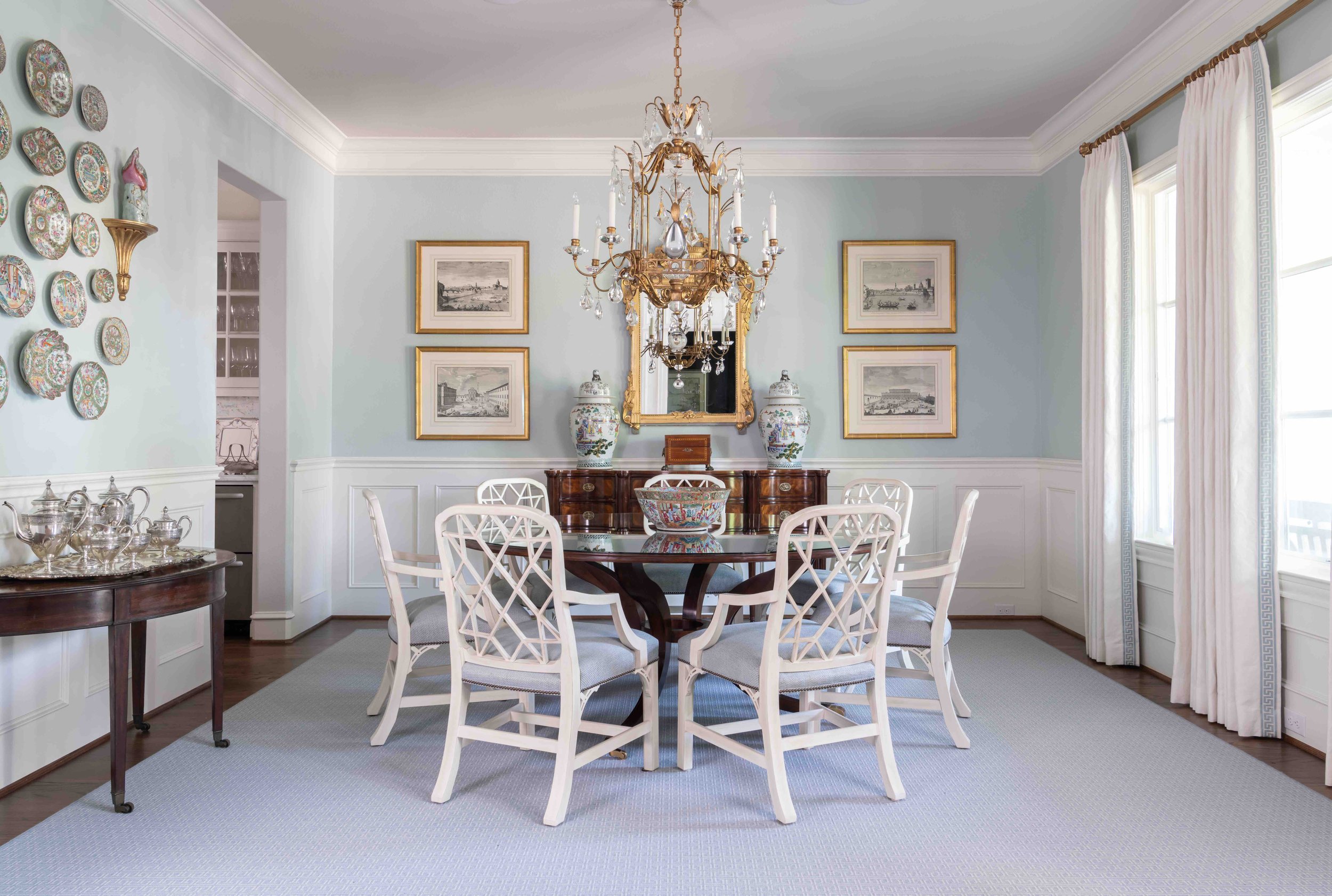
Almost everything in this dining room follows a neutral palette, from the English firework chairs to the feather crystal chandelier.

Whether your dining room is used often or reserved for special occasions, it's an important area in your home and deserves to be beautifully designed. Following are some interior design tips for dining rooms, drawing on my years of experience as a professional designer.

With dining rooms, it's helpful to consider the style of adjacent rooms, any heirloom pieces you intend to use, and the ambiance you want to create. If you own heirloom furniture or have furnishings you don't plan on replacing, such as built-in cabinets, you should pick a color palette that harmonizes with them.

Light colors, like the pale blues and creams we used in this Preston Hollow dining room, make a space feel more open.

Is your dining room small or large? If the room’s size is making it difficult for you to work with, you can use color to make the space appear more open or more enclosed. For example, choosing a deep color for your walls gives your dining room an elegant and cozy feel. Cream and pale colors can help open up a small dining room. If you're putting your dining table in a corner area, combining a banquette with dining chairs is a great way to make the best use of your space. Use the same upholstery fabric on both the banquette and chairs to tie the mixed seating together.

To avoid overcrowding, make sure there is enough room for people to move in and out of their chairs once they've been seated. A good rule of thumb is to leave three feet of room between the dining chairs and surrounding furniture or walls.

In order to seat eight in the relatively small room, we custom designed a round table that was a good fit for the space.

Consider how many people you will want to host before you buy new dining furniture. While rectangular tables are suited to hosting a large party in a rectangular room, round tables are great for square dining rooms and encourage conversation. Forty-two inches is the ideal width for a rectangular table. You should also make sure to take measurements before you buy new chairs for an existing dining table. If the chairs are the wrong height for the table, it makes things uncomfortable for guests. You can add some interest to your seating arrangement by using contrasting chairs for the head and foot of the table.

The textures and colors of your furnishings should be compatible with the style of your home. Steel and glass are a good fit for contemporary, while polished wood can have a formal look, and rougher textures like pine or distressed finishes convey rustic charm. Bring all your furnishings together with an area rug or a chandelier. With an area rug, it’s important to leave enough space on all sides for guests to scoot their chairs out without running over the edge of the rug—at least two feet out from the edge of the table. If your dining room does not have enough space for a rug, it’s preferable to not have one at all.

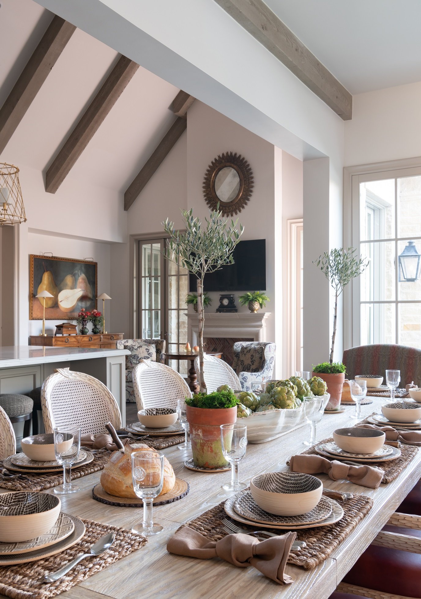
The table setting in this Dallas kitchen we designed exudes rustic comfort with a touch of class.

Make sure your lighting will create the ambiance you want for your dining room. Don’t hang downlights directly over chairs, or else you’ll create dark shadows on guests’ faces. A chandelier should be hung twenty-eight to thirty-four inches above the table to prevent bulb glare from being visible in the eyes of seated guests.

Sconces, buffet lamps, and wall washers are useful for adding ambient light to the room or highlighting artwork and architectural details. A dimmer is also great to have. Not sure what to decorate your dining room walls with? Aside from artwork, you might consider using photography, wallpaper, mirrors, a plate collection, or decorated shelves.

If you're having trouble making the best use of your furniture and your space, you can always consult an interior designer. After all, you'll want your dining room to be a room you love and use often, whether you plan on entertaining or using it as a family hangout space. To schedule a free consultation with us, send an email to info@chambersinteriors.com or call our Dallas office at 214-651-7665.

RELATED ARTICLES:

4 Things You Should Know Before You Decorate Your First Home by Margaret Chambers

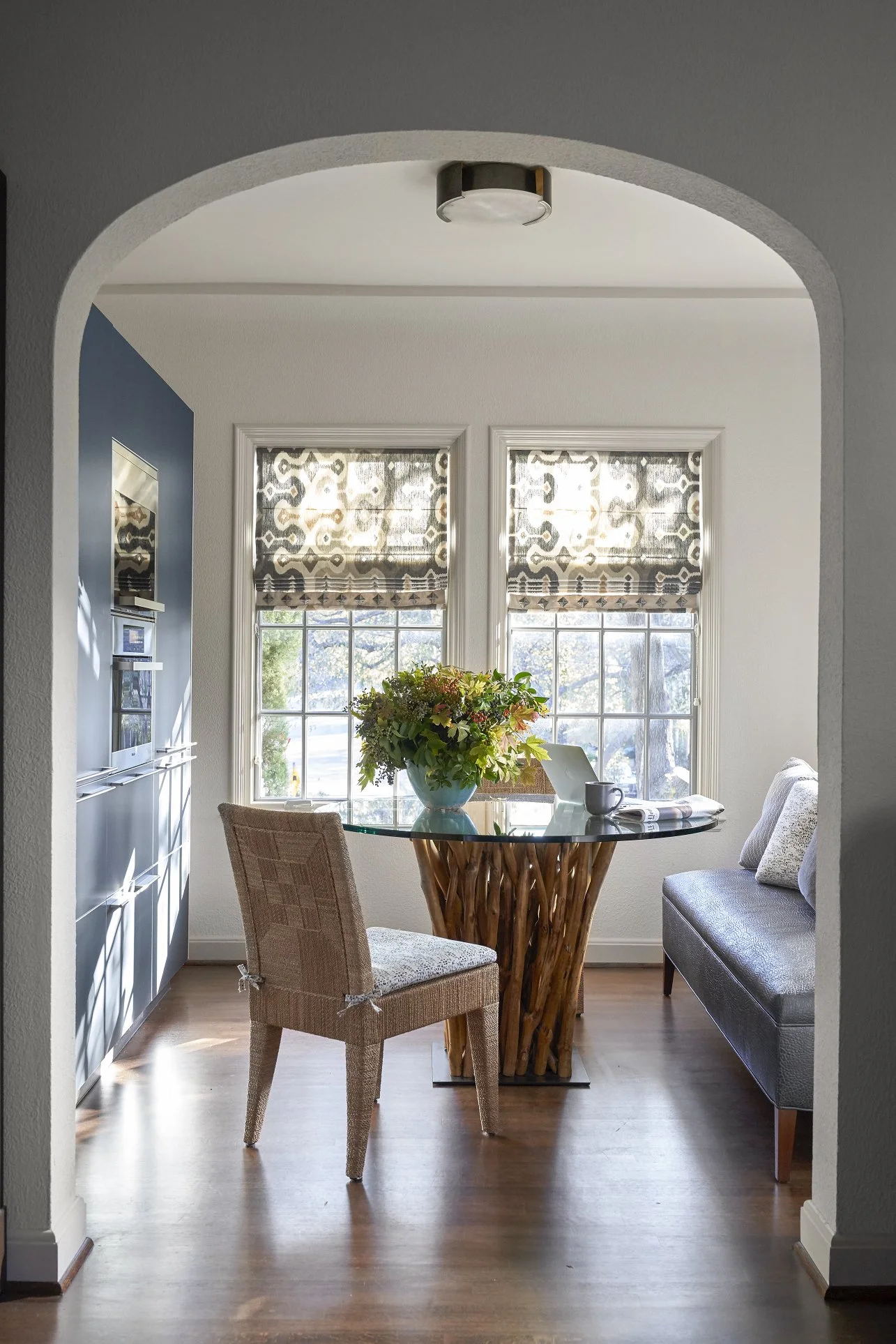
Even small spaces, such as this breakfast area with a custom banquette, can be very special and unique.

Buying your first home is an exciting milestone. For most people, it’s their first chance to truly make the space their own. However, first-time homebuyers might also find the prospect of decorating a whole home daunting. Below are some tips that I think all first-time homebuyers should know before they start decorating.

Plan Your Space in Advance

Get your hands on the plans for the house if possible. Having these will help you see ahead of time which of your furniture will fit and if you need to knock down walls to create a more open layout. If your house does need major renovations, bringing in a design team now will save you a lot of stress later.

An interior designer can also tour homes with you and tell you which of them have the best floor plans, or which homes will require the least amount of work. When I look at homes for sale, I see things most clients wouldn’t notice.

One of the most crucial, but often overlooked, aspects of home design is lighting. It’s especially important to make sure you have adequate lighting for your kitchen and bathrooms. Don’t forget to take natural lighting into consideration and decide how much privacy you’ll need for each room.

Identify Your Favorite Design Styles

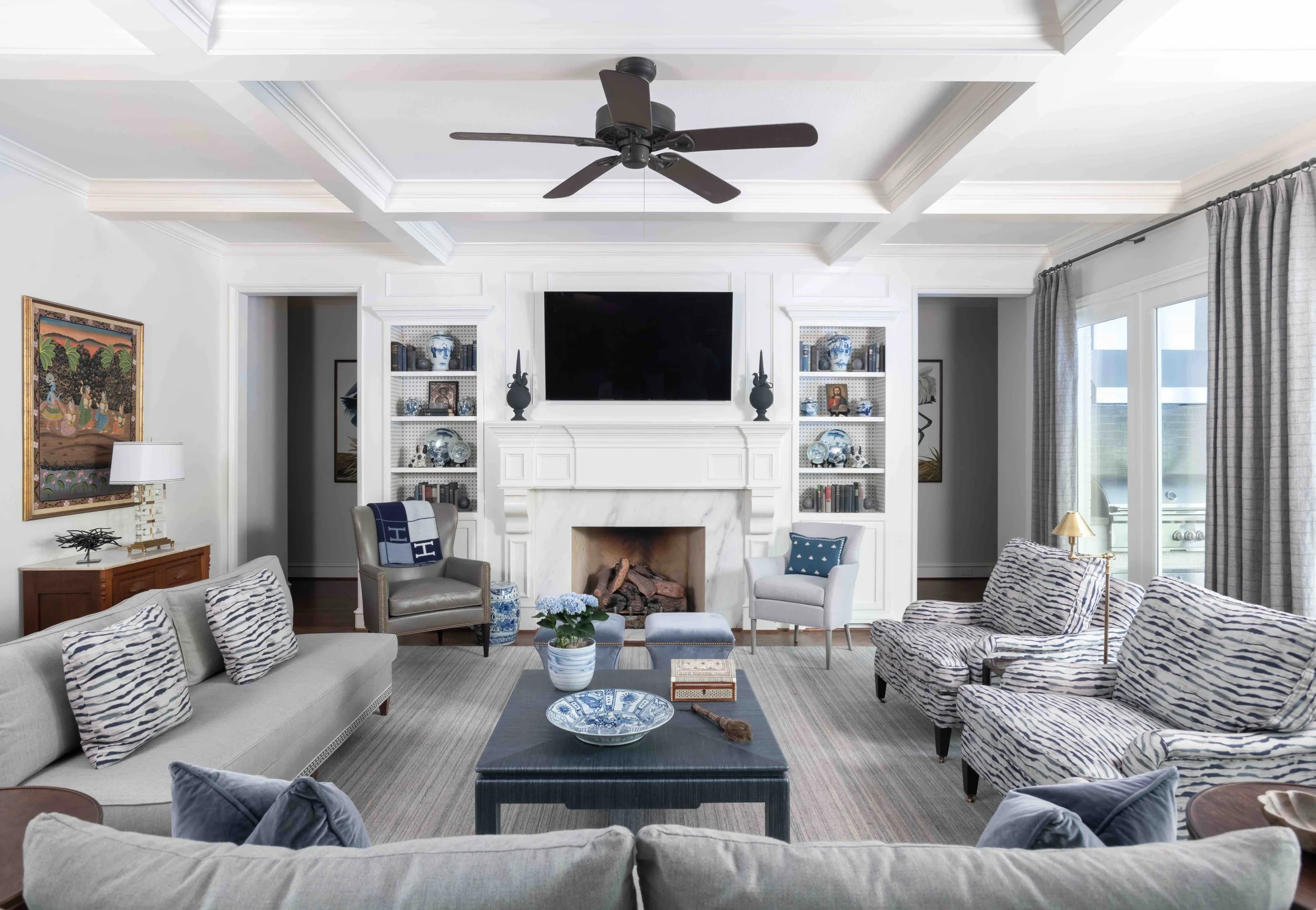
We went with a transitional style for this Preston Hollow home because its architecture is very simple. Blue-and white is always a popular color scheme.

Most people have more than one interior design stye that inspires them. When in doubt, pick a style that is complementary to your home’s architecture. There’s no need to use the same style in every room. Just remember to have at least one design element in common (such as a color) that connects the rooms together.

Although looking at the internet or design magazines for inspiration can be a helpful starting point, don’t get caught up in trying to closely re-create someone else’s design. Your first home will go through a lot of transitions, and you should give yourself freedom to change things up as time goes on.

Start With the Rooms You’ll Use the Most

The best rooms to begin with are the ones you’ll spend the most time in. If you like to entertain, those rooms might be your living room and dining room. Your anchor pieces for each room (such as your bed, sofas, or dining table) should take priority in your budget. I generally recommend that my clients buy the best mattress and bedding they can afford. You can, and should, spend a lot less on accessories for the moment.

When designing your den, try to create as much seating as possible and make it a perfect place to watch TV.

Your friends and family may also have some pieces in storage that they would love to give you. Before turning down a piece, take a moment to consider if it might work better for you if it was reupholstered or repainted. That said, don’t take any furniture that you know won’t fit your desired interior design style. You’ll eventually find yourself having to design around it, which may be more trouble than it’s worth. Hand-me-down or heirloom pieces that are in a neutral color are always easier to integrate into a home.

Layer Items Over Time Instead of Buying Everything at Once

One mistake first-time homebuyers often make is rushing to buy everything at once and getting matching furniture sets. The best homes have a layered look that mixes old and new pieces together. Combine items that are complementary in color, material, and scale. Don’t be in a rush to pick your paint color, either: try testing out swatches instead.

Instead of using the matching chairs that came with your table, try using a different but complementary set.

Finally, remember that most people only stay in their first home for a few years. The items you prioritize in your budget should also be ones you can take with you to your next home. On the other hand, if you plan on enjoying your home for many years to come, consider hiring a professional designer. Designers like myself get to know you so that we can design a space that is perfectly suited for you and your family. If you're interested in working with Chambers Interiors, you can reach our Dallas office by calling 214-651-7665 or emailing us at info@chambersinteriors.com.

RELATED ARTICLES:

4 Things to Know Before You Update Your Bathroom or Powder Room by Margaret Chambers

A few accessories, like a soap dish or some fresh flowers, are all that's needed to complete a bathroom counter.

A few accessories, like a soap dish or some fresh flowers, are all that's needed to complete a bathroom counter.

Bathrooms and powder rooms are woefully overlooked areas in home design. Many people consider designing them an afterthought, or aren’t sure how to work with a small space. But no matter how small your powder rooms are, you deserve to have ones that are thoughtfully planned and tastefully designed. If you’re thinking about giving the bathrooms in your Dallas home a quick update—or an extensive remodel—you’ll surely find these tips useful.

Brunschwig & Fil’s iconic “Les Touches” wallpaper adds a playful touch to this bathroom we designed for a Dallas home.

Brunschwig & Fil’s iconic “Les Touches” wallpaper adds a playful touch to this bathroom we designed for a Dallas home.

2021 Bathroom Trends:

Although grey was a popular wall color for bathrooms the last few years, in 2021 it’s starting to go out of style. Instead, warmth is being brought into bathrooms through the use of gold or brass fixtures and wood accents. Wallpaper has also come back into style. If you do want to put up wallpaper, shop for the vinyl kind that is moisture-resistant.

While you’re updating, take a look into some of the latest developments in bathroom technology. These include smart showers that can be remotely set to start running, voice-activated lighting and temperature controls, and Bluetooth speakers for baths and showers. Heated floors have also been gaining popularity for some time now.

Layout Tips for Bathroom Remodels:

A common bathroom design mistake is to make your toilet the first thing a visitor sees when they enter the bathroom. Choose anything else as your focal point beside the toilet, such as your mirror, your bathtub, or your vanity. The toilet should be out-of-sight from the entrance whenever possible.

This area, with the freestanding tub and large antique mirror, serves as the focal point for this bathroom in Colleyville.

This area, with the freestanding tub and large antique mirror, serves as the focal point for this bathroom in Colleyville.

Bathrooms don’t have to be spacious to be appealing. To make a small powder room feel more luxurious, splurge on a few nice materials and finishes. If you prefer to take showers over baths, don’t take up too much floor space with a large tub.

When we remodeled this shower, we added glass doors, mosaic floor tiles, slabs of Carrera marble, and brass hardware.

When we remodeled this shower, we added glass doors, mosaic floor tiles, slabs of Carrera marble, and brass hardware.

You can maximize elbow room by installing a glass panel or shower curtains instead of a shower door. This way, you also won’t have to worry about your door swinging out and hitting the vanity.

Don’t forget to plan for storage space. Upper vanity cabinets along either side of the mirror are a smart solution for keeping toiletries out of sight. You can even build electrical outlets into the cabinets for plugging in your hairdryers and electric toothbrushes.

Choosing Flooring and Tiles:

There’s a reason why most bathrooms have tiled floors. Carpeting absorbs moisture and can develop mold, and if wood flooring becomes water damaged, it’s costly to replace. If you want the look of wood without the risk of water damage, I’d recommend porcelain tiles with a faux bois grain finish that emulate the look of real wood panels.

Improvements in manufacturing have paved the way for new and improved tile patterns, including chevron, diamond, hexagon, arabesque, and fish scales. I’m starting to see homeowners want to try new patterns instead of defaulting to subway tile.

The Best Lighting for Powder Rooms:

Lighting is always important for home design, and bathrooms are no exception. Older fluorescent light bulbs can cast an unflattering blue hue on skin, while dim lighting makes bathrooms feel small and closed-in. If the color tone of your bulbs is a cool white, update them with a warmer white.

The vertical cabinets in this vanity are great for storing toothbrushes, medications, etc. so they stay out of sight. The cabinets also contain electrical outlets, so everything can stay conveniently plugged in and ready to use.

The vertical cabinets in this vanity are great for storing toothbrushes, medications, etc. so they stay out of sight. The cabinets also contain electrical outlets, so everything can stay conveniently plugged in and ready to use.

As you update your lighting, make sure not to install the fixtures too far above your mirror, or else they’ll cast shadows on your face. Either bring the lights low enough so that they’re almost touching the mirror, or place sconces on either side of the mirror.

To make a bathroom feel light and airy, find a way to filter daylight in. A window to the outside or a skylight through the ceiling are both options. You can always put shutters over the window for more privacy.

We normally use tile in bathrooms, but the client wanted wood floors. To protect them, we added polyurethane coating.

We normally use tile in bathrooms, but the client wanted wood floors. To protect them, we added polyurethane coating.

For your finishing touches and decorations, keep things simple. Instead of cluttering counter space with lots of accessories, buy practical items—such as pretty soap dispensers—that are decorative and integrate into your overall design theme.

If your bathtub is next to a window, you can always add shades for privacy, like this motorized Roman shade we used.

If your bathtub is next to a window, you can always add shades for privacy, like this motorized Roman shade we used.

Many people in Dallas continue to work from home and are thinking about ways they can give their surroundings a facelift. Whether you’re planning a full bathroom remodel, or just want to make better use of the space and layout you already have, the designer tips above will come in handy.

For those of you who are looking to bring in a professional, you should know that Chambers Interiors has a lot of experience a bathroom remodels. To schedule a free consultation, email us at info@chambersinteriors.com or call our Dallas office at 214-651-7665.

RELATED ARTICLES:

No Bohemian Room is Complete Without These 6 Elements by Margaret Chambers

The antiqued gold pagoda mirror frame, patterned wallpaper, and warm colors all lend themselves to Bohemian style.

The antiqued gold pagoda mirror frame, patterned wallpaper, and warm colors all lend themselves to Bohemian style.

The French word bohémien originally referred to migrants from Bohemia, a region in the Czech Republic. Nowadays, we might call someone who is nonconformist, artistic, and well-traveled a bohemian. Bohemian interior design style is as free-spirited and unconventional as the people who inspired it.

Those who love Bohemian (“Boho” for short) style are drawn to it because it is colorful, approachable, carefree, and cozy. This is not a style for minimalists or people who don’t like color. If you’ve always wanted to try decorating your Dallas home in a Bohemian style, make sure to include the following elements.

1. Bold Patterns and Colors

When you study Bohemian rooms, you’ll notice that they often combine a neutral base color with jewel tones, earth tones, and metallic accents. The brightest colors can be anything from emerald green to mustard yellow and royal purple. Bright colors have been becoming more popular this year, making Bohemian a very current look too.

We filled this downtown Dallas high-rise with bold colors and multicultural art, especially African and Indian art.

We filled this downtown Dallas high-rise with bold colors and multicultural art, especially African and Indian art.

For a truly Bohemian look, you’ll want some patterns too, especially patterned rugs. Any patterns you choose should fit into your overall color scheme, but don’t worry about mixing different regional styles. This is your opportunity to combine ikats, suzanis, and shiboris with Moroccan, Mexican and Persian patterns. You can even try hanging a tapestry or rug on the wall instead of art.

2. Low-Seated, Comfortable Furniture

Low seating is ideal for Bohemian rooms because it promotes an air of relaxation. As you furniture shop, look for floor pillows, poufs, ottomans, low-backed sofas, and low coffee tables that invite visitors to settle down and unwind.

This north Dallas bedroom combines many different kinds of patterns in the same basic colors (blue and white).

This north Dallas bedroom combines many different kinds of patterns in the same basic colors (blue and white).

Bohemian style is all about mismatched items that tell a story. This is definitely not the place for all-matching sets of furniture straight from the showroom! Pieces that are distressed and have history to them are ideal.

Although this guest bedroom is not colorful, the patterns on the bedding and curtains help to give it a Boho feel.

Although this guest bedroom is not colorful, the patterns on the bedding and curtains help to give it a Boho feel.

3. Touchable Textures

There is no such thing as “too much texture” in a Boho room. Unsurprisingly, organic materials, like rattan, stone, leather, and wood are especially prevalent here. Try to balance soft fabrics (like velvet) with smooth metals and rough textures (like distressed wood furniture and unglazed pottery).

Of course, not everything in your room has to look worn and casual. A touch of glamor is not unwelcome in a Bohemian space, so look into adding an ornate sunburst mirror or a beautiful chandelier.

4. Plants

Plants are another key fixture of Boho style. They can be live or faux, tall or short. Cacti, monsteras, and tropical plants are always at home in this setting, but really, almost any green plant will add some color and life to the room.

5. Ambient Lighting

Since Bohemian is a “light and bright” style, your room should be well-lit at all hours of the day. Layer a mix of different light sources, such as pendant lights, floor lamps, lanterns, and candles to create an ambient glow that is not too harsh.

6. Multicultural Art and Accessories

Boho is an eclectic, well-traveled look where a variety of items create one storied space. Multicultural art is perhaps the most important feature of this style. Don’t travel often? Visit your local antique store to find interesting pieces from around the world. An interior designer can also be a great resource for helping you find the perfect antiques and art.

If you’re designing your living room in Bohemian style, putting a tall potted plant in the corner is a good idea.

If you’re designing your living room in Bohemian style, putting a tall potted plant in the corner is a good idea.

If you like Bohemian but want your own home to look more restrained, it is perfectly fine to just include a few artsy and colorful accents into an otherwise orderly space. Even if you’re going for a very exuberant Boho home, your bedroom should be more pared-down to create a sense of calm.

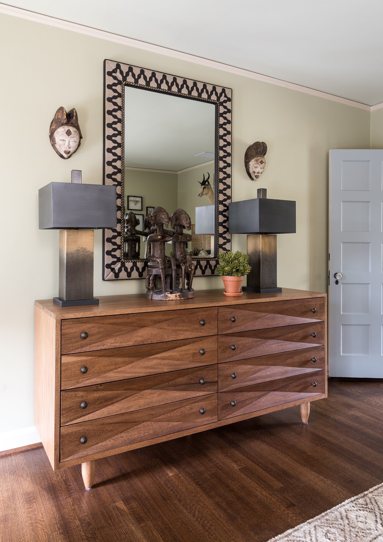
Here you can see a Bohemian guest bedroom from an Oak Cliff project that was decorated in a distinct African theme.

Here you can see a Bohemian guest bedroom from an Oak Cliff project that was decorated in a distinct African theme.

Although there are no hard and fast rules in Bohemian style, there are certain things that really capture its relaxed, free-spirited atmosphere. By breaking down Bohemian into its basic elements, I hope I’ve helped demystify this style so that you can design with a clear vision in mind.

And of course, if you could use some help sourcing antiques, art, and fabrics for your Bohemian space, working with an interior designer can save you a lot of time and trouble. To schedule a free consultation with us, call our Dallas office at 214-651-7665 or send an email to info@chambersinteriors.com.

RELATED ARTICLES:

Design a Balcony, Patio, or Porch that You’ll Love to Use by Margaret Chambers

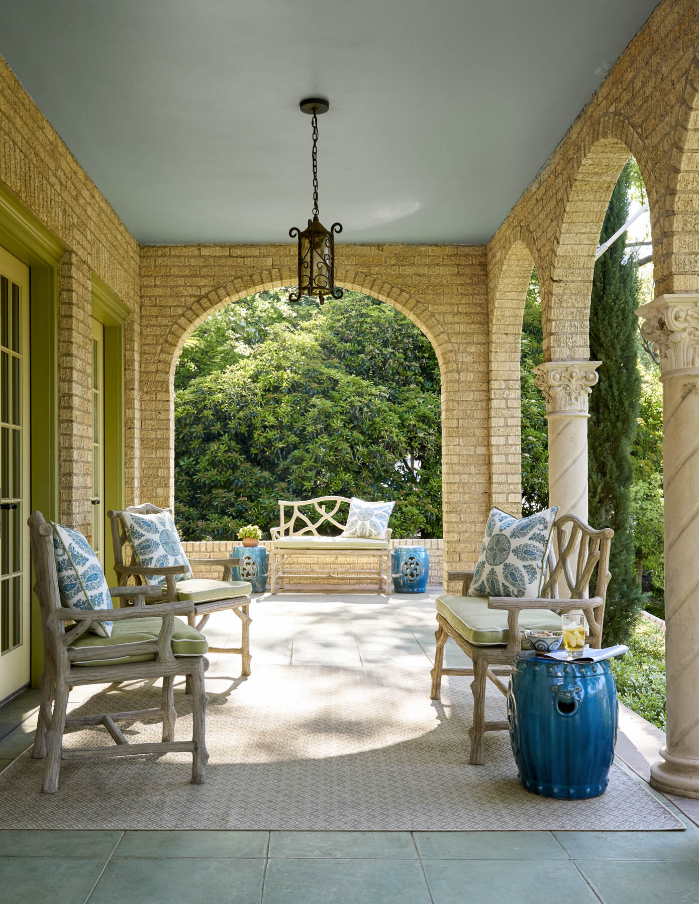
We decorated this front porch on a Dallas home with faux bois benches by Currey & Company.

We decorated this front porch on a Dallas home with faux bois benches by Currey & Company.

Balconies, porches, and patios are enviable design features for a home. But designing an outdoor space comes with its own challenges. You'll need to ask yourself: do you want to design around a view? Create privacy? How will you provide shelter from the elements?

Balconies, especially, are often small. Some people just put out lawn chairs and aren’t sure what else to include. If your Dallas home has an outdoor space that’s a little underutilized, here are some ideas on how to get the most out of it.

General Outdoor Space Guidelines:

A good first step to designing an outdoor space is to research outdoor-friendly furniture materials. Wrought iron, teak, and resin wicker are all common in outdoor decorating. You should also look for cushions that dry quickly and can stand up to the sun's rays.

A lantern chandelier helps to illuminate this outdoor area we designed for a University Park chateau.

A lantern chandelier helps to illuminate this outdoor area we designed for a University Park chateau.

Lighting is very important for these spaces, especially if you like to enjoy your balcony, patio or porch as the sun is setting or in the evenings. Look into pendants, sconces, string lights, or lanterns, and remember that bulbs with a warm color are preferable here to bright white.

An easy way to add color to outdoor spaces is to decorate with vases, potted plants, and pillows. Don’t forget to dress up the floor too. A patterned area rug adds comfort underfoot, but graphic floor tiles can introduce a lot of flair too. If privacy is a concern, you may need to add a screen lattice with climbing plants, a tall potted plant, or a shrub.

Tips for Balconies:

Space is premium on balconies, so think about how you’ll be using yours and plan accordingly. If you like to eat dinner out on the balcony, then obviously you’ll need a table; if you’re only going to be reading or enjoying an occasional cocktail, you can get away with just a comfortable chair and a small ottoman or drink table.

Take the opportunity to install built-in seating if your balcony is still under construction. This way, you won’t have to worry about furniture being knocked over by the wind.

Tips for Porches and Patios:

The brown-and-white-striped cushions seen here complement the earth tones in the stone exterior of the house.

The brown-and-white-striped cushions seen here complement the earth tones in the stone exterior of the house.

As with balconies, consider how you’ve used your porch or patio so far. This is especially important for front porches. Is yours a living space? Or is it a transitional space into your foyer? Either way, it’s important that your outdoor furnishings blend with your interiors and also complement the paint colors on the outside of your home.

An outdoor area, such as this one we designed in Kessler Park, should have a variety of seating options that are all equally comfortable.

An outdoor area, such as this one we designed in Kessler Park, should have a variety of seating options that are all equally comfortable.

Most people who have porches feel like they don’t use them enough. Make sure to buy seating that is comfortable for you and your guests, or else you’ll rarely use it. Porch swings with cozy pillows, deep-seated Adirondack chairs, and rocking chairs give you a variety of options that are both relaxing and durable. Your largest piece of furniture should face outwards, while the rest of your seating in a conversation group should face towards it.

The red painted door brightens this shaded porch and makes it feel more inviting.

The red painted door brightens this shaded porch and makes it feel more inviting.

A small front porch is still an important opportunity to make a good first impression. If your porch is shadowy, brighten things up by painting the door a lighter color than the rest of the home, then add a new door-knocker. The door should ideally be the focal point of the porch or patio, so flank it with symmetrical plants or furniture on either side. If your door is on the right or left rather than in the center, lead a visitor’s eye to your door with a lineup of potted plants.

A ceiling fan will help the residents of this Dallas home enjoy their outdoor seating area even during hot summers.

A ceiling fan will help the residents of this Dallas home enjoy their outdoor seating area even during hot summers.

Swapping accessories out with the seasons adds a lot of charm to your porch or patio. Include throw blankets on the outdoor furniture so you can enjoy the cooler months outside, too. A ceiling fan is also a smart investment for making your porch comfortable in hot summers.

If you have trouble getting your outdoor space to harmonize with the rest of your home, consider hiring a designer. Despite being called ‘interior designers,’ many of us consult with our clients about their outdoor areas too. A professional will know the best way to take advantage of your space and create a porch, patio or balcony you'll enjoy in all seasons. You can reach out to us by calling our Dallas office at 214-232-9501 or sending an email to info@chambersinteriors.com.

RELATED ARTICLES:

8 Design Ideas for Rooms with High Ceilings by Margaret Chambers

Tall drapes with valances, a modern chandelier, and a painting all help to fill the space under this high ceiling.

Tall drapes with valances, a modern chandelier, and a painting all help to fill the space under this high ceiling.

Although high ceilings are a sought-after feature for most Dallas home buyers, they can also present some unique design challenges. People are often stumped trying to figure out what to do with all that extra wall space over door frames.

The key is to bring everything together by visually connecting your furniture, walls, and ceiling. Read on for eight design solutions that help make high-ceilinged rooms feel more inviting and intimate.

1. Find the Perfect Artwork:

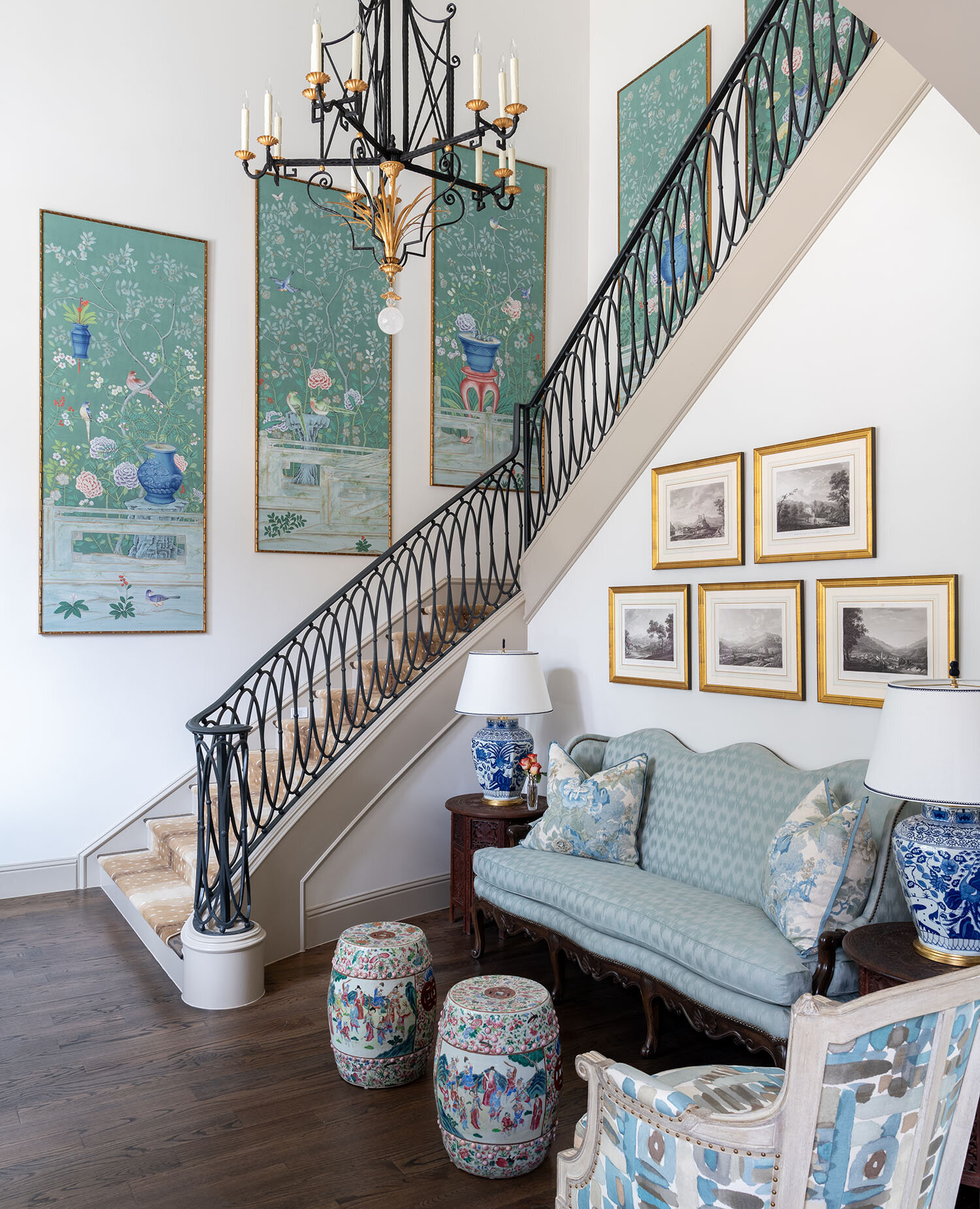
A series of framed de Gournay wallpaper panels add drama to this tall staircase in a Dallas home we designed.

A series of framed de Gournay wallpaper panels add drama to this tall staircase in a Dallas home we designed.

One way to fill your extra wall space is with artwork. One large statement piece, a gallery of smaller pieces, or a tapestry are all good options for high ceiling rooms.

Artwork should be hung at eye-level, unless you have a particularly tall and narrow piece. If you want to hang something above eye level, I recommend a wall clock.

2. Install Custom Drapes:

Very tall ceilings call for very tall window treatments, which usually have to be custom ordered through a designer.

Very tall ceilings call for very tall window treatments, which usually have to be custom ordered through a designer.

The rule of thumb for tall windows is to hang your draperies at ceiling height. On the other hand, if your windows don’t go all the way up to the ceiling, you may want to add valances to make them more proportional. Either way, the drapes should hang so that they almost touch the floor.

Depending on how high your ceilings are, you may need to order custom drapes. Although costly, this is an option worth considering. The softness of drapes helps to make a high ceiling room feel cozier. Don’t worry about the tall draperies being too much: as long as you choose a solid color fabric or a subtle pattern, the effect will be spectacular.

3. Add Architectural Details:

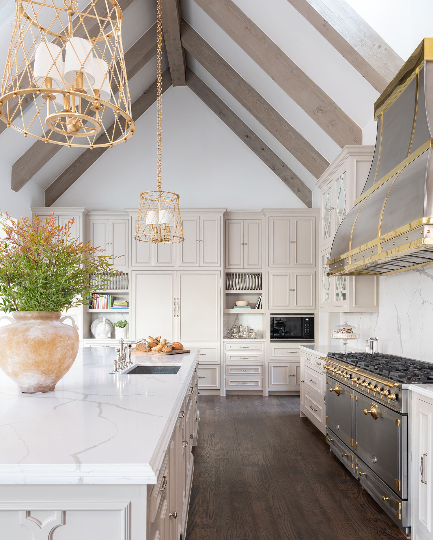
The wood ceiling beams in this kitchen complement the hardwood floors while also contrasting against the sleek metals.

The wood ceiling beams in this kitchen complement the hardwood floors while also contrasting against the sleek metals.

One way to create a sense of depth in a tall ceiling is to add exposed beams or large crown molding. Although beams are usually associated with rustic homes, they can fit into a contemporary style home as well.

4. Use Statement Lighting:

Hanging a statement lighting fixture, such as a chandelier, is a classic solution to drawing the eye towards a ceiling. Generally, chandeliers should be hung over the coffee table or dining table in the center of the room.

For this north Dallas project, we repurposed the dining room chandelier from our clients’ old home and hung it over a seating area in their new master bedroom.

For this north Dallas project, we repurposed the dining room chandelier from our clients’ old home and hung it over a seating area in their new master bedroom.

5. Create a Feature Wall:

Another way to visually connect the upper and lower levels of the room is to turn one wall into a feature wall. There are a few different ways to do this. Painting one wall in a solid, dramatic color from floor to ceiling; wallpapering a wall; or extending the brick or stonework around your fireplace upward are some ideas.

6. Break the Walls into Thirds:

An alternative to the floor-to-ceiling feature wall is to follow the rule of thirds and visually divide the walls into three sections. As an example, the lowest third of your wall could be paneled, the middle third could be for artwork, and the highest third could be left as-is.

The wainscoting seen here, plus the two rows of framed prints above it, divide the wall into visual thirds.

The wainscoting seen here, plus the two rows of framed prints above it, divide the wall into visual thirds.

That said, not everything in your room needs to align with these three segments. Breaking up the visual “horizon” of the room (by including a few bookcases, for example) adds variety to the topography of the space.

If you want to make your walls feel shorter and the ceiling closer, paint your walls in two tones, one color on top of another.

7. Install Shelving:

Some homeowners make use of the extra wall height in their rooms by installing floating shelves or buying tall bookcases. If you like greenery, you can also add a tall potted plant in the corner of your room.

8. Use the Correct Scale Furniture:

A room with tall ceilings needs furnishings and accessories that fit comfortably into its scale. To that end, do not fill your room with collections of small objects or small-scale furniture.

A custom canopy bed and a large area rug are proportionally appropriate choices for this high-ceilinged bedroom we designed.

A custom canopy bed and a large area rug are proportionally appropriate choices for this high-ceilinged bedroom we designed.

Your furniture should be grouped together into multiple seating arrangements and anchored with an appropriately sized rug. Spacing the furniture far apart will make the room feel unbalanced and uncomfortably expansive.

Having high ceilings is an enviable problem many would love to have. That said, there’s no denying that taking advantage of the extra height can be tricky without a designer’s know-how.

By working with a professional interior designer, you can have access to their resources, which include custom window treatments, fine artwork, gorgeous chandeliers and other design elements that bring out the best in a high-ceilinged room. To schedule a free consultation with us, call our Dallas office at 214-232-9501 or email us at info@chambersinteriors.com.

RELATED ARTICLES:

Essential Items for Designing the Perfect Foyer or Entryway by Margaret Chambers

Lots of natural light will help a foyer feel open and airy. This north Dallas project was recently published in Luxe.

Lots of natural light will help a foyer feel open and airy. This north Dallas project was recently published in Luxe.

Foyers and entryways are an important area of the home that sadly often goes overlooked. They’re not just the first impression a guest has of your home; they are also a landing strip where you transition from public to private life.

The following designer tips can be applied to entryways of all shapes and sizes, in all styles of home architecture. Before you begin, take a look at your available space and identify the main goals you want to achieve with your foyer. You might not have room to incorporate all of the suggestions below, so pick the items that make the most sense for you and your family.

Furniture

Putting a console table, bench, and decorative mirror together will form a classic entryway vignette.

Putting a console table, bench, and decorative mirror together will form a classic entryway vignette.

Most professionally-designed foyers will have at least one of the following: a console table, a chest, or a bench. Benches are helpful to have because they offer a place for people to put on or take off shoes.

Choosing a chest over a console table can be wise if you don’t have a lot of closet space and need extra storage for your seasonal clothes. To dress up the space, hang a statement mirror or painting over your table, chest, or bench.

Rugs

This Oak Cliff house we designed features both an entry staircase with a patterned runner and a bench for seating.

This Oak Cliff house we designed features both an entry staircase with a patterned runner and a bench for seating.

In some homes, the entryway is small and enclosed on most sides. In an open concept home, however, the space is less defined. Dallas homeowners with an open concept house should make sure to delineate where their foyer begins and ends using a rug as well as a few pieces of furniture, such as a bookcase, console table, or bench. You can also use a partition or decorative screen to visually divide the entryway from the rest of the first floor.

Since this is a high-traffic area, your entry rug should have good traction and be durable. Wool is easier to clean than other materials, making it a popular choice for entryways. Jute is another good option because it doesn’t show wear and tear as visibly as alternatives. Those of you with an entry staircase should also think about getting a beautiful runner to make it safer to walk on.

Storage

An antique tea caddy can be a charming addition to your console table. Click here to learn more about tea caddies.

An antique tea caddy can be a charming addition to your console table. Click here to learn more about tea caddies.

If you don’t have a separate mudroom, and your foyer tends to get cluttered, identify what kinds of clutter accumulate there. Do you have a shoes-off policy for your home? If so, store shoes in a chest or basket under the console. Do you drop off your mail, sunglasses, and keys as soon as you get home? Place a pretty decorative box on your console table to collect these loose items.

To keep umbrellas off the floor, I recommend finding an umbrella stand made of porcelain, brass, or Lucite. As an aside, all of your storage solutions should either complement the overall space or be in neutral colors so that they fade into the background.

This foyer has two decorative light sources: a star-shaped light fixture overhead and a lamp with a faux bois stand.

This foyer has two decorative light sources: a star-shaped light fixture overhead and a lamp with a faux bois stand.

Lighting

One common problem with entryways is that they can be narrow and poorly lit. You have a few options for making sure yours is bright and welcoming.

In a foyer with very little natural light, a statement chandelier is the obvious choice. A less obvious option you might not have considered would be to decorate your console table or chest with a lamp. To reflect the natural light coming in through your windows or door, include a wall mirror in your foyer. Another advantage to putting a mirror in your entryway is that you can do a hair check one last time as you head out the door.

Accents

Seen here is a coffee table from the foyer we designed in SMU’s new Kappa Alpha Theta sorority house.

Seen here is a coffee table from the foyer we designed in SMU’s new Kappa Alpha Theta sorority house.

Since your foyer is like a sneak peek of the rest of your home, don’t be afraid to show your personality. This area can be a great place for a few personal photos and mementos. For your table or chest, decorate it as you would a coffee table: fresh flowers, a bowl of seashells, antiques, candles, or books could help complete the look.

Designing a better foyer won’t just impress your guests. It’ll bring you cheer when you come home after a long day to find a beautiful and well-organized space awaiting you. By taking a moment to strategize and identify key items missing from your current setup, you too can have a foyer that is as stylish as it is functional.

On the other hand, if you’re looking for an interior design team that will learn about your vision and source the items for you, you’ve come to the right place. To schedule a free consultation, call 214-232-9501 to reach our Dallas office or email us at info@chambersinteriors.com.

RELATED ARTICLES:

Avoid These 9 Costly Remodeling Mistakes by Margaret Chambers

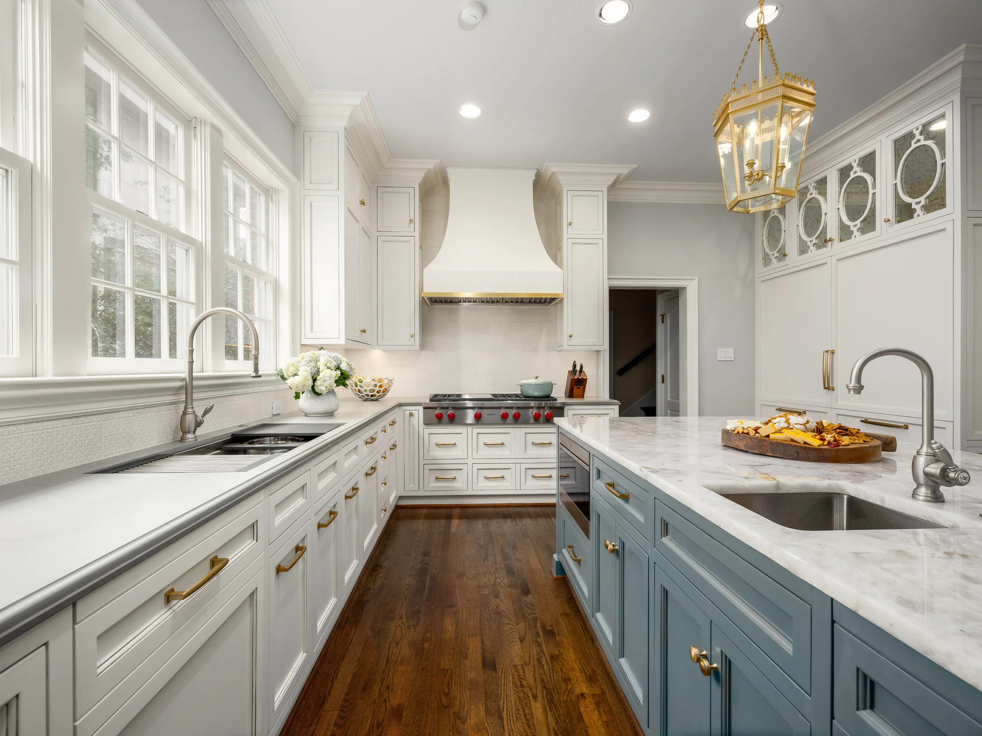
To break up the space in this large kitchen remodel, we decided to use multiple finishes, colors, and materials.

To break up the space in this large kitchen remodel, we decided to use multiple finishes, colors, and materials.

All photos in this article are courtesy of First Showing Photography of Dallas.

If you’re reading this, you’ve probably decided to remodel your home, or you’re at least considering it. You may be wondering how to get the ball rolling. What should you prioritize in your budget? How do you avoid delays and hidden costs? Over the course of my interior design career, I’ve been brought in to design many Dallas remodels. Based on my experience, here is a list of common (and sometimes costly) remodeling mistakes that I think homeowners should be careful to avoid.

1. Not having a clear goal in mind

The first step to a successful remodel is establishing your goal. Do you plan on selling your home, or do you see yourself living there for many years? Be careful not to overbuild for your neighborhood if resale is your end goal. When the value of your home makes it twice as expensive as your neighbor’s homes, it’s going to be a tough sell.

kitchen-remodel-before.jpg
kitchen-remodel-after.jpg

Above: a before-and-after comparison of the award-winning kitchen remodel we recently completed in collaboration with Helene’s Luxury Kitchens. The “after” photo on the right is courtesy of First Showing Photography.

2. Delaying decisions

Start browsing hardware and home goods stores near you as soon as you start planning. This helps you get a feel for all the options out there and how much they cost. Make as many decisions as possible before hiring a team. Once the work begins, every change you make in your design can drive up costs.

3. Designing an extensive remodel without help

If you’re looking at an extensive remodel, you’ll definitely want to bring in an AIA architect, an RID and ASID interior designer, or both to help you plan the new space. Make sure to interview them beforehand. They should ask you a lot of questions about your lifestyle and your family’s needs. If they don’t ask you very many questions, that’s a red flag.

We used satin brass for the majority of the hardware in this Dallas kitchen and pantry remodel.

We used satin brass for the majority of the hardware in this Dallas kitchen and pantry remodel.

4. Underestimating costs

Remodeling TV shows have a tendency to make projects look simpler and easier than they actually are. Make sure to discuss your budget with a contractor: they’ll be able to tell you if your budget and timeline is realistic for your goals. A good rule of thumb is to set aside enough contingency funds to go twenty percent over budget if you need to.

5. Not considering cost-saving alternatives

Avoid moving your toilet or sink whenever possible; moving these comes with a steep price tag. You can also look into getting a discounted package deal on appliances from the same manufacturer.

If you need more natural light in a space, such as your entryway, you may be able to have a light tube added through the ceiling instead of installing windows. Speaking of windows, don’t replace them if they’re original to the home and can be salvaged. If saving energy is a concern, you can always add storm windows.

6. Spending too much on technology

Unfortunately, technology ages quickly and is rarely a good investment. By the time you’re ready to sell your house, your prospective buyers won’t be impressed by a years-old smart home setup.

For this remodeling project, we were asked to work with the existing wallpaper and cabinets in the butler’s pantry.

For this remodeling project, we were asked to work with the existing wallpaper and cabinets in the butler’s pantry.

7. Not making careful measurements

Measuring your available space is a given, but don’t forget to measure the width of your front door, too. If your new refrigerator or stove can’t fit through the door, you’ll have to return it.

8. Not vetting your contractor

Asking your family and friends for recommendations on Dallas contractors is a good start, but go a step further and make sure those contractors are licensed, certified, and in good financial standing. Try to get their last three references if you can, and check their Better Business Bureau listing and Google Reviews.

9. Planning lighting at the last second

Remember to plan for a mixture of general, task, and accent lighting in the room. Lighting alters a person’s perception of the space, so it should never be treated as an afterthought. You don’t want to fill your newly remodeled house entirely with old and dated furniture, either, which is where an interior designer can come in handy.

We worked with Helene Terry to choose paint for the cabinets and walls, the tile backsplash, and the light fixtures.

We worked with Helene Terry to choose paint for the cabinets and walls, the tile backsplash, and the light fixtures.

Although there has never been a remodel that has gone one hundred percent smoothly, some remodels are simply more successful—in terms of keeping costs down and reducing stress—than others. Set your sights on the end goal, keep these pointers in mind, and you’ll be on track to living in the remodeled home you’ve been dreaming of.

If you’re bringing in a professional designer, the best place to start is by interviewing designers experienced in remodels. Our design team has overseen many remodels in the Dallas metroplex over the years. Give us a call at 214-232-9501 or send an email to info@chambersinteriors.com to schedule a free consultation. We would love to hear more about your project!

RELATED ARTICLES:

Plan Your Home Lighting Like a Professional by Margaret Chambers

Featured here are a pair of Murano glass lamps from a dining room we designed in Kessler Park, Dallas.

Featured here are a pair of Murano glass lamps from a dining room we designed in Kessler Park, Dallas.

In previous articles, we’ve talked about how important balance is to interior design. Lighting is no exception. Even the most beautifully designed rooms will look unbalanced if they’re poorly lit. To help your decorations look their best, you'll need to light each room with care.

If you’re furnishing your home from scratch or working on a major remodel, walk through the house and ask yourself along the way: ‘what are the primary functions of this room?’ Odds are that you’ll want task lighting for your study, but mood lighting for your bedroom. Make sure to plan ahead your desired color temperature for the lighting in each room, too. Lower temperatures are warm and yellow, while higher temperatures are closer to blue daylight.

As a general rule, task lighting should be three times brighter than the rest of your lighting. Recessed lights
and pendant lights are reliable solutions for this. Another place where you may want to install task lighting is above the countertops in your kitchen (in this case, under-cabinet lighting strips can be very useful).

In this photo, you can see both the study hall and the dining area for SMU’s Kappa Alpha Theta house. We lit the seating areas for the study hall with brass chandeliers. To the right, the dining room is illuminated with a series of recessed lights.

In this photo, you can see both the study hall and the dining area for SMU’s Kappa Alpha Theta house. We lit the seating areas for the study hall with brass chandeliers. To the right, the dining room is illuminated with a series of recessed lights.

On the other hand, mood lighting is typically created using a balance of many softer light sources in the same room. Including dimmers in your plans will give you more flexibility to control the brightness levels. A popular new trend is to install one light switch that controls all the lights in a particular area or room. These “smart lighting systems” are preferable because having one switch on the wall looks cleaner than having three or four together.

Make sure that each light fixture is performing a specific task, whether it's highlighting an area, creating
depth, or illuminating a cupboard. There's a saying that "if you light everything, you light nothing." Although it’s tempting to plot lights throughout the room, you do need shadows to create variation and atmosphere.

Pendant lights help to illuminate the sink area in this eclectic master bathroom we designed in a downtown Dallas high-rise.

Pendant lights help to illuminate the sink area in this eclectic master bathroom we designed in a downtown Dallas high-rise.

Lighting can also establish focal points in a room. Use recessed lighting to draw the eye to a central seating area or a piece of art over the fireplace. If you have a gallery of artwork in your hallway, make sure each piece is equally lit. Just make sure not to project light directly onto a mirror, as this will create glare. Instead, highlight the mirror frame with a series of wall-mounted lights on opposite sides.

The overall shape of your room should have an influence on the kind of lighting you choose. Lighting can even compensate for a room’s less desirable features. For example, low-hung pendant lights make ceilings feel taller, while up-lighting will make the whole room feel larger and more impressive.

A chandelier is always an eye-catching lighting solution. For a traditional look, place a chandelier over the dining room table to draw attention. However, in a contemporary home you may want to use a pendant light (or group of pendant lights) instead.

The owners of this Plano residence asked us to update their home with a transitional style. You can see how we complemented traditional and modern pieces together in this dining room. The chandelier, with its fine details, has a more traditional loo…

The owners of this Plano residence asked us to update their home with a transitional style. You can see how we complemented traditional and modern pieces together in this dining room. The chandelier, with its fine details, has a more traditional look.

If you read our last article about harmony in design, you can guess that it's important for lighting fixtures to harmonize. Use multiple kinds of light fixtures in each room for variety and interest, but make sure the fixtures also match your decorating scheme. For example, Japanese paper shades typically look best in either modern rooms or Asian-influenced ones, while an antique crystal chandelier could look out of place in the same room. An antler chandelier is a classic choice for a rustic country home.

That said, maybe you have a room that has a little too much harmony, and could use contrast to break things up. In this case, consider making a statement with your lighting. A black iron chandelier would add a lot of impact to a room with a light and bright color scheme.

Whenever possible, get a designer to help you with lighting needs. Much has changed in lighting just in the past few years, and a professional can help you navigate the latest technologies. You'll be glad you went through the extra effort to give your rooms a beautiful glow—after all, a room that is well-lit, is well used. To schedule a free consultation with us, call our office at 214-232-9501 or send an email to info@chambersinteriors.com.

Related Articles:

An Interior Designer’s Guide to Preparing Your Home to Sell by Margaret Chambers

Are you preparing to sell your Dallas home? If so, you’ve probably already begun your own to-do list. While some strategies for showing a home are common knowledge (“clean up,” “make repairs,” “spray air freshener”) there are other ideas you might not have considered. In this guide, we’ll cover all of the essentials involved in selling a home. We’ll also include some tips from our interior design team that your real estate agent may not think to suggest!

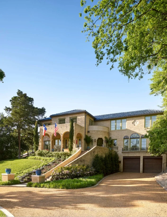
We redecorated this 1927 Spanish colonial house in Kessler Park, Dallas. Lee Roth was the landscape architect. New landscaping gives this home plenty of “curb appeal.”

We redecorated this 1927 Spanish colonial house in Kessler Park, Dallas. Lee Roth was the landscape architect. New landscaping gives this home plenty of “curb appeal.”

First Impressions

Real estate agents stress the importance of “curb appeal” for a good reason. If your home doesn’t make a great first impression, your prospective buyers may never even step out of the car to see it. This is the time to make your yard and front door as presentable as possible. Trimming the bushes, mowing the lawn, and weeding are must-dos. You may also want to plant some new flowers and add fresh mulch.

A quick and easy way to boost your home’s curb appeal is to put a new coat of paint on the front door. Select a color that stands out from the rest of the home, but isn’t too strong, either. If you have lots of decorative items on your porch, you may want to declutter by removing any items beside a welcome mat and a potted plant or two. Make sure that your house numbers are clear and easy to see from the street. If your window trim is fading, repaint that too. You can also pressure wash the siding of your home and the sidewalk.

When you’re wrapping up, step back and take a look at your own home from the street. If you were a buyer, would you want to tour the home?

Tackle Your Repair List

Once you’ve decided that you’re going to sell your home, make a list of all the repair projects you’ve been putting off, and their potential costs. Focus on projects that are either inexpensive, or that you can do yourself. It’s better to take care of all these fixes before the home inspector arrives.

As for more expensive repairs, some are more necessary than others. A leaky roof will definitely turn away buyers. However, while you may be tempted to renovate your outdated kitchen, proceed carefully. A full kitchen renovation can cost as much as $65,000, and it’s estimated that sellers only make back about 60% of their investment when they sell a home with a renovated kitchen. It may be more worthwhile to simply make small repairs to the kitchen and do a deep cleaning.

Your to-do list should include patching holes in walls, fixing doors and drawers that don’t close properly, replacing kitchen cabinet hardware, replacing light bulbs, and fixing leaky faucets. If your flooring is worn out, replacing your carpets and refinishing wood floors can have a higher cost upfront, but is almost always worth the investment. Replace ceilings that are water-stained, even if the plumbing issue was fixed long ago.

Create a Blank Slate

We repainted the walls in the Kessler Park home with mostly neutral colors. In the dining room, beige is a calming backdrop for the gold-framed antique prints. Before, the ceiling was also a dark terracotta color. Covering it with a light wallpaper …

We repainted the walls in the Kessler Park home with mostly neutral colors. In the dining room, beige is a calming backdrop for the gold-framed antique prints. Before, the ceiling was also a dark terracotta color. Covering it with a light wallpaper helped the room feel more expansive.

You have probably heard that it’s important to depersonalize a home for sale. Potential buyers have trouble imagining their own family photos on the walls when yours are still hanging there! Don’t store personal items in the closets, however: buyers will be opening those to see how much storage space you have. Although it’s not necessary to clear them out completely, you’ll want your closets to look tidy. The more organized your closet is, the more space you’ll appear to have.

Instead of putting photos in the closet, rent a storage space for oversize furniture, collectibles, family heirlooms, and photos. Homes that are clean and open will fetch higher prices than excessively cluttered homes, so a storage unit is a smart investment. If you do want to hang something on the wall, scenic pictures and mirrors are just fine. It would also be wise to remove religious items or political statements from your home for now, as these can distract buyers. Once you’ve moved into your new home, you can proudly display them once again.

If you have the time, it’s also worthwhile to organize your pantry and refrigerator. Some buyers will open everything they can to peek inside. You can declutter your pantry pretty easily by moving anything you aren’t planning on using the next few weeks into storage.

We updated this Plano home with transitional style in mind. Before, the walls were painted red. The metallic gray wallpaper we put up is a good example of what’s considered current in wallpaper today.

We updated this Plano home with transitional style in mind. Before, the walls were painted red. The metallic gray wallpaper we put up is a good example of what’s considered current in wallpaper today.

As gorgeous as your dark red bedroom may be, the paint color may be divisive for your buyers. Large, brightly colored furnishings (like upholstered couches) can be off-putting to some as well. You don’t want to provoke too much conversation about your unique taste in interior design. So, if your Dallas home is filled with bold colors, we strongly suggest repainting the walls with a neutral color. Good choices include white, cream, khaki, or gray, depending on what you have in the room. It’s also a good idea to remove any old wallpaper, which may make your home feel more dated than it actually is. You can read more about which wallpaper patterns are trendy, and which are considered out-of-date, in our blog about wallpaper.

The more light you can let into the room, the better. Turn on all the lights and open the draperies. Speaking of draperies, it’s better to just remove heavy draperies before a showing.

These curtains are sheer, allowing lots of natural light into the room.

These curtains are sheer, allowing lots of natural light into the room.

Clean Like You’ve Never Cleaned Before

Be prepared to do a deep cleaning of your home (or hire assistance to do so). After you’ve taken the time to make the counters shine and clear away dust bunnies, you may find rooms getting dirty again with surprising speed. As potential buyers tour your home, your floors and carpets will be tracked with dirt. You won’t need to do another deep-cleaning for a while, but start vacuuming more frequently than you used to. If you have children, ask them to put away their toys each night.

If you have built-in bookshelves, don’t fill them entirely with books. Instead, leave a small selection of your most attractive books and accessories to showcase them. This photo is from the Theta house library we designed at SMU in Dallas.

If you have built-in bookshelves, don’t fill them entirely with books. Instead, leave a small selection of your most attractive books and accessories to showcase them. This photo is from the Theta house library we designed at SMU in Dallas.

A bad odor is an immediate turnoff for buyers. Pet owners will need to take steps to eliminate pet odors. While you’re in the thick of showing, you might also want to avoid cooking meals that leave a smell lingering the next day. On the other hand, don’t be afraid to fill the home with a more inviting scent. Fresh flowers, scented candles, and freshly baked cookies are all safe bets.

Begin the Purge-and-Pack Process

Decluttering goes hand in hand with cleaning. Since you’ll be packing up all of your belongings soon, you should take this opportunity to purge items that you don’t want to take to your next home.

On the other side of the coin, you should ask yourself: “Is there anything in my home I could never part with?” Whether it’s a family heirloom, a custom light fixture, or a favorite piece of artwork, you should consider moving it to storage before buyers can see it. It will hurt negotiations if your buyer covets a beautiful painting by your late grandfather, and is told that she can’t have it. Everyone is happier when your buyers never know what they’re missing!

Clearing knickknacks off of counters and shelves will immediately help your home look neater. After decluttering this house, you’ll have more motivation to keep your next house organized, too. This will save you a lot of time if you need to move and sell your next home suddenly.

For now, you can organize items that you use every day, such as your toiletries, in small boxes and put them out of sight. If you have a storage unit, you should go ahead and move out both your books and your bookcases. Homes will also show better with no rugs rather than with outdated rugs.

Most homes for sale will benefit from having some furniture moved to storage. Focus on moving out any pieces that block pathways, whether they are large sofas or extra dining chairs. Reducing the amount of furniture will help to make each room feel larger.

When it’s time to sell, even looking at your own to-do list can feel intimidating. Just remember that every repair you make, and every item you purge, will increase the value of your home and make your next move easier. If you’ve accomplished all of your to-do’s and are ready to take your home sale to the next level, consider hiring an interior designer to stage your home. A clean home will sell better than a cluttered one, and a professionally staged home will sell even better.

Related Articles: