design tips

Holiday Decorating - Dos and Don'ts by Margaret Chambers

With Thanksgiving behind us, now is the time to get serious about decking the halls. Here are some expert decorating tips to help you perfect your Dallas home's signature holiday look for Christmas.

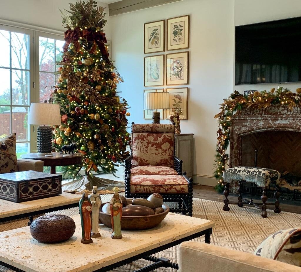
When it comes to ornaments, I recommend metallic colors, like the ones on the Christmas tree seen here. Some ornaments resemble fruit, adding a whimsical touch.

To start with, choose ornaments that complement the rest of the room's colors. Varying the ornaments in three basic sizes will also create interest. When mixed with matte finish ornaments, metallic ornaments scatter light and add a luxurious touch.

Garland creates a focal point across mantels, stairway banisters, and over doorways. Embellish your greenery with ribbons, flowers, faux berries, and hanging ornaments. When decorating your mantel, combine your all-season accessories (such as candles and porcelain) with seasonal accessories (like pinecones, vintage ornaments, tree toppers, and cedar greens) to fashion a holiday look that is all your own. Regardless of which accessories you choose, vary the height of the objects to create a sense of visual rhythm.

The mantel to the right of this picture is decorated with both a green and a gold garland, intertwined.

The mantel to the right of this picture is decorated with both a green and a gold garland, intertwined.

A welcoming wreath is a must for holiday decorating. Try mixing different kinds of greenery in the same wreath for a tone-on-tone look. Of course, no holiday home would be complete without a gorgeous table setting either. An elegantly-set table shows your guests that you appreciate them and want to celebrate with them in style. When choosing your table decorations, be careful not to pick tall accessories that could block conversation between guests. If your dining ware is colorful, you will want to make sure your centerpiece complements those colors.

Not all Christmas decorating needs to be red and green. Here at Chambers Interiors, we're big fans of decorating with jewel tones, metallics, and rich colors like deep purple and blue, too. While boxwood garlands, wooden candle holders, cedar branches and woodland creature figurines would give your home a cozy, rustic holiday feel, decorations in aqua, silver and white, mercury glass, and metallic reindeer figures lend a contemporary look instead.

The holidays are a special time to spend with loved ones, and our homes hold the magic of the holiday season. Consider hiring an interior designer to create your signature holiday look. Chambers Interiors & Associates will expertly style new and treasured holiday decor for a tasteful seasonal display that will impress your guests and give you more time to soak in the joy of the holidays. To schedule a free consultation with us, call us at 214.651.7665 or send an email to info@chambersinteriors.com.

Although aqua is not a traditional Christmas color, it pairs beautifully with the golds and greenery on the banister here. Our clients hung their family stockings on the staircase because there was more room there than on the fireplace mantel.

Although aqua is not a traditional Christmas color, it pairs beautifully with the golds and greenery on the banister here. Our clients hung their family stockings on the staircase because there was more room there for their large family than on the fireplace mantel.

Bring Order to Your Rooms with the Right Focal Points by Margaret Chambers

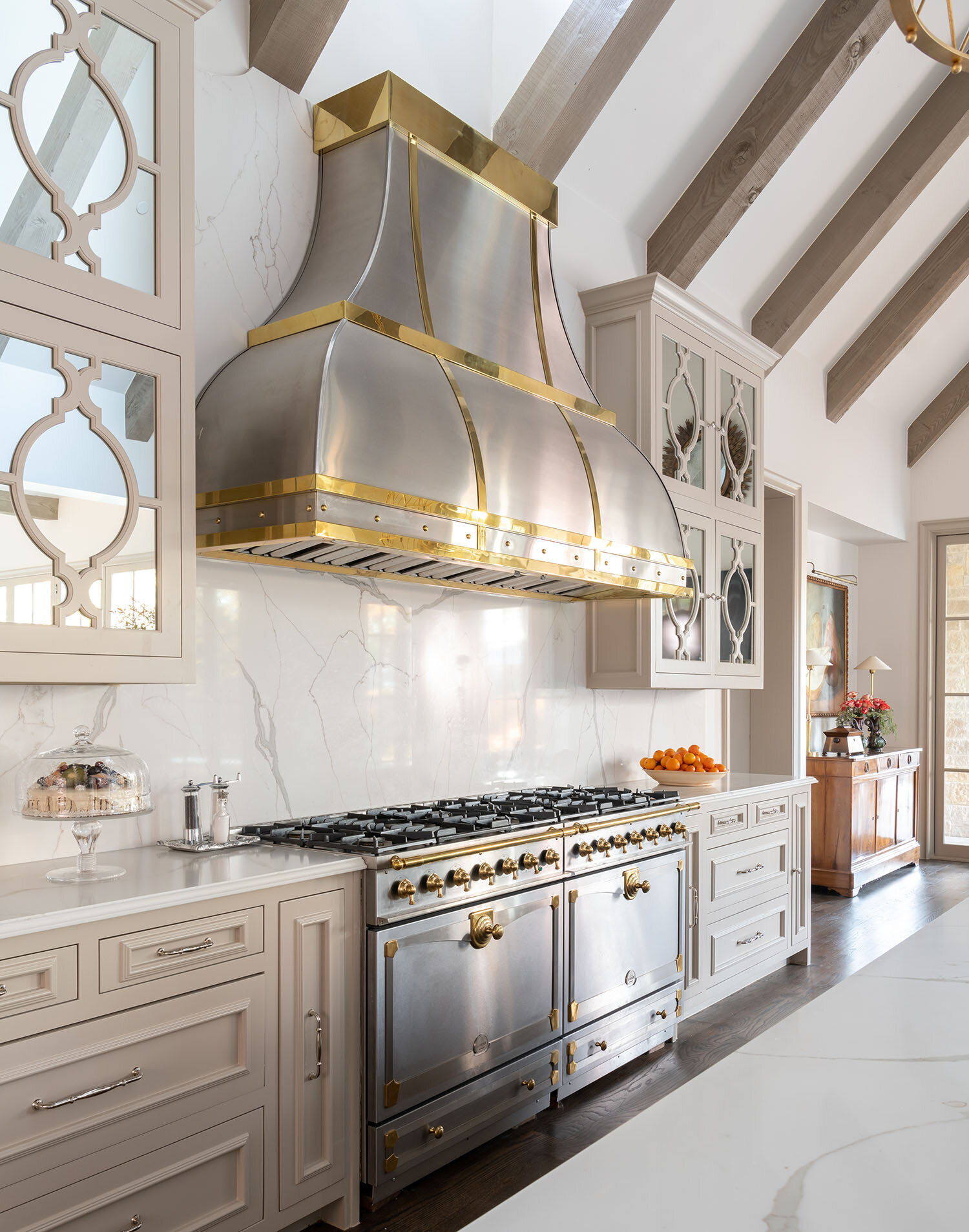
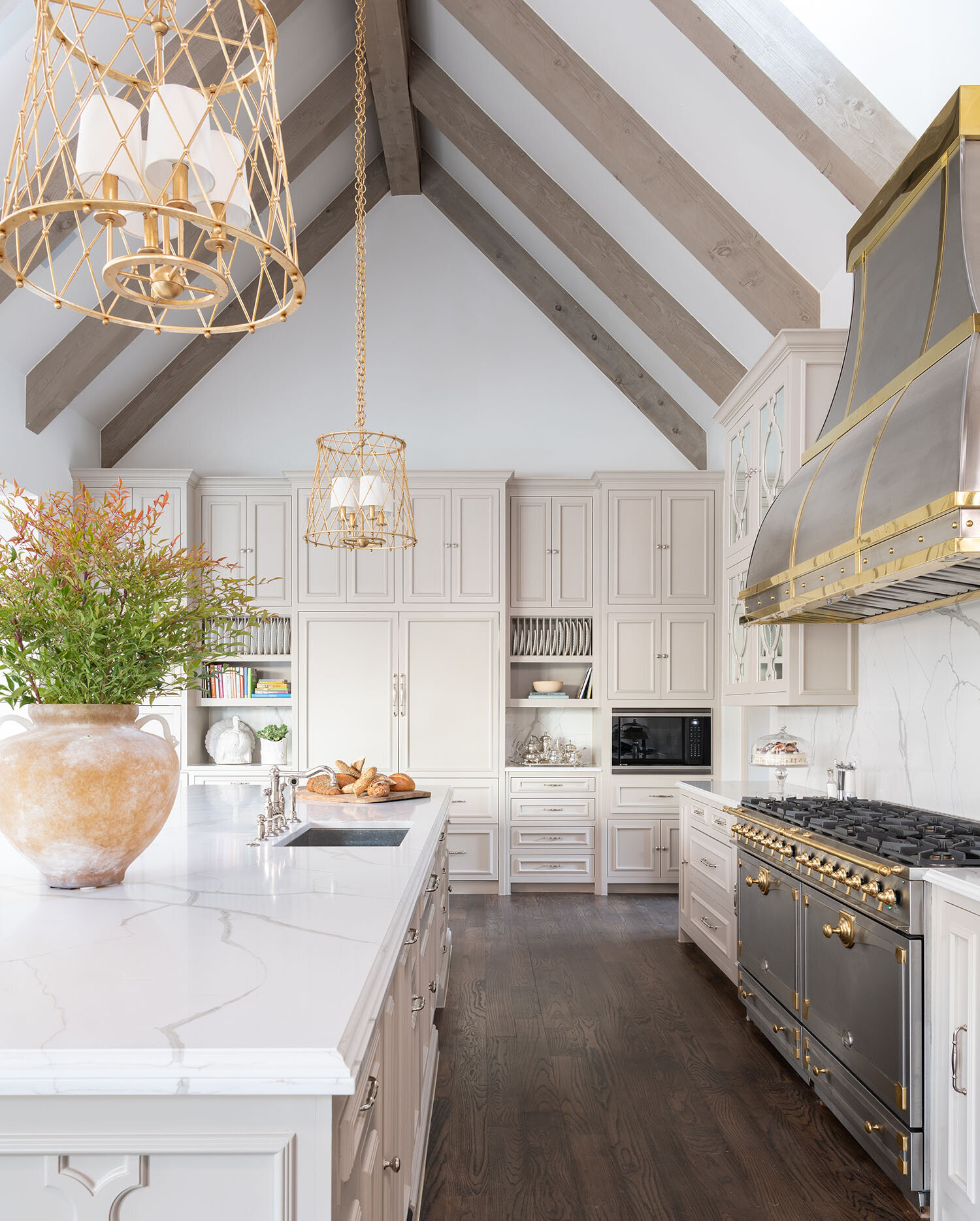
This double range and custom vent hood, both made out of steel and brass, form a focal point for the kitchen we designed in a Dallas home.

This double range and custom vent hood, both made out of steel and brass, form a focal point for the kitchen we designed in a Dallas home.

If you’re worried that one of your rooms has too much going on, it might be because you don’t have a focal point. The term ‘focal point’ will be familiar to our artistic readers: in a photograph, the focal point is the part of the picture where the lens is focused. In a painting, it’s the point where the viewer’s eye is drawn. Interior designers use the term focal point to indicate the place where your eyes first land when you enter a room. For those new to this concept, here is a set of guidelines for using the things you already own to create new focal points.

The beams of this vaulted ceiling act as one focal point while also leading the eye to another: the round wall art.

The beams of this vaulted ceiling act as one focal point while also leading the eye to another: the round wall art.

One way to start identifying potential focal points is to make note of any architectural features you have. Fireplaces, built-in bookcases, vaulted ceilings, mantles, free-standing bathtubs, oven hoods, and large windows will usually be the focal points for their respective rooms.

When you don’t have an architectural focal point in the room, you’ll need to create one with your decorating choices. Statement furniture, paintings, coffee tables, rugs, backsplashes, collections, or lighting fixtures can all be focal points. Whatever you choose, it needs to be in the line of sight for any visitor stepping into the room.

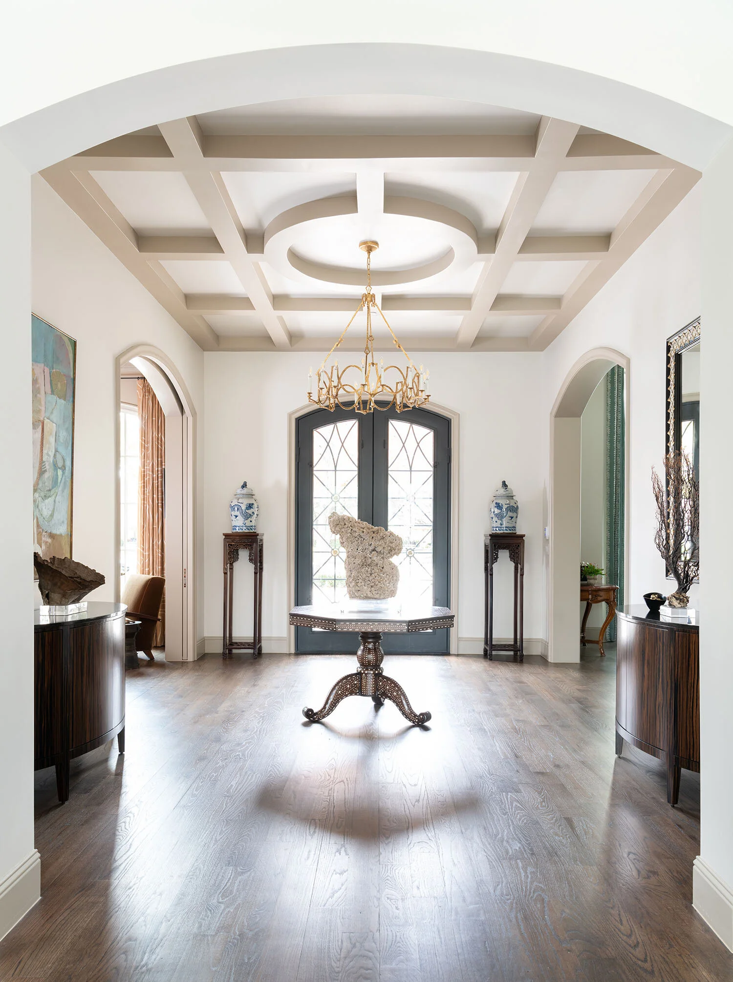
Coffered ceilings, such as this one, make an excellent focal point for entryways, dining rooms, or formal living rooms.

Coffered ceilings, such as this one, make an excellent focal point for entryways, dining rooms, or formal living rooms.

Ideally, a focal point should contrast with its surroundings and command attention, rather than blend in. Different focal points require different approaches:

  • If your windows are the focal point, don’t crowd them with heavy drapes. Another thing to consider is that unless you’re looking out at a brightly lit city skyline, your windows won’t be visually interesting after the sun goes down. If your room is large enough, add another focal point (such as a piece of art) to keep things interesting at all times of the day.

  • To ensure your mantle will be a strong focal point, decorate it with plenty of eye-catching accessories.

  • In an entryway, the door is typically the focal point. Paint it a contrasting color from the rest of the walls to emphasize it.

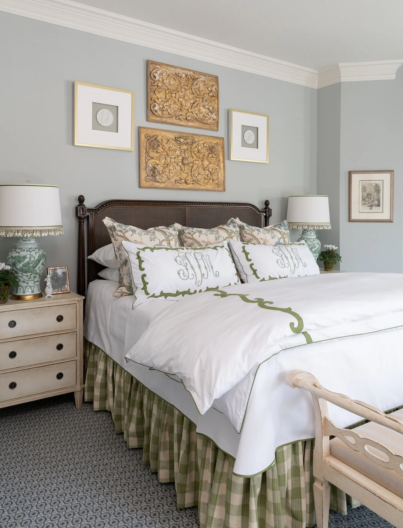
  • Possible focal points for the bedroom can be the bedding, the headboard, or the wall behind the bed.

  • In open-concept layouts, you can give each area its own focal point. You may want to add another focal point between the individual seating areas to bring everything together.

  • For dining rooms, a light fixture or a showy table setting can be focal points.

  • Draw attention to your ceiling with a paint or stain color that isn’t seen anywhere else in the room.

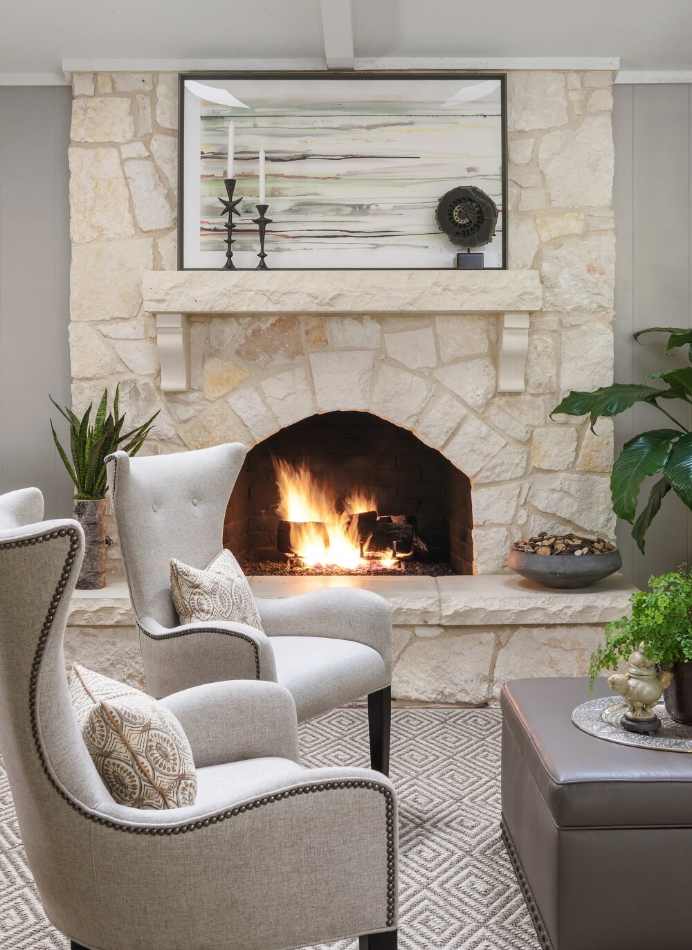
Adding accessories to the mantle of your fireplace will help to make sure that it becomes a focal point for your room.

Adding accessories to the mantle of your fireplace will help to make sure that it becomes a focal point for your room.

A large room can accommodate multiple focal points, but a small room should never have more than two. In a living area with a beautiful view, for example, both the fireplace and the windows can be focal points. To balance more than one focal point, establish seating areas or groups of accessories around each of them.

One of the focal points should always be more dominant than the others, so make sure you’re using paint or lighting to ensure that the viewer will look at it first. To make whitewashed furniture pop, put a dark wall color behind it; inversely, put your dark statement furniture in front of a white wall.

You can also try flanking your focal point with plants, lamps, or vases on either side to give that part of the room some “weight.” Height is another way to help your focal point assert itself. If your focal point is an armoire or desk, and there’s open wall space above, hang a tall mirror over it. Patterns often have visual movement, so a patterned rug can actually help “lead” to a focal point when the lines of the pattern are going in the same direction.

If you have a side table that you'd like to use as a focal point for your room, try hanging a tall mirror over it.

If you have a side table that you'd like to use as a focal point for your room, try hanging a tall mirror over it.

Even if a room is filled with the most beautiful objects, without a clear focal point, it won’t feel cohesive. Creating focal points is a skill any interior designer needs to know to do well in their profession. With some of these designer tips in mind, you’re well on your way to giving your rooms a professional touch.

Because this farmhouse kitchen is mostly white, a black fireplace screen with animal figures was used as a backsplash to command attention.

Because this farmhouse kitchen is mostly white, a black fireplace screen with animal figures was used as a backsplash to command attention.

If you have some ideas on how you want to redesign your rooms but could still use some help, feel free to get in touch with us. The best ways to reach us are by calling our Dallas office at 214-651-7665 or sending an email to info@chambersinteriors.com.

RELATED ARTICLES:

4 Things to Know Before You Update Your Bathroom or Powder Room by Margaret Chambers

A few accessories, like a soap dish or some fresh flowers, are all that's needed to complete a bathroom counter.

A few accessories, like a soap dish or some fresh flowers, are all that's needed to complete a bathroom counter.

Bathrooms and powder rooms are woefully overlooked areas in home design. Many people consider designing them an afterthought, or aren’t sure how to work with a small space. But no matter how small your powder rooms are, you deserve to have ones that are thoughtfully planned and tastefully designed. If you’re thinking about giving the bathrooms in your Dallas home a quick update—or an extensive remodel—you’ll surely find these tips useful.

Brunschwig & Fil’s iconic “Les Touches” wallpaper adds a playful touch to this bathroom we designed for a Dallas home.

Brunschwig & Fil’s iconic “Les Touches” wallpaper adds a playful touch to this bathroom we designed for a Dallas home.

2021 Bathroom Trends:

Although grey was a popular wall color for bathrooms the last few years, in 2021 it’s starting to go out of style. Instead, warmth is being brought into bathrooms through the use of gold or brass fixtures and wood accents. Wallpaper has also come back into style. If you do want to put up wallpaper, shop for the vinyl kind that is moisture-resistant.

While you’re updating, take a look into some of the latest developments in bathroom technology. These include smart showers that can be remotely set to start running, voice-activated lighting and temperature controls, and Bluetooth speakers for baths and showers. Heated floors have also been gaining popularity for some time now.

Layout Tips for Bathroom Remodels:

A common bathroom design mistake is to make your toilet the first thing a visitor sees when they enter the bathroom. Choose anything else as your focal point beside the toilet, such as your mirror, your bathtub, or your vanity. The toilet should be out-of-sight from the entrance whenever possible.

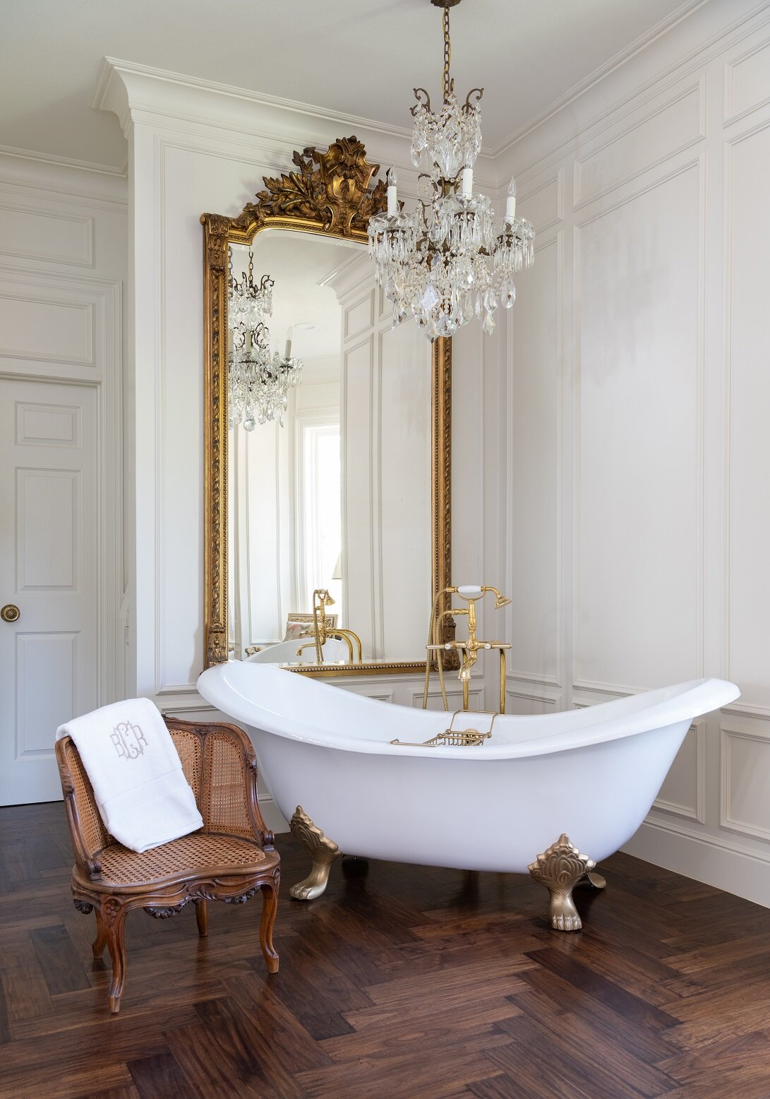
This area, with the freestanding tub and large antique mirror, serves as the focal point for this bathroom in Colleyville.

This area, with the freestanding tub and large antique mirror, serves as the focal point for this bathroom in Colleyville.

Bathrooms don’t have to be spacious to be appealing. To make a small powder room feel more luxurious, splurge on a few nice materials and finishes. If you prefer to take showers over baths, don’t take up too much floor space with a large tub.

When we remodeled this shower, we added glass doors, mosaic floor tiles, slabs of Carrera marble, and brass hardware.

When we remodeled this shower, we added glass doors, mosaic floor tiles, slabs of Carrera marble, and brass hardware.

You can maximize elbow room by installing a glass panel or shower curtains instead of a shower door. This way, you also won’t have to worry about your door swinging out and hitting the vanity.

Don’t forget to plan for storage space. Upper vanity cabinets along either side of the mirror are a smart solution for keeping toiletries out of sight. You can even build electrical outlets into the cabinets for plugging in your hairdryers and electric toothbrushes.

Choosing Flooring and Tiles:

There’s a reason why most bathrooms have tiled floors. Carpeting absorbs moisture and can develop mold, and if wood flooring becomes water damaged, it’s costly to replace. If you want the look of wood without the risk of water damage, I’d recommend porcelain tiles with a faux bois grain finish that emulate the look of real wood panels.

Improvements in manufacturing have paved the way for new and improved tile patterns, including chevron, diamond, hexagon, arabesque, and fish scales. I’m starting to see homeowners want to try new patterns instead of defaulting to subway tile.

The Best Lighting for Powder Rooms:

Lighting is always important for home design, and bathrooms are no exception. Older fluorescent light bulbs can cast an unflattering blue hue on skin, while dim lighting makes bathrooms feel small and closed-in. If the color tone of your bulbs is a cool white, update them with a warmer white.

The vertical cabinets in this vanity are great for storing toothbrushes, medications, etc. so they stay out of sight. The cabinets also contain electrical outlets, so everything can stay conveniently plugged in and ready to use.

The vertical cabinets in this vanity are great for storing toothbrushes, medications, etc. so they stay out of sight. The cabinets also contain electrical outlets, so everything can stay conveniently plugged in and ready to use.

As you update your lighting, make sure not to install the fixtures too far above your mirror, or else they’ll cast shadows on your face. Either bring the lights low enough so that they’re almost touching the mirror, or place sconces on either side of the mirror.

To make a bathroom feel light and airy, find a way to filter daylight in. A window to the outside or a skylight through the ceiling are both options. You can always put shutters over the window for more privacy.

We normally use tile in bathrooms, but the client wanted wood floors. To protect them, we added polyurethane coating.

We normally use tile in bathrooms, but the client wanted wood floors. To protect them, we added polyurethane coating.

For your finishing touches and decorations, keep things simple. Instead of cluttering counter space with lots of accessories, buy practical items—such as pretty soap dispensers—that are decorative and integrate into your overall design theme.

If your bathtub is next to a window, you can always add shades for privacy, like this motorized Roman shade we used.

If your bathtub is next to a window, you can always add shades for privacy, like this motorized Roman shade we used.

Many people in Dallas continue to work from home and are thinking about ways they can give their surroundings a facelift. Whether you’re planning a full bathroom remodel, or just want to make better use of the space and layout you already have, the designer tips above will come in handy.

For those of you who are looking to bring in a professional, you should know that Chambers Interiors has a lot of experience a bathroom remodels. To schedule a free consultation, email us at info@chambersinteriors.com or call our Dallas office at 214-651-7665.

RELATED ARTICLES:

Add Serious Style to Your Bookshelves With These Five Steps by Margaret Chambers

It’s important to leave some negative space on each shelf so that the items have “breathing room.”

It’s important to leave some negative space on each shelf so that the items have “breathing room.”

Although shelves are rarely the focal point in interior design, it can’t be denied that cluttered, carelessly decorated shelves will distract from an otherwise immaculate space. If you’re redecorating your Dallas home and could use some help making your shelves look both clean and stylish, try following these five steps.

1: Edit Your Collections

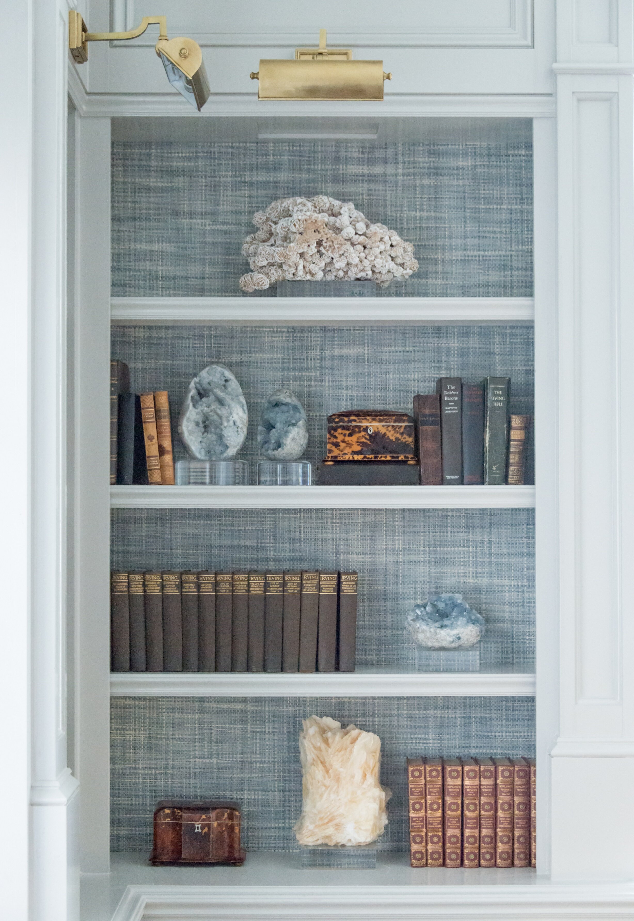
We used a grasscloth wallpaper in the back of this bookcase for added depth, texture, and color.

We used a grasscloth wallpaper in the back of this bookcase for added depth, texture, and color.

To start with, remove all of the items on your shelves and go through them. Edit out anything that you either don’t love anymore or that clashes with the rest of your decorating scheme. This is also a great time to look at your bare shelves and decide if those could use an update, too. I like to add fabric or wallpaper to the backs of bookshelves to give them more depth and flair.

For a professionally designed look, keep in mind that interior designers usually decorate shelves with fewer items than the average homeowner. Cutting down on clutter gives each object more impact.

If you’re starting with a clean slate and could use some shopping tips, look for trays, small bronzes, boxes, antique tea caddies, vases, picture frames, and small art prints in addition to your books. Leaning a framed art print or photo against the back draws the viewer’s eye deeper into the shelf.

Organic accessories, such as petrified wood, geodes, coral, shells, and rattan baskets help give your shelves a variety of textures. Small potted plants (whether faux or live) add some refreshing greenery to your shelves too.

2: Pick Your Main Colors

Bookshelves should have a unified color scheme whenever possible. I recommend picking two complementary colors, adding in one type of metal, and using any number of neutral colors in-between.

3: Place Your Largest Items First

After you’ve narrowed down your selections, place your largest items on the shelves first. These can include stacks of coffee table books, baskets, vases, sculptures and trays. Some of these pieces may be large enough that you can put them on a shelf standalone.

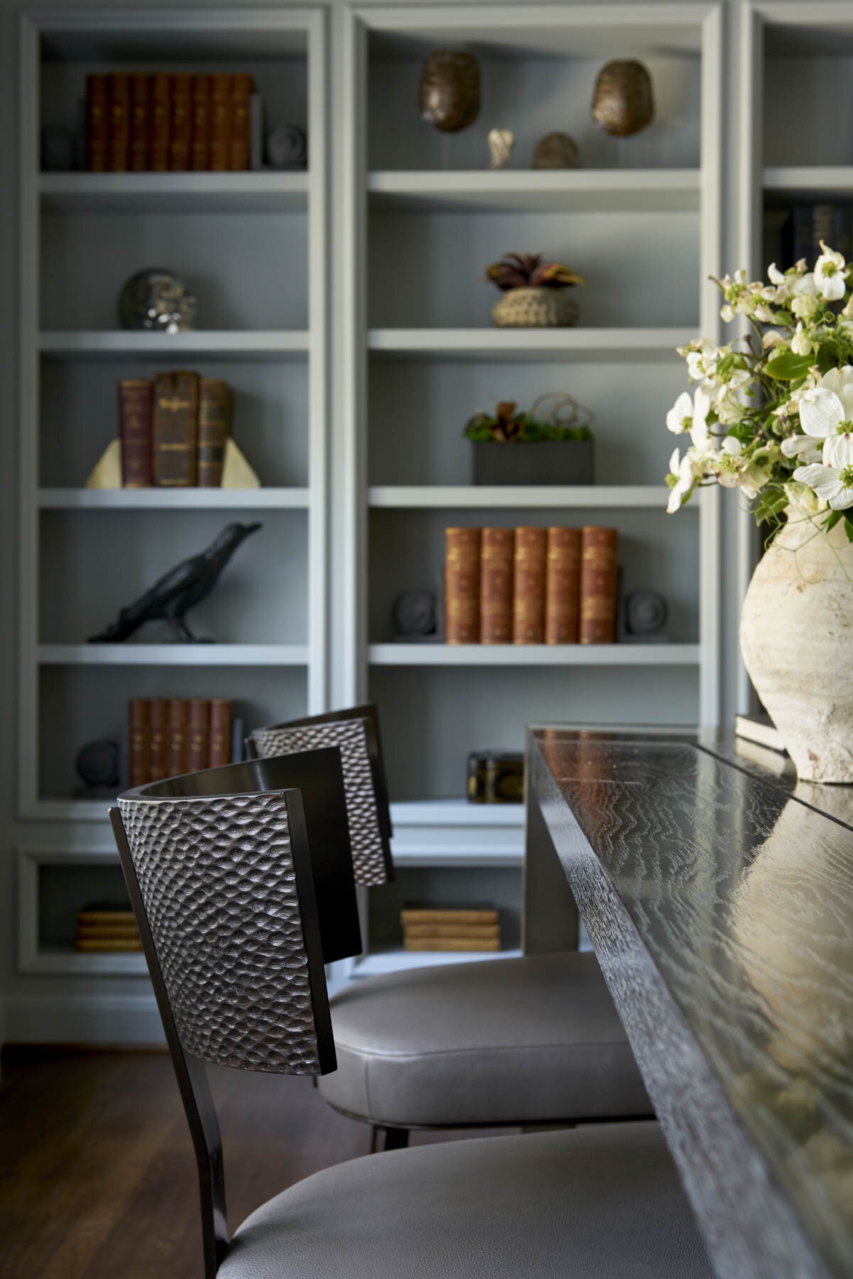
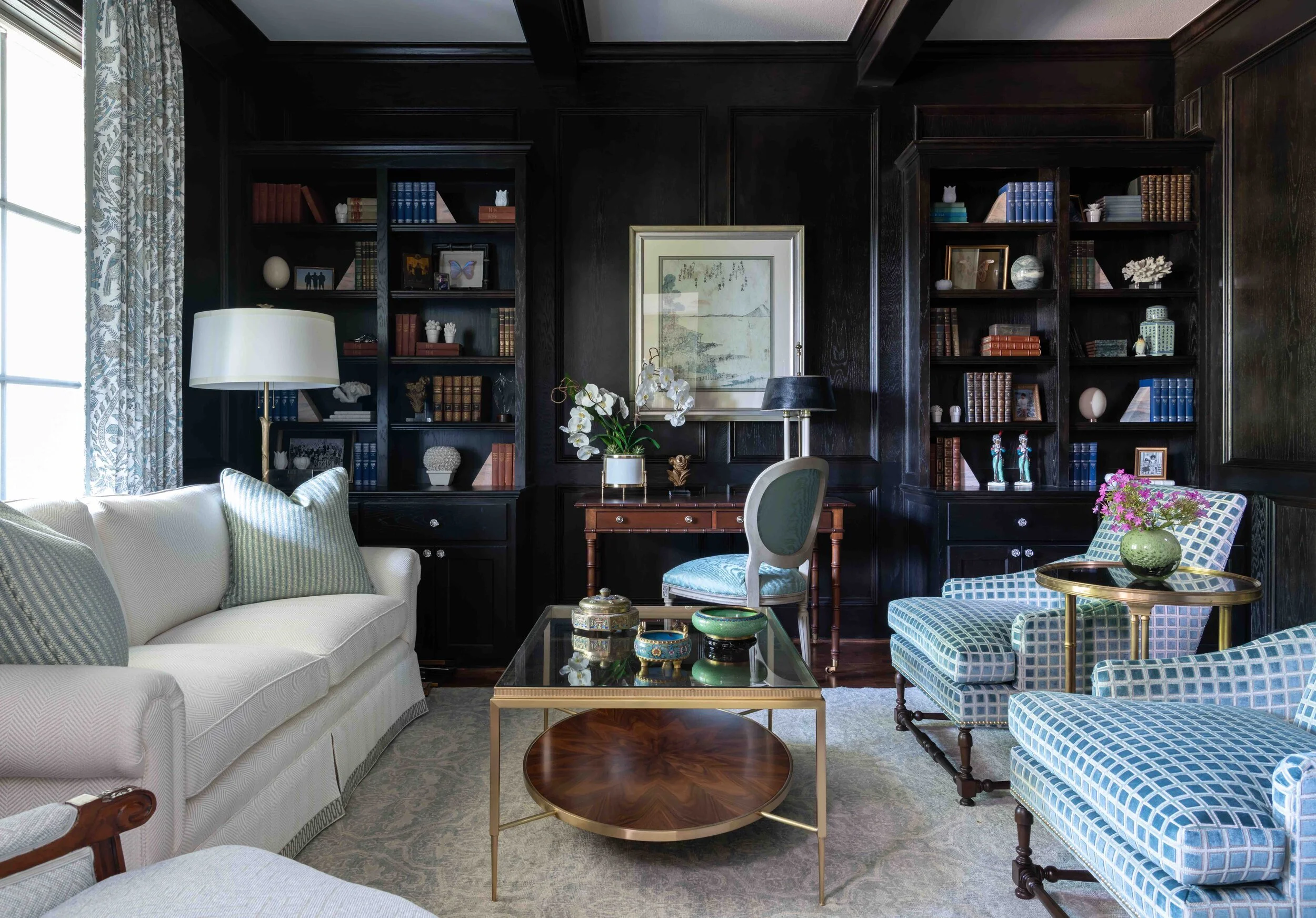
The shelves in this Preston Hollow library are stained black, creating a dramatic backdrop for the clients’ books and objet d’art.

The shelves in this Preston Hollow library are stained black, creating a dramatic backdrop for the clients’ books and objet d’art.

4: Organize Your Books

Next, gather together all the books you’re using. If you have lots of books, you can group them by color.

Experiment with arranging books vertically, leaning them, or stacking them horizontally. A horizontal stack should have at least three books. If any of your books have unattractive spines or do not match your color scheme, turn them around so that the pages are facing out instead.

The blue-and-white china and the books on these shelves are all color-coordinated with the rest of the room.

The blue-and-white china and the books on these shelves are all color-coordinated with the rest of the room.

Some formulas for combining books and accessories include:

·        Putting books, a bookend, and a decorative bowl or basket together on a shelf

·        Setting a ball-shaped accessory against leaning books and adding a vase

·        Holding a set of books upright with a horizontal book stack that has a decorative object on top

5: Add the Finishing Touches

Once you’ve found a place for your large and medium items, use your small items to fill in any awkward gaps. That said, don’t fill out every shelf completely. A little negative space helps give your collections some “breathing room.”

As you arrange your shelves, make sure to vary the heights, pairing tall and short items together. Don’t be afraid to show your personality: shelves are the perfect place for travel mementos, family photos, and collectibles.

Before you finish decorating, take a step back to see how all the shelves in a room work together. It’s important to have some repeating colors or objects evenly distributed throughout the shelves, but it can be tricky to achieve the right balance. For example, if you have two gold objects on two adjoining shelves, you may want to move one of them to a further away shelf to balance things out.

A mixture of potted plants, porcelain jars, books, and picture frames fill these shelves we designed for a Plano home.

A mixture of potted plants, porcelain jars, books, and picture frames fill these shelves we designed for a Plano home.

One way to balance a tall shelving unit is to fill the four corner shelves with similar objects. These corners create a visual “frame” that bring everything together in the center shelves. To style a long shelf, create distinct vignettes that gently touch each other around the edges.

None of these design rules are set in stone, so don’t be afraid to experiment until your shelves feel right to you. And most of all, don’t forget to have some fun too. Shelves are a great opportunity to express a story about yourself. The end result shouldn’t look too staged, but rather, tell the world about who you are.

Having trouble editing down your collections? Getting a professional second opinion from an interior designer is invaluable. To contact us, send an email to info@chambersinteriors.com or call our Dallas office at 214-651-7665.

RELATED ARTICLES:

No Bohemian Room is Complete Without These 6 Elements by Margaret Chambers

The antiqued gold pagoda mirror frame, patterned wallpaper, and warm colors all lend themselves to Bohemian style.

The antiqued gold pagoda mirror frame, patterned wallpaper, and warm colors all lend themselves to Bohemian style.

The French word bohémien originally referred to migrants from Bohemia, a region in the Czech Republic. Nowadays, we might call someone who is nonconformist, artistic, and well-traveled a bohemian. Bohemian interior design style is as free-spirited and unconventional as the people who inspired it.

Those who love Bohemian (“Boho” for short) style are drawn to it because it is colorful, approachable, carefree, and cozy. This is not a style for minimalists or people who don’t like color. If you’ve always wanted to try decorating your Dallas home in a Bohemian style, make sure to include the following elements.

1. Bold Patterns and Colors

When you study Bohemian rooms, you’ll notice that they often combine a neutral base color with jewel tones, earth tones, and metallic accents. The brightest colors can be anything from emerald green to mustard yellow and royal purple. Bright colors have been becoming more popular this year, making Bohemian a very current look too.

We filled this downtown Dallas high-rise with bold colors and multicultural art, especially African and Indian art.

We filled this downtown Dallas high-rise with bold colors and multicultural art, especially African and Indian art.

For a truly Bohemian look, you’ll want some patterns too, especially patterned rugs. Any patterns you choose should fit into your overall color scheme, but don’t worry about mixing different regional styles. This is your opportunity to combine ikats, suzanis, and shiboris with Moroccan, Mexican and Persian patterns. You can even try hanging a tapestry or rug on the wall instead of art.

2. Low-Seated, Comfortable Furniture

Low seating is ideal for Bohemian rooms because it promotes an air of relaxation. As you furniture shop, look for floor pillows, poufs, ottomans, low-backed sofas, and low coffee tables that invite visitors to settle down and unwind.

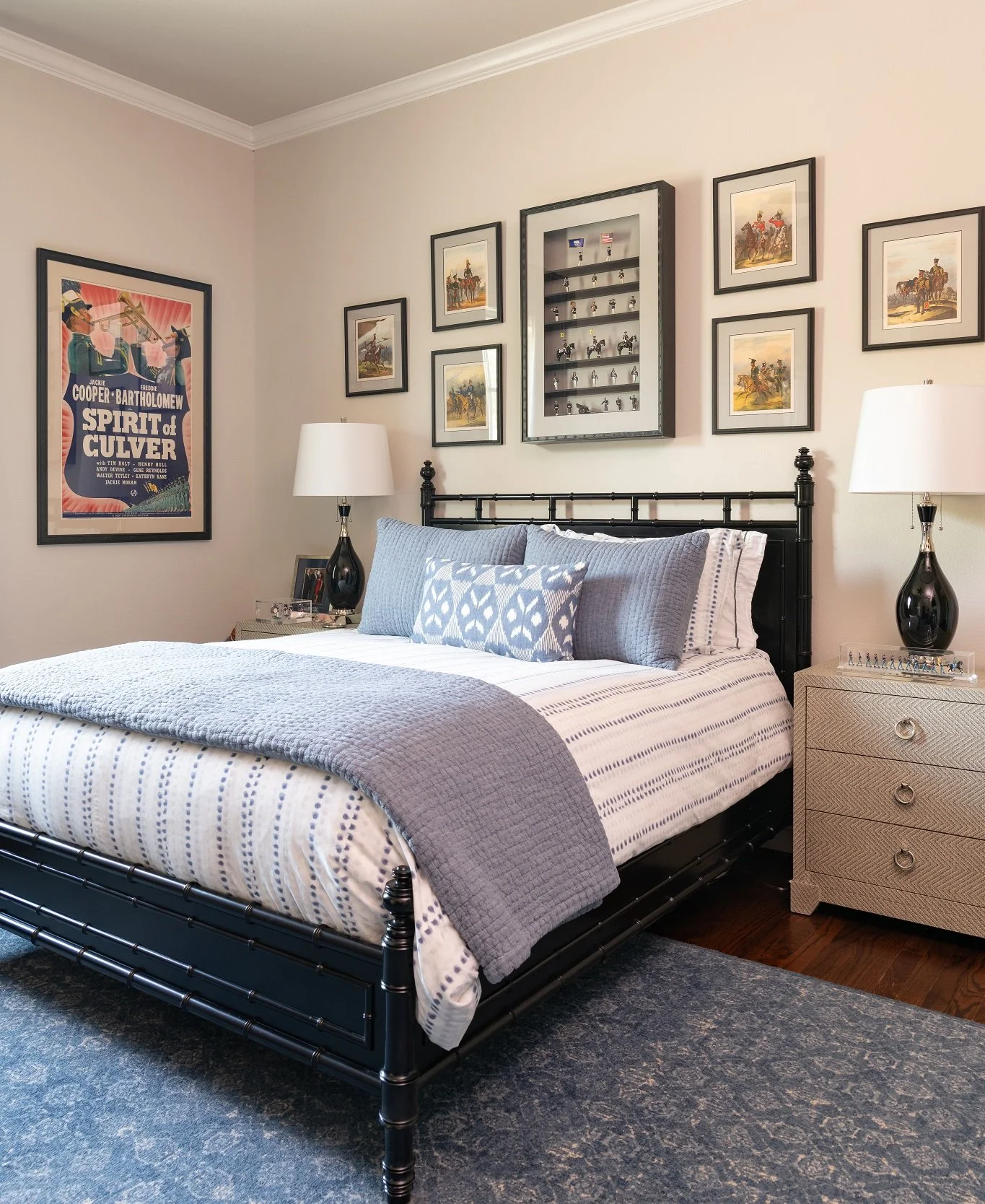
This north Dallas bedroom combines many different kinds of patterns in the same basic colors (blue and white).

This north Dallas bedroom combines many different kinds of patterns in the same basic colors (blue and white).

Bohemian style is all about mismatched items that tell a story. This is definitely not the place for all-matching sets of furniture straight from the showroom! Pieces that are distressed and have history to them are ideal.

Although this guest bedroom is not colorful, the patterns on the bedding and curtains help to give it a Boho feel.

Although this guest bedroom is not colorful, the patterns on the bedding and curtains help to give it a Boho feel.

3. Touchable Textures

There is no such thing as “too much texture” in a Boho room. Unsurprisingly, organic materials, like rattan, stone, leather, and wood are especially prevalent here. Try to balance soft fabrics (like velvet) with smooth metals and rough textures (like distressed wood furniture and unglazed pottery).

Of course, not everything in your room has to look worn and casual. A touch of glamor is not unwelcome in a Bohemian space, so look into adding an ornate sunburst mirror or a beautiful chandelier.

4. Plants

Plants are another key fixture of Boho style. They can be live or faux, tall or short. Cacti, monsteras, and tropical plants are always at home in this setting, but really, almost any green plant will add some color and life to the room.

5. Ambient Lighting

Since Bohemian is a “light and bright” style, your room should be well-lit at all hours of the day. Layer a mix of different light sources, such as pendant lights, floor lamps, lanterns, and candles to create an ambient glow that is not too harsh.

6. Multicultural Art and Accessories

Boho is an eclectic, well-traveled look where a variety of items create one storied space. Multicultural art is perhaps the most important feature of this style. Don’t travel often? Visit your local antique store to find interesting pieces from around the world. An interior designer can also be a great resource for helping you find the perfect antiques and art.

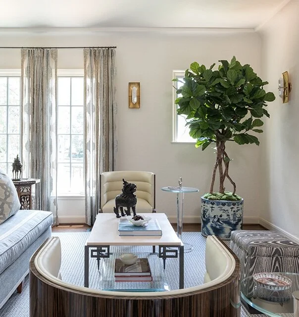
If you’re designing your living room in Bohemian style, putting a tall potted plant in the corner is a good idea.

If you’re designing your living room in Bohemian style, putting a tall potted plant in the corner is a good idea.

If you like Bohemian but want your own home to look more restrained, it is perfectly fine to just include a few artsy and colorful accents into an otherwise orderly space. Even if you’re going for a very exuberant Boho home, your bedroom should be more pared-down to create a sense of calm.

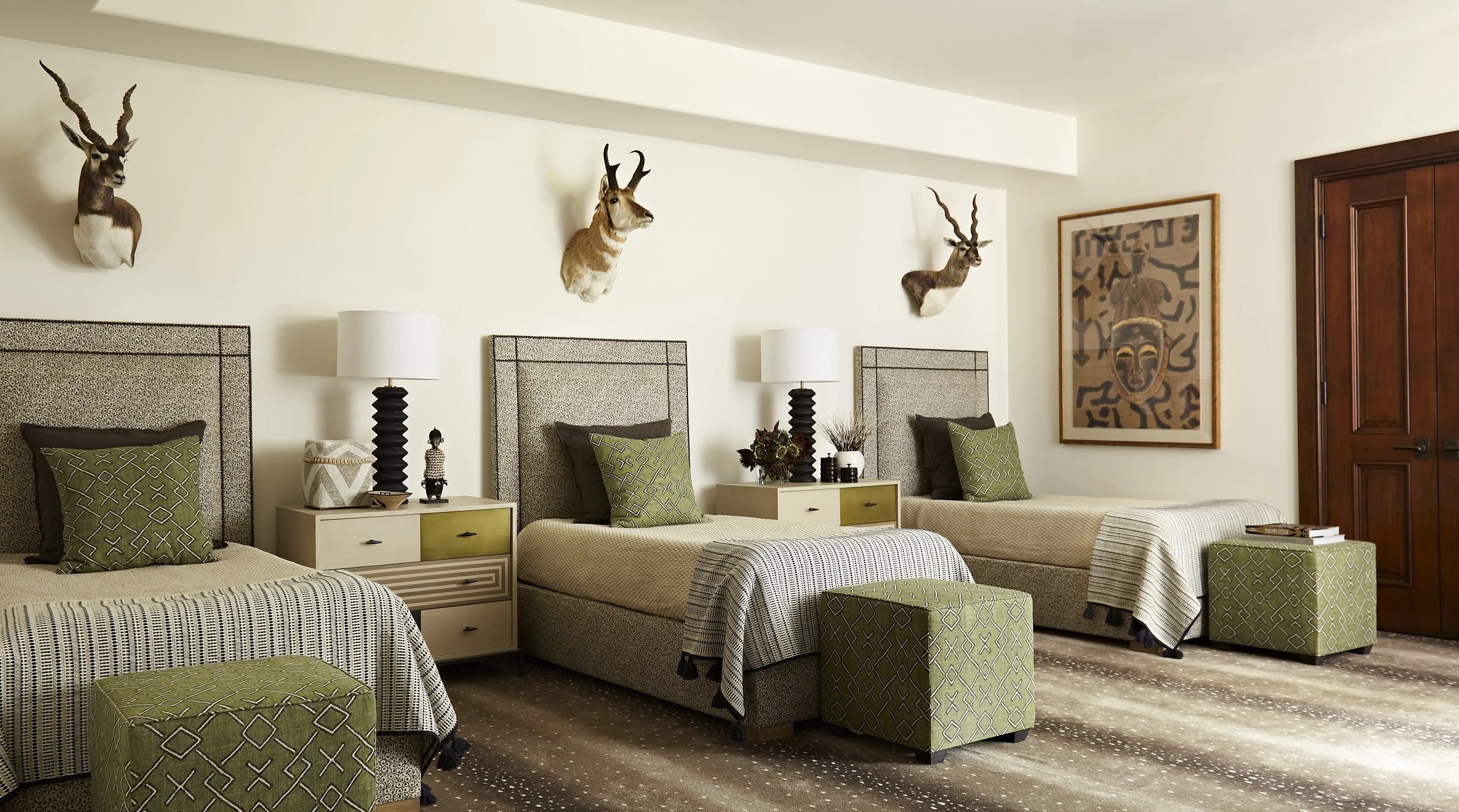
Here you can see a Bohemian guest bedroom from an Oak Cliff project that was decorated in a distinct African theme.

Here you can see a Bohemian guest bedroom from an Oak Cliff project that was decorated in a distinct African theme.

Although there are no hard and fast rules in Bohemian style, there are certain things that really capture its relaxed, free-spirited atmosphere. By breaking down Bohemian into its basic elements, I hope I’ve helped demystify this style so that you can design with a clear vision in mind.

And of course, if you could use some help sourcing antiques, art, and fabrics for your Bohemian space, working with an interior designer can save you a lot of time and trouble. To schedule a free consultation with us, call our Dallas office at 214-651-7665 or send an email to info@chambersinteriors.com.

RELATED ARTICLES:

The Best Questions to Ask When You Interview an Interior Designer by Margaret Chambers

On the left, you can see a painting that our client inherited, which gave us inspiration for the home’s color scheme.

On the left, you can see a painting that our client inherited, which gave us inspiration for the home’s color scheme.

While there are many talented interior designers in Dallas, not all of them will necessarily be the right fit for your project. That’s why asking the right questions when you interview them is important. Here are some questions I would personally ask if I were hiring a designer for my home.

1. What are their credentials?

This home recently won 1st Place for Best Entire Residence Over 5,000 Square Feet in the Dallas Design Ovation Awards.

This home recently won 1st Place for Best Entire Residence Over 5,000 Square Feet in the Dallas Design Ovation Awards.

I’d want to know that my interior designer had a degree from a reputable university, was a registered interior designer, a member of ASID, and had at least ten years of experience. It’s also helpful to see if they’ve been published in magazines and won interior design awards. When you talk to their references, ask: “Would you hire this interior designer again?”

2. Is this person a good fit for my project?

I would interview three to five designers to find the right fit. You can get a sense of the designer’s style and taste by asking them about their favorite colors, their favorite house they’ve designed, and their favorite places to travel. In most cases, you want a designer who can work with any style. However, if you’re passionate about a specific style, it’s not a bad idea to find a designer who specializes in it. During the interview, ask the designer if they’ve done projects similar to yours in the past. If they say yes, have them show you before and after photos.

Any good designer should ask questions to get to know you and how you live in your home when you meet them. It’s also a good idea to find out if the designer is willing to work with your favorite pieces.

We hung the client’s chandelier and antique mirror over this tub. The mirror helps to reflect light into the space.

We hung the client’s chandelier and antique mirror over this tub. The mirror helps to reflect light into the space.

It’s going to be important that you like your interior designer; you’ll be spending a lot of time with them. That said, I would not work with a friend or family member. It’s better to keep this as a business relationship (although you may very well become friends with your designer afterwards).

3. How do they charge?

No two designers will charge in the exact same way. Some of the different payment methods you see in the interior design industry include: charging by the hour, charging a mark-up on products, charging a flat flee, charging a percentage of the total project cost, or a combination of any of these. Designers who offer a flat-rate option usually have stipulations, such as a limit to the number of adjustments you request.

My love for European antiques can be seen in several of our projects, such as this French Chateau in University Park.

My love for European antiques can be seen in several of our projects, such as this French Chateau in University Park.

Another thing to consider is that not all interior designers offer the same services. Some designers focus specifically on design consultation for existing homes. My firm is a full-service design firm, which means that my team and I have the experience to manage an entire home project, from planning and construction to design and installation. Full-service design firms can also do remodeling jobs.

4. What is the designer’s process like?

Ask them: how will you present your selections to me? If I were hiring a designer, I’d like for them to give me two color scheme options for each room.

Another good interview question is to ask the designer about a mistake they made in the past. How did they resolve it? Did they learn from the experience? This gives you important insight into how the designer will handle bumps in the road. To prevent potential problems, my firm double-checks items before we order to make sure everything will fit. You can’t be too detailed in this business: it’s important to document everything you do and require signatures for all deliveries.

You also want to find out who else works with the designer. Do their assistant designers have degrees as well? Who will be your primary point of contact? Personally, I wouldn’t work with a designer “so big” they’re farming out the design work to junior designers.

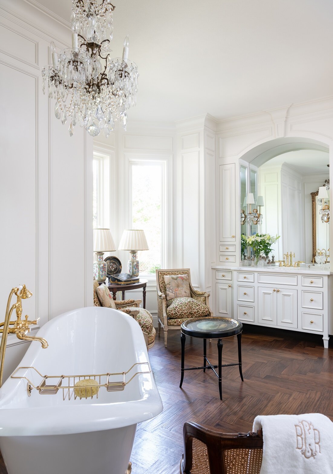
My design firm has experience with both newly built homes and remodels, like this award-winning bathroom remodel.

My design firm has experience with both newly built homes and remodels, like this award-winning bathroom remodel.

Don’t be afraid to ask lots of questions at your interview. Your goal is to find a designer you enjoy working with and who is invested in helping you discover your own personal style, rather than just recreating their own style in your home! If you ask several of the questions discussed here at each of your interviews, you’ll find the perfect match for your project in no time.

At my design firm, we offer a free consultation to get to know you and your project before we start working together. We have a lot of experience working with a variety of styles, from traditional to transitional and contemporary. If you’re currently looking for a Dallas-based interior design firm, give us a call at 214-651-7665. You can also reach us by email at info@chambersinteriors.com.

RELATED ARTICLES:

Decorating With Bold Colors: Tips for the Color-Shy by Margaret Chambers

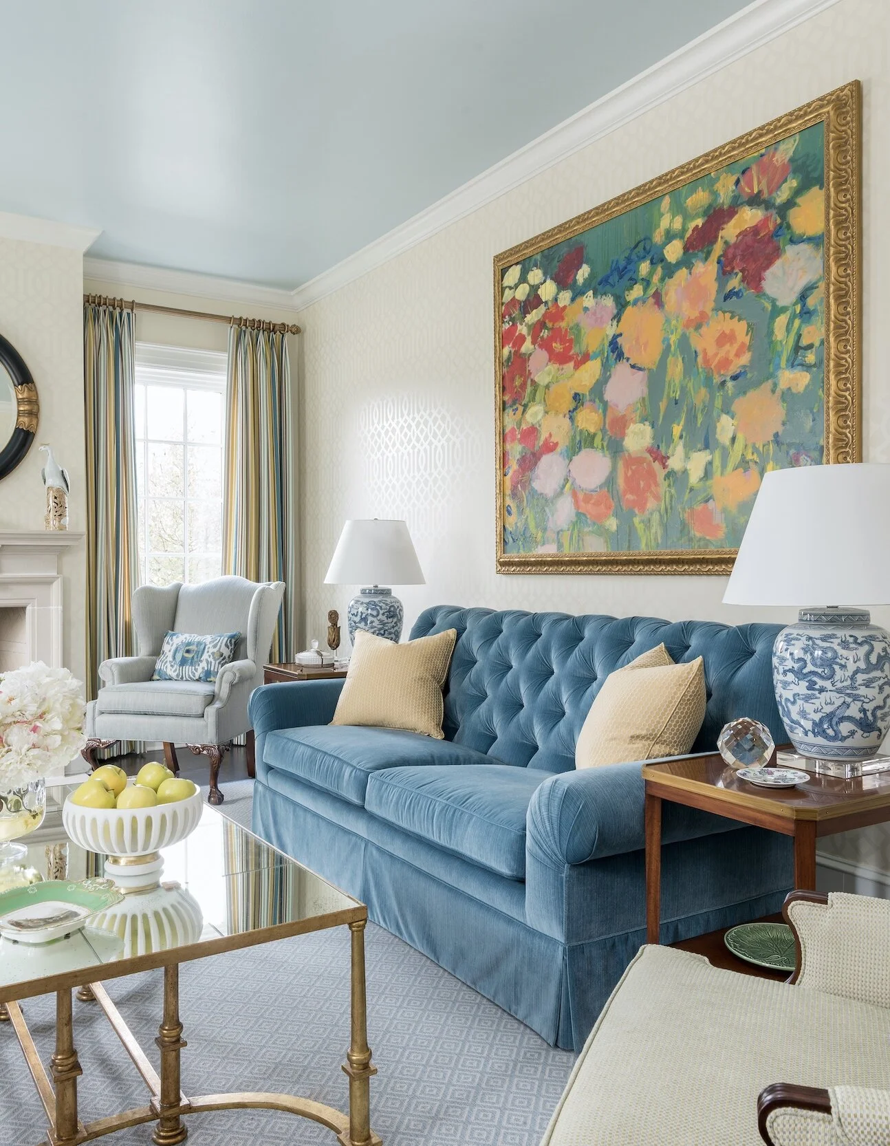
Artwork, like this floral painting over the sofa in SMU’s new Kappa Alpha Theta house in Dallas, is a great opportunity to add a burst of color to your room.

Artwork, like this floral painting over the sofa in SMU’s new Kappa Alpha Theta house in Dallas, is a great opportunity to add a burst of color to your room.

Although bold colors have been trending the last few years, many homeowners wonder, ‘how much is too much?’ In my own design work in Dallas, I’ve been including more color in projects lately. I thought that readers would appreciate some tips on how to work with bold colors in a balanced way.

Starting Small

If you’re new to using bold paint or wallpaper colors, try them in a smaller space like a powder room first. For powder rooms, however, I suggest staying away from bright green. Green casts an unflattering hue on you or your guest in the mirror.

We used a metallic butterfly wallpaper to give this powder room a “jewel box” feel.

We used a metallic butterfly wallpaper to give this powder room a “jewel box” feel.

Brightly colored accessories such as throw pillows, stools, artwork, ottomans, and blankets can be easily swapped out if you get tired of them. If you’d like to add some boldly colored furniture, consider having the furniture you own repainted rather than buying new furniture. Other easy ways to introduce color into the room include buying fresh flowers, getting new lampshades, or putting books with colorful covers on your shelf.

Picking the Dominant Color

The size of your room determines how much color you can comfortably accommodate. In a large room, it would be overwhelming to use a bold paint color on all four walls. In small and medium rooms, however, you can get away with a bold base color.

Some colors can function as neutrals even if they aren’t traditionally thought of as such. For example, navy blue and moss green are soothing to the eye and often used as base colors. The location and architecture of your home can also affect what colors look best in it. Rust red and navy typically look best in traditional homes. Blue-and-white rooms are often associated with coastal style (although you don’t necessarily have to live on the coast to use these colors).

This bedroom is an example of how you can use different shades of the same bold color—like light blue, cobalt, and navy—to create a balanced color scheme.

This bedroom is an example of how you can use different shades of the same bold color—like light blue, cobalt, and navy—to create a balanced color scheme.

Picking Your Secondary Colors

Before you commit to a bold color, pick out your secondary colors to go with it. One good formula is to have sixty percent of your room be in a neutral color, thirty percent in a stronger color, and save the last ten percent for your boldest colored accessories.

Usually the brighter a bold color is, the more challenging it is to work with. Bold colors that are toned down just a notch are a safer bet. For example, consider using burnt orange instead of pumpkin orange, soft yellow instead of highlighter yellow, and brick red instead of fire engine red.

The shades of orange we used in this north Dallas guest bedroom are just bright enough to give the room personality without making it too energizing.

The shades of orange we used in this north Dallas guest bedroom are just bright enough to give the room personality without making it too energizing.

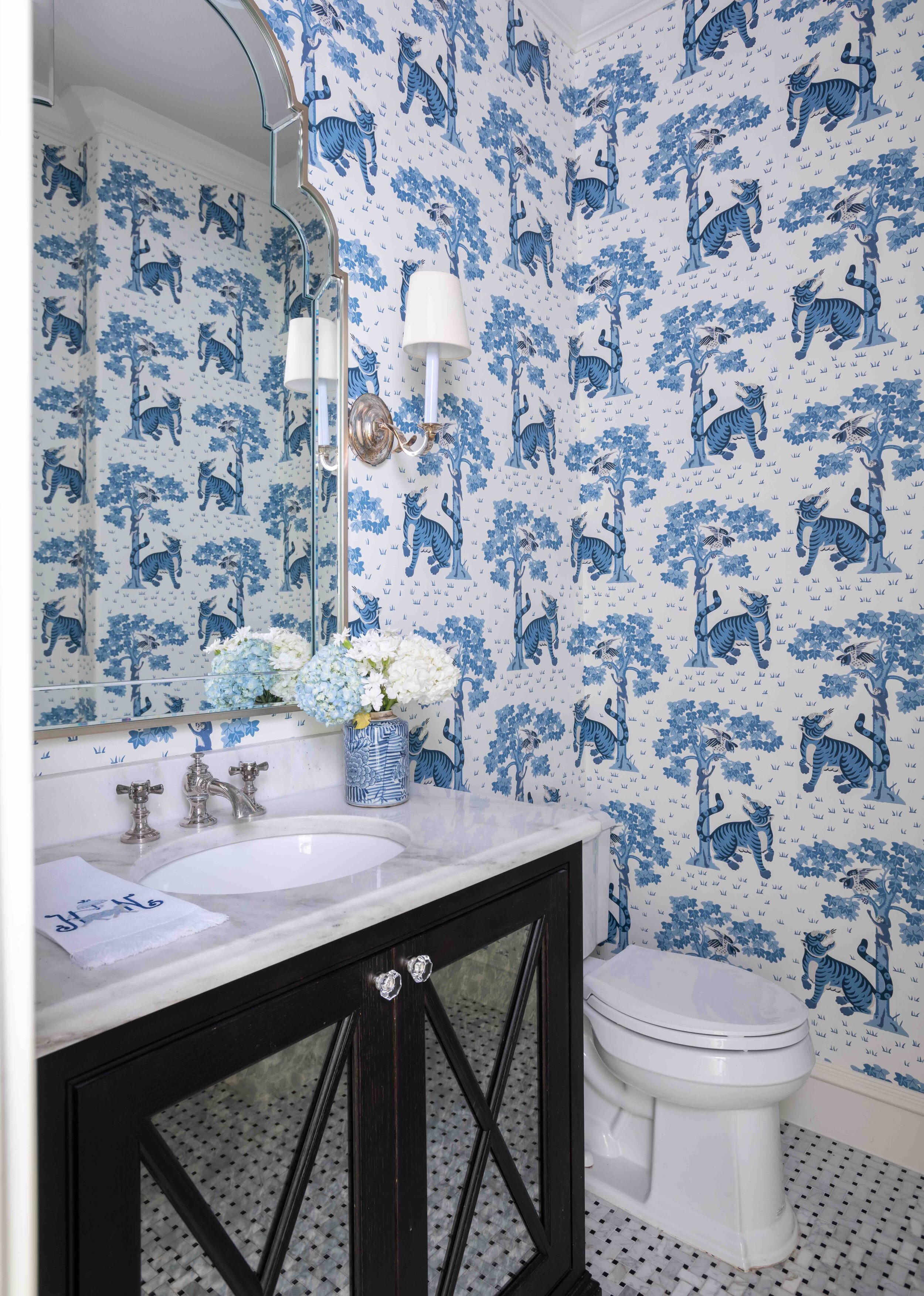
The blue and white tiger wallpaper in this Preston Hollow powder room shows how bright colors can give small rooms more impact.

The blue and white tiger wallpaper in this Preston Hollow powder room shows how bright colors can give small rooms more impact.

Blue-and-white is a classic color combination that never goes out of style. You can get away with very vibrant shades of blue by pairing them with white. After all, it’s a color combination that our eyes are used to seeing—think of white clouds in a blue sky. If you want your room to be really energizing, decorating with one bold color and lots of black and white will give you the high contrast look you need. Placing bright artwork and accessories against a mostly white backdrop is another appealing combination.

For balance and depth, use different, less-intense tones of your boldest color throughout the room. When it comes to patterns, choose either a bold color in a subtle pattern or a busy pattern in a muted color. Chaotic patterns in bright colors are the most difficult to work with.

Coordinate the Rest of Your Home

While not every room in your home needs to have the same color scheme, it’s important that the colors flow naturally. So, if you have one room with a bright pink and teal color scheme, don’t decorate the next one with navy and red. One way to ensure the colors in your rooms flow together is to invert your color combination for adjoining rooms. For example, if your sitting room has green walls and white accents, the next room over could be mostly white with bright green accents.

Vivid colors can be beautiful in both contemporary and classical homes. We decorated this traditional cottage in University Park with bright pink colors.

Vivid colors can be beautiful in both contemporary and classical homes. We decorated this traditional cottage in University Park with bright pink colors.

Although every year sees new colors come into fashion, try not to focus exclusively on what’s trending. A room with a well-balanced, aesthetically pleasing color scheme will always look great no matter the year.

By following some of the tips outlined above, you’ll hopefully have the knowledge you need to start incorporating bold colors in your home. However, if you’re still not confident that you can integrate your favorite eye-popping fabrics, wallpapers, and paint colors, consider giving us a call. As you can see from the photos of recent projects featured here, we have a lot of experience working with color. Call our Dallas office at 214-232-9501 or send an email to info@chambersinteriors.com to schedule a free consultation.

RELATED ARTICLES:

Design a Balcony, Patio, or Porch that You’ll Love to Use by Margaret Chambers

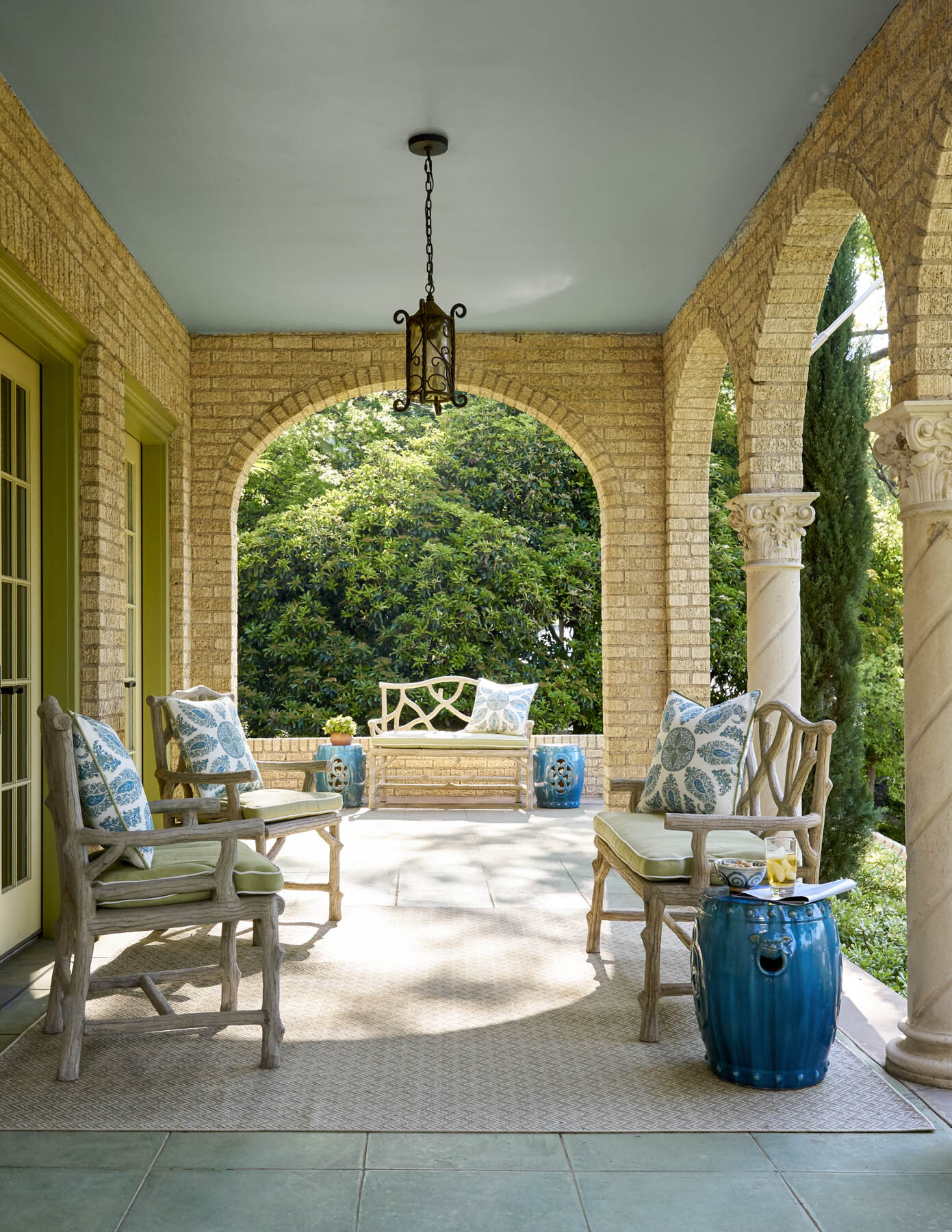
We decorated this front porch on a Dallas home with faux bois benches by Currey & Company.

We decorated this front porch on a Dallas home with faux bois benches by Currey & Company.

Balconies, porches, and patios are enviable design features for a home. But designing an outdoor space comes with its own challenges. You'll need to ask yourself: do you want to design around a view? Create privacy? How will you provide shelter from the elements?

Balconies, especially, are often small. Some people just put out lawn chairs and aren’t sure what else to include. If your Dallas home has an outdoor space that’s a little underutilized, here are some ideas on how to get the most out of it.

General Outdoor Space Guidelines:

A good first step to designing an outdoor space is to research outdoor-friendly furniture materials. Wrought iron, teak, and resin wicker are all common in outdoor decorating. You should also look for cushions that dry quickly and can stand up to the sun's rays.

A lantern chandelier helps to illuminate this outdoor area we designed for a University Park chateau.

A lantern chandelier helps to illuminate this outdoor area we designed for a University Park chateau.

Lighting is very important for these spaces, especially if you like to enjoy your balcony, patio or porch as the sun is setting or in the evenings. Look into pendants, sconces, string lights, or lanterns, and remember that bulbs with a warm color are preferable here to bright white.

An easy way to add color to outdoor spaces is to decorate with vases, potted plants, and pillows. Don’t forget to dress up the floor too. A patterned area rug adds comfort underfoot, but graphic floor tiles can introduce a lot of flair too. If privacy is a concern, you may need to add a screen lattice with climbing plants, a tall potted plant, or a shrub.

Tips for Balconies:

Space is premium on balconies, so think about how you’ll be using yours and plan accordingly. If you like to eat dinner out on the balcony, then obviously you’ll need a table; if you’re only going to be reading or enjoying an occasional cocktail, you can get away with just a comfortable chair and a small ottoman or drink table.

Take the opportunity to install built-in seating if your balcony is still under construction. This way, you won’t have to worry about furniture being knocked over by the wind.

Tips for Porches and Patios:

The brown-and-white-striped cushions seen here complement the earth tones in the stone exterior of the house.

The brown-and-white-striped cushions seen here complement the earth tones in the stone exterior of the house.

As with balconies, consider how you’ve used your porch or patio so far. This is especially important for front porches. Is yours a living space? Or is it a transitional space into your foyer? Either way, it’s important that your outdoor furnishings blend with your interiors and also complement the paint colors on the outside of your home.

An outdoor area, such as this one we designed in Kessler Park, should have a variety of seating options that are all equally comfortable.

An outdoor area, such as this one we designed in Kessler Park, should have a variety of seating options that are all equally comfortable.

Most people who have porches feel like they don’t use them enough. Make sure to buy seating that is comfortable for you and your guests, or else you’ll rarely use it. Porch swings with cozy pillows, deep-seated Adirondack chairs, and rocking chairs give you a variety of options that are both relaxing and durable. Your largest piece of furniture should face outwards, while the rest of your seating in a conversation group should face towards it.

The red painted door brightens this shaded porch and makes it feel more inviting.

The red painted door brightens this shaded porch and makes it feel more inviting.

A small front porch is still an important opportunity to make a good first impression. If your porch is shadowy, brighten things up by painting the door a lighter color than the rest of the home, then add a new door-knocker. The door should ideally be the focal point of the porch or patio, so flank it with symmetrical plants or furniture on either side. If your door is on the right or left rather than in the center, lead a visitor’s eye to your door with a lineup of potted plants.

A ceiling fan will help the residents of this Dallas home enjoy their outdoor seating area even during hot summers.

A ceiling fan will help the residents of this Dallas home enjoy their outdoor seating area even during hot summers.

Swapping accessories out with the seasons adds a lot of charm to your porch or patio. Include throw blankets on the outdoor furniture so you can enjoy the cooler months outside, too. A ceiling fan is also a smart investment for making your porch comfortable in hot summers.

If you have trouble getting your outdoor space to harmonize with the rest of your home, consider hiring a designer. Despite being called ‘interior designers,’ many of us consult with our clients about their outdoor areas too. A professional will know the best way to take advantage of your space and create a porch, patio or balcony you'll enjoy in all seasons. You can reach out to us by calling our Dallas office at 214-232-9501 or sending an email to info@chambersinteriors.com.
RELATED ARTICLES:

8 Design Ideas for Rooms with High Ceilings by Margaret Chambers

Tall drapes with valances, a modern chandelier, and a painting all help to fill the space under this high ceiling.

Tall drapes with valances, a modern chandelier, and a painting all help to fill the space under this high ceiling.

Although high ceilings are a sought-after feature for most Dallas home buyers, they can also present some unique design challenges. People are often stumped trying to figure out what to do with all that extra wall space over door frames.

The key is to bring everything together by visually connecting your furniture, walls, and ceiling. Read on for eight design solutions that help make high-ceilinged rooms feel more inviting and intimate.

1. Find the Perfect Artwork:

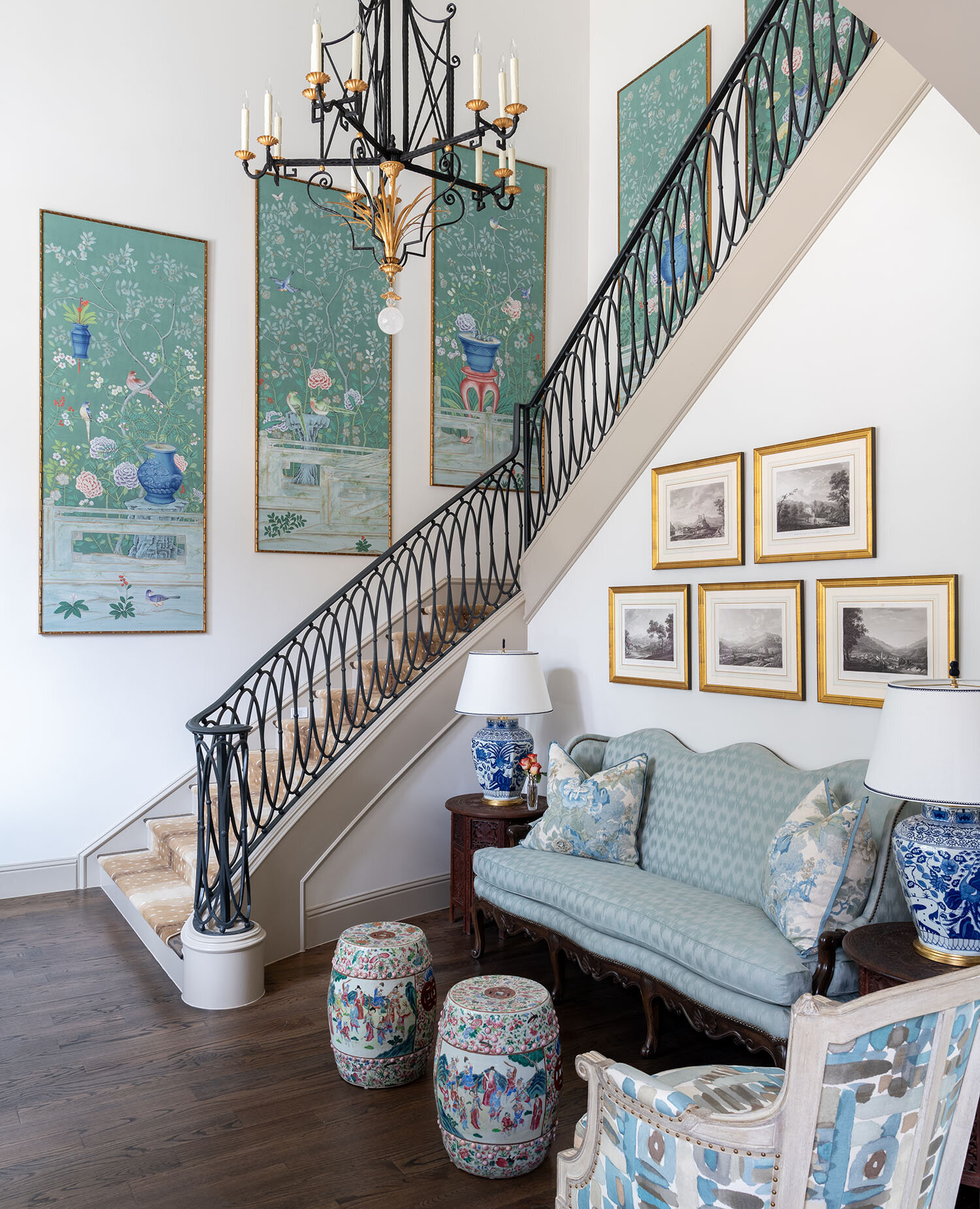
A series of framed de Gournay wallpaper panels add drama to this tall staircase in a Dallas home we designed.

A series of framed de Gournay wallpaper panels add drama to this tall staircase in a Dallas home we designed.

One way to fill your extra wall space is with artwork. One large statement piece, a gallery of smaller pieces, or a tapestry are all good options for high ceiling rooms.

Artwork should be hung at eye-level, unless you have a particularly tall and narrow piece. If you want to hang something above eye level, I recommend a wall clock.

2. Install Custom Drapes:

Very tall ceilings call for very tall window treatments, which usually have to be custom ordered through a designer.

Very tall ceilings call for very tall window treatments, which usually have to be custom ordered through a designer.

The rule of thumb for tall windows is to hang your draperies at ceiling height. On the other hand, if your windows don’t go all the way up to the ceiling, you may want to add valances to make them more proportional. Either way, the drapes should hang so that they almost touch the floor.

Depending on how high your ceilings are, you may need to order custom drapes. Although costly, this is an option worth considering. The softness of drapes helps to make a high ceiling room feel cozier. Don’t worry about the tall draperies being too much: as long as you choose a solid color fabric or a subtle pattern, the effect will be spectacular.

3. Add Architectural Details:

The wood ceiling beams in this kitchen complement the hardwood floors while also contrasting against the sleek metals.

The wood ceiling beams in this kitchen complement the hardwood floors while also contrasting against the sleek metals.

One way to create a sense of depth in a tall ceiling is to add exposed beams or large crown molding. Although beams are usually associated with rustic homes, they can fit into a contemporary style home as well.

4. Use Statement Lighting:

Hanging a statement lighting fixture, such as a chandelier, is a classic solution to drawing the eye towards a ceiling. Generally, chandeliers should be hung over the coffee table or dining table in the center of the room.

For this north Dallas project, we repurposed the dining room chandelier from our clients’ old home and hung it over a seating area in their new master bedroom.

For this north Dallas project, we repurposed the dining room chandelier from our clients’ old home and hung it over a seating area in their new master bedroom.

5. Create a Feature Wall:

Another way to visually connect the upper and lower levels of the room is to turn one wall into a feature wall. There are a few different ways to do this. Painting one wall in a solid, dramatic color from floor to ceiling; wallpapering a wall; or extending the brick or stonework around your fireplace upward are some ideas.

6. Break the Walls into Thirds:

An alternative to the floor-to-ceiling feature wall is to follow the rule of thirds and visually divide the walls into three sections. As an example, the lowest third of your wall could be paneled, the middle third could be for artwork, and the highest third could be left as-is.

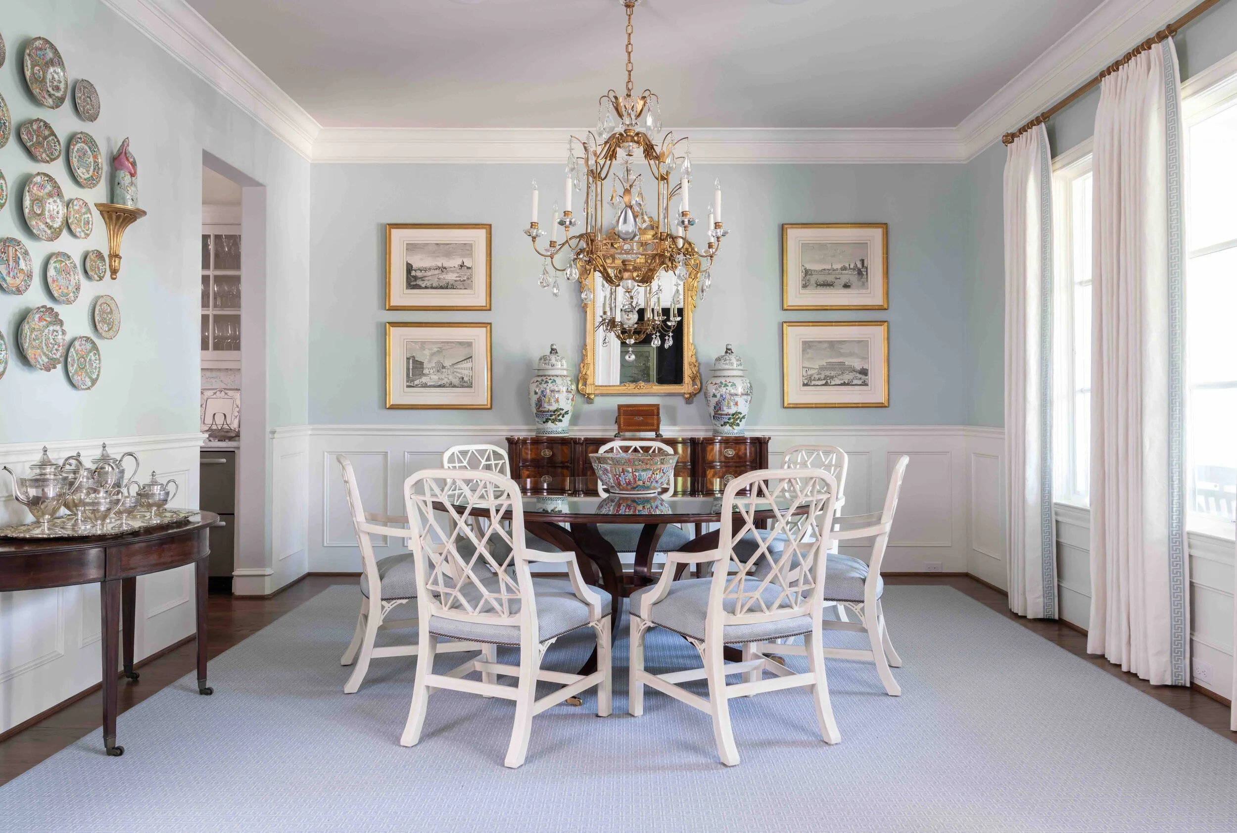
The wainscoting seen here, plus the two rows of framed prints above it, divide the wall into visual thirds.

The wainscoting seen here, plus the two rows of framed prints above it, divide the wall into visual thirds.

That said, not everything in your room needs to align with these three segments. Breaking up the visual “horizon” of the room (by including a few bookcases, for example) adds variety to the topography of the space.

If you want to make your walls feel shorter and the ceiling closer, paint your walls in two tones, one color on top of another.

7. Install Shelving:

Some homeowners make use of the extra wall height in their rooms by installing floating shelves or buying tall bookcases. If you like greenery, you can also add a tall potted plant in the corner of your room.

8. Use the Correct Scale Furniture:

A room with tall ceilings needs furnishings and accessories that fit comfortably into its scale. To that end, do not fill your room with collections of small objects or small-scale furniture.

A custom canopy bed and a large area rug are proportionally appropriate choices for this high-ceilinged bedroom we designed.

A custom canopy bed and a large area rug are proportionally appropriate choices for this high-ceilinged bedroom we designed.

Your furniture should be grouped together into multiple seating arrangements and anchored with an appropriately sized rug. Spacing the furniture far apart will make the room feel unbalanced and uncomfortably expansive.

Having high ceilings is an enviable problem many would love to have. That said, there’s no denying that taking advantage of the extra height can be tricky without a designer’s know-how.

By working with a professional interior designer, you can have access to their resources, which include custom window treatments, fine artwork, gorgeous chandeliers and other design elements that bring out the best in a high-ceilinged room. To schedule a free consultation with us, call our Dallas office at 214-232-9501 or email us at info@chambersinteriors.com.

RELATED ARTICLES:

Creating a Coastal Cool Style for Your Weekend Getaway by Margaret Chambers

Accessories made of rope, like this mirror frame in a Cape Cod style bathroom, are a great choice for coastal style.

Accessories made of rope, like this mirror frame in a Cape Cod style bathroom, are a great choice for coastal style.

Coastal interior design style has many admirers for a reason. It’s unfussy, relaxed and casually elegant all at once, and its combination of neutrals and cheerful colors appeals to a wide variety of tastes.

Not everyone who wants the look lives by the coast. Some people have fond memories of vacationing at the beach and want to bring that nostalgia into their current home. Coastal is also a popular theme for individual rooms, such as guest bedrooms, children’s rooms, and powder rooms. You may find the following design pointers useful if you’re designing a themed room, own a beach or lake house, or simply want to bring this carefree look into your Dallas home.

Feel free to mix different shades of blue in your coastal room. This room features navy, indigo and cobalt blue patterns.

Feel free to mix different shades of blue in your coastal room. This room features navy, indigo and cobalt blue patterns.

Narrowing Down the Coastal Look You Want

Before you start shopping, take a moment to decide on what kind of coastal interiors you want for yourself. Do you like lots of patinas and distressed finishes, or a sleeker contemporary look? You should also be aware that there are different regional styles to draw inspiration from. “California coastal” is more modern with understated colors and subtle tone-on-tone patterns. Floridian beach house style has brighter colors (such as turquoise) and more nautical accessories.

The Best Colors for Coastal Homes

The classic colors for coastal style are white, blue, and sea green. The blues can be in almost any shade, from robin’s egg blue, to turquoise and navy. Your neutral colors can be sandy beiges, creams, and storm grays. Although coastal style is almost always light and bright, navy would also be a perfectly appropriate choice for a moody accent wall.

This Cape Cod bedroom in a Dallas home we designed uses rough textures but soft bedding to keep things comfortable.

This Cape Cod bedroom in a Dallas home we designed uses rough textures but soft bedding to keep things comfortable.

That said, you are not strictly limited to blues and greens for color. Some warmer colors that can be incorporated into a beach home are muted oranges, bright reds, and terracotta, which brings the Mediterranean to mind.

Incorporating Natural Materials

The next step to designing a coastal home is choosing natural materials. You’re drawing inspiration from a natural environment—the beach—so your design won’t hit the mark unless you can bring nature into the indoors.

Rough textures are a must, and there are many easy ways to incorporate them. For furniture, go for painted finishes, wicker, or rattan; for rugs, choose sisal or jute; and then add woven baskets and linen bedding. Driftwood is currently very popular because it reinforces the nautical theme without being too cutesy. It can be used in many different ways: for example, as a base for a glass-topped coffee table or as bookshelves and organizational boxes.

To contrast the rougher textures of the wood, rope, or rattan you may be using, include smooth textures: metals, glass (especially sea glass), and ceramics. Gold hardware pairs nicely with white, blue, and gray, which are all great cabinetry colors in a coastal kitchen.

The hardwood floor and soothing neutrals in this dining room give it a coastal feel even without nautical accessories.

The hardwood floor and soothing neutrals in this dining room give it a coastal feel even without nautical accessories.

There is a reason you don’t see carpet in beach houses. Sand is hard to clean out of it, and carpet will also get musty in humid environments. For these reasons, hardwood or natural stone floors, with rugs to soften footfalls, is the preferred choice for flooring.

Adding a Touch of Nautical Whimsy

The most common pitfall with coastal design is overdoing the theme. In decades past, homeowners loved to go all-out with oars on the wall, sailboats, seashells, and crab print everywhere. This kind of look is now considered kitschy and dated.

Some of the nautical accents in this bedroom include the seashell on the bedside table and the coral drawer pulls.

Some of the nautical accents in this bedroom include the seashell on the bedside table and the coral drawer pulls.

A contemporary beach house should be subtle with the theme. A few nautical accents is more than enough. One way to make a room feel more nautical without being too overt is to add striped patterns. For your seating areas, mix and match decorative pillows with different patterns to create a relaxed and carefree look.

Anyone with a beach or lake house will want to see as much of the view as possible. Even if you’re not actually living on the water, treat the windows in your coastal style home the same way: by letting in lots of natural light. If you need blinds for privacy, go for wooden ones.

While there are a lot of things to consider when you’re aiming for a coastal look, getting them right is a worthwhile goal. A well-designed beach house can make you feel like you’re on vacation every day. And in today’s world, building your own personal oasis is more important than ever.

If you want to make sure your coastal room or residence is on-theme but still classically elegant, feel free to reach out to our design team. For more information, call our Dallas office at 214-232-9501 or email us at info@chambersinteriors.com


RELATED ARTICLES:

Essential Items for Designing the Perfect Foyer or Entryway by Margaret Chambers

Lots of natural light will help a foyer feel open and airy. This north Dallas project was recently published in Luxe.

Lots of natural light will help a foyer feel open and airy. This north Dallas project was recently published in Luxe.

Foyers and entryways are an important area of the home that sadly often goes overlooked. They’re not just the first impression a guest has of your home; they are also a landing strip where you transition from public to private life.

The following designer tips can be applied to entryways of all shapes and sizes, in all styles of home architecture. Before you begin, take a look at your available space and identify the main goals you want to achieve with your foyer. You might not have room to incorporate all of the suggestions below, so pick the items that make the most sense for you and your family.

Furniture

Putting a console table, bench, and decorative mirror together will form a classic entryway vignette.

Putting a console table, bench, and decorative mirror together will form a classic entryway vignette.

Most professionally-designed foyers will have at least one of the following: a console table, a chest, or a bench. Benches are helpful to have because they offer a place for people to put on or take off shoes.

Choosing a chest over a console table can be wise if you don’t have a lot of closet space and need extra storage for your seasonal clothes. To dress up the space, hang a statement mirror or painting over your table, chest, or bench.

Rugs

This Oak Cliff house we designed features both an entry staircase with a patterned runner and a bench for seating.

This Oak Cliff house we designed features both an entry staircase with a patterned runner and a bench for seating.

In some homes, the entryway is small and enclosed on most sides. In an open concept home, however, the space is less defined. Dallas homeowners with an open concept house should make sure to delineate where their foyer begins and ends using a rug as well as a few pieces of furniture, such as a bookcase, console table, or bench. You can also use a partition or decorative screen to visually divide the entryway from the rest of the first floor.

Since this is a high-traffic area, your entry rug should have good traction and be durable. Wool is easier to clean than other materials, making it a popular choice for entryways. Jute is another good option because it doesn’t show wear and tear as visibly as alternatives. Those of you with an entry staircase should also think about getting a beautiful runner to make it safer to walk on.

Storage

An antique tea caddy can be a charming addition to your console table. Click here to learn more about tea caddies.

An antique tea caddy can be a charming addition to your console table. Click here to learn more about tea caddies.

If you don’t have a separate mudroom, and your foyer tends to get cluttered, identify what kinds of clutter accumulate there. Do you have a shoes-off policy for your home? If so, store shoes in a chest or basket under the console. Do you drop off your mail, sunglasses, and keys as soon as you get home? Place a pretty decorative box on your console table to collect these loose items.

To keep umbrellas off the floor, I recommend finding an umbrella stand made of porcelain, brass, or Lucite. As an aside, all of your storage solutions should either complement the overall space or be in neutral colors so that they fade into the background.

This foyer has two decorative light sources: a star-shaped light fixture overhead and a lamp with a faux bois stand.

This foyer has two decorative light sources: a star-shaped light fixture overhead and a lamp with a faux bois stand.

Lighting

One common problem with entryways is that they can be narrow and poorly lit. You have a few options for making sure yours is bright and welcoming.

In a foyer with very little natural light, a statement chandelier is the obvious choice. A less obvious option you might not have considered would be to decorate your console table or chest with a lamp. To reflect the natural light coming in through your windows or door, include a wall mirror in your foyer. Another advantage to putting a mirror in your entryway is that you can do a hair check one last time as you head out the door.

Accents

Seen here is a coffee table from the foyer we designed in SMU’s new Kappa Alpha Theta sorority house.

Seen here is a coffee table from the foyer we designed in SMU’s new Kappa Alpha Theta sorority house.

Since your foyer is like a sneak peek of the rest of your home, don’t be afraid to show your personality. This area can be a great place for a few personal photos and mementos. For your table or chest, decorate it as you would a coffee table: fresh flowers, a bowl of seashells, antiques, candles, or books could help complete the look.

Designing a better foyer won’t just impress your guests. It’ll bring you cheer when you come home after a long day to find a beautiful and well-organized space awaiting you. By taking a moment to strategize and identify key items missing from your current setup, you too can have a foyer that is as stylish as it is functional.

On the other hand, if you’re looking for an interior design team that will learn about your vision and source the items for you, you’ve come to the right place. To schedule a free consultation, call 214-232-9501 to reach our Dallas office or email us at info@chambersinteriors.com.

RELATED ARTICLES:

Avoid These 9 Costly Remodeling Mistakes by Margaret Chambers

To break up the space in this large kitchen remodel, we decided to use multiple finishes, colors, and materials.

To break up the space in this large kitchen remodel, we decided to use multiple finishes, colors, and materials.

All photos in this article are courtesy of First Showing Photography of Dallas.

If you’re reading this, you’ve probably decided to remodel your home, or you’re at least considering it. You may be wondering how to get the ball rolling. What should you prioritize in your budget? How do you avoid delays and hidden costs? Over the course of my interior design career, I’ve been brought in to design many Dallas remodels. Based on my experience, here is a list of common (and sometimes costly) remodeling mistakes that I think homeowners should be careful to avoid.

1. Not having a clear goal in mind

The first step to a successful remodel is establishing your goal. Do you plan on selling your home, or do you see yourself living there for many years? Be careful not to overbuild for your neighborhood if resale is your end goal. When the value of your home makes it twice as expensive as your neighbor’s homes, it’s going to be a tough sell.

kitchen-remodel-before.jpg
kitchen-remodel-after.jpg

Above: a before-and-after comparison of the award-winning kitchen remodel we recently completed in collaboration with Helene’s Luxury Kitchens. The “after” photo on the right is courtesy of First Showing Photography.

2. Delaying decisions

Start browsing hardware and home goods stores near you as soon as you start planning. This helps you get a feel for all the options out there and how much they cost. Make as many decisions as possible before hiring a team. Once the work begins, every change you make in your design can drive up costs.

3. Designing an extensive remodel without help

If you’re looking at an extensive remodel, you’ll definitely want to bring in an AIA architect, an RID and ASID interior designer, or both to help you plan the new space. Make sure to interview them beforehand. They should ask you a lot of questions about your lifestyle and your family’s needs. If they don’t ask you very many questions, that’s a red flag.

We used satin brass for the majority of the hardware in this Dallas kitchen and pantry remodel.

We used satin brass for the majority of the hardware in this Dallas kitchen and pantry remodel.

4. Underestimating costs

Remodeling TV shows have a tendency to make projects look simpler and easier than they actually are. Make sure to discuss your budget with a contractor: they’ll be able to tell you if your budget and timeline is realistic for your goals. A good rule of thumb is to set aside enough contingency funds to go twenty percent over budget if you need to.

5. Not considering cost-saving alternatives

Avoid moving your toilet or sink whenever possible; moving these comes with a steep price tag. You can also look into getting a discounted package deal on appliances from the same manufacturer.

If you need more natural light in a space, such as your entryway, you may be able to have a light tube added through the ceiling instead of installing windows. Speaking of windows, don’t replace them if they’re original to the home and can be salvaged. If saving energy is a concern, you can always add storm windows.

6. Spending too much on technology

Unfortunately, technology ages quickly and is rarely a good investment. By the time you’re ready to sell your house, your prospective buyers won’t be impressed by a years-old smart home setup.

For this remodeling project, we were asked to work with the existing wallpaper and cabinets in the butler’s pantry.

For this remodeling project, we were asked to work with the existing wallpaper and cabinets in the butler’s pantry.

7. Not making careful measurements

Measuring your available space is a given, but don’t forget to measure the width of your front door, too. If your new refrigerator or stove can’t fit through the door, you’ll have to return it.

8. Not vetting your contractor

Asking your family and friends for recommendations on Dallas contractors is a good start, but go a step further and make sure those contractors are licensed, certified, and in good financial standing. Try to get their last three references if you can, and check their Better Business Bureau listing and Google Reviews.

9. Planning lighting at the last second

Remember to plan for a mixture of general, task, and accent lighting in the room. Lighting alters a person’s perception of the space, so it should never be treated as an afterthought. You don’t want to fill your newly remodeled house entirely with old and dated furniture, either, which is where an interior designer can come in handy.

We worked with Helene Terry to choose paint for the cabinets and walls, the tile backsplash, and the light fixtures.

We worked with Helene Terry to choose paint for the cabinets and walls, the tile backsplash, and the light fixtures.

Although there has never been a remodel that has gone one hundred percent smoothly, some remodels are simply more successful—in terms of keeping costs down and reducing stress—than others. Set your sights on the end goal, keep these pointers in mind, and you’ll be on track to living in the remodeled home you’ve been dreaming of.

If you’re bringing in a professional designer, the best place to start is by interviewing designers experienced in remodels. Our design team has overseen many remodels in the Dallas metroplex over the years. Give us a call at 214-232-9501 or send an email to info@chambersinteriors.com to schedule a free consultation. We would love to hear more about your project!

RELATED ARTICLES:

Styling a Bed 101: How to Make Every Bed in Your Home More Inviting by Margaret Chambers

Seen above is the master bedroom from a chateau we designed in University Park, Dallas.

Seen above is the master bedroom from a chateau we designed in University Park, Dallas.

Although there are dozens of ways to style a bed, some methods are more tried-and-true than others. If you’re looking for a way to refresh your bedding without committing a style faux-paus, you’ll want to take a look at these guidelines. In this article, I’ll cover classic formulas for making a bed as well as the most popular colors, patterns, and materials for bedding.

Foolproof Formulas for Making a Bed

The four standard size pillows in the back and smaller decorative pillow up front are just the right proportion for this queen bed.

The four standard size pillows in the back and smaller decorative pillow up front are just the right proportion for this queen bed.

The number and size of the pillows you should use depends on the size of your bed.

For a queen bed, you’ll need: two queen-size pillows, two sham pillows, and an accent pillow between 22 and 26 inches. For a king bed, you’ll want to use the following pillow formula: two king-size pillows, three king-sized sham pillows, and an accent pillow between 24 and 26 inches.

The stylistically safest way to arrange these is to put the pillow shams in back, your sleeping pillows in the middle, and then your accent pillows in front. Here are some alternative formulas for beds that are also very balanced:

  • Four sleeping pillows in back, one lumbar pillow in front

  • ·Two sleeping pillows in back, one lumbar, and one accent pillow in front

  • Four sleeping pillows and two to three differently shaped and sized accent pillows in front

If you have a pretty headboard, you may want to go with fewer pillows to show it off. For lumbar pillows, consider placing a round decorative pillow in front; it’ll contrast nicely with the rectangular shape behind it.

We made sure to use lumbar pillows here so that the hand-blocked pattern on the upholstered headboard would be visible.

We made sure to use lumbar pillows here so that the hand-blocked pattern on the upholstered headboard would be visible.

Duvet and Sheet Tips

Top sheets should be put in finished side down so that the sleeper can enjoy the soft texture. This way, the finished side will also be visible when you fold the banding back.

When you fold your duvet, I recommend folding it in half, and then pulling it back towards you into thirds, past the rows of pillows. Pulling it back gives the pillows more “breathing room” and creates more depth. Regardless of bed size, any blanket or quilt you put on the bed needs to be long enough that both ends could drape off the sides.

Here, the grey quilted coverlet is folded back to expose white sheets, giving more depth to the bed in this Dallas bedroom.

Here, the grey quilted coverlet is folded back to expose white sheets, giving more depth to the bed in this Dallas bedroom.

Choose Bedding Materials Wisely

Since the bed is the main attraction in any bedroom, it makes sense to prioritize it in your budget. Look for the highest quality bedding you can afford. That said, there is no need to break the bank on your next mattress; a good mattress topper can make even the most uncomfortable mattresses feel great. Make sure to get a mattress cover too. It helps you get the most longevity out of your mattress.

Many people change their bedding with the seasons. Percale sheets are nice and cool in the summer, flannels will keep you warm in the winter, and linen is a good in-between material for both spring and fall. Its hollow fibers trap the optimal amount of body heat to keep you warm at night while also being soft and supple.

Color and Pattern Combinations You Can’t Go Wrong With

All-white bedding is popular because it promotes a feeling of relaxation. Even when your duvet and pillows are colorful, it’s strongly recommended to choose white sheets and sleeping pillows. The white pillows and folded-down top sheet (if visible) will help break up the areas of color and give the eye a place to rest. Blue is probably the next most popular color scheme for bedding. While white is elegant and refined, blue has more of a casual and coastal feel.

White and blue is a classic color combination. It can instantly give bedding a refreshing and uplifting feel.

White and blue is a classic color combination. It can instantly give bedding a refreshing and uplifting feel.

Love patterns? Make sure to break up the patterns in your bedding with some solid colors too so that the bedding is not too “busy.” To unite different patterns, make sure both patterns share at least one color. If you’re using a subtle tone-on-tone look for your colors and patterns, you’ll need to go in the opposite direction and introduce contrast with a variety of textures.

The busy patterns on the curtains and decorative pillow in this bedroom are balanced out by the neutral bedding.

The busy patterns on the curtains and decorative pillow in this bedroom are balanced out by the neutral bedding.

A beautifully made bed makes a world of difference for the bedroom. Regardless of whether you want an upscale or a casual look, combining the right patterns, fabrics and colors will help you create a look that makes you (or your guest) want to dive right in.

In this master bedroom, you can see an example of a heavily-patterned, tone-on-tone bedding set.

In this master bedroom, you can see an example of a heavily-patterned, tone-on-tone bedding set.

Could the bedding sets in your home use a refresh this year? Consider bringing in an interior designer to give your bedrooms that extra ‘wow’ factor. To schedule a free consultation with Chambers Interiors, call our Dallas office at 214-651-7665 or send an email to info@chambersinteriors.com.
RELATED ARTICLES:

How to Make Your Closet Just as Beautiful as the Rest of Your Home by Margaret Chambers

Closets may be the smallest rooms in a house, but they can also be the most intimidating to organize and design. Whether your closet is large or small, however, there’s no reason it can’t be as attractive as the rest of your Dallas home. If you’ve been feeling the urge to give your closet a makeover, here are some designer tips for organizing and beautifying closets of all sizes.

Decluttering:

Any closet makeover should begin with a ‘purge.’ Start by removing everything from the closet. Once everything’s out, you can sort your clothing, shoes, and accessories into piles: items to keep, items that need to be cleaned or repaired, items to throw away, and items to donate.

The rule of thumb is that if you haven’t worn it in two years, you probably won’t miss it when it’s gone. When in doubt, try the item on. Does it still fit? Is it out-of-style? Is it uncomfortable?

While your closet is empty, this is the perfect time to do any cleaning, repair, or decorative projects (such as replacing lightbulbs, wiping shelves, painting or putting up wallpaper) that you’ve been putting off.

Decorating Tips for All Closets:

After you’ve narrowed down your wardrobe, try putting everything back in coordinated groups. Some people group clothing by height—short-hanging items on one end, long dresses on the other end. Another option is to coordinate by season or function. For example, consider hanging all of your workday clothes in one group, your evening attire in another group, and your gym clothes in another.

To go the extra mile, hang like-colored items together within each category. All of this organizational work makes your closet look just a little more sophisticated, as if it were an upscale boutique. The better-lit your closet is, the more you’ll enjoy it, too.

Matching hangers are a must for any closet. Pick your favorite kind of hanger and stick to it. Wooden, padded, or colored plastic hangers are much more aesthetically pleasing than wire hangers. Velvet hangers are a personal favorite of mine because they keep clothes from slipping off onto the floor.

If you like to store your shoes in boxes, take a photo of each pair, then tape the photos on the boxes. This will help you easily find the pair you want. Whether the shoes are in or out-of-sight, arranging them by color is also wise. For any other items you don’t want to display, store them in attractive hat boxes or baskets.

Small-Closet Tips:

Use stacking bins to take full advantage of vertical space. For your folded clothes, you may want to store them in bins with clear windows. If you have folded clothes on open shelving, try not to stack them more than five items high.

An unusual paint color or wallpaper adds an element of surprise to a small closet. Wallpaper is especially popular for children’s closets, because it can have so much personality and whimsy.

Small closets tend to look busy if they’re packed from floor to ceiling. If you plan on maximizing every inch of space, choose storage solutions and shelving in neutral colors to help bring a sense of order and calm.

Big Closet Tips:

Some accessories make gorgeous decorations by themselves. If you have open shelf space, create a gallery for your favorite purses or shoes. Jewelry or artwork can also be hung together on a wall to create a beautiful display. For a long, narrow closet, consider using a patterned runner can help liven up the space.

While small closets can benefit from bold paint colors, those same colors are overwhelming in large closets. Is your wardrobe already on the colorful side? If so, white walls, flooring, and cabinetry will make your clothing and accessories really pop.

Even just organizing goes a long way to making your closet more enjoyable. However, when you go beyond the decluttering stage and plan for beauty too, you’ll create a closet that guests will truly envy.

Are you interested in doing an extensive remodel and redesign of your closet? You’re not alone: stylish, spacious closets are more sought after than ever. If you’re considering bringing in a professional interior designer to help design the closet of your dreams, give us a call. The phone number for our Dallas office is 214-651-7665. You can also send an email to info@chambersinteriors.com for more information.

RELATED ARTICLES:

Kitchen Design Basics by Margaret Chambers

All-white kitchens have an open and airy feel to them. This kitchen is from a home we designed in Preston Hollow.

All-white kitchens have an open and airy feel to them. This kitchen is from a home we designed in Preston Hollow.

In the past, kitchens were usually set apart from the rest of the home. Homeowners today, however, often prefer their kitchens to be a hub where they can work and entertain guests at the same time. Following are some general guidelines for designing a kitchen that can do it all—whether you're renovating your Dallas home or starting from scratch.

The first floor of this Dallas home has an open concept layout. The kitchen connects to the living room on the right.

The first floor of this Dallas home has an open concept layout. The kitchen connects to the living room on the right.

Identify Your Goals

Everyone has different needs for their kitchen, so begin the design process by identifying your top priorities. If you love to cook and entertain, make sure you have more than just one stove. If you don't cook often, there's no need to invest in restaurant-quality burners.

Choose a Layout

The size of your kitchen is another important factor in how you should lay things out. When you've got a small space to work with, you may consider installing an island with storage, overhead pot racks, and cabinets that run all the way up to the ceiling. Running cabinets up to the ceiling eliminates the gap that normally just collects dust. By making storage space a design priority, you can store away as many kitchen appliances as possible. This has the advantage of leaving your countertops uncluttered.

As with any small room, you can help a small kitchen feel more expansive by painting the wall colors in a light shade, and letting in as much natural light as possible. Large kitchens allow for more leeway with amenities (such as the number of ovens), as well as dramatic colors and decorative effects. A midsize kitchen can feel more like a big kitchen if you open it up to the family room. One word of caution, however: you might not want kitchen messes to be in your line of sight whenever you’re in the family room!

We worked with Helene’s Luxury Kitchens on this remodel. You can see how the sink, island, and stove form a triangle.

We worked with Helene’s Luxury Kitchens on this remodel. You can see how the sink, island, and stove form a triangle.

Regardless of whether your kitchen is large or small, it’s worthwhile to plan out pathways. Many designers use the ‘kitchen triangle’ method to plan an ergonomic design. In this method, the fridge, sink, and stove form the three corners of a triangle. Your flatware and dining ware should also be stored close to the dishwasher to make unloading faster and easier. If you want your kitchen to be a ‘hangout’ space, make sure to provide seating that is set away from your work area triangle. Island seating and breakfast tables are two common solutions to this problem.

The stainless steel cabinets and kitchen island (by Bulthaup) share the same gray-blue color in this Kessler Park home.

The stainless steel cabinets and kitchen island (by Bulthaup) share the same gray-blue color in this Kessler Park home.

Pick Complementary Paint Colors and Materials

Speaking of islands, I recommend painting your island the same color as your cabinets to create a unified look. The exception to this rule would be large kitchens, which can visually accommodate a wider variety of paint finishes and colors.

Glass cabinets can help give your kitchen depth and make it feel more spacious. However, remember that your dinnerware will all be on display. If you have dining ware that doesn't match with the rest of your collection, you might want to install frosted glass panes instead.

While there's nothing wrong with stainless steel, make sure to not overuse it. You should also take into consideration the visual flow and rhythm of your kitchen when you choose stainless steel. Putting it everywhere can break up the kitchen's design, making it feel uneven. Stainless steel also scratches easily, so it may not be the best material for counters where you’ll be doing cooking prep. If you have a lot of stainless steel visible in your kitchen and would like to introduce variety, you can have wood fronts installed on your dishwasher, refrigerator, or cabinets.

Glass door cabinets help to highlight the client's beautiful crystal and china collection, as seen above.

Glass door cabinets help to highlight the client's beautiful crystal and china collection, as seen above.

Renovating or designing a kitchen can be a lengthy process. Yet regardless of how much cooking you do, you’ll want your kitchen to be a room you enjoy spending time in. A beautiful, thoughtfully-designed kitchen is always worth the trouble!

Just because you have a historical home doesn't mean you can't enjoy the most up-to-date appliances and modern furnishings. If you think it’s time to update your kitchen, consider reaching out to Chambers Interiors. Our design team is familiar with historical home renovation and can help you update appliances while staying faithful to your kitchen’s aesthetic. Contact us by calling our Dallas office at 214-232-9501 or sending an email to info@chambersinteriors.com.
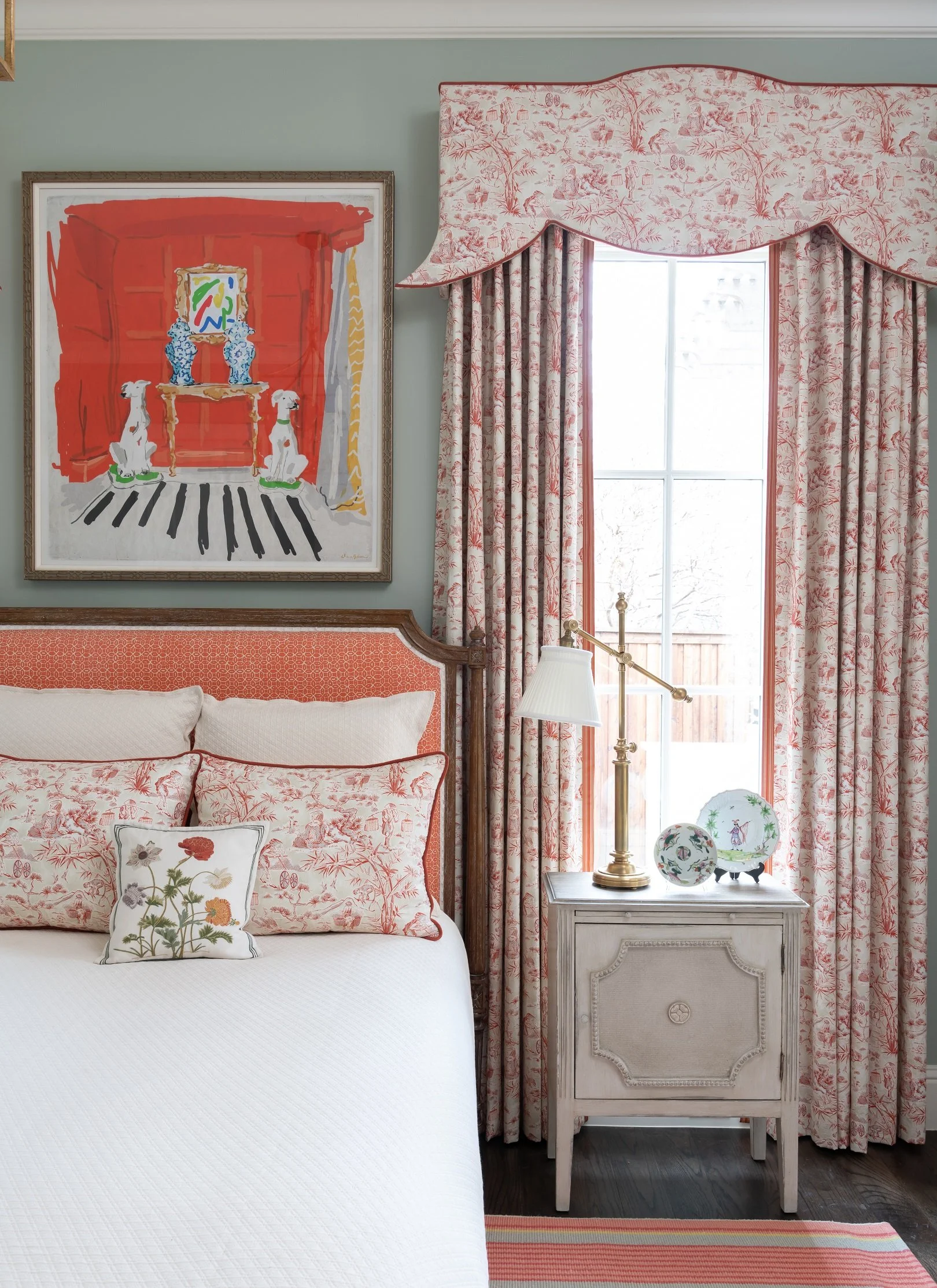
RELATED ARTICLES:

Quick and Easy Ways to Decorate Your Coffee Table by Margaret Chambers

The flowers on this coffee table are baby blue, matching perfectly with the blue and white china in the room.

The flowers on this coffee table are baby blue, matching perfectly with the blue and white china in the room.

You should never underestimate the impact that a coffee table has on the rest of the room. Coffee tables are important because they’re usually the centerpieces of the living room or the den, so they have an effect on a visitor’s first impression. Fortunately, they’re also pretty easy to style once you know the tried-and-true methods for decorating them.

An antique dog statue adds interest and character to this contemporary Dallas living room.

An antique dog statue adds interest and character to this contemporary Dallas living room.

How you decorate your coffee table depends largely on what shape it is. The six basic coffee table shapes are: round, oval, square, rectangular, hexagonal/octagonal, and “amorphous.” Rectangular coffee tables tend to be easier to decorate because they have more surface area than a similarly sized round or oval table. If you have a round table, try arranging items in a triangular shape, and make sure to include at least one round object on the table.

The classic go-to accessories for a coffee table are stacks of books, something tall (such as a plant or a candle), a storage tray or dish, and one unusual accessory. Don’t push any of the objects out to the corners of the table; it looks better if everything is loosely centered.

Books:

Coffee table books look best when stacked in groups of two to four each. Photography, art, fashion, or interior design books are all great choices. Whenever possible, try to select books with covers that complement the color scheme of the rest of the room.

We filled the decorative bowl on this coffee table with Shiva Lingams, which are egg-shaped river stones polished by hand and originally from India.

We filled the decorative bowl on this coffee table with Shiva Lingams, which are egg-shaped river stones polished by hand and originally from India.

Plants:

A coffee table without a single plant (whether faux or live) can feel a little staged. Plants add an organic touch and some texture to the tablespace. As with everything else, the plant needs to be the correct proportion for the table. For example, you wouldn’t want an oversized plant that overwhelms the table, but a tiny potted succulent in the middle of a large table wouldn’t work either. Plants should not be so large that they get in the way of conversation or watching television. For special occasions, you may enjoy swapping out your potted plants with some fresh flowers.

The flowers spilling out of a shallow bowl over this glass-top coffee table add color to the otherwise neutral space.

The flowers spilling out of a shallow bowl over this glass-top coffee table add color to the otherwise neutral space.

Trays and Bowls:

Trays can help organize functional items, such as coasters. Make sure to pick one that doesn’t occupy more than half of the tabletop space, and don’t place it right in the center either. Clear trays and flower vases fade into the background, making your table look a little more spacious. Although many homeowners use their coffee table tray to store remotes, I recommend storing those out-of-sight in drawers or a decorative box instead.

Decorative Objects:

Coffee tables are also a great place to show your personality, since they’re an appropriate spot for unusual collectibles and antiques. Examples can include pretty jewel boxes, antique tea caddies, glass orbs, or small sculptures. To vary the heights of your objects, place decorative objects or plants on top of your stacked books.

Although not every coffee table has to have each of these elements (books, trays, plants, and small accessories), these are usually what you’ll see on a professionally styled coffee table. If your table is smaller, you may want to restrict yourself to just three objects of interest.

The best coffee tables are artfully designed, but functional too: leaving plenty of space for homeowners to set down a magazine or a drink with a coaster. By following these tips, you can design a coffee table that’s not only useable, but also adds some serious style to your Dallas home.

Seen here is a round coffee table from the foyer in SMU’s Kappa Alpha Theta house, which we designed in 2016.

Seen here is a round coffee table from the foyer in SMU’s Kappa Alpha Theta house, which we designed in 2016.

If you need help finding charming accessories for the coffee tables in your home, you may want to consult a professional interior designer. At Chambers Interiors, we know the best places to find antique tea caddies, statues, porcelain plates, and other great accessories for coffee tables. Call our Dallas office at 214-651-7665 or send an email to info@chambersinteriors.com for more information.

RELATED ARTICLES:

The Ultimate Guide to Styling Your Home Office by Margaret Chambers

The shelving and cabinetry in this home office we designed in north Dallas add lots of helpful storage space.

The shelving and cabinetry in this home office we designed in north Dallas add lots of helpful storage space.

This year, many of us have found ourselves working from home for the first time, and wanting to design—or redesign—our home office spaces. The best home offices are not just ergonomic and well-organized, but beautiful, too. Read on for some designer tips for home offices, based on things I’ve learned while designing offices for my clients in Dallas.

Pick the Best Room for Your Home Office

The first step to designing a home office is also the most important: choosing the right location. Managing a healthy work-life balance can be a challenge, so it’s crucial to designate a spot that you only use for work. Of course, not everyone has a spare room available. Some other areas for home offices that you might not have considered include the landing, the kitchen, or under the stairs. To create a strong divide between your work and living area within one room, consider using a decorative screen or sliding door to separate the two.

Large windows, such as the ones in this Oak Cliff home office, fill the room with light and promote alertness.

Large windows, such as the ones in this Oak Cliff home office, fill the room with light and promote alertness.

If you put your home office in a corner, choose the corner closest to the window. When you begin to tire of looking at the computer screen, you’ll be glad to have somewhere else to rest your eyes on for a moment. Speaking of eye strain, make sure to install a bright bulb in your lamp for task lighting.

Plan Your Color Scheme

Paint color psychology plays an important role in home office design. Blues, greens, and purples are cool colors that promote relaxation. Since blue is the sleepiest of them all, I don’t recommend it for offices. On the other hand, green is a nice medium between restful and alert, giving the room a refreshing feeling.

Pastel yellow, pink, burnt orange, or dark red can be gently energizing, but bright orange, neon yellow, or fire engine red paint colors will be too overwhelming for most offices. Neutrals such as whites, beiges and tans are popular choices for both commercial and home offices. That said, since this is your personal space and not a cubicle, feel free to include bold accent colors in your décor for more personality.

We used a lot of colorful artwork in this Dallas high-rise home office. The white walls give the eye places to rest.

We used a lot of colorful artwork in this Dallas high-rise home office. The white walls give the eye places to rest.

Shop for Space-Saving Organizational Aids

You’ll definitely want some organizational aids and storage, but don’t buy anything you won’t use. Identify everything you need to perform your job well at home before you shop for office supplies. For example, if you only use one pen, there’s no need to get a pen cup. To save on desk space, consider installing floating shelves on the wall or using a vertical file folder.

A universal design problem for home offices is managing cords. Thankfully, there are products on the market for this exact issue, including desk grommets, cable clips, and cord covers. Power strips can be mounted to the underside or backside of your desk to keep them out of sight.

If you’re going to splurge on only one piece of furniture, it should be your office chair. Ergonomic desk chairs will have a curved back that is firm, rather than cushy, for the best support.

This home we designed had modern architecture, so we made sure that the home office was modern in style, too.

This home we designed had modern architecture, so we made sure that the home office was modern in style, too.

Coordinate Your Office’s Décor With the Rest of Your Home

Generally, a home office should be in stylistic harmony with the rest of the house. For example, an antique writing desk is a great choice for an office in a traditional house, while the furniture in a midcentury modern office should be simple and streamlined. If you’re a plant lover, bring cheer to your space with some potted plants. Art lovers should adorn the wall behind their desks with a gallery of artwork or a stunning patterned wallpaper.

Depending on your line of work, you may need to invite clients into your home office. Include some comfortable seating for guests if you do. Otherwise, you should avoid putting a cozy sofa or reading chair in your office. The temptation to take a nap may become too difficult to resist!

These additional chairs we added offer visitors a comfortable place to sit when they stop by.

These additional chairs we added offer visitors a comfortable place to sit when they stop by.

When you love your home office, you’ll be more motivated to spend time in it, and keep the area tidy, too. Hopefully, with these suggestions in mind, you can tackle your home office design project with confidence.

The photos in this article are just a few examples from the Chambers Interiors design portfolio. As you can see, our design team has a lot of experience with home offices. If you’re interested in hiring us to design an office that goes perfectly with your Dallas home’s architecture, email us at info@chambersinteriors.com or give us a call at 214-651-7665.

RELATED ARTICLES:

7 Tips for Designing a Stylish, Yet Comfortable Living Room by Margaret Chambers

This living room is from a home we recently designed in Bent Tree (north Dallas).

This living room is from a home we recently designed in Bent Tree (north Dallas).

Living rooms can be challenging to design because they need to be so many things: inviting, comfortable, stylish, and functional all at once. Pristine living rooms that are only for entertaining guests are now a thing of the past. These days, it’s more common to have the living room be both a family space and an entertaining space.

As a designer, I’m also starting to see living rooms be combined into other spaces, including music rooms, studies, and libraries. A good-size room can even be all of these things. Whether you’re updating your home or moving into a newly built one, it’s helpful to think seriously about all the different ways you plan to use your living room.

A bright pink velvet sofa is the star of this living room in a Park Cities English cottage.

A bright pink velvet sofa is the star of this living room in a Park Cities English cottage.

Tip 1: Start With the Sofa

The best place to start is with the sofa. Sofas can make or break a room, so if your existing sofa is not the right style for the room you want, or not the right size for your space, unfortunately you’ll probably have to replace it. Take the time to plan your layout first, as buying the wrong sofa is an expensive mistake. Sofas available through designers tend to be built to last longer than those available from mainstream retailers. Another thing to keep in mind is that simple sofas are easier to style than ones with ornate details.

Tip 2: Use the Rule of Thirds

An easy way to make sure the major elements of your living room are balanced against each other is to follow the rule of thirds. For example, your sofa should generally be two-thirds the width of your area rug, and your coffee table should be two-thirds the width of your sofa. While your major furnishings should be timeless in style, you can safely follow trends for smaller pieces like throw pillows, as these probably won’t be a long-term investment.

This zebra rug adds an element of surprise to the living room for this Dallas ranch home we designed.

This zebra rug adds an element of surprise to the living room for this Dallas ranch home we designed.

Tip 3: Choose the Right Rug Size

Most living room rugs will need to be 9-by-12-foot, 10-by-14-foot, or 12-by-15-foot for a large room. If you have a small room and are having trouble finding a rug that’s just the right fit, try a rug with an unusual shape, such as a zebra rug. These kinds of “amorphous” rugs can fit into a variety of spaces.

Tip 4: Contrast Light Against Dark

The walls of this Plano home are all painted grey. We used black and white accents to create more drama in each room.

The walls of this Plano home are all painted grey. We used black and white accents to create more drama in each room.

A living room that’s all-white can seem too formal and cold. Meanwhile, an all-dark living room tends to feel cave-like, which is an ambiance you might want for your bedroom but not for entertaining guests. The safest color scheme is in the middle: a living room with both light and dark elements.

Tip 5: Shop for Durable Fabrics

If you have young children or pets, you’ll definitely want to choose durable fabrics, such as outdoor fabric lines or Crypton. You should also steer clear of white fabrics that show stains. It’s easy to wipe away spills on leather, but leather also scratches easily, which is something to consider if you have pets.

Tip 6: Mix Old and New

To give your living room some character, try mixing both new and old items. I personally always incorporate antiques into my designs. Including antiques or vintage items is a surefire way to avoid the “showroom” look. Also, mixing different kinds of seating not only makes your living room more interesting, but also gives guests different seating options for their comfort. Make sure to plan your seating around creating conversation groups, rather than have all of the seating facing the TV. Ottomans are one of my go-to’s for extra seating.

Tip 7: Blend Your TV Into The Room

TV’s are a reality of modern life (and sometimes even the focal point in living rooms), so you’ll need to plan around yours. A TV stand is a common solution, but some alternatives you may not have considered include: projecting onto a blank wall, placing a flatscreen TV on a wall and surrounding it with artwork in black frames, or concealing the TV in a large cabinet.

We mixed modern furnishings (art deco chairs) and antiques (incense burners and foo dog statues) in this living room.

We mixed modern furnishings (art deco chairs) and antiques (incense burners and foo dog statues) in this living room.

If there’s one room in your home that you really need to get right, it’s the living room. Not only does it shape the way guests see your home, but it’s a room you’ll want to enjoy for yourself, too. Regardless of whether you want your living room to be formal or casual, it’s worth your time to plan a space that’s welcoming for family and friends alike.

Of course, not everyone has the time to plan their living room design in detail. Hiring an interior design firm is the best way to ensure your home has that professionally designed touch. Schedule a free consultation with Chambers Interiors by emailing us at info@chambersinteriors.com or calling our Dallas office at 214-651-7665.

RELATED ARTICLES:

Smart Ways to Design a Small Space by Margaret Chambers

This small guest bedroom is from a 1960s Dallas ranch we designed for a couple who were downsizing.

This small guest bedroom is from a 1960s Dallas ranch we designed for a couple who were downsizing.

Just because you live in a small apartment or condo doesn’t mean that you can’t go big on style. Designing a small space can present some unique challenges. However, living in a small space also encourages you to be thoughtful and economical about what you bring into it. If you’re looking to get the most out of your apartment or condo, these tips may be helpful.

Identify Your Top Priorities for the Space

To start with, take time to really think about your needs and your routine. For example, if you don’t use your dining table often, you may want to replace it with a table that folds up when not in use. Walk through the apartment and note any blank walls or corners that aren’t serving a purpose. Whenever possible, take advantage of vertical wall space to add additional storage. Tall, narrow bookcases and shelving units are perfect for this.

Daybeds, such as the one seen here, are multi-purpose. They can function as beds as well as seating or lounging areas.

Daybeds, such as the one seen here, are multi-purpose. They can function as beds as well as seating or lounging areas.

Buy Multi-Purpose Furniture

If you’ve read other small space decorating guides, you probably know that buying multi-purpose furniture is a must. Some examples of multi-purpose furniture include beds with built-in storage, bookcases with built-in desks, hollow ottomans and sofa beds. When you’re decorating your small apartment from scratch, it’s crucial to make sure you’re purchasing the correct scale furniture. A major advantage to hiring an interior designer is that they will carefully measure your space and find pieces that are just the right proportion—or have them custom-made, if need be.

The glass and acrylic game table next to this mirror fades into the background. It also doubles as an extra dining spot.

The glass and acrylic game table next to this mirror fades into the background. It also doubles as an extra dining spot.

If you have low ceilings, use short-legged furniture to help your ceilings feel taller. On the other hand, if your ceilings are just the right height, you should consider furniture with longer legs. A large sofa that sits low to the floor can feel extra bulky in a small room. By bringing up your furniture off the floor instead, you’re making it appear as if you have more floor space.

Make Your Walls Feel Bigger With the Right Accessories

One of the tricks designers use for decorating apartments and condos is to buy clear furniture made of acrylic or glass. A clear coffee table fades into its surroundings, making the room feel more expansive. Mirrors are another common solution for small spaces. They add more dimension to an otherwise flat wall, and reflect light into the room. Believe it or not, it’s a mistake to only decorate your walls with small artwork. With artwork, it can actually look better to go bold with a big statement piece.

Use Rugs and Furniture to Create Visual ‘Zones’

Rugs also do a lot of good for a small apartment. They can cover up unsightly carpets and tile, delineate “zones,” or visually expand the space. Speaking of zones, make sure to divide shared spaces with your furniture. An open concept floor plan is not as beneficial to apartments as you might think. It’s better to give the eye places to rest and create cohesive groupings. For example, if your dining area and living room are connected, you can use the back of your sofa to separate the two.

Floor-to-ceiling shelves add plenty of storage space to this small library from a home we designed in Kessler Park.

Floor-to-ceiling shelves add plenty of storage space to this small library from a home we designed in Kessler Park.

Most small spaces are square or rectangular. Adding curved furniture can contrast against the angles of your space in an appealing way, instantly giving your apartment some flair. Don’t forget to complement any curved furniture with one or two curved accessories in the same room, such as an oval mirror or rounded lampshade.

Choose Your Paint Color

When it comes to paint color, different designers approach small spaces in different ways. Some say you should paint the walls white to help the apartment feel more open. Others say that a dark paint color gives your apartment a cozy, jewel-box feel. In my opinion, there is no right or wrong answer: instead, you should decide what kind of feel you want your apartment to have, and go from there.

We used a light, green-and-beige color scheme to help this guest bedroom feel more open and airy.

We used a light, green-and-beige color scheme to help this guest bedroom feel more open and airy.

Whether you’re starting with a blank state, or you simply want to rearrange the furniture you already have, this guide should help you make your small space your own. When a small space is thoughtfully designed, visitors won’t notice its size: instead, they’ll admire your great taste!

If you’re still stumped on how to get the most potential out of your small space, consider hiring an interior designer. To schedule a free consultation with Chambers Interiors, call our office in Dallas at 214-651-7665 or send us an email at info@chambersinteriors.com.
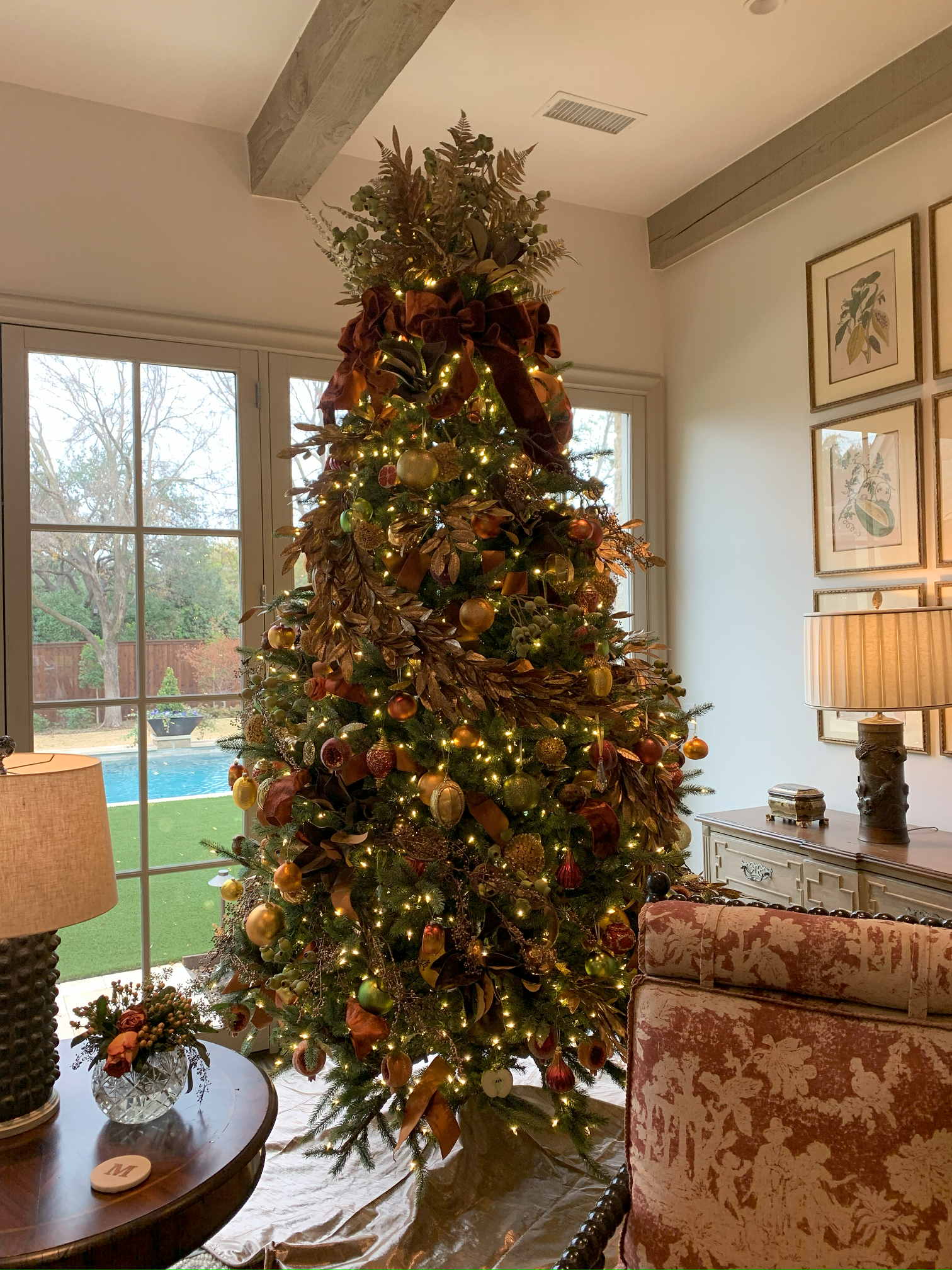
Related Articles:

How to Decorate These Common Types of Dallas Home Architecture by Margaret Chambers

We decorated this modern Dallas house using a midcentury style, with burnt oranges, earth tones, and simple shapes.

We decorated this modern Dallas house using a midcentury style, with burnt oranges, earth tones, and simple shapes.

When I’m working with clients who have recently purchased a home, they often ask me: “What’s the right style for this house’s architecture?” This is an especially common concern among people moving into a historic house. No matter how beautiful your furnishings and art collection are, your home won’t come together if your decorating clashes with the ‘bones’ of the house.

For example, an industrial loft with exposed brick will look strange decorated with all European antiques. A colonial home should use a traditional style as opposed to something trendy, like Scandinavian minimalism. In this guide, I’ll discuss the most appropriate interior design styles for four types of home architecture I see often in Dallas: Modern, English, French, and Italian.
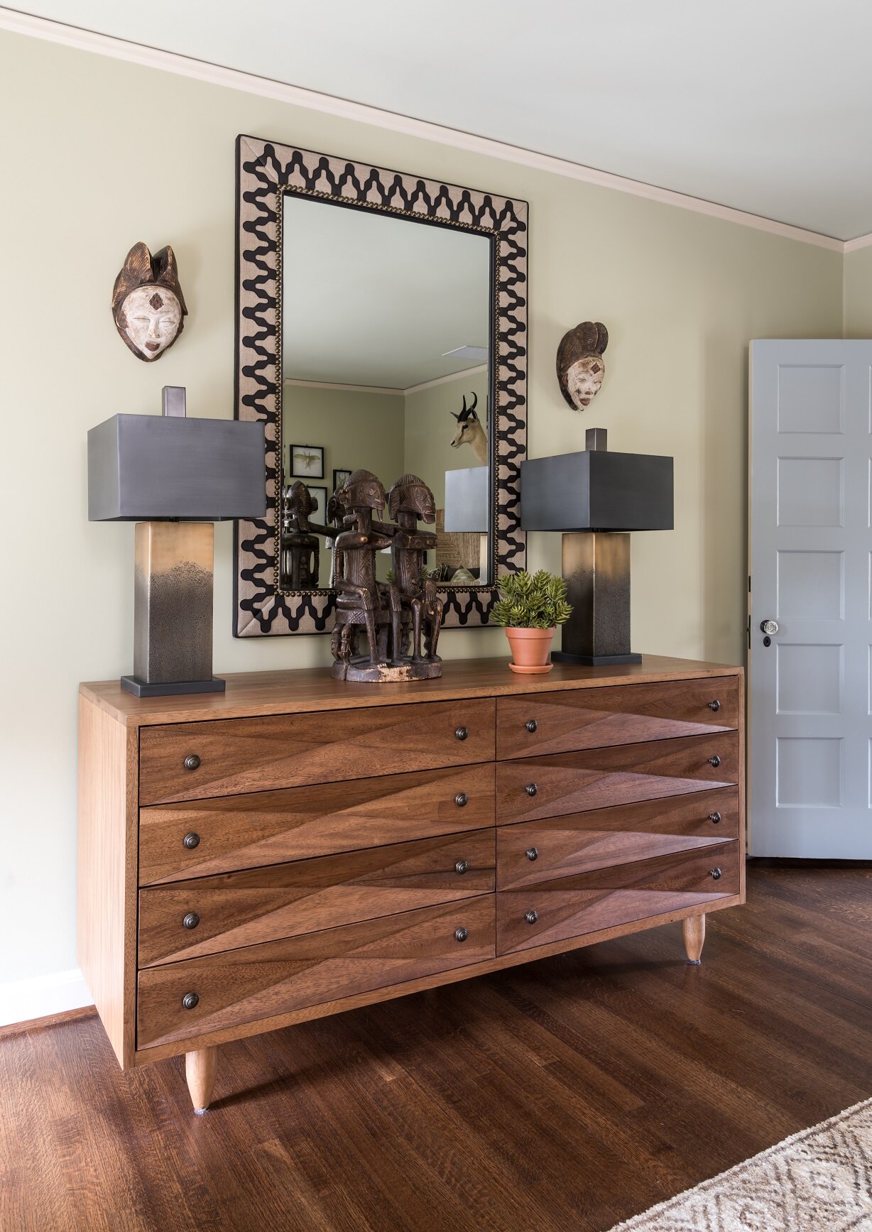
Modern Homes

Modern homes can be seen in Highland Park, University Park, and Lower Greenville. This style of house, which is inspired by Frank Lloyd Wright’s Prairie School architecture, typically has a flat (or sometimes gabled) roof.

Here you can see an exterior photo of the Dallas modern home featured above.

Here you can see an exterior photo of the Dallas modern home featured above.

In a modern home, function comes before form: there is very little ornamentation and few decorative objects, save for some modern art to add sophistication. If you live in a modern home, you’ll need to decorate in either a modern, contemporary, or transitional style. All three of these styles tend to have a neutral color scheme, such as white, gray, tan or cream, with some brown or black accents.

If you do want to include a few antiques, I recommend multicultural works of art. Midcentury modern artists drew inspiration from other cultures (think of Pablo Picasso and his “African Period” of art). This is perhaps why Indian, East Asian, or African art will look natural in a modern setting while European antiques do not.

English, French, or Italian Homes

When you own a home with an English, French, or Italian architectural style, the safest course is to make your interior design consistent with the architecture. Depending on what type of home you have, however, you do have some leeway to incorporate pieces that are in a different style.

The dining room in this University Park English cottage has Chippendale chairs with elaborately carved chair backs.

The dining room in this University Park English cottage has Chippendale chairs with elaborately carved chair backs.

For example, if I were designing an English home, I would make sure that at least eighty-five percent of the furnishings, fabrics, and accessories were English in style. Chippendale furniture is a very popular choice for today’s English homes. For that other fifteen percent of the house, I might include some French pieces, such as French porcelains. American antique furniture (or reproductions) are another option because American furniture was closely based on English furniture.

The same goes for French and Italian homes. A French home should be mostly French, but can have some English pieces. If you’re looking to add variety to your Italian home, I would go with French pieces, which will blend better with the rest of the home than English pieces would.

Another thing to keep in mind is that there’s quite a bit of difference between French Classical or French Country, or between Georgian and English Cottage. If your home can be described as English Cottage or French Country, you’ll want to fill it with items that are more casual and pared down.

The traditional living room in this French chateau we designed combines elegant furnishings with a soft color palette.

The traditional living room in this French chateau we designed combines elegant furnishings with a soft color palette.

For all three of these styles, you can also feel free to include a few modern pieces of artwork. In Paris, it’s a popular trend to decorate old Parisian apartments with all modern artwork and furnishings. Personally, though, I believe that modern furniture should not be used in a classical French, English, or Italian home. It might look trendy today, but it won’t stand the test of time the same way that a more traditional look would.

As an interior designer, when I work with clients who own a beautiful modern, English, French, or Italian home, I want the final result to remain mostly faithful to the architectural style. That said, when most people move into a new home, they don’t start from scratch: everyone has at least a few items they’re bringing with them. Thankfully, there are ways to incorporate heirloom furniture or prized artwork that doesn’t match the exact style of the home. The key is to identify which of your items might potentially clash with the architecture and which could blend right in.
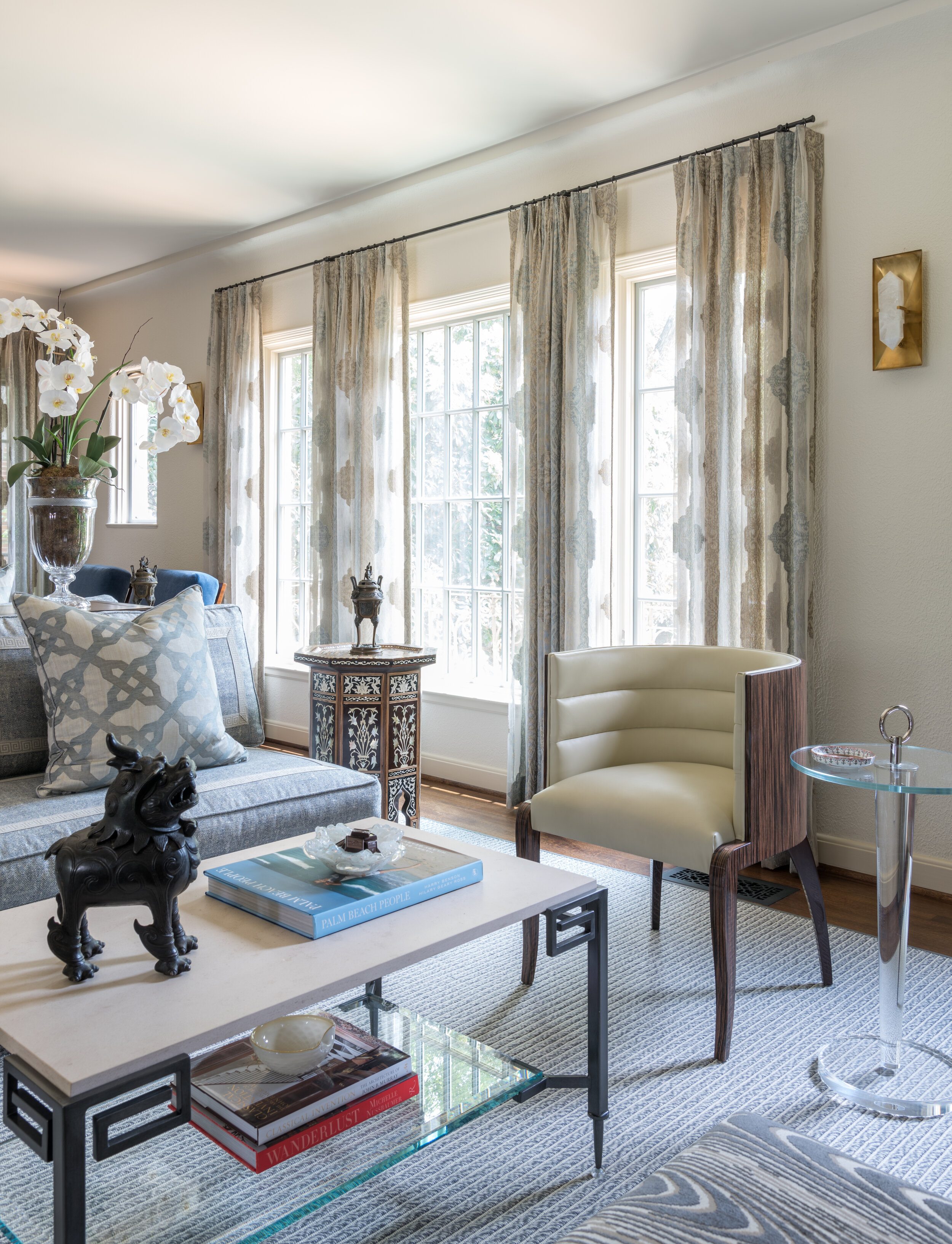
If you recently moved into a new home and aren’t sure how to bring the best out of the architecture, consult an interior designer. Here at Chambers Interiors, we are experienced in designing and decorating homes with a wide variety of architectural styles. Call our Dallas office at 214-651-7665 or email us at info@chambersinteriors.com to learn more.

Related Articles: