modern

The Ultimate Guide to Styling Your Home Office by Margaret Chambers

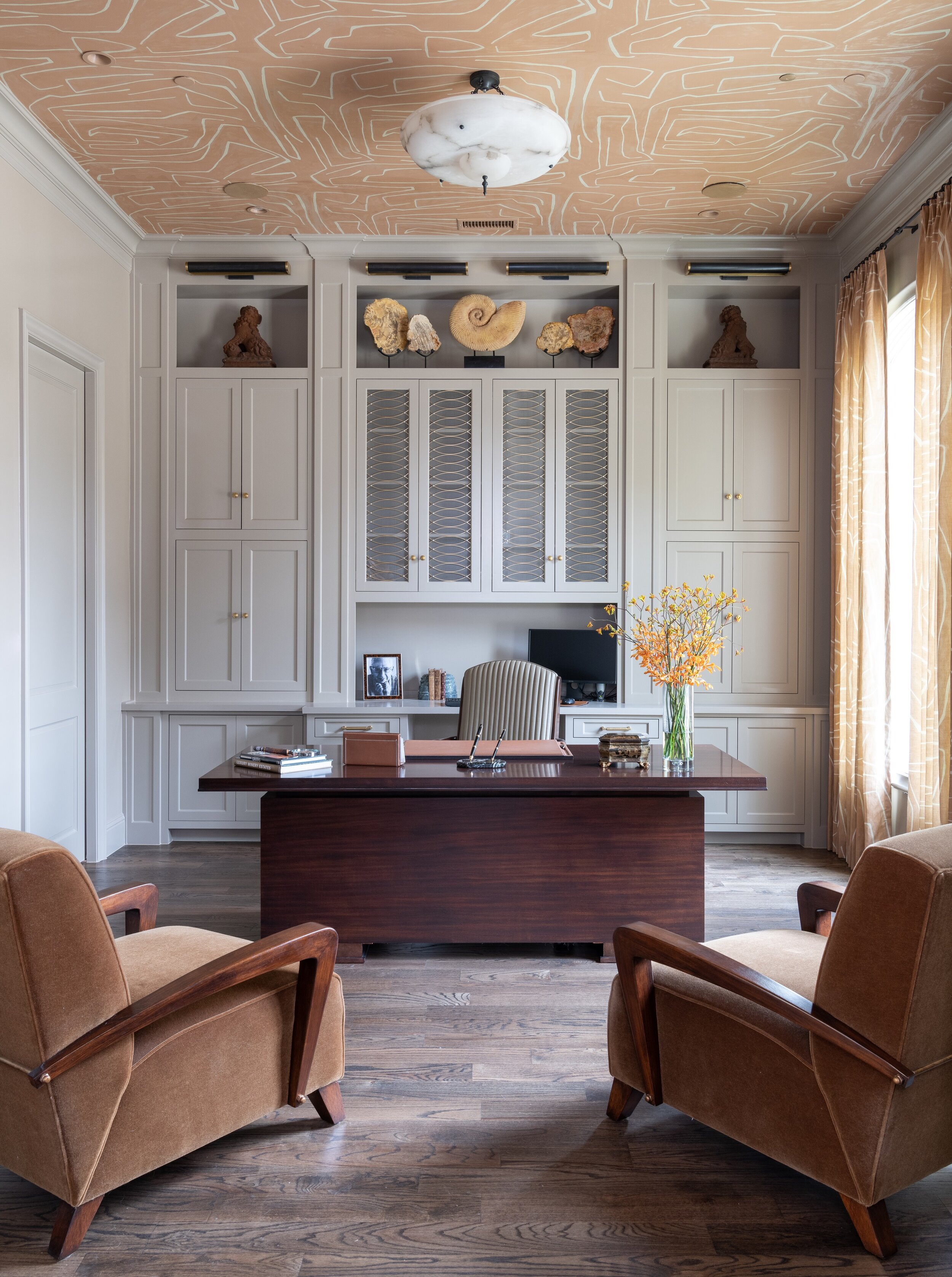
The shelving and cabinetry in this home office we designed in north Dallas add lots of helpful storage space.

The shelving and cabinetry in this home office we designed in north Dallas add lots of helpful storage space.

This year, many of us have found ourselves working from home for the first time, and wanting to design—or redesign—our home office spaces. The best home offices are not just ergonomic and well-organized, but beautiful, too. Read on for some designer tips for home offices, based on things I’ve learned while designing offices for my clients in Dallas.

Pick the Best Room for Your Home Office

The first step to designing a home office is also the most important: choosing the right location. Managing a healthy work-life balance can be a challenge, so it’s crucial to designate a spot that you only use for work. Of course, not everyone has a spare room available. Some other areas for home offices that you might not have considered include the landing, the kitchen, or under the stairs. To create a strong divide between your work and living area within one room, consider using a decorative screen or sliding door to separate the two.

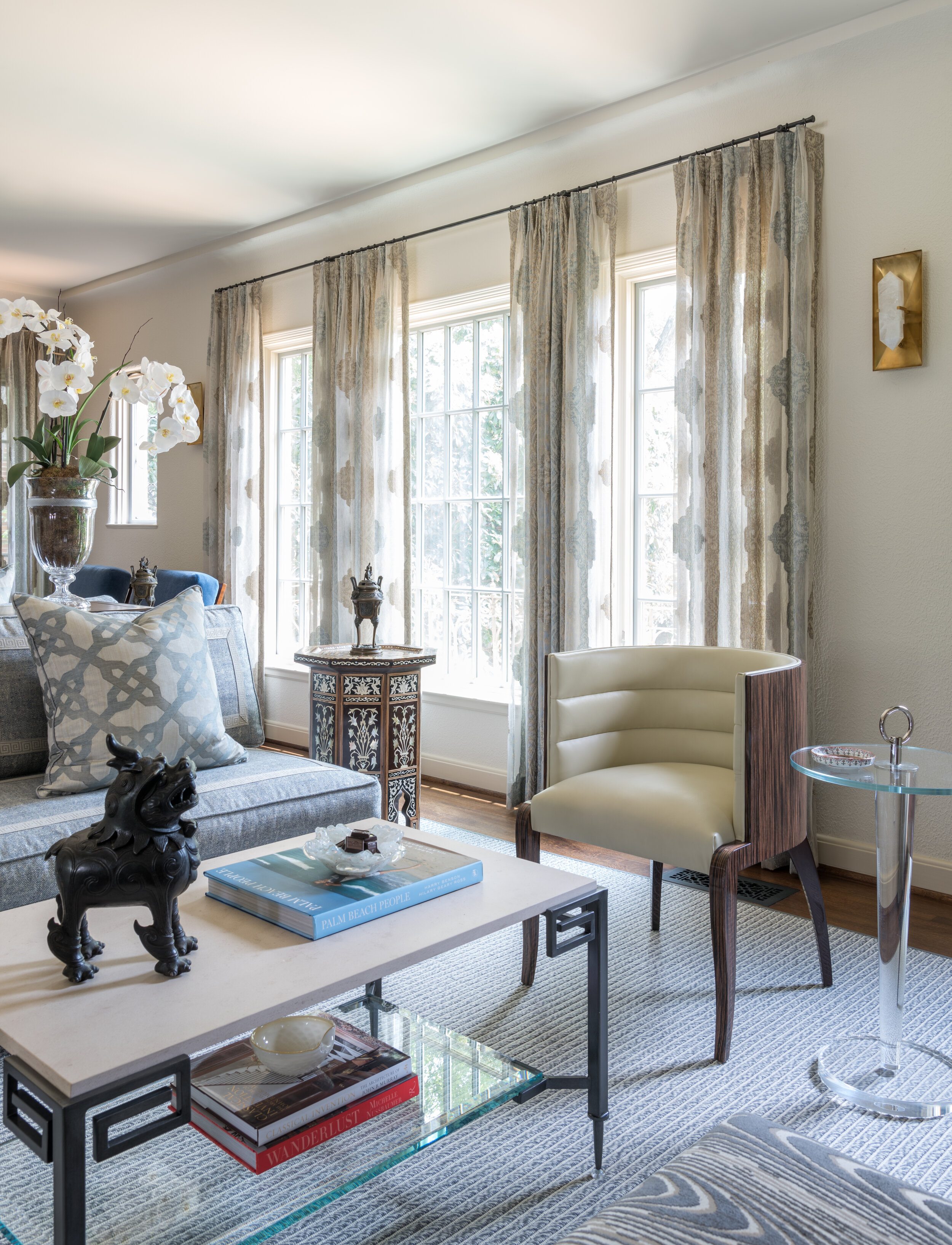
Large windows, such as the ones in this Oak Cliff home office, fill the room with light and promote alertness.

Large windows, such as the ones in this Oak Cliff home office, fill the room with light and promote alertness.

If you put your home office in a corner, choose the corner closest to the window. When you begin to tire of looking at the computer screen, you’ll be glad to have somewhere else to rest your eyes on for a moment. Speaking of eye strain, make sure to install a bright bulb in your lamp for task lighting.

Plan Your Color Scheme

Paint color psychology plays an important role in home office design. Blues, greens, and purples are cool colors that promote relaxation. Since blue is the sleepiest of them all, I don’t recommend it for offices. On the other hand, green is a nice medium between restful and alert, giving the room a refreshing feeling.

Pastel yellow, pink, burnt orange, or dark red can be gently energizing, but bright orange, neon yellow, or fire engine red paint colors will be too overwhelming for most offices. Neutrals such as whites, beiges and tans are popular choices for both commercial and home offices. That said, since this is your personal space and not a cubicle, feel free to include bold accent colors in your décor for more personality.

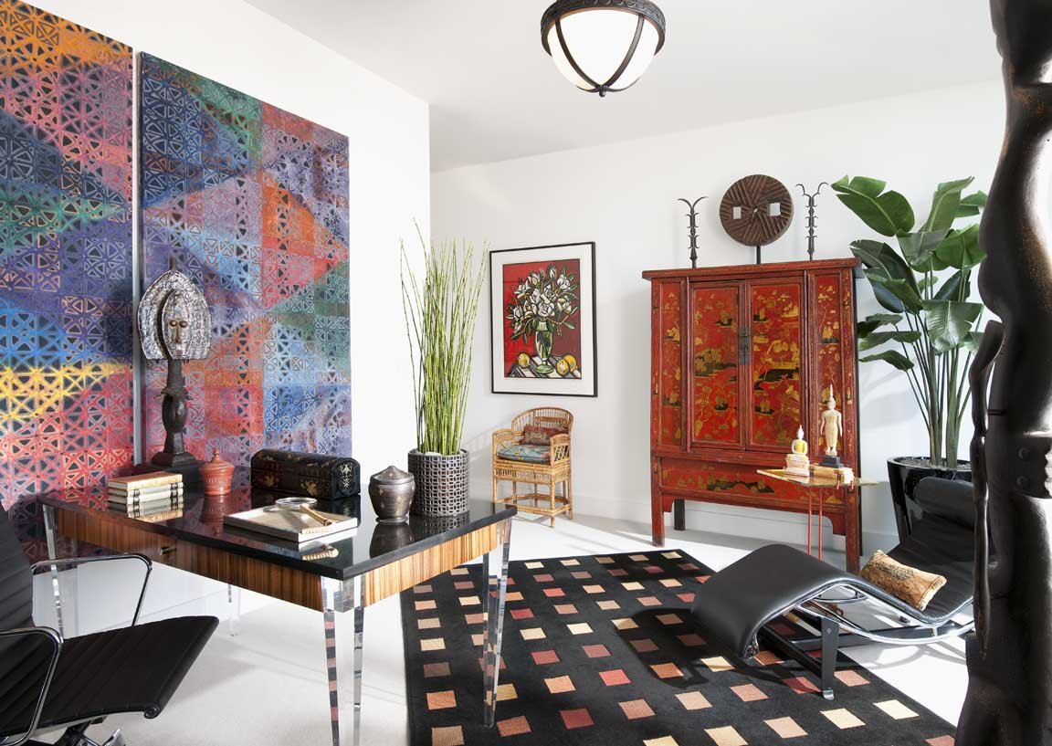
We used a lot of colorful artwork in this Dallas high-rise home office. The white walls give the eye places to rest.

We used a lot of colorful artwork in this Dallas high-rise home office. The white walls give the eye places to rest.

Shop for Space-Saving Organizational Aids

You’ll definitely want some organizational aids and storage, but don’t buy anything you won’t use. Identify everything you need to perform your job well at home before you shop for office supplies. For example, if you only use one pen, there’s no need to get a pen cup. To save on desk space, consider installing floating shelves on the wall or using a vertical file folder.

A universal design problem for home offices is managing cords. Thankfully, there are products on the market for this exact issue, including desk grommets, cable clips, and cord covers. Power strips can be mounted to the underside or backside of your desk to keep them out of sight.

If you’re going to splurge on only one piece of furniture, it should be your office chair. Ergonomic desk chairs will have a curved back that is firm, rather than cushy, for the best support.

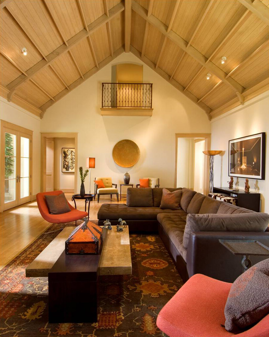
This home we designed had modern architecture, so we made sure that the home office was modern in style, too.

This home we designed had modern architecture, so we made sure that the home office was modern in style, too.

Coordinate Your Office’s Décor With the Rest of Your Home

Generally, a home office should be in stylistic harmony with the rest of the house. For example, an antique writing desk is a great choice for an office in a traditional house, while the furniture in a midcentury modern office should be simple and streamlined. If you’re a plant lover, bring cheer to your space with some potted plants. Art lovers should adorn the wall behind their desks with a gallery of artwork or a stunning patterned wallpaper.

Depending on your line of work, you may need to invite clients into your home office. Include some comfortable seating for guests if you do. Otherwise, you should avoid putting a cozy sofa or reading chair in your office. The temptation to take a nap may become too difficult to resist!

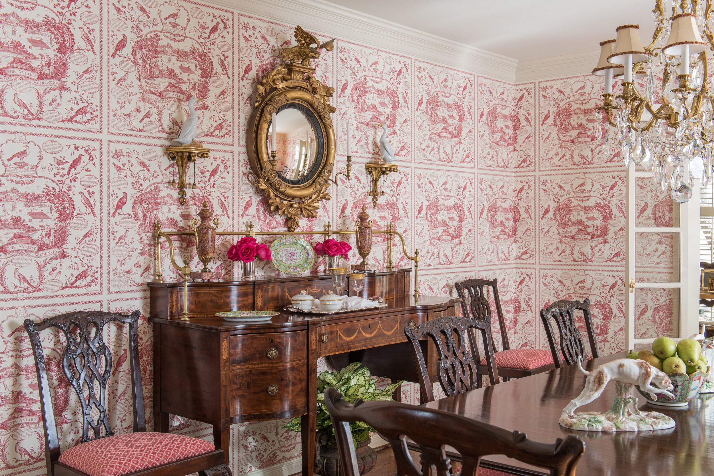
These additional chairs we added offer visitors a comfortable place to sit when they stop by.

These additional chairs we added offer visitors a comfortable place to sit when they stop by.

When you love your home office, you’ll be more motivated to spend time in it, and keep the area tidy, too. Hopefully, with these suggestions in mind, you can tackle your home office design project with confidence.

The photos in this article are just a few examples from the Chambers Interiors design portfolio. As you can see, our design team has a lot of experience with home offices. If you’re interested in hiring us to design an office that goes perfectly with your Dallas home’s architecture, email us at info@chambersinteriors.com or give us a call at 214-651-7665.

RELATED ARTICLES:

7 Tips for Designing a Stylish, Yet Comfortable Living Room by Margaret Chambers

This living room is from a home we recently designed in Bent Tree (north Dallas).

This living room is from a home we recently designed in Bent Tree (north Dallas).

Living rooms can be challenging to design because they need to be so many things: inviting, comfortable, stylish, and functional all at once. Pristine living rooms that are only for entertaining guests are now a thing of the past. These days, it’s more common to have the living room be both a family space and an entertaining space.

As a designer, I’m also starting to see living rooms be combined into other spaces, including music rooms, studies, and libraries. A good-size room can even be all of these things. Whether you’re updating your home or moving into a newly built one, it’s helpful to think seriously about all the different ways you plan to use your living room.

A bright pink velvet sofa is the star of this living room in a Park Cities English cottage.

A bright pink velvet sofa is the star of this living room in a Park Cities English cottage.

Tip 1: Start With the Sofa

The best place to start is with the sofa. Sofas can make or break a room, so if your existing sofa is not the right style for the room you want, or not the right size for your space, unfortunately you’ll probably have to replace it. Take the time to plan your layout first, as buying the wrong sofa is an expensive mistake. Sofas available through designers tend to be built to last longer than those available from mainstream retailers. Another thing to keep in mind is that simple sofas are easier to style than ones with ornate details.

Tip 2: Use the Rule of Thirds

An easy way to make sure the major elements of your living room are balanced against each other is to follow the rule of thirds. For example, your sofa should generally be two-thirds the width of your area rug, and your coffee table should be two-thirds the width of your sofa. While your major furnishings should be timeless in style, you can safely follow trends for smaller pieces like throw pillows, as these probably won’t be a long-term investment.

This zebra rug adds an element of surprise to the living room for this Dallas ranch home we designed.

This zebra rug adds an element of surprise to the living room for this Dallas ranch home we designed.

Tip 3: Choose the Right Rug Size

Most living room rugs will need to be 9-by-12-foot, 10-by-14-foot, or 12-by-15-foot for a large room. If you have a small room and are having trouble finding a rug that’s just the right fit, try a rug with an unusual shape, such as a zebra rug. These kinds of “amorphous” rugs can fit into a variety of spaces.

Tip 4: Contrast Light Against Dark

The walls of this Plano home are all painted grey. We used black and white accents to create more drama in each room.

The walls of this Plano home are all painted grey. We used black and white accents to create more drama in each room.

A living room that’s all-white can seem too formal and cold. Meanwhile, an all-dark living room tends to feel cave-like, which is an ambiance you might want for your bedroom but not for entertaining guests. The safest color scheme is in the middle: a living room with both light and dark elements.

Tip 5: Shop for Durable Fabrics

If you have young children or pets, you’ll definitely want to choose durable fabrics, such as outdoor fabric lines or Crypton. You should also steer clear of white fabrics that show stains. It’s easy to wipe away spills on leather, but leather also scratches easily, which is something to consider if you have pets.

Tip 6: Mix Old and New

To give your living room some character, try mixing both new and old items. I personally always incorporate antiques into my designs. Including antiques or vintage items is a surefire way to avoid the “showroom” look. Also, mixing different kinds of seating not only makes your living room more interesting, but also gives guests different seating options for their comfort. Make sure to plan your seating around creating conversation groups, rather than have all of the seating facing the TV. Ottomans are one of my go-to’s for extra seating.

Tip 7: Blend Your TV Into The Room

TV’s are a reality of modern life (and sometimes even the focal point in living rooms), so you’ll need to plan around yours. A TV stand is a common solution, but some alternatives you may not have considered include: projecting onto a blank wall, placing a flatscreen TV on a wall and surrounding it with artwork in black frames, or concealing the TV in a large cabinet.

We mixed modern furnishings (art deco chairs) and antiques (incense burners and foo dog statues) in this living room.

We mixed modern furnishings (art deco chairs) and antiques (incense burners and foo dog statues) in this living room.

If there’s one room in your home that you really need to get right, it’s the living room. Not only does it shape the way guests see your home, but it’s a room you’ll want to enjoy for yourself, too. Regardless of whether you want your living room to be formal or casual, it’s worth your time to plan a space that’s welcoming for family and friends alike.

Of course, not everyone has the time to plan their living room design in detail. Hiring an interior design firm is the best way to ensure your home has that professionally designed touch. Schedule a free consultation with Chambers Interiors by emailing us at info@chambersinteriors.com or calling our Dallas office at 214-651-7665.

RELATED ARTICLES:

How to Decorate These Common Types of Dallas Home Architecture by Margaret Chambers

We decorated this modern Dallas house using a midcentury style, with burnt oranges, earth tones, and simple shapes.

We decorated this modern Dallas house using a midcentury style, with burnt oranges, earth tones, and simple shapes.

When I’m working with clients who have recently purchased a home, they often ask me: “What’s the right style for this house’s architecture?” This is an especially common concern among people moving into a historic house. No matter how beautiful your furnishings and art collection are, your home won’t come together if your decorating clashes with the ‘bones’ of the house.

For example, an industrial loft with exposed brick will look strange decorated with all European antiques. A colonial home should use a traditional style as opposed to something trendy, like Scandinavian minimalism. In this guide, I’ll discuss the most appropriate interior design styles for four types of home architecture I see often in Dallas: Modern, English, French, and Italian.

Modern Homes

Modern homes can be seen in Highland Park, University Park, and Lower Greenville. This style of house, which is inspired by Frank Lloyd Wright’s Prairie School architecture, typically has a flat (or sometimes gabled) roof.

Here you can see an exterior photo of the Dallas modern home featured above.

Here you can see an exterior photo of the Dallas modern home featured above.

In a modern home, function comes before form: there is very little ornamentation and few decorative objects, save for some modern art to add sophistication. If you live in a modern home, you’ll need to decorate in either a modern, contemporary, or transitional style. All three of these styles tend to have a neutral color scheme, such as white, gray, tan or cream, with some brown or black accents.

If you do want to include a few antiques, I recommend multicultural works of art. Midcentury modern artists drew inspiration from other cultures (think of Pablo Picasso and his “African Period” of art). This is perhaps why Indian, East Asian, or African art will look natural in a modern setting while European antiques do not.

English, French, or Italian Homes

When you own a home with an English, French, or Italian architectural style, the safest course is to make your interior design consistent with the architecture. Depending on what type of home you have, however, you do have some leeway to incorporate pieces that are in a different style.

The dining room in this University Park English cottage has Chippendale chairs with elaborately carved chair backs.

The dining room in this University Park English cottage has Chippendale chairs with elaborately carved chair backs.

For example, if I were designing an English home, I would make sure that at least eighty-five percent of the furnishings, fabrics, and accessories were English in style. Chippendale furniture is a very popular choice for today’s English homes. For that other fifteen percent of the house, I might include some French pieces, such as French porcelains. American antique furniture (or reproductions) are another option because American furniture was closely based on English furniture.

The same goes for French and Italian homes. A French home should be mostly French, but can have some English pieces. If you’re looking to add variety to your Italian home, I would go with French pieces, which will blend better with the rest of the home than English pieces would.

Another thing to keep in mind is that there’s quite a bit of difference between French Classical or French Country, or between Georgian and English Cottage. If your home can be described as English Cottage or French Country, you’ll want to fill it with items that are more casual and pared down.

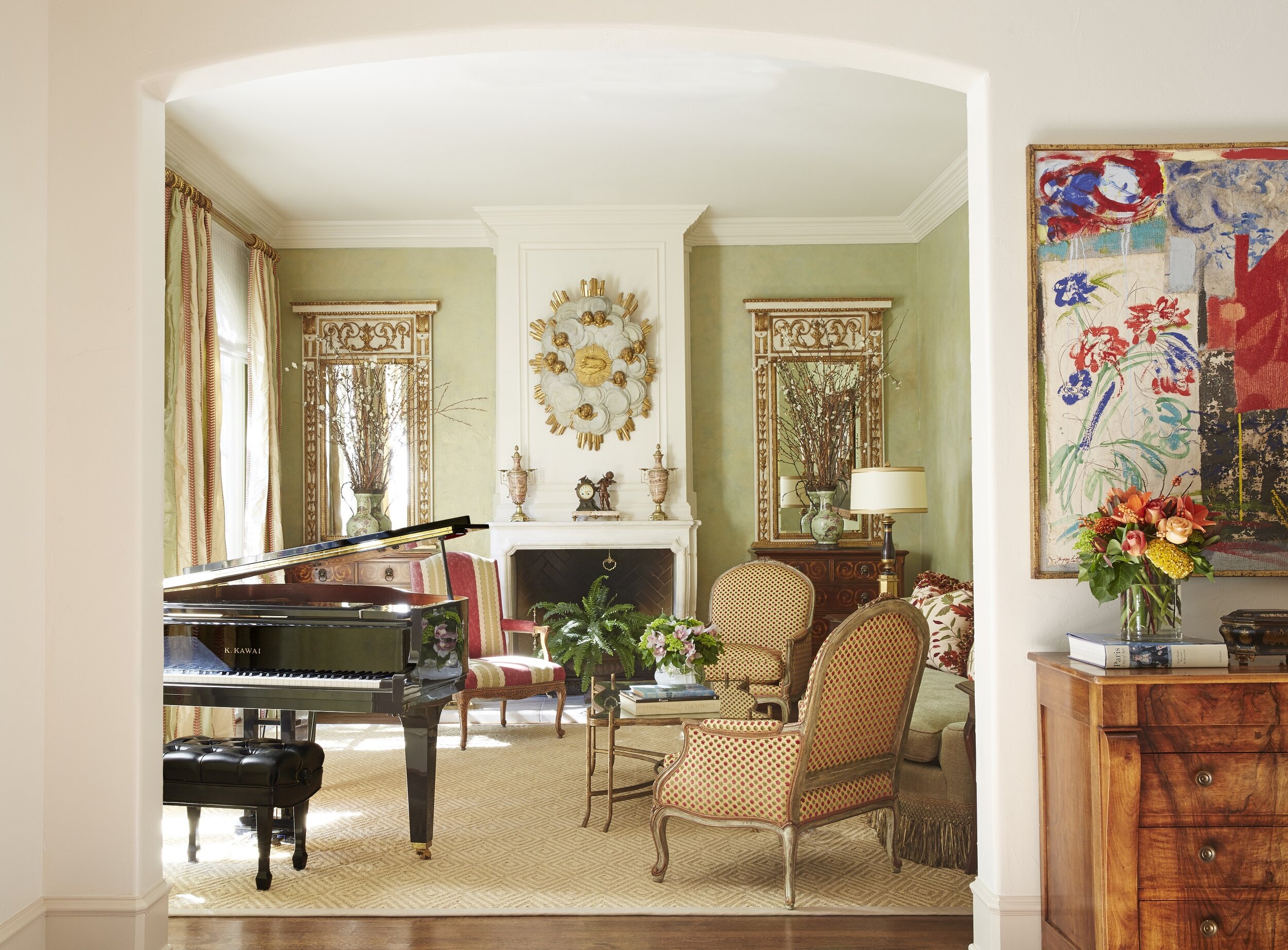
The traditional living room in this French chateau we designed combines elegant furnishings with a soft color palette.

The traditional living room in this French chateau we designed combines elegant furnishings with a soft color palette.

For all three of these styles, you can also feel free to include a few modern pieces of artwork. In Paris, it’s a popular trend to decorate old Parisian apartments with all modern artwork and furnishings. Personally, though, I believe that modern furniture should not be used in a classical French, English, or Italian home. It might look trendy today, but it won’t stand the test of time the same way that a more traditional look would.

As an interior designer, when I work with clients who own a beautiful modern, English, French, or Italian home, I want the final result to remain mostly faithful to the architectural style. That said, when most people move into a new home, they don’t start from scratch: everyone has at least a few items they’re bringing with them. Thankfully, there are ways to incorporate heirloom furniture or prized artwork that doesn’t match the exact style of the home. The key is to identify which of your items might potentially clash with the architecture and which could blend right in.

If you recently moved into a new home and aren’t sure how to bring the best out of the architecture, consult an interior designer. Here at Chambers Interiors, we are experienced in designing and decorating homes with a wide variety of architectural styles. Call our Dallas office at 214-651-7665 or email us at info@chambersinteriors.com to learn more.

Related Articles:

Why Your Rug Might Be the Most Important Decorating Choice You Make by Margaret Chambers

A large area rug in a neutral gray helps to ground the space in this living room from a home we designed in Kessler Park, Dallas.

A large area rug in a neutral gray helps to ground the space in this living room from a home we designed in Kessler Park, Dallas.

While some people treat rugs as an afterthought, for interior designers, rugs are the foundation of a room. Rugs have a major influence on a room’s color scheme and overall mood, despite being below eye-level. In fact, many designers start their designs by picking the rug first and finding furniture that complements it second.

That said, if your rugs are the only element of your home that needs updating, they’re easy to swap out, too. Following are some things to keep in mind next time you’re rug shopping.

  • Choosing the Right Size

When it comes to rugs, the most common pitfall is choosing one that’s too small. A rug should be large enough to extend under, at the very least, the front legs of every piece of furniture in a seating area. On the other hand, a rug that leaves almost no floor showing tends to look like wall-to-wall carpeting. In most cases, you should leave twelve inches to eighteen inches of space between the rug and the wall.

In the dining room, the rug should be low-pile and about twenty-four to thirty inches wider than the dining table. This way, your chairs won’t slide off of the rug and tip whenever someone pulls one out. If you put a rug under your bed, make it large enough so that your feet will land on it when you get out of bed in the morning.

We ordered a custom-designed rug to fit the small dining room. It is hand-tufted wool and silk. Because the rug is a perfect square, the round table fits perfectly on top, and the rug can be rotated in any direction for even wear.

We ordered a custom-designed rug to fit the small dining room. It is hand-tufted wool and silk. Because the rug is a perfect square, the round table fits perfectly on top, and the rug can be rotated in any direction for even wear.

Rugs play an important role in adding personality to hallways, which can otherwise feel like “dead” spaces. Your hallway runner should be wide enough that you can keep both feet on it as you walk through.

  • Choosing the Right Material

Another thing to consider is what material you want your rug to be. Wool is the most popular choice because it is both durable and beautiful: it’s perfect for families with children.

Silk can handle more foot traffic than you might think, but the cleaning process is slightly more involved and expensive than with wool. Natural fiber rugs such as sisal and jute are very affordable but cannot be cleaned if you spill something on them (unless you use a fiber protection method as soon as you get them). If you decide to buy delicate rugs, place them in low-traffic rooms where they won’t risk getting wet.

  • Choosing the Right Color, Pattern, and Style

Renters who love color, but can’t paint their walls, should bring in a colorful rug instead. Bold rugs are also a smart idea if you’re attracted to vibrant colors and patterns, but don’t want to commit to a bold wallpaper or color scheme. For rooms with dark walls, try finding a light, neutral rug with a distinctive texture. This solves two common problems with dark rooms: the color of the rug will keep the mood from being too heavy, and the added texture will create more interest in an environment where fewer shadows are being formed.

Bold colors and patterns abound in this study we designed for a downtown Dallas high-rise.

Bold colors and patterns abound in this study we designed for a downtown Dallas high-rise.

Rugs with large-scale patterns draw a lot of attention to themselves. This can be a great thing when your room feels too subdued and needs something to liven it up. If you’d rather visitors notice your furnishings and accessories first, rather than the rug, choose a pattern with a smaller, “quieter” print.

Contemporary rugs, which often have large-scale designs, do best in contemporary spaces. Oriental rugs are versatile enough to fit in both traditional and contemporary homes. Tribal rugs can go with many different styles but work especially well in Southwest style homes. Transitional rugs will contain both modern and traditional design elements, such as an ornate pattern in a modern, neutral color scheme. Rugs with a “weathered” look are ideal in beach-themed, transitional, and Bohemian rooms.

Oriental rugs can add color and refinement to contemporary settings, as you can see from this eclectic master bathroom.

Oriental rugs can add color and refinement to contemporary settings, as you can see from this eclectic master bathroom.

The earthy colors and tribal pattern on this rug made it the perfect choice for this African themed guest room we designed.

The earthy colors and tribal pattern on this rug made it the perfect choice for this African themed guest room we designed.

Finding the perfect rug can be the solution to many different design problems. A beautiful rug has the power to instantly add interest to a boring room or pull together one with too much going on. If you keep these designer tips for rugs in mind, you’ll be a savvier shopper.

An interior designer can be a great resource for sourcing high-end rugs or ordering custom ones. If you’re updating your rugs and want the best of the best, call us at 214-232-9501, or email us at info@chambersinteriors.com. We’d love to hear more about your project!

Related Articles:

Tips for Decorating a Mid-Century Modern Home by Margaret Chambers

With its timeless and minimalist look, modern interior design remains a preferred style for homeowners in Dallas and across the nation. Modern design can bring out the best qualities of your space because it is a clean and uncluttered style, emphasizing a small collection of carefully chosen furnishings.

Many people use the terms 'modern' and 'contemporary' interchangeably, but when it comes to interior design, they are distinct terms. Contemporary is a catch-all term for the most up-to-date and cutting-edge trends in design. Modern, on the other hand, refers to a specific style that began in the midcentury and has remained mostly the same over time.

Modern design was originally an extension of modern and deco art trends from the early 20th century, such as Bauhaus style, a German artistic movement known for its minimalism. Advances in technology paved the way for furniture designers to work with new materials, colors, and finishes. Plastic, vinyl, Lucite, and plexiglass pieces quickly began appearing in homes, often alongside traditional materials like wood and stone.

Today, modern style continues to emphasize geometric and smooth shapes, such as ovals, rectangles and squares. Since strong lines are important to the style, excess accessories are removed to leave the room's visual lines uninterrupted. Exactly how you highlight your space is, in many ways, more important than the accessories you choose.

This style has as much to do with architecture as it does with furnishings. Modern homes usually take advantage of large rooms, high ceilings, open floor plans and floor-to-ceiling windows. Architects designing modern homes between the 40’s and 60’s often created depth in open spaces using wall panels and changes in elevation. Large windows are also important because they introduce natural light into a room that otherwise might feel cold without it. Some modern homeowners also wish to make the surrounding landscape, not the furnishings, the most eye-catching feature in the roomin this case, bare windows are a must.

The materials you use for your home are another important consideration. Modern style usually is created with smooth textures, like glass, metal and plastic. For this reason, not many modern homes will be carpeted. Instead, you will see smooth wood, tile, or polished concrete floors with geometric rugs. Some rough textures, such as wood and brick, can also be incorporated for contrast.

Mid-century interior design is also well known for its distinctive designer furnishings and accessories. Famous examples include Charles and Ray Eames's chair designs: these were considered cutting edge at the time, but are now sought for their vintage look. Pendant lights, tulip tables, abstract art fixtures, atomic chandeliers and clocks all recreate the modern aesthetic. If an art piece takes center stage in your room, use lighting to bring attention to it.

Stay away from furnishings that are usually associated with traditional interior design. Furniture with hand carved details, traditional prints, and heavy or ruffled drapes would not be a good fit for a modern home. Patterns associated with modern and contemporary design tend to be large graphics with only a few colors. Although this style is known for its soothing neutral palettes, splashes of bright color are also used to liven up the space. Don't be afraid to go bold with orange, teal, or even neon colors.

Modern style has the advantage of looking contemporary while retaining the vintage aesthetic of mid-century design. It's no wonder that Dallas homeowners would still request this classic look from the interior designers they work with.

Looking for someone to help you design the modern home you’ve always wanted? Call us at 214-232-9501, or email us at info@chambersinteriors.com, to schedule your free consultation.

Related Articles: