Bent Tree

Kitchen Design Basics by Margaret Chambers

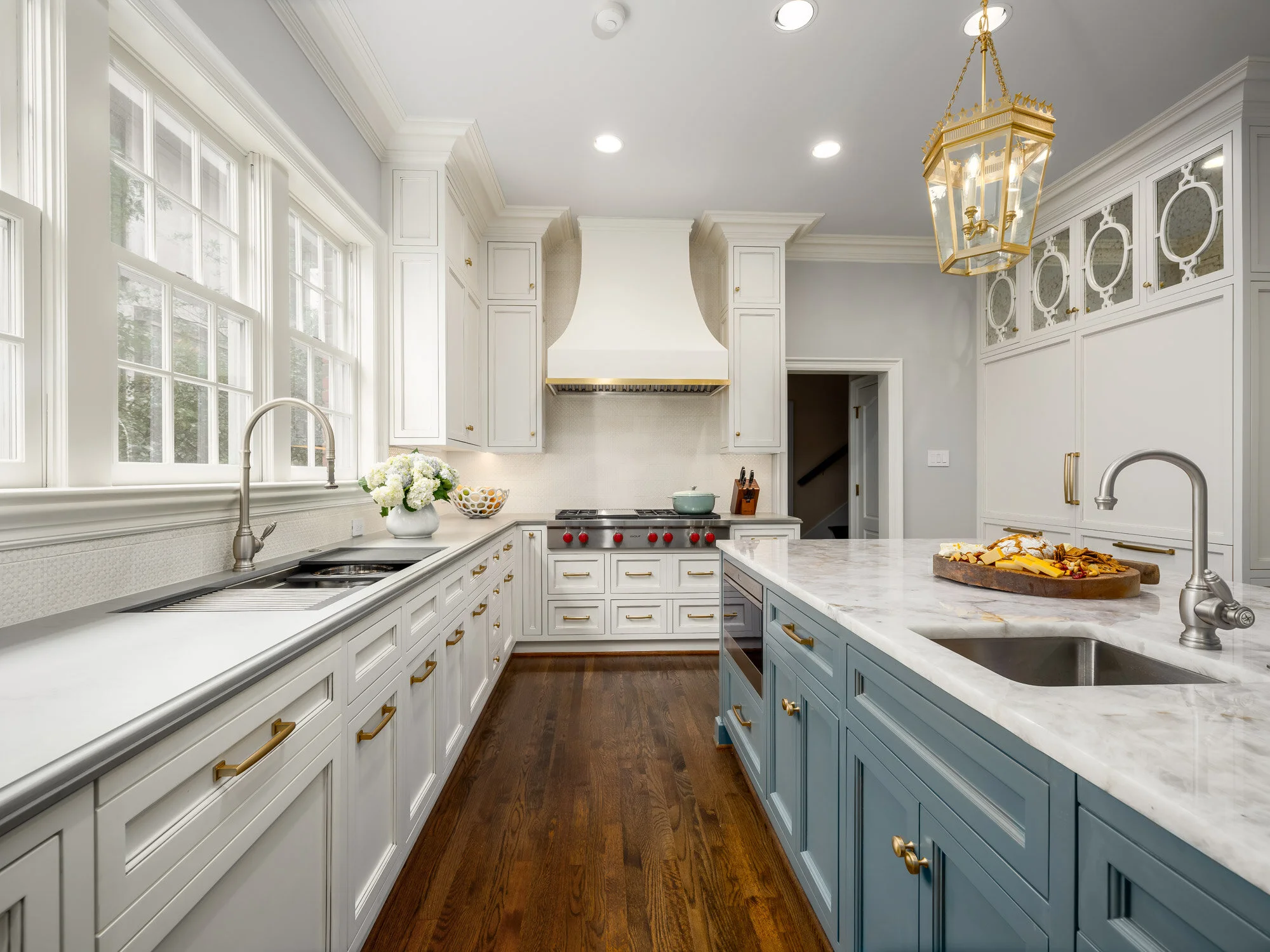
All-white kitchens have an open and airy feel to them. This kitchen is from a home we designed in Preston Hollow.

All-white kitchens have an open and airy feel to them. This kitchen is from a home we designed in Preston Hollow.

In the past, kitchens were usually set apart from the rest of the home. Homeowners today, however, often prefer their kitchens to be a hub where they can work and entertain guests at the same time. Following are some general guidelines for designing a kitchen that can do it all—whether you're renovating your Dallas home or starting from scratch.

The first floor of this Dallas home has an open concept layout. The kitchen connects to the living room on the right.

The first floor of this Dallas home has an open concept layout. The kitchen connects to the living room on the right.

Identify Your Goals

Everyone has different needs for their kitchen, so begin the design process by identifying your top priorities. If you love to cook and entertain, make sure you have more than just one stove. If you don't cook often, there's no need to invest in restaurant-quality burners.

Choose a Layout

The size of your kitchen is another important factor in how you should lay things out. When you've got a small space to work with, you may consider installing an island with storage, overhead pot racks, and cabinets that run all the way up to the ceiling. Running cabinets up to the ceiling eliminates the gap that normally just collects dust. By making storage space a design priority, you can store away as many kitchen appliances as possible. This has the advantage of leaving your countertops uncluttered.

As with any small room, you can help a small kitchen feel more expansive by painting the wall colors in a light shade, and letting in as much natural light as possible. Large kitchens allow for more leeway with amenities (such as the number of ovens), as well as dramatic colors and decorative effects. A midsize kitchen can feel more like a big kitchen if you open it up to the family room. One word of caution, however: you might not want kitchen messes to be in your line of sight whenever you’re in the family room!

We worked with Helene’s Luxury Kitchens on this remodel. You can see how the sink, island, and stove form a triangle.

We worked with Helene’s Luxury Kitchens on this remodel. You can see how the sink, island, and stove form a triangle.

Regardless of whether your kitchen is large or small, it’s worthwhile to plan out pathways. Many designers use the ‘kitchen triangle’ method to plan an ergonomic design. In this method, the fridge, sink, and stove form the three corners of a triangle. Your flatware and dining ware should also be stored close to the dishwasher to make unloading faster and easier. If you want your kitchen to be a ‘hangout’ space, make sure to provide seating that is set away from your work area triangle. Island seating and breakfast tables are two common solutions to this problem.

The stainless steel cabinets and kitchen island (by Bulthaup) share the same gray-blue color in this Kessler Park home.

The stainless steel cabinets and kitchen island (by Bulthaup) share the same gray-blue color in this Kessler Park home.

Pick Complementary Paint Colors and Materials

Speaking of islands, I recommend painting your island the same color as your cabinets to create a unified look. The exception to this rule would be large kitchens, which can visually accommodate a wider variety of paint finishes and colors.

Glass cabinets can help give your kitchen depth and make it feel more spacious. However, remember that your dinnerware will all be on display. If you have dining ware that doesn't match with the rest of your collection, you might want to install frosted glass panes instead.

While there's nothing wrong with stainless steel, make sure to not overuse it. You should also take into consideration the visual flow and rhythm of your kitchen when you choose stainless steel. Putting it everywhere can break up the kitchen's design, making it feel uneven. Stainless steel also scratches easily, so it may not be the best material for counters where you’ll be doing cooking prep. If you have a lot of stainless steel visible in your kitchen and would like to introduce variety, you can have wood fronts installed on your dishwasher, refrigerator, or cabinets.

Glass door cabinets help to highlight the client's beautiful crystal and china collection, as seen above.

Glass door cabinets help to highlight the client's beautiful crystal and china collection, as seen above.

Renovating or designing a kitchen can be a lengthy process. Yet regardless of how much cooking you do, you’ll want your kitchen to be a room you enjoy spending time in. A beautiful, thoughtfully-designed kitchen is always worth the trouble!

Just because you have a historical home doesn't mean you can't enjoy the most up-to-date appliances and modern furnishings. If you think it’s time to update your kitchen, consider reaching out to Chambers Interiors. Our design team is familiar with historical home renovation and can help you update appliances while staying faithful to your kitchen’s aesthetic. Contact us by calling our Dallas office at 214-232-9501 or sending an email to info@chambersinteriors.com.

RELATED ARTICLES:

The Ultimate Guide to Styling Your Home Office by Margaret Chambers

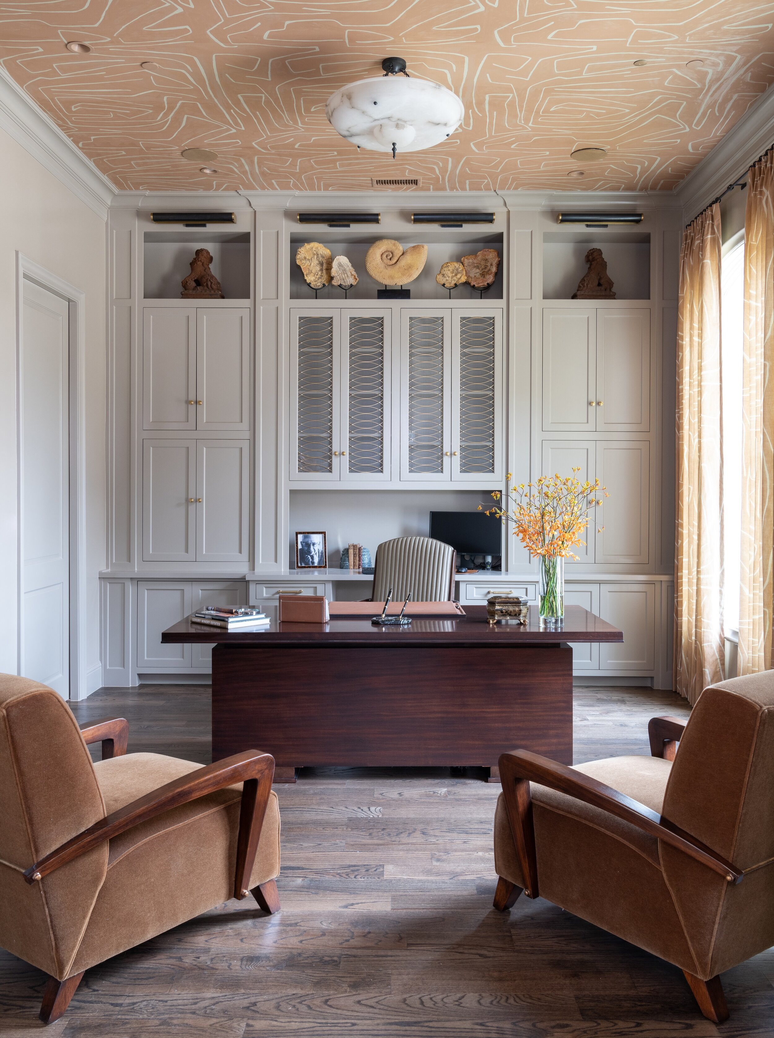
The shelving and cabinetry in this home office we designed in north Dallas add lots of helpful storage space.

The shelving and cabinetry in this home office we designed in north Dallas add lots of helpful storage space.

This year, many of us have found ourselves working from home for the first time, and wanting to design—or redesign—our home office spaces. The best home offices are not just ergonomic and well-organized, but beautiful, too. Read on for some designer tips for home offices, based on things I’ve learned while designing offices for my clients in Dallas.

Pick the Best Room for Your Home Office

The first step to designing a home office is also the most important: choosing the right location. Managing a healthy work-life balance can be a challenge, so it’s crucial to designate a spot that you only use for work. Of course, not everyone has a spare room available. Some other areas for home offices that you might not have considered include the landing, the kitchen, or under the stairs. To create a strong divide between your work and living area within one room, consider using a decorative screen or sliding door to separate the two.

Large windows, such as the ones in this Oak Cliff home office, fill the room with light and promote alertness.

Large windows, such as the ones in this Oak Cliff home office, fill the room with light and promote alertness.

If you put your home office in a corner, choose the corner closest to the window. When you begin to tire of looking at the computer screen, you’ll be glad to have somewhere else to rest your eyes on for a moment. Speaking of eye strain, make sure to install a bright bulb in your lamp for task lighting.

Plan Your Color Scheme

Paint color psychology plays an important role in home office design. Blues, greens, and purples are cool colors that promote relaxation. Since blue is the sleepiest of them all, I don’t recommend it for offices. On the other hand, green is a nice medium between restful and alert, giving the room a refreshing feeling.

Pastel yellow, pink, burnt orange, or dark red can be gently energizing, but bright orange, neon yellow, or fire engine red paint colors will be too overwhelming for most offices. Neutrals such as whites, beiges and tans are popular choices for both commercial and home offices. That said, since this is your personal space and not a cubicle, feel free to include bold accent colors in your décor for more personality.

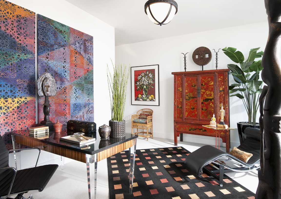
We used a lot of colorful artwork in this Dallas high-rise home office. The white walls give the eye places to rest.

We used a lot of colorful artwork in this Dallas high-rise home office. The white walls give the eye places to rest.

Shop for Space-Saving Organizational Aids

You’ll definitely want some organizational aids and storage, but don’t buy anything you won’t use. Identify everything you need to perform your job well at home before you shop for office supplies. For example, if you only use one pen, there’s no need to get a pen cup. To save on desk space, consider installing floating shelves on the wall or using a vertical file folder.

A universal design problem for home offices is managing cords. Thankfully, there are products on the market for this exact issue, including desk grommets, cable clips, and cord covers. Power strips can be mounted to the underside or backside of your desk to keep them out of sight.

If you’re going to splurge on only one piece of furniture, it should be your office chair. Ergonomic desk chairs will have a curved back that is firm, rather than cushy, for the best support.

This home we designed had modern architecture, so we made sure that the home office was modern in style, too.

This home we designed had modern architecture, so we made sure that the home office was modern in style, too.

Coordinate Your Office’s Décor With the Rest of Your Home

Generally, a home office should be in stylistic harmony with the rest of the house. For example, an antique writing desk is a great choice for an office in a traditional house, while the furniture in a midcentury modern office should be simple and streamlined. If you’re a plant lover, bring cheer to your space with some potted plants. Art lovers should adorn the wall behind their desks with a gallery of artwork or a stunning patterned wallpaper.

Depending on your line of work, you may need to invite clients into your home office. Include some comfortable seating for guests if you do. Otherwise, you should avoid putting a cozy sofa or reading chair in your office. The temptation to take a nap may become too difficult to resist!

These additional chairs we added offer visitors a comfortable place to sit when they stop by.

These additional chairs we added offer visitors a comfortable place to sit when they stop by.

When you love your home office, you’ll be more motivated to spend time in it, and keep the area tidy, too. Hopefully, with these suggestions in mind, you can tackle your home office design project with confidence.

The photos in this article are just a few examples from the Chambers Interiors design portfolio. As you can see, our design team has a lot of experience with home offices. If you’re interested in hiring us to design an office that goes perfectly with your Dallas home’s architecture, email us at info@chambersinteriors.com or give us a call at 214-651-7665.

RELATED ARTICLES: