Oak Cliff

Essential Items for Designing the Perfect Foyer or Entryway by Margaret Chambers

Lots of natural light will help a foyer feel open and airy. This north Dallas project was recently published in Luxe.

Lots of natural light will help a foyer feel open and airy. This north Dallas project was recently published in Luxe.

Foyers and entryways are an important area of the home that sadly often goes overlooked. They’re not just the first impression a guest has of your home; they are also a landing strip where you transition from public to private life.

The following designer tips can be applied to entryways of all shapes and sizes, in all styles of home architecture. Before you begin, take a look at your available space and identify the main goals you want to achieve with your foyer. You might not have room to incorporate all of the suggestions below, so pick the items that make the most sense for you and your family.

Furniture

Putting a console table, bench, and decorative mirror together will form a classic entryway vignette.

Putting a console table, bench, and decorative mirror together will form a classic entryway vignette.

Most professionally-designed foyers will have at least one of the following: a console table, a chest, or a bench. Benches are helpful to have because they offer a place for people to put on or take off shoes.

Choosing a chest over a console table can be wise if you don’t have a lot of closet space and need extra storage for your seasonal clothes. To dress up the space, hang a statement mirror or painting over your table, chest, or bench.

Rugs

This Oak Cliff house we designed features both an entry staircase with a patterned runner and a bench for seating.

This Oak Cliff house we designed features both an entry staircase with a patterned runner and a bench for seating.

In some homes, the entryway is small and enclosed on most sides. In an open concept home, however, the space is less defined. Dallas homeowners with an open concept house should make sure to delineate where their foyer begins and ends using a rug as well as a few pieces of furniture, such as a bookcase, console table, or bench. You can also use a partition or decorative screen to visually divide the entryway from the rest of the first floor.

Since this is a high-traffic area, your entry rug should have good traction and be durable. Wool is easier to clean than other materials, making it a popular choice for entryways. Jute is another good option because it doesn’t show wear and tear as visibly as alternatives. Those of you with an entry staircase should also think about getting a beautiful runner to make it safer to walk on.

Storage

An antique tea caddy can be a charming addition to your console table. Click here to learn more about tea caddies.

An antique tea caddy can be a charming addition to your console table. Click here to learn more about tea caddies.

If you don’t have a separate mudroom, and your foyer tends to get cluttered, identify what kinds of clutter accumulate there. Do you have a shoes-off policy for your home? If so, store shoes in a chest or basket under the console. Do you drop off your mail, sunglasses, and keys as soon as you get home? Place a pretty decorative box on your console table to collect these loose items.

To keep umbrellas off the floor, I recommend finding an umbrella stand made of porcelain, brass, or Lucite. As an aside, all of your storage solutions should either complement the overall space or be in neutral colors so that they fade into the background.

This foyer has two decorative light sources: a star-shaped light fixture overhead and a lamp with a faux bois stand.

This foyer has two decorative light sources: a star-shaped light fixture overhead and a lamp with a faux bois stand.

Lighting

One common problem with entryways is that they can be narrow and poorly lit. You have a few options for making sure yours is bright and welcoming.

In a foyer with very little natural light, a statement chandelier is the obvious choice. A less obvious option you might not have considered would be to decorate your console table or chest with a lamp. To reflect the natural light coming in through your windows or door, include a wall mirror in your foyer. Another advantage to putting a mirror in your entryway is that you can do a hair check one last time as you head out the door.

Accents

Seen here is a coffee table from the foyer we designed in SMU’s new Kappa Alpha Theta sorority house.

Seen here is a coffee table from the foyer we designed in SMU’s new Kappa Alpha Theta sorority house.

Since your foyer is like a sneak peek of the rest of your home, don’t be afraid to show your personality. This area can be a great place for a few personal photos and mementos. For your table or chest, decorate it as you would a coffee table: fresh flowers, a bowl of seashells, antiques, candles, or books could help complete the look.

Designing a better foyer won’t just impress your guests. It’ll bring you cheer when you come home after a long day to find a beautiful and well-organized space awaiting you. By taking a moment to strategize and identify key items missing from your current setup, you too can have a foyer that is as stylish as it is functional.

On the other hand, if you’re looking for an interior design team that will learn about your vision and source the items for you, you’ve come to the right place. To schedule a free consultation, call 214-232-9501 to reach our Dallas office or email us at info@chambersinteriors.com.

RELATED ARTICLES:

The Top Six Interior Design Trends for 2021 by Margaret Chambers

This powder room we designed is a perfect example of three 2021 trends: bold colors, wallpaper, and global influences.

This powder room we designed is a perfect example of three 2021 trends: bold colors, wallpaper, and global influences.

Over the course of my interior design career, I have watched many trends come and go. Some looks are timeless and never seem to go out of style. Others fall in and out of favor in decades-long cycles. In this article, I’ll touch upon the six trends I am seeing come back for 2021: colorful interiors, antiques, globally-inspired rooms, home offices, brass hardware, and wallpaper.

Color:

Starting around the 2010s, designers and homeowners alike gravitated towards neutral interiors with cool grays, dark hardwood floors, and all-white walls. Recently, I’ve started to see things swinging back in the other direction. Colors, especially rich colors (like ocean blues), are finally back. I think this is due in part to Instagram, where colorful interior photos seem to attract more attention than neutral ones. While I have designed many white-and-gray homes at my clients’ request, I’ve always preferred color and am excited to see homeowners favoring it once again.

For this Preston Hollow dining room, we decorated the wall with antique Rose Medallion plates.

For this Preston Hollow dining room, we decorated the wall with antique Rose Medallion plates.

Antiques:

Contemporary design has enjoyed precedence for quite a while now; meanwhile, Old-World styles went out of fashion. Nowadays, however, people are wanting to mix old and new pieces again. Since people are spending a lot more time at home, buyers are more attracted to comfortable furniture with rounded curves and traditional detailing instead of sharp lines and sleek metals. Antiques add history, warmth, soul, and character to a house.

This older project from our portfolio still looks current today due to the use of bold colors and multicultural art.

This older project from our portfolio still looks current today due to the use of bold colors and multicultural art.

Although antiques are not as valuable as they once were, I predict that buyers will begin to seek them out again this year. Antiques and vintage items also appeal to young homeowners because they are a more sustainable option than newly-produced furniture.

Globally-Inspired Rooms

Another trend that design experts are predicting for 2021 is globally-inspired and travel-inspired rooms. This makes a lot of sense, since many of us have spent the year yearning for travel. With the right décor, it’s possible to make any room feel like a tropical getaway, coastal oasis, or luxury hotel room. Some interior designers are also seeking to include influences from Africa and India in their work.

Home Offices

The patterned wallpaper we placed on this dining room ceiling helps to create the illusion that the ceiling is taller.

The patterned wallpaper we placed on this dining room ceiling helps to create the illusion that the ceiling is taller.

Global Workplace Analytics, a research and consulting firm, predicts that twenty-five to thirty percent of the workforce will continue to work from home for multiple days of the week by the end of 2021. Although most people will be working outside of the home this coming year, the trend of renovating home offices is here to stay. This year will also see many people turning their rooms into multi-purpose spaces, such as combining a living room with a home office.

Brass Hardware:

For many people, brass hardware screams ‘the 80s.’ Interestingly, it’s been making a comeback for the last few years. This may be related to last decade’s trend of tonal gray rooms: brass added some much-needed contrast and warmth to those otherwise cool spaces. One newly popular brass finish is “living finish,” which starts out bright and patinas naturally over time.

Wallpaper:

Wallpaper has been back for four or five years now and is still going strong. Lately, I see a lot of wallpapered ceilings and bathrooms. The one area of the house where it’s still considered “too dated” for wallpaper is the kitchen.

This north Dallas project we designed features framed de Gournay wallpaper prints.

This north Dallas project we designed features framed de Gournay wallpaper prints.

The trendiest patterns include botanicals, geometrics with metallic colors, textured wallpapers, and trompe-l'œil wallpaper (such as faux bois or faux tiled patterns). Some people also frame wallpaper panels and display them as pieces of artwork.

If you’ve been wanting to redecorate but have worried that your love for color, brass, antiques, or wallpaper dates you, fear not. Now is the perfect time to capitalize on those looks, so reintroduce them into your home to your heart’s content.

Is one of your new year resolutions to update your home for 2021? You can make the process easier and smoother by enlisting the help of a professional interior designer. To schedule a free consultation with us, call our Dallas office at 214-232-9501 or send an email to info@chambersinteriors.com.

RELATED ARTICLES:

Styling a Bed 101: How to Make Every Bed in Your Home More Inviting by Margaret Chambers

Seen above is the master bedroom from a chateau we designed in University Park, Dallas.

Seen above is the master bedroom from a chateau we designed in University Park, Dallas.

Although there are dozens of ways to style a bed, some methods are more tried-and-true than others. If you’re looking for a way to refresh your bedding without committing a style faux-paus, you’ll want to take a look at these guidelines. In this article, I’ll cover classic formulas for making a bed as well as the most popular colors, patterns, and materials for bedding.

Foolproof Formulas for Making a Bed

The four standard size pillows in the back and smaller decorative pillow up front are just the right proportion for this queen bed.

The four standard size pillows in the back and smaller decorative pillow up front are just the right proportion for this queen bed.

The number and size of the pillows you should use depends on the size of your bed.

For a queen bed, you’ll need: two queen-size pillows, two sham pillows, and an accent pillow between 22 and 26 inches. For a king bed, you’ll want to use the following pillow formula: two king-size pillows, three king-sized sham pillows, and an accent pillow between 24 and 26 inches.

The stylistically safest way to arrange these is to put the pillow shams in back, your sleeping pillows in the middle, and then your accent pillows in front. Here are some alternative formulas for beds that are also very balanced:

  • Four sleeping pillows in back, one lumbar pillow in front

  • ·Two sleeping pillows in back, one lumbar, and one accent pillow in front

  • Four sleeping pillows and two to three differently shaped and sized accent pillows in front

If you have a pretty headboard, you may want to go with fewer pillows to show it off. For lumbar pillows, consider placing a round decorative pillow in front; it’ll contrast nicely with the rectangular shape behind it.

We made sure to use lumbar pillows here so that the hand-blocked pattern on the upholstered headboard would be visible.

We made sure to use lumbar pillows here so that the hand-blocked pattern on the upholstered headboard would be visible.

Duvet and Sheet Tips

Top sheets should be put in finished side down so that the sleeper can enjoy the soft texture. This way, the finished side will also be visible when you fold the banding back.

When you fold your duvet, I recommend folding it in half, and then pulling it back towards you into thirds, past the rows of pillows. Pulling it back gives the pillows more “breathing room” and creates more depth. Regardless of bed size, any blanket or quilt you put on the bed needs to be long enough that both ends could drape off the sides.

Here, the grey quilted coverlet is folded back to expose white sheets, giving more depth to the bed in this Dallas bedroom.

Here, the grey quilted coverlet is folded back to expose white sheets, giving more depth to the bed in this Dallas bedroom.

Choose Bedding Materials Wisely

Since the bed is the main attraction in any bedroom, it makes sense to prioritize it in your budget. Look for the highest quality bedding you can afford. That said, there is no need to break the bank on your next mattress; a good mattress topper can make even the most uncomfortable mattresses feel great. Make sure to get a mattress cover too. It helps you get the most longevity out of your mattress.

Many people change their bedding with the seasons. Percale sheets are nice and cool in the summer, flannels will keep you warm in the winter, and linen is a good in-between material for both spring and fall. Its hollow fibers trap the optimal amount of body heat to keep you warm at night while also being soft and supple.

Color and Pattern Combinations You Can’t Go Wrong With

All-white bedding is popular because it promotes a feeling of relaxation. Even when your duvet and pillows are colorful, it’s strongly recommended to choose white sheets and sleeping pillows. The white pillows and folded-down top sheet (if visible) will help break up the areas of color and give the eye a place to rest. Blue is probably the next most popular color scheme for bedding. While white is elegant and refined, blue has more of a casual and coastal feel.

White and blue is a classic color combination. It can instantly give bedding a refreshing and uplifting feel.

White and blue is a classic color combination. It can instantly give bedding a refreshing and uplifting feel.

Love patterns? Make sure to break up the patterns in your bedding with some solid colors too so that the bedding is not too “busy.” To unite different patterns, make sure both patterns share at least one color. If you’re using a subtle tone-on-tone look for your colors and patterns, you’ll need to go in the opposite direction and introduce contrast with a variety of textures.

The busy patterns on the curtains and decorative pillow in this bedroom are balanced out by the neutral bedding.

The busy patterns on the curtains and decorative pillow in this bedroom are balanced out by the neutral bedding.

A beautifully made bed makes a world of difference for the bedroom. Regardless of whether you want an upscale or a casual look, combining the right patterns, fabrics and colors will help you create a look that makes you (or your guest) want to dive right in.

In this master bedroom, you can see an example of a heavily-patterned, tone-on-tone bedding set.

In this master bedroom, you can see an example of a heavily-patterned, tone-on-tone bedding set.

Could the bedding sets in your home use a refresh this year? Consider bringing in an interior designer to give your bedrooms that extra ‘wow’ factor. To schedule a free consultation with Chambers Interiors, call our Dallas office at 214-651-7665 or send an email to info@chambersinteriors.com.

RELATED ARTICLES:

Kitchen Design Basics by Margaret Chambers

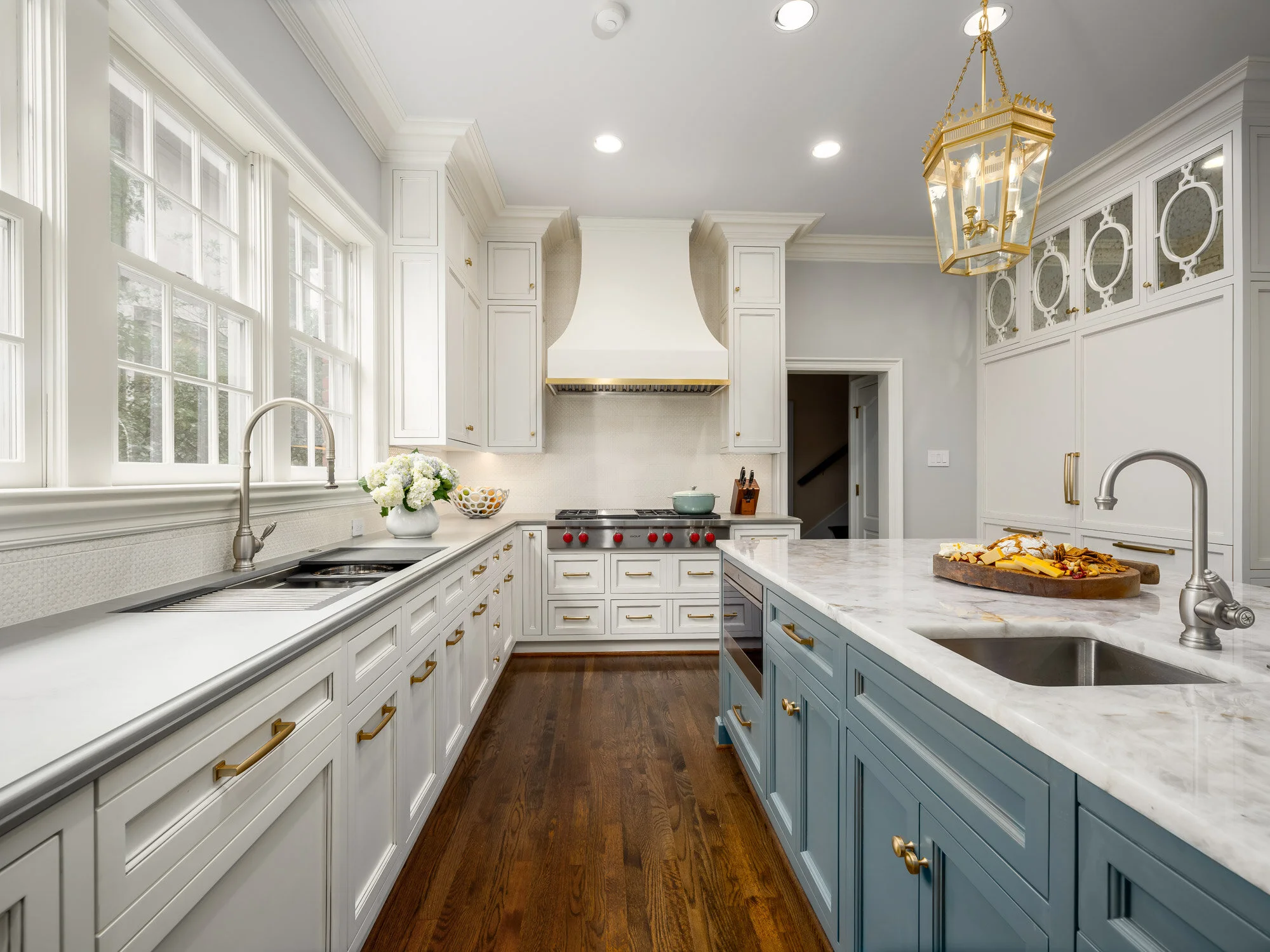
All-white kitchens have an open and airy feel to them. This kitchen is from a home we designed in Preston Hollow.

All-white kitchens have an open and airy feel to them. This kitchen is from a home we designed in Preston Hollow.

In the past, kitchens were usually set apart from the rest of the home. Homeowners today, however, often prefer their kitchens to be a hub where they can work and entertain guests at the same time. Following are some general guidelines for designing a kitchen that can do it all—whether you're renovating your Dallas home or starting from scratch.

The first floor of this Dallas home has an open concept layout. The kitchen connects to the living room on the right.

The first floor of this Dallas home has an open concept layout. The kitchen connects to the living room on the right.

Identify Your Goals

Everyone has different needs for their kitchen, so begin the design process by identifying your top priorities. If you love to cook and entertain, make sure you have more than just one stove. If you don't cook often, there's no need to invest in restaurant-quality burners.

Choose a Layout

The size of your kitchen is another important factor in how you should lay things out. When you've got a small space to work with, you may consider installing an island with storage, overhead pot racks, and cabinets that run all the way up to the ceiling. Running cabinets up to the ceiling eliminates the gap that normally just collects dust. By making storage space a design priority, you can store away as many kitchen appliances as possible. This has the advantage of leaving your countertops uncluttered.

As with any small room, you can help a small kitchen feel more expansive by painting the wall colors in a light shade, and letting in as much natural light as possible. Large kitchens allow for more leeway with amenities (such as the number of ovens), as well as dramatic colors and decorative effects. A midsize kitchen can feel more like a big kitchen if you open it up to the family room. One word of caution, however: you might not want kitchen messes to be in your line of sight whenever you’re in the family room!

We worked with Helene’s Luxury Kitchens on this remodel. You can see how the sink, island, and stove form a triangle.

We worked with Helene’s Luxury Kitchens on this remodel. You can see how the sink, island, and stove form a triangle.

Regardless of whether your kitchen is large or small, it’s worthwhile to plan out pathways. Many designers use the ‘kitchen triangle’ method to plan an ergonomic design. In this method, the fridge, sink, and stove form the three corners of a triangle. Your flatware and dining ware should also be stored close to the dishwasher to make unloading faster and easier. If you want your kitchen to be a ‘hangout’ space, make sure to provide seating that is set away from your work area triangle. Island seating and breakfast tables are two common solutions to this problem.

The stainless steel cabinets and kitchen island (by Bulthaup) share the same gray-blue color in this Kessler Park home.

The stainless steel cabinets and kitchen island (by Bulthaup) share the same gray-blue color in this Kessler Park home.

Pick Complementary Paint Colors and Materials

Speaking of islands, I recommend painting your island the same color as your cabinets to create a unified look. The exception to this rule would be large kitchens, which can visually accommodate a wider variety of paint finishes and colors.

Glass cabinets can help give your kitchen depth and make it feel more spacious. However, remember that your dinnerware will all be on display. If you have dining ware that doesn't match with the rest of your collection, you might want to install frosted glass panes instead.

While there's nothing wrong with stainless steel, make sure to not overuse it. You should also take into consideration the visual flow and rhythm of your kitchen when you choose stainless steel. Putting it everywhere can break up the kitchen's design, making it feel uneven. Stainless steel also scratches easily, so it may not be the best material for counters where you’ll be doing cooking prep. If you have a lot of stainless steel visible in your kitchen and would like to introduce variety, you can have wood fronts installed on your dishwasher, refrigerator, or cabinets.

Glass door cabinets help to highlight the client's beautiful crystal and china collection, as seen above.

Glass door cabinets help to highlight the client's beautiful crystal and china collection, as seen above.

Renovating or designing a kitchen can be a lengthy process. Yet regardless of how much cooking you do, you’ll want your kitchen to be a room you enjoy spending time in. A beautiful, thoughtfully-designed kitchen is always worth the trouble!

Just because you have a historical home doesn't mean you can't enjoy the most up-to-date appliances and modern furnishings. If you think it’s time to update your kitchen, consider reaching out to Chambers Interiors. Our design team is familiar with historical home renovation and can help you update appliances while staying faithful to your kitchen’s aesthetic. Contact us by calling our Dallas office at 214-232-9501 or sending an email to info@chambersinteriors.com.

RELATED ARTICLES:

Quick and Easy Ways to Decorate Your Coffee Table by Margaret Chambers

The flowers on this coffee table are baby blue, matching perfectly with the blue and white china in the room.

The flowers on this coffee table are baby blue, matching perfectly with the blue and white china in the room.

You should never underestimate the impact that a coffee table has on the rest of the room. Coffee tables are important because they’re usually the centerpieces of the living room or the den, so they have an effect on a visitor’s first impression. Fortunately, they’re also pretty easy to style once you know the tried-and-true methods for decorating them.

An antique dog statue adds interest and character to this contemporary Dallas living room.

An antique dog statue adds interest and character to this contemporary Dallas living room.

How you decorate your coffee table depends largely on what shape it is. The six basic coffee table shapes are: round, oval, square, rectangular, hexagonal/octagonal, and “amorphous.” Rectangular coffee tables tend to be easier to decorate because they have more surface area than a similarly sized round or oval table. If you have a round table, try arranging items in a triangular shape, and make sure to include at least one round object on the table.

The classic go-to accessories for a coffee table are stacks of books, something tall (such as a plant or a candle), a storage tray or dish, and one unusual accessory. Don’t push any of the objects out to the corners of the table; it looks better if everything is loosely centered.

Books:

Coffee table books look best when stacked in groups of two to four each. Photography, art, fashion, or interior design books are all great choices. Whenever possible, try to select books with covers that complement the color scheme of the rest of the room.

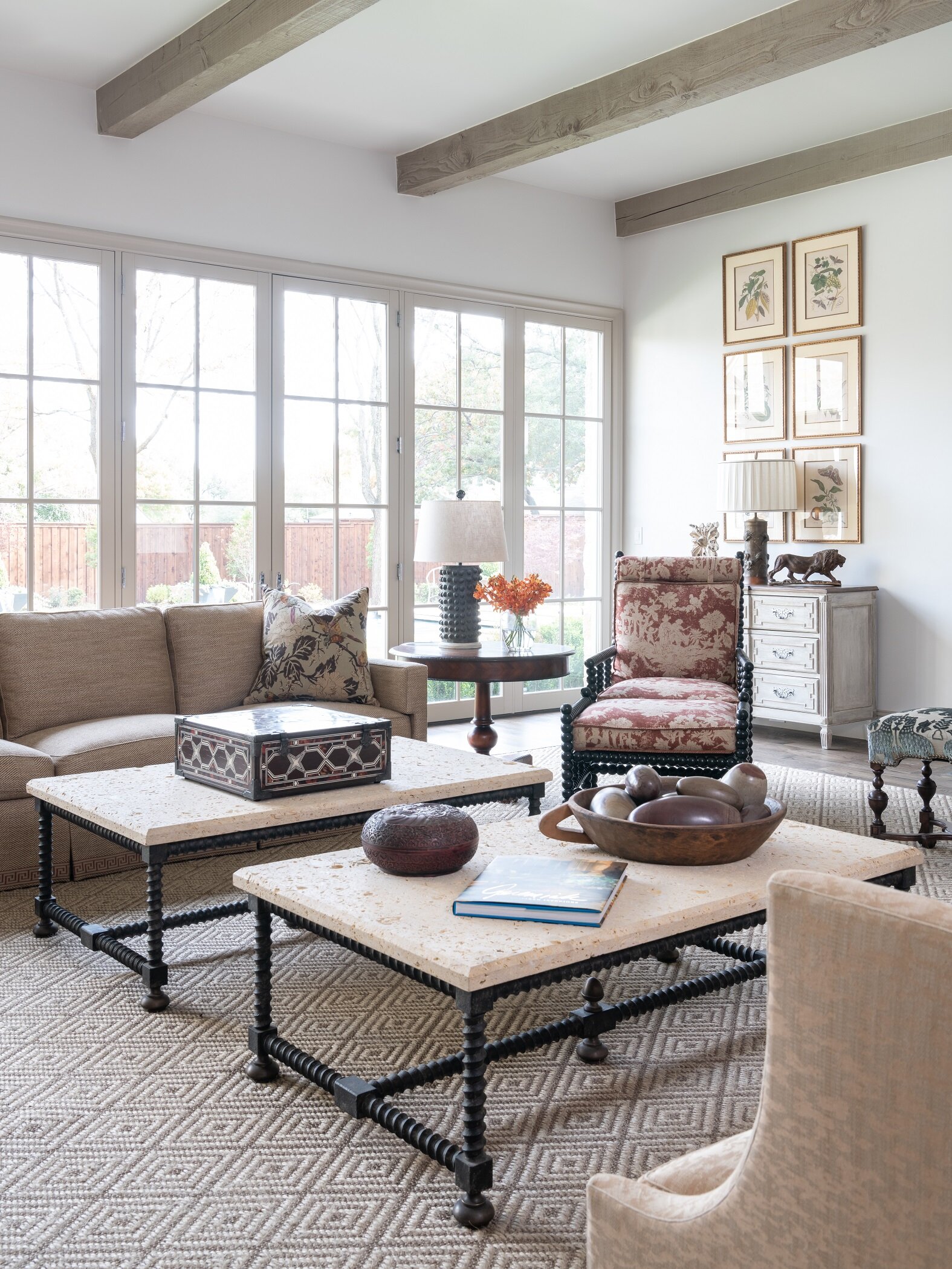
We filled the decorative bowl on this coffee table with Shiva Lingams, which are egg-shaped river stones polished by hand and originally from India.

We filled the decorative bowl on this coffee table with Shiva Lingams, which are egg-shaped river stones polished by hand and originally from India.

Plants:

A coffee table without a single plant (whether faux or live) can feel a little staged. Plants add an organic touch and some texture to the tablespace. As with everything else, the plant needs to be the correct proportion for the table. For example, you wouldn’t want an oversized plant that overwhelms the table, but a tiny potted succulent in the middle of a large table wouldn’t work either. Plants should not be so large that they get in the way of conversation or watching television. For special occasions, you may enjoy swapping out your potted plants with some fresh flowers.

The flowers spilling out of a shallow bowl over this glass-top coffee table add color to the otherwise neutral space.

The flowers spilling out of a shallow bowl over this glass-top coffee table add color to the otherwise neutral space.

Trays and Bowls:

Trays can help organize functional items, such as coasters. Make sure to pick one that doesn’t occupy more than half of the tabletop space, and don’t place it right in the center either. Clear trays and flower vases fade into the background, making your table look a little more spacious. Although many homeowners use their coffee table tray to store remotes, I recommend storing those out-of-sight in drawers or a decorative box instead.

Decorative Objects:

Coffee tables are also a great place to show your personality, since they’re an appropriate spot for unusual collectibles and antiques. Examples can include pretty jewel boxes, antique tea caddies, glass orbs, or small sculptures. To vary the heights of your objects, place decorative objects or plants on top of your stacked books.

Although not every coffee table has to have each of these elements (books, trays, plants, and small accessories), these are usually what you’ll see on a professionally styled coffee table. If your table is smaller, you may want to restrict yourself to just three objects of interest.

The best coffee tables are artfully designed, but functional too: leaving plenty of space for homeowners to set down a magazine or a drink with a coaster. By following these tips, you can design a coffee table that’s not only useable, but also adds some serious style to your Dallas home.

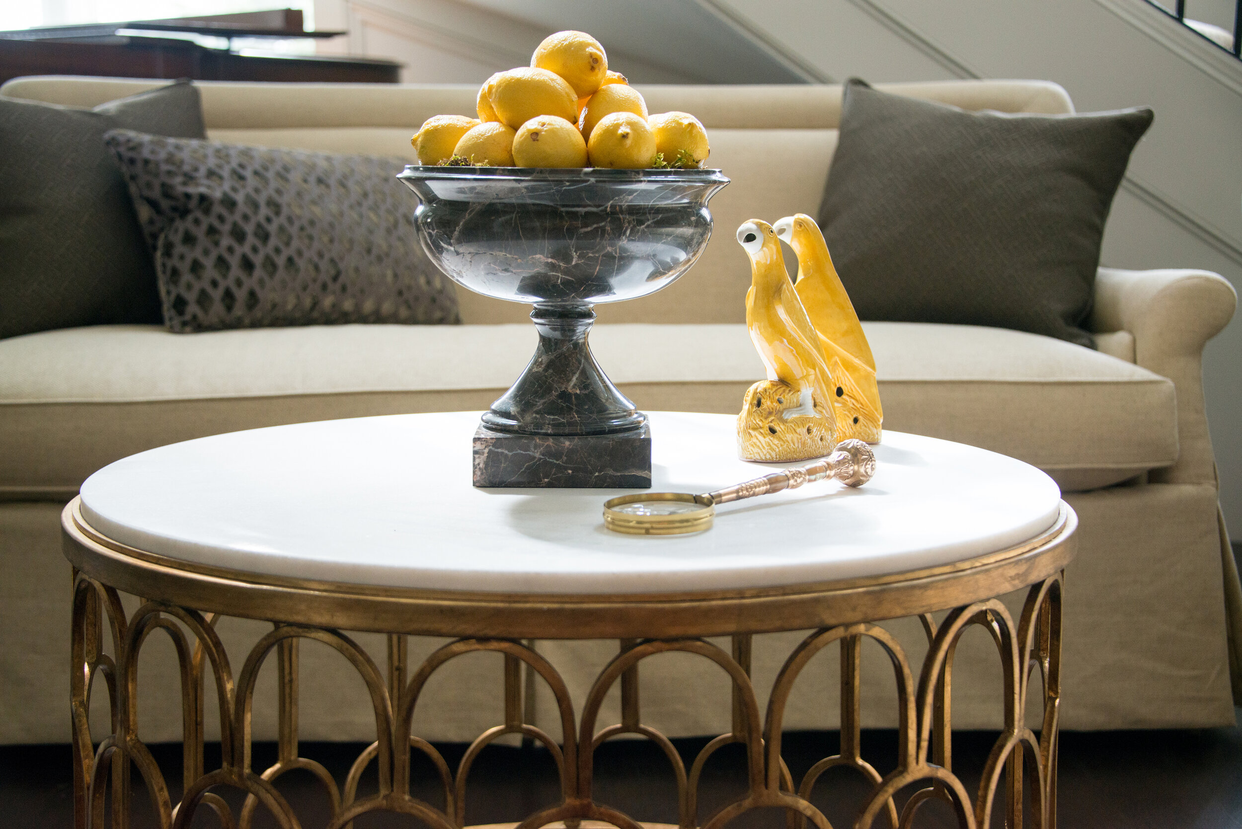
Seen here is a round coffee table from the foyer in SMU’s Kappa Alpha Theta house, which we designed in 2016.

Seen here is a round coffee table from the foyer in SMU’s Kappa Alpha Theta house, which we designed in 2016.

If you need help finding charming accessories for the coffee tables in your home, you may want to consult a professional interior designer. At Chambers Interiors, we know the best places to find antique tea caddies, statues, porcelain plates, and other great accessories for coffee tables. Call our Dallas office at 214-651-7665 or send an email to info@chambersinteriors.com for more information.

RELATED ARTICLES: