design trends

4 Things to Know Before You Update Your Bathroom or Powder Room by Margaret Chambers

A few accessories, like a soap dish or some fresh flowers, are all that's needed to complete a bathroom counter.

A few accessories, like a soap dish or some fresh flowers, are all that's needed to complete a bathroom counter.

Bathrooms and powder rooms are woefully overlooked areas in home design. Many people consider designing them an afterthought, or aren’t sure how to work with a small space. But no matter how small your powder rooms are, you deserve to have ones that are thoughtfully planned and tastefully designed. If you’re thinking about giving the bathrooms in your Dallas home a quick update—or an extensive remodel—you’ll surely find these tips useful.

Brunschwig & Fil’s iconic “Les Touches” wallpaper adds a playful touch to this bathroom we designed for a Dallas home.

Brunschwig & Fil’s iconic “Les Touches” wallpaper adds a playful touch to this bathroom we designed for a Dallas home.

2021 Bathroom Trends:

Although grey was a popular wall color for bathrooms the last few years, in 2021 it’s starting to go out of style. Instead, warmth is being brought into bathrooms through the use of gold or brass fixtures and wood accents. Wallpaper has also come back into style. If you do want to put up wallpaper, shop for the vinyl kind that is moisture-resistant.

While you’re updating, take a look into some of the latest developments in bathroom technology. These include smart showers that can be remotely set to start running, voice-activated lighting and temperature controls, and Bluetooth speakers for baths and showers. Heated floors have also been gaining popularity for some time now.

Layout Tips for Bathroom Remodels:

A common bathroom design mistake is to make your toilet the first thing a visitor sees when they enter the bathroom. Choose anything else as your focal point beside the toilet, such as your mirror, your bathtub, or your vanity. The toilet should be out-of-sight from the entrance whenever possible.

This area, with the freestanding tub and large antique mirror, serves as the focal point for this bathroom in Colleyville.

This area, with the freestanding tub and large antique mirror, serves as the focal point for this bathroom in Colleyville.

Bathrooms don’t have to be spacious to be appealing. To make a small powder room feel more luxurious, splurge on a few nice materials and finishes. If you prefer to take showers over baths, don’t take up too much floor space with a large tub.

When we remodeled this shower, we added glass doors, mosaic floor tiles, slabs of Carrera marble, and brass hardware.

When we remodeled this shower, we added glass doors, mosaic floor tiles, slabs of Carrera marble, and brass hardware.

You can maximize elbow room by installing a glass panel or shower curtains instead of a shower door. This way, you also won’t have to worry about your door swinging out and hitting the vanity.

Don’t forget to plan for storage space. Upper vanity cabinets along either side of the mirror are a smart solution for keeping toiletries out of sight. You can even build electrical outlets into the cabinets for plugging in your hairdryers and electric toothbrushes.

Choosing Flooring and Tiles:

There’s a reason why most bathrooms have tiled floors. Carpeting absorbs moisture and can develop mold, and if wood flooring becomes water damaged, it’s costly to replace. If you want the look of wood without the risk of water damage, I’d recommend porcelain tiles with a faux bois grain finish that emulate the look of real wood panels.

Improvements in manufacturing have paved the way for new and improved tile patterns, including chevron, diamond, hexagon, arabesque, and fish scales. I’m starting to see homeowners want to try new patterns instead of defaulting to subway tile.

The Best Lighting for Powder Rooms:

Lighting is always important for home design, and bathrooms are no exception. Older fluorescent light bulbs can cast an unflattering blue hue on skin, while dim lighting makes bathrooms feel small and closed-in. If the color tone of your bulbs is a cool white, update them with a warmer white.

The vertical cabinets in this vanity are great for storing toothbrushes, medications, etc. so they stay out of sight. The cabinets also contain electrical outlets, so everything can stay conveniently plugged in and ready to use.

The vertical cabinets in this vanity are great for storing toothbrushes, medications, etc. so they stay out of sight. The cabinets also contain electrical outlets, so everything can stay conveniently plugged in and ready to use.

As you update your lighting, make sure not to install the fixtures too far above your mirror, or else they’ll cast shadows on your face. Either bring the lights low enough so that they’re almost touching the mirror, or place sconces on either side of the mirror.

To make a bathroom feel light and airy, find a way to filter daylight in. A window to the outside or a skylight through the ceiling are both options. You can always put shutters over the window for more privacy.

We normally use tile in bathrooms, but the client wanted wood floors. To protect them, we added polyurethane coating.

We normally use tile in bathrooms, but the client wanted wood floors. To protect them, we added polyurethane coating.

For your finishing touches and decorations, keep things simple. Instead of cluttering counter space with lots of accessories, buy practical items—such as pretty soap dispensers—that are decorative and integrate into your overall design theme.

If your bathtub is next to a window, you can always add shades for privacy, like this motorized Roman shade we used.

If your bathtub is next to a window, you can always add shades for privacy, like this motorized Roman shade we used.

Many people in Dallas continue to work from home and are thinking about ways they can give their surroundings a facelift. Whether you’re planning a full bathroom remodel, or just want to make better use of the space and layout you already have, the designer tips above will come in handy.

For those of you who are looking to bring in a professional, you should know that Chambers Interiors has a lot of experience a bathroom remodels. To schedule a free consultation, email us at info@chambersinteriors.com or call our Dallas office at 214-651-7665.

RELATED ARTICLES:

Decorating With Bold Colors: Tips for the Color-Shy by Margaret Chambers

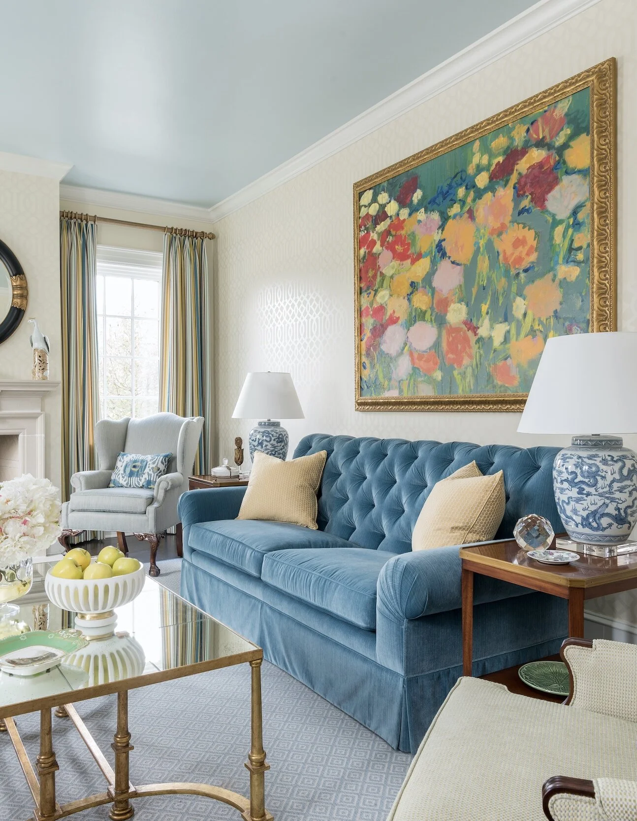
Artwork, like this floral painting over the sofa in SMU’s new Kappa Alpha Theta house in Dallas, is a great opportunity to add a burst of color to your room.

Artwork, like this floral painting over the sofa in SMU’s new Kappa Alpha Theta house in Dallas, is a great opportunity to add a burst of color to your room.

Although bold colors have been trending the last few years, many homeowners wonder, ‘how much is too much?’ In my own design work in Dallas, I’ve been including more color in projects lately. I thought that readers would appreciate some tips on how to work with bold colors in a balanced way.

Starting Small

If you’re new to using bold paint or wallpaper colors, try them in a smaller space like a powder room first. For powder rooms, however, I suggest staying away from bright green. Green casts an unflattering hue on you or your guest in the mirror.

We used a metallic butterfly wallpaper to give this powder room a “jewel box” feel.

We used a metallic butterfly wallpaper to give this powder room a “jewel box” feel.

Brightly colored accessories such as throw pillows, stools, artwork, ottomans, and blankets can be easily swapped out if you get tired of them. If you’d like to add some boldly colored furniture, consider having the furniture you own repainted rather than buying new furniture. Other easy ways to introduce color into the room include buying fresh flowers, getting new lampshades, or putting books with colorful covers on your shelf.

Picking the Dominant Color

The size of your room determines how much color you can comfortably accommodate. In a large room, it would be overwhelming to use a bold paint color on all four walls. In small and medium rooms, however, you can get away with a bold base color.

Some colors can function as neutrals even if they aren’t traditionally thought of as such. For example, navy blue and moss green are soothing to the eye and often used as base colors. The location and architecture of your home can also affect what colors look best in it. Rust red and navy typically look best in traditional homes. Blue-and-white rooms are often associated with coastal style (although you don’t necessarily have to live on the coast to use these colors).

This bedroom is an example of how you can use different shades of the same bold color—like light blue, cobalt, and navy—to create a balanced color scheme.

This bedroom is an example of how you can use different shades of the same bold color—like light blue, cobalt, and navy—to create a balanced color scheme.

Picking Your Secondary Colors

Before you commit to a bold color, pick out your secondary colors to go with it. One good formula is to have sixty percent of your room be in a neutral color, thirty percent in a stronger color, and save the last ten percent for your boldest colored accessories.

Usually the brighter a bold color is, the more challenging it is to work with. Bold colors that are toned down just a notch are a safer bet. For example, consider using burnt orange instead of pumpkin orange, soft yellow instead of highlighter yellow, and brick red instead of fire engine red.

The shades of orange we used in this north Dallas guest bedroom are just bright enough to give the room personality without making it too energizing.

The shades of orange we used in this north Dallas guest bedroom are just bright enough to give the room personality without making it too energizing.

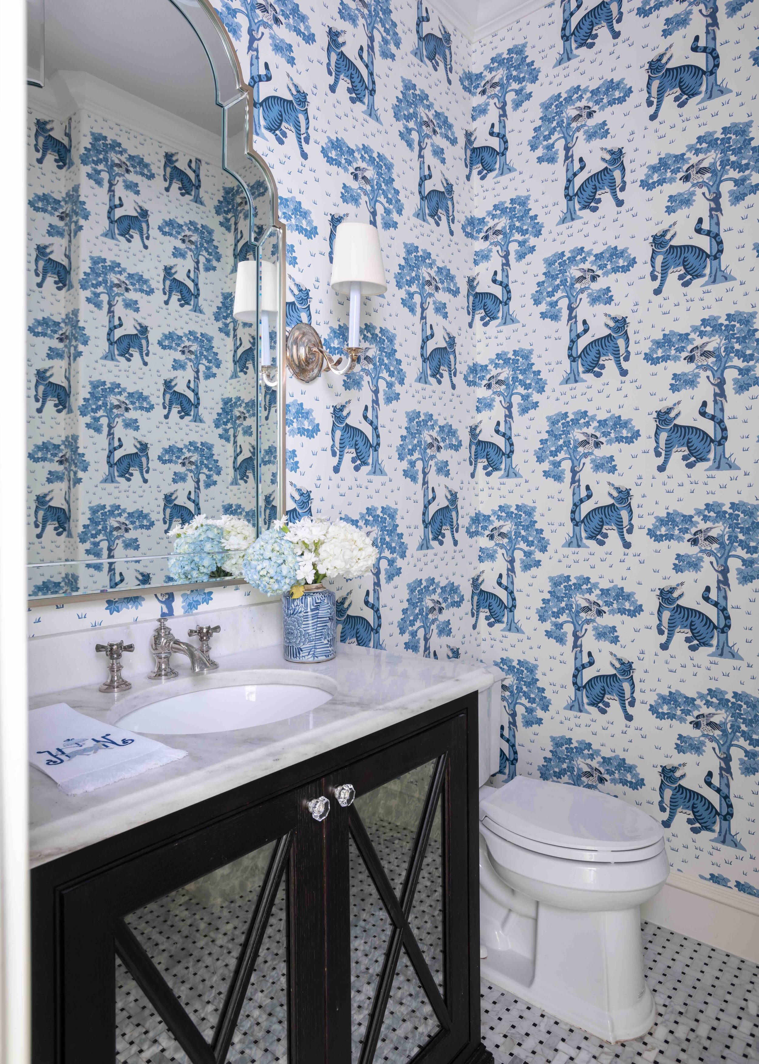
The blue and white tiger wallpaper in this Preston Hollow powder room shows how bright colors can give small rooms more impact.

The blue and white tiger wallpaper in this Preston Hollow powder room shows how bright colors can give small rooms more impact.

Blue-and-white is a classic color combination that never goes out of style. You can get away with very vibrant shades of blue by pairing them with white. After all, it’s a color combination that our eyes are used to seeing—think of white clouds in a blue sky. If you want your room to be really energizing, decorating with one bold color and lots of black and white will give you the high contrast look you need. Placing bright artwork and accessories against a mostly white backdrop is another appealing combination.

For balance and depth, use different, less-intense tones of your boldest color throughout the room. When it comes to patterns, choose either a bold color in a subtle pattern or a busy pattern in a muted color. Chaotic patterns in bright colors are the most difficult to work with.

Coordinate the Rest of Your Home

While not every room in your home needs to have the same color scheme, it’s important that the colors flow naturally. So, if you have one room with a bright pink and teal color scheme, don’t decorate the next one with navy and red. One way to ensure the colors in your rooms flow together is to invert your color combination for adjoining rooms. For example, if your sitting room has green walls and white accents, the next room over could be mostly white with bright green accents.

Vivid colors can be beautiful in both contemporary and classical homes. We decorated this traditional cottage in University Park with bright pink colors.

Vivid colors can be beautiful in both contemporary and classical homes. We decorated this traditional cottage in University Park with bright pink colors.

Although every year sees new colors come into fashion, try not to focus exclusively on what’s trending. A room with a well-balanced, aesthetically pleasing color scheme will always look great no matter the year.

By following some of the tips outlined above, you’ll hopefully have the knowledge you need to start incorporating bold colors in your home. However, if you’re still not confident that you can integrate your favorite eye-popping fabrics, wallpapers, and paint colors, consider giving us a call. As you can see from the photos of recent projects featured here, we have a lot of experience working with color. Call our Dallas office at 214-232-9501 or send an email to info@chambersinteriors.com to schedule a free consultation.

RELATED ARTICLES:

The Top Six Interior Design Trends for 2021 by Margaret Chambers

This powder room we designed is a perfect example of three 2021 trends: bold colors, wallpaper, and global influences.

This powder room we designed is a perfect example of three 2021 trends: bold colors, wallpaper, and global influences.

Over the course of my interior design career, I have watched many trends come and go. Some looks are timeless and never seem to go out of style. Others fall in and out of favor in decades-long cycles. In this article, I’ll touch upon the six trends I am seeing come back for 2021: colorful interiors, antiques, globally-inspired rooms, home offices, brass hardware, and wallpaper.

Color:

Starting around the 2010s, designers and homeowners alike gravitated towards neutral interiors with cool grays, dark hardwood floors, and all-white walls. Recently, I’ve started to see things swinging back in the other direction. Colors, especially rich colors (like ocean blues), are finally back. I think this is due in part to Instagram, where colorful interior photos seem to attract more attention than neutral ones. While I have designed many white-and-gray homes at my clients’ request, I’ve always preferred color and am excited to see homeowners favoring it once again.

For this Preston Hollow dining room, we decorated the wall with antique Rose Medallion plates.

For this Preston Hollow dining room, we decorated the wall with antique Rose Medallion plates.

Antiques:

Contemporary design has enjoyed precedence for quite a while now; meanwhile, Old-World styles went out of fashion. Nowadays, however, people are wanting to mix old and new pieces again. Since people are spending a lot more time at home, buyers are more attracted to comfortable furniture with rounded curves and traditional detailing instead of sharp lines and sleek metals. Antiques add history, warmth, soul, and character to a house.

This older project from our portfolio still looks current today due to the use of bold colors and multicultural art.

This older project from our portfolio still looks current today due to the use of bold colors and multicultural art.

Although antiques are not as valuable as they once were, I predict that buyers will begin to seek them out again this year. Antiques and vintage items also appeal to young homeowners because they are a more sustainable option than newly-produced furniture.

Globally-Inspired Rooms

Another trend that design experts are predicting for 2021 is globally-inspired and travel-inspired rooms. This makes a lot of sense, since many of us have spent the year yearning for travel. With the right décor, it’s possible to make any room feel like a tropical getaway, coastal oasis, or luxury hotel room. Some interior designers are also seeking to include influences from Africa and India in their work.

Home Offices

The patterned wallpaper we placed on this dining room ceiling helps to create the illusion that the ceiling is taller.

The patterned wallpaper we placed on this dining room ceiling helps to create the illusion that the ceiling is taller.

Global Workplace Analytics, a research and consulting firm, predicts that twenty-five to thirty percent of the workforce will continue to work from home for multiple days of the week by the end of 2021. Although most people will be working outside of the home this coming year, the trend of renovating home offices is here to stay. This year will also see many people turning their rooms into multi-purpose spaces, such as combining a living room with a home office.

Brass Hardware:

For many people, brass hardware screams ‘the 80s.’ Interestingly, it’s been making a comeback for the last few years. This may be related to last decade’s trend of tonal gray rooms: brass added some much-needed contrast and warmth to those otherwise cool spaces. One newly popular brass finish is “living finish,” which starts out bright and patinas naturally over time.

Wallpaper:

Wallpaper has been back for four or five years now and is still going strong. Lately, I see a lot of wallpapered ceilings and bathrooms. The one area of the house where it’s still considered “too dated” for wallpaper is the kitchen.

This north Dallas project we designed features framed de Gournay wallpaper prints.

This north Dallas project we designed features framed de Gournay wallpaper prints.

The trendiest patterns include botanicals, geometrics with metallic colors, textured wallpapers, and trompe-l'œil wallpaper (such as faux bois or faux tiled patterns). Some people also frame wallpaper panels and display them as pieces of artwork.

If you’ve been wanting to redecorate but have worried that your love for color, brass, antiques, or wallpaper dates you, fear not. Now is the perfect time to capitalize on those looks, so reintroduce them into your home to your heart’s content.

Is one of your new year resolutions to update your home for 2021? You can make the process easier and smoother by enlisting the help of a professional interior designer. To schedule a free consultation with us, call our Dallas office at 214-232-9501 or send an email to info@chambersinteriors.com.

RELATED ARTICLES:

Window Treatments: What to Know Before You Start Shopping by Margaret Chambers

These curtains with a modern trellis pattern pair beautifully with the shutters in this Dallas home.

These curtains with a modern trellis pattern pair beautifully with the shutters in this Dallas home.

When it comes to home decorating, choosing window treatments can be one of the most daunting parts of the process. Even when you know exactly what you want, finding drapery in the right size and color for your Dallas home can be tricky. On the other hand, you might feel like there are just too many options to choose from. If you could use ideas on where to begin, read on for some interior designer tips.

The first step to choosing window treatments is to decide whether you want 'hard' or 'soft' window treatments. Hard treatments include blinds, shades, and shutters, while soft treatments include drapes and curtains.

Drapes and Curtains

Striped curtains with bright colors were used for the formal living room in SMU's new Kappa Alpha Theta house.

Striped curtains with bright colors were used for the formal living room in SMU's new Kappa Alpha Theta house.

The words ‘curtains' and 'drapes' are used synonymously by many people but actually have different definitions. Curtains are unlined and can run to any length. Because they’re unlined, they are more lightweight than drapes and come in a wider variety of colors and patterns. Drapes, which are more formal, are lined to block out light, often run from the top of the window to the floor, and are usually made of heavier fabrics such as velvet, damask, or silk.

Once you’ve decided on the kind of soft window treatment you’d like, you'll need to decide on color, fabric, length, and hardware. If you are buying your own fabric, see if the store will let you take home a swatch. By bringing back a swatch, you can test how the texture of the fabric will look in the light of your space. Remember that patterns will look very different in person than they will in a sample image. Stripes, for example, will not look as straight in the folds of a curtain, and small-scale patterns will lose their detail from a distance.

Fabrics

We chose sheer curtains for this living room in Kessler Park. They allow plenty of natural light to filter through.

We chose sheer curtains for this living room in Kessler Park. They allow plenty of natural light to filter through.

Heavier fabrics are considered to be formal, while lighter fabrics feel much more casual. Choose heavier fabrics for a luxurious look, as they are well suited for full-length drapes with pinched pleats. If you don't need much privacy in a room, you can let in more light with sheer curtains. Regardless of what material you use, choose colors that harmonize with the rest of the room. You never want your window treatments to distract from a beautiful view (or the room itself)!

Length

Length is important to consider as well. Some homeowners like to emphasize the height of their rooms by running drapes from ceiling to floor. A crisper look is created by letting curtains hang just above the floor. You can also have 'cafe-style' curtains that only cover the lower half of the window: the kitchen is a great place for curtains like these.

Buying store-bought drapes will be less expensive than buying your own fabric, but these drapes don't always come in a wide range of styles and colors. If you buy curtains or drapes from the store, keep looking until you find something you love. You can bring the whole look together with carefully chosen hardware, finials, and ties.

Trends

Trends in curtains and drapes today include patterns, grommets, and vertical and horizontal banding. Since patterns have enjoyed a recent upswing in popularity, you can expect to see a variety of geometric, floral, trellis and stripe patterns when you shop. Valances are not as common as they used to be, but can still be useful for softening the look of an otherwise undecorated window, hiding hardware, or adding color to a set of blinds. The latest trend in hardware is to use small finials and thin rods made of metal for a more understated look. Pinch pleats have always been a classic choice, but looser pleats and inverted box pleats are popular for contemporary homes.

Valances are common in traditional design, making them a good choice for these drapes in a University Park chateau.

Valances are common in traditional design, making them a good choice for these drapes in a University Park chateau.

Even after exploring all of your options at the fabric store, you may find it difficult to get the exact color and sizes you need. In this case, an interior designer can help you order the perfect custom window treatments.

Shades, Blinds, and Shutters

Whether you should choose hard, or soft window treatments depends on your needs for each room. Consider the following: do you need to protect your colorful furnishings from the sun? Will glare make it difficult to watch TV? Will insulating your windows with shades help keep down the cost of heating your home? If the answer to any of these questions is ‘yes,’ you may want to install hard treatments. Many homeowners choose shades, blinds, or shutters when they want to control the light in their room without introducing a lot of texture and color.

Shades

Shades offer privacy, light control, and a clean-cut look. They can be made of either synthetic or organic materials, and come in a wide range of styles. Roller shades are a good choice for contemporary homes because of their minimalistic look; meanwhile, woven and wood shades fit with casual chic and rustic rooms. Honeycomb and cellular shades are also great insulation for your windows.

Here you can see an example of patterned Roman shades. The colors match with the grays and blues throughout the house.

Here you can see an example of patterned Roman shades. The colors match with the grays and blues throughout the house.

Cloth shades such as Roman or balloon shades feature the patterns and soft look you normally get with drapery. The difference is that unlike drapes, cloth shades have an easy up-and-close function. Choosing cloth shades over drapes can also save space in tight areas, such as between corner windows. One brand of grasscloth shades, Conrad Shades, is only available through interior designers. These shades are custom-woven to fit the size of your window.

Some people combine Roman shades with curtains. To make this look work, you’ll need to make sure there will be space left between the two of them. You can either install the shades inside the window frame or situate the rod so that there is enough depth between the curtains and shades.

Blinds

Unlike shades, blinds can be tilted with louvers to let in light at an angle. Blinds are usually made of either aluminum, wood, or faux-wood. Wood blinds are a classic choice that suits many different decorating styles. They are also offered in a variety of finishes, such as bamboo and pine. Faux wood blinds will not warp over time, so they are a smart choice for people living in high humidity climates.

When you buy blinds, you have multiple options for the slat sizes. For reference, the most commonly chosen slat size for blinds is two inches. A good rule of thumb is that the slat size should match the size of your window: large slats for large windows, and small slats for small windows. Two-inch slats are what you’d usually choose for medium-size windows.

Shutters

This Dallas ranch home that we updated featured plenty of wood shutters.

This Dallas ranch home that we updated featured plenty of wood shutters.

Shutters are made of either wood or vinyl and are more of an expensive, long-term option. Unlike blinds and shades, they do not lift to reveal the view, but can be opened out at the hinges from within the window frame. Shutters add sophistication and architectural detail to your windows. In the end, they can even increase the value of your home. Regular shutters and blinds have one inch of space between louvers. Plantation shutters have two to three inches of space, which lets you see more of the view.

Not sure what kind of blinds, shades, or shutters would work best for your Dallas home? Since window treatments can be a big commitment, some people prefer to seek a professional opinion. At Chambers Interiors, we help our clients find the best treatments for their windows. To set up your free consultation, call us at 214-232-9501, or email us at info@chambersinteriors.com.

Related Articles:

How to Decorate with Faux Bois, the Classic That’s Making a Comeback by Margaret Chambers

This garden bench by Currey & Company resembles wood branches, but is actually made of concrete. For more information on where to buy Currey & Company pieces, please contact us.

This garden bench by Currey & Company resembles wood branches, but is actually made of concrete. For more information on where to buy Currey & Company pieces, please contact us.

Even if you’ve never heard the term, “faux bois,” you’ve almost certainly seen it used in interior design. Faux bois means “false wood” in French. It can be any kind of decorative item, but when people talk about “faux bois,” they usually mean the cement, stone, or cast iron furniture that is shaped and patterned like wood. Though faux bois fell out of favor for a few decades, interior designers here in Dallas and elsewhere are seeing it make a comeback.

The first example of faux bois was a garden bridge created by Joseph Monier, a Frenchman, in 1875. Monier layered concrete and sand over metal rods and sculpted them to look like wood branches. In recent years, faux bois has remained an important tool for interior designers as certain woods have become more rare and expensive.  

Examples of Faux Bois

We decorated this outdoor patio with faux bois benches by Currey & Company.

We decorated this outdoor patio with faux bois benches by Currey & Company.

Faux bois furniture is traditionally used for the outdoors. For example, faux bois is a great choice for patio furniture, bird fountains, gardening tables, planters, and more.

The latest trend in Dallas and elsewhere is bringing faux bois inside to pull a touch of nature into the home. A popular accessory is the faux bois mirror, which is bordered by interlocking imitation tree branches.

Other examples of faux bois can include dinnerware, wallpaper, lampshades, and fabrics with a painted or printed wood grain pattern. Even glass can be crafted to have a distinctive wood grain look.

Faux bois cement pieces are much more durable than real wood, and can last over 100 years. Unfortunately, newly produced cement faux bois is becoming rarer and rarer. If you want to buy antiques, you can start by looking at the differences between European and North American faux bois and decide which style you like best.

Faux Bois Furniture Traditions in America

The frame of this mirror is surrounded by faux bois branches and leaves, which resemble carved wood.

The frame of this mirror is surrounded by faux bois branches and leaves, which resemble carved wood.

In the 1920’s, Mexican-born artist Dionisio Rodriguez developed his own take on faux bois. The Mexican style of faux bois is called “El Trabajo Rustico,” or ‘the rustic work.’ Trabajo rustico furniture were usually tinted and given highly naturalistic details such as lichen, peeled bark, and knotholes.

Today, Rodriguez’s largest pieces are kept in the Brackenridge Park in San Antonio. Carlos Cortes, Rodriguez’s great-nephew, continues the tradition using steel-reinforced concrete in his studio in San Antonio.

Another designer who made faux bois a hit in America was John Dickinson. In the 1970s, Dickinson’s design collection included faux bois lamps and mirrors with cast concrete “twigs.” He used a distinctive chalk white finish for many of these pieces. John Dickinson’s furniture and accessories command high prices from collectors today.

Now that it’s the twenty-tens, faux bois is probably enjoying another resurgence in popularity because of Martha Stewart, who fell in love with Rodriguez’s pieces in Brackenridge Park and released her own line of faux bois bath items.

Faux Bois Design Tips

Because faux bois has been around for such a long time, you don’t need to worry about it being a passing fad. It also has the advantage of blending with either rustic, shabby chic, or upscale contemporary rooms.

This accent table by Currey & Company is well-suited for the indoors, too.

This accent table by Currey & Company is well-suited for the indoors, too.

If you want your faux bois pieces to have their maximum impact, limit them to one or two per room. Visitors will enjoy the surprise of seeing tree stumps as low tables, or wood branches as hanging rods. You can mix these pieces easily with real wood and other organic textures, such as a sisal rug.

Introducing a bold graphic wood-grain print is one example of how faux bois should be used in modern interior design. Faux bois wallpaper can come in playful colors, and there are a variety of options for the scale, texture, or subtlety of the pattern too. One smart way to update your kitchen cabinetry is to find a painter who’s experienced with a faux wood painting finish.

Our design team at Chambers Interiors in Dallas has personal experience decorating with faux bois. Whether you already own faux bois and could use some creative ideas for decorating with it, or you’re interested in buying faux bois furniture for the first time, Chambers Interiors can help you bridge the gap between your vision and your next home.

Related Articles:

Incorporating Mirrored Furniture Into Your Home by Margaret Chambers

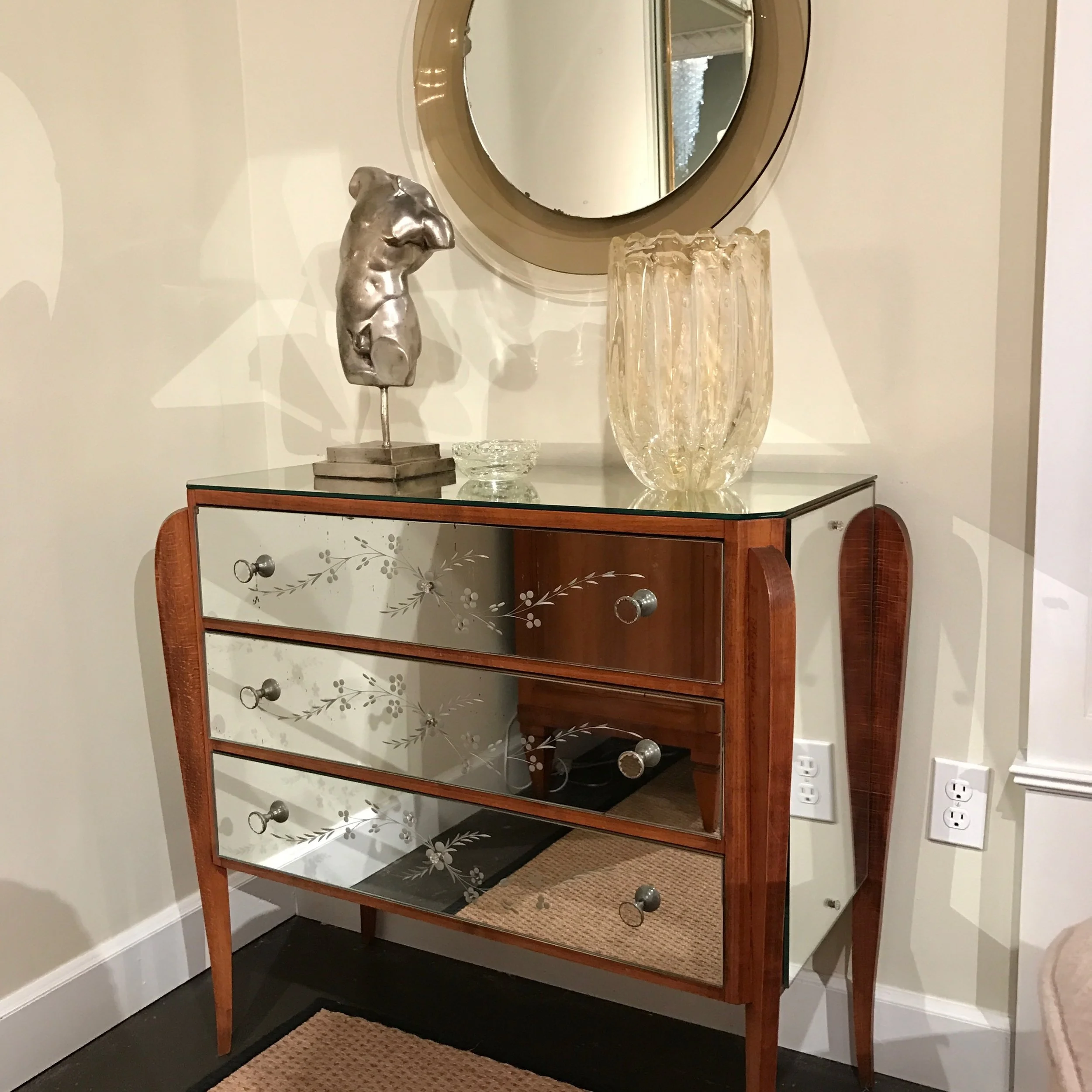
mirrored-chest-of-drawers

If you've ever shopped in Dallas and seen mirrored furniture on display, you may have wondered: is mirrored furniture in style? Or out of style?

Back in the 90's, mirrored furniture was overused in interior design, so it went out of style for awhile. However, mirrored furniture started to come back steadily in the early 2000's. Most interior designers now believe that it's a trend that's here to stay. 

To some people, mirrored furniture has a classic look that will always bring a touch of glamour and elegance to a room. Others believe that these pieces work best when they're used with restraint.  By following some basic guidelines, you should have no trouble finding the perfect place for these pieces in your home.

History of Mirrored Furniture

This 3-part mirrored desk by Bungalow 5 commands quite the presence with its high shine and ample storage space. If you’re interested in purchasing Bungalow 5 products, please feel free to reach out to us.

This 3-part mirrored desk by Bungalow 5 commands quite the presence with its high shine and ample storage space. If you’re interested in purchasing Bungalow 5 products, please feel free to reach out to us.

The earliest examples of mirrored furniture date back to the 18th century. At that time, mirrored woman’s dressing tables were especially popular. However, most of the new mirrored furnishings you find today are actually inspired by pieces from the Art Deco period in the 1920's and 30's. 

That's why when people see mirrored furniture, they might think of old Hollywood interiors. Mirrored furniture can feel both glamorous and retro at the same time, so it works best when mixed with other styles.

Dallas-ranch-home-mirrored-chest.jpg

Pros and Cons of Mirrored Furniture

One major benefit of introducing reflective surfaces into a room is that it gives the illusion of extra space. While a wooden armoire with dark staining feels visually "heavy," the same armoire with mirrored panels will actually "recede" by reflecting what is around it.

Although mirrors can bounce light around a room, they also make a room feel cool instead of warm--much like metal furnishings. The high sheen of this furniture can serve as a bridge between classical and contemporary elements in a room.

Bungalow 5 has also released this stunning 7-drawer storage piece. Its overall structure takes inspiration from Italian midcentury design, while the rippling wave pattern is a stylish addition.

Bungalow 5 has also released this stunning 7-drawer storage piece. Its overall structure takes inspiration from Italian midcentury design, while the rippling wave pattern is a stylish addition.

The downsides to owning mirrored furniture include their cost of repair. Fixing any damage made on mirrored furniture can be a challenge. Also, keep in mind that you'll need to wipe away fingerprints, dust, splashes, and stains regularly. While cleaning may be frequent, however, it is also much easier to clean than wood. For instance, a wet glass that would leave on ring on wood furniture wouldn’t do the same on mirrored furniture.

Where to Put Mirrored Furniture in Your Dallas Home

Pictured above is the Cecilia center/dining table by Bungalow 5. It is made of wood with a mirrored surface.

Pictured above is the Cecilia center/dining table by Bungalow 5. It is made of wood with a mirrored surface.

The best kind of mirrored furnishings for bedrooms include wardrobes, chests, side tables, and dressing tables. A bed with mirrored frames makes an especially dramatic, mmirrore contemporary statement. For your living rooms, consider having a mirrored coffee table, end tables or sideboard. Mirrored folding screens can also add a touch of style to a large room.

Of course, you don't have to commit to a large statement piece. Chairs with a band of mirrored glass around the frame, or a small mirrored bedside table, can also add just a touch of sparkle.

On the other hand, you'll want to avoid putting this kind of furniture in busy rooms that already have a lot going on. A good rule of thumb is to have no more than one or two pieces in the same room.

Don't forget that mirrors can also be made with gray finishes to tone down their shine, while antique patinas give mirrors a unique "smoky" look.  Unless you're after an antiqued patina, there's no need to track down real period pieces, however. Antique mirrored furniture was often cheaply made, since it's easier to glue on mirrors than staining or carving a wooden piece of furniture. We have the ability to help you find newer pieces that have this same, antiqued look.

As you can see, mirrored furniture is surprisingly versatile. When placed with care, these captivating pieces can make the whole room feel larger, bridge the gap between classical and modern, or add a glitzy shine. If you want to make sure that you're bringing out the full potential of your mirrored furniture, here at Chambers Interiors we often use mirrored pieces in contemporary, transitional and traditional spaces. If you're starting from scratch, we can also help you locate a wide variety of mirrored pieces in the Dallas Design District that are perfect for your interior.

Related Articles: