contemporary

Decorating With Bold Colors: Tips for the Color-Shy by Margaret Chambers

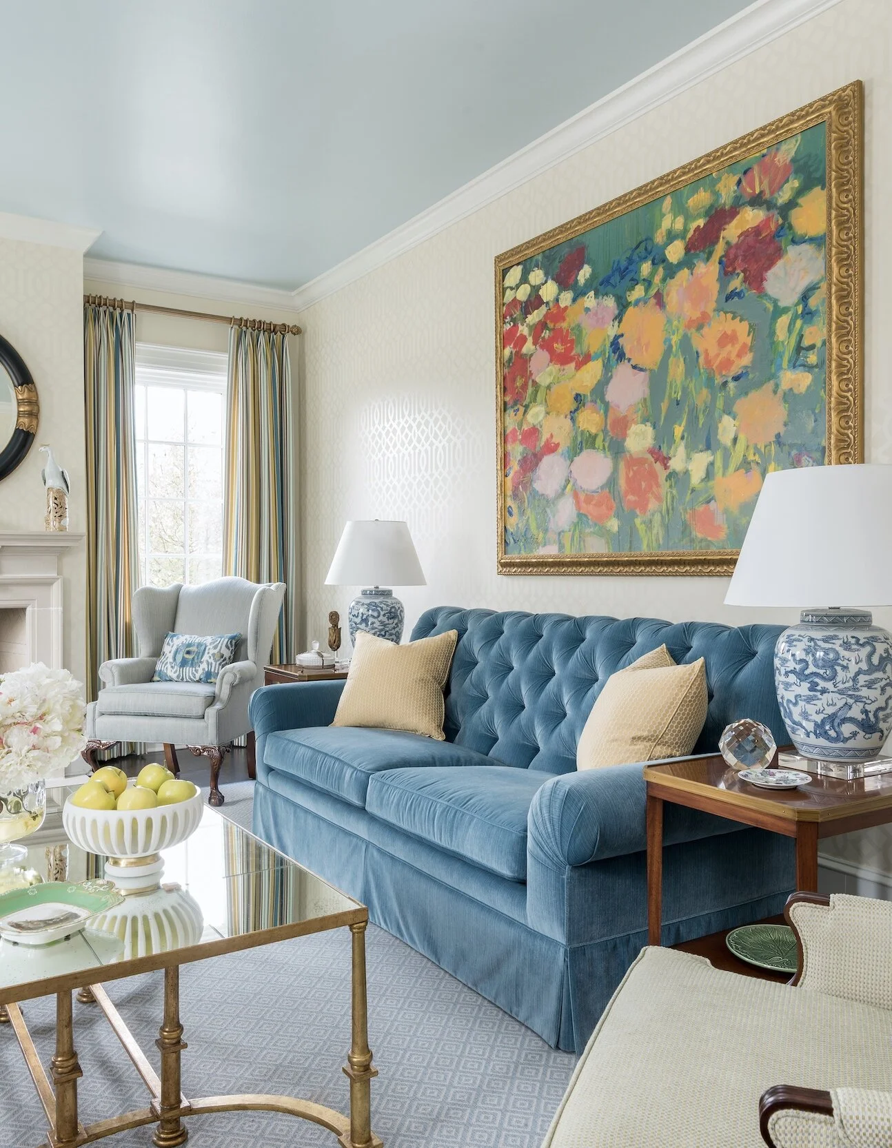
Artwork, like this floral painting over the sofa in SMU’s new Kappa Alpha Theta house in Dallas, is a great opportunity to add a burst of color to your room.

Artwork, like this floral painting over the sofa in SMU’s new Kappa Alpha Theta house in Dallas, is a great opportunity to add a burst of color to your room.

Although bold colors have been trending the last few years, many homeowners wonder, ‘how much is too much?’ In my own design work in Dallas, I’ve been including more color in projects lately. I thought that readers would appreciate some tips on how to work with bold colors in a balanced way.

Starting Small

If you’re new to using bold paint or wallpaper colors, try them in a smaller space like a powder room first. For powder rooms, however, I suggest staying away from bright green. Green casts an unflattering hue on you or your guest in the mirror.

We used a metallic butterfly wallpaper to give this powder room a “jewel box” feel.

We used a metallic butterfly wallpaper to give this powder room a “jewel box” feel.

Brightly colored accessories such as throw pillows, stools, artwork, ottomans, and blankets can be easily swapped out if you get tired of them. If you’d like to add some boldly colored furniture, consider having the furniture you own repainted rather than buying new furniture. Other easy ways to introduce color into the room include buying fresh flowers, getting new lampshades, or putting books with colorful covers on your shelf.

Picking the Dominant Color

The size of your room determines how much color you can comfortably accommodate. In a large room, it would be overwhelming to use a bold paint color on all four walls. In small and medium rooms, however, you can get away with a bold base color.

Some colors can function as neutrals even if they aren’t traditionally thought of as such. For example, navy blue and moss green are soothing to the eye and often used as base colors. The location and architecture of your home can also affect what colors look best in it. Rust red and navy typically look best in traditional homes. Blue-and-white rooms are often associated with coastal style (although you don’t necessarily have to live on the coast to use these colors).

This bedroom is an example of how you can use different shades of the same bold color—like light blue, cobalt, and navy—to create a balanced color scheme.

This bedroom is an example of how you can use different shades of the same bold color—like light blue, cobalt, and navy—to create a balanced color scheme.

Picking Your Secondary Colors

Before you commit to a bold color, pick out your secondary colors to go with it. One good formula is to have sixty percent of your room be in a neutral color, thirty percent in a stronger color, and save the last ten percent for your boldest colored accessories.

Usually the brighter a bold color is, the more challenging it is to work with. Bold colors that are toned down just a notch are a safer bet. For example, consider using burnt orange instead of pumpkin orange, soft yellow instead of highlighter yellow, and brick red instead of fire engine red.

The shades of orange we used in this north Dallas guest bedroom are just bright enough to give the room personality without making it too energizing.

The shades of orange we used in this north Dallas guest bedroom are just bright enough to give the room personality without making it too energizing.

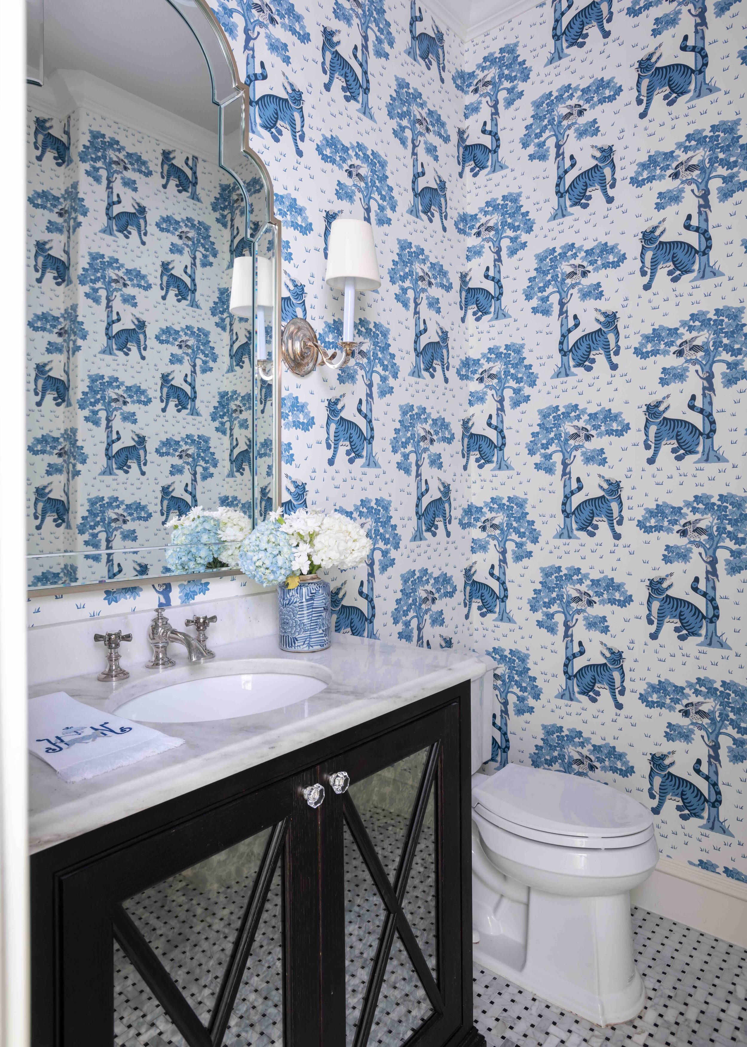
The blue and white tiger wallpaper in this Preston Hollow powder room shows how bright colors can give small rooms more impact.

The blue and white tiger wallpaper in this Preston Hollow powder room shows how bright colors can give small rooms more impact.

Blue-and-white is a classic color combination that never goes out of style. You can get away with very vibrant shades of blue by pairing them with white. After all, it’s a color combination that our eyes are used to seeing—think of white clouds in a blue sky. If you want your room to be really energizing, decorating with one bold color and lots of black and white will give you the high contrast look you need. Placing bright artwork and accessories against a mostly white backdrop is another appealing combination.

For balance and depth, use different, less-intense tones of your boldest color throughout the room. When it comes to patterns, choose either a bold color in a subtle pattern or a busy pattern in a muted color. Chaotic patterns in bright colors are the most difficult to work with.

Coordinate the Rest of Your Home

While not every room in your home needs to have the same color scheme, it’s important that the colors flow naturally. So, if you have one room with a bright pink and teal color scheme, don’t decorate the next one with navy and red. One way to ensure the colors in your rooms flow together is to invert your color combination for adjoining rooms. For example, if your sitting room has green walls and white accents, the next room over could be mostly white with bright green accents.

Vivid colors can be beautiful in both contemporary and classical homes. We decorated this traditional cottage in University Park with bright pink colors.

Vivid colors can be beautiful in both contemporary and classical homes. We decorated this traditional cottage in University Park with bright pink colors.

Although every year sees new colors come into fashion, try not to focus exclusively on what’s trending. A room with a well-balanced, aesthetically pleasing color scheme will always look great no matter the year.

By following some of the tips outlined above, you’ll hopefully have the knowledge you need to start incorporating bold colors in your home. However, if you’re still not confident that you can integrate your favorite eye-popping fabrics, wallpapers, and paint colors, consider giving us a call. As you can see from the photos of recent projects featured here, we have a lot of experience working with color. Call our Dallas office at 214-232-9501 or send an email to info@chambersinteriors.com to schedule a free consultation.

RELATED ARTICLES:

Avoid These 9 Costly Remodeling Mistakes by Margaret Chambers

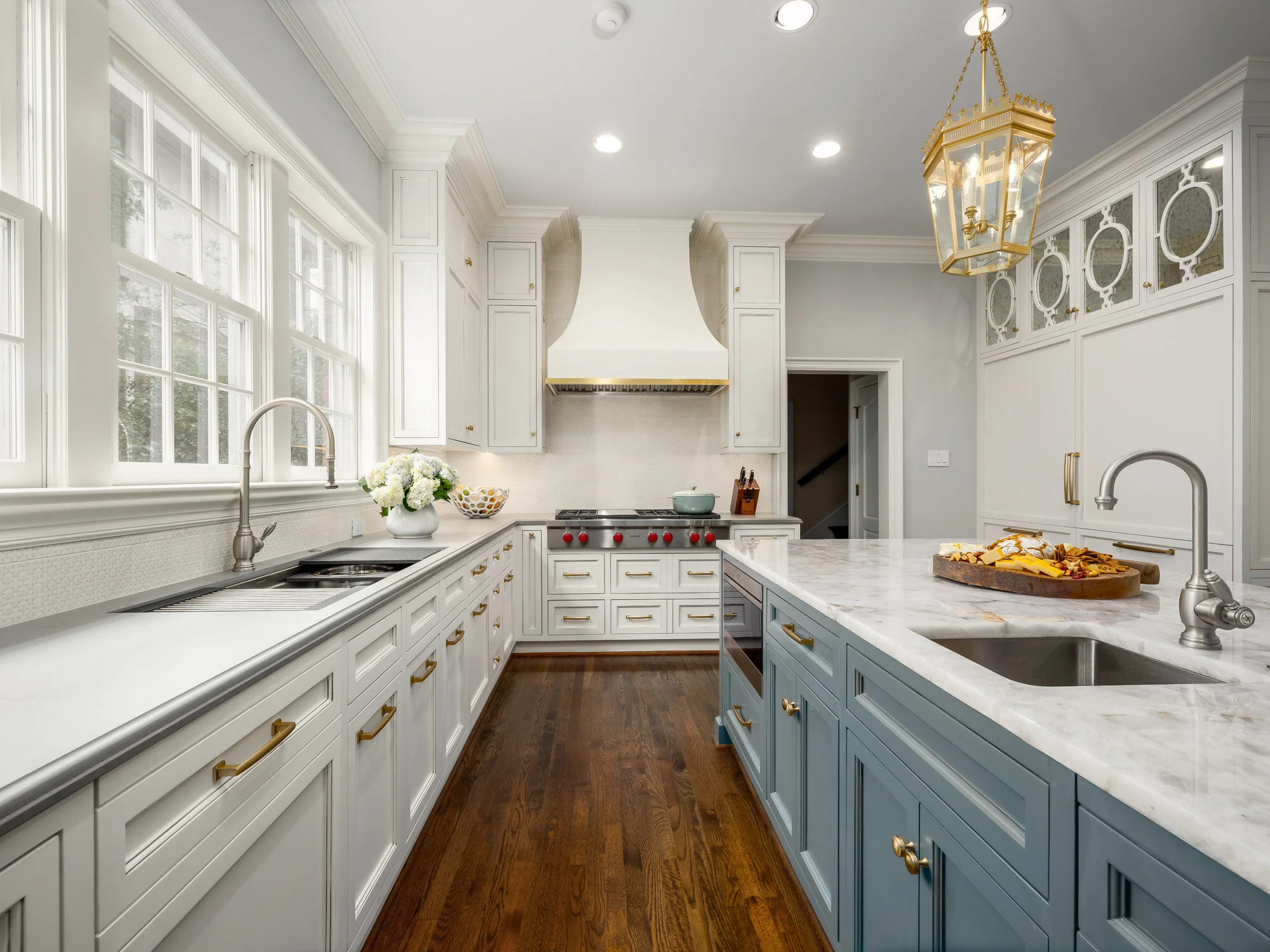
To break up the space in this large kitchen remodel, we decided to use multiple finishes, colors, and materials.

To break up the space in this large kitchen remodel, we decided to use multiple finishes, colors, and materials.

All photos in this article are courtesy of First Showing Photography of Dallas.

If you’re reading this, you’ve probably decided to remodel your home, or you’re at least considering it. You may be wondering how to get the ball rolling. What should you prioritize in your budget? How do you avoid delays and hidden costs? Over the course of my interior design career, I’ve been brought in to design many Dallas remodels. Based on my experience, here is a list of common (and sometimes costly) remodeling mistakes that I think homeowners should be careful to avoid.

1. Not having a clear goal in mind

The first step to a successful remodel is establishing your goal. Do you plan on selling your home, or do you see yourself living there for many years? Be careful not to overbuild for your neighborhood if resale is your end goal. When the value of your home makes it twice as expensive as your neighbor’s homes, it’s going to be a tough sell.

kitchen-remodel-before.jpg
kitchen-remodel-after.jpg

Above: a before-and-after comparison of the award-winning kitchen remodel we recently completed in collaboration with Helene’s Luxury Kitchens. The “after” photo on the right is courtesy of First Showing Photography.

2. Delaying decisions

Start browsing hardware and home goods stores near you as soon as you start planning. This helps you get a feel for all the options out there and how much they cost. Make as many decisions as possible before hiring a team. Once the work begins, every change you make in your design can drive up costs.

3. Designing an extensive remodel without help

If you’re looking at an extensive remodel, you’ll definitely want to bring in an AIA architect, an RID and ASID interior designer, or both to help you plan the new space. Make sure to interview them beforehand. They should ask you a lot of questions about your lifestyle and your family’s needs. If they don’t ask you very many questions, that’s a red flag.

We used satin brass for the majority of the hardware in this Dallas kitchen and pantry remodel.

We used satin brass for the majority of the hardware in this Dallas kitchen and pantry remodel.

4. Underestimating costs

Remodeling TV shows have a tendency to make projects look simpler and easier than they actually are. Make sure to discuss your budget with a contractor: they’ll be able to tell you if your budget and timeline is realistic for your goals. A good rule of thumb is to set aside enough contingency funds to go twenty percent over budget if you need to.

5. Not considering cost-saving alternatives

Avoid moving your toilet or sink whenever possible; moving these comes with a steep price tag. You can also look into getting a discounted package deal on appliances from the same manufacturer.

If you need more natural light in a space, such as your entryway, you may be able to have a light tube added through the ceiling instead of installing windows. Speaking of windows, don’t replace them if they’re original to the home and can be salvaged. If saving energy is a concern, you can always add storm windows.

6. Spending too much on technology

Unfortunately, technology ages quickly and is rarely a good investment. By the time you’re ready to sell your house, your prospective buyers won’t be impressed by a years-old smart home setup.

For this remodeling project, we were asked to work with the existing wallpaper and cabinets in the butler’s pantry.

For this remodeling project, we were asked to work with the existing wallpaper and cabinets in the butler’s pantry.

7. Not making careful measurements

Measuring your available space is a given, but don’t forget to measure the width of your front door, too. If your new refrigerator or stove can’t fit through the door, you’ll have to return it.

8. Not vetting your contractor

Asking your family and friends for recommendations on Dallas contractors is a good start, but go a step further and make sure those contractors are licensed, certified, and in good financial standing. Try to get their last three references if you can, and check their Better Business Bureau listing and Google Reviews.

9. Planning lighting at the last second

Remember to plan for a mixture of general, task, and accent lighting in the room. Lighting alters a person’s perception of the space, so it should never be treated as an afterthought. You don’t want to fill your newly remodeled house entirely with old and dated furniture, either, which is where an interior designer can come in handy.

We worked with Helene Terry to choose paint for the cabinets and walls, the tile backsplash, and the light fixtures.

We worked with Helene Terry to choose paint for the cabinets and walls, the tile backsplash, and the light fixtures.

Although there has never been a remodel that has gone one hundred percent smoothly, some remodels are simply more successful—in terms of keeping costs down and reducing stress—than others. Set your sights on the end goal, keep these pointers in mind, and you’ll be on track to living in the remodeled home you’ve been dreaming of.

If you’re bringing in a professional designer, the best place to start is by interviewing designers experienced in remodels. Our design team has overseen many remodels in the Dallas metroplex over the years. Give us a call at 214-232-9501 or send an email to info@chambersinteriors.com to schedule a free consultation. We would love to hear more about your project!

RELATED ARTICLES:

Why Your Rug Might Be the Most Important Decorating Choice You Make by Margaret Chambers

A large area rug in a neutral gray helps to ground the space in this living room from a home we designed in Kessler Park, Dallas.

A large area rug in a neutral gray helps to ground the space in this living room from a home we designed in Kessler Park, Dallas.

While some people treat rugs as an afterthought, for interior designers, rugs are the foundation of a room. Rugs have a major influence on a room’s color scheme and overall mood, despite being below eye-level. In fact, many designers start their designs by picking the rug first and finding furniture that complements it second.

That said, if your rugs are the only element of your home that needs updating, they’re easy to swap out, too. Following are some things to keep in mind next time you’re rug shopping.

  • Choosing the Right Size

When it comes to rugs, the most common pitfall is choosing one that’s too small. A rug should be large enough to extend under, at the very least, the front legs of every piece of furniture in a seating area. On the other hand, a rug that leaves almost no floor showing tends to look like wall-to-wall carpeting. In most cases, you should leave twelve inches to eighteen inches of space between the rug and the wall.

In the dining room, the rug should be low-pile and about twenty-four to thirty inches wider than the dining table. This way, your chairs won’t slide off of the rug and tip whenever someone pulls one out. If you put a rug under your bed, make it large enough so that your feet will land on it when you get out of bed in the morning.

We ordered a custom-designed rug to fit the small dining room. It is hand-tufted wool and silk. Because the rug is a perfect square, the round table fits perfectly on top, and the rug can be rotated in any direction for even wear.

We ordered a custom-designed rug to fit the small dining room. It is hand-tufted wool and silk. Because the rug is a perfect square, the round table fits perfectly on top, and the rug can be rotated in any direction for even wear.

Rugs play an important role in adding personality to hallways, which can otherwise feel like “dead” spaces. Your hallway runner should be wide enough that you can keep both feet on it as you walk through.

  • Choosing the Right Material

Another thing to consider is what material you want your rug to be. Wool is the most popular choice because it is both durable and beautiful: it’s perfect for families with children.

Silk can handle more foot traffic than you might think, but the cleaning process is slightly more involved and expensive than with wool. Natural fiber rugs such as sisal and jute are very affordable but cannot be cleaned if you spill something on them (unless you use a fiber protection method as soon as you get them). If you decide to buy delicate rugs, place them in low-traffic rooms where they won’t risk getting wet.

  • Choosing the Right Color, Pattern, and Style

Renters who love color, but can’t paint their walls, should bring in a colorful rug instead. Bold rugs are also a smart idea if you’re attracted to vibrant colors and patterns, but don’t want to commit to a bold wallpaper or color scheme. For rooms with dark walls, try finding a light, neutral rug with a distinctive texture. This solves two common problems with dark rooms: the color of the rug will keep the mood from being too heavy, and the added texture will create more interest in an environment where fewer shadows are being formed.

Bold colors and patterns abound in this study we designed for a downtown Dallas high-rise.

Bold colors and patterns abound in this study we designed for a downtown Dallas high-rise.

Rugs with large-scale patterns draw a lot of attention to themselves. This can be a great thing when your room feels too subdued and needs something to liven it up. If you’d rather visitors notice your furnishings and accessories first, rather than the rug, choose a pattern with a smaller, “quieter” print.

Contemporary rugs, which often have large-scale designs, do best in contemporary spaces. Oriental rugs are versatile enough to fit in both traditional and contemporary homes. Tribal rugs can go with many different styles but work especially well in Southwest style homes. Transitional rugs will contain both modern and traditional design elements, such as an ornate pattern in a modern, neutral color scheme. Rugs with a “weathered” look are ideal in beach-themed, transitional, and Bohemian rooms.

Oriental rugs can add color and refinement to contemporary settings, as you can see from this eclectic master bathroom.

Oriental rugs can add color and refinement to contemporary settings, as you can see from this eclectic master bathroom.

The earthy colors and tribal pattern on this rug made it the perfect choice for this African themed guest room we designed.

The earthy colors and tribal pattern on this rug made it the perfect choice for this African themed guest room we designed.

Finding the perfect rug can be the solution to many different design problems. A beautiful rug has the power to instantly add interest to a boring room or pull together one with too much going on. If you keep these designer tips for rugs in mind, you’ll be a savvier shopper.

An interior designer can be a great resource for sourcing high-end rugs or ordering custom ones. If you’re updating your rugs and want the best of the best, call us at 214-232-9501, or email us at info@chambersinteriors.com. We’d love to hear more about your project!

Related Articles:

How to Update a Home with Antiques by Margaret Chambers

There are many reasons Dallas homeowners today love their antiques. Original antiques are usually hand-made with high-quality craftsmanship; with proper care, an antique can last for generations. Antiques also bring their decades, or even centuries, of history into your home. Ask any antique seller about their wares and you'll hear the story behind each piece. And unlike many other used furnishings, an antique will only go up in value over time.

That said, the most popular styles of interior design today are contemporary, modern, and transitional. Rooms are increasingly becoming simple, light, and airy. Some collectors worry that filling their home with antiques can make the space feel too dated. If you've been meaning to update your traditional interior design, here are some tips to help freshen things up.

We incorporated antiques into this University Park bedroom while also using simple drapes, clean lines, and neutral tone-on-tone colors. The result is a room both classical and refreshingly modern.

We incorporated antiques into this University Park bedroom while also using simple drapes, clean lines, and neutral tone-on-tone colors. The result is a room both classical and refreshingly modern.

If you have heavy drapes with ornamented rods in your home, it's probably time for an update. The current trend is to use very simple rods with little ornamentation. Curtains and drapes should be in solid colors or subtle tone-on-tone patterns, with simple trim. Meanwhile, antique upholstery with solid color fabric, or a geometric design, will fit in better than upholstery with a traditional pattern.

An oriental rug with vividly contrasting colors will usually be out of place in a modern home. Roll up your older rugs for now and replace them with sisal rugs, which are popular for their textural quality, or muted oriental rugs.

This sitting room features a sisal rug with a geometric design.

This sitting room features a sisal rug with a geometric design.

Lamps should have clean silhouettes and simple shades, preferably in white. Lucite bases are also a popular choice for lamps in contemporary design.

White, tan, and gray are common neutral wall colors, but if you prefer color, go with pastel shades. Lacquered walls with bright colors are a bolder new trend, and wallpaper is coming back as well. Make sure to choose a contemporary, graphic print for wallpaper instead of a traditional pattern.

For today's transitional and contemporary homes, decluttering is key. Pare down your collections to your favorite statement items, displaying only one or two on each surface. You can always put away your other collectibles and cycle them back out when the seasons change.

You can highlight the craftsmanship and classic design of your antiques by contrasting them with modern pieces. A brightly colored piece of contemporary art will play off wonderfully against an antique chest, sofa, or mantelpiece beneath it.

This contemporary painting in a downtown Dallas high-rise matches the earth tones of the items and chest of drawers beneath it.

This contemporary painting in a downtown Dallas high-rise matches the earth tones of the items and chest of drawers beneath it.

If all of these suggestions make you feel overwhelmed, try looking for inspiration in magazines. Save photos of rooms that combine antiques with modern design, focusing on your favorite elements. Instead of updating one item or area at a time, plan out your overall color scheme for each room. You can then use your color scheme as a guide for picking wall colors, fabrics, accents, art, and rugs.

In this process, you will probably find that you cannot keep all of the antiques in your collection. Hold onto your favorite and most valuable pieces, then store, pass down, or get rid of those that are too dated. You can always reupholster furniture to update its look. Also consider that some styles of antiques will fit in better with modern surroundings than others. Asian, Swedish, and Neoclassical antiques are currently in style, for example.

Even if contemporary and transitional interior design are all the rage, antiques add just as much charm and classical detail to a room today as ever. An experienced designer will know how to incorporate your best antiques into a room, while appealing to modern day design trends.