kitchens

Future-Proof Your Home With These Design Tips for Aging-in-Place by Margaret Chambers

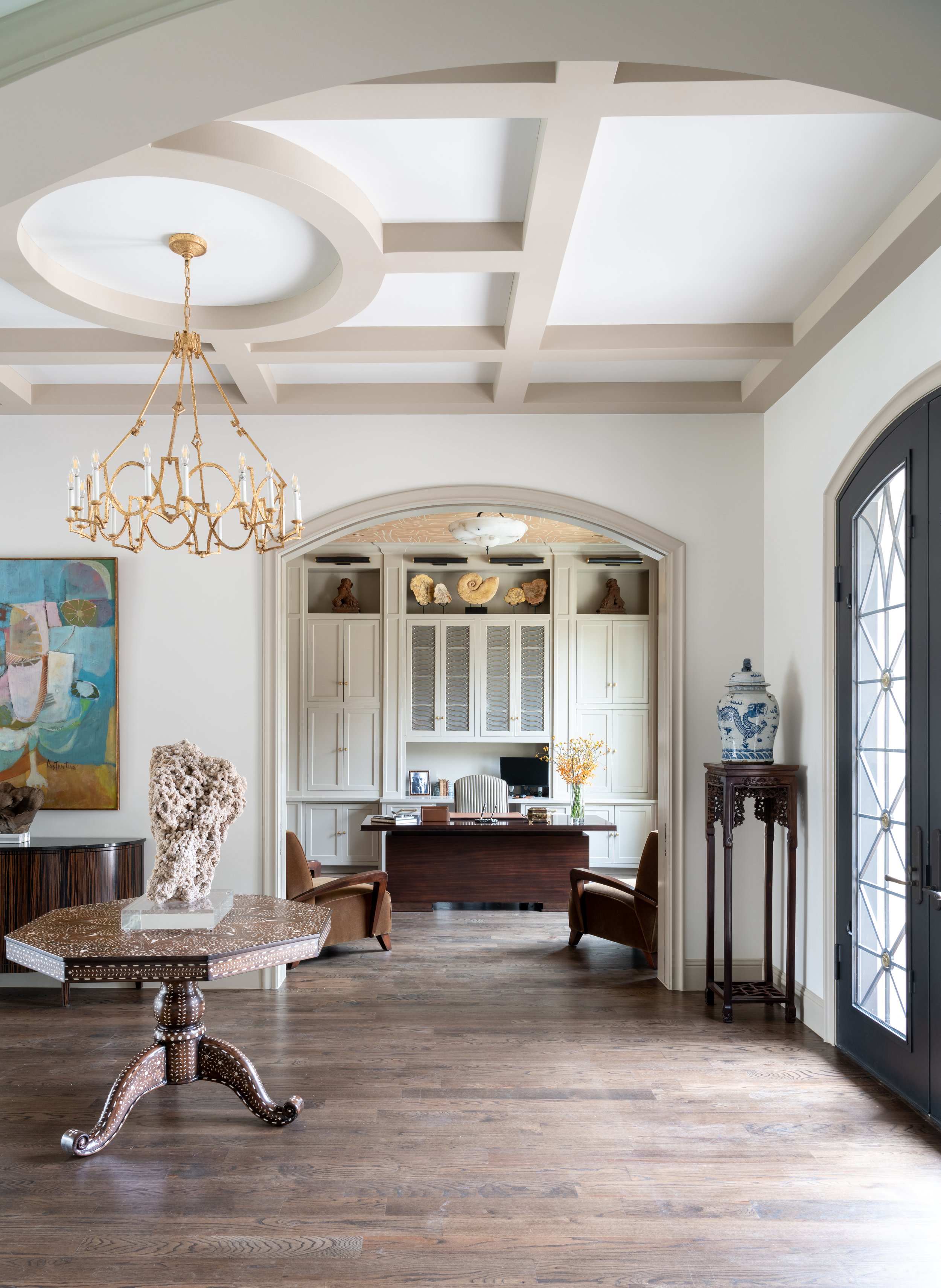
Our client needed to use a wheelchair while recovering from a virus when we started this house. We knew everything needed to be handicap-accessible. This wide entryway area permits plenty of room for a wheelchair to enter.

Today, more Dallas homeowners than ever are interested in aging-in-place, whether that means making renovations to their current home, finding a home that is wheelchair-accessible, or building a new home. This is especially true of the baby boomer generation, many of whom watched their parents go to assisted living.

The Americans with Disabilities Act (ADA) of 1991 set minimum standards for accessibility in newly constructed public facilities, and since then, these changes have been slowly making their way into the residential sector. The term “accessible design” encompasses homes designed for a variety of people with disabilities, but for this article, I’ll focus on wheelchair accessibility. Many of these design features can make the home more convenient for any homeowner, which is why some people refer to accessible design as “universal design.”

To be wheelchair-accessible, a home must have a wider doorway (preferably 36 inches) and a zero-step entrance. There should be no level changes in the house, not even a threshold for a door. ADA-compliant transition strips can help smooth thresholds between rooms. Since wheelchairs require a turning radius of 60-by-60 inches, open floor plans are a sensible choice.

If making the entire home wheelchair-accessible seems out of reach, consider making your home partially accessible. Even if you are not disabled or do not plan on retiring in your current home, you may wish to make your home more accessible so that aging or disabled parents, relatives, and friends can still visit you.

Carpets are a hassle for those who use assistive devices (interior designers like myself generally don’t like carpeting either). Go for hardwood flooring if you can, preferably with either flat-weave rugs or no rugs at all. Rugs should be secured to the floor with double-sided tape. If you must have carpet, choose cut-pile carpet or carpet with a thinner level loop.

Another accessibility feature we added to this Dallas home was a pair of grab bars in the shower.

Curb-less showers are not just accessible, but glamorous as well, making them a desirable feature. If you’re building a new bathroom, install plywood or solid wood blocking behind the shower wall so that it’s already reinforced if you need to add grab bars later. It’s also very important that the floor tile is slip-resistant.

Cabinets under the sink should be removed and replaced with plumbing that is installed tightly against the back wall. This creates knee space for wheelchair users to roll up to the sink. Some freestanding tubs are labeled “handicap-accessible,” but I don’t recommend them. It’s safer for someone to be able to sit on the side of the tub area, and swing their legs over, which freestanding tubs don’t allow.

If you’re building a new house for a handicapped person, the kitchen counter should be set 28-30 inches high. Multi-level countertops allow a person in a wheelchair to prep food alongside someone else who needs a higher countertop. In accessible homes, microwaves are often set into lower cabinets, somewhere between 15 to 37 inches from the floor. Also, keep in mind that the freezer is easier to reach when it is side-by-side with the refrigerator instead of stacked on top or on bottom.

When designing a home for clients who want to age-in-place, we will typically replace doorknobs with lever handles because they are much easier to use for those with arthritic hands.

A one-story house is better than a two-story house, but if you need the extra space, a two-story home with an elevator is another good option. The easiest place to install an elevator is where two closets are stacked. If you’re building a new house but don’t want the added expense of an elevator, you can include two stacked closets in the design just in case.

More interior designers are finding ways to make homes accessible without sacrificing style. It’s important that your home feels warm and welcoming, filled with things you find beautiful, rather than cold and clinical. After all, no one wants their home to feel like a hospital or a retirement home. Some designers bring their own experience with disability to their craft. For example, the famous modern architect, Michael Graves, became an advocate for accessible home design after he needed to use a wheelchair following illness.

If you’re looking for a home and accessibility is a priority for you, give us a call at 214.651.7665 or send an email to info@chambersinteriors.com. As a member of ASID, every year, I take 12 hours of continuing education classes to keep my registration, including a class on accessibility. I pride myself in my ability to design a timelessly beautiful home perfectly suited for my Dallas clients and their families’ needs.

RELATED ARTICLES:

Avoid These 9 Costly Remodeling Mistakes by Margaret Chambers

To break up the space in this large kitchen remodel, we decided to use multiple finishes, colors, and materials.

To break up the space in this large kitchen remodel, we decided to use multiple finishes, colors, and materials.

All photos in this article are courtesy of First Showing Photography of Dallas.

If you’re reading this, you’ve probably decided to remodel your home, or you’re at least considering it. You may be wondering how to get the ball rolling. What should you prioritize in your budget? How do you avoid delays and hidden costs? Over the course of my interior design career, I’ve been brought in to design many Dallas remodels. Based on my experience, here is a list of common (and sometimes costly) remodeling mistakes that I think homeowners should be careful to avoid.

1. Not having a clear goal in mind

The first step to a successful remodel is establishing your goal. Do you plan on selling your home, or do you see yourself living there for many years? Be careful not to overbuild for your neighborhood if resale is your end goal. When the value of your home makes it twice as expensive as your neighbor’s homes, it’s going to be a tough sell.

kitchen-remodel-before.jpg
kitchen-remodel-after.jpg

Above: a before-and-after comparison of the award-winning kitchen remodel we recently completed in collaboration with Helene’s Luxury Kitchens. The “after” photo on the right is courtesy of First Showing Photography.

2. Delaying decisions

Start browsing hardware and home goods stores near you as soon as you start planning. This helps you get a feel for all the options out there and how much they cost. Make as many decisions as possible before hiring a team. Once the work begins, every change you make in your design can drive up costs.

3. Designing an extensive remodel without help

If you’re looking at an extensive remodel, you’ll definitely want to bring in an AIA architect, an RID and ASID interior designer, or both to help you plan the new space. Make sure to interview them beforehand. They should ask you a lot of questions about your lifestyle and your family’s needs. If they don’t ask you very many questions, that’s a red flag.

We used satin brass for the majority of the hardware in this Dallas kitchen and pantry remodel.

We used satin brass for the majority of the hardware in this Dallas kitchen and pantry remodel.

4. Underestimating costs

Remodeling TV shows have a tendency to make projects look simpler and easier than they actually are. Make sure to discuss your budget with a contractor: they’ll be able to tell you if your budget and timeline is realistic for your goals. A good rule of thumb is to set aside enough contingency funds to go twenty percent over budget if you need to.

5. Not considering cost-saving alternatives

Avoid moving your toilet or sink whenever possible; moving these comes with a steep price tag. You can also look into getting a discounted package deal on appliances from the same manufacturer.

If you need more natural light in a space, such as your entryway, you may be able to have a light tube added through the ceiling instead of installing windows. Speaking of windows, don’t replace them if they’re original to the home and can be salvaged. If saving energy is a concern, you can always add storm windows.

6. Spending too much on technology

Unfortunately, technology ages quickly and is rarely a good investment. By the time you’re ready to sell your house, your prospective buyers won’t be impressed by a years-old smart home setup.

For this remodeling project, we were asked to work with the existing wallpaper and cabinets in the butler’s pantry.

For this remodeling project, we were asked to work with the existing wallpaper and cabinets in the butler’s pantry.

7. Not making careful measurements

Measuring your available space is a given, but don’t forget to measure the width of your front door, too. If your new refrigerator or stove can’t fit through the door, you’ll have to return it.

8. Not vetting your contractor

Asking your family and friends for recommendations on Dallas contractors is a good start, but go a step further and make sure those contractors are licensed, certified, and in good financial standing. Try to get their last three references if you can, and check their Better Business Bureau listing and Google Reviews.

9. Planning lighting at the last second

Remember to plan for a mixture of general, task, and accent lighting in the room. Lighting alters a person’s perception of the space, so it should never be treated as an afterthought. You don’t want to fill your newly remodeled house entirely with old and dated furniture, either, which is where an interior designer can come in handy.

We worked with Helene Terry to choose paint for the cabinets and walls, the tile backsplash, and the light fixtures.

We worked with Helene Terry to choose paint for the cabinets and walls, the tile backsplash, and the light fixtures.

Although there has never been a remodel that has gone one hundred percent smoothly, some remodels are simply more successful—in terms of keeping costs down and reducing stress—than others. Set your sights on the end goal, keep these pointers in mind, and you’ll be on track to living in the remodeled home you’ve been dreaming of.

If you’re bringing in a professional designer, the best place to start is by interviewing designers experienced in remodels. Our design team has overseen many remodels in the Dallas metroplex over the years. Give us a call at 214-232-9501 or send an email to info@chambersinteriors.com to schedule a free consultation. We would love to hear more about your project!

RELATED ARTICLES:

Kitchen Design Basics by Margaret Chambers

All-white kitchens have an open and airy feel to them. This kitchen is from a home we designed in Preston Hollow.

All-white kitchens have an open and airy feel to them. This kitchen is from a home we designed in Preston Hollow.

In the past, kitchens were usually set apart from the rest of the home. Homeowners today, however, often prefer their kitchens to be a hub where they can work and entertain guests at the same time. Following are some general guidelines for designing a kitchen that can do it all—whether you're renovating your Dallas home or starting from scratch.

The first floor of this Dallas home has an open concept layout. The kitchen connects to the living room on the right.

The first floor of this Dallas home has an open concept layout. The kitchen connects to the living room on the right.

Identify Your Goals

Everyone has different needs for their kitchen, so begin the design process by identifying your top priorities. If you love to cook and entertain, make sure you have more than just one stove. If you don't cook often, there's no need to invest in restaurant-quality burners.

Choose a Layout

The size of your kitchen is another important factor in how you should lay things out. When you've got a small space to work with, you may consider installing an island with storage, overhead pot racks, and cabinets that run all the way up to the ceiling. Running cabinets up to the ceiling eliminates the gap that normally just collects dust. By making storage space a design priority, you can store away as many kitchen appliances as possible. This has the advantage of leaving your countertops uncluttered.

As with any small room, you can help a small kitchen feel more expansive by painting the wall colors in a light shade, and letting in as much natural light as possible. Large kitchens allow for more leeway with amenities (such as the number of ovens), as well as dramatic colors and decorative effects. A midsize kitchen can feel more like a big kitchen if you open it up to the family room. One word of caution, however: you might not want kitchen messes to be in your line of sight whenever you’re in the family room!

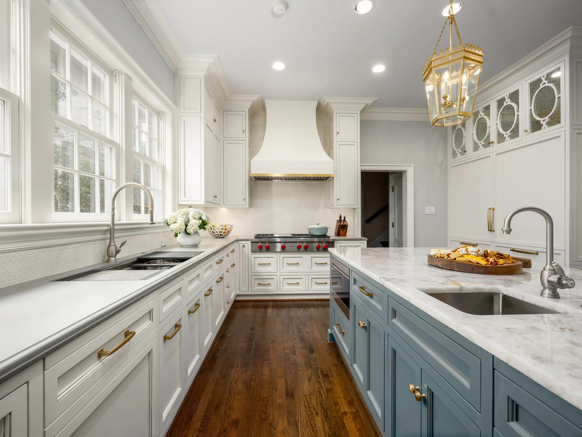
We worked with Helene’s Luxury Kitchens on this remodel. You can see how the sink, island, and stove form a triangle.

We worked with Helene’s Luxury Kitchens on this remodel. You can see how the sink, island, and stove form a triangle.

Regardless of whether your kitchen is large or small, it’s worthwhile to plan out pathways. Many designers use the ‘kitchen triangle’ method to plan an ergonomic design. In this method, the fridge, sink, and stove form the three corners of a triangle. Your flatware and dining ware should also be stored close to the dishwasher to make unloading faster and easier. If you want your kitchen to be a ‘hangout’ space, make sure to provide seating that is set away from your work area triangle. Island seating and breakfast tables are two common solutions to this problem.

The stainless steel cabinets and kitchen island (by Bulthaup) share the same gray-blue color in this Kessler Park home.

The stainless steel cabinets and kitchen island (by Bulthaup) share the same gray-blue color in this Kessler Park home.

Pick Complementary Paint Colors and Materials

Speaking of islands, I recommend painting your island the same color as your cabinets to create a unified look. The exception to this rule would be large kitchens, which can visually accommodate a wider variety of paint finishes and colors.

Glass cabinets can help give your kitchen depth and make it feel more spacious. However, remember that your dinnerware will all be on display. If you have dining ware that doesn't match with the rest of your collection, you might want to install frosted glass panes instead.

While there's nothing wrong with stainless steel, make sure to not overuse it. You should also take into consideration the visual flow and rhythm of your kitchen when you choose stainless steel. Putting it everywhere can break up the kitchen's design, making it feel uneven. Stainless steel also scratches easily, so it may not be the best material for counters where you’ll be doing cooking prep. If you have a lot of stainless steel visible in your kitchen and would like to introduce variety, you can have wood fronts installed on your dishwasher, refrigerator, or cabinets.

Glass door cabinets help to highlight the client's beautiful crystal and china collection, as seen above.

Glass door cabinets help to highlight the client's beautiful crystal and china collection, as seen above.

Renovating or designing a kitchen can be a lengthy process. Yet regardless of how much cooking you do, you’ll want your kitchen to be a room you enjoy spending time in. A beautiful, thoughtfully-designed kitchen is always worth the trouble!

Just because you have a historical home doesn't mean you can't enjoy the most up-to-date appliances and modern furnishings. If you think it’s time to update your kitchen, consider reaching out to Chambers Interiors. Our design team is familiar with historical home renovation and can help you update appliances while staying faithful to your kitchen’s aesthetic. Contact us by calling our Dallas office at 214-232-9501 or sending an email to info@chambersinteriors.com.

RELATED ARTICLES: