Design tips

Marrying Styles: How Newlyweds Can Design a Home They Both Love by Margaret Chambers

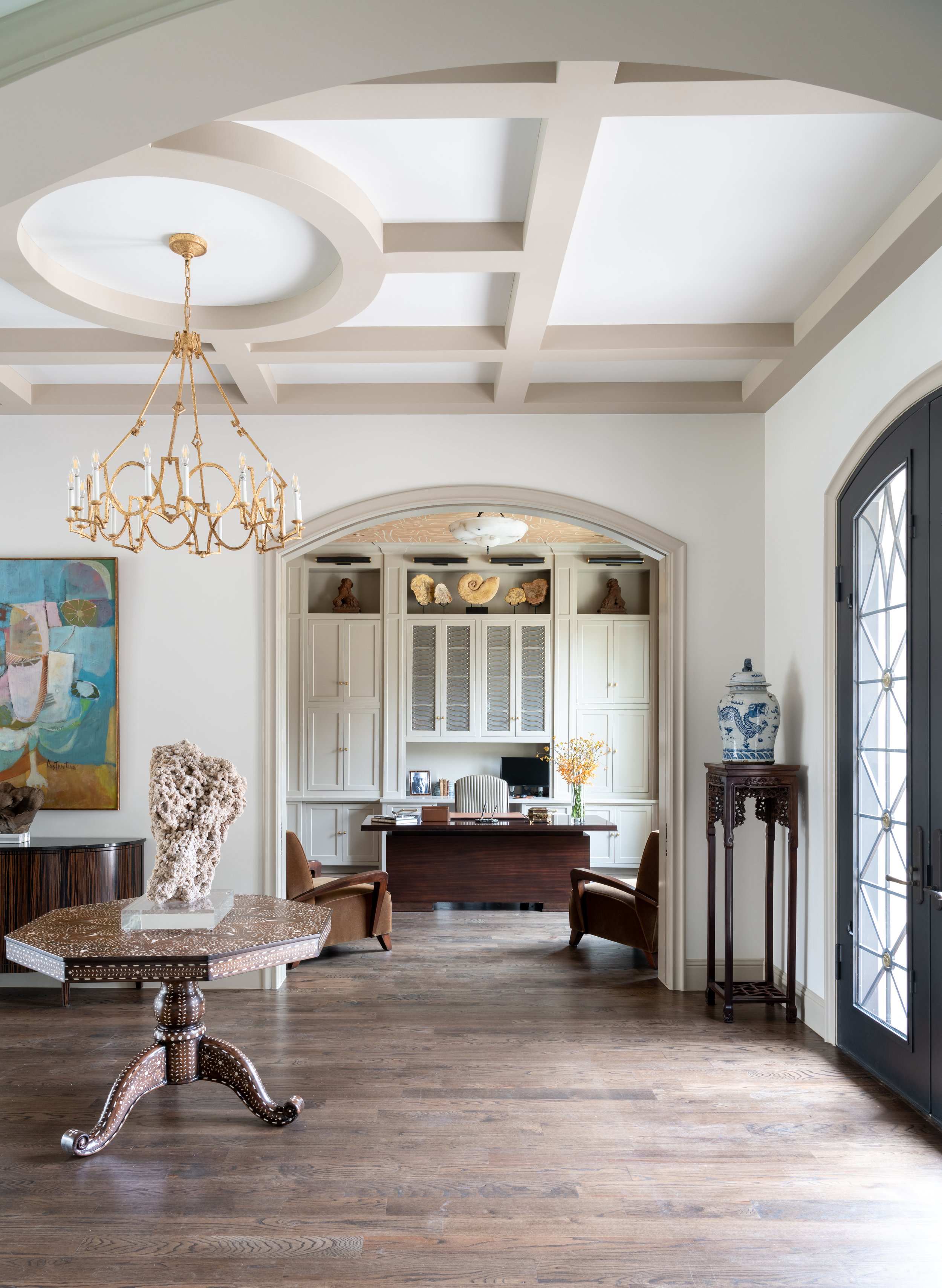
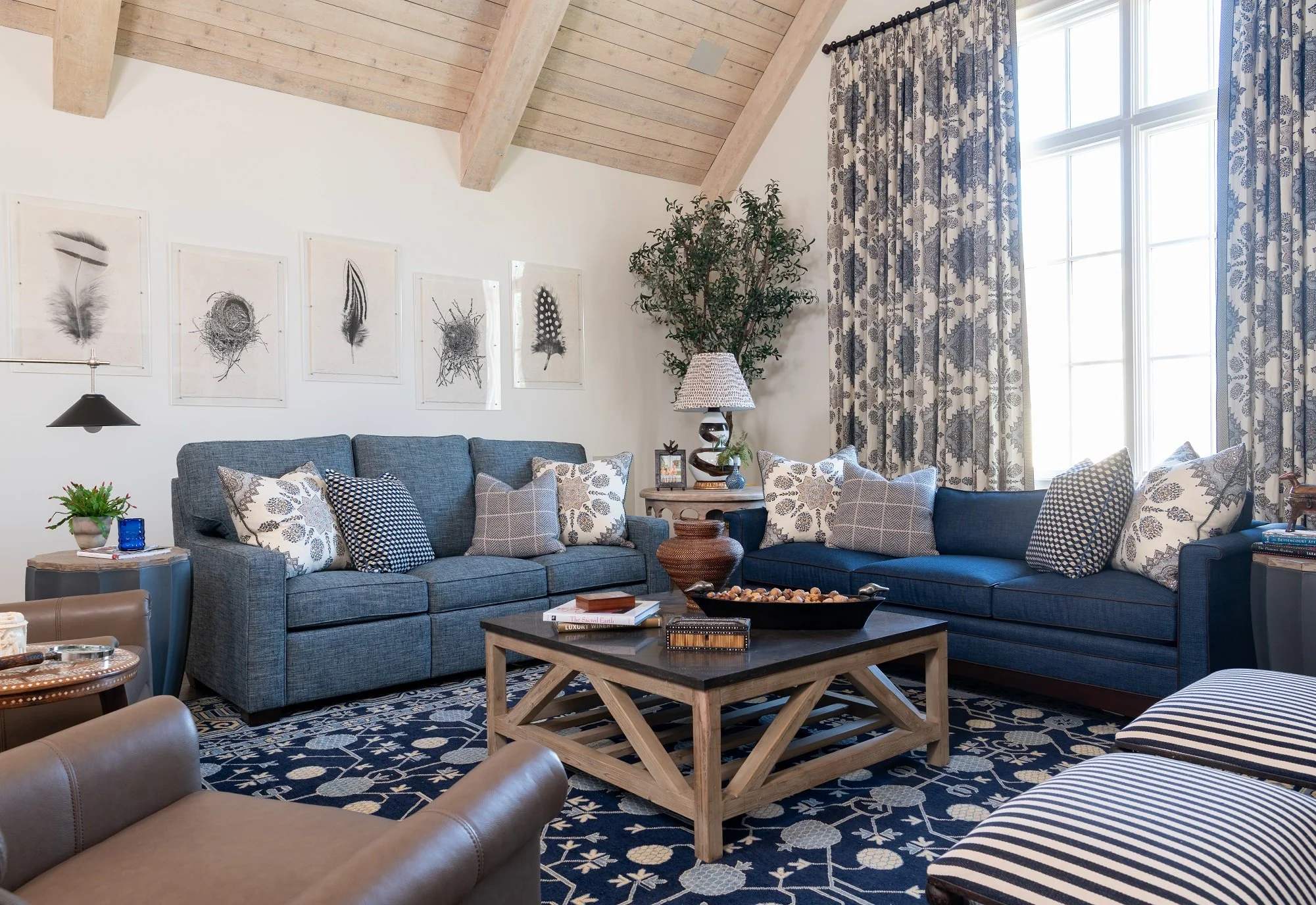
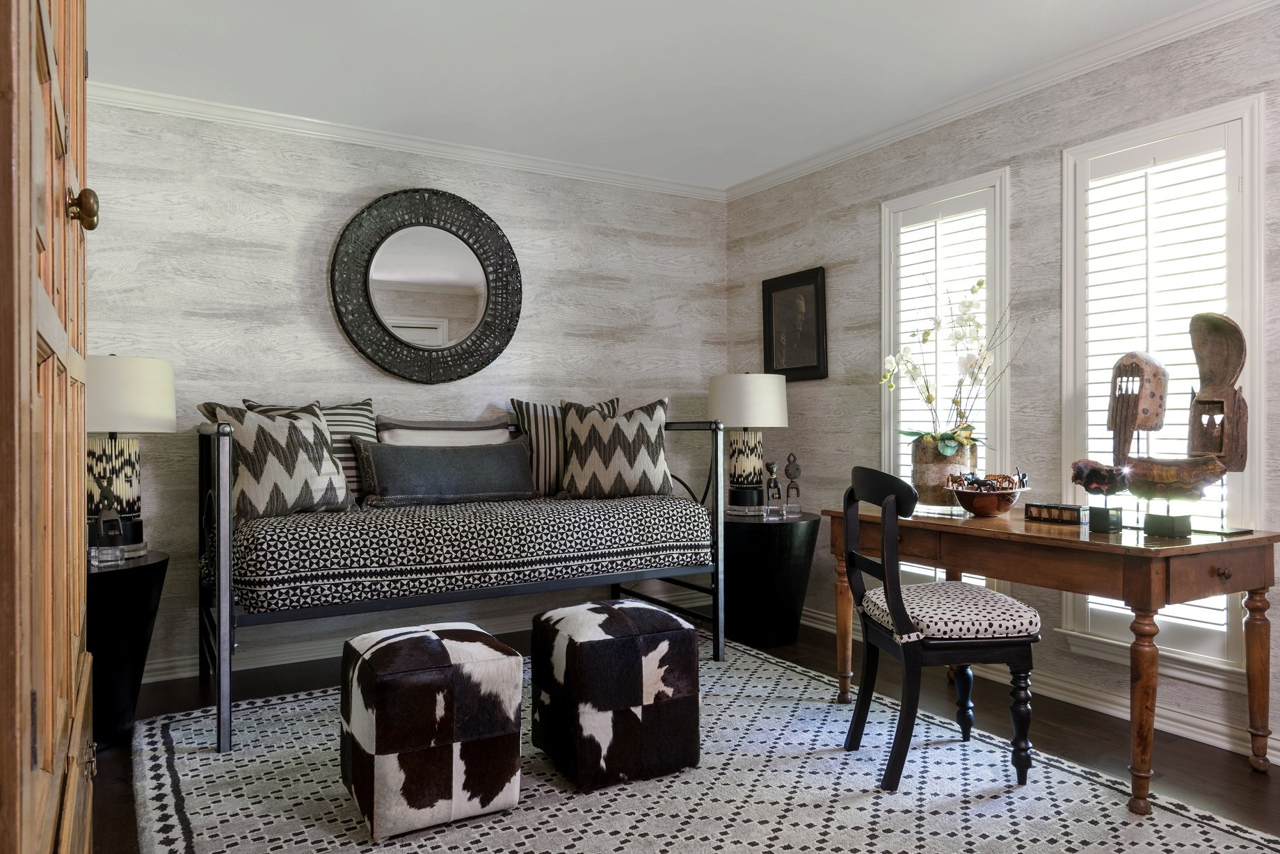
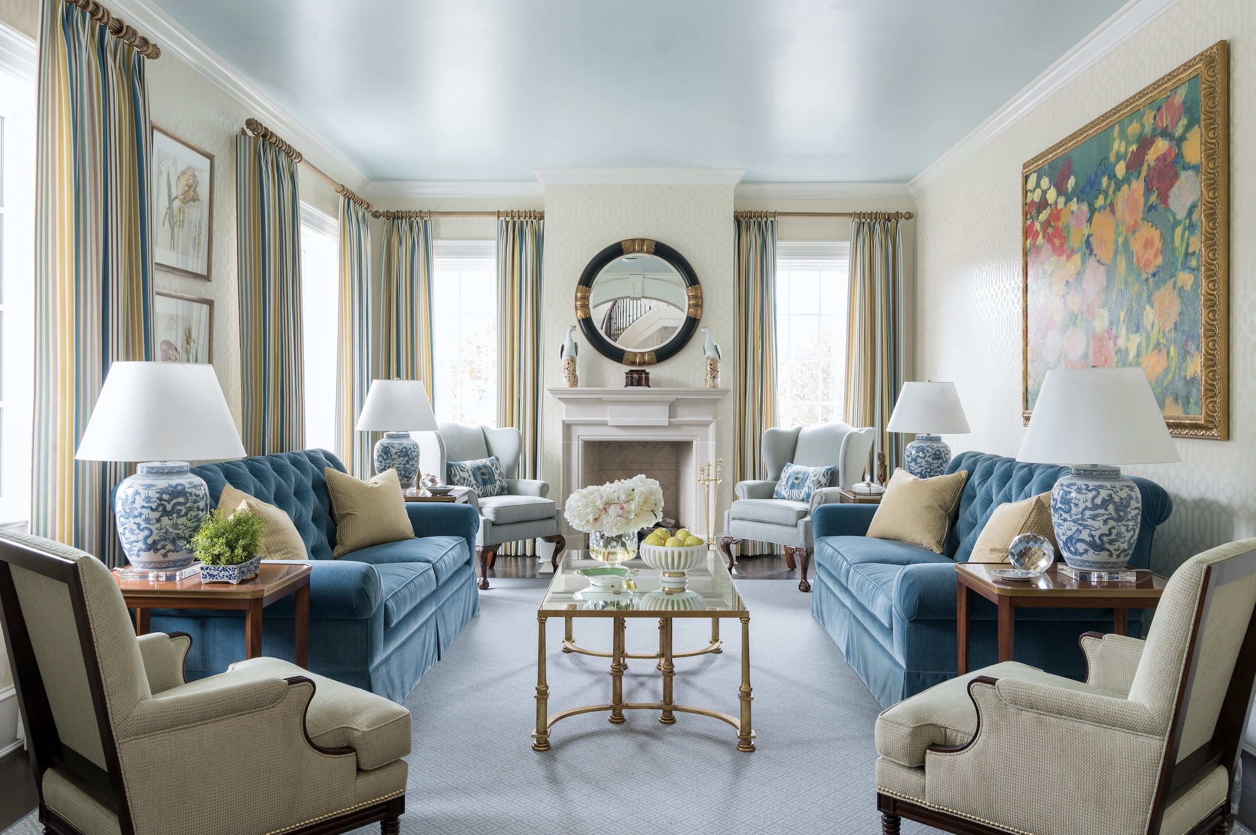
Our clients for this project in Kessler Park had different tastes. The wife preferred antiques, while the husband liked a modern style. We bridged the gap between modern and traditional by complementing multicultural antiques with updated colors and patterns.

I once met with a new couple who had just come to Dallas from California. The woman wanted a beach house (light, airy, and a little on the feminine side), but the man wanted a home that looked like the bar at The Mansion on Turtle Creek: dark, rich, and very masculine.

Designing a beautiful living space for yourself is challenging enough. When you need to accommodate a significant other, it’s doubly difficult. But don’t be discouraged if you and your partner like completely different things. Even professional interior designers like myself rarely decorate a whole home in a single style. Below, you’ll find my personal tips for combining styles with your partner.

1. Assign Roles

If you aren’t hiring a professional, decide on how you want to split the work for the project. Does one person want to be the main decision-maker and shopper? Does one of you want to only be consulted on key decisions? This system works best if one person in the relationship is much more invested than the other. If you are the designated shopper, I do think it’s always good to ask the other person before you buy something. Your partner might also appreciate being shown a few options for an item first.

This study in a Preston Hollow home combines both masculine and feminine traits. The dark, moody stain color on the paneling and bookshelves has a masculine feel, while the softly colored fabrics on the upholstered furniture are associated with femininity.

2. Search for Inspiration

Working with that couple from California who were moving into University Park, I suggested that the two of them should shop together for an interior design book that they both liked. They eventually found a book with “beach-y” homes and marked a lot of pages to share with me for inspiration. My advice to most couples moving in together for the first time is to look through interior design books and magazines, separately, to see what catches their eye.

Here is another example of how we combined modern and traditional in the Kessler Park home mentioned earlier. This guest bedroom has an African theme, juxtaposing African art with these modern, rectangular lampshades. Contemporary style and multicultural sculptures mix beautifully together.

Another method is to make a Pinterest board and pin pictures of rooms you like. Ask your partner to point out what they like in the photos they chose. If your partner likes something that you don’t, politely explain why it doesn’t work for you. Art seems to be one of the harder things for most couples to agree upon. It’s more personal than fabrics, sofas, or rugs.

There is no need to pick a single theme for the whole house. Instead, try to find common ground in color choices, materials, and furniture styles, then figure out what will look complementary together. Over time, you should start to see some patterns emerging. If the two of you end up liking styles that are completely opposed to each other, then you may need an interior designer to help you combine those looks.

3. Choose Your Color Palette

The next step is to build a complementary color palette by picking one main color and two accent colors together. If you’re going for a monochromatic look, your three choices should all be different shades of the same color. Having an intentional color scheme makes it easier to decide what stays in and what goes out.

These colors can inform your wall color choices, trim color choices, floor color choices, and the colors you choose for upholstery and accessories. Neutral paint colors can serve as an unobtrusive backdrop for a variety of different pieces.

A lot of our color inspiration for this home came from a modern painting that the wife inherited (seen to the left in this photo), which incorporated aquas, terracottas, oranges, blues, taupes, and browns. Our clients specifically wanted warm colors, rather than a stark, cold, contemporary design.

4. Discuss Your Must-Have Items

Next, it’s time to go through each of your belongings to see what will fit into the new house. Speak up if an item contains a lot of sentimental value for you, such as a family heirloom. Ask your partner if there are certain items that they also cannot do without. Kindness and compromise are key to ensuring that both people love the new house.

Identify any multiples that you and your partner have and eliminate one from each pair. For example, you probably don’t need two pressure cookers or two toaster ovens. You may not have room for two coffee tables or two sofas, either.

When I’m helping my interior design clients in Dallas, I pick the best pieces out of everything they own rather than trying to use all they have. It’s entirely possible that your space will dictate what you can and can’t keep. Once you start moving pieces into the space, you may discover that some of the most contentious items that you’re bringing in don’t fit into the floor plan anyway.

Starting with a completely blank slate is also an option. This makes more sense if you’re moving across the country. The benefit of starting new is that the two of you can shop for items together and take your time finding pieces that appeal to both of you.

5. Create Zones

Identify different rooms that can belong to just you or just your partner. For example, maybe one of you wants a man cave, a craft room, or a home office. These spaces should reflect the preferences of the person who’s going to spend the most time in them.

Our 65-year-old clients built a new home in Dallas with high ceilings and enlisted our help with the interior design. The wife loved traditional furnishings, antiques, and lots of color. Meanwhile, the husband wanted a home that was light and open, easy to move around in, and had a TV in every room if possible.

Don’t forget to talk about the different ways that the two of you use your spaces. Couples who like to entertain may want furniture that is easy to move around and plenty of seating. If one of you often forgets to use a coaster, maybe it’s better to buy a glass coffee table than a wood one.

6. Bring Everything Together

When you start to combine your items with your partner’s items, it may look awkward and haphazard. Try different furniture configurations before giving up on it. Keep an eye on the scales of different furniture pieces too. Your coffee table should not be significantly taller than your sofa seats, for example.

Don’t forget to leave some blank wall space, open floor space, and breathing room around furniture. This is especially important when you’re combining different styles within a room. Leaving “breathing room” around your furnishings and art will make the mixing and matching feel intentional rather than chaotic.

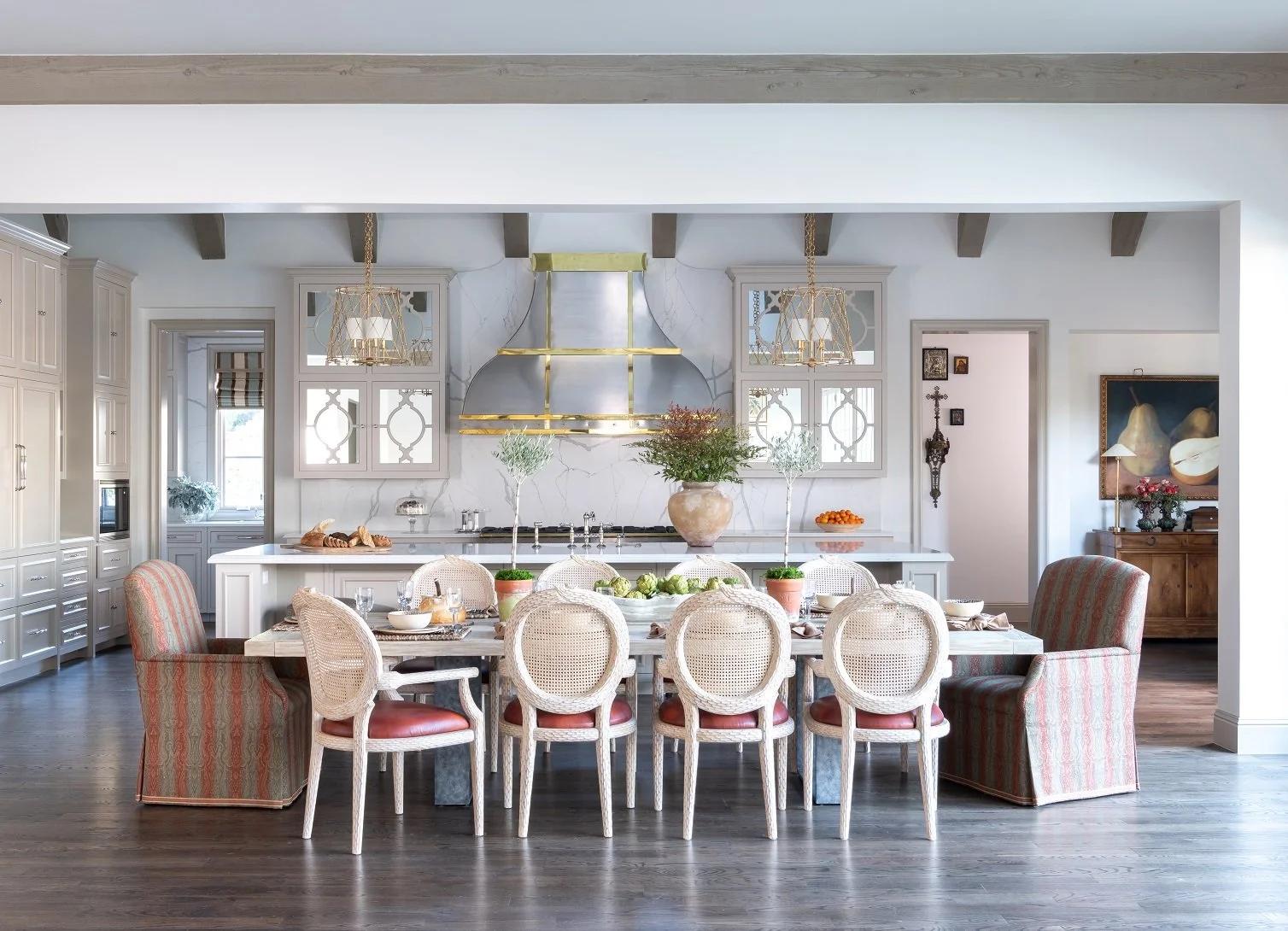
The clients previously lived in a home where space around the dishwasher door was tight, meaning that they had to step over it when it was opened. They wanted us to make sure their new kitchen would be ergonomically laid out. We took care to leave enough space on either side of the fridge and freezer for something to be set down. There is also plenty of space around the dishwasher door.

Remember that no home comes together overnight. It’s a good idea to leave some room for additional pieces you acquire along the way, so don’t get hung up on every little accessory. Smaller items can easily be swapped out or replaced over time if they never end up growing on you.

Merging styles with your partner becomes easier when you have a shared vision you can both get excited about. However, bringing in an interior designer could also help save you hours of discussion (and possibly prevent arguments). Any designer with experience will know how to work with newlyweds or couples moving in together, as it’s a common scenario we see in our work.

When I work with couples and families, it’s important to me that everyone who lives in the home is happy and sees themselves reflected in the space. If you're interested in working with Chambers Interiors & Associates, send an email to info@chambersinteriors.com or call 214-651-7665 to reach our Dallas office.

RELATED ARTICLES:

Five Key Decisions to Make Before Buying a Coffee Table by Margaret Chambers

In very large living spaces, such as this den in a Dallas home we designed, it’s better to have two coffee tables rather than one huge table that is difficult to get around. These two tables have tops made of fossil stone and iron bases.

You may think that your sofa is the statement piece of the living room, but here at Chambers Interiors, we consider the coffee table to be equally important. A coffee table that’s the wrong size or style can throw off the whole space, so choosing one shouldn’t be an afterthought. As an interior designer, I consider the following criteria when shopping for a coffee table for my Dallas clients.

1. Material

Not all coffee tables are actually used for their intended purpose. Will you be setting down drinks on your table or playing games on it? Will it be purely decorative? The material you choose should depend on how much wear and tear you think the table will get.

A clear acrylic or glass coffee table can help a small room feel more open. Another advantage to clear tabletops that is that they won’t cover up a beautiful rug. Glass is not a good choice for families with young children or pets. Not only is it fragile, prone to fingerprints, and easy to scratch, but any sharp corners are a hazard. Acrylic is shatter-resistant but scratches more easily than glass and must be cleaned with a special cleaner. Upholstery provides a soft landing, making it the safest choice for active kids.

Seen here is a vintage, highly collectible, Jansen coffee table made of glass and brass. Glass tables make a small living room, like this one in a Park Cities home, feel more open.

Wood tables introduce texture and warmth to the room. Mahogany and walnut are classic choices for traditional homes, while Cirrus Oak is a good fit for modern spaces. Just remember that darker woods show dust more easily. I recommend using a contrasting material, such as marble, glass, or metal when you already have wood floors or stunning wood furniture in the space. Marble is a popular choice that instantly adds a touch of elegance into a room. Metal is highly durable and comes in a range of finishes, but stay away from tables that mix metals (like brass and chrome) because they may look dated in the future. Stone tables are suitable for both indoor and outdoor spaces.

Good materials for a modern room include glass, acrylic, lacquer, metal, and stone. For a sophisticated, traditional space, I would suggest choosing a table made of dark wood or marble. Leather can work in either a traditional or a modern setting.

2. Shape

Rectangular and oval-shaped tables are both smart choices in narrow spaces. A round table will soften the look of your room, especially if you have a lot of sharp lines and hard corners.

A square table can fit perfectly into the L-shaped nook of a sectional. Nesting coffee tables, in which one table is tucked slightly underneath a taller one, create more surface area, making them a great solution for when you have guests over.

3. Style

If you want your coffee table to be a focal point, make sure to choose a table with a color or shape that contrasts with the rest of the room. However, the table’s design style should still match or at least complement what’s around it.

A coffee table with extensive detailing, like wood cut-outs or a hammered metal finish, looks best with simple furnishings and solid colors surrounding it.

4. Size and Placement

Choosing the right size is important. When your coffee table is too large, it feels like you have to squeeze past it to sit down. A coffee table that is too small is too far away to comfortably set down drinks.

Your coffee table should ideally measure between one-half and two-thirds the length of your sofa. Leave at least a foot-and-a-half of space between the table and the sofa for legroom, plus twenty-four to thirty inches between the table and your TV console or fireplace for walking room. The height of the table should be equal to the seat of the sofa, or slightly below (one to two inches).

If you have a large living room with multiple seating arrangements, you will probably need more than one coffee table. After all, you don’t want a huge coffee table that is hard to get around. The coffee tables don’t necessarily have to match each other. Consider putting small drink tables and end tables next to additional seating areas.

Putting a glass top on a wood table can offer the best of both worlds: the wood adds a natural and organic texture, while the reflective surface of the glass brightens the room.

5. Storage

Storage is an important consideration if you need a place to hide TV remotes, toys, games, or other items. Look for tables that have drawers, shelves, or a top that lifts to reveal storage. Antique coffee tables usually don’t have storage.

The right coffee table can elevate your room to the next level of luxury. When you style it with carefully chosen accessories, your design will look even more tasteful. Those of you who are giving your formal living or family room a facelift may consider reaching out to an interior designer like myself. Along with access to trade-only resources, Chambers Interiors & Associates pays attention to the small details that are easily overlooked. We can find the perfectly proportioned table for your space while ensuring that the layout of your room flows beautifully. You can reach us by calling our Dallas office at 214.651.7665 or sending an email to info@chambersinteriors.com.

RELATED ARTICLES:

Future-Proof Your Home With These Design Tips for Aging-in-Place by Margaret Chambers

Our client needed to use a wheelchair while recovering from a virus when we started this house. We knew everything needed to be handicap-accessible. This wide entryway area permits plenty of room for a wheelchair to enter.

Today, more Dallas homeowners than ever are interested in aging-in-place, whether that means making renovations to their current home, finding a home that is wheelchair-accessible, or building a new home. This is especially true of the baby boomer generation, many of whom watched their parents go to assisted living.

The Americans with Disabilities Act (ADA) of 1991 set minimum standards for accessibility in newly constructed public facilities, and since then, these changes have been slowly making their way into the residential sector. The term “accessible design” encompasses homes designed for a variety of people with disabilities, but for this article, I’ll focus on wheelchair accessibility. Many of these design features can make the home more convenient for any homeowner, which is why some people refer to accessible design as “universal design.”

To be wheelchair-accessible, a home must have a wider doorway (preferably 36 inches) and a zero-step entrance. There should be no level changes in the house, not even a threshold for a door. ADA-compliant transition strips can help smooth thresholds between rooms. Since wheelchairs require a turning radius of 60-by-60 inches, open floor plans are a sensible choice.

If making the entire home wheelchair-accessible seems out of reach, consider making your home partially accessible. Even if you are not disabled or do not plan on retiring in your current home, you may wish to make your home more accessible so that aging or disabled parents, relatives, and friends can still visit you.

Carpets are a hassle for those who use assistive devices (interior designers like myself generally don’t like carpeting either). Go for hardwood flooring if you can, preferably with either flat-weave rugs or no rugs at all. Rugs should be secured to the floor with double-sided tape. If you must have carpet, choose cut-pile carpet or carpet with a thinner level loop.

Another accessibility feature we added to this Dallas home was a pair of grab bars in the shower.

Curb-less showers are not just accessible, but glamorous as well, making them a desirable feature. If you’re building a new bathroom, install plywood or solid wood blocking behind the shower wall so that it’s already reinforced if you need to add grab bars later. It’s also very important that the floor tile is slip-resistant.

Cabinets under the sink should be removed and replaced with plumbing that is installed tightly against the back wall. This creates knee space for wheelchair users to roll up to the sink. Some freestanding tubs are labeled “handicap-accessible,” but I don’t recommend them. It’s safer for someone to be able to sit on the side of the tub area, and swing their legs over, which freestanding tubs don’t allow.

If you’re building a new house for a handicapped person, the kitchen counter should be set 28-30 inches high. Multi-level countertops allow a person in a wheelchair to prep food alongside someone else who needs a higher countertop. In accessible homes, microwaves are often set into lower cabinets, somewhere between 15 to 37 inches from the floor. Also, keep in mind that the freezer is easier to reach when it is side-by-side with the refrigerator instead of stacked on top or on bottom.

When designing a home for clients who want to age-in-place, we will typically replace doorknobs with lever handles because they are much easier to use for those with arthritic hands.

A one-story house is better than a two-story house, but if you need the extra space, a two-story home with an elevator is another good option. The easiest place to install an elevator is where two closets are stacked. If you’re building a new house but don’t want the added expense of an elevator, you can include two stacked closets in the design just in case.

More interior designers are finding ways to make homes accessible without sacrificing style. It’s important that your home feels warm and welcoming, filled with things you find beautiful, rather than cold and clinical. After all, no one wants their home to feel like a hospital or a retirement home. Some designers bring their own experience with disability to their craft. For example, the famous modern architect, Michael Graves, became an advocate for accessible home design after he needed to use a wheelchair following illness.

If you’re looking for a home and accessibility is a priority for you, give us a call at 214.651.7665 or send an email to info@chambersinteriors.com. As a member of ASID, every year, I take 12 hours of continuing education classes to keep my registration, including a class on accessibility. I pride myself in my ability to design a timelessly beautiful home perfectly suited for my Dallas clients and their families’ needs.

RELATED ARTICLES:

8 Exterior Home Makeover Ideas for Budgets of Any Size by Margaret Chambers

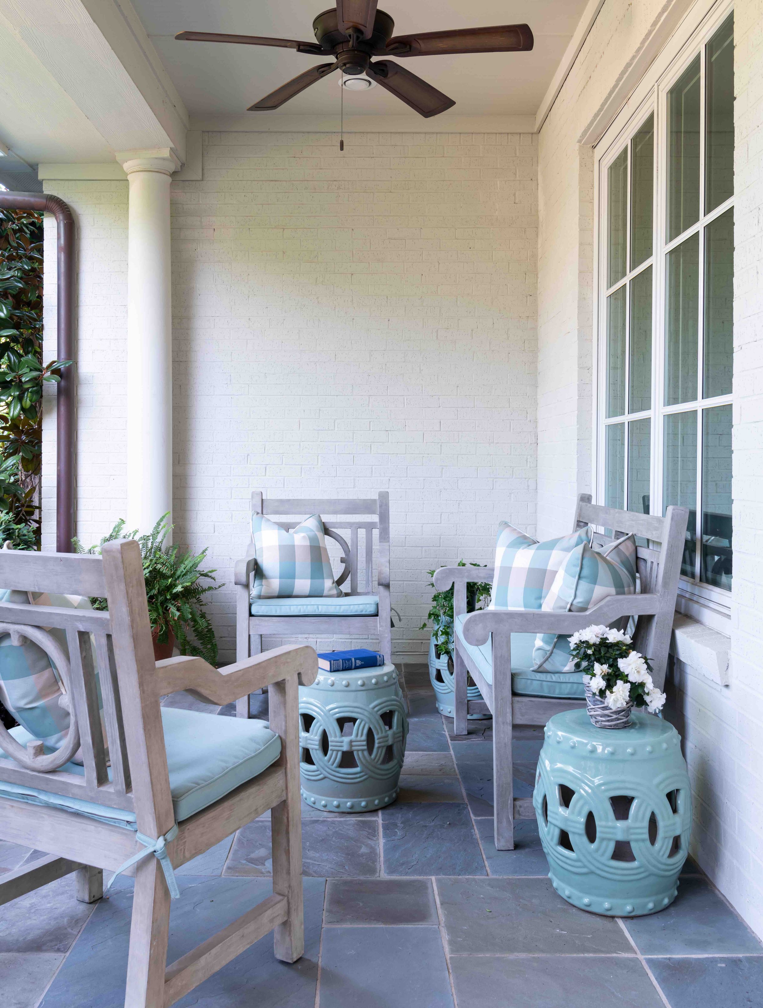
The concrete patio furniture that we used for this sitting area is very sturdy and won’t be knocked over in inclement weather. We chose aqua as the color for the gingham cushions and the garden stools because it complements the patio floor and the interior color scheme.

Whether you are selling your Dallas home or plan on enjoying it for years to come, it’s important to make the exterior just as inviting as the interior. Making a good first impression is especially crucial for home sales. If you look at listings online, you’ll notice that the vast majority of home listings feature the exterior as the main photo. However, many homeowners are daunted by the costs and decision-making involved in a renovation, especially if they haven’t made any updates since they first moved in. Below, you’ll find my top designer tips for getting your home looking its best this summer.

1. Start by Making a Budget

Any successful renovation project starts with making a budget and a checklist. After you’ve made a list of your most wanted upgrades, do research on how much each of them will cost, making a note of which you can do yourself and which you would need to hire a specialist for. You’ll also want to make sure you don’t overbuild for your neighborhood or create a design that will clash with adjacent homes.

The projects that tend to drive up costs the most include repainting the whole exterior, adding an outdoor living area, replacing the roof, replacing the garage doors, or redoing the landscaping. However, these upgrades also tend to have the biggest return on investment. Some less expensive ways to freshen up your home’s exterior include:

  • Removing fallen branches and dead plants, then planting new flowers

  • Washing the exteriors of your windows

  • Sweeping and decluttering your porch

  • Weeding the driveway

  • Replacing hardware with new fixtures in matching metal colors

2. Get Your Front Façade Sparkling Clean Again

Power washing is not recommended for homes with vinyl siding, shingles, or weathered brick. Shingles and weathered brick can be easily damaged, while vinyl siding is pliable, allowing water to possibly get trapped behind it. You can save money on a pressure washer by renting one from your local appliance store instead of buying one. To clean your windows, use a microfiber cloth with water and a few drops of dishwashing detergent on a pole.

3. Consider New Paint Colors

Just because the paint on your house hasn’t begun to peel doesn’t mean that it couldn’t benefit from a fresh coat, especially if the color has become dull over time. Although repainting a home can cost between $6000-$12,000, you can also give your home a more affordable facelift by only repainting the trim or shutters and front door.

Test any new paint colors by painting a small swatch. I generally recommend doing paint swatches in the back instead of in the front, unless you plan on repainting the whole house soon. You don’t want those paint swatches to be visible from the street, especially if you’re not going to commit to painting the house for another six months to a year.

If you own a brick home and the brick is starting to look tired, you can consider painting it a new color. That said, I prefer to leave the brick unpainted, as long as it’s an attractive color. The problem with repainting brick is that once you paint it, you have to repaint every 10 to 15 years to maintain it. When I do paint brick, I like to use paint with an eggshell finish, which stays fresh-looking for longer and helps dirt to wash off.

Repainting your front door in a bold color, like the red paint seen on the front door of this Preston Hollow home, is an easy way to make your front porch more eye-catching.

4. Take a Look at Your Front PorcH

One of the most impactful ways you can update your front porch is by either repainting or replacing the front door. Before replacing the door entirely, consider choosing a new design that will let in more light, have more or less architectural detail, or will be made of a different material. Whether you are repainting or replacing, make sure that the door still complements your home. If you’re replacing your hardware such as your house numbers, doorknocker, or doorknobs, try to match the fixtures to the style of your house — simple, modern fixtures for a modern house, or ornate fixtures for a traditional house.

Some types of home, such as ranch homes, have small entry areas. A popular renovation trend right now is visually enlarging these front door areas by widening the front steps or adding glass inserts on either side of the front door.

5. Have Your Roof Inspected

It’s generally recommended to have your roof inspected twice a year, especially after a big storm. The average lifespan for a roof in Texas is 15-20 years, but the actual lifespan of your roof depends on a number of factors, such as the material and the amount of damage it has taken. If your roof needs to be replaced, you may want to update it with architectural shingles instead of traditional asphalt shingles. Architectural roof shingles have more dimension and reflect UV rays, which helps to keep the house cooler. Nowadays, roof tiles can also be made of concrete, which is more durable than clay tiles.

This landscaping for a University Park home is beautifully manicured and full of variety, between the trimmed bushes, the ivy on the balustrades and the house, the pansies on the left and right, and the Japanese maple.

6. Freshen Your Landscaping

Fences aren’t just for security — they define your property and are another opportunity to add style to your landscape. Adding a gate to the fence gives your home even more presence. Before putting in new landscaping, try to choose plants that are suitable for your climate in all seasons. Shrubs can help hide less attractive features of your home, but make sure not to cover up any windows or other light sources.

Take a look at your hardscape to see if there are ways you can give it more charm and style. Exposed aggregate, colored concrete, or textured concrete are finishes that are becoming more popular for stone walkways. You can also use ground pavers and bricks to add a decorative finishing touch to your driveway. Another trend is retaining walls that are multipurpose and serve as planters.

7. Upgrade the Garage Doors

Although replacing the garage doors is an expensive project, it may be worthwhile if you’ve been having issues with your garage doors anyway, such as them getting noisier over time. Carriage style doors, carved doors, and contemporary style doors all have more personality and visual appeal than flat garage doors.

8. Brighten the Home with New Windows and Shutters

Many newly built homes in Dallas have nonfunctional, fixed shutters that are less attractive than traditional shutters. Consider updating your shutters with country or midcentury modern style shutters, depending on what kind of architecture you have. You may even want to enlarge the windows themselves. Enlarging windows allows more light to filter in while adding dimension to your front façade.

There are plenty of ways you can update your house’s exterior, no matter your budget. If you’re planning on making a serious overhaul, consulting an interior designer is not a bad idea. As the owner of a full-service interior design firm, I’m often involved with both the outside and inside of a house design. An interior designer like myself can keep your project on track and help you create a new look that stands the test of time. To schedule a free consultation with us, call our Dallas office at 214-651-7665 or send us an email at info@chambersinteriors.com.

RELATED ARTICLES:

4 Things to Consider Before Buying a Sofa by Margaret Chambers

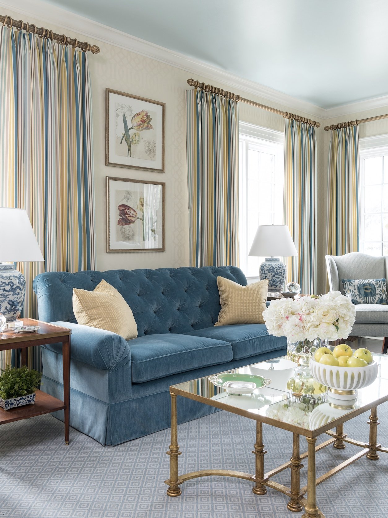
This blue sofa with yellow throw pillows perfectly matches the colors we chose for this SMU Theta sorority house in Dallas.

Sofas are one of those “anchor pieces” that define the look of the whole room. Since they aren’t inexpensive, you’ll want to find one that you can enjoy sitting on and looking at for years to come. Following is a checklist of four things that I, as an interior designer, would suggest that people keep in mind as they shop.

1. Scale

Consider the different ways that you sit or lounge on a sofa. Do you like to sit with your legs up? Make sure that the sofa is deep enough to accommodate. Do you lie down sometimes? Your sofa will need to be long enough for you to stretch out. If you’re tall, you may also want to look for a sofa with a higher back for better back support. For couples, sofas that are between 80-90 inches are an appropriate width. Families should seek sofas that are 90 inches or wider.

Sectionals look best in large rooms, so for a small living room, I would recommend a pair of two-seater sofas instead. That way, you don’t have a large block of the same color fabric dominating one side of the room.

Sectionals, like the gray L-shaped sectional we used in this Kessler Park den, look best in large rooms.

When you’ve found a sofa that you like, try cutting out the shape of it from newspaper and placing it on your floor to serve as a visual guide. Check to see if you have enough space to walk around it and that any open doors or shelves won’t swing into it. Measure your doorways too to make sure you can fit your newest purchase into the house. If you’re going to have difficulty getting a sofa into the house, you can look for sofas with a low back style or removable legs, or modular sofas that can be brought in piece by piece.

To leave enough room for a side table, add about 20 inches of width to your measurement. You should also leave 20 inches of space between the edge of your coffee table and the front of your sofa. Don’t forget to measure the sofa’s height too, especially if you plan on having it in the middle of an open concept living space. You want the back of the sofa to be low so that it doesn’t cut across sightlines in the room.

When the seat is too low, it makes the sofa more difficult to get out of, especially as we age. 15 inches or less is considered a low seat height. 

2. Comfort

For a casual living room, opt for comfortable cushions, but for a formal sitting area, you want cushions that are firm and keep their shape. Feather-filled cushions have a cloud-like feel; however, they need to be fluffed once a week to retain their shape. Foam-filled cushions are less plush, but they hold their shape better. Cushions with inner springs that are wrapped in both foam and down feathers are my top pick because they keep their crown longer.

3. Fabric

For families with small children, I suggest choosing stain-resistant outdoor fabric brands like Sunbrella or Crypton. These fabrics won’t fade in sunlight either, so they can be placed near windows. Leather is easy to clean but also scratches easily, so it might not be a good option for families with pets.

We used a combination of different upholstery textures to create variety for this seating area in a North Dallas home.

In choosing your fabric color, ask yourself: is this room intended to be calming, playful, or elegant? A colorful or patterned sofa can inject energy into a room. A neutral, solid color sofa provides harmony. Make sure to bring home a sample swatch. With a swatch, you can see how the scale of the pattern looks in your living space or how the light in the room changes the color of the fabric.

4. Style

When it comes to sofas, some people prioritize comfort over style, so they end up bringing home a sofa that looks completely out of place. It’s worth your time and money to find a sofa that matches your home and feels great.

Although it’s possible to mix different styles of furniture, the safest bet is to pick a sofa that matches the style of the rest of the room. Modern sofas often have tapered legs, track arms, block feet, and grid-tufted cushions. Traditional sofas tend to have a skirt with tape on the bottom, rolled arms, and contrasting cording. Modern sofas will be a lot sleeker, deeper, and lower to the ground than traditional sofas.

Finding the perfect sofa isn’t easy. However, arming yourself with a checklist of your top priorities will make the shopping process faster and easier. If you could use more guidance, try reaching out to an interior designer like myself. Interior designers have access to the most durable upholstery fabrics on the market. And once we see your space, we’ll know exactly what style and size of sofa will fit right in.

You can reach us by sending an email to info@chambersinteriors.com or calling us at our Dallas office: 214-651-7665.

RELATED ARTICLES:

Bring Warmth and Beauty to Your Home with These Fireplace Design Tips by Margaret Chambers

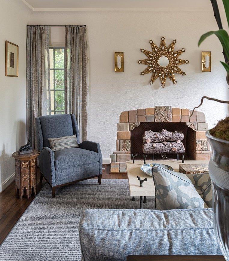
When we renovated this Spanish Colonial house in Kessler Park, we left the existing fireplace. It is surrounded with Rookwood tiles.

If you don’t have a fireplace, you may have wondered about what it takes to have one built. There are a lot of options out there: how do you decide which one is best for your Dallas home? On the other hand, maybe you have a fireplace already and want to give the mantel a major facelift for the holidays. Whether you already have a fireplace or are building a house for the first time, these tips should help you get started in your design process.

If you’re planning on adding a fireplace to your next home, you should start by selecting the basic type that you want:

Wood-Burning Fireplaces:

For many people, nothing beats the nostalgia, warmth, crackling sounds and aroma of a natural wood fire. Traditional wood-burning fireplaces come in handy during a power outage because they require no gas or electricity. However, they are an inefficient heating source compared to newer alternatives.

Gas Fireplaces:

Gas fireplaces do not require a chimney and can be controlled with the push of a button. They are also more energy efficient and environmentally friendly than traditional wood-burning fireplaces. The main requirements for a gas fireplace are a gas supply line and a venting mechanism, such as a chimney or metal tubing.

Gas logs are actually made of ceramic and placed above the gas burner to imitate the look of a real wood fireplace. Personally, I don’t mind gas logs. They’ve gotten more realistic and are convenient and easy to clean.

This dramatic fireplace is one of the architectural highlights of this home, which was designed by Bernbaum Magadini Architects, one of Dallas’s finest contemporary architecture firms.

Fireplace Style and Design:

It’s really important for a fireplace to be in the same style of the architecture of the house and proportional to the rest of the room it’s in. In my opinion, fireplaces should have a good size opening, preferably forty by forty inches. I also like to do a nice background, like a herringbone pattern, in the interior brick. If the mantel is wood, there needs to be one foot of noncombustible material around it. This material could potentially be cast stone, limestone, or brick. In my designs, I like for the firebox to go to the floor, which has a more classical look.

Keep in mind that the mantel should have enough depth for decorations: eight to ten inches deep, or deeper for a large fireplace. It’s also a good idea to have a plug above the center of the fireplace mantel for Christmas lights.

Sometimes all a fireplace mantel needs is a large piece of artwork over it, like this Audubon painting above the fireplace in the foyer of SMU’s Kappa Alpha Theta house. Fusch Architects designed this project.

Decorating Your Fireplace Mantel:

Since the fireplace is usually the focal point for a room, make sure it’s something that you want to look at. I recommend hanging a large piece of art or a mirror in the center that serves as an anchor for the decorative accessories in front of it. To create interest and lead a person’s eye all across the mantel, vary the height of the objects and include contrasting colors.

In this Hill Country farmhouse, we decorated the stone fireplace with a metal compass sculpture, rocking horse, candlesticks, and grass bouquet.

Note that if the mantel is crammed with too many accessories and picture frames, nothing stands out. On the other hand, mantels with just a couple of small items look underwhelming. Take a look at pictures of professionally decorated fireplaces to get a good idea for how many items to use and how big they should be. I usually use three to five items, such as a tea caddy in the center and candlesticks or vases on either side.

Although fireplaces may not get used often here in Dallas, now is the time of year when people are grateful to have them. Fireplaces are also a popular amenity that can raise the value of your home. If you’d love to include a fireplace in your dream home but find all the different options dizzying, consider connecting with an interior designer.

An interior designer like myself can help lay out the options for you and add the finishing touches to your mantel after the house is built. You can reach us by calling our Dallas office at 214-651-7665 or sending an email to info@chambersinteriors.com.

RELATED ARTICLES:

How to Tastefully Update a Period Home by Margaret Chambers

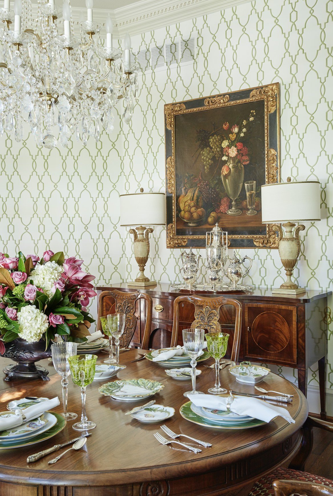
This dining room features dentil crown molding along the ceiling. We went with a clean, elegant, geometric wallpaper pattern that wouldn’t distract from the home’s architectural details.

Period homes (generally defined as any home built before WWI) tend to have high ceilings, beautiful detailing, and architectural features you don’t often see in new homes. For many homebuyers, the creaks, the cracks, and the repair costs of a period home are well worth it.

You might wonder how an interior designer like myself would approach a historic property. In my opinion, the architecture should tell you the design direction that you go, and the furnishings should reflect the period of the house. I personally think it’s kind of disturbing to obliterate the interior and redecorate in a minimalist style.

Of course, there’s no need to turn your house into a museum, either. Here are some tips for decorating a period home in a way that’s sympathetic to the house’s history, but still looks current:

1. Choose Fresh Colors

Start by doing research on how homes in the period were originally decorated, then pick and choose the elements that look the most timeless. As with any home, it’s better to make a period home as timeless as possible. After all, it’s expensive to do a home: if you only follow the latest trends, in ten years, those trends are gone and we’re all off to something else.

Don’t be afraid to use soft, contemporary paint colors in a Georgian, Federal, or Neoclassical house. If you use saturated wall paint colors, keep the period detailing (such as the cornicing) in more understated tones for contrast. Keep in mind that if your home is in a historic part of Dallas like Swiss Avenue, Hollywood Heights, or Munger Place, you may need to use a traditional color for the exterior.

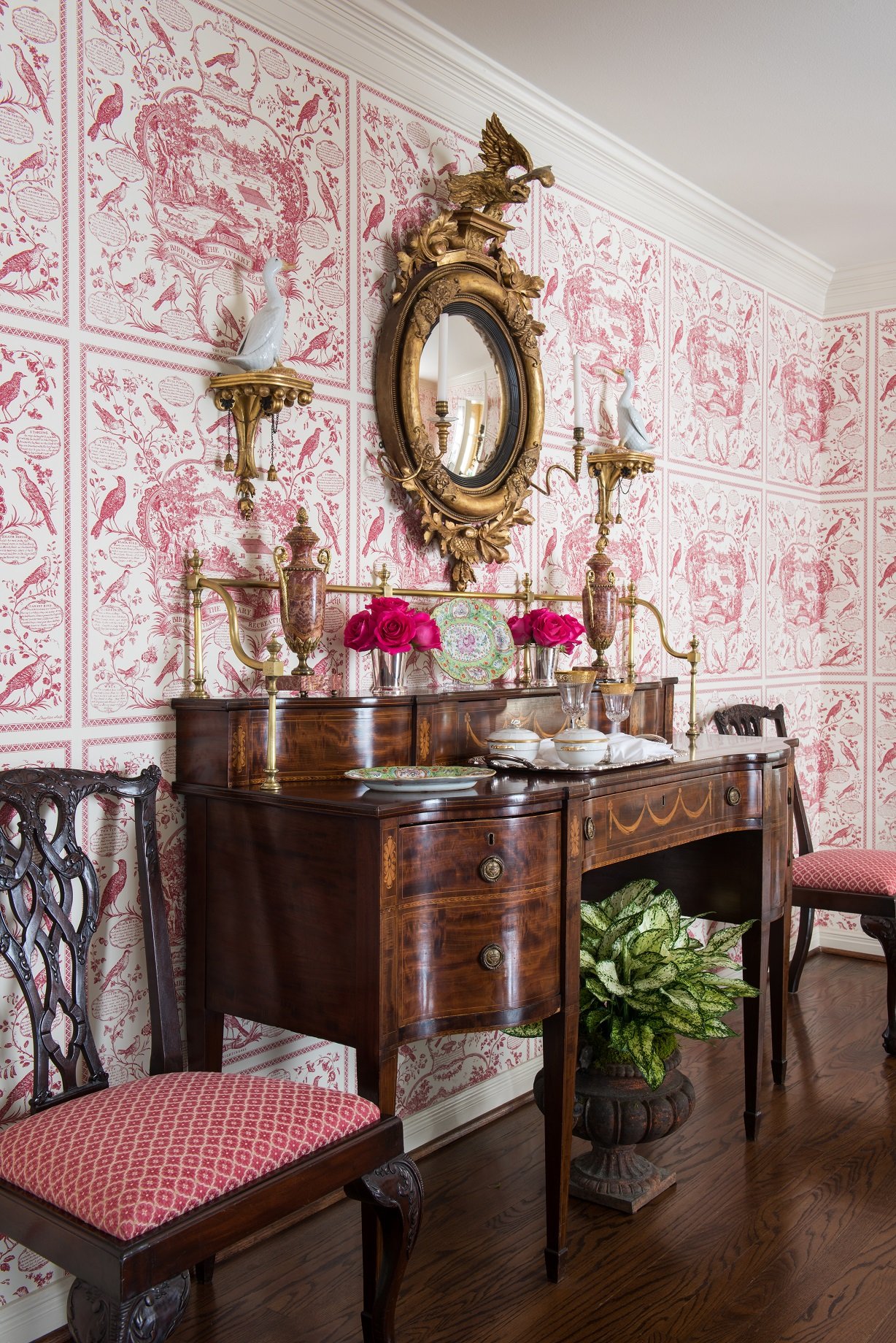
Patterned wallpaper is a luxurious touch, but choose a print with more modern and understated colors to keep your space from looking too dated. I suggest hanging mirrors instead of art over wallpaper because their simplicity gives the eye a place to rest.

Light and pastel colors, like the pinks that we used in this Park Cities English cottage, can help a traditionally decorated room feel fresh.

2. Highlight Traditional Architectural Features

Sadly, many period homes have had their original sash windows, fireplaces, molding, ceiling medallions, and baseboards ripped out and replaced with cheaper materials. Regardless of whether or not original fireplaces are still in working order, they are part of the charm of the home and should be celebrated.

Instead of replacing sash windows, consider repairing them, waterproofing them, or even upgrading them with double glazing. The wall around a stained-glass window should ideally be painted white or another neutral color to let the colors of the glass stand out.

If the original wood flooring is heavily worn down, consult a renovation expert before tearing it out. It may be possible to patch or repair it. I would also advise against changing the detailing in the house, and instead restore it by repainting it.

You can create an interesting contrast with original molding and ornate ceilings by hanging contemporary light fixtures. If you want to keep any original light fixtures, such as sconces, you can always have them rewired.

3. Play to Your Period House’s Strengths

One of the advantages of period homes are the high ceilings. You will probably want a large lighting fixture, such as a chandelier, to take advantage of the extra ceiling height. On the other hand, one of the downsides to period homes is that they sometimes have dark, narrow hallways. Hang mirrors, which reflect more light into the space, or add sconces in your hallways. High gloss paint can also be a good choice for brightening the walls of a period home. Just remember that your walls have to be extremely smooth, like glass, or a glossy paint finish will highlight every imperfection.

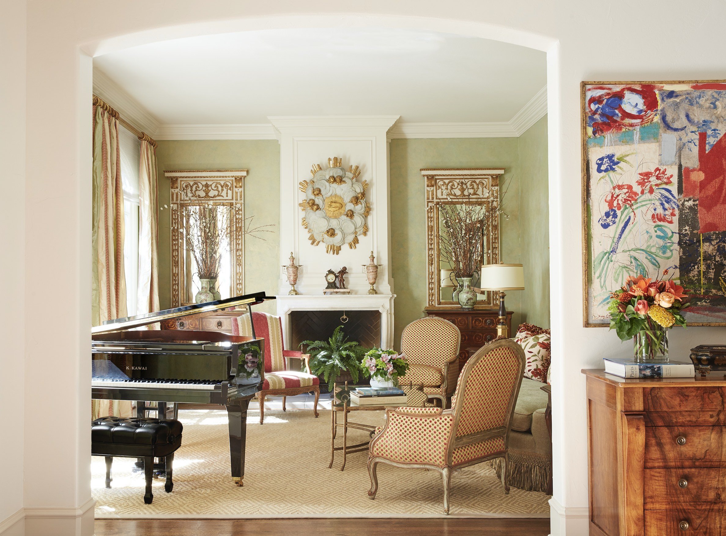
This formal living room we designed for a classically French home in University Park is traditional without being fussy. To the right is a piece of contemporary artwork that matches the color scheme of the room.

4. Find the Right Balance of Traditional and Contemporary

When it comes to furnishings, I think juxtaposing modern and traditional elements is best. If you’re using traditional art, mirrors, and wallpaper patterns, mix contemporary furniture into the room. The simple lines of the furniture will stand out beautifully against the traditional backdrop. Likewise, if you use a lot of antique furniture, you may want to use updated colors for the walls as well as contemporary art, which adds an element of surprise. Make sure to reupholster antique furniture using current fabrics.

An alternative to buying a period home is to work with a classically trained architect (like Larry Boerder, Robbie Fusch, or Stephen Zepeda, to name a few), who can build you a new home in a period style. If you already own a period home and need help deciding which parts should be kept as is, restored, or torn out, it might be time to consult an interior designer. A professional designer can help make sure that your renovation doesn’t go too far, and will be connected with lots of restoration experts who can breathe new life into the home. To schedule an appointment with Chambers Interiors, send an email to info@chambersinteriors.com or call our Dallas office at 214-651-7665.

RELATED ARTICLES:

6-Step Checklist for Making Your Next Outdoor Party a Success by Margaret Chambers

We mixed wrought iron and concrete faux bois furniture in this Kessler Park outdoor seating area to create a more interesting look.

An outdoor party takes a little more planning than an indoor one. Here are some of my personal tips for making sure everyone has a great time at your next barbecue, cocktail hour, or pool party.

1. Seating:

For this North Dallas project, it worked out better to have two small tables with umbrellas instead of one large table.

Once you’ve figured out how many guests you’ll be having, you can determine what your seating arrangements will be. Will your guests be seated at a long table? Or will you create a variety of seating arrangements for individual conversation groups? If there will be kids present, do you want a kids’ table?

You may want to rent additional tables, table cloths, linens, and chairs. In the past, I’ve ordered bamboo tables that seat four people and pushed them together to seat six people.

2. Table Settings:

I recommend decorative melamine plates because they are shatterproof and dishwasher safe. With melamine, you can hardly tell that it’s not real porcelain. Acrylic stemware is a sturdy alternative to glassware—after all, you don’t want glass near the pool.

3. Food:

It’s very important that the food you serve won’t melt or wilt in the heat. Some tried-and-true choices for outdoor parties include nuts, crudités and hummus dips, puff pastries, charcuterie boards, and dried fruit.

4. Drinks:

Self-service drink areas encourage guests to circulate the space and possibly cross paths with someone new to talk to. Stock your drink station with glasses, cups, straws, lemons and limes, club soda, and a cocktail shaker. Also consider including your own cocktail mix or punch (serve ice separately so that you don’t water down the mixture).

5. Games:

Food and drinks are not the only ingredients for a successful outdoor party: don’t forget to include games so that your guests never get bored. Good outdoor party games include horseshoes, croquet, giant Jenga, and badminton.

Cheese, olives, crackers, and cold cuts are all good snack choices for an outdoor party, even on a hot day.

6. Weather:

Here in Dallas, the window of opportunity for perfect weather is pretty small. If chill is a concern, provide throw blankets, outdoor heaters, or use a fire pit to keep guests warm. During the hot summer, guests will appreciate access to cold nonalcoholic drinks, misters, plenty of ice, fans, and shade.

Even if you’ve never entertained outdoors before, if you keep these tips in mind, you can plan with confidence. My firm also has a lot of experience with decorating both indoor and outdoor spaces, so if your outdoor living space could use an update, consider giving us a call, too. You can reach us by calling our Dallas office at 214-651-7665 or emailing us at info@chambersinteriors.com.

RELATED ARTICLES:

Get Ready for Pool Season With These 7 Pool Design Tips by Margaret Chambers

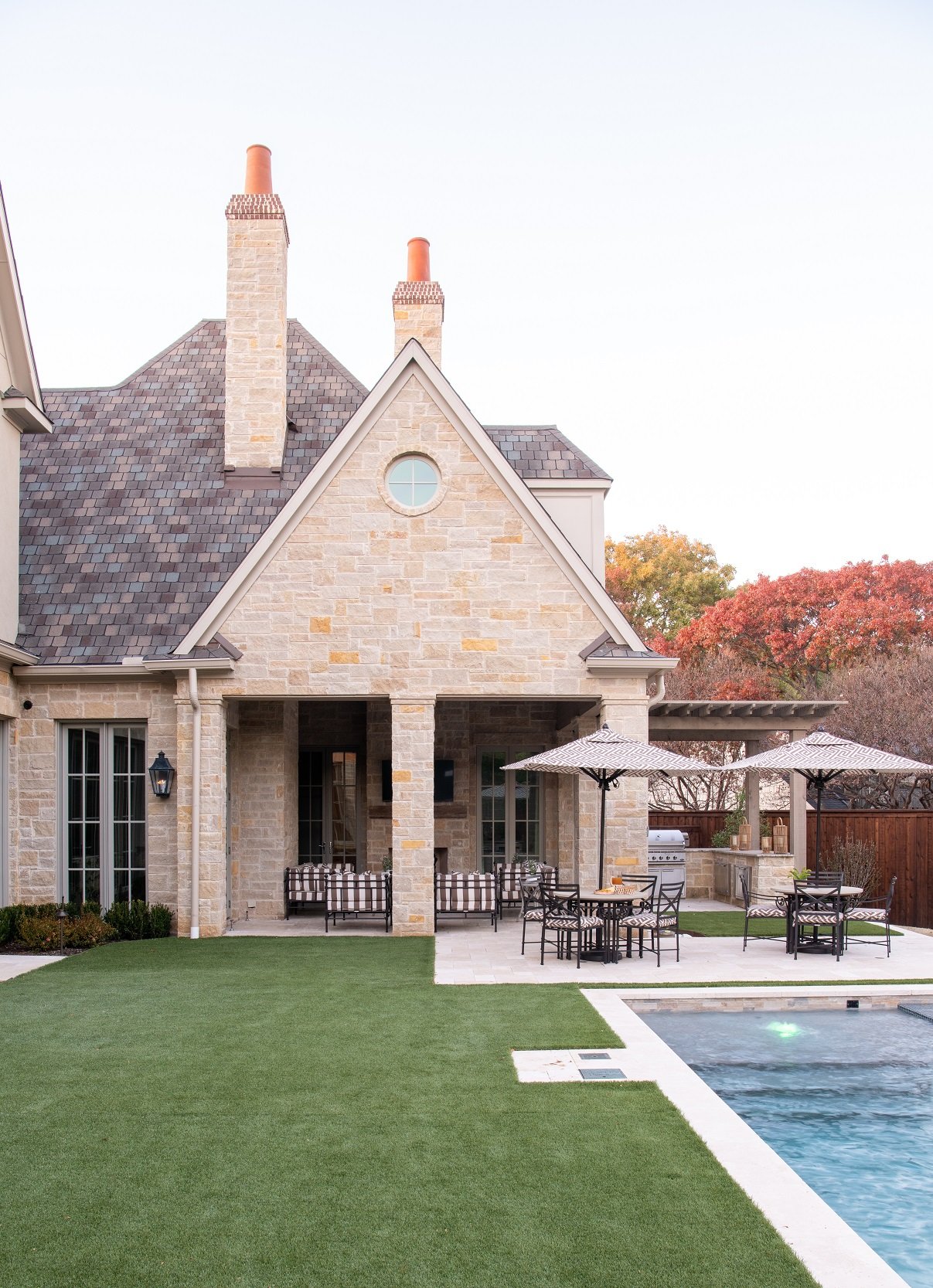
We used matching fabrics for the chairs and umbrellas to give this poolside outdoor living area a consistent look.

Over the years, I’ve had the opportunity to watch pool trends come and go and help choose pool shapes, finishes, and pool furniture for my Dallas clients. Here are some of the things I’ve learned about pools during my career as an interior designer.

1. Determine How You’ll Use Your Pool

First, if you’re thinking of building a pool, you need to list the different ways you plan on enjoying it. Do you want your pool to be for family recreation, personal fitness, entertaining, or a combination of all of these?

Families with children might want their pool to have a continuous underwater shelf or a pool bench. A lap pool needs to be rectangular and very large. If you are primarily using your pool as a party setting, you should ask yourself: will you want a fire pit or fireplace nearby? What about an outdoor kitchen, bar, or cabana?

2. Take a Look at Your Site

It’s important to ask a pool design expert to do a site analysis based on your property. This can help prevent your project from running into snags later. Big leafy trees and pools are a bad combination: you’ll constantly be cleaning out leaves. Pecan trees are prone to a disease call pecan scab in which the leaves develop black spots. When the leaves come in contact with other surfaces, like your pool deck, they leave behind a black film that is very difficult to get rid of.

3. Choose Your Pool Type and Shape

Vinyl and fiberglass pools are not commonly built in Texas because of soil conditions, so if you live in Texas, concrete is likely your best choice. The shape of the pool should also complement the architecture of your house. For example, for a modern house, I would design a sleek and simple pool. Be careful about “trendy” pool designs. A pool that is trendy now can date the house later.

4. Select Water and Deck Color

As far as color goes, I think that a pretty blue or aqua is the best pool color. Light-colored decks reflect light, while dark pool decks absorb heat. One of the concerns with light-colored decks is that they stain easily, but a good sealer can prevent this. Choose a durable tile that is easy to clean for the inside edge of your pool.

5. Plan for Pool Extras

This pool on a University Park home that we designed features an integrated hot tub with matching tile.

A spa or hot tub can be either integrated into a pool or built separately. I think it’s better to integrate the two as long as the spa will blend with the pool’s design. When it comes to water features, I personally love deck jets that arc and crisscross each other.

6. Add Outdoor Furniture

Pool furniture needs to have complementary colors to the home’s exterior. Although I often mix and match different kinds of furniture in my interior design, with outdoor furniture I almost always use all matching sets, with the same metal finishes and same fabric on the large cushions and umbrella. I introduce variety with contrasting decorative pillows or accent tables (like faux bois accent tables or garden stools), but that’s about it.

7. Do Your Research

It’s easy to get excited looking at brochures of beautiful pools, but think carefully before you take the plunge. Although a pool can help sell your house, homes with poorly made pools are harder to sell than homes without them. Look for pool companies in your area that have been in the business for a minimum of fifteen to twenty years and have a good reputation.

If adding a pool to your home is just one part of your home building or home renovation project, you can also bring in an interior designer for their input. An interior designer usually has a lot to say about pools: after all, they want to make sure that your pool not only looks beautiful, but is the perfect match for your house. To schedule a free consultation with us, send an email to info@chambersinteriors.com or call our Dallas office at 214-651-7665.

RELATED ARTICLES:

Make Your Home Inviting Day or Night with the Right Exterior Lighting by Margaret Chambers

Using a variety of lights creates a balanced and professionally-lit exterior, like this Dallas home we helped to design.

I’ve discussed interior lighting design in previous articles, but today I want to address exterior lighting because it’s really important for accenting your home and landscape. Exterior lighting helps you get the most out of your outdoor living spaces, even during short winter days. It’s also crucial for personal safety: a well-lit property gives intruders fewer places to hide. Below, I’ll go over some of the things I’ve learned about exterior lighting as a design professional.

Just like indoor lighting, outdoor lighting should be layered with different types of coverage. To light the front of your house, use bullet lights with bulbs that have a narrow (12°) spread, and aim them at the corners of your house or on architectural details. Fill in the gaps with soft wash lights. Generally, spotlights should be placed about one-and-a-half feet from whatever they’re shining on. When lighting the upper areas of your house, use smaller fixtures that won’t stick out as much.

For front porches, I recommend hanging a light fixture over the doorway and lights on either side of the door. I like to make sure loggias have hanging lights and fans. You can also put sconces on the columns, and add extra lighting with upward and downward lights. Steps will need lights — such as risers or lit treads – so that people don’t stumble.

One way to light a front or back door is by putting a sconce on either side.

Many people will put a series of lights in a straight line along a pathway, but this can make the path feel like an airplane runway. A more attractive alternative would be to stagger the lights on either side. As far as landscaping goes, there should be at least a little bit of lighting in the flowerbeds. If you have a large yard, you can light it by putting lights on posts at the corners.

Pool lighting is also important, and water features like fountains should always be lit. It’s also a good idea to think about where your Christmas lights will plug in. Add them to the backyard too if you’re planning on having backyard Christmas parties.

Solar lights are not recommended for exterior lighting because they are not as bright as electric lights. If you do use solar lights, you’ll need to choose larger fixtures to compensate. Although LED lights are more expensive upfront, they are a wise investment over time: they are more energy efficient and usually last twenty-five times longer than standard bulbs. When in doubt, use warm temperature bulbs. 3000K is a great standard color, one that is suitable to be used for your entire landscaping system.

It’s important to consider the scale of your home when choosing fixture sizes. For example, a two-story house will need larger lanterns than a one-story house will. If your house is under construction, go ahead and start purchasing fixtures now. You can compare different sizes, holding them up to your house to see which will be more proportional.

When you can, match the style of your outdoor lighting fixtures with the style of your home’s architecture. A traditional home should be lit with traditional wall sconces or an outdoor lantern, for example, while modern homes should use light fixtures with simple silhouettes. If you have a historic house, you may want to have the original exterior light fixtures rewired and refinished instead of replacing them.

When we updated this 1927 home in Kessler Park, we kept the original exterior light fixtures and rewired them.

Getting that “professionally lit” look for your house can be daunting. Between fixture placement, fixture style, voltage, wattage, color temperature, and beam spread, there are a lot of factors to consider for each and every light that you choose. These tips will help you get started, but if you’re pressed for time or feeling unsure, you can always bring in a professional.

As an interior designer, I’m often involved with choosing the exterior lighting for my projects. A full-service interior design firm such as mine can help make sure that your home is well lit inside and out. You can reach out to us by calling our Dallas office at 214-651-7665 or emailing us at info@chambersinteriors.com.

RELATED ARTICLES:

Why Homeowners and Designers Alike Are Embracing English Style This Year by Margaret Chambers

English style can work with both warm or cool colors. Pink adds a whimsical touch to this English cottage we designed.

English style has been making a comeback lately. If I had to make a guess as to why, I think it’s because English furniture is a little bit simpler than French or Italian style furniture. It mixes really well with a modern home.

If you’re drawn to English style but are worried that incorporating it will date your interior design, you’ll be glad to know that an English-inspired home can still look very current. In this article, I’ll give an overview of the key characteristics of English style and how I’ve been using English furniture and accessories successfully in my own design projects.

Traditional English homes, whether they are cottages or manors, tend to be comfortable, warm, and inviting. The color schemes are classic and understated rather than bold and vibrant. For example, these colors can include rust red, robin’s egg blue, pale green, pink, or gray. The flooring in an English home is usually wood with rugs over it, especially oriental or sisal rugs. The window treatments could be drapes, curtains, or shades, but never blinds.

Even a relatively modern or transitional English style home should be layered with antiques or traditional art to give the home a sense of history. That said, most designers are not using as many antiques as we did ten or twenty years ago. Back then, I would occasionally do entire rooms in English style, but nowadays, I use English antiques as more of an accent, scattering them throughout the home.

Another way to help an English-inspired room feel more current is to choose contemporary colors and simple draperies. For example, in one project with English antiques I used an aqua paint color to make the room feel fresh.

Aqua paint helps this English antique-filled dining room seem light and airy as opposed to dark and dated.

If you don’t already own English antique furniture, you’ll definitely want to brush up on the different periods of furniture making, such as the Tudor, Georgian, or Edwardian periods. Thomas Chippendale is the most famous English furniture maker: anything that was originally made in his workshop belongs in a museum today.

English furniture is usually made with very dark wood, such as mahogany, and has less carving than French or Italian pieces. Another interesting thing to know is that the English liked as many reflective surfaces in their homes as possible to brighten things up. As a result, they used shiny finishes on both their wood furniture and their hardware, with the hardware often finished in shiny brass.

English antiques are often made of dark woods with shiny finishes, like these in a University Park home we designed.

An easy way to capture the ‘English look’ is to learn about iconic furniture designs from England and incorporate them into your rooms. Some of these “staple” pieces include the Windsor chair, the Queen Anne chair, and the Chesterfield sofa. Four-poster beds with heavy drapes were traditionally used in English homes to insulate against the night chill.

I would also encourage anyone serious about English antiques to see collections in person if they can. Here in Dallas, the DMA has a whole wing of fine pieces of American furniture. American furniture is worth looking at as well: American and English antique furniture are so similar to each other that it can take an expert to distinguish the two. Another large collection of American furniture is in the Winterthur Museum in Delaware.

As far as accessories go, the English liked to use chinoiserie. Europeans in general have long been fascinated with Asian porcelains. Other accessories commonly seen in the traditional English home include needlepoint pillows, antique clocks, and oil paintings of family portraits, dogs, or horses.

Traditional paintings featuring dogs and horses, especially in hunting scenes, are classic English style.

Even if full-blown English interiors are considered outdated by some today, I still love to work with English furnishings and antiques. Balancing them with a modern or contemporary interior is a fun and rewarding challenge.

An interior designer like myself, especially one well-versed in European antiques, can be a valuable partner in both sourcing the antiques and figuring out the best way to use them in your home. To schedule a free consultation with us, send an email to info@chambersinteriors.com or call our Dallas office at 214-651-7665.
RELATED ARTICLES:

Framing Art 101: How to Properly Protect and Showcase Your Art by Margaret Chambers

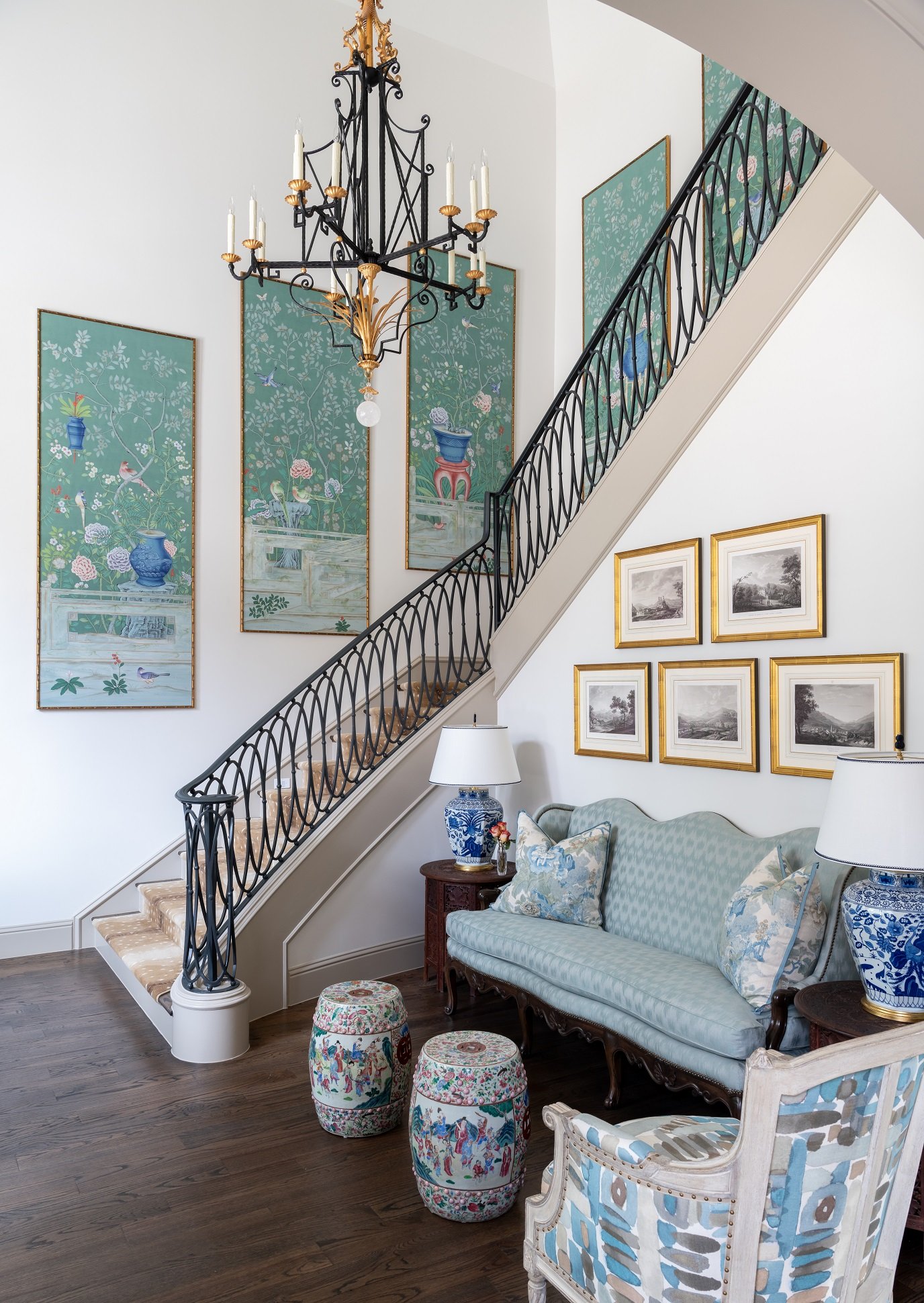
When we frame and hang wallpaper panels, like these seen here, we don’t add glass in order to keep them lightweight.

Framing art is a project that people tend to put off because there are so many decisions involved. It’s not just the frame that you have to select: you also have to choose the right mat and decide whether you want glass, plexiglass, or no glass. As an interior designer, I love to work with clients who are art collectors. Here are some of the things I’ve learned while framing my clients’ art pieces.

Protecting Valuable or Personal Art

If you’re looking to reframe multiple art pieces, start by separating your most valuable pieces from the rest. These pieces should be framed using archival, museum-grade materials, such as an acid-free mat, a dust cover, and possibly a glass or plexiglass front.

We usually put non-glare, museum quality, UV-protected glass on fine art pieces. Textiles and watercolors are extra-sensitive to light and should be hung in shaded areas, even if they have UV-protected glass.

Use a Mat to Create a Neutral Backdrop

Most artwork looks better matted. The mat acts as a visual buffer between the artwork and the frame. By separating the art from the glass, it also creates a small space for airflow so that the glass and the art do not stick together.

These antique pen and ink drawings are framed in 22 karat gold.

Although mats can come in different colors, you almost always want to go with a white or off-white. Brightly colored mats tend to look dated. However, black or gray mats can be an appropriate choice for artwork that is already mostly white. For very small artworks, keep in mind that the smaller the artwork, the larger your mat should be. For prints or botanicals, I like to use French mats; a lot of the time, we also include a fillet of gold or silver on the inside, depending on what color the frame is.

Finding the Right Frame

Since professional framing can be expensive, it’s worthwhile to shop at antique stores for pretty frames to repurpose. When I’m helping a client, I like to give them high, medium, and low price points for frames. Prices vary a lot, and sometimes the framing can be almost as expensive as the art.

On the left is a 16th century Indian painting that was reproduced onto a tapestry. We mounted it in a custom acrylic shadowbox.

When it comes to framing, I want to highlight and complement the art rather than distract from it. For example, I would use an elaborate frame for traditional art, such as a portrait, and a simple frame for modern art. Sometimes people put mirrors in nice antique frames. I also love to frame textiles from Africa and India. With a textile, we will attach it to a linen backing and put a Lucite box around it. When framing large wallpaper panels, we like to use a very thin gold frame or a bamboo frame.

Seen here is a series of prints on handmade paper. We floated them in acrylic enclosures for this Dallas family room.

The Pros and Cons of Glass and Plexiglass

Museum grade glass was the standard option for a long time, but plexiglass has come a long way and is a solid choice. Plexiglass is lightweight, antistatic and scratch resistant. However, even scratch resistant varieties of plexiglass are easier to scratch than real glass. Plexiglass is great for collectors who move often: it’s easier to take with you from place to place and less likely to shatter if it’s dropped.

We always put glass on watercolor and prints, but we don’t put any glass on large wallpaper panels or oil paintings. Oil paint does not fade in the sunlight, so it doesn’t require the same protection as other mediums.

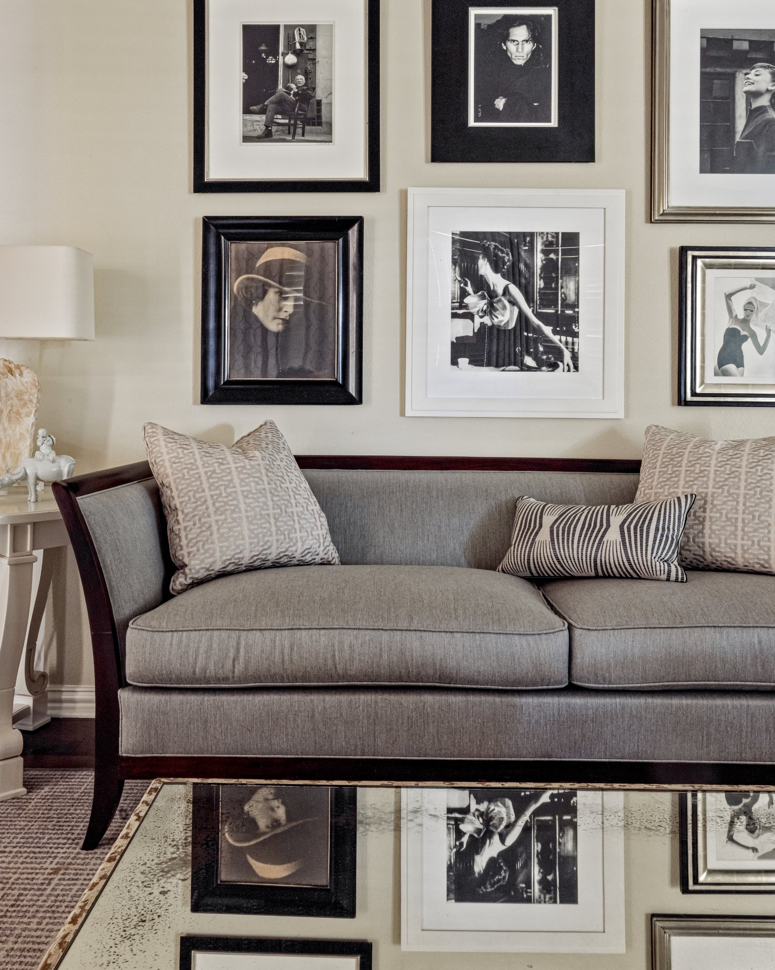
Rather than using all-matching frames for your gallery wall, try choosing frames that are different but complementary to each other, like the simple, monochromatic frames we chose for this gallery of black-and-white photos.

Although framing art can be intimidating, it’s a great opportunity to make your art look even more spectacular. By arming yourself with knowledge, you can approach a framer — or frame a piece yourself — with confidence.

For homeowners with large collections and little time, I would recommend contacting an interior designer. An interior designer like myself will not only know the best way to frame your pieces, but can also help you find where to put them in your home and hang them at the correct height. Our Dallas office can be reached by calling 214-651-7665 or sending an email to info@chambersinteriors.com.

RELATED ARTICLES:

How to Use Paint to Add New Life to Old Furniture by Margaret Chambers

The bedside chest in this photo is painted in a neutral wash to balance out the bold oranges in the rest of the room.

Painting is a great way to update old and tired furniture with worn finishes. Painted furniture has been around for hundreds of years, and you can see examples of it in every major interior design style. For example, whitewashed furniture is traditionally used in Sweden to make a room feel brighter during Scandinavia’s dark and dreary winters. In Asia, a lot of antique furniture is painted in a cinnabar color with a high-gloss finish or black lacquer with a little gilding.

That said, with painted furniture, a little goes a long way. Before you pick up a paintbrush, read this design guide for some do’s and don’ts on using painted pieces in a room effectively.

Choosing the Right Color and Finish

Antiqued gold accents on a whitewashed piece of furniture add both dimension and a touch of flair to the piece.

Not all paint colors and finishes are created equal when it comes to furniture. Generally, muted colors are preferable to bright colors: a touch of gray in a color gives it sophistication. Old-fashioned desks or armoires can feel fresh and modern again when painted in an unexpected color, like gray green. Rattan chairs take on a refined air when painted with gray and mixed with modern furniture. However, I personally would never paint a fine antique, especially a piece from the 18th century or older.

At my firm, lately we’ve been lacquering vintage pieces with a high-gloss finish. Sometimes we also whitewash a piece of furniture, then paint the details in a contrasting color or gild them. Metallic paint looks best as subtle accents on painted furniture. With night chests, I like to stain the top and whitewash the bottom. Something to keep in mind is that furniture pieces don’t have to be painted all in one finish.

Mixing and Matching

Many homeowners are afraid to mix furniture with different styles and finishes, but a serious designer will never use a matching set of furniture. The challenge is worth it: in my opinion, rooms are much more interesting when the finishes don’t all match. For example, if you have three painted furniture pieces in a room, you might want to use different shades of the same color. I also like to add stained pieces, which ground the room, in with my painted pieces.

The painted chairs in this Preston Hollow dining room did not come with the table, but still complement it nicely.

On the other hand, using the same paint color for multiple furniture pieces is not a bad idea when you’re bringing together different kinds of chairs in the same seating area. The chairs should ideally be in the same general style and made of similar woods, so that you’ll know that they take paint the same way.

Don’t Rush the Process

The best paint jobs have a lot of prep work put into them. If you’re going to paint your furniture yourself, make sure to sand and prime it well so that the paint won’t chip later.

Also, remember that different types of wood take paint differently. For example, poplar or soft maple yield a smooth finish. Oak plywood is not recommended for painting, as paint or primer will not fill the pores very well.

Use Painted Pieces Sparingly

I only use painted furniture as accent pieces. I would never do a whole room with painted furniture, and the most I would use is three pieces per room. I often like to use a painted bed in my designs and scatter other painted pieces throughout the rest of the house. If you’re not sure whether you want to use one, two, or three painted pieces in a room, try painting just one and living with it for a while.

These leather and cane-back dining chairs, which have painted faux bois frames, are custom designed from The Chambers Collection.

Although painted furniture belongs in any home, no matter the style, it’s tricky for most people to learn how and when to use it. If you would love to extend the life of your vintage pieces but are unsure what finish or paint color would look best, ask an interior designer to look at your collection. This is one of the reasons why people hire interior designers in the first place: combining furniture pieces with different paint colors, wood types, and finishes is a skill that takes years of experience to master. You can schedule a free consultation with us by calling our Dallas office at 214-651-7665 or emailing us at info@chambersinteriors.com.

RELATED ARTICLES:

Take Your Interiors to the Next Level with Decorative Mirrors by Margaret Chambers

Antique mirrors are best for traditional homes, like this English cottage we designed in University Park.

Mirrors are one of those interior design tools that no home can really do without. Even in rooms where you wouldn’t normally need a mirror, they still offer many benefits, such as reflecting more light into the space or making a room feel more expansive. If you’d like to add more mirrors to your home but aren’t sure what kind to buy or where to hang them, read on for some of my personal tips.

Choosing Mirror Size

This mirror in a Dallas home goes all the way up to the ceiling. It makes the small powder room feel twice as large.

As far as size goes, you should usually go for the largest mirror you can afford. Because mirrors tend to recede into the background, you can get away with a large mirror even in a space where a large painting of the same size wouldn’t work. Don’t forget that mirrored walls are an option too — they really open up a small space, like a bathroom.

Selecting Mirror Shapes

In a room with a lot of straight lines, a round mirror will add some much-needed variety.

Mirrors come in a lot of shapes besides rectangular, so consider your options carefully before buying. It’s possible that a round, oval, bull’s-eye, square, or sunburst mirror would be the perfect shape for your wall. At my firm, we sometimes use beveled mirrors with small medallions in the corners.

Finding the Right Mirror Style and Frame

Carved frames like this one can be ‘too much’ for contemporary homes but are perfect for Old World style homes.

The style of your home or room should complement the mirrors you choose. Traditional mirrors, which often have sculpted frames with intricate details, are best for traditional houses, for example. If you have a brand-new mirror that you want to include in a traditional room, you can always have it antiqued. Mirror frames in contemporary or modern homes tend to be more simple and subtle.

Placing Your Mirrors

We placed a painting and a mirror across from each other in this entry so that the painting would reflect in the mirror.

When it comes to finding the right spot for your mirror, you have two options. You should either try to reflect natural light or reflect something decorative in your room. For windowless rooms, you can also put your mirror next to a lamp or sconce to double the amount of light: this is a great technique for lighting up dark corners.

If you’re going to reflect something besides light or scenery, it’s important that your mirror shows something attractive. For example, try to reflect a painting, a piece of pretty furniture, or a beautiful door in your mirror.

Hanging Your Mirror

If you're hanging a mirror above a chest, it should generally be closer to the chest rather than centered on the wall.

How high you hang your mirror depends on what kind of room it’s in. For example, a hallway mirror should be at eye level so that you can check your reflection before you leave the house. If you’re hanging your mirror above a piece of furniture, the mirror should be closer to the furniture than it is to the ceiling. This brings the mirror and furniture together as a vignette. A nice way to fill a large wall is to hang one mirror in the center of a group of small individual paintings or prints.

Mirrors need to be hung with at least two wall hooks or picture hangers. The problem with hanging a mirror on a single hook is that it will end up resting against the wall at an angle, which distorts the reflection. Always have your very heavy mirrors hung by professionals.

Once you’ve learned about the different kinds of mirrors available and how to utilize them effectively, adding that extra touch of luxe to your home will be that much easier. If you could use some help with sourcing antique mirrors or custom mirrors for your Dallas home, give us a call at 214-651-7665 or send an email to info@chambersinteriors.com. I work with a wide variety of interior design styles, so I have a lot of experience with using both traditional and contemporary mirrors.

RELATED ARTICLES:

Design a Beautiful Dining Room You’ll Use Year-Round by Margaret Chambers

Almost everything in this dining room follows a neutral palette, from the English firework chairs to the feather crystal chandelier.

Whether your dining room is used often or reserved for special occasions, it's an important area in your home and deserves to be beautifully designed. Following are some interior design tips for dining rooms, drawing on my years of experience as a professional designer.

With dining rooms, it's helpful to consider the style of adjacent rooms, any heirloom pieces you intend to use, and the ambiance you want to create. If you own heirloom furniture or have furnishings you don't plan on replacing, such as built-in cabinets, you should pick a color palette that harmonizes with them.

Light colors, like the pale blues and creams we used in this Preston Hollow dining room, make a space feel more open.

Is your dining room small or large? If the room’s size is making it difficult for you to work with, you can use color to make the space appear more open or more enclosed. For example, choosing a deep color for your walls gives your dining room an elegant and cozy feel. Cream and pale colors can help open up a small dining room. If you're putting your dining table in a corner area, combining a banquette with dining chairs is a great way to make the best use of your space. Use the same upholstery fabric on both the banquette and chairs to tie the mixed seating together.

To avoid overcrowding, make sure there is enough room for people to move in and out of their chairs once they've been seated. A good rule of thumb is to leave three feet of room between the dining chairs and surrounding furniture or walls.

In order to seat eight in the relatively small room, we custom designed a round table that was a good fit for the space.

Consider how many people you will want to host before you buy new dining furniture. While rectangular tables are suited to hosting a large party in a rectangular room, round tables are great for square dining rooms and encourage conversation. Forty-two inches is the ideal width for a rectangular table. You should also make sure to take measurements before you buy new chairs for an existing dining table. If the chairs are the wrong height for the table, it makes things uncomfortable for guests. You can add some interest to your seating arrangement by using contrasting chairs for the head and foot of the table.

The textures and colors of your furnishings should be compatible with the style of your home. Steel and glass are a good fit for contemporary, while polished wood can have a formal look, and rougher textures like pine or distressed finishes convey rustic charm. Bring all your furnishings together with an area rug or a chandelier. With an area rug, it’s important to leave enough space on all sides for guests to scoot their chairs out without running over the edge of the rug—at least two feet out from the edge of the table. If your dining room does not have enough space for a rug, it’s preferable to not have one at all.

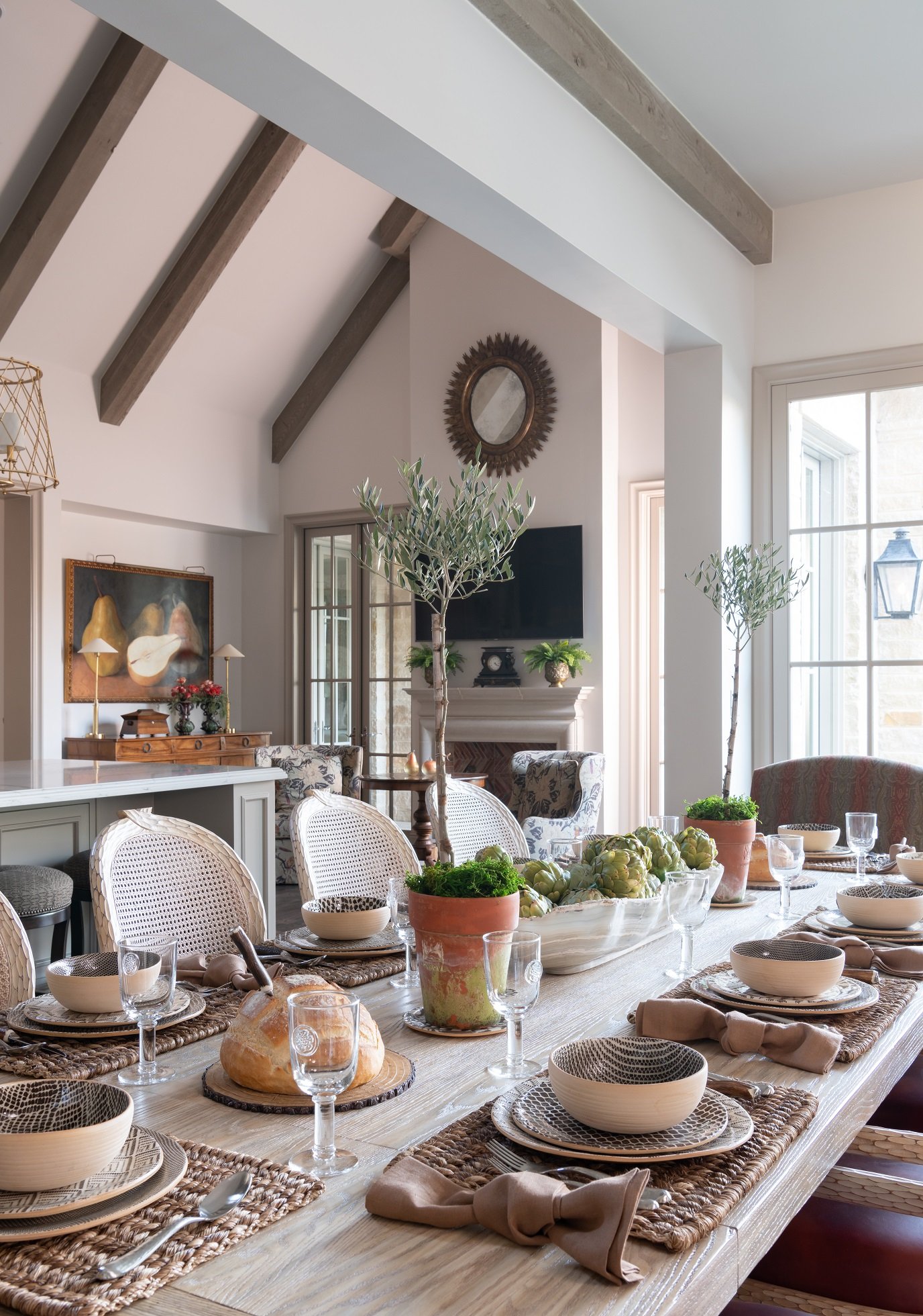
The table setting in this Dallas kitchen we designed exudes rustic comfort with a touch of class.

Make sure your lighting will create the ambiance you want for your dining room. Don’t hang downlights directly over chairs, or else you’ll create dark shadows on guests’ faces. A chandelier should be hung twenty-eight to thirty-four inches above the table to prevent bulb glare from being visible in the eyes of seated guests.

Sconces, buffet lamps, and wall washers are useful for adding ambient light to the room or highlighting artwork and architectural details. A dimmer is also great to have. Not sure what to decorate your dining room walls with? Aside from artwork, you might consider using photography, wallpaper, mirrors, a plate collection, or decorated shelves.

If you're having trouble making the best use of your furniture and your space, you can always consult an interior designer. After all, you'll want your dining room to be a room you love and use often, whether you plan on entertaining or using it as a family hangout space. To schedule a free consultation with us, send an email to info@chambersinteriors.com or call our Dallas office at 214-651-7665.

RELATED ARTICLES:

7 Tips for Charming Children's Rooms by Margaret Chambers

The best-designed children's rooms have a touch of childlike whimsy but also complement the rest of the home.

Decorating a room for your child can be a great opportunity to show your creativity, but it also presents some unique challenges. Children's rooms should express the child's interests while also blending with the rest of the house. If you're stumped on the best way to please both your child and yourself, consider these suggestions.

1. Use Multi-Purpose Furniture

Unless you want to spend a lot of money redecorating as the child grows older, you should decorate with flexibility in mind. A crib that can convert to a youth bed is a smart choice. It’s also not a bad idea to make space for a small desk now. Your child will appreciate having a place to work on drawings, and later, the workspace can be updated to a teen work desk. Younger children need plenty of floor space to play, so remember to leave lots of room.

Even if your child isn't attending school yet, try to leave space in the room for a work desk.

2. Include Enough Storage

You can encourage your child to be more responsible and independent by including storage bins and shelves that are low to the floor and easy to access. It’s easier for them to put away clothes on shelving rather than hangers in a wardrobe. Use a mixture of open and closed storage so your child will be able to display a few favorite items while keeping the rest out of sight. Baskets and canvas bins are a more attractive storage option than plastic bins and are softer to the touch.

3. Plan Ahead for Lighting

Lighting is important in every room, but a child's room should be especially well-lit. You can fill the room with light using a pendant light or a cute chandelier that completes the room's theme. A reading light beside the bed or a favorite chair is a must.

The art and rug in this boys’ room were previously owned by the clients. We chose fabrics to match their bold colors.

4. Weigh Your Flooring Options

Choosing flooring for children’s bedrooms can be a balancing act between comfort and maintenance. While carpet is comfortable and absorbs noise, it’s also harder to clean in case of messes. Hardwood is easy to clean, but doesn’t insulate noise or soften falls. A good compromise is hardwood flooring with plush rugs. Don’t forget to put a pad underneath the rug to prevent slippage.

A wall-mounted collection of toy soldiers add charm to this boy's room we designed in a Preston Hollow home.

5. Approach Theming in a Balanced Way

An important topic to consider is themed decorating. While your dinosaur-obsessed toddler may love to see dinosaurs throughout the room, he or she might outgrow the phase. How themed you want the room to be is up to you. You can go all the way with a sports theme using sports posters, bedding, and wall decorations, or you may decide to focus on choosing patterns and colors your child enjoys instead. A suggested middle ground might be to use simple and flexible furnishings while placing a few themed accents around the room.

6. Choose Paint Color Carefully

When you have a baby on the way, it's tempting to paint the room in pink or blue, but gender-neutral colors like green and yellow are becoming more popular as well. Also, keep in mind that color has a psychological effect and can be either calming or energizing. A good rule of thumb is to choose a light wall color and use stronger colors for the accessories and furnishings.

Light green is a gender-neutral paint color that is becoming more popular for children's rooms.

7. Don’t Forget About Wallpaper

Wallpaper has been making a comeback over the last decade and instantly adds charm to a child’s bedroom. Wallpaper patterns designed for children’s rooms are not your only options. Basic geometrics and florals are versatile enough to work with a wide variety of room styles.

By choosing timeless furnishings and colors, and a few personal touches to express your child's interests, you can create a beautiful room your child will remember fondly. If you need help designing a nursery for a baby on the way or updating a bedroom for a growing child, give us a call. Most of our clients have children or grandchildren, so at my firm, we have a lot of experience in both children’s and teen bedrooms. You can reach our Dallas office by calling 214-651-7665 or sending an email to info@chambersinteriors.com.

RELATED ARTICLES:

Why Sconces Belong in Any Home’s Lighting Plan by Margaret Chambers

Lantern style sconces are usually used outdoors, but can be used indoors as well, like in this Dallas bathroom.

Sconces are a wonderful way to add decorative lighting to any room. You most often see them on either side of a bathroom mirror, but I like to use them in many other applications as well, such as alongside a big painting, next to bookshelves in a library, or above fireplace mantles. If you’re currently designing a new home and want to try incorporating more sconces into your plan, you’ll find the following pointers useful.

Researching Sconce Styles and Materials

If you have a modern or contemporary home, you’ll want to look for wall sconces with straight lines, simple forms, and sharp angles. For a very traditional home, I’d recommend fine reproductions of traditional sconces, or shopping for antique sconces and having them rewired.

While sconces do not have to perfectly match the other light fixtures in the room, they should be complementary in some way, like sharing the same metal or similar shapes. At my interior design firm, we used to use a lot of iron sconces, but nowadays we prefer sconces made of brass or polished nickel, some with patterned fabric shades.

Ordering and Hanging Your Sconces

Adding sconces to an existing wall is a difficult process, so the planning for sconces is typically done during the design phase for a house. When we work with the client, we use a tape measurer to figure out where sconces should go so that we’ll know where the electrician should pull the cords to.

These modern sconces are an appealing contrast to the multicultural antiques and patterns in this formal living room.

Whenever possible, buy the sconces you think you want and hold them in the room to make sure they’re the right size. Getting the right proportion is tricky for most clients. Generally, the lower your ceilings, the smaller your sconces should be. Most sconces should be hung at approximately eye level, between five and a half to six feet high.

Hallways and Stairways:

Space the sconces about eight to ten feet apart to make sure that the hallway is adequately lit without being too bright. In a narrow hallway, sconces should not stick out too far.

One of the trickiest places to add sconces in is a staircase, but they can be helpful for safety purposes. Here, it’s usually better to use odd numbers of sconces rather than even.

Bedrooms:

Wall-mounted sconces are perfect for creating reading light over the bed. They should usually be positioned thirty to thirty-six inches above the top of the mattress, and no more than a foot away from the edge of the bed. Another great spot for a bedroom sconce is where the fabric is gathered on a canopy bed.

You can also use sconces to light the area where you get ready for the day. After all, overhead lights are not the best for putting on makeup or shaving.

Bathrooms:

Sconces for a bathroom mirror should be hung one quarter to one third of the way down from the top of the mirror. If your bathroom has two vanities, you’ll want three sconces: one to put on either side of the outer edges of the vanities, and one in between them.

It's best to put sconces on either side of a mirror. Overhead lighting casts unflattering shadows on the face.

Exterior Lighting:

Outdoor lanterns are essentially sconces with covers to keep dirt out. In my opinion, people often position them too high or too low on the front of a house. Outdoor sconces need to be durable enough to withstand the elements and also bright enough to illuminate the porch, the front, or the back of your home.

Even after doing research and making careful measurements, some homeowners may still find it difficult to get sconces that are the right proportion and style for their home. In cases like this, they may want to seek out an interior designer such as myself who often uses sconces in their designs. The trouble is worth it: when sconces are thoughtfully chosen and positioned, they are a fantastic asset to your overall lighting plan. If you live in the Dallas-Fort Worth area and would like to schedule a free consultation with us, call 214-651-7665 or send an email to info@chambersinteriors.com.

RELATED ARTICLES:

Find Your Happy Place with These 4 Vacation Home Design Tips by Margaret Chambers

Seen here is a charming vignette from a Hill Country style second home we designed in Prosper, Texas.

If you’re like many Dallas urbanites, you’ve always dreamed of having another place to escape to, such as a mountain cabin, lake house, or beach house. However, designing one home is already a big project. It’s no wonder that many people would feel weary just thinking about styling and furnishing a second home.

There are certain things that I think people should keep in mind before they design their first vacation house. Regardless of whether or not you already own a vacation property, or are making plans to buy one, these designer tips should help you get started.

1. Choose the Appropriate Design Style for Your Location

This guest bedroom and bathroom in a Dallas home have a nautical theme to give guests that "getaway" experience.

Now is the time to create a look that’s entirely different from your city home. To start with, I think a second home should reflect the area it is in. Farmhouses and mountain homes tend to be rustic, while coastal homes are usually more casual. For example, a mountain home could have photographs of local scenery or wildlife on the walls. If your second home is by the shore, you’ll definitely want nautical accessories, like seashells or nautical paintings. A lake home should almost always be decorated in light and cool colors, such as blues, whites, and aquas.

2. Make Sure to Create an Oasis

Your vacation home should be a place that you want to escape to. No matter the budget, there needs to be at least some touches of luxury in the home to give you that “resort” feel. It’s up to you where you want to splurge—in unique accessories, luxurious fabrics or in natural materials, to give some examples. One way to make your bed feel more inviting is to choose an extra tall or extra wide headboard. Your bathroom should also be bright and well-lit to create a spa-like atmosphere.

While some accessories are necessary to give the home personality and charm, remember that clutter also creates more stress (and all of those pieces will need to be dusted, too). I wouldn’t include anything that is too delicate or precious in a vacation home. This is especially true if small children or pets will be spending time at the house, in which case you should choose a durable flooring, like polyurethane-coated hardwood or tile, instead of carpeting.

Instead of delegating worn out bedding sets to your second home, make quality bedding one of your budget priorities.

3. Keep Things Interesting with Texture

Vacation homes are usually in a beautiful natural setting, so you’ll want to ‘bring the outdoors in’ by using natural materials. If you look at professionally designed vacation homes, you’ll see a lot of wood furnishings. Some other natural materials you can think about including are slate floor tiles and natural fiber rugs. Don’t forget to combine your rough textures with soft fabrics, like those made of sheepskin, wool, or linen. Since you won’t be using your vacation home year-round, you probably don’t want to buy live plants. Instead, add some greenery with realistic-looking faux plants.

Since this vacation home is a farmhouse, we made sure to include lots of natural materials, especially wood.

4. Plan Ahead for Your Guests

Most people who own a second home intend to let their friends or relatives use it too. If you do plan on entertaining, make sure that your living and dining areas will have enough seating space. A round table makes it easier to squeeze in additional chairs if needed. A vacation home table should also have plenty of space to play games or work on puzzles. Consider adding bar seating to your kitchen island so that guests can visit and chat with you while you cook. If you’re loaning out the home to people you don’t know very well, have an area where you lock up and store your own personal belongings.

As you can imagine, there are certain design styles that are better suited than others for vacation homes. Depending on where your second home is located, the list of fitting styles gets even narrower. Knowing more about these styles will make it much easier for you to envision and design your dream home.

The striped green curtains in this girl's room bring the colors of the outdoors in.

If you don’t have the time or energy to do it yourself, that’s where an interior designer such as myself could come in. My firm has a lot of experience with vacation homes, and I personally enjoy finding ways to bring local color and regional accessories into them. You can reach out to us by sending an email to info@chambersinteriors.com or calling us at 214-651-7665.


RELATED ARTICLES:

5 Alternatives to a Plain White Ceiling by Margaret Chambers

A coffered ceiling in a foyer, like this one in a Dallas home we designed, makes a dramatic first impression.

Ceilings are usually the most forgotten part of a room. It’s a shame, because there are so many ways to make ceilings the finishing touch for your interior design. If you’ve made a habit of ignoring your ceilings but are ready to try something new, you’ll be glad to know that there are paint colors, wallpaper patterns, plasterwork, and faux beams that can instantly transform your ceiling from drab to dramatic.

1. Accent Ceilings

We painted the ceiling in the formal living room of SMU's Kappa Alpha Theta house a high-gloss sky blue, reminiscent of southern porch ceilings.

My favorite paint colors for ceilings lately are light blues and light aquas. Blue paint is often used for porch ceilings in the South to deter wasps from building their nests, but increasingly, homeowners are starting to use it for their ceilings indoors.

If you do decide to paint your ceiling a contrasting color, I recommend choosing high gloss enamel or lacquer for the finish. A high-gloss ceiling will reflect the surrounding colors and make the room feel more expansive. However, steer clear of glossy paint finishes if your ceiling has imperfections, as the sheen will make small bumps or cracks more noticeable.

Dark ceiling colors tend to make rooms feel smaller. Interestingly, though, a room with the same dark color on all four walls and the ceiling will not feel small as long as there’s plenty of natural light in the space. For black-painted ceilings, make sure to also use black elsewhere in the room to ensure that the whole design is balanced.

2. Wallpaper

My firm has also been doing wallpapered ceilings for the past few years. In one project, the clients’ existing dining room had a ceiling painted in a dark salmon color. To make the room feel more open, we covered that ceiling with a light, patterned wallpaper. For a contemporary home, you might consider a subtle tone-on-tone pattern or a textured wallpaper, like grass cloth.

The wallpaper we added to this ceiling is a big improvement over the salmon paint color that was there before.

3. Plasterwork

Color and pattern are not the only ways to draw the eye upward to your ceiling. You can also add a three-dimensional element with decorative plasterwork. Designers like myself have been bringing back beautiful plaster ceilings with detailed borders around the edges of the room. I’d recommend using this kind of ceiling in dining rooms, living rooms, and bedrooms. However, you do have to think carefully about light fixture placement.

4. Beams

Running beadboard in the opposite direction of your beams will make a vaulted ceiling more dynamic.

Even if your home didn’t have beams originally, you can always have faux beams added. They should only be installed in rooms with ceilings that are nine feet or higher, or else they’ll make the room feel claustrophobic. I love the look of beams in a vaulted ceiling with beadboard running in the opposite direction. We usually run the beams up and down and the beadboard crosswise.

5. Coffered ceilings

A coffered ceiling is one in which recessed panels are created by adding beams in a grid pattern. Coffered ceilings look best in rooms with nine to fourteen-foot-high ceilings. To add more contrast, you can paint in the recessed sections, wallpaper them, or have them paneled with wood while leaving the beams white. Coffered ceilings are definitely more formal, so you usually won’t see them in rustic or casual homes.

Like coffered ceilings, tray ceilings have recessed areas to give the ceiling depth. The recessed areas resemble upside-down trays. They are great for open concept homes because the recessed areas can act as a reflection for separate zones on the floor below.

In this home office we designed for a Dallas home, the patterned, wallpapered ceiling matches the curtains.

For those of you who like the idea of a painted, wallpapered, beamed, or coffered ceiling, but are having trouble deciding between them, try looking at interior design magazines or Instagram and pay attention to the ceilings you see. If you’re still drawing a blank, the next best step would be to consult with an interior designer like myself. An interior designer will know which ceilings in your home would look best if left white, which could benefit from wallpaper, and which rooms would be perfect for a showstopper like a coffered or plasterwork ceiling. To schedule a free consultation with us, email us at info@chambersinteriors.com or call us at 214-651-7665.

RELATED ARTICLES:

4 Things You Should Know Before You Decorate Your First Home by Margaret Chambers

Even small spaces, such as this breakfast area with a custom banquette, can be very special and unique.

Buying your first home is an exciting milestone. For most people, it’s their first chance to truly make the space their own. However, first-time homebuyers might also find the prospect of decorating a whole home daunting. Below are some tips that I think all first-time homebuyers should know before they start decorating.

Plan Your Space in Advance

Get your hands on the plans for the house if possible. Having these will help you see ahead of time which of your furniture will fit and if you need to knock down walls to create a more open layout. If your house does need major renovations, bringing in a design team now will save you a lot of stress later.

An interior designer can also tour homes with you and tell you which of them have the best floor plans, or which homes will require the least amount of work. When I look at homes for sale, I see things most clients wouldn’t notice.

One of the most crucial, but often overlooked, aspects of home design is lighting. It’s especially important to make sure you have adequate lighting for your kitchen and bathrooms. Don’t forget to take natural lighting into consideration and decide how much privacy you’ll need for each room.

Identify Your Favorite Design Styles

We went with a transitional style for this Preston Hollow home because its architecture is very simple. Blue-and white is always a popular color scheme.

Most people have more than one interior design stye that inspires them. When in doubt, pick a style that is complementary to your home’s architecture. There’s no need to use the same style in every room. Just remember to have at least one design element in common (such as a color) that connects the rooms together.

Although looking at the internet or design magazines for inspiration can be a helpful starting point, don’t get caught up in trying to closely re-create someone else’s design. Your first home will go through a lot of transitions, and you should give yourself freedom to change things up as time goes on.

Start With the Rooms You’ll Use the Most

The best rooms to begin with are the ones you’ll spend the most time in. If you like to entertain, those rooms might be your living room and dining room. Your anchor pieces for each room (such as your bed, sofas, or dining table) should take priority in your budget. I generally recommend that my clients buy the best mattress and bedding they can afford. You can, and should, spend a lot less on accessories for the moment.

When designing your den, try to create as much seating as possible and make it a perfect place to watch TV.

Your friends and family may also have some pieces in storage that they would love to give you. Before turning down a piece, take a moment to consider if it might work better for you if it was reupholstered or repainted. That said, don’t take any furniture that you know won’t fit your desired interior design style. You’ll eventually find yourself having to design around it, which may be more trouble than it’s worth. Hand-me-down or heirloom pieces that are in a neutral color are always easier to integrate into a home.

Layer Items Over Time Instead of Buying Everything at Once

One mistake first-time homebuyers often make is rushing to buy everything at once and getting matching furniture sets. The best homes have a layered look that mixes old and new pieces together. Combine items that are complementary in color, material, and scale. Don’t be in a rush to pick your paint color, either: try testing out swatches instead.

Instead of using the matching chairs that came with your table, try using a different but complementary set.

Finally, remember that most people only stay in their first home for a few years. The items you prioritize in your budget should also be ones you can take with you to your next home. On the other hand, if you plan on enjoying your home for many years to come, consider hiring a professional designer. Designers like myself get to know you so that we can design a space that is perfectly suited for you and your family. If you're interested in working with Chambers Interiors, you can reach our Dallas office by calling 214-651-7665 or emailing us at info@chambersinteriors.com.

RELATED ARTICLES: