Flooring

7 Tips for Charming Children's Rooms by Margaret Chambers

The best-designed children's rooms have a touch of childlike whimsy but also complement the rest of the home.

Decorating a room for your child can be a great opportunity to show your creativity, but it also presents some unique challenges. Children's rooms should express the child's interests while also blending with the rest of the house. If you're stumped on the best way to please both your child and yourself, consider these suggestions.

1. Use Multi-Purpose Furniture

Unless you want to spend a lot of money redecorating as the child grows older, you should decorate with flexibility in mind. A crib that can convert to a youth bed is a smart choice. It’s also not a bad idea to make space for a small desk now. Your child will appreciate having a place to work on drawings, and later, the workspace can be updated to a teen work desk. Younger children need plenty of floor space to play, so remember to leave lots of room.

Even if your child isn't attending school yet, try to leave space in the room for a work desk.

2. Include Enough Storage

You can encourage your child to be more responsible and independent by including storage bins and shelves that are low to the floor and easy to access. It’s easier for them to put away clothes on shelving rather than hangers in a wardrobe. Use a mixture of open and closed storage so your child will be able to display a few favorite items while keeping the rest out of sight. Baskets and canvas bins are a more attractive storage option than plastic bins and are softer to the touch.

3. Plan Ahead for Lighting

Lighting is important in every room, but a child's room should be especially well-lit. You can fill the room with light using a pendant light or a cute chandelier that completes the room's theme. A reading light beside the bed or a favorite chair is a must.

The art and rug in this boys’ room were previously owned by the clients. We chose fabrics to match their bold colors.

4. Weigh Your Flooring Options

Choosing flooring for children’s bedrooms can be a balancing act between comfort and maintenance. While carpet is comfortable and absorbs noise, it’s also harder to clean in case of messes. Hardwood is easy to clean, but doesn’t insulate noise or soften falls. A good compromise is hardwood flooring with plush rugs. Don’t forget to put a pad underneath the rug to prevent slippage.

A wall-mounted collection of toy soldiers add charm to this boy's room we designed in a Preston Hollow home.

5. Approach Theming in a Balanced Way

An important topic to consider is themed decorating. While your dinosaur-obsessed toddler may love to see dinosaurs throughout the room, he or she might outgrow the phase. How themed you want the room to be is up to you. You can go all the way with a sports theme using sports posters, bedding, and wall decorations, or you may decide to focus on choosing patterns and colors your child enjoys instead. A suggested middle ground might be to use simple and flexible furnishings while placing a few themed accents around the room.

6. Choose Paint Color Carefully

When you have a baby on the way, it's tempting to paint the room in pink or blue, but gender-neutral colors like green and yellow are becoming more popular as well. Also, keep in mind that color has a psychological effect and can be either calming or energizing. A good rule of thumb is to choose a light wall color and use stronger colors for the accessories and furnishings.

Light green is a gender-neutral paint color that is becoming more popular for children's rooms.

7. Don’t Forget About Wallpaper

Wallpaper has been making a comeback over the last decade and instantly adds charm to a child’s bedroom. Wallpaper patterns designed for children’s rooms are not your only options. Basic geometrics and florals are versatile enough to work with a wide variety of room styles.

By choosing timeless furnishings and colors, and a few personal touches to express your child's interests, you can create a beautiful room your child will remember fondly. If you need help designing a nursery for a baby on the way or updating a bedroom for a growing child, give us a call. Most of our clients have children or grandchildren, so at my firm, we have a lot of experience in both children’s and teen bedrooms. You can reach our Dallas office by calling 214-651-7665 or sending an email to info@chambersinteriors.com.

RELATED ARTICLES:

How to Use Décor to Highlight Your Hardwood Floors by Margaret Chambers

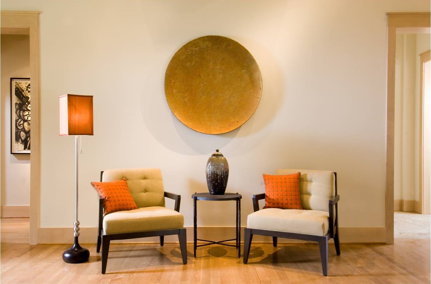
The neutral colors and orange accents in this modern Dallas home complement the light wood floors.

In my last design article, I discussed the different kinds of hardwood flooring available and the pros and cons of each. This follow-up article is aimed at homeowners who already have hardwood flooring but could use some help complementing it with the right décor. If you’ve ever wondered which wall paint colors go best with dark wood floors, which colors are best for light floors, or when to use rugs (and when not to), look no further: I’ll answer these questions and more here.

Start by Identifying Your Wood’s Color Tone

Ideally, the color scheme for a room should harmonize with the wood floor’s undertone color. Depending on its species or finish, wood can have tints of gray, red, orange, or yellow. Oak, for example, can be red or white (I personally prefer white oak because I think it makes a prettier brown). Pastel blue, cream, or apricot are good wall paint colors for a room with red oak floors. Meanwhile, charcoal gray or light gray are attractive wall colors for rooms with white oak floors.

How to Make Dark Wood Floors Shine

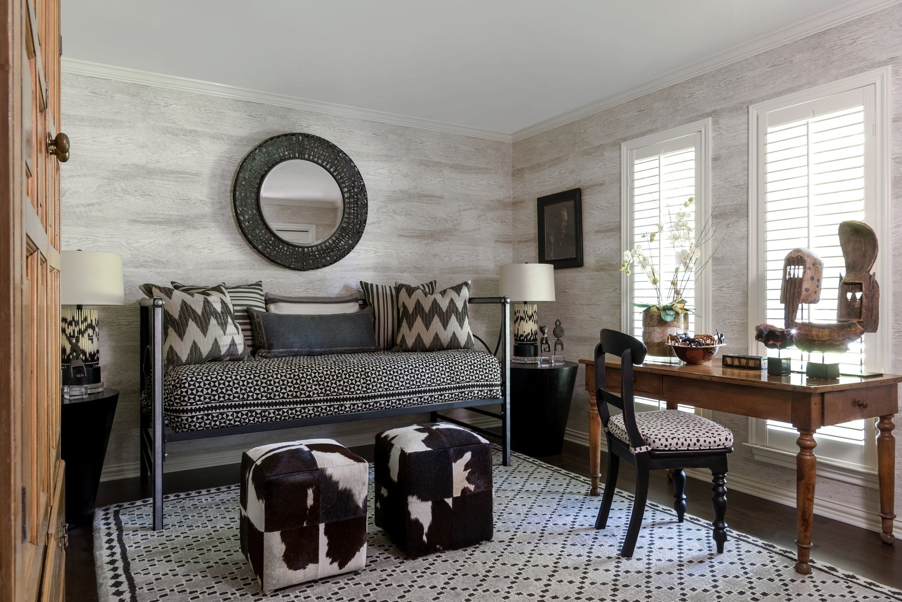
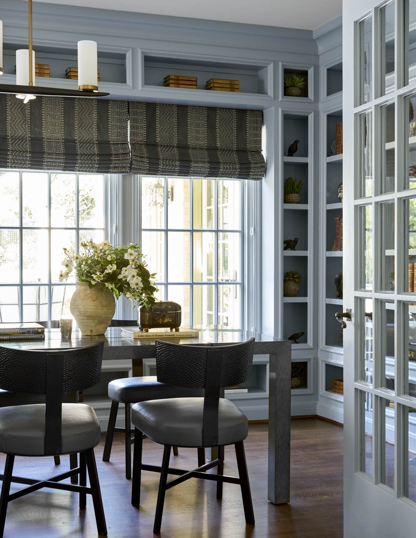
Grey paint, as seen here in the library of a Kessler Park home, is a good wall color to go with dark hardwood floors.

Rooms with dark wood floors need to have light walls to prevent the room from becoming too dark and cave-like. That said, this still leaves a wide variety of paint color options, from cream, to light gray, bronze, light blue, or pale green. Some people will also use painted furniture in light colors to create contrast against the dark floor. A more formal look can be achieved by using dark wood furniture that is a slightly lighter shade than the floors.

Incorporating plants is also a good idea: the bright greenery will really pop against the dark base. Natural light also reflects beautifully against the grain of dark-stained wood, so try to let in as much natural light as possible.

Tips for Working with Light Hardwood Floors

The best wall colors for rooms with light hardwood tend to be neutrals. Off-white will give the room an airy feel, cool gray will create an aura of relaxation, and warm gray will make the room seem cozy and inviting.

White furniture, a sandy brown rug, colorful accents, and gold or silver accessories are a winning combination for light hardwood floors. Some other area rug colors to consider are earth tones, burgundy, and peach. For the furnishings, you could go with grey or black furniture.

Almost every home with hardwood floors should use rugs.

A Word About Area Rugs

Area rugs are almost always a must for hardwood floors. They protect your floors from daily wear and tear while also softening footfalls. If you have wood furniture that is similar in color or tone to your wood floors, you can use a contrasting rug to create a buffer between them so that they don’t blend together.

Parquet floors are one of the only types of hardwood floors that I wouldn’t recommend using rugs on. Sometimes, the inlaid wood pattern is so busy that it would be overwhelming to break it up even further with rugs.

If your home has wood floors, don’t use all wood furniture. You can introduce more variety by including upholstery and pieces made of glass or metal.

Don’t Forget to Mix Up Materials

Though hardwood floors can complement other woods in the same color family, you’ll also need to mix things up by incorporating other materials in the room. Woven fabrics, leather, metal, and upholstery introduce an appealing variety of textures in a room.

As an example, rich brown hardwood goes well with organic materials, such as a natural stone fireplace. If your wood floor has a bright sheen, you can add some softness into the room with upholstered, curvaceous furniture. Metallics and glass will bring a sleek touch to a modern or contemporary home with white oak floors.

Hardwood is the most sought-after kind of flooring, so if you have it, you’ll naturally want to show it off. By harmonizing your hardwood floors with the right paint colors, furnishings, and fabrics, the process becomes much easier. Those who still find the prospect intimidating would do well to work with a designer.

An experienced designer like myself can take one look at a room with hardwood floors and know exactly which colors and style of furnishings will work best with it and its architecture. If you'd like to work with Chambers Interiors, give us a call at 214-651-7665 or send an email to info@chambersinteriors.com.

RELATED ARTICLES:

Pick Out the Perfect Hardwood Floors with This Five-Step Checklist by Margaret Chambers

Keep in mind that solid hardwood can be sanded and refinished, but some kinds of engineered hardwood cannot.

Hardwood is the preferred choice for flooring among Dallas interior designers and homeowners alike. While tile both looks and feels cold, wood has a sense of warmth, making it a good choice for living spaces and bedrooms. A wood floor with rugs is also more interesting than wall-to-wall carpet, easier to clean, and more hypoallergenic.

If you’re shopping for hardwood flooring for the very first time, you may be experiencing some “analysis paralysis.” Between choosing your wood species, sawing method, plank width, grain pattern, stain and finish, there are a lot of decisions that need to be made. Before you shop, I recommend going over the following checklist to help narrow down your options.

1. Choose between solid or engineered hardwood

Solid hardwood is the more traditional option, but engineered hardwood—in which a thin upper layer of wood is bonded to layers of plywood and composite material—is becoming more and more popular.

The advantages of solid hardwood are that it’s quieter underfoot and has a longer lifespan. If the wood veneer on engineered hardwood is too thin, it can’t be sanded and refinished in the future. The advantage of an engineered hardwood floor is that it is less likely to shift as the wood expands and contracts because different layers of the board create opposing forces on the wood. This makes engineered hardwood the best choice for rooms where moisture can be an issue, like basements and bathrooms.

Seen here are 5” quarter-sawn white oak planks. If you look closely, you can see the irregular patterns of the grain.

2. Choose your wood species

Oak is the most commonly used wood in the US because it is affordable, easy to stain, and durable. Cherry, maple, hickory, walnut and ash are other options, each with their own unique colors and grain patterns. Exotic woods, like Cumaru, Brazilian Koa, and Brazilian Cherry tend to be harder than domestic woods. No matter the species, try to select a wood that is already close to the stain color you want.

3. Choose your cut

Keep in mind that wood planks can also be cut in three different ways, yielding three different grain patterns. The most common and affordable method is plain-sawn, which creates the classic grain pattern with curving V-shaped marks (called cathedrals). A quarter-sawn plank has an intricate pattern of irregular growth rings. The most expensive method, rift-sawn, produces a series of very fine, straight lines.

4. Choose the plank width and pattern

In the past, two to three inches was the standard width for wood floor planks. Today, the latest trend is to use planks that are four to seven inches wide. Wider planks are associated with luxury homes and are an appropriate choice for large rooms. Of course, horizontal planks are not the only kind of wood flooring pattern. I think herringbone patterns go well with entryways, dining rooms, or studies.

The planks in this Kessler Park home are on the thin side, at about two and a half inches wide, which is typical of that period in time.

5. Choose your stain and finish

Dark and light stains are suited for different styles of homes. While light wood floors are a good choice for modern or casual homes, dark wood floors are more traditional and sophisticated. Prefinished wood is already stained with a topcoat applied, so you’ll be able to see what you’re getting. Having the wood finished on-site, however, allows you to choose your own stain color and sheen.

Different finishes can really transform wood flooring. The same wood plank in a mid-gloss, high-gloss, matte, distressed, or wire-brushed finish will look completely different. I suggest staying away from hand-scraped finishes, as they look dated. For high-traffic rooms, I recommend looking into polyurethane coating. It’s a new type of coating that is highly protective and often used for basketball courts. Bona Traffic HD is the brand I recommend: it’s durable but also looks like a beautiful wax.

When we redesigned this 1927 home, we kept the oak hardwood floors but sanded and re-stained them in a darker color.

Do all the different options make your head spin? Try looking at design magazines and focusing on the examples of wood flooring you see. You’ll get a better sense of what stain colors and grain patterns you gravitate towards.

At my firm, we typically use wood flooring with rugs in our projects, so we are very knowledgeable with the different types available and what the latest trends are. When in doubt, it never hurts to consult a professional before you take the plunge! To schedule a free consultation with us, call our Dallas office at 214-651-7665 or send an email to info@chambersinteriors.com.

RELATED ARTICLES:

A Designer’s Guide to Selecting the Best Tiles for Your Bathroom by Margaret Chambers

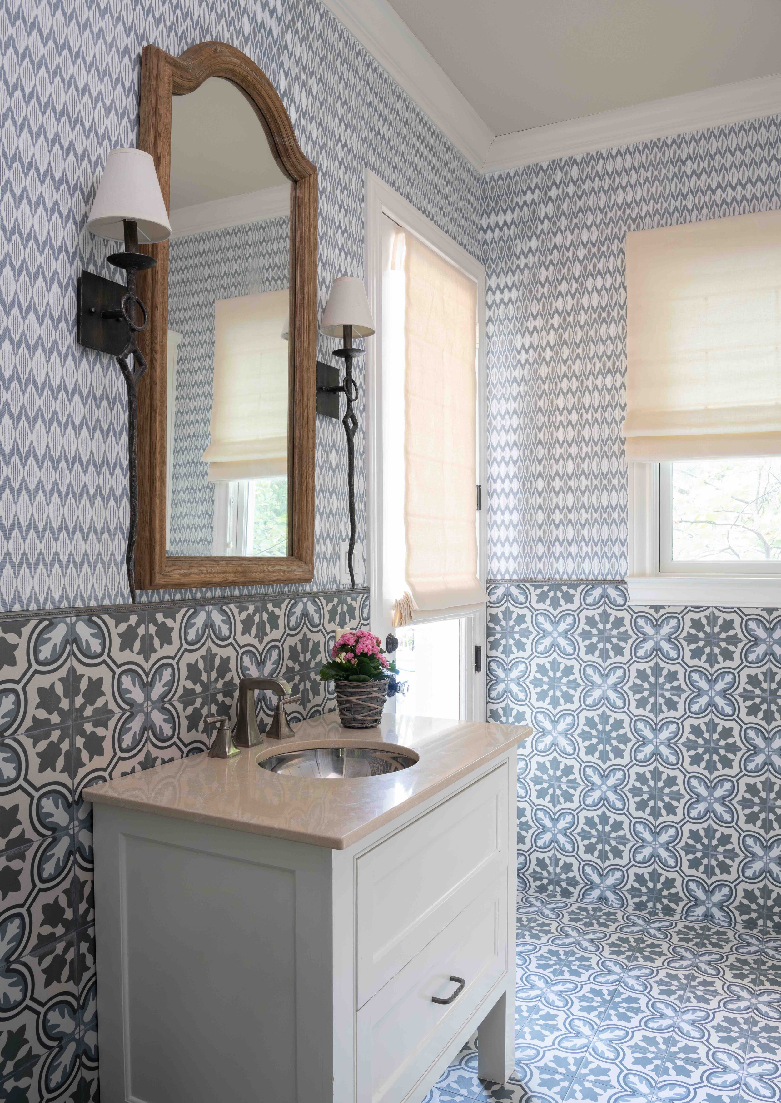
Patterned tiles, like the ones we used in this Preston Hollow pool bathroom, can add a lot of impact to a small space.

One of the reasons choosing tiles for your bathroom can be so tricky is that there are a lot of options, but not all of them will still look current in a few years. And, unfortunately, swapping out tile is not an easy project. The key is to find the right balance between a tile that is timeless but also has some character to it. The most important factors to consider are: the size of your bathroom, your preferred colors, and what pattern you want the tiles to be installed in.

Tile Sizes:

Different parts of your bathroom call for different sizes of tiles. For example, if you have a shower bench, a larger slab will feel more comfortable to sit on than a lot of smaller tiles. At my design firm, we usually use matching slabs of the same material for both the shower seat and the sink countertop.

This shower we remodeled in a Colleyville home has small mosaic tiles on the floor for safety and security.

Mosaic tile has more grout lines, which makes it suitable for shower floors: more grout lines equal better drainage and more traction. Ideally, the tiles should be two inches or smaller. Mosaic tiles are not the only choice for shower floors, however. Slip-resistant ceramic is another safe option.

Tile Colors:

The most popular tile for bathrooms is white subway tile. I recommend choosing a bright white tile if your toilet, bathtub, and sink are also bright white. Sometimes, a warmer white (such as a biscuit color) is preferable, especially in traditional houses.

I personally consider bold accent tiles to be dated. I haven’t used them in my projects for a decade. Instead of having a border of accent tiles in your bathroom, I suggest combining a neutral tile (like white or gray) with an interesting wallpaper or paint color.

These floor tiles are cut in a fresh new version of a traditional pattern. The biscuit white color matches the tub.

Remember the rule of three: a patterned tile should contain no more than three colors, and you should stick to no more than three varieties of tile in the entire bathroom. A good starting point is to pick out a tile you really love and then pick two other tile types that complement it.

Something to note about dark grout is that it shows efflorescence (light grey spots from salts) over time. White grout will show dirt more easily, so make sure to use grout sealer and thin grout lines if you choose white for your grout color.

Tile Materials:

Ceramic is the most affordable tile, so it’s a good choice for covering large areas such as your floor. Porcelain is more expensive, but many people prefer it for the following reasons: it’s more durable, and the color goes all the way through the tile instead of being merely glazed on top. That way, if a porcelain tile is chipped, the color that shows underneath is the same.

Glass tile is great for an accent wall, but it’s also slippery, so don’t use it on the floor. If you’re interested in glass tile, try shopping for it in person instead of online. Seeing it in person helps you get a better sense of its color and shine.

Tile Placement and Patterns:

Tile should be used on every side of the shower except for the door or curtain. I like to encourage my clients to also cover the shower ceiling with tile instead of paint, since paint can peel in humidity.

A common piece of advice is to install floor tiles diagonally to makes a small bathroom feel more expansive. Just keep in mind that attention-grabbing patterns like diagonal and herringbone should only be used with simple tile patterns that have subtle grout lines. The most conservative patterns for tile are “running bond” (which looks like an alternating brick pattern) and “stacked,” in which rows of tiles are stacked vertically from top to bottom.

This floor has small hexagon-shaped tiles that run into the shower, while the shower walls have herringbone tiles.

The right tile choices can make or break a bathroom, so it’s worth your time to research and proceed with caution. After all, it’s a costly mistake to pick the wrong tile. If you’re hesitating between several different options, then it might be time to consult a professional designer. An experienced designer like myself will be able to point you towards options that are both practical and pleasing to the eye. To schedule a free consultation with us, send an email to info@chambersinteriors.com or call our Dallas office at 214-232-9501.

RELATED ARTICLES:

Four Crucial Steps for Designing an Open Concept Space by Margaret Chambers

This project has an open concept space where the dining room, kitchen, morning room, and living room are all connected.

This project has an open concept space where the dining room, kitchen, morning room, and living room are all connected.

There’s a reason why open floor plans have become so ubiquitous in Dallas homes over the last few decades. Open concept interior design promotes a feeling of togetherness, which is especially attractive to young families with busy schedules.

However, people who are furnishing an open concept home for the first time may be intimidated by all the extra room. How do you make sure that your home feels warm and inviting instead of empty and cold? How do you balance the lighting and ensure that you’re getting the most use out of the space? For answers to these questions and more, read on.

Step 1: Choosing Flooring and Paint Colors

If you’re building a new home or having one remodeled, you should try to use the same flooring material throughout your open concept space. For paint colors, we as designers suggest choosing a neutral color for the walls. Some open concept homes feature an accent wall painted in a different color. Even in this case, I would recommend painting the trim all in the same color (or even the same color as the walls) for a feeling of continuity in the room.

If you have a high ceiling, you might also consider painting the ceiling a darker shade, which helps the room feel cozy and cave-like. Regardless of what paint colors you choose, don’t leave your walls bare: make sure to fill all that open wall space with art and mirrors.

Large windows filter light into this open concept kitchen during the day, while chandeliers illuminate it at night.

Large windows filter light into this open concept kitchen during the day, while chandeliers illuminate it at night.

Step 2: Plan Your Lighting Ahead of Time

It’s very important that your open concept space be well-lit at all times of the day. An open floor plan that is shadowy in spots feels unbalanced and unwelcoming. The easiest way to create an even coverage is by installing overhead lights and scattering lamps across the space. When I design an open concept space, I make sure to plan the positions of the furniture and floor outlets ahead of time. That way, we can plug the lamps in the floor outlets without running the cords across the floor.

Step 3: Furniture Shopping

If you have an especially large open floor, you’ll want to “anchor” it with appropriately sized furniture, such as a large dining table and large sofas. You can then pair your bulky pieces with slender furniture. Whenever you can, include multifunctional pieces. Putting a writing desk in your den area makes that space also function as a home office.

This Dallas living area features the same rust, beige, green, and cream colors that we used in the open concept kitchen.

This Dallas living area features the same rust, beige, green, and cream colors that we used in the open concept kitchen.

It’s generally not advised to push your furniture up against the walls, so keep in mind that your furniture will be seen from all sides. Make sure to buy pieces that you think look great at any angle.

Step 4: Use Furniture and Rugs to Divide the Space

Once you have your color scheme, furnishings, and lighting fixtures ready to go, the next step is to use them to divide the floor into functional spaces. A good place to start is by identifying a focal point in your room and then organizing a seating area around it. Examples of focal points in an open concept space include gallery walls, large windows, and fireplaces.

Seen here is an open concept morning room. The swivel chairs can be turned towards the fireplace or the kitchen.

Seen here is an open concept morning room. The swivel chairs can be turned towards the fireplace or the kitchen.

Rugs are one of your best tools for visually breaking up a large space and marking off seating areas. By having the legs of your furniture touching a single area rug, it helps bring them together. You can also create separate areas in your space by using shelving units, decorative screens, sectionals, or console tables.

To prevent each of these areas from clashing too much, coordinate them by using similar colors and materials in each zone. It’s not necessary to use the same colors and patterns throughout your whole house, but in the open concept space, everything within eyesight needs to harmonize.

Learning how to decorate an open concept space is an important skill even if you’re not currently living in one. After all, most newly built homes these days have a floor that connects the family room and kitchen area, so it’s likely that your next home will be open concept.

By planning the space thoughtfully, or working with an interior designer who is experienced with open concept design, you can create a space that feels spacious but also comforting. If you're interested in working with Chambers Interiors for your upcoming project, call our Dallas office at 214-232-9501 or send an email to info@chambersinteriors.com.

RELATED ARTICLES: