Wallpaper

How to Tastefully Update a Period Home by Margaret Chambers

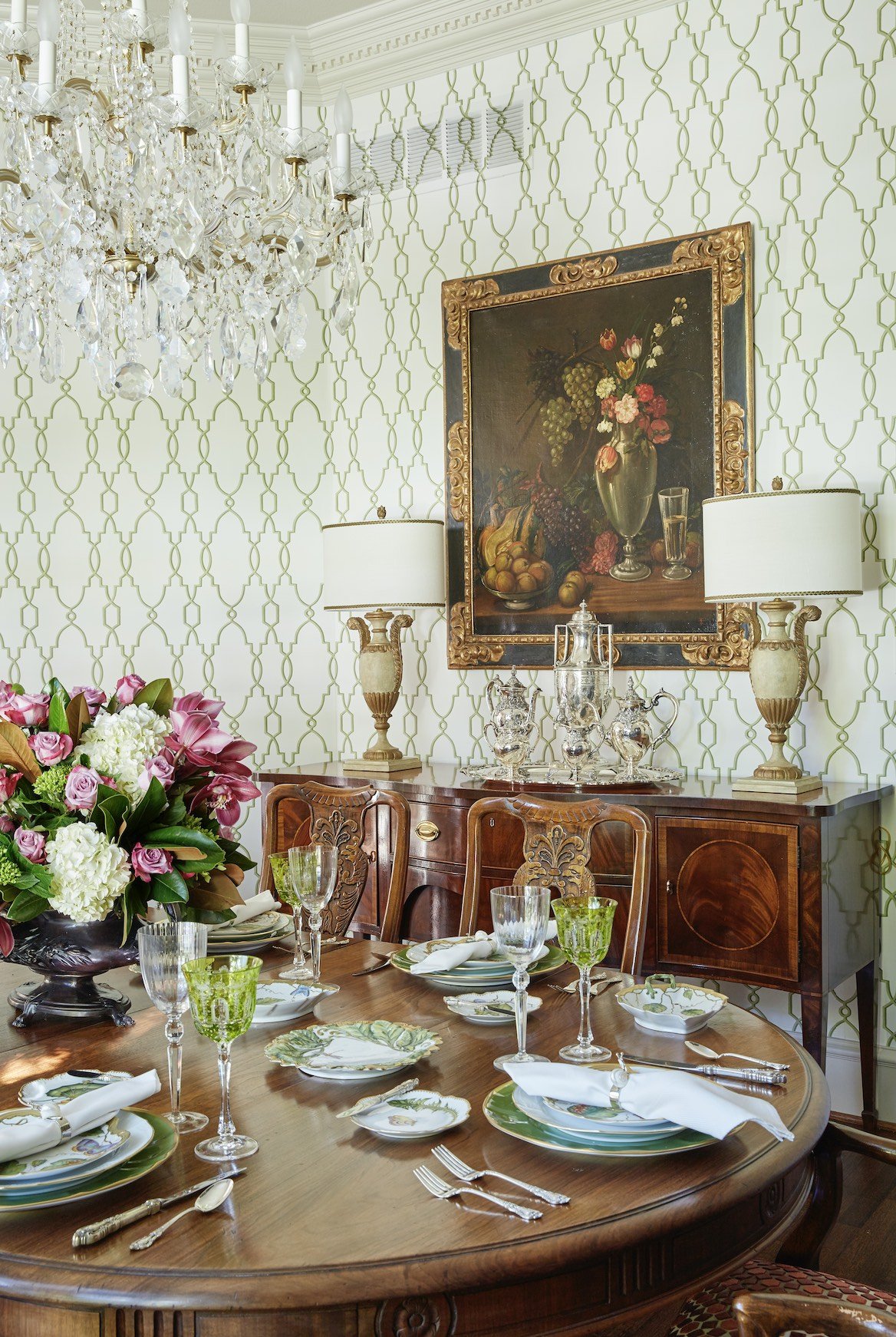
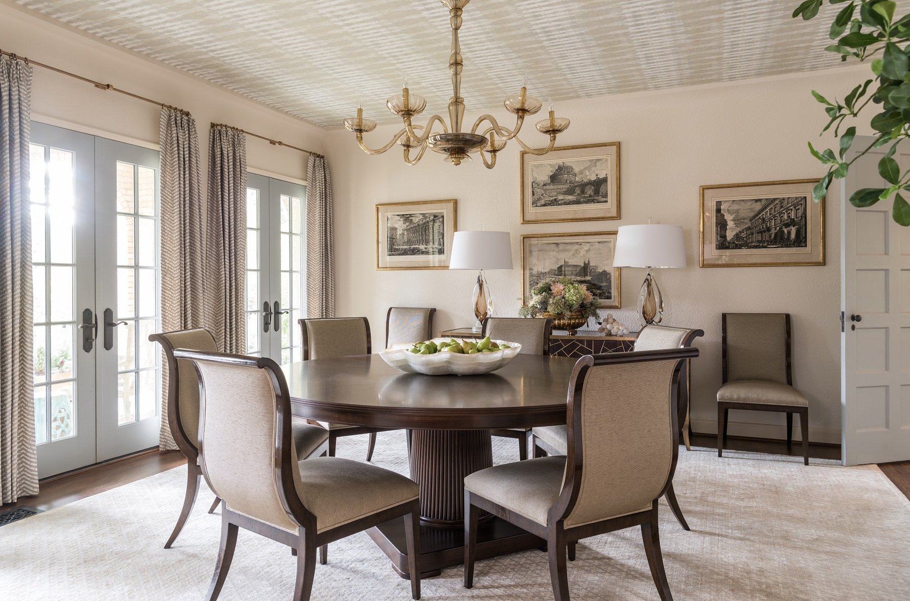
This dining room features dentil crown molding along the ceiling. We went with a clean, elegant, geometric wallpaper pattern that wouldn’t distract from the home’s architectural details.

Period homes (generally defined as any home built before WWI) tend to have high ceilings, beautiful detailing, and architectural features you don’t often see in new homes. For many homebuyers, the creaks, the cracks, and the repair costs of a period home are well worth it.

You might wonder how an interior designer like myself would approach a historic property. In my opinion, the architecture should tell you the design direction that you go, and the furnishings should reflect the period of the house. I personally think it’s kind of disturbing to obliterate the interior and redecorate in a minimalist style.

Of course, there’s no need to turn your house into a museum, either. Here are some tips for decorating a period home in a way that’s sympathetic to the house’s history, but still looks current:

1. Choose Fresh Colors

Start by doing research on how homes in the period were originally decorated, then pick and choose the elements that look the most timeless. As with any home, it’s better to make a period home as timeless as possible. After all, it’s expensive to do a home: if you only follow the latest trends, in ten years, those trends are gone and we’re all off to something else.

Don’t be afraid to use soft, contemporary paint colors in a Georgian, Federal, or Neoclassical house. If you use saturated wall paint colors, keep the period detailing (such as the cornicing) in more understated tones for contrast. Keep in mind that if your home is in a historic part of Dallas like Swiss Avenue, Hollywood Heights, or Munger Place, you may need to use a traditional color for the exterior.

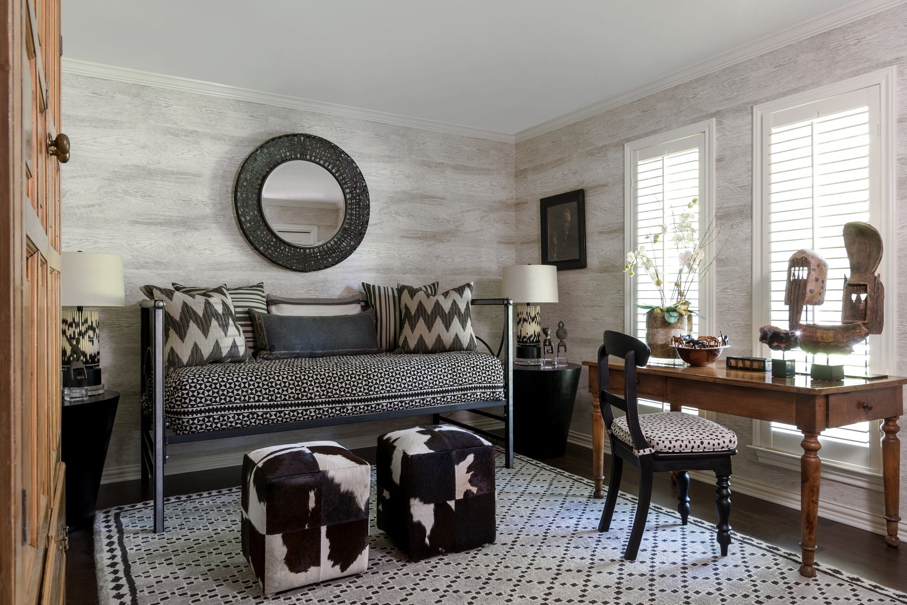
Patterned wallpaper is a luxurious touch, but choose a print with more modern and understated colors to keep your space from looking too dated. I suggest hanging mirrors instead of art over wallpaper because their simplicity gives the eye a place to rest.

Light and pastel colors, like the pinks that we used in this Park Cities English cottage, can help a traditionally decorated room feel fresh.

2. Highlight Traditional Architectural Features

Sadly, many period homes have had their original sash windows, fireplaces, molding, ceiling medallions, and baseboards ripped out and replaced with cheaper materials. Regardless of whether or not original fireplaces are still in working order, they are part of the charm of the home and should be celebrated.

Instead of replacing sash windows, consider repairing them, waterproofing them, or even upgrading them with double glazing. The wall around a stained-glass window should ideally be painted white or another neutral color to let the colors of the glass stand out.

If the original wood flooring is heavily worn down, consult a renovation expert before tearing it out. It may be possible to patch or repair it. I would also advise against changing the detailing in the house, and instead restore it by repainting it.

You can create an interesting contrast with original molding and ornate ceilings by hanging contemporary light fixtures. If you want to keep any original light fixtures, such as sconces, you can always have them rewired.

3. Play to Your Period House’s Strengths

One of the advantages of period homes are the high ceilings. You will probably want a large lighting fixture, such as a chandelier, to take advantage of the extra ceiling height. On the other hand, one of the downsides to period homes is that they sometimes have dark, narrow hallways. Hang mirrors, which reflect more light into the space, or add sconces in your hallways. High gloss paint can also be a good choice for brightening the walls of a period home. Just remember that your walls have to be extremely smooth, like glass, or a glossy paint finish will highlight every imperfection.

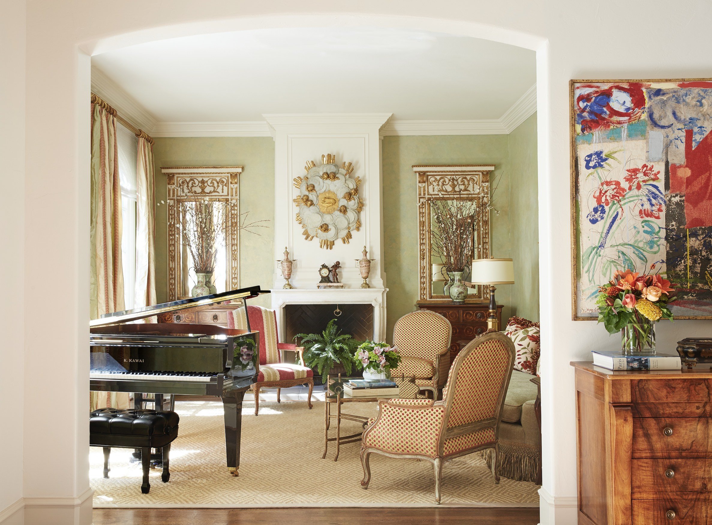
This formal living room we designed for a classically French home in University Park is traditional without being fussy. To the right is a piece of contemporary artwork that matches the color scheme of the room.

4. Find the Right Balance of Traditional and Contemporary

When it comes to furnishings, I think juxtaposing modern and traditional elements is best. If you’re using traditional art, mirrors, and wallpaper patterns, mix contemporary furniture into the room. The simple lines of the furniture will stand out beautifully against the traditional backdrop. Likewise, if you use a lot of antique furniture, you may want to use updated colors for the walls as well as contemporary art, which adds an element of surprise. Make sure to reupholster antique furniture using current fabrics.

An alternative to buying a period home is to work with a classically trained architect (like Larry Boerder, Robbie Fusch, or Stephen Zepeda, to name a few), who can build you a new home in a period style. If you already own a period home and need help deciding which parts should be kept as is, restored, or torn out, it might be time to consult an interior designer. A professional designer can help make sure that your renovation doesn’t go too far, and will be connected with lots of restoration experts who can breathe new life into the home. To schedule an appointment with Chambers Interiors, send an email to info@chambersinteriors.com or call our Dallas office at 214-651-7665.

RELATED ARTICLES:

7 Tips for Charming Children's Rooms by Margaret Chambers

The best-designed children's rooms have a touch of childlike whimsy but also complement the rest of the home.

Decorating a room for your child can be a great opportunity to show your creativity, but it also presents some unique challenges. Children's rooms should express the child's interests while also blending with the rest of the house. If you're stumped on the best way to please both your child and yourself, consider these suggestions.

1. Use Multi-Purpose Furniture

Unless you want to spend a lot of money redecorating as the child grows older, you should decorate with flexibility in mind. A crib that can convert to a youth bed is a smart choice. It’s also not a bad idea to make space for a small desk now. Your child will appreciate having a place to work on drawings, and later, the workspace can be updated to a teen work desk. Younger children need plenty of floor space to play, so remember to leave lots of room.

Even if your child isn't attending school yet, try to leave space in the room for a work desk.

2. Include Enough Storage

You can encourage your child to be more responsible and independent by including storage bins and shelves that are low to the floor and easy to access. It’s easier for them to put away clothes on shelving rather than hangers in a wardrobe. Use a mixture of open and closed storage so your child will be able to display a few favorite items while keeping the rest out of sight. Baskets and canvas bins are a more attractive storage option than plastic bins and are softer to the touch.

3. Plan Ahead for Lighting

Lighting is important in every room, but a child's room should be especially well-lit. You can fill the room with light using a pendant light or a cute chandelier that completes the room's theme. A reading light beside the bed or a favorite chair is a must.

The art and rug in this boys’ room were previously owned by the clients. We chose fabrics to match their bold colors.

4. Weigh Your Flooring Options

Choosing flooring for children’s bedrooms can be a balancing act between comfort and maintenance. While carpet is comfortable and absorbs noise, it’s also harder to clean in case of messes. Hardwood is easy to clean, but doesn’t insulate noise or soften falls. A good compromise is hardwood flooring with plush rugs. Don’t forget to put a pad underneath the rug to prevent slippage.

A wall-mounted collection of toy soldiers add charm to this boy's room we designed in a Preston Hollow home.

5. Approach Theming in a Balanced Way

An important topic to consider is themed decorating. While your dinosaur-obsessed toddler may love to see dinosaurs throughout the room, he or she might outgrow the phase. How themed you want the room to be is up to you. You can go all the way with a sports theme using sports posters, bedding, and wall decorations, or you may decide to focus on choosing patterns and colors your child enjoys instead. A suggested middle ground might be to use simple and flexible furnishings while placing a few themed accents around the room.

6. Choose Paint Color Carefully

When you have a baby on the way, it's tempting to paint the room in pink or blue, but gender-neutral colors like green and yellow are becoming more popular as well. Also, keep in mind that color has a psychological effect and can be either calming or energizing. A good rule of thumb is to choose a light wall color and use stronger colors for the accessories and furnishings.

Light green is a gender-neutral paint color that is becoming more popular for children's rooms.

7. Don’t Forget About Wallpaper

Wallpaper has been making a comeback over the last decade and instantly adds charm to a child’s bedroom. Wallpaper patterns designed for children’s rooms are not your only options. Basic geometrics and florals are versatile enough to work with a wide variety of room styles.

By choosing timeless furnishings and colors, and a few personal touches to express your child's interests, you can create a beautiful room your child will remember fondly. If you need help designing a nursery for a baby on the way or updating a bedroom for a growing child, give us a call. Most of our clients have children or grandchildren, so at my firm, we have a lot of experience in both children’s and teen bedrooms. You can reach our Dallas office by calling 214-651-7665 or sending an email to info@chambersinteriors.com.

RELATED ARTICLES:

5 Alternatives to a Plain White Ceiling by Margaret Chambers

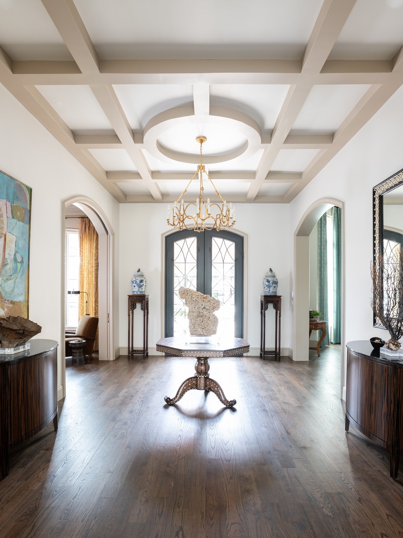
A coffered ceiling in a foyer, like this one in a Dallas home we designed, makes a dramatic first impression.

Ceilings are usually the most forgotten part of a room. It’s a shame, because there are so many ways to make ceilings the finishing touch for your interior design. If you’ve made a habit of ignoring your ceilings but are ready to try something new, you’ll be glad to know that there are paint colors, wallpaper patterns, plasterwork, and faux beams that can instantly transform your ceiling from drab to dramatic.

1. Accent Ceilings

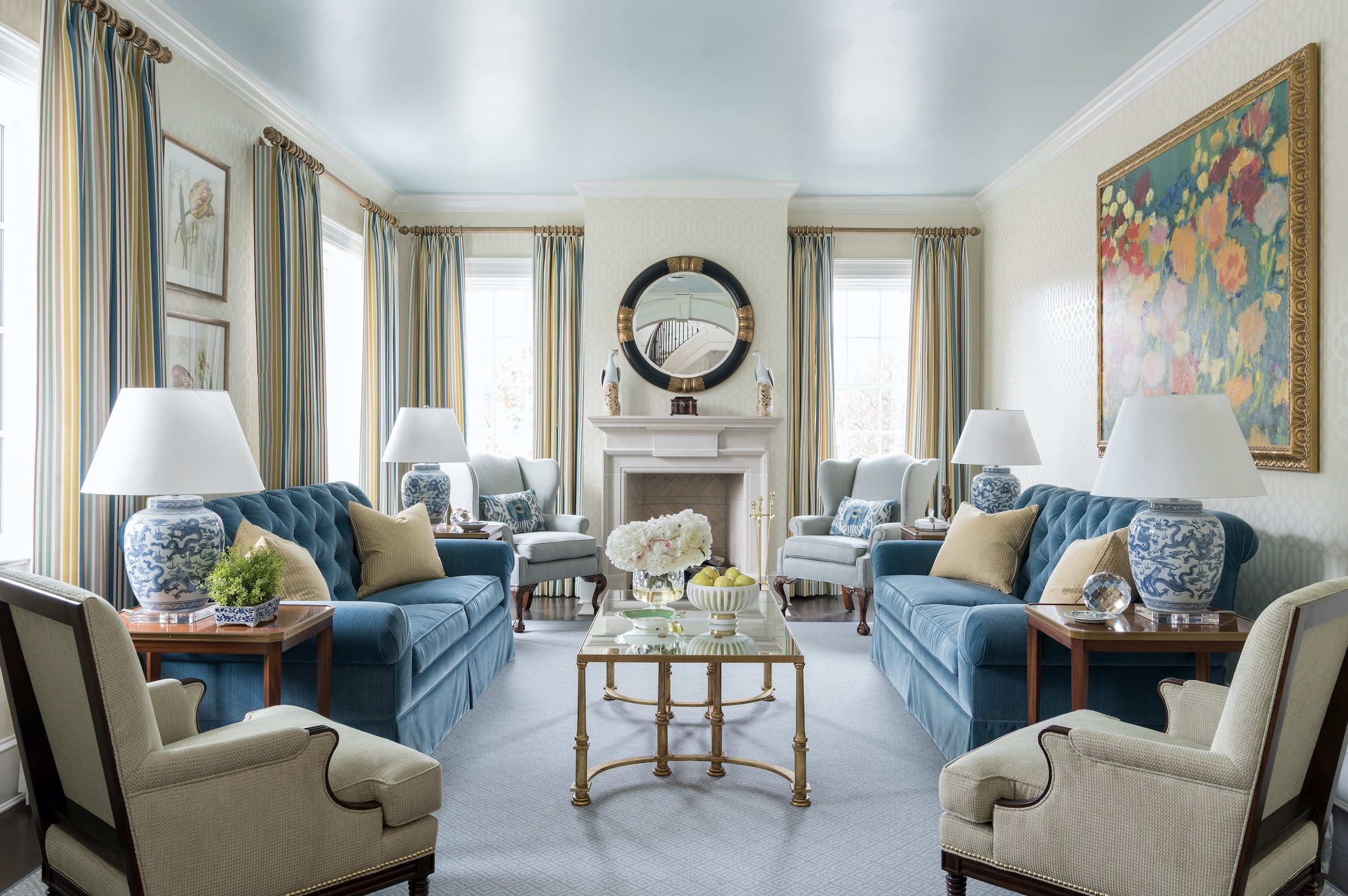
We painted the ceiling in the formal living room of SMU's Kappa Alpha Theta house a high-gloss sky blue, reminiscent of southern porch ceilings.

My favorite paint colors for ceilings lately are light blues and light aquas. Blue paint is often used for porch ceilings in the South to deter wasps from building their nests, but increasingly, homeowners are starting to use it for their ceilings indoors.

If you do decide to paint your ceiling a contrasting color, I recommend choosing high gloss enamel or lacquer for the finish. A high-gloss ceiling will reflect the surrounding colors and make the room feel more expansive. However, steer clear of glossy paint finishes if your ceiling has imperfections, as the sheen will make small bumps or cracks more noticeable.

Dark ceiling colors tend to make rooms feel smaller. Interestingly, though, a room with the same dark color on all four walls and the ceiling will not feel small as long as there’s plenty of natural light in the space. For black-painted ceilings, make sure to also use black elsewhere in the room to ensure that the whole design is balanced.

2. Wallpaper

My firm has also been doing wallpapered ceilings for the past few years. In one project, the clients’ existing dining room had a ceiling painted in a dark salmon color. To make the room feel more open, we covered that ceiling with a light, patterned wallpaper. For a contemporary home, you might consider a subtle tone-on-tone pattern or a textured wallpaper, like grass cloth.

The wallpaper we added to this ceiling is a big improvement over the salmon paint color that was there before.

3. Plasterwork

Color and pattern are not the only ways to draw the eye upward to your ceiling. You can also add a three-dimensional element with decorative plasterwork. Designers like myself have been bringing back beautiful plaster ceilings with detailed borders around the edges of the room. I’d recommend using this kind of ceiling in dining rooms, living rooms, and bedrooms. However, you do have to think carefully about light fixture placement.

4. Beams

Running beadboard in the opposite direction of your beams will make a vaulted ceiling more dynamic.

Even if your home didn’t have beams originally, you can always have faux beams added. They should only be installed in rooms with ceilings that are nine feet or higher, or else they’ll make the room feel claustrophobic. I love the look of beams in a vaulted ceiling with beadboard running in the opposite direction. We usually run the beams up and down and the beadboard crosswise.

5. Coffered ceilings

A coffered ceiling is one in which recessed panels are created by adding beams in a grid pattern. Coffered ceilings look best in rooms with nine to fourteen-foot-high ceilings. To add more contrast, you can paint in the recessed sections, wallpaper them, or have them paneled with wood while leaving the beams white. Coffered ceilings are definitely more formal, so you usually won’t see them in rustic or casual homes.

Like coffered ceilings, tray ceilings have recessed areas to give the ceiling depth. The recessed areas resemble upside-down trays. They are great for open concept homes because the recessed areas can act as a reflection for separate zones on the floor below.

In this home office we designed for a Dallas home, the patterned, wallpapered ceiling matches the curtains.

For those of you who like the idea of a painted, wallpapered, beamed, or coffered ceiling, but are having trouble deciding between them, try looking at interior design magazines or Instagram and pay attention to the ceilings you see. If you’re still drawing a blank, the next best step would be to consult with an interior designer like myself. An interior designer will know which ceilings in your home would look best if left white, which could benefit from wallpaper, and which rooms would be perfect for a showstopper like a coffered or plasterwork ceiling. To schedule a free consultation with us, email us at info@chambersinteriors.com or call us at 214-651-7665.

RELATED ARTICLES:

6 Reasons Why Framed Wallpaper Panels Are Hot Right Now by Margaret Chambers

We hung these de Gournay panels in a rising sequence. The panels add interest to the wall of this high-ceilinged room.

The words “wallpaper” and “trendy” might sound like an odd combination, but as it turns out, wallpaper has been coming back in a big way in Dallas homes over the last three or four years. One of the trendiest ways to use wallpaper is to take individual panels, frame them, and display them as art.

If you’ve never seen framed wallpaper panels in action, you might be wondering why someone would choose them over papering an entire wall or room. Here are some reasons why interior designers like myself recommend them:

  1. They are less of a commitment.

    It’s much easier to remove framed panels from a wall than it is to remove wallpaper from the wall itself.

  2. They are more affordable.

    If you have your sights set on very expensive, hand-painted wallpaper brands like Gracie or de Gournay, you can bring down the costs by only buying the panels you need. They’re also a smart way to add wallpaper to large voids, like in a high-ceilinged room or a staircase. After all, it’s easier to use several panels of matching wallpaper than it is to find several pieces of matching artwork.

  3. Using panels can help break up bold patterns.

    Sometimes a dramatic wallpaper would be too much for your room. But the same pattern divided into visual blocks could possibly fit better into your design.

  4. You can take them with you to your next home.

    Once applied directly to the wall, most brands of wallpaper can’t be reused. Framed wallpaper panels, however, can come with you when you move, making them a wise investment. They’re a great option for renters, too.

  5. Framed wallpaper panels are less hassle.

    Even if you’re planning on framing the panels yourself, this will still be an easier project than putting up wallpaper.

  6. They can add some much-needed interest to plain walls.

    For example, framed wallpaper panels are great for homes without many architectural details.

Sounds appealing, right? If you’re sold on the idea but don’t have much experience with wallpaper, here are some pointers to help you get started.

Before you even pick a pattern, measure your wall space carefully so that you can figure out how many panels you need and what their dimensions should be. Once you have your measurements, then it’s time to decide what color and pattern you want. The dominant color in your wallpaper pattern should be based on at least one other color from the surrounding room, even if it’s just a secondary color.

On the other hand, if you’ve already found the wallpaper you love but haven’t designed the rest of the room, you can use the wallpaper as inspiration for the room’s color scheme. Wallpapers with neutral colors and touchable textures (like linen or painted grass cloth) are another creative option if you don’t normally decorate with bold colors or patterns. “Busy” patterned wallpapers should be used in spaces that are otherwise clean and simple in style. That way, your panels will command attention without making the room feel overwhelming.

We used Gracie wallpaper panels in this upstairs hallway. Although they are part of a set, each panel is unique.

Your choice of frame can have a bigger impact on the wallpaper’s presentation than you might expect, so pick a complementary one. For example, one-inch gold bamboo frames are the perfect match for chinoiserie wallpaper. Your frames should always be small to make them lightweight and keep the focus on the wallpaper itself. Another thing to note is that adding glass will make your wallpaper panels much heavier and more difficult to hang, so I don’t advise it at all.

I myself have worked with framed wallpaper panels on two Dallas projects recently. For one project, we used Gracie panels in the client’s upstairs hallway. On the other project, we hung de Gournay panels in a rising sequence along the wall next to the staircase. If you’re interested in adding this surprising alternative to artwork to your walls, but could use help making measurements, picking the right pattern, and picking the right frame, give us a call. You can reach our Dallas office by calling 214-232-9501, or you can send an email to info@chambersinteriors.com. I personally believe that this is one of those occasional design trends that is classically beautiful enough to stand the test of time.

RELATED ARTICLES: