mirrors

Bring Warmth and Beauty to Your Home with These Fireplace Design Tips by Margaret Chambers

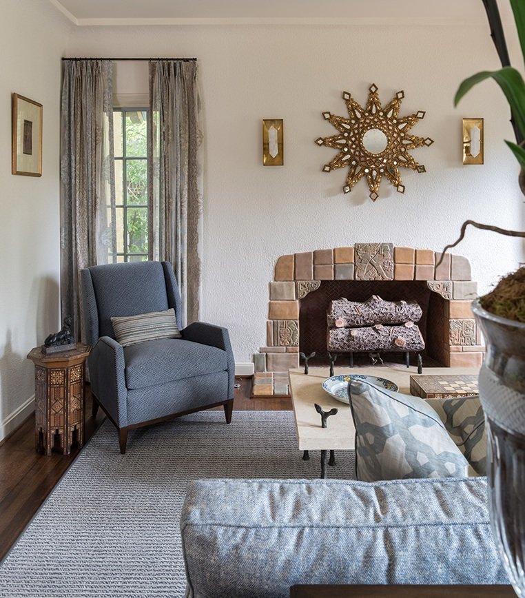
When we renovated this Spanish Colonial house in Kessler Park, we left the existing fireplace. It is surrounded with Rookwood tiles.

If you don’t have a fireplace, you may have wondered about what it takes to have one built. There are a lot of options out there: how do you decide which one is best for your Dallas home? On the other hand, maybe you have a fireplace already and want to give the mantel a major facelift for the holidays. Whether you already have a fireplace or are building a house for the first time, these tips should help you get started in your design process.

If you’re planning on adding a fireplace to your next home, you should start by selecting the basic type that you want:

Wood-Burning Fireplaces:

For many people, nothing beats the nostalgia, warmth, crackling sounds and aroma of a natural wood fire. Traditional wood-burning fireplaces come in handy during a power outage because they require no gas or electricity. However, they are an inefficient heating source compared to newer alternatives.

Gas Fireplaces:

Gas fireplaces do not require a chimney and can be controlled with the push of a button. They are also more energy efficient and environmentally friendly than traditional wood-burning fireplaces. The main requirements for a gas fireplace are a gas supply line and a venting mechanism, such as a chimney or metal tubing.

Gas logs are actually made of ceramic and placed above the gas burner to imitate the look of a real wood fireplace. Personally, I don’t mind gas logs. They’ve gotten more realistic and are convenient and easy to clean.

This dramatic fireplace is one of the architectural highlights of this home, which was designed by Bernbaum Magadini Architects, one of Dallas’s finest contemporary architecture firms.

Fireplace Style and Design:

It’s really important for a fireplace to be in the same style of the architecture of the house and proportional to the rest of the room it’s in. In my opinion, fireplaces should have a good size opening, preferably forty by forty inches. I also like to do a nice background, like a herringbone pattern, in the interior brick. If the mantel is wood, there needs to be one foot of noncombustible material around it. This material could potentially be cast stone, limestone, or brick. In my designs, I like for the firebox to go to the floor, which has a more classical look.

Keep in mind that the mantel should have enough depth for decorations: eight to ten inches deep, or deeper for a large fireplace. It’s also a good idea to have a plug above the center of the fireplace mantel for Christmas lights.

Sometimes all a fireplace mantel needs is a large piece of artwork over it, like this Audubon painting above the fireplace in the foyer of SMU’s Kappa Alpha Theta house. Fusch Architects designed this project.

Decorating Your Fireplace Mantel:

Since the fireplace is usually the focal point for a room, make sure it’s something that you want to look at. I recommend hanging a large piece of art or a mirror in the center that serves as an anchor for the decorative accessories in front of it. To create interest and lead a person’s eye all across the mantel, vary the height of the objects and include contrasting colors.

In this Hill Country farmhouse, we decorated the stone fireplace with a metal compass sculpture, rocking horse, candlesticks, and grass bouquet.

Note that if the mantel is crammed with too many accessories and picture frames, nothing stands out. On the other hand, mantels with just a couple of small items look underwhelming. Take a look at pictures of professionally decorated fireplaces to get a good idea for how many items to use and how big they should be. I usually use three to five items, such as a tea caddy in the center and candlesticks or vases on either side.

Although fireplaces may not get used often here in Dallas, now is the time of year when people are grateful to have them. Fireplaces are also a popular amenity that can raise the value of your home. If you’d love to include a fireplace in your dream home but find all the different options dizzying, consider connecting with an interior designer.

An interior designer like myself can help lay out the options for you and add the finishing touches to your mantel after the house is built. You can reach us by calling our Dallas office at 214-651-7665 or sending an email to info@chambersinteriors.com.

RELATED ARTICLES:

Bring Order to Your Rooms with the Right Focal Points by Margaret Chambers

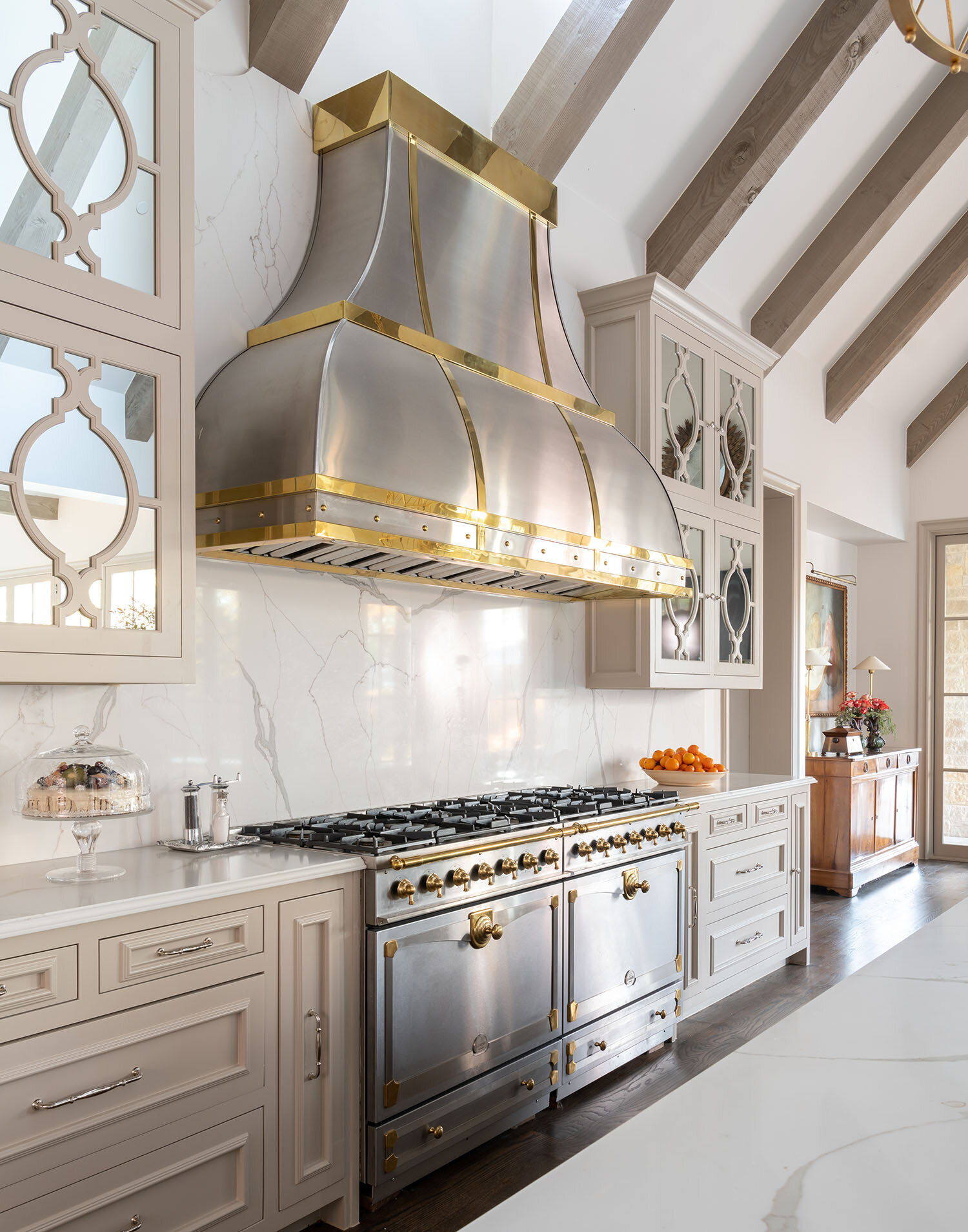
This double range and custom vent hood, both made out of steel and brass, form a focal point for the kitchen we designed in a Dallas home.

This double range and custom vent hood, both made out of steel and brass, form a focal point for the kitchen we designed in a Dallas home.

If you’re worried that one of your rooms has too much going on, it might be because you don’t have a focal point. The term ‘focal point’ will be familiar to our artistic readers: in a photograph, the focal point is the part of the picture where the lens is focused. In a painting, it’s the point where the viewer’s eye is drawn. Interior designers use the term focal point to indicate the place where your eyes first land when you enter a room. For those new to this concept, here is a set of guidelines for using the things you already own to create new focal points.

The beams of this vaulted ceiling act as one focal point while also leading the eye to another: the round wall art.

The beams of this vaulted ceiling act as one focal point while also leading the eye to another: the round wall art.

One way to start identifying potential focal points is to make note of any architectural features you have. Fireplaces, built-in bookcases, vaulted ceilings, mantles, free-standing bathtubs, oven hoods, and large windows will usually be the focal points for their respective rooms.

When you don’t have an architectural focal point in the room, you’ll need to create one with your decorating choices. Statement furniture, paintings, coffee tables, rugs, backsplashes, collections, or lighting fixtures can all be focal points. Whatever you choose, it needs to be in the line of sight for any visitor stepping into the room.

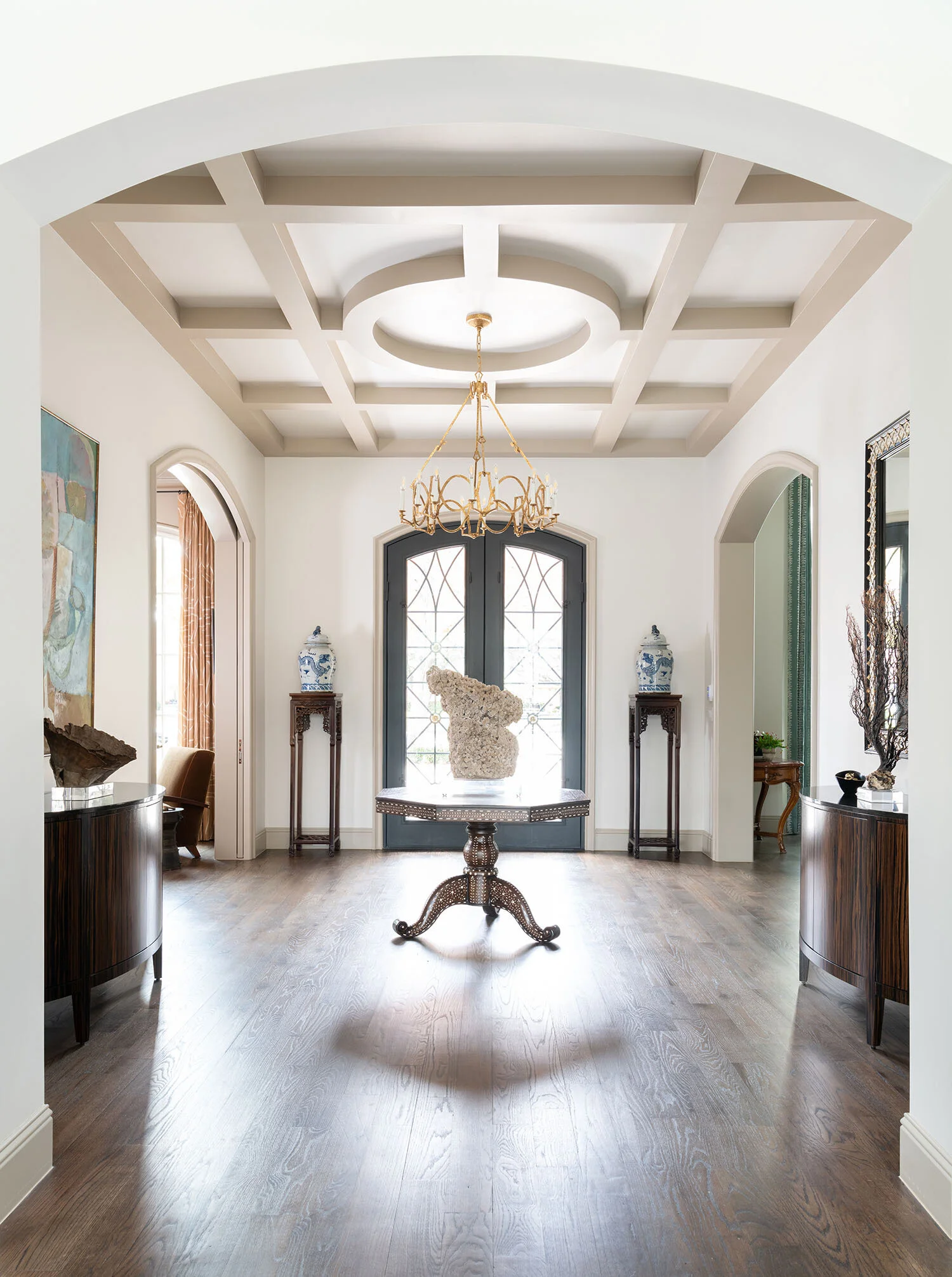
Coffered ceilings, such as this one, make an excellent focal point for entryways, dining rooms, or formal living rooms.

Coffered ceilings, such as this one, make an excellent focal point for entryways, dining rooms, or formal living rooms.

Ideally, a focal point should contrast with its surroundings and command attention, rather than blend in. Different focal points require different approaches:

  • If your windows are the focal point, don’t crowd them with heavy drapes. Another thing to consider is that unless you’re looking out at a brightly lit city skyline, your windows won’t be visually interesting after the sun goes down. If your room is large enough, add another focal point (such as a piece of art) to keep things interesting at all times of the day.

  • To ensure your mantle will be a strong focal point, decorate it with plenty of eye-catching accessories.

  • In an entryway, the door is typically the focal point. Paint it a contrasting color from the rest of the walls to emphasize it.

  • Possible focal points for the bedroom can be the bedding, the headboard, or the wall behind the bed.

  • In open-concept layouts, you can give each area its own focal point. You may want to add another focal point between the individual seating areas to bring everything together.

  • For dining rooms, a light fixture or a showy table setting can be focal points.

  • Draw attention to your ceiling with a paint or stain color that isn’t seen anywhere else in the room.

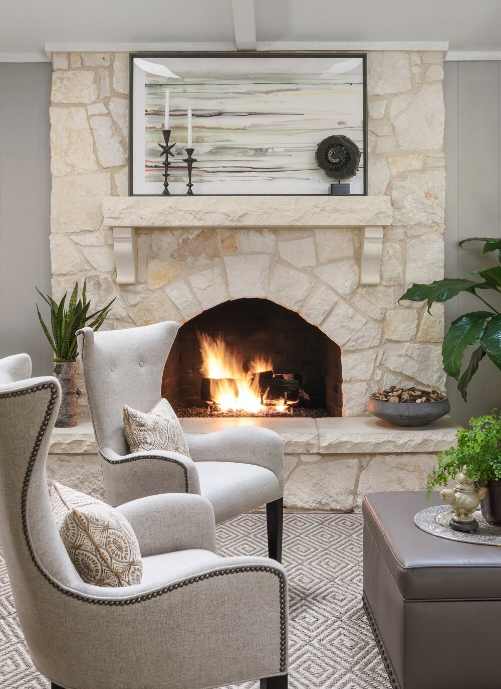
Adding accessories to the mantle of your fireplace will help to make sure that it becomes a focal point for your room.

Adding accessories to the mantle of your fireplace will help to make sure that it becomes a focal point for your room.

A large room can accommodate multiple focal points, but a small room should never have more than two. In a living area with a beautiful view, for example, both the fireplace and the windows can be focal points. To balance more than one focal point, establish seating areas or groups of accessories around each of them.

One of the focal points should always be more dominant than the others, so make sure you’re using paint or lighting to ensure that the viewer will look at it first. To make whitewashed furniture pop, put a dark wall color behind it; inversely, put your dark statement furniture in front of a white wall.

You can also try flanking your focal point with plants, lamps, or vases on either side to give that part of the room some “weight.” Height is another way to help your focal point assert itself. If your focal point is an armoire or desk, and there’s open wall space above, hang a tall mirror over it. Patterns often have visual movement, so a patterned rug can actually help “lead” to a focal point when the lines of the pattern are going in the same direction.

If you have a side table that you'd like to use as a focal point for your room, try hanging a tall mirror over it.

If you have a side table that you'd like to use as a focal point for your room, try hanging a tall mirror over it.

Even if a room is filled with the most beautiful objects, without a clear focal point, it won’t feel cohesive. Creating focal points is a skill any interior designer needs to know to do well in their profession. With some of these designer tips in mind, you’re well on your way to giving your rooms a professional touch.

Because this farmhouse kitchen is mostly white, a black fireplace screen with animal figures was used as a backsplash to command attention.

Because this farmhouse kitchen is mostly white, a black fireplace screen with animal figures was used as a backsplash to command attention.

If you have some ideas on how you want to redesign your rooms but could still use some help, feel free to get in touch with us. The best ways to reach us are by calling our Dallas office at 214-651-7665 or sending an email to info@chambersinteriors.com.

RELATED ARTICLES:

4 Things to Know Before You Update Your Bathroom or Powder Room by Margaret Chambers

A few accessories, like a soap dish or some fresh flowers, are all that's needed to complete a bathroom counter.

A few accessories, like a soap dish or some fresh flowers, are all that's needed to complete a bathroom counter.

Bathrooms and powder rooms are woefully overlooked areas in home design. Many people consider designing them an afterthought, or aren’t sure how to work with a small space. But no matter how small your powder rooms are, you deserve to have ones that are thoughtfully planned and tastefully designed. If you’re thinking about giving the bathrooms in your Dallas home a quick update—or an extensive remodel—you’ll surely find these tips useful.

Brunschwig & Fil’s iconic “Les Touches” wallpaper adds a playful touch to this bathroom we designed for a Dallas home.

Brunschwig & Fil’s iconic “Les Touches” wallpaper adds a playful touch to this bathroom we designed for a Dallas home.

2021 Bathroom Trends:

Although grey was a popular wall color for bathrooms the last few years, in 2021 it’s starting to go out of style. Instead, warmth is being brought into bathrooms through the use of gold or brass fixtures and wood accents. Wallpaper has also come back into style. If you do want to put up wallpaper, shop for the vinyl kind that is moisture-resistant.

While you’re updating, take a look into some of the latest developments in bathroom technology. These include smart showers that can be remotely set to start running, voice-activated lighting and temperature controls, and Bluetooth speakers for baths and showers. Heated floors have also been gaining popularity for some time now.

Layout Tips for Bathroom Remodels:

A common bathroom design mistake is to make your toilet the first thing a visitor sees when they enter the bathroom. Choose anything else as your focal point beside the toilet, such as your mirror, your bathtub, or your vanity. The toilet should be out-of-sight from the entrance whenever possible.

This area, with the freestanding tub and large antique mirror, serves as the focal point for this bathroom in Colleyville.

This area, with the freestanding tub and large antique mirror, serves as the focal point for this bathroom in Colleyville.

Bathrooms don’t have to be spacious to be appealing. To make a small powder room feel more luxurious, splurge on a few nice materials and finishes. If you prefer to take showers over baths, don’t take up too much floor space with a large tub.

When we remodeled this shower, we added glass doors, mosaic floor tiles, slabs of Carrera marble, and brass hardware.

When we remodeled this shower, we added glass doors, mosaic floor tiles, slabs of Carrera marble, and brass hardware.

You can maximize elbow room by installing a glass panel or shower curtains instead of a shower door. This way, you also won’t have to worry about your door swinging out and hitting the vanity.

Don’t forget to plan for storage space. Upper vanity cabinets along either side of the mirror are a smart solution for keeping toiletries out of sight. You can even build electrical outlets into the cabinets for plugging in your hairdryers and electric toothbrushes.

Choosing Flooring and Tiles:

There’s a reason why most bathrooms have tiled floors. Carpeting absorbs moisture and can develop mold, and if wood flooring becomes water damaged, it’s costly to replace. If you want the look of wood without the risk of water damage, I’d recommend porcelain tiles with a faux bois grain finish that emulate the look of real wood panels.

Improvements in manufacturing have paved the way for new and improved tile patterns, including chevron, diamond, hexagon, arabesque, and fish scales. I’m starting to see homeowners want to try new patterns instead of defaulting to subway tile.

The Best Lighting for Powder Rooms:

Lighting is always important for home design, and bathrooms are no exception. Older fluorescent light bulbs can cast an unflattering blue hue on skin, while dim lighting makes bathrooms feel small and closed-in. If the color tone of your bulbs is a cool white, update them with a warmer white.

The vertical cabinets in this vanity are great for storing toothbrushes, medications, etc. so they stay out of sight. The cabinets also contain electrical outlets, so everything can stay conveniently plugged in and ready to use.

The vertical cabinets in this vanity are great for storing toothbrushes, medications, etc. so they stay out of sight. The cabinets also contain electrical outlets, so everything can stay conveniently plugged in and ready to use.

As you update your lighting, make sure not to install the fixtures too far above your mirror, or else they’ll cast shadows on your face. Either bring the lights low enough so that they’re almost touching the mirror, or place sconces on either side of the mirror.

To make a bathroom feel light and airy, find a way to filter daylight in. A window to the outside or a skylight through the ceiling are both options. You can always put shutters over the window for more privacy.

We normally use tile in bathrooms, but the client wanted wood floors. To protect them, we added polyurethane coating.

We normally use tile in bathrooms, but the client wanted wood floors. To protect them, we added polyurethane coating.

For your finishing touches and decorations, keep things simple. Instead of cluttering counter space with lots of accessories, buy practical items—such as pretty soap dispensers—that are decorative and integrate into your overall design theme.

If your bathtub is next to a window, you can always add shades for privacy, like this motorized Roman shade we used.

If your bathtub is next to a window, you can always add shades for privacy, like this motorized Roman shade we used.

Many people in Dallas continue to work from home and are thinking about ways they can give their surroundings a facelift. Whether you’re planning a full bathroom remodel, or just want to make better use of the space and layout you already have, the designer tips above will come in handy.

For those of you who are looking to bring in a professional, you should know that Chambers Interiors has a lot of experience a bathroom remodels. To schedule a free consultation, email us at info@chambersinteriors.com or call our Dallas office at 214-651-7665.

RELATED ARTICLES:

Essential Items for Designing the Perfect Foyer or Entryway by Margaret Chambers

Lots of natural light will help a foyer feel open and airy. This north Dallas project was recently published in Luxe.

Lots of natural light will help a foyer feel open and airy. This north Dallas project was recently published in Luxe.

Foyers and entryways are an important area of the home that sadly often goes overlooked. They’re not just the first impression a guest has of your home; they are also a landing strip where you transition from public to private life.

The following designer tips can be applied to entryways of all shapes and sizes, in all styles of home architecture. Before you begin, take a look at your available space and identify the main goals you want to achieve with your foyer. You might not have room to incorporate all of the suggestions below, so pick the items that make the most sense for you and your family.

Furniture

Putting a console table, bench, and decorative mirror together will form a classic entryway vignette.

Putting a console table, bench, and decorative mirror together will form a classic entryway vignette.

Most professionally-designed foyers will have at least one of the following: a console table, a chest, or a bench. Benches are helpful to have because they offer a place for people to put on or take off shoes.

Choosing a chest over a console table can be wise if you don’t have a lot of closet space and need extra storage for your seasonal clothes. To dress up the space, hang a statement mirror or painting over your table, chest, or bench.

Rugs

This Oak Cliff house we designed features both an entry staircase with a patterned runner and a bench for seating.

This Oak Cliff house we designed features both an entry staircase with a patterned runner and a bench for seating.

In some homes, the entryway is small and enclosed on most sides. In an open concept home, however, the space is less defined. Dallas homeowners with an open concept house should make sure to delineate where their foyer begins and ends using a rug as well as a few pieces of furniture, such as a bookcase, console table, or bench. You can also use a partition or decorative screen to visually divide the entryway from the rest of the first floor.

Since this is a high-traffic area, your entry rug should have good traction and be durable. Wool is easier to clean than other materials, making it a popular choice for entryways. Jute is another good option because it doesn’t show wear and tear as visibly as alternatives. Those of you with an entry staircase should also think about getting a beautiful runner to make it safer to walk on.

Storage

An antique tea caddy can be a charming addition to your console table. Click here to learn more about tea caddies.

An antique tea caddy can be a charming addition to your console table. Click here to learn more about tea caddies.

If you don’t have a separate mudroom, and your foyer tends to get cluttered, identify what kinds of clutter accumulate there. Do you have a shoes-off policy for your home? If so, store shoes in a chest or basket under the console. Do you drop off your mail, sunglasses, and keys as soon as you get home? Place a pretty decorative box on your console table to collect these loose items.

To keep umbrellas off the floor, I recommend finding an umbrella stand made of porcelain, brass, or Lucite. As an aside, all of your storage solutions should either complement the overall space or be in neutral colors so that they fade into the background.

This foyer has two decorative light sources: a star-shaped light fixture overhead and a lamp with a faux bois stand.

This foyer has two decorative light sources: a star-shaped light fixture overhead and a lamp with a faux bois stand.

Lighting

One common problem with entryways is that they can be narrow and poorly lit. You have a few options for making sure yours is bright and welcoming.

In a foyer with very little natural light, a statement chandelier is the obvious choice. A less obvious option you might not have considered would be to decorate your console table or chest with a lamp. To reflect the natural light coming in through your windows or door, include a wall mirror in your foyer. Another advantage to putting a mirror in your entryway is that you can do a hair check one last time as you head out the door.

Accents

Seen here is a coffee table from the foyer we designed in SMU’s new Kappa Alpha Theta sorority house.

Seen here is a coffee table from the foyer we designed in SMU’s new Kappa Alpha Theta sorority house.

Since your foyer is like a sneak peek of the rest of your home, don’t be afraid to show your personality. This area can be a great place for a few personal photos and mementos. For your table or chest, decorate it as you would a coffee table: fresh flowers, a bowl of seashells, antiques, candles, or books could help complete the look.

Designing a better foyer won’t just impress your guests. It’ll bring you cheer when you come home after a long day to find a beautiful and well-organized space awaiting you. By taking a moment to strategize and identify key items missing from your current setup, you too can have a foyer that is as stylish as it is functional.

On the other hand, if you’re looking for an interior design team that will learn about your vision and source the items for you, you’ve come to the right place. To schedule a free consultation, call 214-232-9501 to reach our Dallas office or email us at info@chambersinteriors.com.

RELATED ARTICLES:

Smart Ways to Design a Small Space by Margaret Chambers

This small guest bedroom is from a 1960s Dallas ranch we designed for a couple who were downsizing.

This small guest bedroom is from a 1960s Dallas ranch we designed for a couple who were downsizing.

Just because you live in a small apartment or condo doesn’t mean that you can’t go big on style. Designing a small space can present some unique challenges. However, living in a small space also encourages you to be thoughtful and economical about what you bring into it. If you’re looking to get the most out of your apartment or condo, these tips may be helpful.

Identify Your Top Priorities for the Space

To start with, take time to really think about your needs and your routine. For example, if you don’t use your dining table often, you may want to replace it with a table that folds up when not in use. Walk through the apartment and note any blank walls or corners that aren’t serving a purpose. Whenever possible, take advantage of vertical wall space to add additional storage. Tall, narrow bookcases and shelving units are perfect for this.

Daybeds, such as the one seen here, are multi-purpose. They can function as beds as well as seating or lounging areas.

Daybeds, such as the one seen here, are multi-purpose. They can function as beds as well as seating or lounging areas.

Buy Multi-Purpose Furniture

If you’ve read other small space decorating guides, you probably know that buying multi-purpose furniture is a must. Some examples of multi-purpose furniture include beds with built-in storage, bookcases with built-in desks, hollow ottomans and sofa beds. When you’re decorating your small apartment from scratch, it’s crucial to make sure you’re purchasing the correct scale furniture. A major advantage to hiring an interior designer is that they will carefully measure your space and find pieces that are just the right proportion—or have them custom-made, if need be.

The glass and acrylic game table next to this mirror fades into the background. It also doubles as an extra dining spot.

The glass and acrylic game table next to this mirror fades into the background. It also doubles as an extra dining spot.

If you have low ceilings, use short-legged furniture to help your ceilings feel taller. On the other hand, if your ceilings are just the right height, you should consider furniture with longer legs. A large sofa that sits low to the floor can feel extra bulky in a small room. By bringing up your furniture off the floor instead, you’re making it appear as if you have more floor space.

Make Your Walls Feel Bigger With the Right Accessories

One of the tricks designers use for decorating apartments and condos is to buy clear furniture made of acrylic or glass. A clear coffee table fades into its surroundings, making the room feel more expansive. Mirrors are another common solution for small spaces. They add more dimension to an otherwise flat wall, and reflect light into the room. Believe it or not, it’s a mistake to only decorate your walls with small artwork. With artwork, it can actually look better to go bold with a big statement piece.

Use Rugs and Furniture to Create Visual ‘Zones’

Rugs also do a lot of good for a small apartment. They can cover up unsightly carpets and tile, delineate “zones,” or visually expand the space. Speaking of zones, make sure to divide shared spaces with your furniture. An open concept floor plan is not as beneficial to apartments as you might think. It’s better to give the eye places to rest and create cohesive groupings. For example, if your dining area and living room are connected, you can use the back of your sofa to separate the two.

Floor-to-ceiling shelves add plenty of storage space to this small library from a home we designed in Kessler Park.

Floor-to-ceiling shelves add plenty of storage space to this small library from a home we designed in Kessler Park.

Most small spaces are square or rectangular. Adding curved furniture can contrast against the angles of your space in an appealing way, instantly giving your apartment some flair. Don’t forget to complement any curved furniture with one or two curved accessories in the same room, such as an oval mirror or rounded lampshade.

Choose Your Paint Color

When it comes to paint color, different designers approach small spaces in different ways. Some say you should paint the walls white to help the apartment feel more open. Others say that a dark paint color gives your apartment a cozy, jewel-box feel. In my opinion, there is no right or wrong answer: instead, you should decide what kind of feel you want your apartment to have, and go from there.

We used a light, green-and-beige color scheme to help this guest bedroom feel more open and airy.

We used a light, green-and-beige color scheme to help this guest bedroom feel more open and airy.

Whether you’re starting with a blank state, or you simply want to rearrange the furniture you already have, this guide should help you make your small space your own. When a small space is thoughtfully designed, visitors won’t notice its size: instead, they’ll admire your great taste!

If you’re still stumped on how to get the most potential out of your small space, consider hiring an interior designer. To schedule a free consultation with Chambers Interiors, call our office in Dallas at 214-651-7665 or send us an email at info@chambersinteriors.com.

Related Articles:

Incorporating Mirrored Furniture Into Your Home by Margaret Chambers

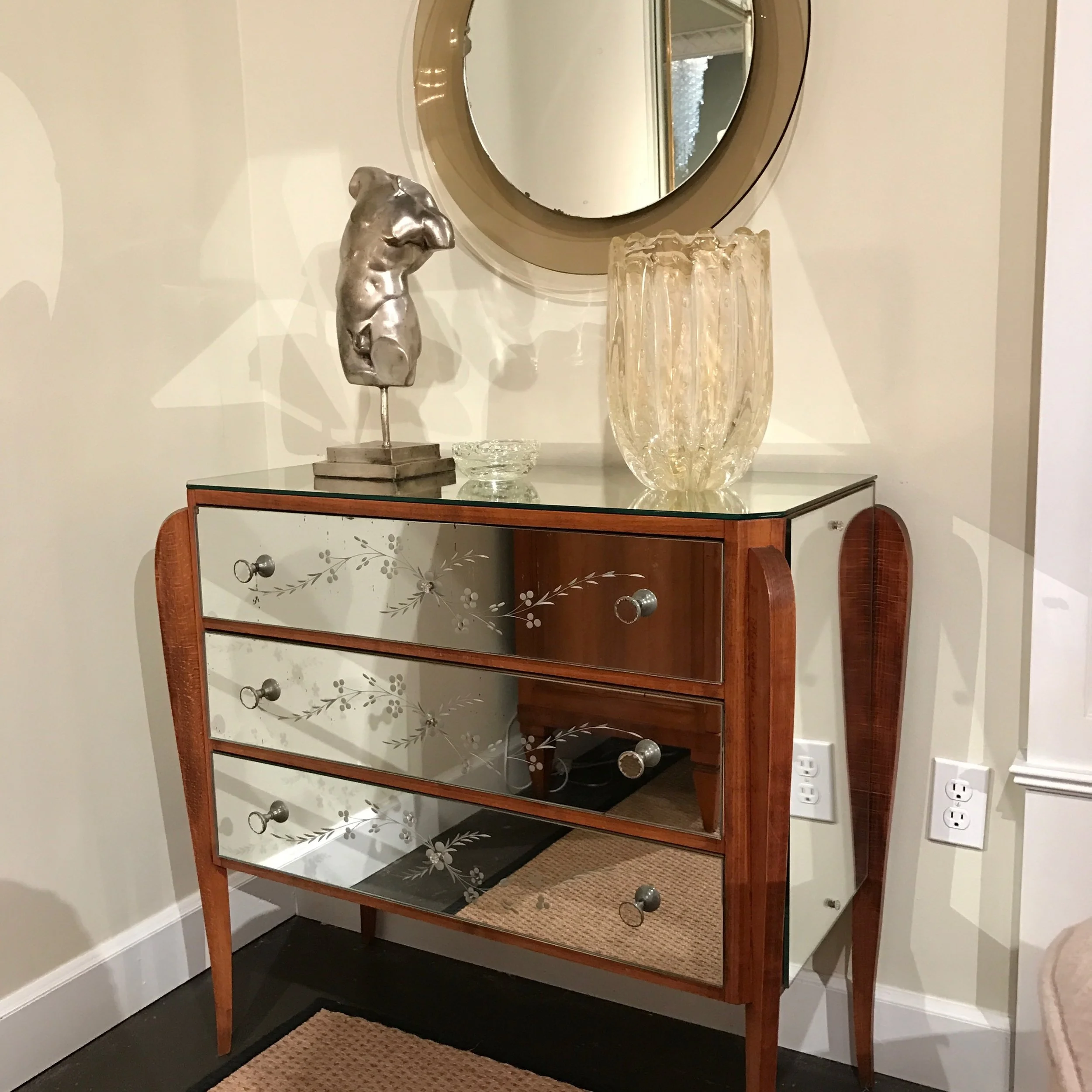
mirrored-chest-of-drawers

If you've ever shopped in Dallas and seen mirrored furniture on display, you may have wondered: is mirrored furniture in style? Or out of style?

Back in the 90's, mirrored furniture was overused in interior design, so it went out of style for awhile. However, mirrored furniture started to come back steadily in the early 2000's. Most interior designers now believe that it's a trend that's here to stay. 

To some people, mirrored furniture has a classic look that will always bring a touch of glamour and elegance to a room. Others believe that these pieces work best when they're used with restraint.  By following some basic guidelines, you should have no trouble finding the perfect place for these pieces in your home.

History of Mirrored Furniture

This 3-part mirrored desk by Bungalow 5 commands quite the presence with its high shine and ample storage space. If you’re interested in purchasing Bungalow 5 products, please feel free to reach out to us.

This 3-part mirrored desk by Bungalow 5 commands quite the presence with its high shine and ample storage space. If you’re interested in purchasing Bungalow 5 products, please feel free to reach out to us.

The earliest examples of mirrored furniture date back to the 18th century. At that time, mirrored woman’s dressing tables were especially popular. However, most of the new mirrored furnishings you find today are actually inspired by pieces from the Art Deco period in the 1920's and 30's. 

That's why when people see mirrored furniture, they might think of old Hollywood interiors. Mirrored furniture can feel both glamorous and retro at the same time, so it works best when mixed with other styles.

Dallas-ranch-home-mirrored-chest.jpg

Pros and Cons of Mirrored Furniture

One major benefit of introducing reflective surfaces into a room is that it gives the illusion of extra space. While a wooden armoire with dark staining feels visually "heavy," the same armoire with mirrored panels will actually "recede" by reflecting what is around it.

Although mirrors can bounce light around a room, they also make a room feel cool instead of warm--much like metal furnishings. The high sheen of this furniture can serve as a bridge between classical and contemporary elements in a room.

Bungalow 5 has also released this stunning 7-drawer storage piece. Its overall structure takes inspiration from Italian midcentury design, while the rippling wave pattern is a stylish addition.

Bungalow 5 has also released this stunning 7-drawer storage piece. Its overall structure takes inspiration from Italian midcentury design, while the rippling wave pattern is a stylish addition.

The downsides to owning mirrored furniture include their cost of repair. Fixing any damage made on mirrored furniture can be a challenge. Also, keep in mind that you'll need to wipe away fingerprints, dust, splashes, and stains regularly. While cleaning may be frequent, however, it is also much easier to clean than wood. For instance, a wet glass that would leave on ring on wood furniture wouldn’t do the same on mirrored furniture.

Where to Put Mirrored Furniture in Your Dallas Home

Pictured above is the Cecilia center/dining table by Bungalow 5. It is made of wood with a mirrored surface.

Pictured above is the Cecilia center/dining table by Bungalow 5. It is made of wood with a mirrored surface.

The best kind of mirrored furnishings for bedrooms include wardrobes, chests, side tables, and dressing tables. A bed with mirrored frames makes an especially dramatic, mmirrore contemporary statement. For your living rooms, consider having a mirrored coffee table, end tables or sideboard. Mirrored folding screens can also add a touch of style to a large room.

Of course, you don't have to commit to a large statement piece. Chairs with a band of mirrored glass around the frame, or a small mirrored bedside table, can also add just a touch of sparkle.

On the other hand, you'll want to avoid putting this kind of furniture in busy rooms that already have a lot going on. A good rule of thumb is to have no more than one or two pieces in the same room.

Don't forget that mirrors can also be made with gray finishes to tone down their shine, while antique patinas give mirrors a unique "smoky" look.  Unless you're after an antiqued patina, there's no need to track down real period pieces, however. Antique mirrored furniture was often cheaply made, since it's easier to glue on mirrors than staining or carving a wooden piece of furniture. We have the ability to help you find newer pieces that have this same, antiqued look.

As you can see, mirrored furniture is surprisingly versatile. When placed with care, these captivating pieces can make the whole room feel larger, bridge the gap between classical and modern, or add a glitzy shine. If you want to make sure that you're bringing out the full potential of your mirrored furniture, here at Chambers Interiors we often use mirrored pieces in contemporary, transitional and traditional spaces. If you're starting from scratch, we can also help you locate a wide variety of mirrored pieces in the Dallas Design District that are perfect for your interior.

Related Articles: