architecture

8 Design Ideas for Rooms with High Ceilings by Margaret Chambers

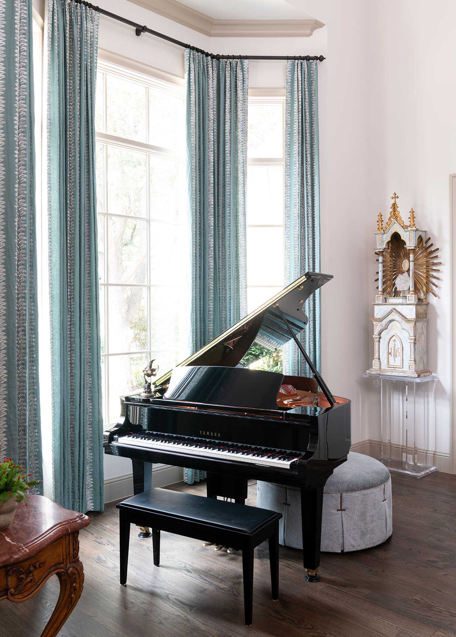
Tall drapes with valances, a modern chandelier, and a painting all help to fill the space under this high ceiling.

Tall drapes with valances, a modern chandelier, and a painting all help to fill the space under this high ceiling.

Although high ceilings are a sought-after feature for most Dallas home buyers, they can also present some unique design challenges. People are often stumped trying to figure out what to do with all that extra wall space over door frames.

The key is to bring everything together by visually connecting your furniture, walls, and ceiling. Read on for eight design solutions that help make high-ceilinged rooms feel more inviting and intimate.

1. Find the Perfect Artwork:

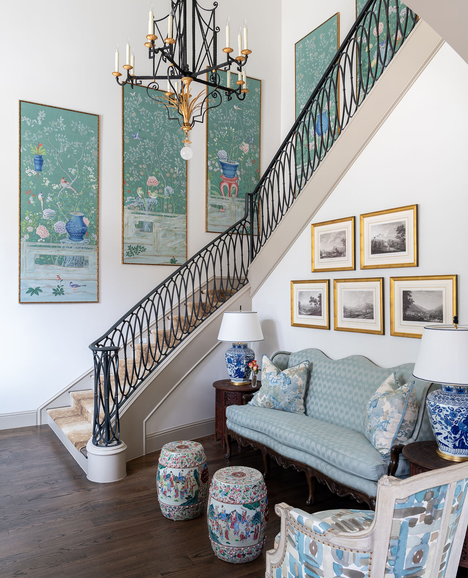
A series of framed de Gournay wallpaper panels add drama to this tall staircase in a Dallas home we designed.

A series of framed de Gournay wallpaper panels add drama to this tall staircase in a Dallas home we designed.

One way to fill your extra wall space is with artwork. One large statement piece, a gallery of smaller pieces, or a tapestry are all good options for high ceiling rooms.

Artwork should be hung at eye-level, unless you have a particularly tall and narrow piece. If you want to hang something above eye level, I recommend a wall clock.

2. Install Custom Drapes:

Very tall ceilings call for very tall window treatments, which usually have to be custom ordered through a designer.

Very tall ceilings call for very tall window treatments, which usually have to be custom ordered through a designer.

The rule of thumb for tall windows is to hang your draperies at ceiling height. On the other hand, if your windows don’t go all the way up to the ceiling, you may want to add valances to make them more proportional. Either way, the drapes should hang so that they almost touch the floor.

Depending on how high your ceilings are, you may need to order custom drapes. Although costly, this is an option worth considering. The softness of drapes helps to make a high ceiling room feel cozier. Don’t worry about the tall draperies being too much: as long as you choose a solid color fabric or a subtle pattern, the effect will be spectacular.

3. Add Architectural Details:

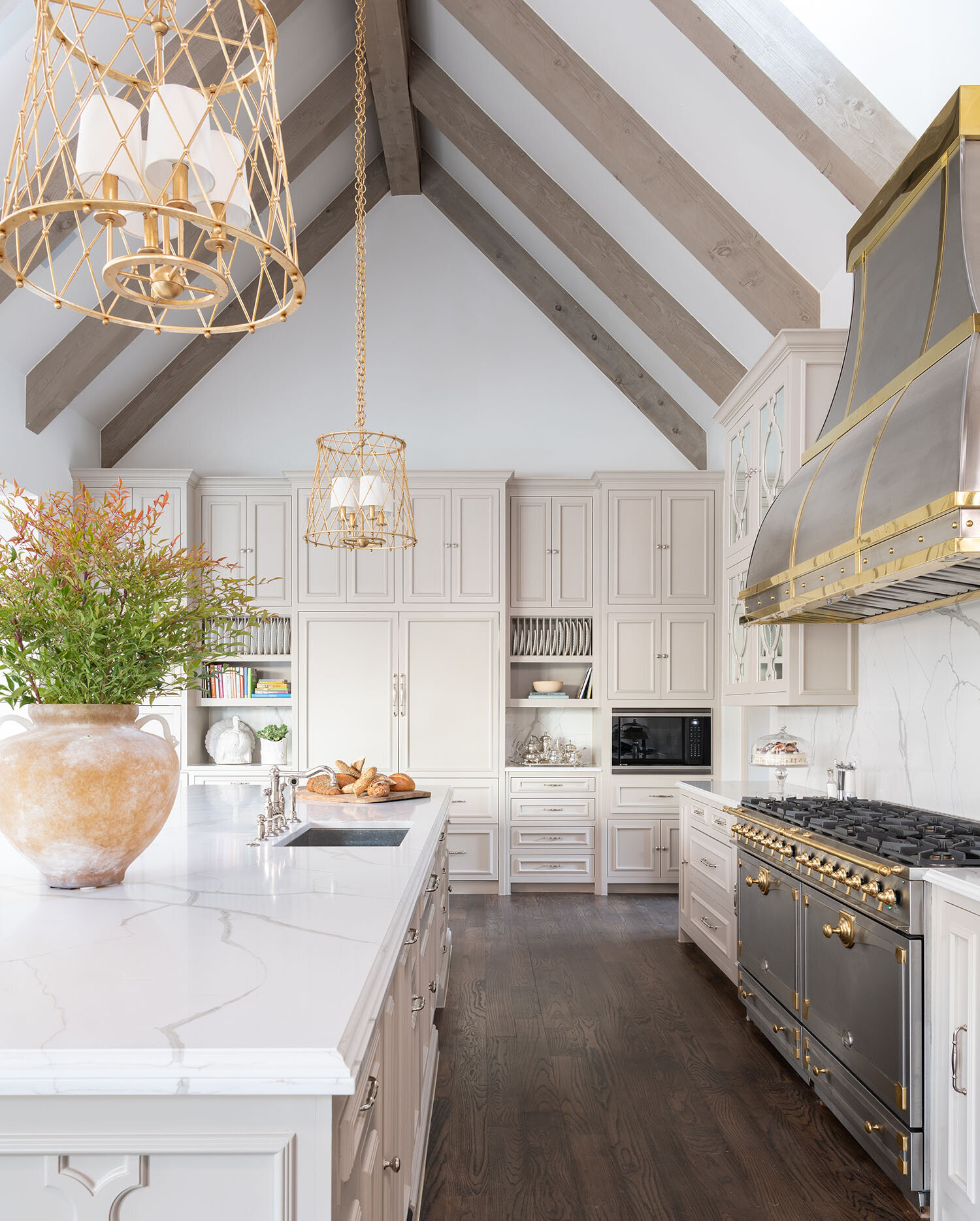
The wood ceiling beams in this kitchen complement the hardwood floors while also contrasting against the sleek metals.

The wood ceiling beams in this kitchen complement the hardwood floors while also contrasting against the sleek metals.

One way to create a sense of depth in a tall ceiling is to add exposed beams or large crown molding. Although beams are usually associated with rustic homes, they can fit into a contemporary style home as well.

4. Use Statement Lighting:

Hanging a statement lighting fixture, such as a chandelier, is a classic solution to drawing the eye towards a ceiling. Generally, chandeliers should be hung over the coffee table or dining table in the center of the room.

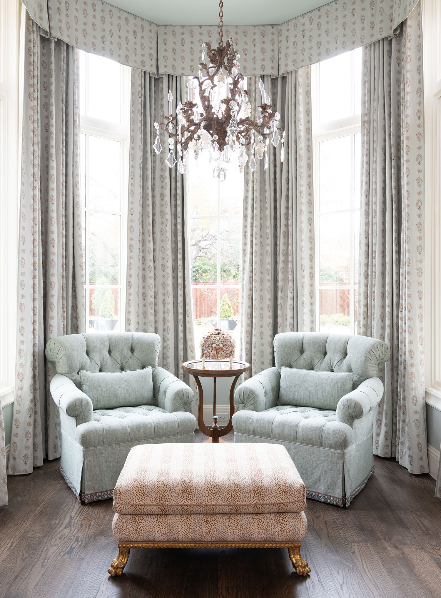
For this north Dallas project, we repurposed the dining room chandelier from our clients’ old home and hung it over a seating area in their new master bedroom.

For this north Dallas project, we repurposed the dining room chandelier from our clients’ old home and hung it over a seating area in their new master bedroom.

5. Create a Feature Wall:

Another way to visually connect the upper and lower levels of the room is to turn one wall into a feature wall. There are a few different ways to do this. Painting one wall in a solid, dramatic color from floor to ceiling; wallpapering a wall; or extending the brick or stonework around your fireplace upward are some ideas.

6. Break the Walls into Thirds:

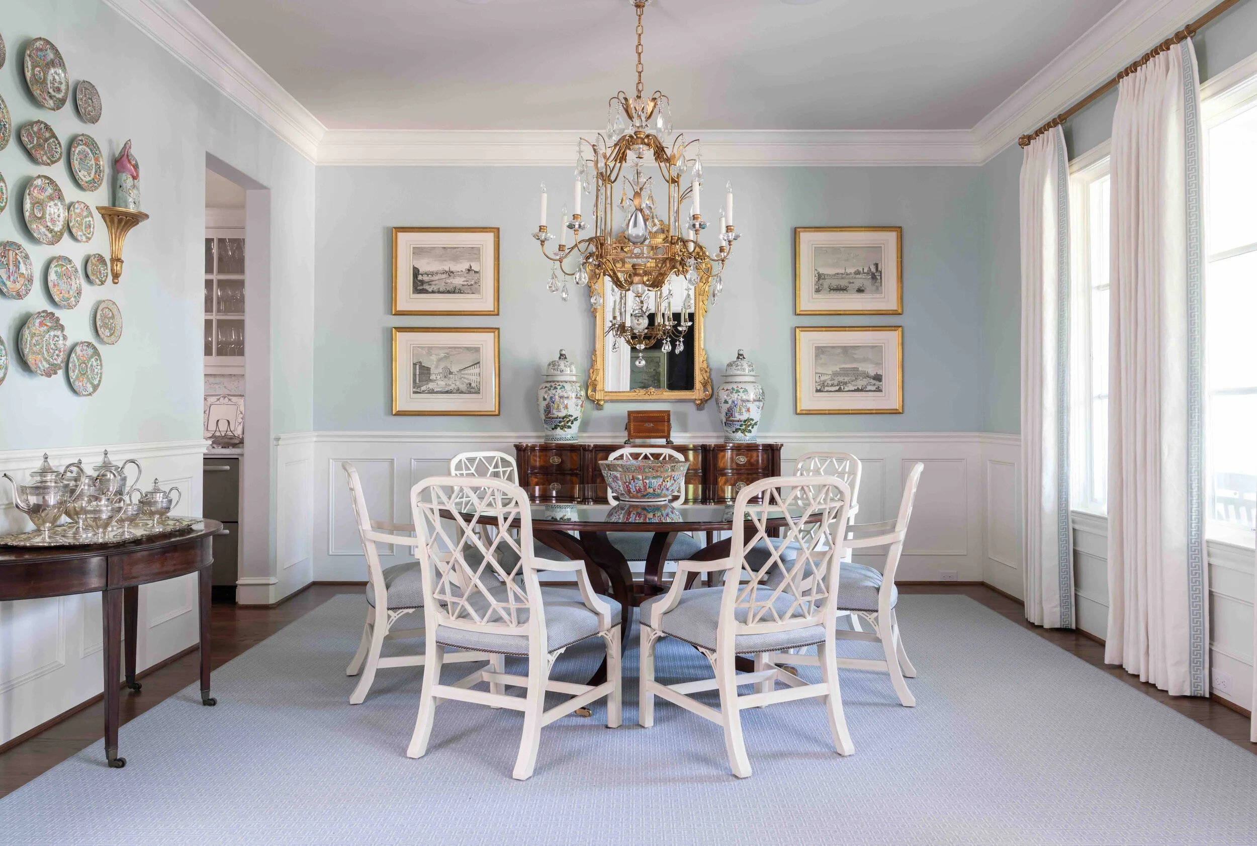
An alternative to the floor-to-ceiling feature wall is to follow the rule of thirds and visually divide the walls into three sections. As an example, the lowest third of your wall could be paneled, the middle third could be for artwork, and the highest third could be left as-is.

The wainscoting seen here, plus the two rows of framed prints above it, divide the wall into visual thirds.

The wainscoting seen here, plus the two rows of framed prints above it, divide the wall into visual thirds.

That said, not everything in your room needs to align with these three segments. Breaking up the visual “horizon” of the room (by including a few bookcases, for example) adds variety to the topography of the space.

If you want to make your walls feel shorter and the ceiling closer, paint your walls in two tones, one color on top of another.

7. Install Shelving:

Some homeowners make use of the extra wall height in their rooms by installing floating shelves or buying tall bookcases. If you like greenery, you can also add a tall potted plant in the corner of your room.

8. Use the Correct Scale Furniture:

A room with tall ceilings needs furnishings and accessories that fit comfortably into its scale. To that end, do not fill your room with collections of small objects or small-scale furniture.

A custom canopy bed and a large area rug are proportionally appropriate choices for this high-ceilinged bedroom we designed.

A custom canopy bed and a large area rug are proportionally appropriate choices for this high-ceilinged bedroom we designed.

Your furniture should be grouped together into multiple seating arrangements and anchored with an appropriately sized rug. Spacing the furniture far apart will make the room feel unbalanced and uncomfortably expansive.

Having high ceilings is an enviable problem many would love to have. That said, there’s no denying that taking advantage of the extra height can be tricky without a designer’s know-how.

By working with a professional interior designer, you can have access to their resources, which include custom window treatments, fine artwork, gorgeous chandeliers and other design elements that bring out the best in a high-ceilinged room. To schedule a free consultation with us, call our Dallas office at 214-232-9501 or email us at info@chambersinteriors.com.

RELATED ARTICLES:

How to Decorate These Common Types of Dallas Home Architecture by Margaret Chambers

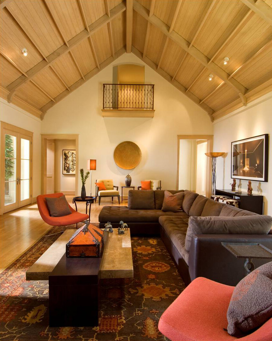
We decorated this modern Dallas house using a midcentury style, with burnt oranges, earth tones, and simple shapes.

We decorated this modern Dallas house using a midcentury style, with burnt oranges, earth tones, and simple shapes.

When I’m working with clients who have recently purchased a home, they often ask me: “What’s the right style for this house’s architecture?” This is an especially common concern among people moving into a historic house. No matter how beautiful your furnishings and art collection are, your home won’t come together if your decorating clashes with the ‘bones’ of the house.

For example, an industrial loft with exposed brick will look strange decorated with all European antiques. A colonial home should use a traditional style as opposed to something trendy, like Scandinavian minimalism. In this guide, I’ll discuss the most appropriate interior design styles for four types of home architecture I see often in Dallas: Modern, English, French, and Italian.

Modern Homes

Modern homes can be seen in Highland Park, University Park, and Lower Greenville. This style of house, which is inspired by Frank Lloyd Wright’s Prairie School architecture, typically has a flat (or sometimes gabled) roof.

Here you can see an exterior photo of the Dallas modern home featured above.

Here you can see an exterior photo of the Dallas modern home featured above.

In a modern home, function comes before form: there is very little ornamentation and few decorative objects, save for some modern art to add sophistication. If you live in a modern home, you’ll need to decorate in either a modern, contemporary, or transitional style. All three of these styles tend to have a neutral color scheme, such as white, gray, tan or cream, with some brown or black accents.

If you do want to include a few antiques, I recommend multicultural works of art. Midcentury modern artists drew inspiration from other cultures (think of Pablo Picasso and his “African Period” of art). This is perhaps why Indian, East Asian, or African art will look natural in a modern setting while European antiques do not.

English, French, or Italian Homes

When you own a home with an English, French, or Italian architectural style, the safest course is to make your interior design consistent with the architecture. Depending on what type of home you have, however, you do have some leeway to incorporate pieces that are in a different style.

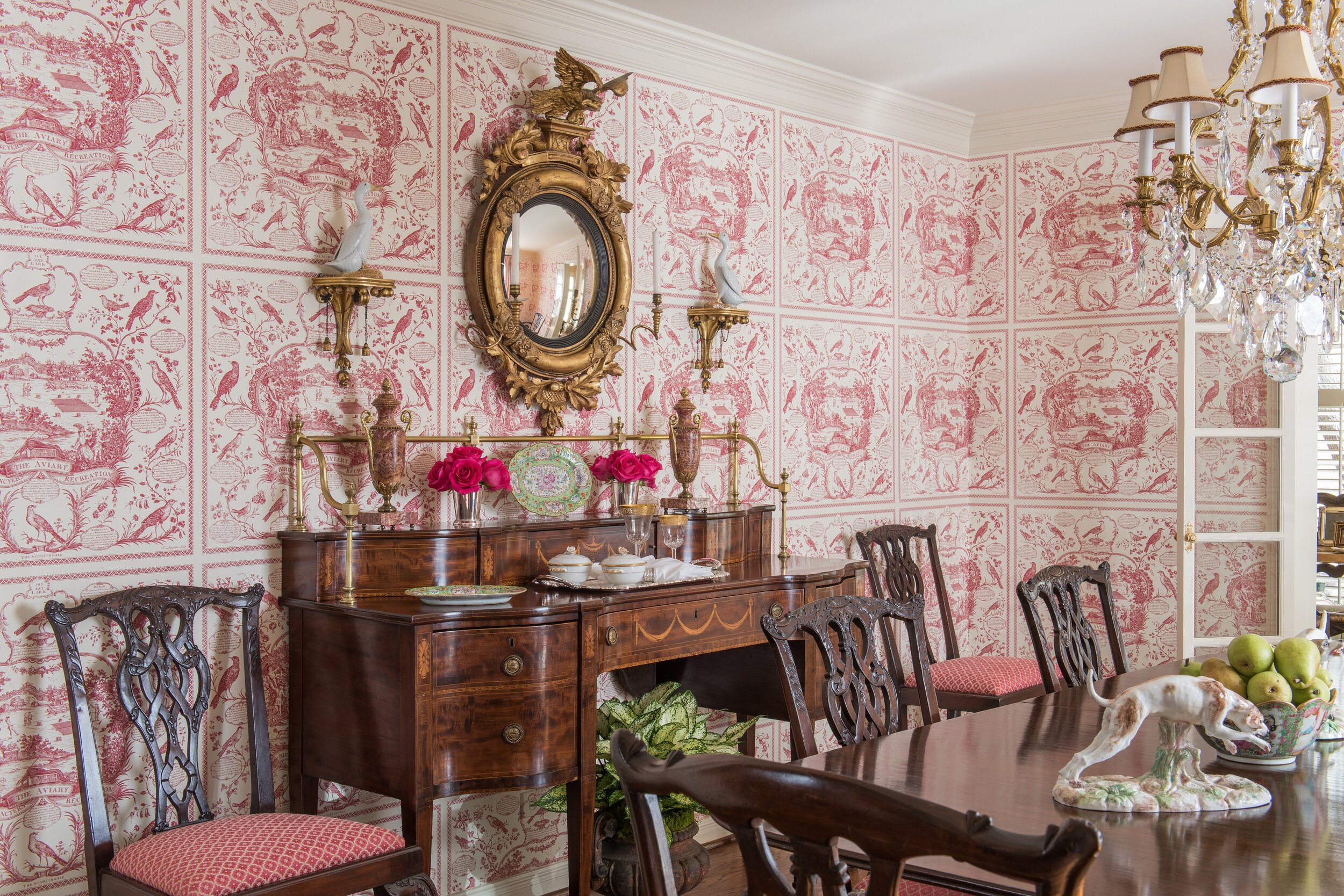
The dining room in this University Park English cottage has Chippendale chairs with elaborately carved chair backs.

The dining room in this University Park English cottage has Chippendale chairs with elaborately carved chair backs.

For example, if I were designing an English home, I would make sure that at least eighty-five percent of the furnishings, fabrics, and accessories were English in style. Chippendale furniture is a very popular choice for today’s English homes. For that other fifteen percent of the house, I might include some French pieces, such as French porcelains. American antique furniture (or reproductions) are another option because American furniture was closely based on English furniture.

The same goes for French and Italian homes. A French home should be mostly French, but can have some English pieces. If you’re looking to add variety to your Italian home, I would go with French pieces, which will blend better with the rest of the home than English pieces would.

Another thing to keep in mind is that there’s quite a bit of difference between French Classical or French Country, or between Georgian and English Cottage. If your home can be described as English Cottage or French Country, you’ll want to fill it with items that are more casual and pared down.

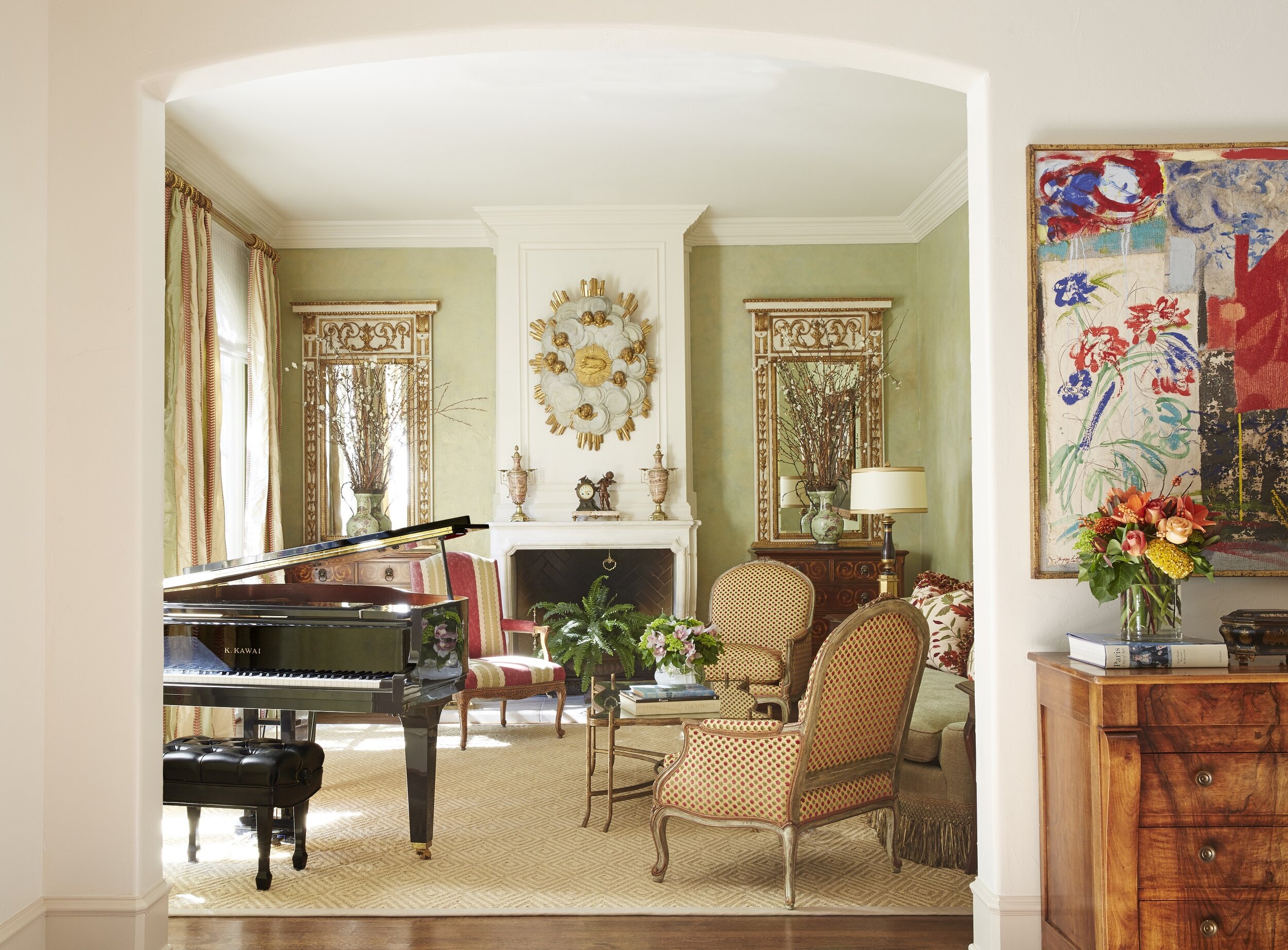
The traditional living room in this French chateau we designed combines elegant furnishings with a soft color palette.

The traditional living room in this French chateau we designed combines elegant furnishings with a soft color palette.

For all three of these styles, you can also feel free to include a few modern pieces of artwork. In Paris, it’s a popular trend to decorate old Parisian apartments with all modern artwork and furnishings. Personally, though, I believe that modern furniture should not be used in a classical French, English, or Italian home. It might look trendy today, but it won’t stand the test of time the same way that a more traditional look would.

As an interior designer, when I work with clients who own a beautiful modern, English, French, or Italian home, I want the final result to remain mostly faithful to the architectural style. That said, when most people move into a new home, they don’t start from scratch: everyone has at least a few items they’re bringing with them. Thankfully, there are ways to incorporate heirloom furniture or prized artwork that doesn’t match the exact style of the home. The key is to identify which of your items might potentially clash with the architecture and which could blend right in.

If you recently moved into a new home and aren’t sure how to bring the best out of the architecture, consult an interior designer. Here at Chambers Interiors, we are experienced in designing and decorating homes with a wide variety of architectural styles. Call our Dallas office at 214-651-7665 or email us at info@chambersinteriors.com to learn more.

Related Articles:

Why Neoclassical Home Architecture Never Goes out of Style by Margaret Chambers

With its combination of clean lines, imposing scale, and stately details, Neoclassical architecture always makes a statement. Here in Dallas, our historic courthouse and the Dallas High School are both examples of this timeless look. Although many people associate Neoclassical with government buildings, it’s also a popular style for traditional homes.

lexington-neoclassical-home.jpg
Architect Robbie Fusch designed this home on Lexington. Like any Neoclassical home should, it favors symmetry over asymmetry. (This photo and drawing are copyright of Fusch Architects, Inc. Chambers Interiors & Associates was granted permission …

Architect Robbie Fusch designed this home on Lexington. Like any Neoclassical home should, it favors symmetry over asymmetry. (This photo and drawing are copyright of Fusch Architects, Inc. Chambers Interiors & Associates was granted permission to feature these images).

History

Neoclassical, or “new classical” is the revival of ideas and culture from ancient Greece and Rome. True classical architecture was built between 850 B.C. and A.D. 476.

By the late 18th century, architects and interior designers throughout Europe were beginning to tire of Rococo style. Excavations at Pompeii and Herculaneum inspired designers to return to the simplicity and elegance of the ancient past. Neoclassical became so popular that by the year 1800, almost all British architects were using it.

During the 19th century, US architects defined the aesthetic course of the nation by designing universities and government buildings in a Neoclassical style. This was intended to suggest similarities between the new republic and ancient Rome. Today, Neoclassical buildings can also be found in France, Russia, and Latin America. Some famous examples of Neoclassical design include the U.S. Capitol, the Panthéon in Paris, the Prado Museum in Madrid, and Thomas Jefferson’s Monticello in Virginia.

Le Panthéon de Paris as painted by Jean-Baptiste Hilair, 1795. (Public domain)

Le Panthéon de Paris as painted by Jean-Baptiste Hilair, 1795. (Public domain)

You might wonder if Neoclassical is too ostentatious for residential architecture. Not so: Neoclassical homes are still being designed and built all across America.

Characteristics

Some of the key tenets of Neoclassical architecture include symmetry, dramatic columns, domed roofs, and triangular pediments. Columns are built according to the Doric, Ionic, or Corinthian orders (classical style guidelines) and will always be placed in even numbers. Unlike British Neoclassical homes, American Neoclassical homes are often built with a double portico. Some Neoclassical homes also have a balustrade along the second story porch.

This Turtle Creek home by architect Richard Davis has both a double portico and a balustrade. The columns here follow the Doric order, meaning they are simple and streamlined in design. (This photo is copyright of Richard Drummond Davis Architects. …

This Turtle Creek home by architect Richard Davis has both a double portico and a balustrade. The columns here follow the Doric order, meaning they are simple and streamlined in design. (This photo is copyright of Richard Drummond Davis Architects. Chambers Interiors & Associates was granted permission to feature this image).

An aerial shot of a Neoclassical home with a double portico in Fort Worth, designed by Ralph Duesing. (This photo is copyright of Ralph Duesing Architect, LLC. Chambers Interiors & Associates was granted permission to feature this image).

An aerial shot of a Neoclassical home with a double portico in Fort Worth, designed by Ralph Duesing. (This photo is copyright of Ralph Duesing Architect, LLC. Chambers Interiors & Associates was granted permission to feature this image).

The thought behind Neoclassical is that pure, simple forms should be the basis of great architecture. However, there is still room to include some ornamental details. Examples include dentil moldings (rectangular blocks along the roof line or below the cornice) and Corinthian columns, the tops (capitals) of which are densely decorated with scrolls and foliage.

In this photo of a home designed by Paul Turney, you can see examples of both dentil moldings and Corinthian columns. Dentil moldings line the pediment over the front porch. (This image is copyright of Turney & Associates, Inc. Chambers Interior…

In this photo of a home designed by Paul Turney, you can see examples of both dentil moldings and Corinthian columns. Dentil moldings line the pediment over the front porch. (This image is copyright of Turney & Associates, Inc. Chambers Interiors & Associates was given permission to feature this image).

Many American Neoclassical homes are constructed using Flemish Bond red brick and limestone corner stones called quoins. Door and window trim, columns, roof-line balustrades, and shutters are all made of either limestone or wood. The brick exterior walls and wood ornamentation of a Neoclassical home help to give the building its sense of solidness, but the wood ornamentation also needs to be carefully maintained over time. Anything made of wood should be repainted or re-stained once in a while, as well as inspected for rot.

Fountains and abundant greenery give a restful quality to this Neoclassical outdoor area. Paul Turney was the architect for this home, while the landscape architect was John Armstrong. (This image is copyright of Turney & Associates, Inc. Chambe…

Fountains and abundant greenery give a restful quality to this Neoclassical outdoor area. Paul Turney was the architect for this home, while the landscape architect was John Armstrong. (This image is copyright of Turney & Associates, Inc. Chambers Interiors & Associates was given permission to feature this image).

Unlike casement windows, traditional double-hung windows do not have an airtight seal when closed. They also tend to leak more air as they age. If you buy an older Neoclassical home, you may want to have the windows inspected. Repairing or replacing these windows with modern replicas can help you save money on your energy bill.

Windows in Neoclassical homes, such as this home designed by Richard Davis, have double-hung sashes with shutters on either side. (This photo is copyright of Richard Drummond Davis Architects. Chambers Interiors & Associates was granted permissi…

Windows in Neoclassical homes, such as this home designed by Richard Davis, have double-hung sashes with shutters on either side. (This photo is copyright of Richard Drummond Davis Architects. Chambers Interiors & Associates was granted permission to feature this image).

Interior design in Neoclassical homes

Restraint is key here. Neoclassical is a style that can easily cross the boundary between “tasteful” and “gaudy.” How do you find the sweet spot? Aim for an elegant and refined color scheme that is paired with bold architectural lines, daring geometrics and playful accessories.

When it comes to color, Neoclassical rooms tend to have a light overall color scheme, with a few dramatic or darkly colored accents. For example, one room may have an overall black-and-white scheme with geometric patterns; another room could use softer cream, pale blue or pearl as its main colors. Popular accent colors for these rooms include navy blue, terracotta, gold, and wine red.

If you’d like to decorate a single room in Neoclassical style, it should be a room with high ceilings, large windows, and lots of natural light. This is the optimal setting for this style.

Cobalt blue is the accent color of choice in this room from a Neoclassical home by Robbie Fusch. (This photo is copyright of Fusch Architects, Inc. Chambers Interiors & Associates was granted permission to feature this image).

Cobalt blue is the accent color of choice in this room from a Neoclassical home by Robbie Fusch. (This photo is copyright of Fusch Architects, Inc. Chambers Interiors & Associates was granted permission to feature this image).

In the 1700s, designers who worked in Neoclassical style chose furniture that balanced clean lines and Greco-Roman details. Antique furniture from this period often had tapered or fluted legs, scrolls, lyre backs, and rosettes. In the same way that Neoclassical architecture tended to be symmetrical, Neoclassical furniture is usually symmetrical in design too. Upholstery was usually in colors like rose, white, gray-blue, and striped or toile patterns. Gilt accents on mirrors and furnishings are also quite common. Since this style is associated with luxury, you may want to splurge on high-quality fabrics such as silk, linen, brocade, and velvet.

In a Lexington home designed by Robbie Fusch, this mirror with a gilt frame makes a stunning statement piece. (This photo is copyright of Fusch Architects, Inc. Chambers Interiors & Associates was granted permission to feature this image).

In a Lexington home designed by Robbie Fusch, this mirror with a gilt frame makes a stunning statement piece. (This photo is copyright of Fusch Architects, Inc. Chambers Interiors & Associates was granted permission to feature this image).

One key difference between Neoclassical and other traditional styles is that Neoclassical has less clutter. Of course, there are some accessories that are a must for this look. Busts, statues, obelisks, urns, large mirrors, crystal chandeliers, and classic art will help cinch the style. Neoclassical vases and urns are often painted in a solid color with a white pattern (like a garland, series of swags, or Greco-Roman scenery) wrapped around. For your other accessories, look for lamps and mirrors with Neoclassical motifs, like griffins, sphinxes, and satyrs.

Crystal chandeliers, crown molding, and painted walls give elegance to the dining room in this Turtle Creek home by Richard Davis. (This photo is copyright of Richard Drummond Davis Architects. Chambers Interiors & Associates was granted permiss…

Crystal chandeliers, crown molding, and painted walls give elegance to the dining room in this Turtle Creek home by Richard Davis. (This photo is copyright of Richard Drummond Davis Architects. Chambers Interiors & Associates was granted permission to feature this image).

Since Neoclassical rooms tend to have a “clean” look, some Dallas homeowners are combining elements of Neoclassical with modern and contemporary design. Be careful to not include too many accessories, especially in rooms that already have busy patterns. Just a few pieces will go a long way to getting the glamorous look you want.

neoclassical-sorority-house.jpg
Chambers Interiors & Associates was the interior design team for the new SMU Theta sorority house (exterior and interior photos shown above). We chose a transitional style that would please both older alumni and current students. The new buildin…

Chambers Interiors & Associates was the interior design team for the new SMU Theta sorority house (exterior and interior photos shown above). We chose a transitional style that would please both older alumni and current students. The new building was designed in Neoclassical style by Fusch Architects, Inc.

Like many famous Neoclassical buildings, this home by Ralph Duesing in Westover Hills has a large triangular pediment. (This photo is copyright of Ralph Duesing Architect, LLC. Chambers Interiors & Associates was granted permission to feature th…

Like many famous Neoclassical buildings, this home by Ralph Duesing in Westover Hills has a large triangular pediment. (This photo is copyright of Ralph Duesing Architect, LLC. Chambers Interiors & Associates was granted permission to feature this image).

Whether you prefer traditional or contemporary, Neoclassical style has a lot to offer. If you own a Neoclassical home and are not sure how to balance this style with your other furnishings, consider enlisting the help of a designer familiar with the style. Neoclassical can be a very difficult style for the average homeowner to pull off, especially if the home doesn’t have a lot of classical architectural detailing.

If you could use an expert eye to make sure you hit your mark, contact us by emailing info@chambersinteriors.com or call our office in Dallas (214-651-7665) to tell us more about your project.

Related Articles: