dallas

Happy Thanksgiving From Chambers Interiors by Margaret Chambers

Michael Hunter - Dining 1.JPG

Chambers Interiors wishes you and your loved ones a happy Thanksgiving

We hope your holiday week is a safe and joyful one! Pictured above is a table setting from our project that was recently published. You can see more photos in the November / December issue of Luxe Magazine (Dallas + Fort Worth). If you get the chance, look for the magazine on newsstands.

Luxe-cover.jpg

Here's what the cover of the magazine looks like. This issue is also available to order online at the Luxe website: LUXE INTERIORS + DESIGN (pubservice.com)

As you check out, make sure to select the issue entitled, LUXE MAGAZINE - DALLAS + FORT WORTH - NOVEMBER / DECEMBER 2020.

Interested in a home makeover of your own? We'd love to hear more about your vision! To schedule a free consultation, call our office in Dallas at 214-651-7665 or email us at info@chambersinteriors.com.

How to Use Rhythm and Harmony to Design Great Rooms by Margaret Chambers

The words “rhythm” and “harmony” likely bring music to mind, but these are also terms that interior designers like myself use to describe our work. If you’re a Dallas homeowner and have ever wondered about what it takes to design a room that is both cohesive and interesting, you’ll want to study up on both of these design principles.

Many homes have architectural details that add built-in rhythm to the room. This is the foyer of the SMU Theta sorority house in Dallas, which was designed by Fusch Architects, Inc. and decorated by us. The elegant staircase curves as it rises up, i…

Many homes have architectural details that add built-in rhythm to the room. This is the foyer of the SMU Theta sorority house in Dallas, which was designed by Fusch Architects, Inc. and decorated by us. The elegant staircase curves as it rises up, inviting the visitor’s eye to follow along with it. Gold and yellow accessories create another kind of visual rhythm in the sitting area below.

Rhythm:

You can lead a viewer's eye throughout the room by repeating a pattern or color among your furnishings and accessories. This kind of visual flow is called rhythm. The use of rhythm can be subtle: for example, a particular shade of yellow in a painting could be echoed in the pillows on the sofa. By distributing that color or pattern throughout the room, you are creating visual "movement" and balancing your color scheme, too.

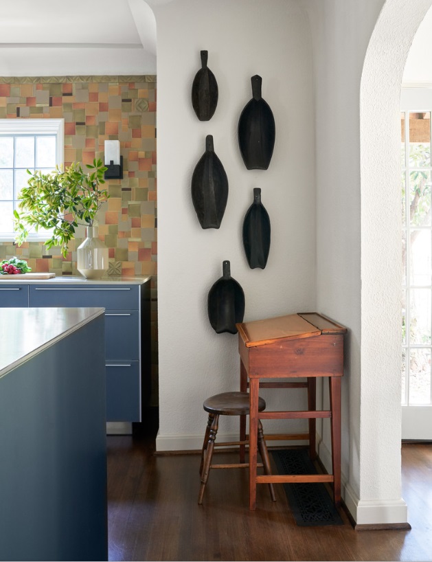
The owners of this home we designed in Kessler Park displayed their collection of African artifacts in the kitchen. The pieces are united in color, but have slightly different shapes and sizes.

The owners of this home we designed in Kessler Park displayed their collection of African artifacts in the kitchen. The pieces are united in color, but have slightly different shapes and sizes.

Any repetition of elements in a room can create rhythm. For example, a group of art prints along the wall, a series of matching lighting fixtures, or a row of candles on a mantle all establish rhythm through repetition. However, not all of your repeating accessories need to be identical.

You can also create interest through progression, in which you line up your accessories from large to small, small to large, or even from light to dark in tone. A series of similar but differently-sized vases in an entrée way is a charming example of progression. Featuring a basic shape throughout the room is another opportunity to create rhythm. For example, an oval-patterned wallpaper can be accentuated by an oval-shaped mirror.

Keeping repetition and rhythm in mind will guide you to make smarter purchases as you furnish your home, because it encourages you to create cohesive groupings. If you’ve tried to incorporate rhythm, but the room still feels “off” somehow, remember to step back and let your eyes naturally follow the lines of the room. This can help you identify where changes should be made.

A pink, toile-patterned wallpaper adds movement and rhythm to the walls of this formal dining room in University Park, Dallas. This dining room is part of a home decorated in a traditional English cottage style.

A pink, toile-patterned wallpaper adds movement and rhythm to the walls of this formal dining room in University Park, Dallas. This dining room is part of a home decorated in a traditional English cottage style.

Harmony:

Another way to achieve balance in your interiors is through harmony, in which all the elements of your space relate to each other in a pleasing way. When there are too many different colors, shapes, or textures in a room, the result is visual chaos. A room has harmony when almost everything in it is part of the same color family: in other words, a monochromatic color scheme.

The living room shown above is from a transitional home we designed in Plano, Texas. The color scheme for this house is made up of calming neutrals, while a variety of textures and patterns add interest to the space.

The living room shown above is from a transitional home we designed in Plano, Texas. The color scheme for this house is made up of calming neutrals, while a variety of textures and patterns add interest to the space.

While a room with contrasting colors and rhythm is exciting, a room with harmony is especially restful. So monochromatic color schemes are a great idea for rooms you want to be able to relax in, such as the bedroom. A symmetrically designed room will also feel more harmonious than an asymmetrical room.

If you are just beginning to furnish your Dallas home and aren’t sure how to proceed, pick one item or visual element you definitely want in your room, and then design around it. Be careful not to get too carried away, and make sure to leave room for ‘negative space.’ Negative space gives interiors a calming quality, and too much clutter can take away from that.

This Dallas dining room is a great example of a room where negative space makes the room feel more open.

This Dallas dining room is a great example of a room where negative space makes the room feel more open.

You don't have to make everything in your room all of one color to achieve harmony. Distributing similar textures throughout your room will achieve a similar effect: from coarse textures like brick and timber paneling, to smooth textures like polished concrete and glass.

The danger in creating a harmonious room is that without the right amount of contrast, you can end up with a boring design. A smart designer will know how to add just the right amount of variety while still maintaining a balanced look. If your monochromatic color scheme feels too “matchy-matchy,” you’ll want to introduce other colors.

Here is the formal living room from SMU’s Kappa Alpha Theta house that we featured earlier. We used a bright multi-color scheme for this room: golds, greens, and aquas are found throughout the room, and echoed again in the large floral painting over…

Here is the formal living room from SMU’s Kappa Alpha Theta house that we featured earlier. We used a bright multi-color scheme for this room: golds, greens, and aquas are found throughout the room, and echoed again in the large floral painting over the sofa.

When it comes to multi-color schemes, many interior designers follow the 60-30-10 rule. This rule is designed to guide you in distributing the right amount of color in each room. 60 percent of the room should represent your dominant color, 30 percent should be your secondary color, and the last 10 percent is for accents.

Now that you've read about a few examples of rhythm and harmony, hopefully you can approach your interiors with a fresh eye and see where you can make improvements. If you’re overwhelmed by the size of your project and could use an expert opinion, consider reaching out to our interior design team for a free consultation.

Related Articles:

An Interior Designer’s Guide to Preparing Your Home to Sell by Margaret Chambers

Are you preparing to sell your Dallas home? If so, you’ve probably already begun your own to-do list. While some strategies for showing a home are common knowledge (“clean up,” “make repairs,” “spray air freshener”) there are other ideas you might not have considered. In this guide, we’ll cover all of the essentials involved in selling a home. We’ll also include some tips from our interior design team that your real estate agent may not think to suggest!

We redecorated this 1927 Spanish colonial house in Kessler Park, Dallas. Lee Roth was the landscape architect. New landscaping gives this home plenty of “curb appeal.”

We redecorated this 1927 Spanish colonial house in Kessler Park, Dallas. Lee Roth was the landscape architect. New landscaping gives this home plenty of “curb appeal.”

First Impressions

Real estate agents stress the importance of “curb appeal” for a good reason. If your home doesn’t make a great first impression, your prospective buyers may never even step out of the car to see it. This is the time to make your yard and front door as presentable as possible. Trimming the bushes, mowing the lawn, and weeding are must-dos. You may also want to plant some new flowers and add fresh mulch.

A quick and easy way to boost your home’s curb appeal is to put a new coat of paint on the front door. Select a color that stands out from the rest of the home, but isn’t too strong, either. If you have lots of decorative items on your porch, you may want to declutter by removing any items beside a welcome mat and a potted plant or two. Make sure that your house numbers are clear and easy to see from the street. If your window trim is fading, repaint that too. You can also pressure wash the siding of your home and the sidewalk.

When you’re wrapping up, step back and take a look at your own home from the street. If you were a buyer, would you want to tour the home?

Tackle Your Repair List

Once you’ve decided that you’re going to sell your home, make a list of all the repair projects you’ve been putting off, and their potential costs. Focus on projects that are either inexpensive, or that you can do yourself. It’s better to take care of all these fixes before the home inspector arrives.

As for more expensive repairs, some are more necessary than others. A leaky roof will definitely turn away buyers. However, while you may be tempted to renovate your outdated kitchen, proceed carefully. A full kitchen renovation can cost as much as $65,000, and it’s estimated that sellers only make back about 60% of their investment when they sell a home with a renovated kitchen. It may be more worthwhile to simply make small repairs to the kitchen and do a deep cleaning.

Your to-do list should include patching holes in walls, fixing doors and drawers that don’t close properly, replacing kitchen cabinet hardware, replacing light bulbs, and fixing leaky faucets. If your flooring is worn out, replacing your carpets and refinishing wood floors can have a higher cost upfront, but is almost always worth the investment. Replace ceilings that are water-stained, even if the plumbing issue was fixed long ago.

Create a Blank Slate

We repainted the walls in the Kessler Park home with mostly neutral colors. In the dining room, beige is a calming backdrop for the gold-framed antique prints. Before, the ceiling was also a dark terracotta color. Covering it with a light wallpaper …

We repainted the walls in the Kessler Park home with mostly neutral colors. In the dining room, beige is a calming backdrop for the gold-framed antique prints. Before, the ceiling was also a dark terracotta color. Covering it with a light wallpaper helped the room feel more expansive.

You have probably heard that it’s important to depersonalize a home for sale. Potential buyers have trouble imagining their own family photos on the walls when yours are still hanging there! Don’t store personal items in the closets, however: buyers will be opening those to see how much storage space you have. Although it’s not necessary to clear them out completely, you’ll want your closets to look tidy. The more organized your closet is, the more space you’ll appear to have.

Instead of putting photos in the closet, rent a storage space for oversize furniture, collectibles, family heirlooms, and photos. Homes that are clean and open will fetch higher prices than excessively cluttered homes, so a storage unit is a smart investment. If you do want to hang something on the wall, scenic pictures and mirrors are just fine. It would also be wise to remove religious items or political statements from your home for now, as these can distract buyers. Once you’ve moved into your new home, you can proudly display them once again.

If you have the time, it’s also worthwhile to organize your pantry and refrigerator. Some buyers will open everything they can to peek inside. You can declutter your pantry pretty easily by moving anything you aren’t planning on using the next few weeks into storage.

We updated this Plano home with transitional style in mind. Before, the walls were painted red. The metallic gray wallpaper we put up is a good example of what’s considered current in wallpaper today.

We updated this Plano home with transitional style in mind. Before, the walls were painted red. The metallic gray wallpaper we put up is a good example of what’s considered current in wallpaper today.

As gorgeous as your dark red bedroom may be, the paint color may be divisive for your buyers. Large, brightly colored furnishings (like upholstered couches) can be off-putting to some as well. You don’t want to provoke too much conversation about your unique taste in interior design. So, if your Dallas home is filled with bold colors, we strongly suggest repainting the walls with a neutral color. Good choices include white, cream, khaki, or gray, depending on what you have in the room. It’s also a good idea to remove any old wallpaper, which may make your home feel more dated than it actually is. You can read more about which wallpaper patterns are trendy, and which are considered out-of-date, in our blog about wallpaper.

The more light you can let into the room, the better. Turn on all the lights and open the draperies. Speaking of draperies, it’s better to just remove heavy draperies before a showing.

These curtains are sheer, allowing lots of natural light into the room.

These curtains are sheer, allowing lots of natural light into the room.

Clean Like You’ve Never Cleaned Before

Be prepared to do a deep cleaning of your home (or hire assistance to do so). After you’ve taken the time to make the counters shine and clear away dust bunnies, you may find rooms getting dirty again with surprising speed. As potential buyers tour your home, your floors and carpets will be tracked with dirt. You won’t need to do another deep-cleaning for a while, but start vacuuming more frequently than you used to. If you have children, ask them to put away their toys each night.

If you have built-in bookshelves, don’t fill them entirely with books. Instead, leave a small selection of your most attractive books and accessories to showcase them. This photo is from the Theta house library we designed at SMU in Dallas.

If you have built-in bookshelves, don’t fill them entirely with books. Instead, leave a small selection of your most attractive books and accessories to showcase them. This photo is from the Theta house library we designed at SMU in Dallas.

A bad odor is an immediate turnoff for buyers. Pet owners will need to take steps to eliminate pet odors. While you’re in the thick of showing, you might also want to avoid cooking meals that leave a smell lingering the next day. On the other hand, don’t be afraid to fill the home with a more inviting scent. Fresh flowers, scented candles, and freshly baked cookies are all safe bets.

Begin the Purge-and-Pack Process

Decluttering goes hand in hand with cleaning. Since you’ll be packing up all of your belongings soon, you should take this opportunity to purge items that you don’t want to take to your next home.

On the other side of the coin, you should ask yourself: “Is there anything in my home I could never part with?” Whether it’s a family heirloom, a custom light fixture, or a favorite piece of artwork, you should consider moving it to storage before buyers can see it. It will hurt negotiations if your buyer covets a beautiful painting by your late grandfather, and is told that she can’t have it. Everyone is happier when your buyers never know what they’re missing!

Clearing knickknacks off of counters and shelves will immediately help your home look neater. After decluttering this house, you’ll have more motivation to keep your next house organized, too. This will save you a lot of time if you need to move and sell your next home suddenly.

For now, you can organize items that you use every day, such as your toiletries, in small boxes and put them out of sight. If you have a storage unit, you should go ahead and move out both your books and your bookcases. Homes will also show better with no rugs rather than with outdated rugs.

Most homes for sale will benefit from having some furniture moved to storage. Focus on moving out any pieces that block pathways, whether they are large sofas or extra dining chairs. Reducing the amount of furniture will help to make each room feel larger.

When it’s time to sell, even looking at your own to-do list can feel intimidating. Just remember that every repair you make, and every item you purge, will increase the value of your home and make your next move easier. If you’ve accomplished all of your to-do’s and are ready to take your home sale to the next level, consider hiring an interior designer to stage your home. A clean home will sell better than a cluttered one, and a professionally staged home will sell even better.

Related Articles: