traditional

How to Tastefully Update a Period Home by Margaret Chambers

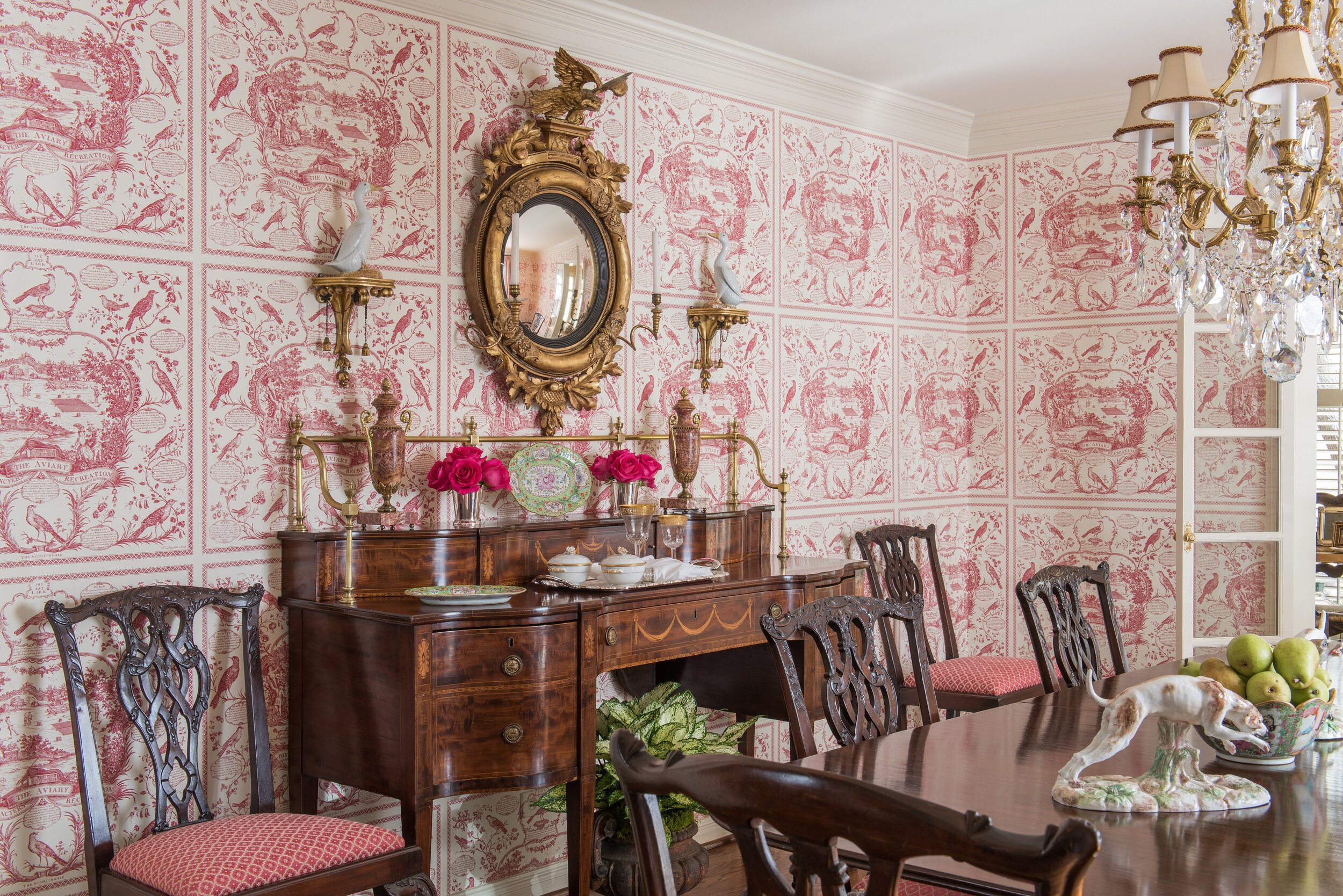
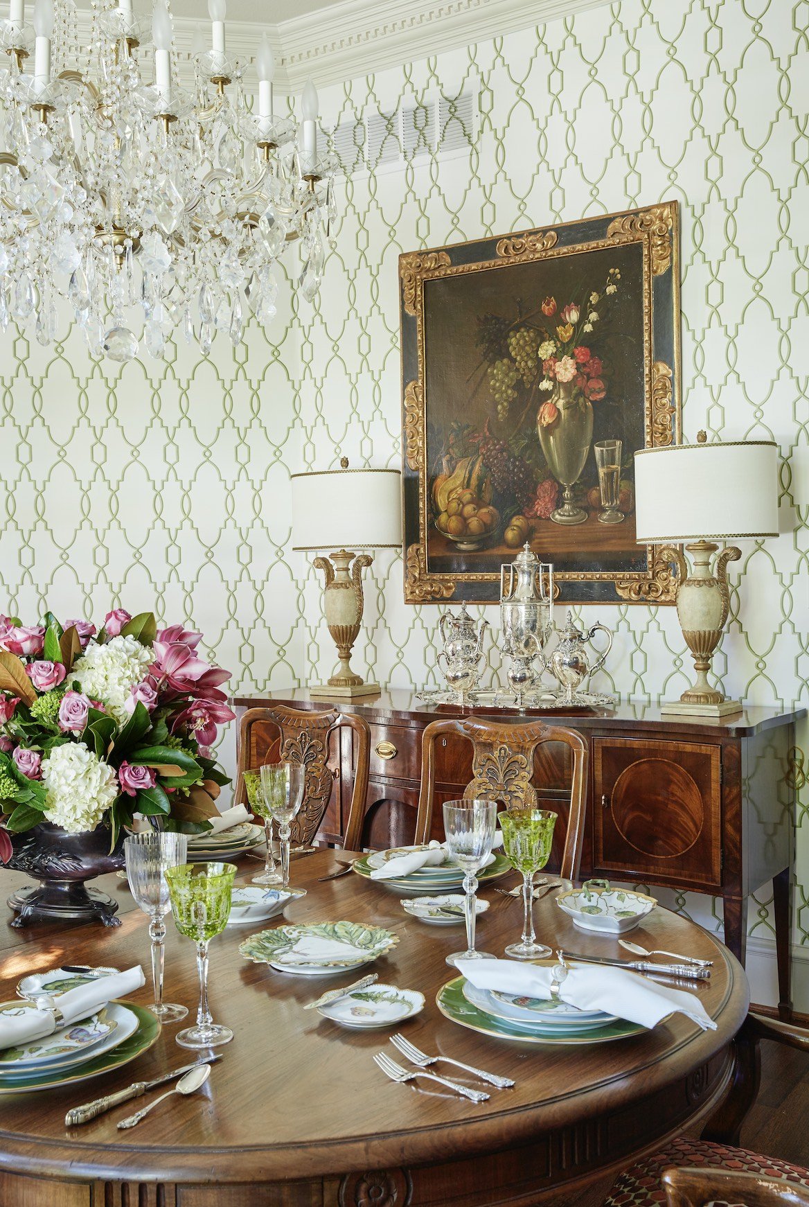
This dining room features dentil crown molding along the ceiling. We went with a clean, elegant, geometric wallpaper pattern that wouldn’t distract from the home’s architectural details.

Period homes (generally defined as any home built before WWI) tend to have high ceilings, beautiful detailing, and architectural features you don’t often see in new homes. For many homebuyers, the creaks, the cracks, and the repair costs of a period home are well worth it.

You might wonder how an interior designer like myself would approach a historic property. In my opinion, the architecture should tell you the design direction that you go, and the furnishings should reflect the period of the house. I personally think it’s kind of disturbing to obliterate the interior and redecorate in a minimalist style.

Of course, there’s no need to turn your house into a museum, either. Here are some tips for decorating a period home in a way that’s sympathetic to the house’s history, but still looks current:

1. Choose Fresh Colors

Start by doing research on how homes in the period were originally decorated, then pick and choose the elements that look the most timeless. As with any home, it’s better to make a period home as timeless as possible. After all, it’s expensive to do a home: if you only follow the latest trends, in ten years, those trends are gone and we’re all off to something else.

Don’t be afraid to use soft, contemporary paint colors in a Georgian, Federal, or Neoclassical house. If you use saturated wall paint colors, keep the period detailing (such as the cornicing) in more understated tones for contrast. Keep in mind that if your home is in a historic part of Dallas like Swiss Avenue, Hollywood Heights, or Munger Place, you may need to use a traditional color for the exterior.

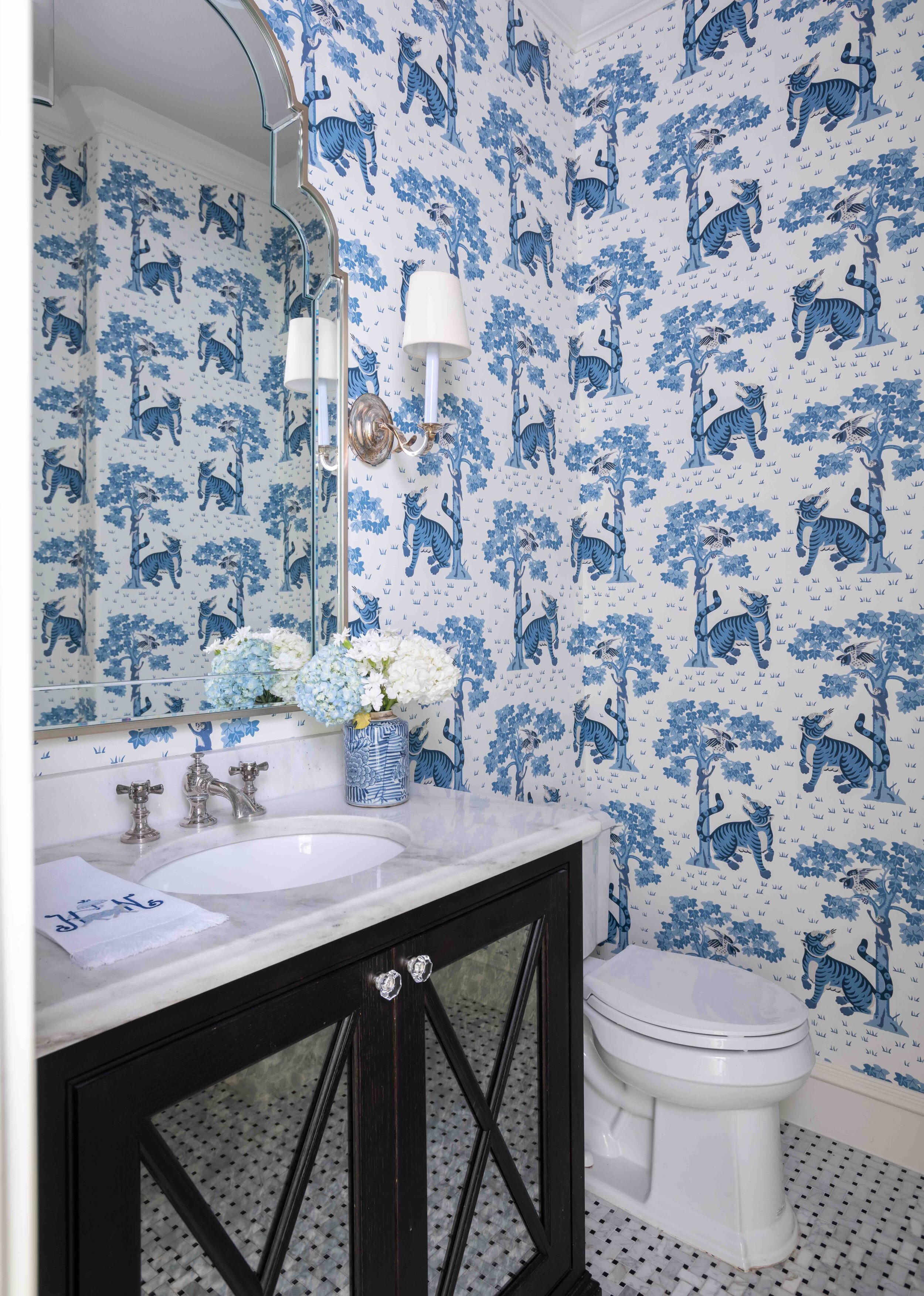
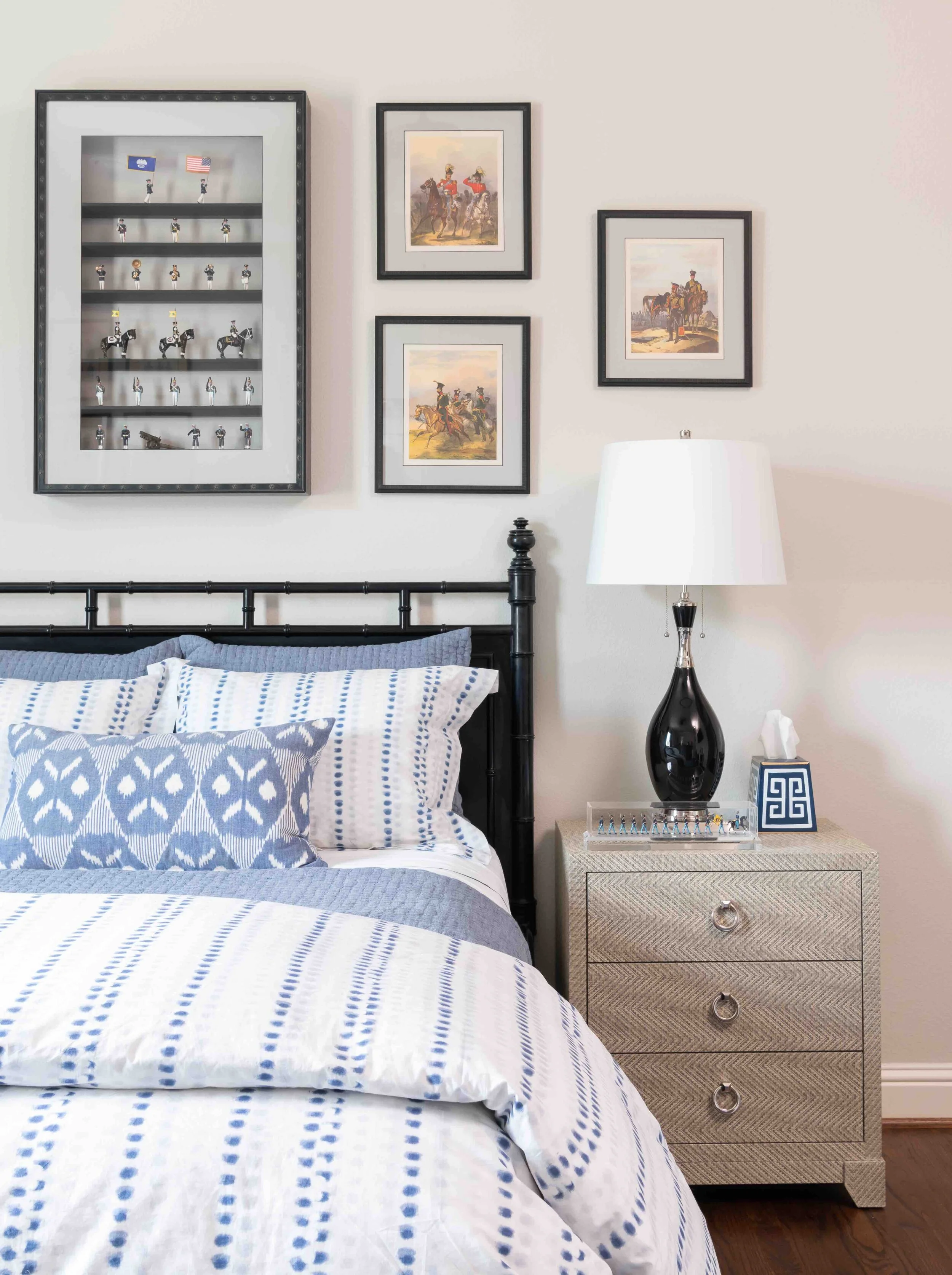
Patterned wallpaper is a luxurious touch, but choose a print with more modern and understated colors to keep your space from looking too dated. I suggest hanging mirrors instead of art over wallpaper because their simplicity gives the eye a place to rest.

Light and pastel colors, like the pinks that we used in this Park Cities English cottage, can help a traditionally decorated room feel fresh.

2. Highlight Traditional Architectural Features

Sadly, many period homes have had their original sash windows, fireplaces, molding, ceiling medallions, and baseboards ripped out and replaced with cheaper materials. Regardless of whether or not original fireplaces are still in working order, they are part of the charm of the home and should be celebrated.

Instead of replacing sash windows, consider repairing them, waterproofing them, or even upgrading them with double glazing. The wall around a stained-glass window should ideally be painted white or another neutral color to let the colors of the glass stand out.

If the original wood flooring is heavily worn down, consult a renovation expert before tearing it out. It may be possible to patch or repair it. I would also advise against changing the detailing in the house, and instead restore it by repainting it.

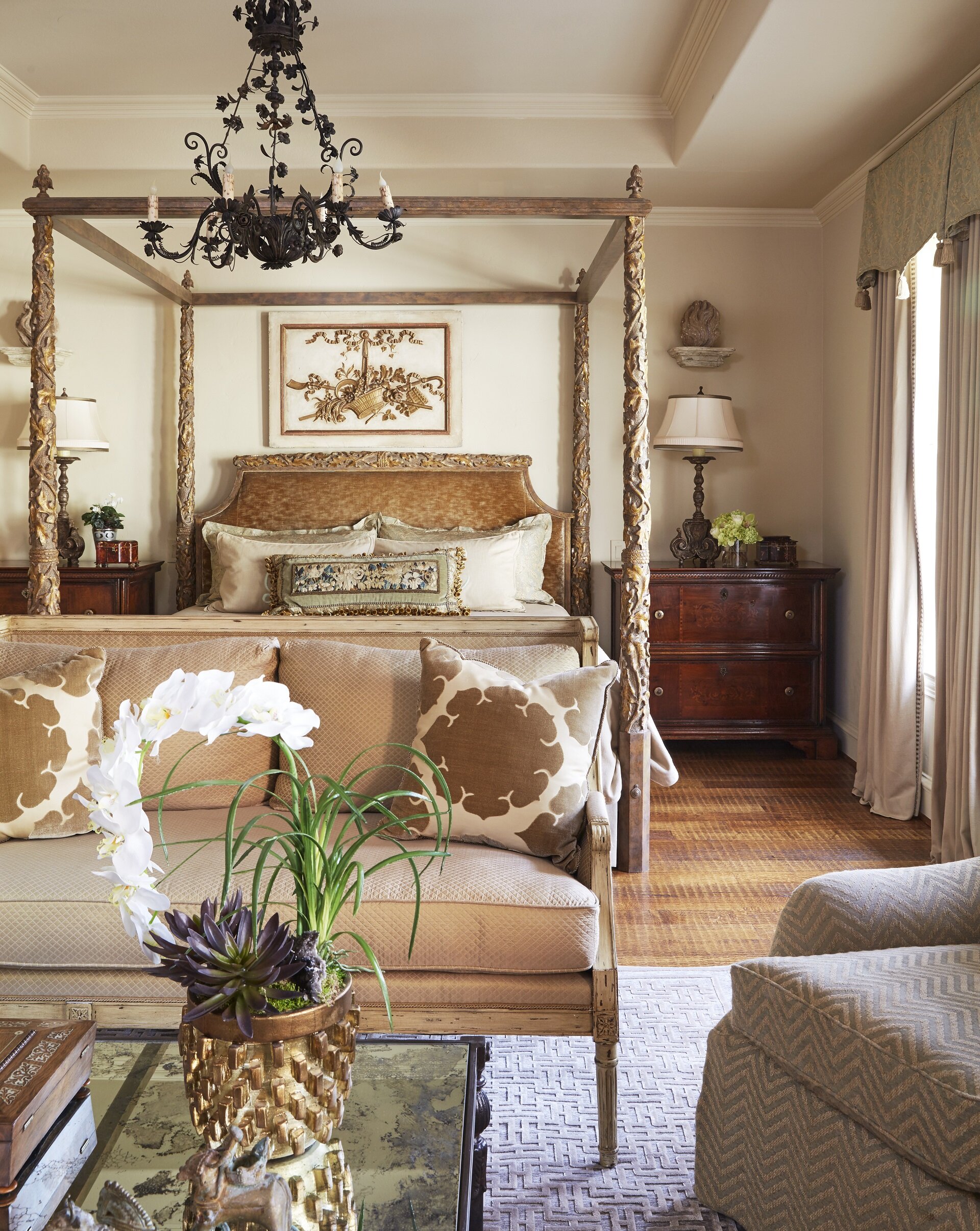
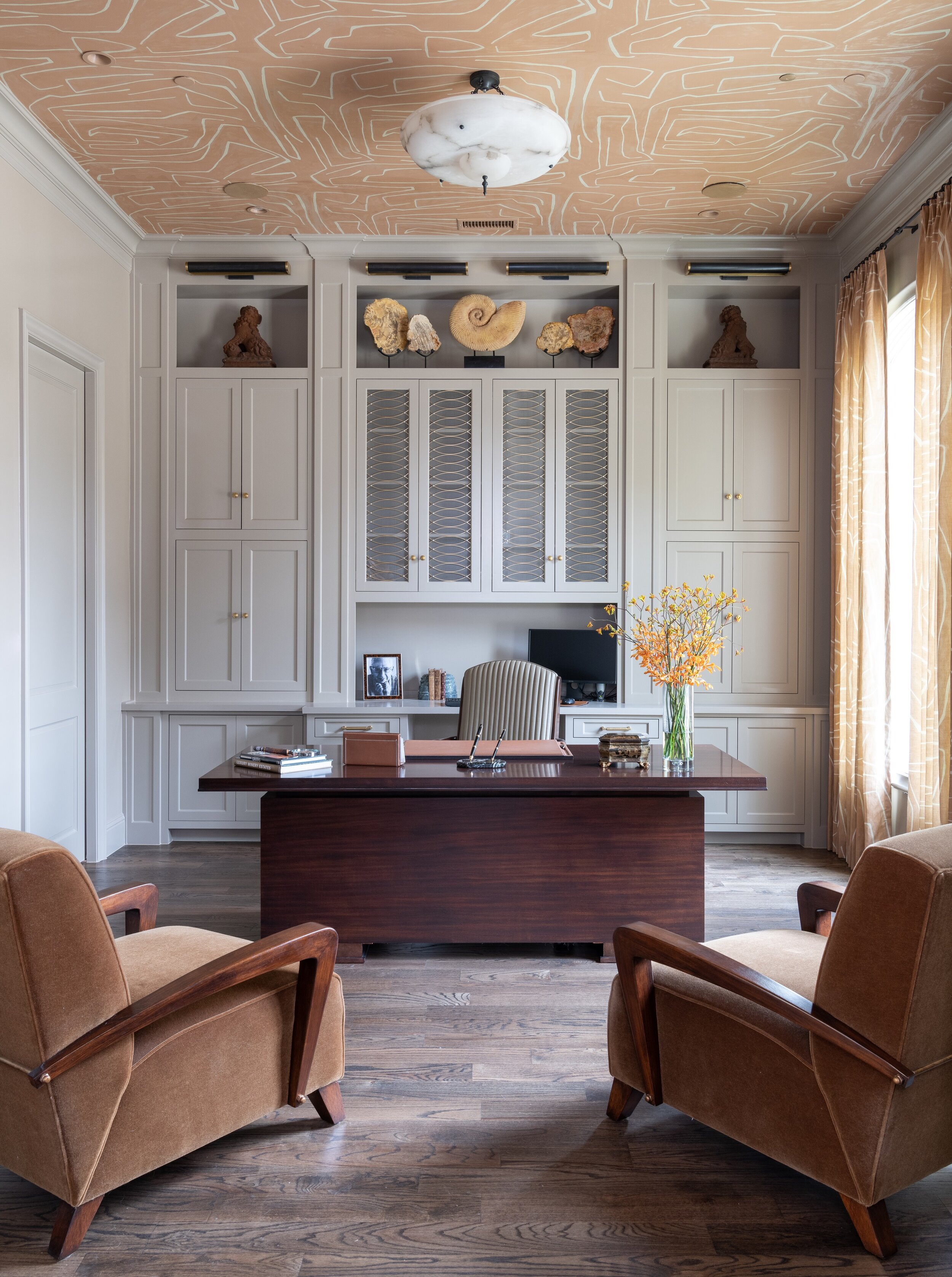
You can create an interesting contrast with original molding and ornate ceilings by hanging contemporary light fixtures. If you want to keep any original light fixtures, such as sconces, you can always have them rewired.

3. Play to Your Period House’s Strengths

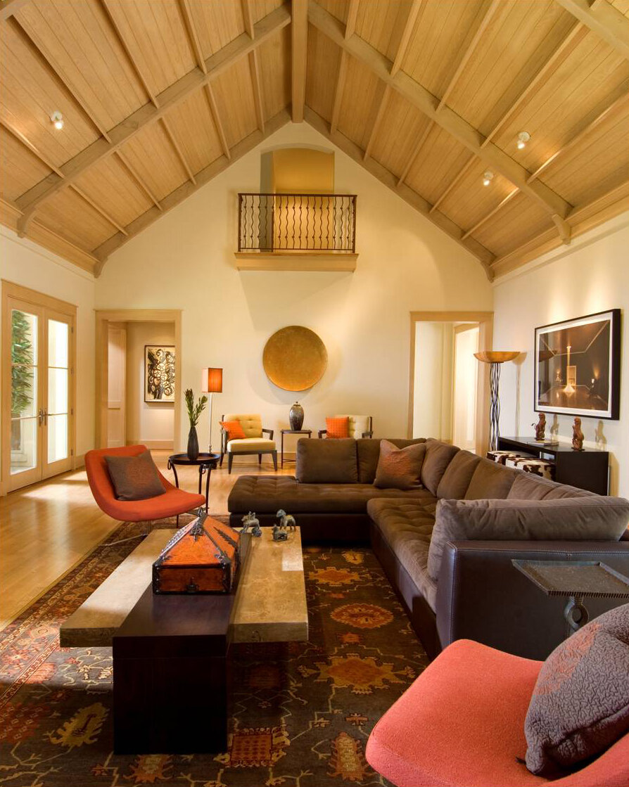
One of the advantages of period homes are the high ceilings. You will probably want a large lighting fixture, such as a chandelier, to take advantage of the extra ceiling height. On the other hand, one of the downsides to period homes is that they sometimes have dark, narrow hallways. Hang mirrors, which reflect more light into the space, or add sconces in your hallways. High gloss paint can also be a good choice for brightening the walls of a period home. Just remember that your walls have to be extremely smooth, like glass, or a glossy paint finish will highlight every imperfection.

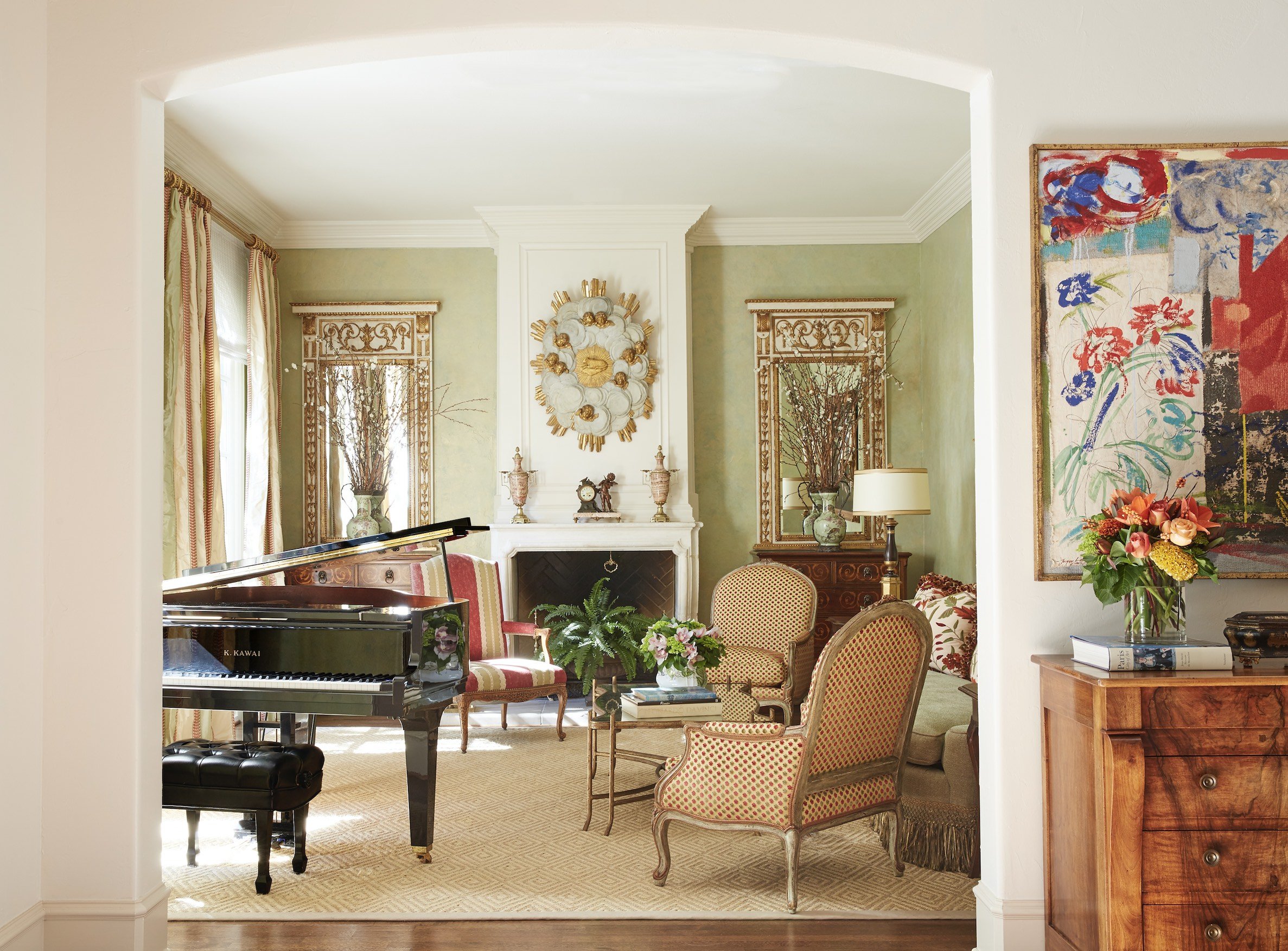
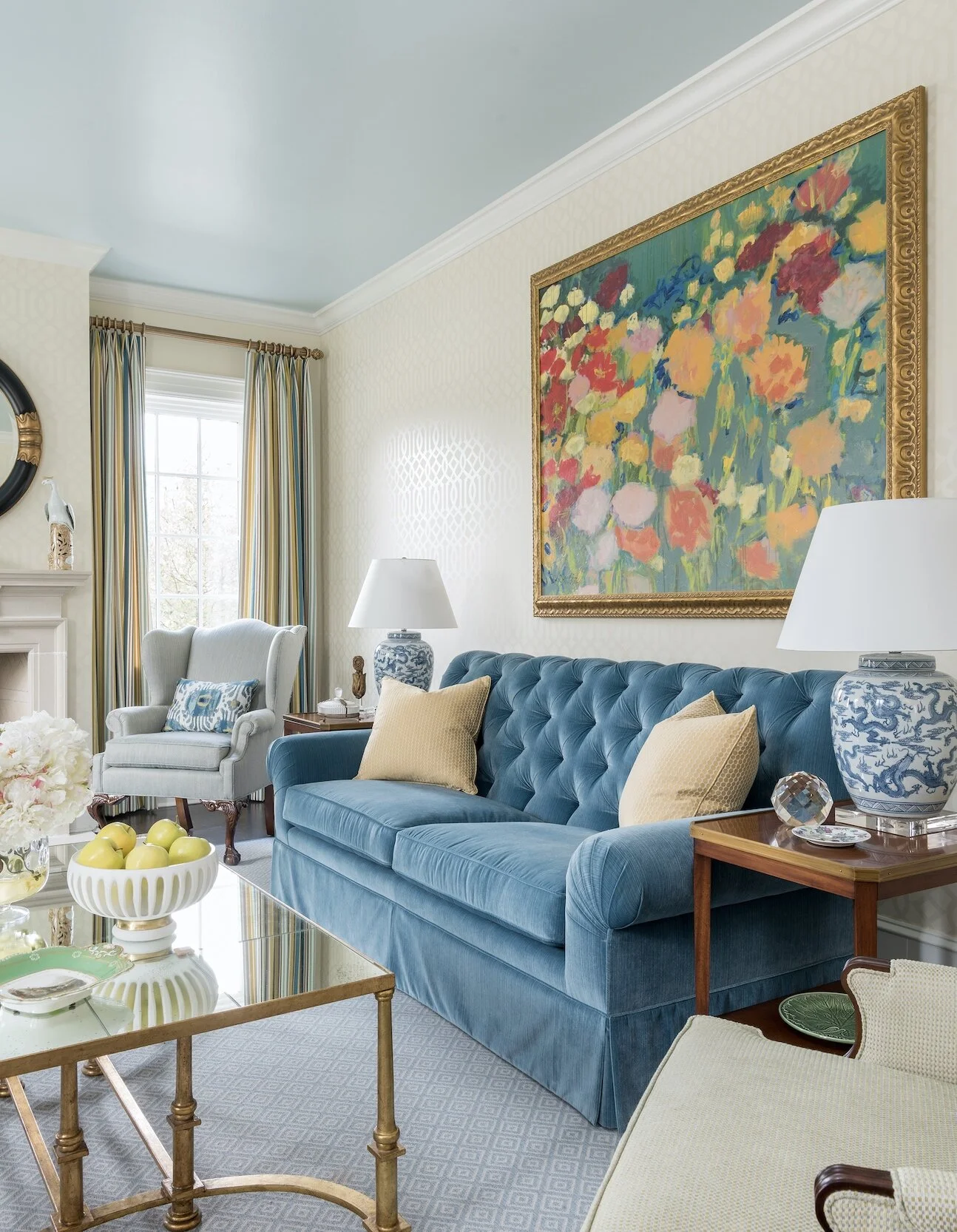
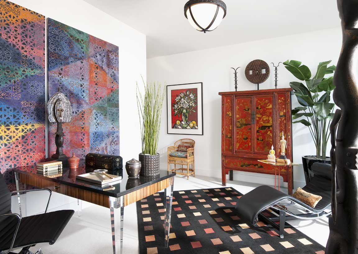
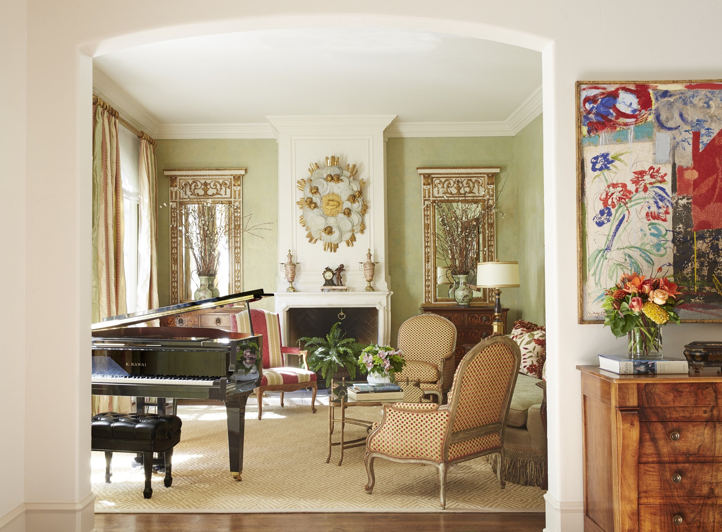
This formal living room we designed for a classically French home in University Park is traditional without being fussy. To the right is a piece of contemporary artwork that matches the color scheme of the room.

4. Find the Right Balance of Traditional and Contemporary

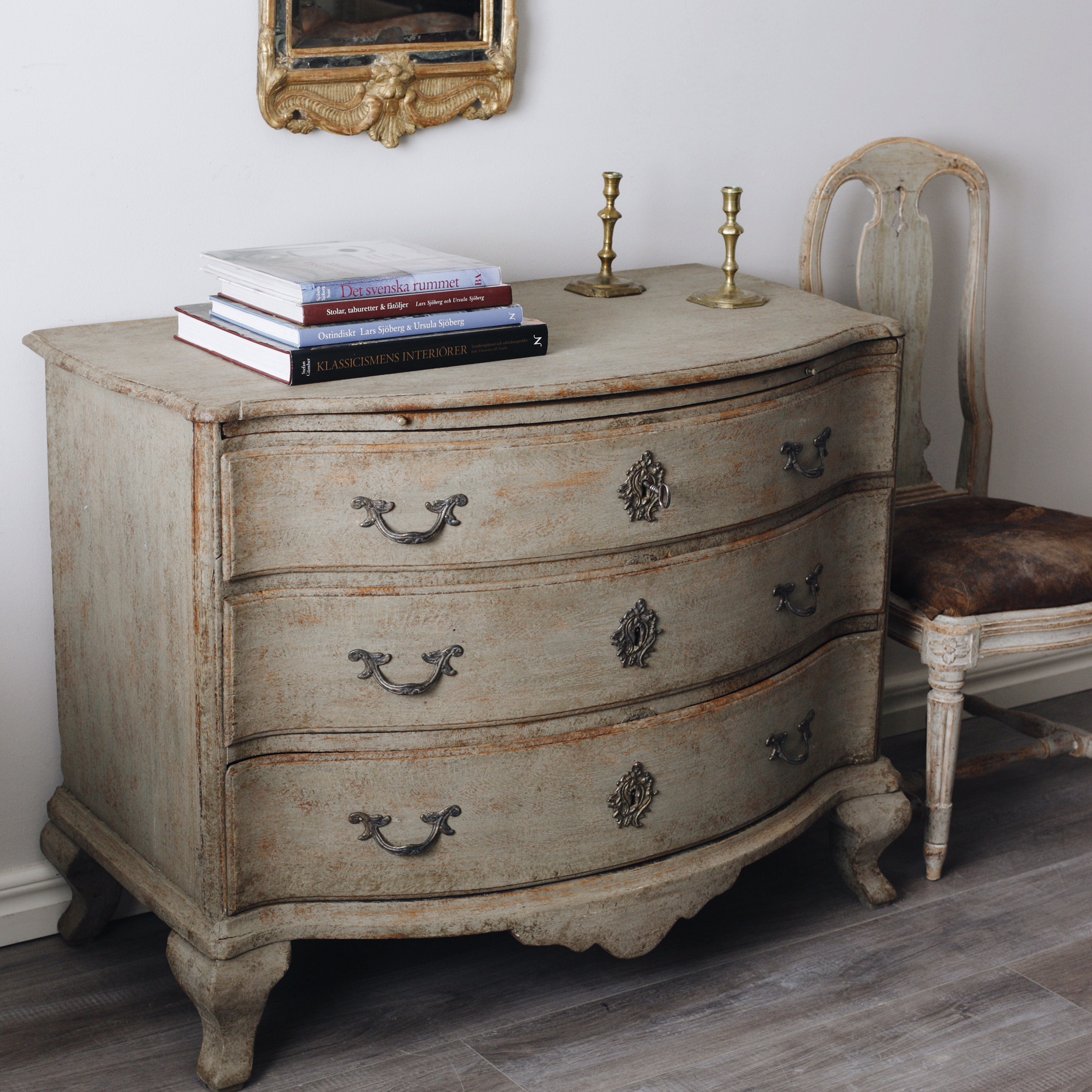
When it comes to furnishings, I think juxtaposing modern and traditional elements is best. If you’re using traditional art, mirrors, and wallpaper patterns, mix contemporary furniture into the room. The simple lines of the furniture will stand out beautifully against the traditional backdrop. Likewise, if you use a lot of antique furniture, you may want to use updated colors for the walls as well as contemporary art, which adds an element of surprise. Make sure to reupholster antique furniture using current fabrics.

An alternative to buying a period home is to work with a classically trained architect (like Larry Boerder, Robbie Fusch, or Stephen Zepeda, to name a few), who can build you a new home in a period style. If you already own a period home and need help deciding which parts should be kept as is, restored, or torn out, it might be time to consult an interior designer. A professional designer can help make sure that your renovation doesn’t go too far, and will be connected with lots of restoration experts who can breathe new life into the home. To schedule an appointment with Chambers Interiors, send an email to info@chambersinteriors.com or call our Dallas office at 214-651-7665.

RELATED ARTICLES:

Decorating With Bold Colors: Tips for the Color-Shy by Margaret Chambers

Artwork, like this floral painting over the sofa in SMU’s new Kappa Alpha Theta house in Dallas, is a great opportunity to add a burst of color to your room.

Artwork, like this floral painting over the sofa in SMU’s new Kappa Alpha Theta house in Dallas, is a great opportunity to add a burst of color to your room.

Although bold colors have been trending the last few years, many homeowners wonder, ‘how much is too much?’ In my own design work in Dallas, I’ve been including more color in projects lately. I thought that readers would appreciate some tips on how to work with bold colors in a balanced way.

Starting Small

If you’re new to using bold paint or wallpaper colors, try them in a smaller space like a powder room first. For powder rooms, however, I suggest staying away from bright green. Green casts an unflattering hue on you or your guest in the mirror.

We used a metallic butterfly wallpaper to give this powder room a “jewel box” feel.

We used a metallic butterfly wallpaper to give this powder room a “jewel box” feel.

Brightly colored accessories such as throw pillows, stools, artwork, ottomans, and blankets can be easily swapped out if you get tired of them. If you’d like to add some boldly colored furniture, consider having the furniture you own repainted rather than buying new furniture. Other easy ways to introduce color into the room include buying fresh flowers, getting new lampshades, or putting books with colorful covers on your shelf.

Picking the Dominant Color

The size of your room determines how much color you can comfortably accommodate. In a large room, it would be overwhelming to use a bold paint color on all four walls. In small and medium rooms, however, you can get away with a bold base color.

Some colors can function as neutrals even if they aren’t traditionally thought of as such. For example, navy blue and moss green are soothing to the eye and often used as base colors. The location and architecture of your home can also affect what colors look best in it. Rust red and navy typically look best in traditional homes. Blue-and-white rooms are often associated with coastal style (although you don’t necessarily have to live on the coast to use these colors).

This bedroom is an example of how you can use different shades of the same bold color—like light blue, cobalt, and navy—to create a balanced color scheme.

This bedroom is an example of how you can use different shades of the same bold color—like light blue, cobalt, and navy—to create a balanced color scheme.

Picking Your Secondary Colors

Before you commit to a bold color, pick out your secondary colors to go with it. One good formula is to have sixty percent of your room be in a neutral color, thirty percent in a stronger color, and save the last ten percent for your boldest colored accessories.

Usually the brighter a bold color is, the more challenging it is to work with. Bold colors that are toned down just a notch are a safer bet. For example, consider using burnt orange instead of pumpkin orange, soft yellow instead of highlighter yellow, and brick red instead of fire engine red.

The shades of orange we used in this north Dallas guest bedroom are just bright enough to give the room personality without making it too energizing.

The shades of orange we used in this north Dallas guest bedroom are just bright enough to give the room personality without making it too energizing.

The blue and white tiger wallpaper in this Preston Hollow powder room shows how bright colors can give small rooms more impact.

The blue and white tiger wallpaper in this Preston Hollow powder room shows how bright colors can give small rooms more impact.

Blue-and-white is a classic color combination that never goes out of style. You can get away with very vibrant shades of blue by pairing them with white. After all, it’s a color combination that our eyes are used to seeing—think of white clouds in a blue sky. If you want your room to be really energizing, decorating with one bold color and lots of black and white will give you the high contrast look you need. Placing bright artwork and accessories against a mostly white backdrop is another appealing combination.

For balance and depth, use different, less-intense tones of your boldest color throughout the room. When it comes to patterns, choose either a bold color in a subtle pattern or a busy pattern in a muted color. Chaotic patterns in bright colors are the most difficult to work with.

Coordinate the Rest of Your Home

While not every room in your home needs to have the same color scheme, it’s important that the colors flow naturally. So, if you have one room with a bright pink and teal color scheme, don’t decorate the next one with navy and red. One way to ensure the colors in your rooms flow together is to invert your color combination for adjoining rooms. For example, if your sitting room has green walls and white accents, the next room over could be mostly white with bright green accents.

Vivid colors can be beautiful in both contemporary and classical homes. We decorated this traditional cottage in University Park with bright pink colors.

Vivid colors can be beautiful in both contemporary and classical homes. We decorated this traditional cottage in University Park with bright pink colors.

Although every year sees new colors come into fashion, try not to focus exclusively on what’s trending. A room with a well-balanced, aesthetically pleasing color scheme will always look great no matter the year.

By following some of the tips outlined above, you’ll hopefully have the knowledge you need to start incorporating bold colors in your home. However, if you’re still not confident that you can integrate your favorite eye-popping fabrics, wallpapers, and paint colors, consider giving us a call. As you can see from the photos of recent projects featured here, we have a lot of experience working with color. Call our Dallas office at 214-232-9501 or send an email to info@chambersinteriors.com to schedule a free consultation.

RELATED ARTICLES:

Styling a Bed 101: How to Make Every Bed in Your Home More Inviting by Margaret Chambers

Seen above is the master bedroom from a chateau we designed in University Park, Dallas.

Seen above is the master bedroom from a chateau we designed in University Park, Dallas.

Although there are dozens of ways to style a bed, some methods are more tried-and-true than others. If you’re looking for a way to refresh your bedding without committing a style faux-paus, you’ll want to take a look at these guidelines. In this article, I’ll cover classic formulas for making a bed as well as the most popular colors, patterns, and materials for bedding.

Foolproof Formulas for Making a Bed

The four standard size pillows in the back and smaller decorative pillow up front are just the right proportion for this queen bed.

The four standard size pillows in the back and smaller decorative pillow up front are just the right proportion for this queen bed.

The number and size of the pillows you should use depends on the size of your bed.

For a queen bed, you’ll need: two queen-size pillows, two sham pillows, and an accent pillow between 22 and 26 inches. For a king bed, you’ll want to use the following pillow formula: two king-size pillows, three king-sized sham pillows, and an accent pillow between 24 and 26 inches.

The stylistically safest way to arrange these is to put the pillow shams in back, your sleeping pillows in the middle, and then your accent pillows in front. Here are some alternative formulas for beds that are also very balanced:

  • Four sleeping pillows in back, one lumbar pillow in front

  • ·Two sleeping pillows in back, one lumbar, and one accent pillow in front

  • Four sleeping pillows and two to three differently shaped and sized accent pillows in front

If you have a pretty headboard, you may want to go with fewer pillows to show it off. For lumbar pillows, consider placing a round decorative pillow in front; it’ll contrast nicely with the rectangular shape behind it.

We made sure to use lumbar pillows here so that the hand-blocked pattern on the upholstered headboard would be visible.

We made sure to use lumbar pillows here so that the hand-blocked pattern on the upholstered headboard would be visible.

Duvet and Sheet Tips

Top sheets should be put in finished side down so that the sleeper can enjoy the soft texture. This way, the finished side will also be visible when you fold the banding back.

When you fold your duvet, I recommend folding it in half, and then pulling it back towards you into thirds, past the rows of pillows. Pulling it back gives the pillows more “breathing room” and creates more depth. Regardless of bed size, any blanket or quilt you put on the bed needs to be long enough that both ends could drape off the sides.

Here, the grey quilted coverlet is folded back to expose white sheets, giving more depth to the bed in this Dallas bedroom.

Here, the grey quilted coverlet is folded back to expose white sheets, giving more depth to the bed in this Dallas bedroom.

Choose Bedding Materials Wisely

Since the bed is the main attraction in any bedroom, it makes sense to prioritize it in your budget. Look for the highest quality bedding you can afford. That said, there is no need to break the bank on your next mattress; a good mattress topper can make even the most uncomfortable mattresses feel great. Make sure to get a mattress cover too. It helps you get the most longevity out of your mattress.

Many people change their bedding with the seasons. Percale sheets are nice and cool in the summer, flannels will keep you warm in the winter, and linen is a good in-between material for both spring and fall. Its hollow fibers trap the optimal amount of body heat to keep you warm at night while also being soft and supple.

Color and Pattern Combinations You Can’t Go Wrong With

All-white bedding is popular because it promotes a feeling of relaxation. Even when your duvet and pillows are colorful, it’s strongly recommended to choose white sheets and sleeping pillows. The white pillows and folded-down top sheet (if visible) will help break up the areas of color and give the eye a place to rest. Blue is probably the next most popular color scheme for bedding. While white is elegant and refined, blue has more of a casual and coastal feel.

White and blue is a classic color combination. It can instantly give bedding a refreshing and uplifting feel.

White and blue is a classic color combination. It can instantly give bedding a refreshing and uplifting feel.

Love patterns? Make sure to break up the patterns in your bedding with some solid colors too so that the bedding is not too “busy.” To unite different patterns, make sure both patterns share at least one color. If you’re using a subtle tone-on-tone look for your colors and patterns, you’ll need to go in the opposite direction and introduce contrast with a variety of textures.

The busy patterns on the curtains and decorative pillow in this bedroom are balanced out by the neutral bedding.

The busy patterns on the curtains and decorative pillow in this bedroom are balanced out by the neutral bedding.

A beautifully made bed makes a world of difference for the bedroom. Regardless of whether you want an upscale or a casual look, combining the right patterns, fabrics and colors will help you create a look that makes you (or your guest) want to dive right in.

In this master bedroom, you can see an example of a heavily-patterned, tone-on-tone bedding set.

In this master bedroom, you can see an example of a heavily-patterned, tone-on-tone bedding set.

Could the bedding sets in your home use a refresh this year? Consider bringing in an interior designer to give your bedrooms that extra ‘wow’ factor. To schedule a free consultation with Chambers Interiors, call our Dallas office at 214-651-7665 or send an email to info@chambersinteriors.com.

RELATED ARTICLES:

The Ultimate Guide to Styling Your Home Office by Margaret Chambers

The shelving and cabinetry in this home office we designed in north Dallas add lots of helpful storage space.

The shelving and cabinetry in this home office we designed in north Dallas add lots of helpful storage space.

This year, many of us have found ourselves working from home for the first time, and wanting to design—or redesign—our home office spaces. The best home offices are not just ergonomic and well-organized, but beautiful, too. Read on for some designer tips for home offices, based on things I’ve learned while designing offices for my clients in Dallas.

Pick the Best Room for Your Home Office

The first step to designing a home office is also the most important: choosing the right location. Managing a healthy work-life balance can be a challenge, so it’s crucial to designate a spot that you only use for work. Of course, not everyone has a spare room available. Some other areas for home offices that you might not have considered include the landing, the kitchen, or under the stairs. To create a strong divide between your work and living area within one room, consider using a decorative screen or sliding door to separate the two.

Large windows, such as the ones in this Oak Cliff home office, fill the room with light and promote alertness.

Large windows, such as the ones in this Oak Cliff home office, fill the room with light and promote alertness.

If you put your home office in a corner, choose the corner closest to the window. When you begin to tire of looking at the computer screen, you’ll be glad to have somewhere else to rest your eyes on for a moment. Speaking of eye strain, make sure to install a bright bulb in your lamp for task lighting.

Plan Your Color Scheme

Paint color psychology plays an important role in home office design. Blues, greens, and purples are cool colors that promote relaxation. Since blue is the sleepiest of them all, I don’t recommend it for offices. On the other hand, green is a nice medium between restful and alert, giving the room a refreshing feeling.

Pastel yellow, pink, burnt orange, or dark red can be gently energizing, but bright orange, neon yellow, or fire engine red paint colors will be too overwhelming for most offices. Neutrals such as whites, beiges and tans are popular choices for both commercial and home offices. That said, since this is your personal space and not a cubicle, feel free to include bold accent colors in your décor for more personality.

We used a lot of colorful artwork in this Dallas high-rise home office. The white walls give the eye places to rest.

We used a lot of colorful artwork in this Dallas high-rise home office. The white walls give the eye places to rest.

Shop for Space-Saving Organizational Aids

You’ll definitely want some organizational aids and storage, but don’t buy anything you won’t use. Identify everything you need to perform your job well at home before you shop for office supplies. For example, if you only use one pen, there’s no need to get a pen cup. To save on desk space, consider installing floating shelves on the wall or using a vertical file folder.

A universal design problem for home offices is managing cords. Thankfully, there are products on the market for this exact issue, including desk grommets, cable clips, and cord covers. Power strips can be mounted to the underside or backside of your desk to keep them out of sight.

If you’re going to splurge on only one piece of furniture, it should be your office chair. Ergonomic desk chairs will have a curved back that is firm, rather than cushy, for the best support.

This home we designed had modern architecture, so we made sure that the home office was modern in style, too.

This home we designed had modern architecture, so we made sure that the home office was modern in style, too.

Coordinate Your Office’s Décor With the Rest of Your Home

Generally, a home office should be in stylistic harmony with the rest of the house. For example, an antique writing desk is a great choice for an office in a traditional house, while the furniture in a midcentury modern office should be simple and streamlined. If you’re a plant lover, bring cheer to your space with some potted plants. Art lovers should adorn the wall behind their desks with a gallery of artwork or a stunning patterned wallpaper.

Depending on your line of work, you may need to invite clients into your home office. Include some comfortable seating for guests if you do. Otherwise, you should avoid putting a cozy sofa or reading chair in your office. The temptation to take a nap may become too difficult to resist!

These additional chairs we added offer visitors a comfortable place to sit when they stop by.

These additional chairs we added offer visitors a comfortable place to sit when they stop by.

When you love your home office, you’ll be more motivated to spend time in it, and keep the area tidy, too. Hopefully, with these suggestions in mind, you can tackle your home office design project with confidence.

The photos in this article are just a few examples from the Chambers Interiors design portfolio. As you can see, our design team has a lot of experience with home offices. If you’re interested in hiring us to design an office that goes perfectly with your Dallas home’s architecture, email us at info@chambersinteriors.com or give us a call at 214-651-7665.

RELATED ARTICLES:

How to Decorate These Common Types of Dallas Home Architecture by Margaret Chambers

We decorated this modern Dallas house using a midcentury style, with burnt oranges, earth tones, and simple shapes.

We decorated this modern Dallas house using a midcentury style, with burnt oranges, earth tones, and simple shapes.

When I’m working with clients who have recently purchased a home, they often ask me: “What’s the right style for this house’s architecture?” This is an especially common concern among people moving into a historic house. No matter how beautiful your furnishings and art collection are, your home won’t come together if your decorating clashes with the ‘bones’ of the house.

For example, an industrial loft with exposed brick will look strange decorated with all European antiques. A colonial home should use a traditional style as opposed to something trendy, like Scandinavian minimalism. In this guide, I’ll discuss the most appropriate interior design styles for four types of home architecture I see often in Dallas: Modern, English, French, and Italian.

Modern Homes

Modern homes can be seen in Highland Park, University Park, and Lower Greenville. This style of house, which is inspired by Frank Lloyd Wright’s Prairie School architecture, typically has a flat (or sometimes gabled) roof.

Here you can see an exterior photo of the Dallas modern home featured above.

Here you can see an exterior photo of the Dallas modern home featured above.

In a modern home, function comes before form: there is very little ornamentation and few decorative objects, save for some modern art to add sophistication. If you live in a modern home, you’ll need to decorate in either a modern, contemporary, or transitional style. All three of these styles tend to have a neutral color scheme, such as white, gray, tan or cream, with some brown or black accents.

If you do want to include a few antiques, I recommend multicultural works of art. Midcentury modern artists drew inspiration from other cultures (think of Pablo Picasso and his “African Period” of art). This is perhaps why Indian, East Asian, or African art will look natural in a modern setting while European antiques do not.

English, French, or Italian Homes

When you own a home with an English, French, or Italian architectural style, the safest course is to make your interior design consistent with the architecture. Depending on what type of home you have, however, you do have some leeway to incorporate pieces that are in a different style.

The dining room in this University Park English cottage has Chippendale chairs with elaborately carved chair backs.

The dining room in this University Park English cottage has Chippendale chairs with elaborately carved chair backs.

For example, if I were designing an English home, I would make sure that at least eighty-five percent of the furnishings, fabrics, and accessories were English in style. Chippendale furniture is a very popular choice for today’s English homes. For that other fifteen percent of the house, I might include some French pieces, such as French porcelains. American antique furniture (or reproductions) are another option because American furniture was closely based on English furniture.

The same goes for French and Italian homes. A French home should be mostly French, but can have some English pieces. If you’re looking to add variety to your Italian home, I would go with French pieces, which will blend better with the rest of the home than English pieces would.

Another thing to keep in mind is that there’s quite a bit of difference between French Classical or French Country, or between Georgian and English Cottage. If your home can be described as English Cottage or French Country, you’ll want to fill it with items that are more casual and pared down.

The traditional living room in this French chateau we designed combines elegant furnishings with a soft color palette.

The traditional living room in this French chateau we designed combines elegant furnishings with a soft color palette.

For all three of these styles, you can also feel free to include a few modern pieces of artwork. In Paris, it’s a popular trend to decorate old Parisian apartments with all modern artwork and furnishings. Personally, though, I believe that modern furniture should not be used in a classical French, English, or Italian home. It might look trendy today, but it won’t stand the test of time the same way that a more traditional look would.

As an interior designer, when I work with clients who own a beautiful modern, English, French, or Italian home, I want the final result to remain mostly faithful to the architectural style. That said, when most people move into a new home, they don’t start from scratch: everyone has at least a few items they’re bringing with them. Thankfully, there are ways to incorporate heirloom furniture or prized artwork that doesn’t match the exact style of the home. The key is to identify which of your items might potentially clash with the architecture and which could blend right in.

If you recently moved into a new home and aren’t sure how to bring the best out of the architecture, consult an interior designer. Here at Chambers Interiors, we are experienced in designing and decorating homes with a wide variety of architectural styles. Call our Dallas office at 214-651-7665 or email us at info@chambersinteriors.com to learn more.

Related Articles:

Why Your Rug Might Be the Most Important Decorating Choice You Make by Margaret Chambers

A large area rug in a neutral gray helps to ground the space in this living room from a home we designed in Kessler Park, Dallas.

A large area rug in a neutral gray helps to ground the space in this living room from a home we designed in Kessler Park, Dallas.

While some people treat rugs as an afterthought, for interior designers, rugs are the foundation of a room. Rugs have a major influence on a room’s color scheme and overall mood, despite being below eye-level. In fact, many designers start their designs by picking the rug first and finding furniture that complements it second.

That said, if your rugs are the only element of your home that needs updating, they’re easy to swap out, too. Following are some things to keep in mind next time you’re rug shopping.

  • Choosing the Right Size

When it comes to rugs, the most common pitfall is choosing one that’s too small. A rug should be large enough to extend under, at the very least, the front legs of every piece of furniture in a seating area. On the other hand, a rug that leaves almost no floor showing tends to look like wall-to-wall carpeting. In most cases, you should leave twelve inches to eighteen inches of space between the rug and the wall.

In the dining room, the rug should be low-pile and about twenty-four to thirty inches wider than the dining table. This way, your chairs won’t slide off of the rug and tip whenever someone pulls one out. If you put a rug under your bed, make it large enough so that your feet will land on it when you get out of bed in the morning.

We ordered a custom-designed rug to fit the small dining room. It is hand-tufted wool and silk. Because the rug is a perfect square, the round table fits perfectly on top, and the rug can be rotated in any direction for even wear.

We ordered a custom-designed rug to fit the small dining room. It is hand-tufted wool and silk. Because the rug is a perfect square, the round table fits perfectly on top, and the rug can be rotated in any direction for even wear.

Rugs play an important role in adding personality to hallways, which can otherwise feel like “dead” spaces. Your hallway runner should be wide enough that you can keep both feet on it as you walk through.

  • Choosing the Right Material

Another thing to consider is what material you want your rug to be. Wool is the most popular choice because it is both durable and beautiful: it’s perfect for families with children.

Silk can handle more foot traffic than you might think, but the cleaning process is slightly more involved and expensive than with wool. Natural fiber rugs such as sisal and jute are very affordable but cannot be cleaned if you spill something on them (unless you use a fiber protection method as soon as you get them). If you decide to buy delicate rugs, place them in low-traffic rooms where they won’t risk getting wet.

  • Choosing the Right Color, Pattern, and Style

Renters who love color, but can’t paint their walls, should bring in a colorful rug instead. Bold rugs are also a smart idea if you’re attracted to vibrant colors and patterns, but don’t want to commit to a bold wallpaper or color scheme. For rooms with dark walls, try finding a light, neutral rug with a distinctive texture. This solves two common problems with dark rooms: the color of the rug will keep the mood from being too heavy, and the added texture will create more interest in an environment where fewer shadows are being formed.

Bold colors and patterns abound in this study we designed for a downtown Dallas high-rise.

Bold colors and patterns abound in this study we designed for a downtown Dallas high-rise.

Rugs with large-scale patterns draw a lot of attention to themselves. This can be a great thing when your room feels too subdued and needs something to liven it up. If you’d rather visitors notice your furnishings and accessories first, rather than the rug, choose a pattern with a smaller, “quieter” print.

Contemporary rugs, which often have large-scale designs, do best in contemporary spaces. Oriental rugs are versatile enough to fit in both traditional and contemporary homes. Tribal rugs can go with many different styles but work especially well in Southwest style homes. Transitional rugs will contain both modern and traditional design elements, such as an ornate pattern in a modern, neutral color scheme. Rugs with a “weathered” look are ideal in beach-themed, transitional, and Bohemian rooms.

Oriental rugs can add color and refinement to contemporary settings, as you can see from this eclectic master bathroom.

Oriental rugs can add color and refinement to contemporary settings, as you can see from this eclectic master bathroom.

The earthy colors and tribal pattern on this rug made it the perfect choice for this African themed guest room we designed.

The earthy colors and tribal pattern on this rug made it the perfect choice for this African themed guest room we designed.

Finding the perfect rug can be the solution to many different design problems. A beautiful rug has the power to instantly add interest to a boring room or pull together one with too much going on. If you keep these designer tips for rugs in mind, you’ll be a savvier shopper.

An interior designer can be a great resource for sourcing high-end rugs or ordering custom ones. If you’re updating your rugs and want the best of the best, call us at 214-232-9501, or email us at info@chambersinteriors.com. We’d love to hear more about your project!

Related Articles:

Buying Your First Antique Grandfather Clock by Margaret Chambers

Although most people nowadays use their phones to keep time, there are always going to be people who appreciate the beautiful design and charming sounds of an antique clock. After all, a clock is one of the only kinds of antique furniture that can still be used and enjoyed as it was originally intended.

The following guide is an introduction to the tallest and most impressive kind of clock, the grandfather clock. Whether you're trying to start a collection, learn more about your family heirloom, or buy the perfect grandfather clock to complete your interior design, this guide can help you get started.

History of the Grandfather Clock

green-and-gold-grandfather-clock.JPG

In the 1660’s, English clockmakers discovered that a long pendulum could keep time more accurately than a short one. This new kind of clock needed to be at least six feet tall to hold the three-foot long pendulum and weights that made it work.

Today, English longcase clocks that were made during the "Golden Age" of clock making (from the 1660s to 1730s) are extremely valuable. These early clocks were made in London for the wealthiest nobility, so their craftsmanship is particularly beautiful. Only a handful of these become available for sale each year, so most English clock collectors buy clocks made in the late 1800s and early 1900s.

Eventually, tall clocks were produced in America as well. Metal was scarce before the Industrial Revolution, so in 1815, clockmakers in Connecticut developed wooden gears that were a less expensive alternative to traditional brass gears. As tall clocks became more popular and affordable, American clockmakers designed unique regional varieties that remain very collectable today. 

In 1876, Henry C. Work, an American songwriter, published a popular song that begins, "My grandfather's clock was too large for the shelf / so it stood ninety years on the floor." This song, "My Grandfather's Clock," is why longcase clocks are often referred to as grandfather clocks.

England and America weren't the only countries that produced grandfather clocks. Other varieties include the French Comtoise clock, which has a rounded "port belly" case, and the Danish Bornholk clock, which usually has a square head and tall, boxy case. 

black-grandfather-clock.JPG

The Benefits of Owning a Grandfather Clock

Grandfather clocks can have a high investment value as long as they are maintained and restored carefully. A high quality, working antique grandfather clock rarely costs less than $3000. The rarest grandfather clocks, such as those made during the aforementioned Golden Age, can be worth as much as $100,000.

That said, most people who are interested in buying a grandfather clock simply enjoy having a clock in their home. While an antique clock will never be as accurate as a modern digital clock, your grandfather clock should keep good time each week, with a difference of maybe a few minutes.

Since purchasing or restoring a clock requires careful research, clock collecting can be an excellent way to learn more about history. Most grandfather clocks can be dated to 10 or 15 year periods by their design alone. Each decade of clock making was influenced by the design styles and taste of that period.

Because of their regal appearance, grandfather clocks also make excellent centerpieces to your room's interior design. Finally, many homeowners enjoy the musical chimes that announce each hour, while for others, the quiet ticking is enough to add life to an otherwise silent room.

How Grandfather Clocks Are Priced

If you browse the online listings for clock shops in Dallas, you might be surprised by the dramatic price differences between one clock and the next. Like other antiques, grandfather clocks are priced by age, condition, and rarity.

Almost all antique clocks have been altered in some way. By the late 1800s, grandfather clocks were not considered the valuable heirlooms that they once were, and those who inherited them felt free to replace the inner workings or repaint the dials. 

When a clock is sold with replaced parts, it is referred to as a "marriage." This kind of clock may be great for your interior design, but not for investment. Collectors see a marriage as a "collection of parts" rather than a valuable antique. This is why it's important to do your research before you go to an auction house or clock shop in Dallas. Research can help you learn to ask the right questions and avoid clocks that are an unwise investment.

When a clock stops working, it's either because of neglect, damage during moving, or poor repairs with ill-fitting parts. If you buy a "project" clock for cheap with the intent to repair it, be prepared for the possibility that repairs may cost more than the clock itself is worth.

antique-grandfather-clock.JPG

Starting Your Collection

The best way to start your search is by asking yourself, "Why do I want a grandfather clock?" Is this the start of a new collecting hobby? In that case, you'll want to spend some time looking at clocks across history to see if one particular clockmaker or regional style attracts you. Do you just want one for aesthetics? Choosing a clock that harmonizes with your interior design style will help you narrow down your options.

Or are you buying a grandfather clock as an investor? Clocks of this quality will never be made again, so buying the right clock is important to making a great investment.

An investor and a collector will each approach clocks from different angles. Once you've identified your reason for buying clocks, the next step is to connect with clock shops, antique dealers, or interior designers in Dallas, around the country, or overseas.

Whether you want to get a great deal on an antique or complement your home's style, Margaret Chambers and her team can provide you with the guidance to find the perfect clock. Send an email to info@chambersinteriors.com or call Margaret at 214-232-9501 to schedule a free consultation. (Please note that Chambers Interiors does not do appraisals. If you want to learn more about the value of your grandfather clock, we recommend that you contact your local auction house or appraiser.)

Related Articles:

Decorating with Chinoiserie by Margaret Chambers

What is Chinoiserie?

red-chinoiserie-chest

Chinoiserie, a French word for "Chinese-esque," refers to European decorative art that was inspired by objects and stories brought back from the Middle East and Asia. It was most popular during the 1600s and 1700s, but there are many Dallas interior designers who are fans of this style to this day. Although Chinoiserie sounds like it should be primarily based on Chinese design, the style also owes its look to Indian, Persian, Korean, and Japanese art. 

History of Chinoiserie

Trade between Europe and Asia was open through the Silk Road beginning in the 1200s. Hand-painted porcelain, wallpaper, silks, and lacquered furniture were among the items brought back. In the year 1292, Italian merchant Marco Polo left China, where he had lived for 17 years, to return to Venice. Although Marco Polo was not the first westerner to travel to China, he was the first person to publish a manuscript about what he saw there: The Travels of Marco Polo. Europeans were astonished by what they read.

chinoiserie-painting

For westerners, owning expensive fabrics and ceramics from Asia became a status symbol. The demand for Asian imports outstripped the existing supply, so European artisans learned to make their own imitations. These pieces were a mixture of actual Asian design features and pure European whimsy. One example would be pastoral scenes, which are typically a Rococo motif depicting European nobility. In Chinoiserie, the artist would illustrate the Chinese Emperor and court instead. Since Chinoiserie was in vogue during the same period that Rococo was, the two styles share some similarities: asymmetry, scroll forms, and fantastical imagery. 

The earliest examples of Chinoiserie were Italian, such as the silks produced by Lucca factories. Over time, different countries in Europe popularized different kinds of Chinoiserie. Germany specialized in porcelain figurines. The Netherlands is still famous today for its Delft pottery factories. Meanwhile, England produced silver, tapestries, and embroidery with Chinoiserie motifs.

Chinoiserie's popularity reached its height in the mid-1700s, eventually giving way to neoclassicism's cool restraint. One hundred years later, the style made another comeback during the Rococo Revival. European nobility commissioned interior designers to create entire rooms for displaying their Chinoiserie porcelain and fabrics.  

How to Spot a Chinoiserie Piece

chinoiserie-painted-scene

There are many different images and motifs that characterize Chinoiserie. In patterns and paintings, you will often see scenes of Chinese men with Fu-Manchu beards and long robes and courtly Chinese women in water gardens or pagoda pavilions. Landscape paintings were mountainous and misty, with bamboo, lotus flowers, and weeping willows in the foreground. The most popular animals in Chinoiserie art were a mixture of real and fantasy: fantastical birds, peacocks, elephants, foo dogs, and dragons of all colors.

Chinoiserie is not all flowers and dragons, however. Geometric designs are important to this style too. Thomas Chippendale, an English cabinet maker, took inspiration from Chinese fretwork when he made his famous lattice-back Chippendale chairs. Furniture makers also incorporated pagoda shapes to their designs--for example, in headboards, bed canopies, chests, and secretaries.

painted-chinoiserie-furniture

Though black lacquer and white porcelain are common in Chinoiserie interiors, this style can also be extremely colorful. Red, orange, teal, turquoise, pink, burnished gold, cobalt, and green can all be found in Chinoiserie interior design.

Decorating with Chinoiserie Today

Chinoiserie blends well with other styles because it brings a touch of worldliness and history into a room. Since this style is considered to have a feminine touch and is maximal rather than minimal in detail, it's best to use it with restraint by using a few well-chosen Asian accessories. If you want to go bold, an accent wall with Chinoiserie wallpaper will transform the whole look of a room.

Blue and white porcelain is beautiful in both traditional and contemporary interiors, so it's one of the easiest ways to add a little Chinoiserie. Since these ceramics share the same colors, you can mix and match different patterns without worry. 

While lacquer furniture is typical of Chinoiserie, not every furnishing in your room needs to be coated. Some pieces with Chinese fretwork will look best with their natural wood. Mixing natural wood and painted or lacquered furniture helps to create more visual variety in a themed Chinoiserie room.

If you're going for a more subtle touch, focus on details and accessories rather than furniture. Examples include tableware with bamboo-styled handles; small lacquered boxes; ginger jars, or lamps shaped like ginger jars; figurines of Chinese characters or foo dogs; or decorative mirrors and chandeliers with pagoda shapes.

Although over-the-top Chinoiserie rooms are not as popular today as they were in the 1700s, interior designers are still often asked about incorporating Chinoiserie in a room. If you need help tracking down the perfect antique pottery, wallpaper pattern, or Chippendale furniture to complement your contemporary or traditional space, Chambers Interiors - a Dallas-based interior design firm – can help you achieve the look. To schedule a free consultation, call Margaret Chambers at 214-232-9501 or email us at info@chambersinteriors.com.

Related Articles:

Swedish Design and Decor Tips by Margaret Chambers

Achieving the Swedish Design 'Look'

When most homeowners in Dallas hear the words, "Swedish interior design," they probably think of the internationally successful furniture chain, IKEA. Of course, there is more to Scandinavian design than just modern-style furniture.

antique-Swedish-furniture

Among interior designers, Swedish style is known for its soothing colors, painted wood furniture, and lack of clutter. This style became more popular in the US during the 1950s, because it shared traits with midcentury modern design. Today, Swedish design style still has plenty of fans. Younger homeowners are often attracted to the style's marriage of "shabby chic" and traditional elegance.

The Style of Swedish Interiors

Swedes live with long daylight hours in the summer, and long, dark nights in the winter. During the winter especially, they want to bring as much light into their homes as possible. Floor-to ceiling windows, crystal chandeliers, and gilt mirrors help reflect light around the room and make winter days a little more cheerful.

Another design choice that helps make Swedish interiors feel more open and airy is wood flooring. The wood is almost always either white, pine, or birch. Carpeting is nowhere near as common in Swedish homes as it is in other styles that can be found in Dallas.

Swedish-side-table

Although Swedish design is best known for its palette of whites and grays, many Swedish interiors have an accent color as well. Robin's egg blue is a popular color throughout Scandinavia. The preference for blue is one thing that makes Swedish style stand apart from American midcentury modern.

Swedish Antique Furniture

To design a Swedish style home, especially a traditional or transitional home, it helps to know about Swedish antique furniture. These pieces are often referred to as "Gustavian furniture," named after King Gustav III, who reigned in Sweden from 1771-1792. Gustav spent a lot of time in Versailles with King Louis XVI, which is where he was exposed to the neo-classical style growing popular in France. 

antique-Swedish-chest

Gustav loved what he saw and brought elements of it home with him. Swedish handmade furniture produced during his time borrowed forms from the French and English, but left out hand-carved Rococo details. The result is furniture with artful, but clean lines. Gustav's taste trickled down to the gentry, who in turn influenced the lower classes.  Swedish country homeowners would paint their wood furniture because they could not afford the expensive woods Gustav used in his palatial homes.

Many interior designers associate Swedish style with white and gray painted furniture, however some true antiques were actually painted in pale blue or green. Blue and white gingham was the usual pattern for upholstery and linens.

There are a few furniture styles that were unique to Sweden. One of these designs was the iconic Swedish Mora clock. Mora clocks were produced in the town of Mora, in the Dalarna province, from the late 1700s through the 1800s. Some desks were produced with a built-in Mora clock on top, but these are hard to find today.

Swedish-Mora-clock.JPG

Buying Swedish Antiques

Be warned that Swedish antiques can be difficult to authenticate because some of them look newer than they actually are, or have been repainted since they were first built. That is why having an expert in antiques and buying from the best dealers is so important. If you do want to start collecting authentic, high-quality Swedish antiques, connecting with a dealer in Sweden can help you secure them.

Swedish-painted-wood-chest

At Chambers Interiors, we offer a European buying trip service called Tour Decor. We use our close relationships with top dealers overseas to help you find the best antiques at wholesale prices. With an itinerary just for Scandinavia, Margaret Chambers works alongside her partner, Lea Barfield, to find the perfect pieces. If you are interested, visit Tour Decor's site to learn more and see photos from our latest trip - www.tour-decor.com

Related Articles:

Collecting American Antiques by Margaret Chambers

Get Started Collecting American Antique Furniture

Given the popularity of contemporary interior design, it might seem like now would be a odd time to start collecting antique furniture. Many new homeowners in Dallas are choosing to sell their family heirlooms and start over with brand new, factory-made furnishings. However, it is actually because of this downward trend in antique collecting that savvy collectors are finding amazing deals.

American antiques, which are the most valuable and collectible in the world, are selling for historically low prices. If you've long admired the craftsmanship of antique furniture, but feel like you need a degree in art history to navigate the marketplace, this guide can help you get started.

Why Buy Antiques?

Since 1890, furniture in America has been made by factories rather than by hand. If you want handmade furniture that was built to last generations, you'll want to buy antiques. These days you can potentially get a high-quality antique with a unique patina and character for the same cost, or less, than you would pay for a mass-produced piece with a "distressed" finish.

Because design trends run in cycles, it's likely that these low prices for antique furniture won't last forever. The popularity of different kinds of furniture also fluctuates over time. For example, in the past ten years many kitchens were designed with an "open" plan, connected to dining and sitting areas. This made formal dining room sets less desirable. However, more recently we are seeing separate dining rooms come back as homeowners decide they don't want their guests to see dishes piling up near the sink.

Learning about American Antiques

The American antique period starts in the mid-1600s, with very simple and utilitarian furniture, and ends in the late 1800s with the Aesthetic Movement. An antique is by definition at least 100 years old, so any furniture created after this period would be referred to as "vintage" instead of antique. Since America is a "young" country with only 300 years’ worth of handmade furniture to go around, American antiques tend to command higher prices than European or Asian antiques.

Periods of American furniture:

William and Mary:

  • Produced from 1680 to 1730.

  • Named after William III of Orange and Mary II, the co-regents of England in the late 1600s.

  • Usually made of maple, pine, oak or walnut woods. These early pieces of American furniture were characterized by a Baroque look with intense curves and turnings.

Queen Anne:

  • Produced from 1730 to 1760.

  • Named after Queen Anne of England.

  • This era saw the introduction of the cabriole leg. Other features of this style include decorative shells, scroll shapes, and curved chair crests.

Chippendale:

  • Produced from 1755 to 1780.

  • Named after Thomas Chippendale, who published a book of furniture designs called The Gentleman and Cabinet-Maker’s Director.

  • Chippendale furniture features a lot of carved accents and ball-and-claw feet.

Federal:

  • Produced from 1780 to 1820, during the Federal period of American history.

  • This period was inspired by Greco-Roman architecture and featured motifs such as swags, garlands, columns, and urns. The furniture had straight legs, inlays, and simple lines without many carved details.

Classical:

  • Produced from 1820 to 1840.

  • Inspired by the French Restoration period.

  • This is the last period of handmade furniture in America. The furniture often had veneered surfaces with little decoration.

Egyptian Revival:

  • Produced from 1861 to 1865, which was during the Civil War.

  • While Federal furniture had taken inspiration from Greece and Rome, now furniture makers were looking back to Egypt.

  • Sphinxes, obelisks, and pyramids appear as motifs. The combination of black and gold furniture detailing also draws inspiration from Egyptian art.

Renaissance Revival:

  • Produced from 1850 to 1885.

  • Inspired by Renaissance architecture.

  • During this period, you see a lot of walnut wood furniture with square forms, tapering legs, plaques, and medallions.

Aesthetic Movement:

  • Produced from 1860 to 1890.

  • The Aesthetic Movement was a wider cultural movement that promoted the idea of “art for art’s sake.” According to aesthetes, not all art needed to be functional and utilitarian.

  • Aesthetic furniture features simple lines, marquetry, and inlays. Often these pieces were painted black and had brightly colored detailing, calling to mind lacquered goods from Japan.

Buying antiques as an investment

If you're buying antiques as an investment, spend your money on a few high-quality antiques rather than on a large collection of inexpensive pieces. Antiques will always rise and fall in value. But when prices fall, the value of high-quality pieces will be affected the least. Also, remember that it could be at least 10 years before your prized antique appreciates in value significantly. So make sure to buy pieces you will actually use, or at least enjoy looking at in your home.

When an appraiser evaluates a piece, he or she assesses how close the item is to its original condition, its provenance (history of ownership), size, rarity, and quality of construction. Contrary to what you might expect, most antique collectors desire an aged and well-used surface to a refinished one. It's a furniture's patina that gives it character and history, so even a cracked and fading paint job is preferable to stripping the original paint away.

Refurnished pieces sell for much lower, even if the repairs were necessary or desirable. For example, new feet on a desk can reduce its price by half or more. If you're not buying to invest, and just want an antique you will enjoy for its own merits, you can get very nice refinished furniture for very low prices.

Keeping Antiques

Many collectors today mix and match antiques from different periods. You can easily bring these antiques together by choosing matching wood tones. Small antiques should be grouped together as a collection, rather than scattered throughout the house.

If you want to keep an antique in the best condition, research the best ways to take care of its wood and finish. Beeswax is considered the best polish for antique wood. Carefully dust the piece-preferably with a soft cloth or brush rather than a feather duster--  before applying any polish. If a piece of the antique breaks, hold onto it until you can find a repairer to restore the piece for you.

A professional interior designer with experience in traditional design can help connect you with respectable antique dealers in Dallas. At Chambers Interiors, we have our own collection of antiques for sale, and we also offer private antique buying trips to Europe. Whether you're interested in American antiques or those from the Old World, an interior designer is a valuable resource for locating the best pieces at the best prices. Call our Dallas office at 214-651-7665 or email us at info@chambersinteriors.com for more information.

Related Articles:

How to Update a Home with Antiques by Margaret Chambers

There are many reasons Dallas homeowners today love their antiques. Original antiques are usually hand-made with high-quality craftsmanship; with proper care, an antique can last for generations. Antiques also bring their decades, or even centuries, of history into your home. Ask any antique seller about their wares and you'll hear the story behind each piece. And unlike many other used furnishings, an antique will only go up in value over time.

That said, the most popular styles of interior design today are contemporary, modern, and transitional. Rooms are increasingly becoming simple, light, and airy. Some collectors worry that filling their home with antiques can make the space feel too dated. If you've been meaning to update your traditional interior design, here are some tips to help freshen things up.

We incorporated antiques into this University Park bedroom while also using simple drapes, clean lines, and neutral tone-on-tone colors. The result is a room both classical and refreshingly modern.

We incorporated antiques into this University Park bedroom while also using simple drapes, clean lines, and neutral tone-on-tone colors. The result is a room both classical and refreshingly modern.

If you have heavy drapes with ornamented rods in your home, it's probably time for an update. The current trend is to use very simple rods with little ornamentation. Curtains and drapes should be in solid colors or subtle tone-on-tone patterns, with simple trim. Meanwhile, antique upholstery with solid color fabric, or a geometric design, will fit in better than upholstery with a traditional pattern.

An oriental rug with vividly contrasting colors will usually be out of place in a modern home. Roll up your older rugs for now and replace them with sisal rugs, which are popular for their textural quality, or muted oriental rugs.

This sitting room features a sisal rug with a geometric design.

This sitting room features a sisal rug with a geometric design.

Lamps should have clean silhouettes and simple shades, preferably in white. Lucite bases are also a popular choice for lamps in contemporary design.

White, tan, and gray are common neutral wall colors, but if you prefer color, go with pastel shades. Lacquered walls with bright colors are a bolder new trend, and wallpaper is coming back as well. Make sure to choose a contemporary, graphic print for wallpaper instead of a traditional pattern.

For today's transitional and contemporary homes, decluttering is key. Pare down your collections to your favorite statement items, displaying only one or two on each surface. You can always put away your other collectibles and cycle them back out when the seasons change.

You can highlight the craftsmanship and classic design of your antiques by contrasting them with modern pieces. A brightly colored piece of contemporary art will play off wonderfully against an antique chest, sofa, or mantelpiece beneath it.

This contemporary painting in a downtown Dallas high-rise matches the earth tones of the items and chest of drawers beneath it.

This contemporary painting in a downtown Dallas high-rise matches the earth tones of the items and chest of drawers beneath it.

If all of these suggestions make you feel overwhelmed, try looking for inspiration in magazines. Save photos of rooms that combine antiques with modern design, focusing on your favorite elements. Instead of updating one item or area at a time, plan out your overall color scheme for each room. You can then use your color scheme as a guide for picking wall colors, fabrics, accents, art, and rugs.

In this process, you will probably find that you cannot keep all of the antiques in your collection. Hold onto your favorite and most valuable pieces, then store, pass down, or get rid of those that are too dated. You can always reupholster furniture to update its look. Also consider that some styles of antiques will fit in better with modern surroundings than others. Asian, Swedish, and Neoclassical antiques are currently in style, for example.

Even if contemporary and transitional interior design are all the rage, antiques add just as much charm and classical detail to a room today as ever. An experienced designer will know how to incorporate your best antiques into a room, while appealing to modern day design trends.