Expert Tips for Choosing Paint Color in Your Home (Guest Article from Redfin) by Margaret Chambers

The following article was originally written by Emily Huddleston and published on Redfin. It features paint color tips from a variety of painting and design experts, including Margaret Chambers.

As you probably know, painting a room or even a single wall in your home is a project that can have a major impact on any space. But with the entire rainbow to choose from, picking the perfect paint colors can be an overwhelming task. The good news is, we’re here to help. We asked painting and design experts from San Diego to New York to share their best tips and tricks for choosing paint color for your home. Check out what they had to say.

painting wall.jpg

Never pick your paint color first. Figure out where you want to pull inspiration from whether it be textiles in your home, fashion trends, or your surroundings in nature. Then move on to test your colors in the actual space where you’ll get an accurate feel in terms of the natural and artificial lighting. – Fresh Paint by Garman Homes

Use toned colors. Successful paint color is always “dirtied” with brown or gray. When you fan through a complete paint chip deck with hundreds of color gradations and subtle color shades, select less “pure” colors. Toned colors are much more palatable in a large scale. The best blue and green paint colors will have quite a bit of gray in them, good yellows will have quite a bit of brown. – Lorain Design Associates

Think of paint color like a mood ring. Every house will have its own mood, or variation of color, based on its exposure and lighting. Both natural and artificial light change how we see color. A lovely beige in the morning may be a sickly green at night. Place paint samples on all walls in a room and check them at different times of the day. If there are artificial lights in the room, turn them on and see how the color is affected, this way you can better see the final color results. – iPaint and Contract

Consider lighting. If you intend on upgrading any lighting in the space, double-check your selected paint colors after the new lighting has been installed if possible. Colors look completely different under different types of lighting. Unless you’re using the exact same bulbs in new fixtures, the color is going to change. – SG23 Design

Get ideas from the fabrics in your home. Your patterned fabrics can be a great source of color inspiration, so take a closer look at them. You can quickly decide on a neutral wall color by looking at the secondary color in the largest pattern in your space. For example, if you have an area rug that is mostly gray with some streaks of ivory, then ivory paint can be a good choice for that room.  – Chambers Interiors & Associates

Look outside. There’s no better color inspiration than nature itself. Start by looking through the windows of the space you’d like to paint. Do you want to complement or contrast the colors you see? Also, a nature or garden walk can help you identify colors you find attractive. – Home Works Painting

entryway.jpg

Select paint by the rule of 3’s.

  1. The field color: This is the color, typically a neutral, that is the background for everything. Clean and bright whites, steady and true grays, cool or warm tones – these all influence the vibe you want in the room.

  2. The trim color: Is this going to be a neutral or high contrast option? Ask yourself do you want to see it or do you prefer they be quiet?

  3. The accent color: This may or may not be paint, it may be wallpaper, drapery, pillows, area rugs, or other accents. However, you should always consider the “pop” of color that you want to incorporate into the scheme before settling on a paint palette.

Don’t forget about the paint finish. The paint finish, or sheen level, impacts the paint’s color, mood, and tone.– K. Smith Interiors

When choosing your colors, get both one shade darker and one shade lighter. Once you have gotten samples of your choice, coat several pieces of standard white paper and place it on different walls throughout the space getting painted. The colors will react differently with sun and shade. This will ensure you are happy no matter the weather. – Go Green Painting

Find your favorite color vase or piece of art and then color match. Since it may be difficult to drag that piece of art into a store for color matching, you can purchase a color match tool on amazon that uses an app on your phone. Digitally scan the color with the tool and the color names will generate, along with the brand of paint to match that color. – Savvy Interiors

Never take an internet recommendation without testing the paint color in your home and on each wall. There are eight thousand Pinterest posts that will tell you Revere Pewter is the best paint color ever. Yes, Revere Pewter IS a fantastic paint color and we have used it many times. However, it changes from home to home and room to room within the same home. It’s always best to test the color in your home to determine if it’s the right color for you and your décor. – Beautiful Habitat Design & Decoration

brick home.jpg

Play around with painting your front door and shutters. By doing so you can easily change the look of a good neutral color running throughout the rest of your home. These areas also tend to be easy to paint and can add all the front character you need, especially when combined with some details like landscaping, flowers, and porch décor. To help visualize different color schemes, take a quick photo on your phone from squarely in front of your house and use a photo editing app or program (Canva is easy and free if you aren’t a Photoshop user) to overlay transparent colored rectangles on the door or other places you are considering painting. – True Design House

Have some fun and paint the ceiling. Playing with paint really begins with your ceiling (or as we designers call it – the fifth wall). By keeping your wall color neutral, and adding a pop-of-color, a fun wallpaper, or even a patterned stencil to your ceiling, you can creatively add personality to your space. If you want a more rich and elegant look, we recommend painting the walls, as well as the baseboards, crown moldings, and trims with the same rich, saturated color. This gives the room the appearance of additional height and makes the molding stand out in a whole new way. – Grey Hunt Interiors

Do a virtual consultation. In an increasingly digital age, virtual consultations are a huge advantage in any industry. Especially when they’re free. No matter where you are in the country, a virtual mockup is a great first step before this crucial home improvement. Consider a virtual mockup – through Sherwin Williams or Benjamin Moore – before your next professional paint job. - Mission Painting and Home Improvements

Alternatively, consider hiring a professional service. Regardless of your experience level, it’s always a good idea to consider hiring a professional painting service for several reasons. A good painter can offer expert guidance and save you time as well as the hassle of prepping your space and cleaning up afterward, not to mention the high-quality finish. – Robinson Painting

Step-by-Step Guides for Designing Masculine or Feminine Spaces by Margaret Chambers

Pictured is a masculine library with a blue and gray color scheme.
Shown here is a feminine formal living room with a pink color scheme.

Have you ever noticed how some rooms feel more feminine, while others feel masculine? Flipping through an interior design magazine, you can probably point to which rooms fall on either side of the spectrum (along with a few rooms that are a little bit of both). But perhaps you’ve never stopped to think about exactly why those rooms feel “gendered.”

For interior designers, it’s an important skill to know how to convey masculinity or femininity in a room. After all, we design for men, women, and families; we need to know how to make anyone feel at home in the spaces we design. Here are my personal designer tips for decorating the perfect masculine or feminine space.

How to Style Masculine Rooms

When you think of “masculine spaces,” the stereotypical man-cave probably comes to mind: dark walls, sports memorabilia, movie posters, a big TV, and a couch that’s seen better days. But there’s no reason that men should get the short end of the stick in home design.

Maybe you’re a bachelor wanting to give a facelift to your pad. Maybe you’re a wife who’s making sure that your husband feels included in the design process. Or maybe you’re someone who’s always been attracted to moody, gentlemanly spaces and would love to have a whole home that recreates that aesthetic. If any of the above applies to you, this design guide should come in handy.

The wood paneling in this study is stained black. The dark color gives the space masculine sophistication, while the furniture (which is more on the feminine side) brings balance to the space.

The wood paneling in this study is stained black. The dark color gives the space masculine sophistication, while the furniture (which is more on the feminine side) brings balance to the space.

Step 1: Choose Your Color Palette and Patterns

Most masculine rooms you see in professionally designed interiors will feature one of the following color schemes: black-and-white, warm neutrals, or dark, rich colors. While deep reds, blues, greens, browns, and grays are great choices, avoid painting the walls black, which puts the ‘cave’ in ‘man-cave!’

Pastels, pinks, purples, and oranges are usually associated with femininity, so these should be avoided as paint colors. Deep purple and rust-orange can sometimes be included as accent colors in a masculine room. For your accent metals, try “cool” metals such as silver, pewter, gunmetal, and chrome.

There are few patterns that you couldn’t work into a masculine space, but in general, geometric patterns will be more at home here. Masculine furniture tends to have strong, clean lines rather than curves and ornate details; the same logic applies to patterns, as well. Animal print is another option if you prefer something more organic.

Step 2: Select Furniture

This den we designed for a home in Kessler Park is subtly masculine with its tonal gray fabrics and angular furniture.

This den we designed for a home in Kessler Park is subtly masculine with its tonal gray fabrics and angular furniture.

Something I notice when I study masculine rooms is that everything is a little more massive in scale. The patterns are bigger and the furniture is beefier. Although a masculine room can be either traditional or contemporary, either way, you should select furniture with boxy silhouettes and little ornamentation. Some historical styles of furniture that lend themselves easily to this look include Art Deco, neoclassical, Biedermeier, and midcentury modern.

No masculine space is truly complete without at least one leather piece of furniture. Thankfully, leather can be purchased in multiple colors (including brown, black, or white), making it easy to incorporate into any color scheme. The overall layout of your furniture should be orderly, preferably symmetrical.

Step 3: Add Texture

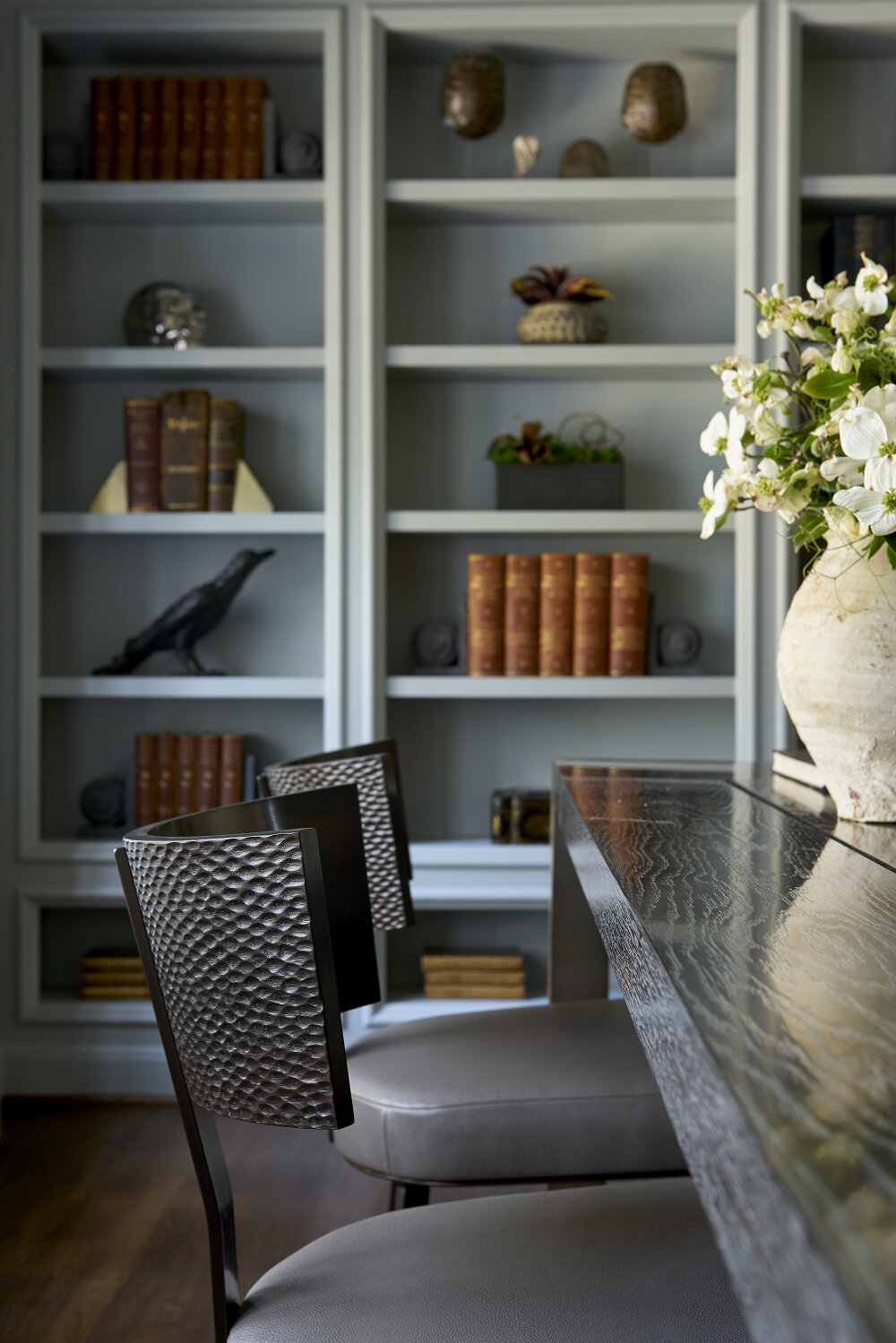
The wooden desk, hammered metal chair backs, and leather seats in this study help to give the room its masculine feel.

The wooden desk, hammered metal chair backs, and leather seats in this study help to give the room its masculine feel.

Designing a masculine room is a great opportunity to play with contrasting textures. Rough textures such as unfinished wood, brick, concrete, and stone bring masculinity to mind, but so do smooth textures such as metal, leather, and lacquer.

To prevent the room from feeling cold and uncomfortable, add fabrics such as mohair, wool, tweed and cashmere. All of these materials are traditionally associated with menswear.

Step 4: Pick the Right Accessories

A masculine room doesn’t necessarily need to be minimalist. To add character to the room, don’t forget to incorporate accessories such as vintage books, pottery, or small male busts of famous leaders. Another example of an accessory I might include in a masculine room would be a large bowl of alabaster balls.

Add art or photography prints to the walls for a touch of sophistication. Art can also be your method of introducing bright accent colors to a masculine room, if you want them, since your wall colors will probably need to be more subdued.

Before you design a masculine room for the first time, you might feel like your options are limited. But there are many different ways to convey masculinity, just as there are many different ways to be a man. The ideal masculine space conveys strength, sophistication, and warmth—qualities that anyone with great taste can appreciate.

Black-and-white architectural prints, such as these seen here, are traditionally considered masculine rather than feminine.

Black-and-white architectural prints, such as these seen here, are traditionally considered masculine rather than feminine.

Four Steps for Creating a Glamorous Feminine Space

In the early 2010s, solemn, masculine spaces were considered to be the cutting-edge of interior design. Rooms with floral patterns and lightweight furniture—feminine rooms—were not taken quite as seriously in the art and design world. After 2015, however, designers such as myself began to notice that feminine design was making a comeback, this time with a modern edge.

Step 1: Pick Your Paint Color and Main Patterns

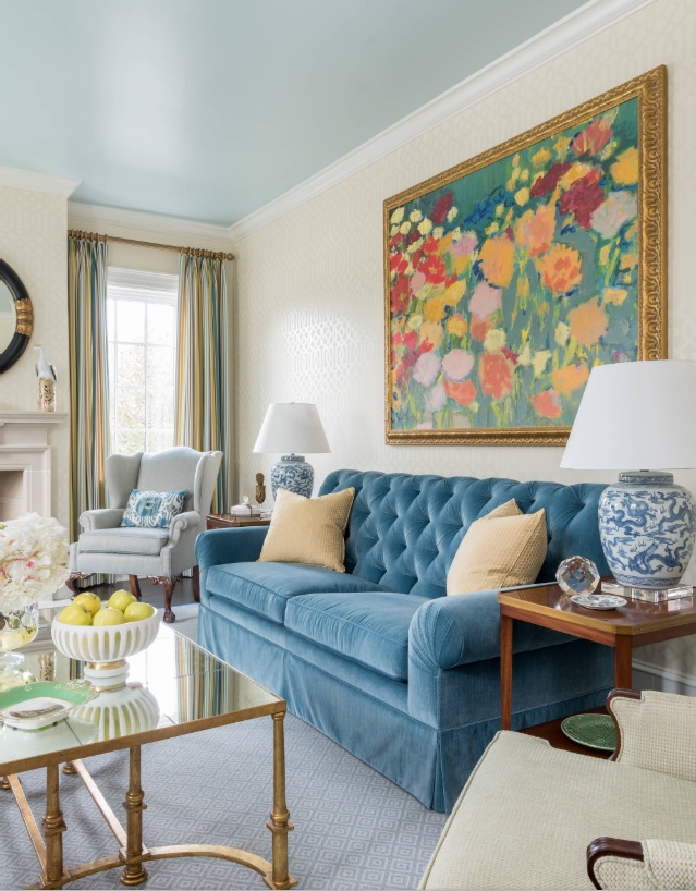
We painted this formal living room ceiling aqua with a high-gloss paint finish. The rest of the room is filled with softly feminine colors.

We painted this formal living room ceiling aqua with a high-gloss paint finish. The rest of the room is filled with softly feminine colors.

While dark walls are a popular choice for masculine rooms, in a feminine room, you’ll usually want to go for “light and bright.” Appropriate neutrals include beige, dove grey, cream and white. Pastels such as pink, peach, soft yellow, mint green, lavender, or aqua are also options for those who prefer color. To give the room some extra shine, consider using a high-gloss paint finish for your walls and ceiling.

If your heart is set on a dark wall color, rose red is probably the most feminine choice. Dusty pinks are an alternative to pastel pink: they can give your room a mature, classy feel that isn’t too juvenile.

As far as patterns go, florals and damasks are classically feminine. To avoid your room ending up with a grandmotherly vibe, pair these patterns with unusual color combinations. Geometric patterns are not off the table here: some geometrics, such as stripes or trellis patterns, can also be right at home in a feminine room.

Step 2: Choose a Style of Furniture

This English cottage style home is in University Park, Dallas. The curved lines and glossy finish of the sideboard seen here, along with the pink wallpaper, are classically feminine.

This English cottage style home is in University Park, Dallas. The curved lines and glossy finish of the sideboard seen here, along with the pink wallpaper, are classically feminine.

Western ideas about what constitutes feminine design are heavily influenced by European trends in art. For example, Louis XV and Louis XVI furniture have the curved profiles and carved details that we associate with femininity today.

However, you don’t have to be an antique collector to design the perfect feminine space. Midcentury modern, beach-themed, and eclectic interiors can also evoke feminine delicacy and sophistication. There is no “right” style when it comes to decorating for a feminine room: what’s important is that you find the style that makes you feel the most at ease and comfortable.

While most of the furniture in your feminine room should have curved silhouettes, break things up with at least a couple of pieces with straight lines. Sleek and sinuous objects, like tall, slender lamps can also pair nicely with your other furnishings.

Step 3: Mix in Different Textures

As with any room, your feminine room should have a variety of textures. Soft fabrics, such as velvet, silk, satin, and chenille will give your room a luxurious feel, but make sure to contrast them with other textures. For a feminine room, I recommend smooth textures such as metals, glass, and lacquer.

The formal living room of the English cottage we designed features both soft textures (the velvet sofa) and smooth textures (the mirror and glass top coffee table).

The formal living room of the English cottage we designed features both soft textures (the velvet sofa) and smooth textures (the mirror and glass top coffee table).

Step 4: Find the Perfect Accessories

In a masculine room, you need to be sparing with the details. Not so with a feminine room: the accessories are really key here. For a glamorous look, add crystal, Lucite, mirrors, porcelain or marble. Fresh flowers and decorative throw pillows will also add an instant touch of femininity to any room.

Our clients in this Preston Hollow home asked us to use six curtain panels that originally belonged to the client’s mother. The unusual color combination (apple green, purple, and black) defined the color scheme for the rest of this guest bedroom. T…

Our clients in this Preston Hollow home asked us to use six curtain panels that originally belonged to the client’s mother. The unusual color combination (apple green, purple, and black) defined the color scheme for the rest of this guest bedroom. The still life painting has a dark background to match the black in the curtains.

The kinds of art you’ll usually see in a feminine space include still lifes, portraits, and colorful abstract paintings. In most cases, you’ll want your accent metals to be warm rather than cool—yellow gold, rose gold, or brass, for example. Yellow gold is considered feminine because it is such a popular metal for jewelry.

For your chandelier (because you’ll definitely want a chandelier in a feminine space), scrolled or crystal chandeliers would be suitable choices in a traditional setting. For contemporary, look for something simpler, such as a drum-shade chandelier. Pinch pleated drapes or sheer curtains are both good options for window treatments, depending on how much light you want to let into the room.

Ideally, most of the rooms in your home should be a balance of both masculine and feminine design traits. There are certain situations, however, where a strongly feminine room is desirable. A young girl’s bedroom; an adult woman’s dressing room; or an entertaining space for the lady of the house and her friends, for example. Anyone who is drawn to environments that are calm, comforting, and elegant can benefit from studying up on the elements of feminine design.

Interested in bringing in an experienced design team to help you create a gentlemanly study, an ultra-feminine bedroom, or a formal living room with the best of both worlds? Call us at 214-232-9501, or email us at info@chambersinteriors.com to schedule a free consultation!

Related Articles:

The Best Ways to Display Your Art Collection by Margaret Chambers

The abstract painting with pops of color pictured here is a perfect match for this neutral seating area with green and blue pillows.

The abstract painting with pops of color pictured here is a perfect match for this neutral seating area with green and blue pillows.

Have you ever purchased a piece of artwork, and then weren't sure how you should display it when you got home? Art is subjective, and there are no hard rules for displaying it either. That said, here are some suggestions on how to make your art look its best in your Dallas home.

Most artwork should be hung at eye level with the center-point around sixty inches above the floor. On the other hand, if you're hanging art in your dining room, you may want to display it a touch above the eye level of seated diners. In rooms with tall ceilings, some artwork can fill the empty space far above eye level, even above doorways.

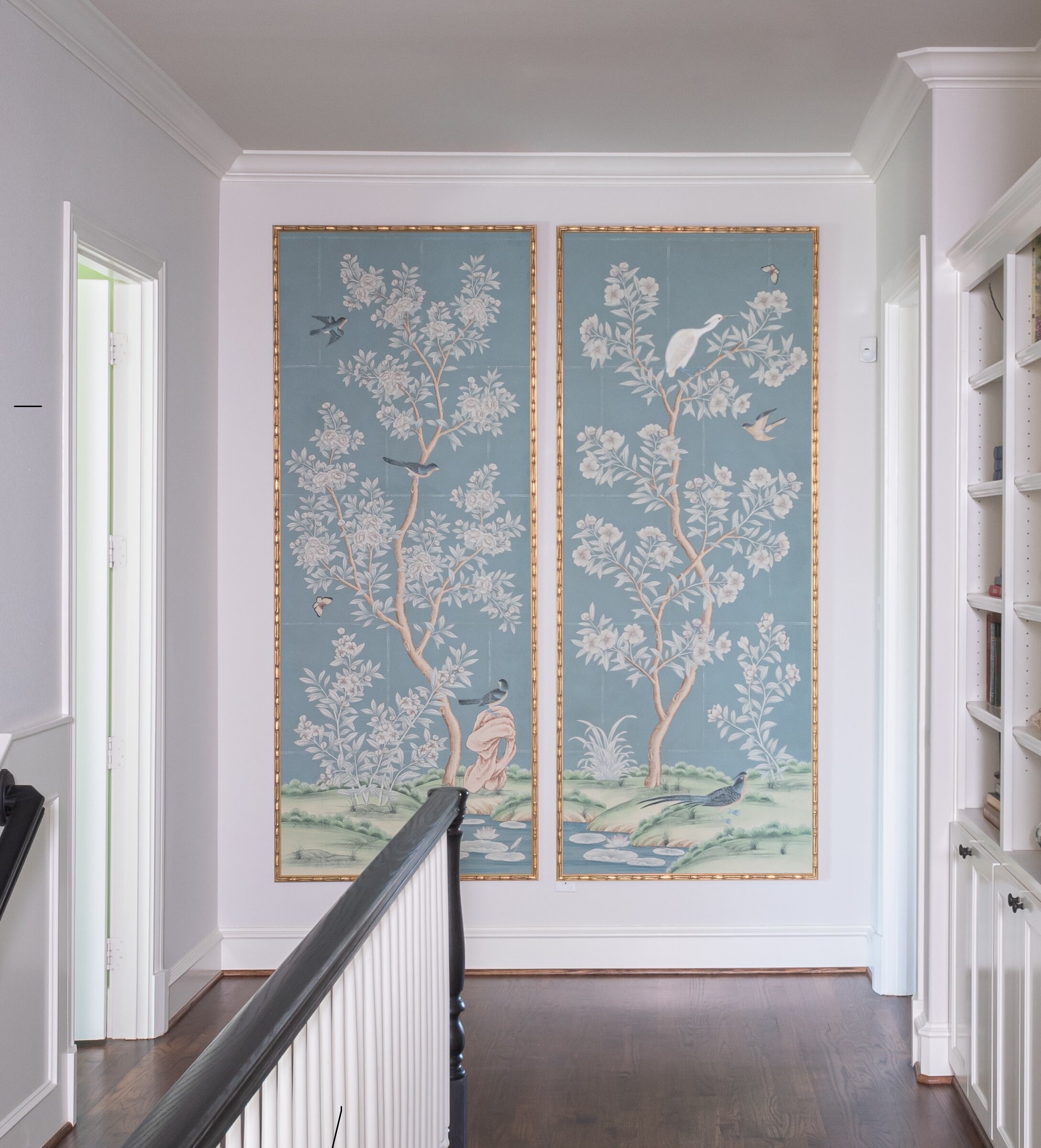
Tall, narrow framed wallpaper panels are just the right shape to fill this wall at the end of an upstairs hallway.

Tall, narrow framed wallpaper panels are just the right shape to fill this wall at the end of an upstairs hallway.

While a large painting or photo can bring drama to a room, don't discount the appeal of smaller artwork. A series of small prints has its own charm, inviting the viewer to step closer. Small, standalone works of art can also be a delightful surprise when displayed in unexpected places, such as bathroom vanities, kitchen shelves, and windowsills.

When you hang multiple pieces of art together, try to keep each of them at least two inches apart. If you want to display a collection over a piece of furniture (like a sofa), there’s no need to space them across the entire width of the furniture. Instead, center the whole collection in a tight grouping.

In this Preston Hollow home, we displayed these whimsical animal prints closely together to leave plenty of negative space on the rest of the walls.

In this Preston Hollow home, we displayed these whimsical animal prints closely together to leave plenty of negative space on the rest of the walls.

Homeowners with multiple collections may feel like they don’t have enough space to display them all. In this case, put some of your collections in storage and cycle them out with the change in seasons.

You can help blend your artwork into the room by picking up accent colors in the painting and pairing them with accessories of a similar color. Or, you can have your artwork command attention: a colorful piece in a neutral-toned room will always make a statement. Especially tall artwork should be hung about fifteen inches off the floor.

For the formal living room in the SMU Theta sorority house, we placed an abstract floral painting over the sofa. The bright colors and large size of the piece make it a stunning focal point.

For the formal living room in the SMU Theta sorority house, we placed an abstract floral painting over the sofa. The bright colors and large size of the piece make it a stunning focal point.

Traditional frames are best for classical subjects like landscapes and portraits. Modern art and photography, on the other hand, usually call for frames with clean lines. Large photos often look their best when mounted in plexiglass or acrylic. Small dimensional pieces will also look great in plexiglass display boxes, which give them a “gallery” feel.

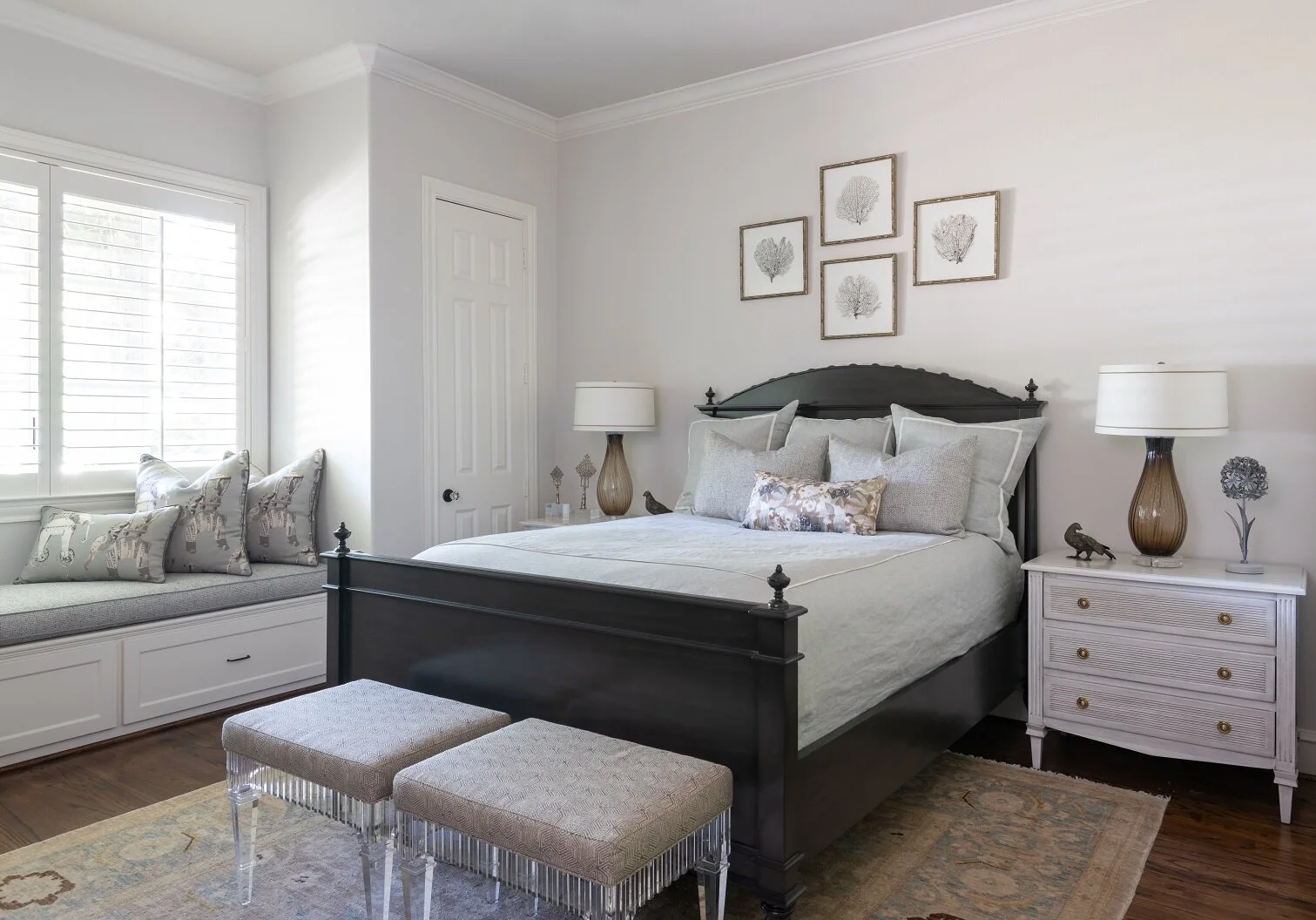
Neutral-Dallas-Guest-Bedroom.JPG
Bamboo frames, such as the ones we used in the vignette above this bed, are a good choice for natural imagery.

Bamboo frames, such as the ones we used in the vignette above this bed, are a good choice for natural imagery.

Of course, not all art pieces in a collection have to be perfectly matching. Hanging together differently sized pieces that share a common element, such as a style or color, can also create interest. A gallery wall in a hallway is a great way to show off a variety of art.

Do you have a themed collection that’s still growing? If so, you can leave wall space by putting up the pieces you have so far in the center of the wall, and filling the surrounding space as your collection expands. Try to plan out ahead of time how you’d like the final arrangement to look, so that you won’t need to rearrange pieces and patch over holes later.

Decorative plate collections can look fantastic displayed together on a wall.

Decorative plate collections can look fantastic displayed together on a wall.

Another thing to keep in mind is that artwork and photos on paper will fade in direct sunlight. If you still want to display this kind of artwork in rooms with lots of natural light, having them protected by UV plexiglass or UV glass is an option. Always use acid-free mats for your artwork. Rag matting, which is made from cotton, is 100% acid free and the go-to mat for museums. Your older art pieces may be in an acidic mat, so it’s worthwhile to have those placed in acid-free mats over time.

When you live with art, you want to show it off to its best potential. Hopefully some of these guidelines can help you find a perfect place for all your prized collections.

An interior designer can also help you find accessories to go with even your boldest pieces. To schedule a free consultation, call us at 214-232-9501 or send an email to info@chambersinteriors.com. We would love to help you get the most out of your art collection!

Why Your Rug Might Be the Most Important Decorating Choice You Make by Margaret Chambers

A large area rug in a neutral gray helps to ground the space in this living room from a home we designed in Kessler Park, Dallas.

A large area rug in a neutral gray helps to ground the space in this living room from a home we designed in Kessler Park, Dallas.

While some people treat rugs as an afterthought, for interior designers, rugs are the foundation of a room. Rugs have a major influence on a room’s color scheme and overall mood, despite being below eye-level. In fact, many designers start their designs by picking the rug first and finding furniture that complements it second.

That said, if your rugs are the only element of your home that needs updating, they’re easy to swap out, too. Following are some things to keep in mind next time you’re rug shopping.

  • Choosing the Right Size

When it comes to rugs, the most common pitfall is choosing one that’s too small. A rug should be large enough to extend under, at the very least, the front legs of every piece of furniture in a seating area. On the other hand, a rug that leaves almost no floor showing tends to look like wall-to-wall carpeting. In most cases, you should leave twelve inches to eighteen inches of space between the rug and the wall.

In the dining room, the rug should be low-pile and about twenty-four to thirty inches wider than the dining table. This way, your chairs won’t slide off of the rug and tip whenever someone pulls one out. If you put a rug under your bed, make it large enough so that your feet will land on it when you get out of bed in the morning.

We ordered a custom-designed rug to fit the small dining room. It is hand-tufted wool and silk. Because the rug is a perfect square, the round table fits perfectly on top, and the rug can be rotated in any direction for even wear.

We ordered a custom-designed rug to fit the small dining room. It is hand-tufted wool and silk. Because the rug is a perfect square, the round table fits perfectly on top, and the rug can be rotated in any direction for even wear.

Rugs play an important role in adding personality to hallways, which can otherwise feel like “dead” spaces. Your hallway runner should be wide enough that you can keep both feet on it as you walk through.

  • Choosing the Right Material

Another thing to consider is what material you want your rug to be. Wool is the most popular choice because it is both durable and beautiful: it’s perfect for families with children.

Silk can handle more foot traffic than you might think, but the cleaning process is slightly more involved and expensive than with wool. Natural fiber rugs such as sisal and jute are very affordable but cannot be cleaned if you spill something on them (unless you use a fiber protection method as soon as you get them). If you decide to buy delicate rugs, place them in low-traffic rooms where they won’t risk getting wet.

  • Choosing the Right Color, Pattern, and Style

Renters who love color, but can’t paint their walls, should bring in a colorful rug instead. Bold rugs are also a smart idea if you’re attracted to vibrant colors and patterns, but don’t want to commit to a bold wallpaper or color scheme. For rooms with dark walls, try finding a light, neutral rug with a distinctive texture. This solves two common problems with dark rooms: the color of the rug will keep the mood from being too heavy, and the added texture will create more interest in an environment where fewer shadows are being formed.

Bold colors and patterns abound in this study we designed for a downtown Dallas high-rise.

Bold colors and patterns abound in this study we designed for a downtown Dallas high-rise.

Rugs with large-scale patterns draw a lot of attention to themselves. This can be a great thing when your room feels too subdued and needs something to liven it up. If you’d rather visitors notice your furnishings and accessories first, rather than the rug, choose a pattern with a smaller, “quieter” print.

Contemporary rugs, which often have large-scale designs, do best in contemporary spaces. Oriental rugs are versatile enough to fit in both traditional and contemporary homes. Tribal rugs can go with many different styles but work especially well in Southwest style homes. Transitional rugs will contain both modern and traditional design elements, such as an ornate pattern in a modern, neutral color scheme. Rugs with a “weathered” look are ideal in beach-themed, transitional, and Bohemian rooms.

Oriental rugs can add color and refinement to contemporary settings, as you can see from this eclectic master bathroom.

Oriental rugs can add color and refinement to contemporary settings, as you can see from this eclectic master bathroom.

The earthy colors and tribal pattern on this rug made it the perfect choice for this African themed guest room we designed.

The earthy colors and tribal pattern on this rug made it the perfect choice for this African themed guest room we designed.

Finding the perfect rug can be the solution to many different design problems. A beautiful rug has the power to instantly add interest to a boring room or pull together one with too much going on. If you keep these designer tips for rugs in mind, you’ll be a savvier shopper.

An interior designer can be a great resource for sourcing high-end rugs or ordering custom ones. If you’re updating your rugs and want the best of the best, call us at 214-232-9501, or email us at info@chambersinteriors.com. We’d love to hear more about your project!

Related Articles:

All About Downsizing: What to Let Go, What to Bring, and What to Buy by Margaret Chambers

Our clients for this project originally lived in Highland Park. Their kids were grown, so they didn’t need to be in a school district anymore and wanted to downsize to another home in Dallas. After their house sold sooner than expected, they quickly…

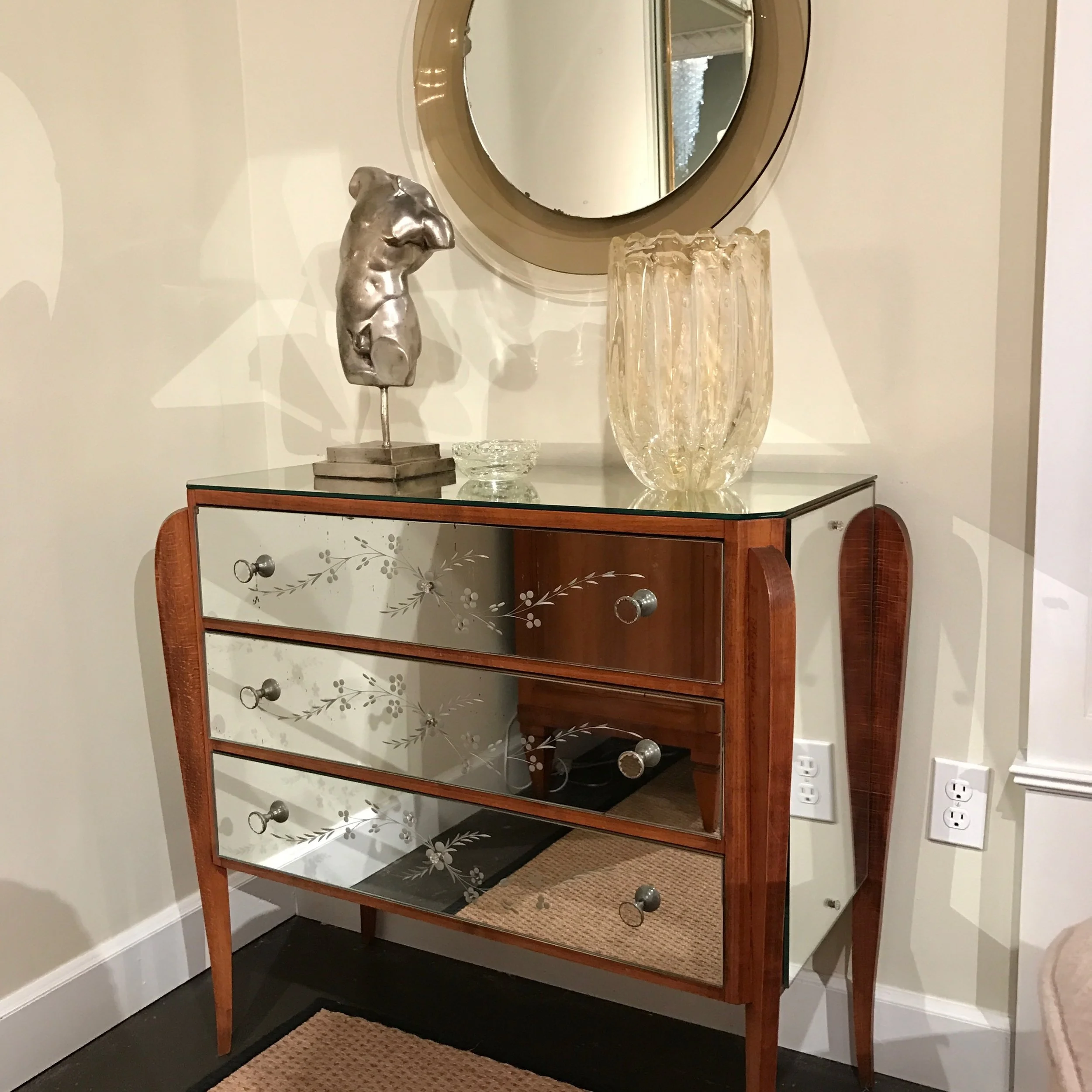
Our clients for this project originally lived in Highland Park. Their kids were grown, so they didn’t need to be in a school district anymore and wanted to downsize to another home in Dallas. After their house sold sooner than expected, they quickly found a 1960’s ranch style home and brought us in to update it. Almost all of the furniture and accessories were newly purchased by us. In this shot, you can see a mirrored console table, which adds extra storage.

More Americans than ever are looking to downsize for their next home purchase. Downsizing makes sense to people from all walks of life: empty-nesters, retirees, and people who are moving in with, or separating from, a significant other. This article is aimed at anyone who’s downsizing for the first time and looking for practical advice on where to begin.

Now that you know you want to downsize, start the process at least a month early. Decluttering can be an emotionally exhausting process, so pace yourself by focusing on just one room at a time. Starting early will give you time to pause and enjoy looking at old photos and travel mementos. You’ll also have time to research the true value of your collectibles and antiques.

If you’ve already found your next home, now’s a good time to walk through it with a tape measure to see which furniture can physically fit in each room. Everything you take with you to your next home should have a dedicated place for it. If you can, you may even want to mark off sections of your new home in tape to create a floor-plan ahead of time. Choose only the best of the best of your furniture to bring with you. If you are keeping your antique chairs, you can give them a fresher look by reupholstering them with modern fabrics. Almost any kind of furniture can be refreshed with either new upholstery or a new coat of paint.

We updated the upholstery on these antique Victorian chairs with a newer fabric that the clients owned. The chairs once belonged to the clients’ grandparents, and the new fabric was once used on the set of the Sex and the City movie.

We updated the upholstery on these antique Victorian chairs with a newer fabric that the clients owned. The chairs once belonged to the clients’ grandparents, and the new fabric was once used on the set of the Sex and the City movie.

A common downsizing tip is to sort your belongings into Yes, No, and Maybe piles. However, I would suggest you skip the Maybe pile. Maybe piles just create an extra chore for you later when you have to look at all those items a second time. An easy way to cut down on kitchen clutter is to identify your duplicates and get rid of them. If you don’t entertain large parties, you probably don’t need shelves and shelves of drinking glasses, or multiple sets of dishes.

Don’t get rid of useful items that you know you’d have to repurchase later, or nostalgic items that are important to you. A good way to narrow down your keepsakes is to ask yourself: if your house were on fire, what would you save? Your family members may want to take some sentimental items off your hands, so reach out to them to see if you get any takers. If you have adult children, give them a deadline to pick up their old things, or offer to ship them. Whatever you do, don’t let your next home become your children’s storage locker.

If you own an entrée table but won’t have a foyer in your next home, consider repurposing it as a breakfast table. This table we bought for our clients is actually an entrée table, but we decided to use it as a breakfast table instead.

If you own an entrée table but won’t have a foyer in your next home, consider repurposing it as a breakfast table. This table we bought for our clients is actually an entrée table, but we decided to use it as a breakfast table instead.

Consider selling valuable items at consignment shops, a yard sale, or online. You can also bring your most valuable items to an auction house to see if they’re interested. Yard sales are good for moving items quickly. Online selling on eBay, Craigslist, etc. can yield higher returns, but is more of a time investment, as taking photos, packing items, and creating the listings will eat into your remaining time until moving day.

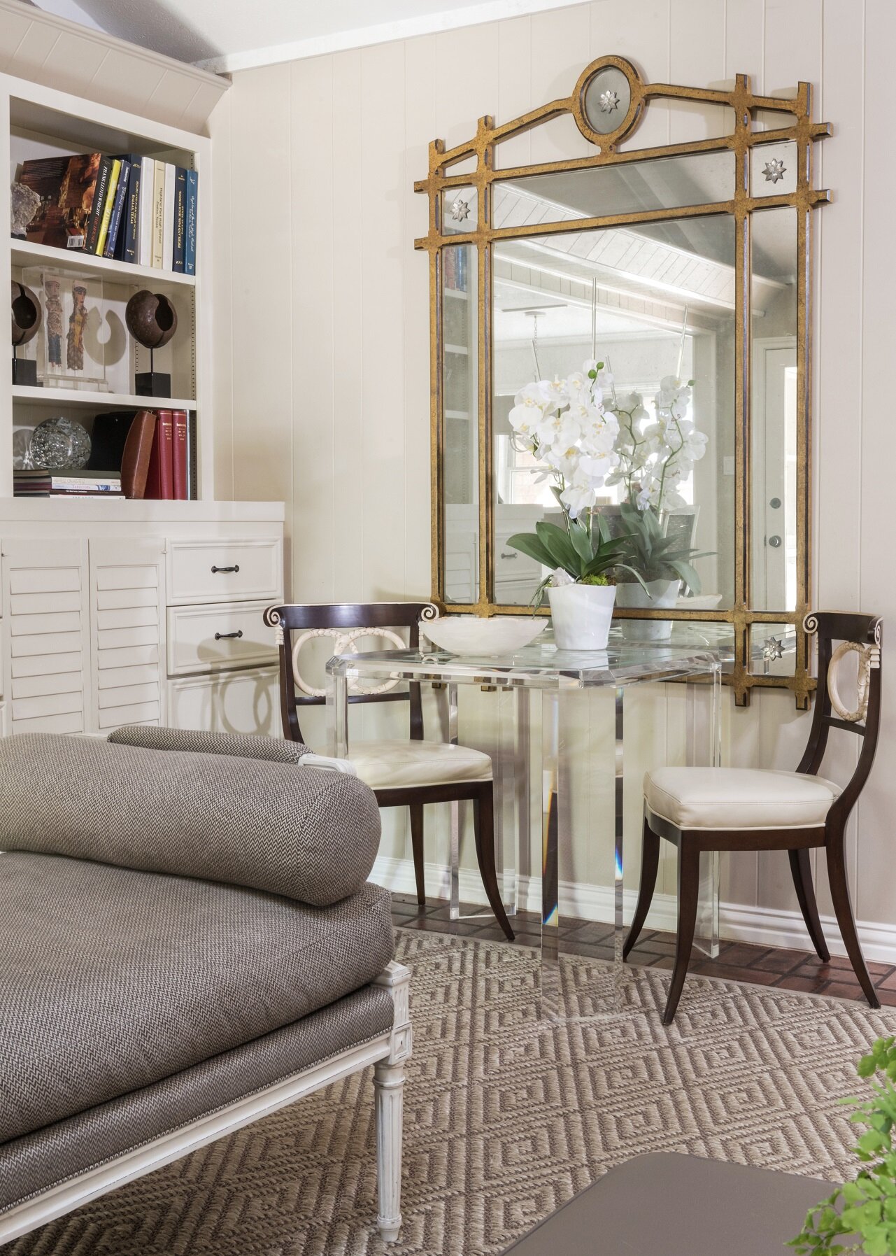
Of course, downsizing isn’t just about getting rid of things. It’s also about finding new furniture and storage solutions that work best in your new home. If you’re buying a new coffee table, try getting a glass-top coffee table that gives the illusion of extra room, rather than a bulky all-wood table. Free up space by choosing multi-purpose items whenever possible. Instead of having a guest bedroom, you can get a comfortable sofa-sleeper or an attractive daybed with a trundle bed.

The glass and acrylic game table next to this mirror fades into the background. A dark wood or metal table in the same spot would likely make the sitting area look too crowded. This game table can also double as an extra dining spot, making it a mul…

The glass and acrylic game table next to this mirror fades into the background. A dark wood or metal table in the same spot would likely make the sitting area look too crowded. This game table can also double as an extra dining spot, making it a multi-purpose piece.

Downsizing is no easy task, but for many people, the results are worth it: a simpler lifestyle, less surface area to clean, less space for clutter to accumulate in, and lower utility bills. This is an opportunity to give your old things a fresh start, creating a new environment that you look forward to coming home to. If downsizing is in your future, I hope that this article can make your next move as stress-free as possible.

Some of our clients approach us for downsizing help because they’re looking for a second opinion on the items they’re bringing with them. If you, too, would like a professional eye to help you manage your downsizing project, call us at 214-232-9501, or email us at info@chambersinteriors.com to schedule a free consultation.

Related Articles:

Designing a Luxury Guest Bedroom by Margaret Chambers

Adding ottomans to the end of this bed gives guests another place to set their bags or fasten their shoes.

Adding ottomans to the end of this bed gives guests another place to set their bags or fasten their shoes.

Do you plan to host your friends or family this year, but feel like your guest bedroom could use an update? With the right look and the right shopping list, you can recreate the feel of a luxury hotel in your own home. To update an existing bedroom, here are some guidelines for achieving the most comfortable experience:

It’s not uncommon for old, tired bedding sets to be relegated to the guest bedroom. Consider investing in new sheets with a high thread-count. If your mattress is uncomfortable or lumpy, you can put on a memory foam topper or mattress pad to make it feel like new. A thick area rug under the bed will give guests something soft to step on when they rise for the day, especially if you have hardwood floors.

Although this guest bathroom has many different patterns, the cool white-and-gray color scheme helps it feel calming rather than busy.

Although this guest bathroom has many different patterns, the cool white-and-gray color scheme helps it feel calming rather than busy.

Sooner or later, most homeowners are tempted to use their guest bedroom closets for overflow storage. If you do, don’t forget to make space for your guests’ things before they arrive. When sheets and towels have been left undisturbed for a long time, they may develop a slight musty smell. Change the sheets and pillowcases, and wash and dry the towels in the bathroom too.

Your room should be well-lit so guests can comfortably read. However, you’ll also want it to be as dark as possible at night so guests can get a good night’s sleep. To achieve this, you can either install blackout curtains or leave a sleep mask on the bedside table.

Just because you don’t have a designated guest bedroom doesn’t mean you can’t create a restful guest space. An attic can be a perfectly good guest bedroom: if your ceiling is sloped, make sure to choose furniture that sits low to the floor to make the ceiling seem taller. To repurpose your home office as a guest bedroom, add a daybed, or include a full-sized bed that is partitioned off with a curtain. Even if you do have a guest bedroom, consider adding a work desk anyway. A small desk, lamp, and chair give your room a “hotel” feel.

Pictured is a seating area from a guest bedroom we designed. With the drink table on one side and a pharmacy lamp on the other, it makes an excellent reading corner.

Pictured is a seating area from a guest bedroom we designed. With the drink table on one side and a pharmacy lamp on the other, it makes an excellent reading corner.

If you’re designing a guest bedroom from scratch, here are some additional points to consider:

Think ahead about who you’d like to invite over. Will you be hosting couples, or family members with children? Make sure you can accommodate their storage needs and sleeping arrangements.

If you anticipate having families with children over, or a pair of single friends, you’ll probably want to fit in twin beds rather than a single queen or king-size bed. Another consideration: will you be allowing guests to bring a pet? If so, keeping food and water dishes and a pet bed on hand is a thoughtful extra touch.

If you can, include at least one comfortable sitting area or reading nook. Guests will appreciate having a place to retreat to and relax besides the bed that isn’t in a communal living space. Padded benches at the end of the bed are another option: they add a place for guests to sit and tie their shoes or set down their bags.

Guest bedrooms should be as self-contained as possible. Include a TV and full-length mirror if you can. For the ultimate in luxury, look into having heated floors installed in the guest bathroom.

Having a landline phone on the bedside table is helpful for guests when their cell phones are low on battery, or when you live in a remote area with spotty cell phone service. Include some books (preferably light reading) or recently published magazines on the bedside table too. Some people have trouble sleeping in unfamiliar beds, and those guests will appreciate having the reading material available. Your bedside table lamp should also be bright enough to read by.

Of course, the best hotel rooms are not only comfortable but tastefully designed. You’ll want yours to be a beautiful room that guests remember, too. A distinctive or unusual headboard is one way to make a statement. Decorative pillows, rugs, and throw blankets are also a good opportunity to add a burst of color.

The fabric on the curtains you see in this Preston Hollow guest bedroom originally belonged to the client’s mother. The purple, apple green, and black in the curtains was a challenging color scheme for us to work with, but ultimately lead us to crea…

The fabric on the curtains you see in this Preston Hollow guest bedroom originally belonged to the client’s mother. The purple, apple green, and black in the curtains was a challenging color scheme for us to work with, but ultimately lead us to create a unique result.

Other ways to add personality to your guest bedroom include decorating the wall with a gallery of artwork, choosing a colorful wallpaper, or picking a theme for the room (nautical is a popular theme for guest rooms). For an extra luxurious feel, outfit your window treatments with rope tiebacks or simple valances. When it comes to color schemes for guest bedrooms, you can either go light and bright for a clean and refreshing look, or dark for a cozy, cave-like feel. To design a romantic bedroom, choose deep, rich colors.

The key to being a great host is to anticipate your guest’s needs before they do. Here is a checklist of items to include that help you go the extra mile:

·         Bathrobe, slippers

·         Water bottle and drinking glasses

·         Fresh flowers

·         Luggage rack

·         Pen and paper

·         Books and magazines

·         Note with your Wi-Fi password

·         Small clock (make sure it doesn’t tick loudly)

·         Hair dryer, travel-size toiletries

·         Snacks (such as a bowl of fruit)

·         Charging station for electronic devices

·         Coffee pot

·         Ironing board and iron

When your bedroom is close to complete, stay a night to test it out. Did you sleep as comfortably as you would in your master bed? Were you missing anything?

Inviting guests into your home gives them a glimpse into your own lifestyle. If you keep these design tips in mind, your guests will not only enjoy their stay, but admire your great taste too.

If you could use a professional touch to help your guest bedroom go the extra mile, consider hiring an interior designer. To schedule a free consultation with us, call our Dallas office at 214-651-7665 or send an email to info@chambersinteriors.com.

Related Articles:

New Article Publication in Southern Style at Home by Margaret Chambers

southern-style-at-home.jpeg

Chambers Interiors is featured in the latest issue of Southern Style at Home magazine, a special edition of Southern Lady. Pick up a copy on newsstands or at your local bookstore to see how we designed a 6,000-square-foot lakeside residence.

From the article, “Bespoke Blend:”

Built in 2012, the dwelling had great architectural bones, plus attractive floors and finishes like the den's coffered ceiling, white subway tile in the kitchen, and custom cabinetry throughout. 

“But we had to add some character to the house," Margaret says. She and Allen dressed up many smaller spaces with jazzy wallpapers and, in the bedrooms and larger gathering places, balanced modern touches with antiques. 

"They have a certain warmth and character that new things just rarely have," says Margaret, whose career in northern Texas spans more than three decades.

bespoke-blend-lakeside-residence.png

Click here to order a copy online!

Interested in a home makeover of your own? We'd love to hear more about your vision! Call us at 214-651-7665 or email us at info@chambersinteriors.com to schedule a free consultation.

Plan Your Home Lighting Like a Professional by Margaret Chambers

Featured here are a pair of Murano glass lamps from a dining room we designed in Kessler Park, Dallas.

Featured here are a pair of Murano glass lamps from a dining room we designed in Kessler Park, Dallas.

In previous articles, we’ve talked about how important balance is to interior design. Lighting is no exception. Even the most beautifully designed rooms will look unbalanced if they’re poorly lit. To help your decorations look their best, you'll need to light each room with care.

If you’re furnishing your home from scratch or working on a major remodel, walk through the house and ask yourself along the way: ‘what are the primary functions of this room?’ Odds are that you’ll want task lighting for your study, but mood lighting for your bedroom. Make sure to plan ahead your desired color temperature for the lighting in each room, too. Lower temperatures are warm and yellow, while higher temperatures are closer to blue daylight.

As a general rule, task lighting should be three times brighter than the rest of your lighting. Recessed lights
and pendant lights are reliable solutions for this. Another place where you may want to install task lighting is above the countertops in your kitchen (in this case, under-cabinet lighting strips can be very useful).

In this photo, you can see both the study hall and the dining area for SMU’s Kappa Alpha Theta house. We lit the seating areas for the study hall with brass chandeliers. To the right, the dining room is illuminated with a series of recessed lights.

In this photo, you can see both the study hall and the dining area for SMU’s Kappa Alpha Theta house. We lit the seating areas for the study hall with brass chandeliers. To the right, the dining room is illuminated with a series of recessed lights.

On the other hand, mood lighting is typically created using a balance of many softer light sources in the same room. Including dimmers in your plans will give you more flexibility to control the brightness levels. A popular new trend is to install one light switch that controls all the lights in a particular area or room. These “smart lighting systems” are preferable because having one switch on the wall looks cleaner than having three or four together.

Make sure that each light fixture is performing a specific task, whether it's highlighting an area, creating
depth, or illuminating a cupboard. There's a saying that "if you light everything, you light nothing." Although it’s tempting to plot lights throughout the room, you do need shadows to create variation and atmosphere.

Pendant lights help to illuminate the sink area in this eclectic master bathroom we designed in a downtown Dallas high-rise.

Pendant lights help to illuminate the sink area in this eclectic master bathroom we designed in a downtown Dallas high-rise.

Lighting can also establish focal points in a room. Use recessed lighting to draw the eye to a central seating area or a piece of art over the fireplace. If you have a gallery of artwork in your hallway, make sure each piece is equally lit. Just make sure not to project light directly onto a mirror, as this will create glare. Instead, highlight the mirror frame with a series of wall-mounted lights on opposite sides.

The overall shape of your room should have an influence on the kind of lighting you choose. Lighting can even compensate for a room’s less desirable features. For example, low-hung pendant lights make ceilings feel taller, while up-lighting will make the whole room feel larger and more impressive.

A chandelier is always an eye-catching lighting solution. For a traditional look, place a chandelier over the dining room table to draw attention. However, in a contemporary home you may want to use a pendant light (or group of pendant lights) instead.

The owners of this Plano residence asked us to update their home with a transitional style. You can see how we complemented traditional and modern pieces together in this dining room. The chandelier, with its fine details, has a more traditional loo…

The owners of this Plano residence asked us to update their home with a transitional style. You can see how we complemented traditional and modern pieces together in this dining room. The chandelier, with its fine details, has a more traditional look.

If you read our last article about harmony in design, you can guess that it's important for lighting fixtures to harmonize. Use multiple kinds of light fixtures in each room for variety and interest, but make sure the fixtures also match your decorating scheme. For example, Japanese paper shades typically look best in either modern rooms or Asian-influenced ones, while an antique crystal chandelier could look out of place in the same room. An antler chandelier is a classic choice for a rustic country home.

That said, maybe you have a room that has a little too much harmony, and could use contrast to break things up. In this case, consider making a statement with your lighting. A black iron chandelier would add a lot of impact to a room with a light and bright color scheme.

Whenever possible, get a designer to help you with lighting needs. Much has changed in lighting just in the past few years, and a professional can help you navigate the latest technologies. You'll be glad you went through the extra effort to give your rooms a beautiful glow—after all, a room that is well-lit, is well used. To schedule a free consultation with us, call our office at 214-232-9501 or send an email to info@chambersinteriors.com.

Related Articles:

Solutions to Common Decorating Mistakes by Margaret Chambers

When you work as an interior designer, you encounter many misconceptions about home decorating. These misconceptions can lead homeowners to make unnecessary mistakes and fail to capture the true potential of their home. Thankfully, many of these problems also have quick and inexpensive solutions.

Klismos chairs, a modern chandelier, and an abstract painting give character to this breakfast nook in a 1960s Dallas ranch home. A breakfast table such as this one needs ‘breathing room,’ and should not be placed too close to walls or corners.

Klismos chairs, a modern chandelier, and an abstract painting give character to this breakfast nook in a 1960s Dallas ranch home. A breakfast table such as this one needs ‘breathing room,’ and should not be placed too close to walls or corners.

One of the most common decorating mistakes is pushing furniture up against the walls. People do this to make more space in the center of the room, but ironically it actually makes things feel more cramped! The solution is to bring your furniture closer together to create intimate seating areas. This also allows there to be some “breathing room” between the walls and furniture.

We used a console table to act as a buffer between the two sofas in this Kessler Park Spanish Colonial home.

We used a console table to act as a buffer between the two sofas in this Kessler Park Spanish Colonial home.

As you plan your seating areas, consider how foot traffic will flow in and out of the room. You don’t want the room to be awkward to navigate. As a rule of thumb, you should make sure the back of your sofa is not facing the entrance into the room. Entering a room where the main seating area is facing away can feel subtly unwelcoming to visitors. If turning the sofa around isn’t an option, place an attractive console table at the sofa’s back with books or other accessories.

This may sound surprising coming from a designer, but comfort is just as important as style. It’s a mistake to settle for an uncomfortable chair just because you love its look. Comfort is especially crucial for dining chairs: whether you’re sitting down to a family dinner or entertaining guests, you want everyone to be able to relax.

A large room needs a large rug. The unfortunate reality is that a small rug that “floats” in the center of the floor never works! For small rooms, we like to use a rug that leaves only ten to twelve inches of floor space between the rug and the wall. Using a large rug will make a small room feel more expansive.

If you haven’t bought a rug yet, you can use painter’s tape to plan out the area you want the rug to cover. Want to get the most out of the rug you already have? Hide the edges of it under furniture legs. This tricks the eye into thinking the rug stretches farther than it actually does.

Chambers Interiors designed this study hall and dining area for SMU’s Kappa Alpha Theta house. The two separate seating areas here each have their own large area rug. Using two rugs helps to visually break up the space.

Chambers Interiors designed this study hall and dining area for SMU’s Kappa Alpha Theta house. The two separate seating areas here each have their own large area rug. Using two rugs helps to visually break up the space.

You may see an abundance of decorative pillows when you browse design magazines. I’m here to tell you that it’s actually better if you don’t put throw pillows everywhere. Not only will too many pillows look fussy, but you’ll also get tired of moving them to make room every time you sit on the couch. It’s also unnecessary to have all the pillows on a bed or sofa perfectly match.

A pair of decorative pillows add color and pattern to the sofa in this family room. Because there are only two pillows, there is plenty of space left to sit.

A pair of decorative pillows add color and pattern to the sofa in this family room. Because there are only two pillows, there is plenty of space left to sit.

Another common mistake is displaying every accessory you own. Generally, the less clutter the better. Reducing clutter on counters or walls gives the eye places to rest, too. Give yourself permission to let go of any decorating items you don’t want to keep anymore, even gifts from loved ones. If you have lots of photos to display, create a gallery wall for them instead of clustering them on mantles and shelves.

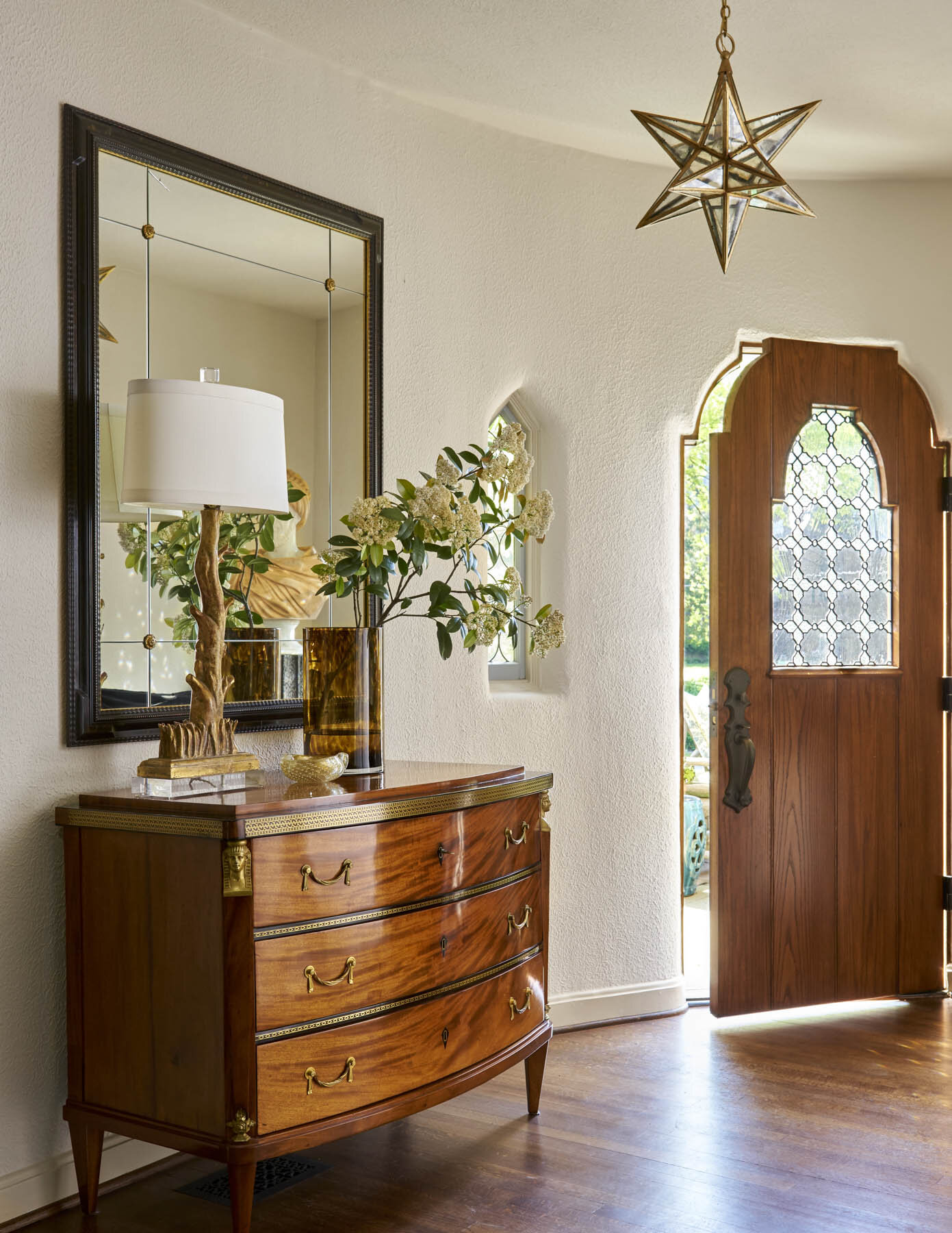
Our clients for this home wanted a refreshing and high-gloss look. Lacquered furniture and glass light fixtures, such as the ones seen in this foyer, helped to cinch the look.

Our clients for this home wanted a refreshing and high-gloss look. Lacquered furniture and glass light fixtures, such as the ones seen in this foyer, helped to cinch the look.

That said, it’s also possible to make a room feel too staged. A room without any family photos or other personal items runs the risk of feeling like a furniture store. Another common decorating mistake is ignoring your foyer. The foyer is an opportunity to make a great first impression for visitors, so don’t leave it bare.

Be careful of design fads. Don’t chase any trends that will be expensive to redo or replace later, because there’s always a possibility you’ll get tired of a certain look.  Instead, pick trendy accessories that will be easy to replace if they look dated in a few years. Or better yet, pursue classic looks that have already stood the test of time.

This list covers some of the most common decorating mistakes we see. If something doesn’t feel right with a room you’ve decorated, I hope you can now identify and solve the issue.

Have a home decorating problem that isn’t discussed here? We’d love to help you find the solution. Reach out to us by calling 214-232-9501 or sending an email to info@chambersinteriors.com.

Related Articles:

Choosing the Perfect Patterns by Margaret Chambers

In the living room of this sorority house at SMU in Dallas, we paired a yellow pillow with a small-scale pattern and a blue pillow with a large-scale ikat pattern. Although the pillows are completely different, both of them fit into the overall colo…

In the living room of this sorority house at SMU in Dallas, we paired a yellow pillow with a small-scale pattern and a blue pillow with a large-scale ikat pattern. Although the pillows are completely different, both of them fit into the overall color scheme of the room.

Patterns are an important tool in any interior designer's repertoire. However, you don’t have to be a professional to appreciate the difference that the right wallpaper pattern or rug can bring to a room. Whether you prefer geometric designs or traditional motifs like floral and paisley, it's important to know when and where to use patterns in your home.

Patterns come in a variety of densities, from fine, to medium and oversized. We use the word “density” here to describe how close together the images in the pattern are placed to one another. One example of an oversized pattern would be a bold geometric design. Some examples of medium patterns typically include botanical motifs and plaids. Fine patterns, on the other hand, can be so small-scale that they look like a solid color from a distance.

We decorated this guest bedroom in a Dallas ranch home using a black, white, and gray palette, which can accommodate a variety of pattern densities. The ottomans have a large-scale cow print pattern, while the patterns on the upholstered desk chair …

We decorated this guest bedroom in a Dallas ranch home using a black, white, and gray palette, which can accommodate a variety of pattern densities. The ottomans have a large-scale cow print pattern, while the patterns on the upholstered desk chair and day-bed are both small-scale.

This is a detail shot from a transitional home we designed in Plano, Texas. The Missoni pillow on the left has a geometric pattern (stripes) while the pillow on the right features a traditional wood blocked pattern. As you can see, stripes can accom…

This is a detail shot from a transitional home we designed in Plano, Texas. The Missoni pillow on the left has a geometric pattern (stripes) while the pillow on the right features a traditional wood blocked pattern. As you can see, stripes can accompany a wide variety of patterns.

In addition to density, patterns can also be categorized by their style. Organic patterns are based on natural images, like plants or animals, while geometric patterns include abstract motifs such as stripes and squares. Both geometric and organic patterns can be used to create different visual effects.

Vertical stripes will make a low ceiling seem taller, while floral and toile prints give the room a soft and cozy feel. Animal prints are associated with glamour, and can work in either traditional or contemporary settings. If you want to cultivate a Bohemian or artsy look, ikats and paisleys are smart choices. Finally, stripes are a fantastic multi-purpose pattern that complements almost all other patterns, whether they are abstract or traditional.

It may be tempting to use the same pattern throughout your room, but be warned: doing so is a surefire way to make your home feel dated! From a design perspective, too much of one pattern is also just overwhelming. Incorporating complementary patterns that are in a variety of styles is the way to go these days. When in doubt, mixing different patterns that are all in the same color is a safe strategy. A monotone color scheme will give you leeway to mix patterns that might otherwise clash with one another.

Pictured here is another guest bedroom from the Dallas ranch home mentioned earlier. You can spot many different kinds of patterns here, but because they are all in various shades of gray, they do not clash with one another.

Pictured here is another guest bedroom from the Dallas ranch home mentioned earlier. You can spot many different kinds of patterns here, but because they are all in various shades of gray, they do not clash with one another.

The kind of pattern you choose for each piece should depend on what you're displaying it on. If you want to feature an oversized pattern, it needs to dominate the room. Use that pattern on wallpaper, a sofa, or an area rug. Large rooms can handle both darker and bolder prints, while small rooms will feel more open if you decorate them with fine, softly-colored patterns.

The pattern on these upholstered chairs is one example of an over-sized pattern. These Victorian chairs originally belonged to the clients’ grandparents: she updated them with a fabric that was originally used on the set of the Sex and the City movi…

The pattern on these upholstered chairs is one example of an over-sized pattern. These Victorian chairs originally belonged to the clients’ grandparents: she updated them with a fabric that was originally used on the set of the Sex and the City movie.

As a general rule, only use one oversized pattern per room. From there, you’ll want to complement your single oversized pattern with medium-density patterns on your chair upholstery, ottomans or curtains. Fine patterns look best on accent pieces such as pillows and lampshades.

Blue-and-yellow-striped curtains complement a blue sofa and yellow pillows in the Kappa Alpha Theta house at SMU.

Blue-and-yellow-striped curtains complement a blue sofa and yellow pillows in the Kappa Alpha Theta house at SMU.

If you've decided on a pattern but aren't sure what color you want, you can use your other furnishings as a guide. For example, if you already own a green upholstered ottoman, why not buy pillows or drapes in a similar shade of green? Once you’ve chosen your patterns, keep in mind that it’s important to space each pattern evenly throughout the room for visual balance. Putting solid color fabrics in between acts as a visual buffer.

These are only general guidelines. Experienced designers know that sometimes the best results can come from a little experimentation. Don't be afraid to play around with patterns until you've found the perfect combination!

If you could use an expert eye to help you balance your favorite patterns and colors, reach out to us by calling 214-232-9501 or sending an email to info@chambersinteriors.com.

Related Articles:

Tips for Decorating a Mid-Century Modern Home by Margaret Chambers

With its timeless and minimalist look, modern interior design remains a preferred style for homeowners in Dallas and across the nation. Modern design can bring out the best qualities of your space because it is a clean and uncluttered style, emphasizing a small collection of carefully chosen furnishings.

Many people use the terms 'modern' and 'contemporary' interchangeably, but when it comes to interior design, they are distinct terms. Contemporary is a catch-all term for the most up-to-date and cutting-edge trends in design. Modern, on the other hand, refers to a specific style that began in the midcentury and has remained mostly the same over time.

Modern design was originally an extension of modern and deco art trends from the early 20th century, such as Bauhaus style, a German artistic movement known for its minimalism. Advances in technology paved the way for furniture designers to work with new materials, colors, and finishes. Plastic, vinyl, Lucite, and plexiglass pieces quickly began appearing in homes, often alongside traditional materials like wood and stone.

Today, modern style continues to emphasize geometric and smooth shapes, such as ovals, rectangles and squares. Since strong lines are important to the style, excess accessories are removed to leave the room's visual lines uninterrupted. Exactly how you highlight your space is, in many ways, more important than the accessories you choose.

This style has as much to do with architecture as it does with furnishings. Modern homes usually take advantage of large rooms, high ceilings, open floor plans and floor-to-ceiling windows. Architects designing modern homes between the 40’s and 60’s often created depth in open spaces using wall panels and changes in elevation. Large windows are also important because they introduce natural light into a room that otherwise might feel cold without it. Some modern homeowners also wish to make the surrounding landscape, not the furnishings, the most eye-catching feature in the roomin this case, bare windows are a must.

The materials you use for your home are another important consideration. Modern style usually is created with smooth textures, like glass, metal and plastic. For this reason, not many modern homes will be carpeted. Instead, you will see smooth wood, tile, or polished concrete floors with geometric rugs. Some rough textures, such as wood and brick, can also be incorporated for contrast.

Mid-century interior design is also well known for its distinctive designer furnishings and accessories. Famous examples include Charles and Ray Eames's chair designs: these were considered cutting edge at the time, but are now sought for their vintage look. Pendant lights, tulip tables, abstract art fixtures, atomic chandeliers and clocks all recreate the modern aesthetic. If an art piece takes center stage in your room, use lighting to bring attention to it.

Stay away from furnishings that are usually associated with traditional interior design. Furniture with hand carved details, traditional prints, and heavy or ruffled drapes would not be a good fit for a modern home. Patterns associated with modern and contemporary design tend to be large graphics with only a few colors. Although this style is known for its soothing neutral palettes, splashes of bright color are also used to liven up the space. Don't be afraid to go bold with orange, teal, or even neon colors.

Modern style has the advantage of looking contemporary while retaining the vintage aesthetic of mid-century design. It's no wonder that Dallas homeowners would still request this classic look from the interior designers they work with.

Looking for someone to help you design the modern home you’ve always wanted? Call us at 214-232-9501, or email us at info@chambersinteriors.com, to schedule your free consultation.

Related Articles:

How to Use Rhythm and Harmony to Design Great Rooms by Margaret Chambers

The words “rhythm” and “harmony” likely bring music to mind, but these are also terms that interior designers like myself use to describe our work. If you’re a Dallas homeowner and have ever wondered about what it takes to design a room that is both cohesive and interesting, you’ll want to study up on both of these design principles.

Many homes have architectural details that add built-in rhythm to the room. This is the foyer of the SMU Theta sorority house in Dallas, which was designed by Fusch Architects, Inc. and decorated by us. The elegant staircase curves as it rises up, i…

Many homes have architectural details that add built-in rhythm to the room. This is the foyer of the SMU Theta sorority house in Dallas, which was designed by Fusch Architects, Inc. and decorated by us. The elegant staircase curves as it rises up, inviting the visitor’s eye to follow along with it. Gold and yellow accessories create another kind of visual rhythm in the sitting area below.

Rhythm:

You can lead a viewer's eye throughout the room by repeating a pattern or color among your furnishings and accessories. This kind of visual flow is called rhythm. The use of rhythm can be subtle: for example, a particular shade of yellow in a painting could be echoed in the pillows on the sofa. By distributing that color or pattern throughout the room, you are creating visual "movement" and balancing your color scheme, too.

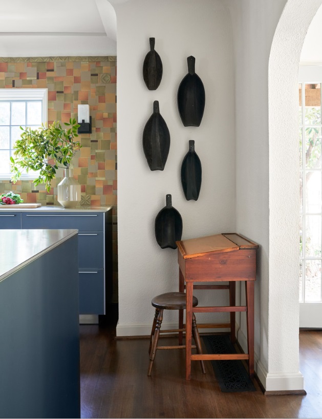
The owners of this home we designed in Kessler Park displayed their collection of African artifacts in the kitchen. The pieces are united in color, but have slightly different shapes and sizes.

The owners of this home we designed in Kessler Park displayed their collection of African artifacts in the kitchen. The pieces are united in color, but have slightly different shapes and sizes.

Any repetition of elements in a room can create rhythm. For example, a group of art prints along the wall, a series of matching lighting fixtures, or a row of candles on a mantle all establish rhythm through repetition. However, not all of your repeating accessories need to be identical.

You can also create interest through progression, in which you line up your accessories from large to small, small to large, or even from light to dark in tone. A series of similar but differently-sized vases in an entrée way is a charming example of progression. Featuring a basic shape throughout the room is another opportunity to create rhythm. For example, an oval-patterned wallpaper can be accentuated by an oval-shaped mirror.

Keeping repetition and rhythm in mind will guide you to make smarter purchases as you furnish your home, because it encourages you to create cohesive groupings. If you’ve tried to incorporate rhythm, but the room still feels “off” somehow, remember to step back and let your eyes naturally follow the lines of the room. This can help you identify where changes should be made.

A pink, toile-patterned wallpaper adds movement and rhythm to the walls of this formal dining room in University Park, Dallas. This dining room is part of a home decorated in a traditional English cottage style.

A pink, toile-patterned wallpaper adds movement and rhythm to the walls of this formal dining room in University Park, Dallas. This dining room is part of a home decorated in a traditional English cottage style.

Harmony:

Another way to achieve balance in your interiors is through harmony, in which all the elements of your space relate to each other in a pleasing way. When there are too many different colors, shapes, or textures in a room, the result is visual chaos. A room has harmony when almost everything in it is part of the same color family: in other words, a monochromatic color scheme.

The living room shown above is from a transitional home we designed in Plano, Texas. The color scheme for this house is made up of calming neutrals, while a variety of textures and patterns add interest to the space.

The living room shown above is from a transitional home we designed in Plano, Texas. The color scheme for this house is made up of calming neutrals, while a variety of textures and patterns add interest to the space.

While a room with contrasting colors and rhythm is exciting, a room with harmony is especially restful. So monochromatic color schemes are a great idea for rooms you want to be able to relax in, such as the bedroom. A symmetrically designed room will also feel more harmonious than an asymmetrical room.

If you are just beginning to furnish your Dallas home and aren’t sure how to proceed, pick one item or visual element you definitely want in your room, and then design around it. Be careful not to get too carried away, and make sure to leave room for ‘negative space.’ Negative space gives interiors a calming quality, and too much clutter can take away from that.

This Dallas dining room is a great example of a room where negative space makes the room feel more open.

This Dallas dining room is a great example of a room where negative space makes the room feel more open.

You don't have to make everything in your room all of one color to achieve harmony. Distributing similar textures throughout your room will achieve a similar effect: from coarse textures like brick and timber paneling, to smooth textures like polished concrete and glass.

The danger in creating a harmonious room is that without the right amount of contrast, you can end up with a boring design. A smart designer will know how to add just the right amount of variety while still maintaining a balanced look. If your monochromatic color scheme feels too “matchy-matchy,” you’ll want to introduce other colors.

Here is the formal living room from SMU’s Kappa Alpha Theta house that we featured earlier. We used a bright multi-color scheme for this room: golds, greens, and aquas are found throughout the room, and echoed again in the large floral painting over…

Here is the formal living room from SMU’s Kappa Alpha Theta house that we featured earlier. We used a bright multi-color scheme for this room: golds, greens, and aquas are found throughout the room, and echoed again in the large floral painting over the sofa.

When it comes to multi-color schemes, many interior designers follow the 60-30-10 rule. This rule is designed to guide you in distributing the right amount of color in each room. 60 percent of the room should represent your dominant color, 30 percent should be your secondary color, and the last 10 percent is for accents.

Now that you've read about a few examples of rhythm and harmony, hopefully you can approach your interiors with a fresh eye and see where you can make improvements. If you’re overwhelmed by the size of your project and could use an expert opinion, consider reaching out to our interior design team for a free consultation.

Related Articles:

An Interior Designer’s Guide to Preparing Your Home to Sell by Margaret Chambers

Are you preparing to sell your Dallas home? If so, you’ve probably already begun your own to-do list. While some strategies for showing a home are common knowledge (“clean up,” “make repairs,” “spray air freshener”) there are other ideas you might not have considered. In this guide, we’ll cover all of the essentials involved in selling a home. We’ll also include some tips from our interior design team that your real estate agent may not think to suggest!

We redecorated this 1927 Spanish colonial house in Kessler Park, Dallas. Lee Roth was the landscape architect. New landscaping gives this home plenty of “curb appeal.”

We redecorated this 1927 Spanish colonial house in Kessler Park, Dallas. Lee Roth was the landscape architect. New landscaping gives this home plenty of “curb appeal.”

First Impressions

Real estate agents stress the importance of “curb appeal” for a good reason. If your home doesn’t make a great first impression, your prospective buyers may never even step out of the car to see it. This is the time to make your yard and front door as presentable as possible. Trimming the bushes, mowing the lawn, and weeding are must-dos. You may also want to plant some new flowers and add fresh mulch.

A quick and easy way to boost your home’s curb appeal is to put a new coat of paint on the front door. Select a color that stands out from the rest of the home, but isn’t too strong, either. If you have lots of decorative items on your porch, you may want to declutter by removing any items beside a welcome mat and a potted plant or two. Make sure that your house numbers are clear and easy to see from the street. If your window trim is fading, repaint that too. You can also pressure wash the siding of your home and the sidewalk.

When you’re wrapping up, step back and take a look at your own home from the street. If you were a buyer, would you want to tour the home?

Tackle Your Repair List

Once you’ve decided that you’re going to sell your home, make a list of all the repair projects you’ve been putting off, and their potential costs. Focus on projects that are either inexpensive, or that you can do yourself. It’s better to take care of all these fixes before the home inspector arrives.

As for more expensive repairs, some are more necessary than others. A leaky roof will definitely turn away buyers. However, while you may be tempted to renovate your outdated kitchen, proceed carefully. A full kitchen renovation can cost as much as $65,000, and it’s estimated that sellers only make back about 60% of their investment when they sell a home with a renovated kitchen. It may be more worthwhile to simply make small repairs to the kitchen and do a deep cleaning.

Your to-do list should include patching holes in walls, fixing doors and drawers that don’t close properly, replacing kitchen cabinet hardware, replacing light bulbs, and fixing leaky faucets. If your flooring is worn out, replacing your carpets and refinishing wood floors can have a higher cost upfront, but is almost always worth the investment. Replace ceilings that are water-stained, even if the plumbing issue was fixed long ago.

Create a Blank Slate

We repainted the walls in the Kessler Park home with mostly neutral colors. In the dining room, beige is a calming backdrop for the gold-framed antique prints. Before, the ceiling was also a dark terracotta color. Covering it with a light wallpaper …

We repainted the walls in the Kessler Park home with mostly neutral colors. In the dining room, beige is a calming backdrop for the gold-framed antique prints. Before, the ceiling was also a dark terracotta color. Covering it with a light wallpaper helped the room feel more expansive.

You have probably heard that it’s important to depersonalize a home for sale. Potential buyers have trouble imagining their own family photos on the walls when yours are still hanging there! Don’t store personal items in the closets, however: buyers will be opening those to see how much storage space you have. Although it’s not necessary to clear them out completely, you’ll want your closets to look tidy. The more organized your closet is, the more space you’ll appear to have.

Instead of putting photos in the closet, rent a storage space for oversize furniture, collectibles, family heirlooms, and photos. Homes that are clean and open will fetch higher prices than excessively cluttered homes, so a storage unit is a smart investment. If you do want to hang something on the wall, scenic pictures and mirrors are just fine. It would also be wise to remove religious items or political statements from your home for now, as these can distract buyers. Once you’ve moved into your new home, you can proudly display them once again.

If you have the time, it’s also worthwhile to organize your pantry and refrigerator. Some buyers will open everything they can to peek inside. You can declutter your pantry pretty easily by moving anything you aren’t planning on using the next few weeks into storage.

We updated this Plano home with transitional style in mind. Before, the walls were painted red. The metallic gray wallpaper we put up is a good example of what’s considered current in wallpaper today.

We updated this Plano home with transitional style in mind. Before, the walls were painted red. The metallic gray wallpaper we put up is a good example of what’s considered current in wallpaper today.

As gorgeous as your dark red bedroom may be, the paint color may be divisive for your buyers. Large, brightly colored furnishings (like upholstered couches) can be off-putting to some as well. You don’t want to provoke too much conversation about your unique taste in interior design. So, if your Dallas home is filled with bold colors, we strongly suggest repainting the walls with a neutral color. Good choices include white, cream, khaki, or gray, depending on what you have in the room. It’s also a good idea to remove any old wallpaper, which may make your home feel more dated than it actually is. You can read more about which wallpaper patterns are trendy, and which are considered out-of-date, in our blog about wallpaper.

The more light you can let into the room, the better. Turn on all the lights and open the draperies. Speaking of draperies, it’s better to just remove heavy draperies before a showing.

These curtains are sheer, allowing lots of natural light into the room.

These curtains are sheer, allowing lots of natural light into the room.

Clean Like You’ve Never Cleaned Before

Be prepared to do a deep cleaning of your home (or hire assistance to do so). After you’ve taken the time to make the counters shine and clear away dust bunnies, you may find rooms getting dirty again with surprising speed. As potential buyers tour your home, your floors and carpets will be tracked with dirt. You won’t need to do another deep-cleaning for a while, but start vacuuming more frequently than you used to. If you have children, ask them to put away their toys each night.

If you have built-in bookshelves, don’t fill them entirely with books. Instead, leave a small selection of your most attractive books and accessories to showcase them. This photo is from the Theta house library we designed at SMU in Dallas.

If you have built-in bookshelves, don’t fill them entirely with books. Instead, leave a small selection of your most attractive books and accessories to showcase them. This photo is from the Theta house library we designed at SMU in Dallas.

A bad odor is an immediate turnoff for buyers. Pet owners will need to take steps to eliminate pet odors. While you’re in the thick of showing, you might also want to avoid cooking meals that leave a smell lingering the next day. On the other hand, don’t be afraid to fill the home with a more inviting scent. Fresh flowers, scented candles, and freshly baked cookies are all safe bets.

Begin the Purge-and-Pack Process

Decluttering goes hand in hand with cleaning. Since you’ll be packing up all of your belongings soon, you should take this opportunity to purge items that you don’t want to take to your next home.

On the other side of the coin, you should ask yourself: “Is there anything in my home I could never part with?” Whether it’s a family heirloom, a custom light fixture, or a favorite piece of artwork, you should consider moving it to storage before buyers can see it. It will hurt negotiations if your buyer covets a beautiful painting by your late grandfather, and is told that she can’t have it. Everyone is happier when your buyers never know what they’re missing!

Clearing knickknacks off of counters and shelves will immediately help your home look neater. After decluttering this house, you’ll have more motivation to keep your next house organized, too. This will save you a lot of time if you need to move and sell your next home suddenly.

For now, you can organize items that you use every day, such as your toiletries, in small boxes and put them out of sight. If you have a storage unit, you should go ahead and move out both your books and your bookcases. Homes will also show better with no rugs rather than with outdated rugs.

Most homes for sale will benefit from having some furniture moved to storage. Focus on moving out any pieces that block pathways, whether they are large sofas or extra dining chairs. Reducing the amount of furniture will help to make each room feel larger.

When it’s time to sell, even looking at your own to-do list can feel intimidating. Just remember that every repair you make, and every item you purge, will increase the value of your home and make your next move easier. If you’ve accomplished all of your to-do’s and are ready to take your home sale to the next level, consider hiring an interior designer to stage your home. A clean home will sell better than a cluttered one, and a professionally staged home will sell even better.

Related Articles:

Why Neoclassical Home Architecture Never Goes out of Style by Margaret Chambers

With its combination of clean lines, imposing scale, and stately details, Neoclassical architecture always makes a statement. Here in Dallas, our historic courthouse and the Dallas High School are both examples of this timeless look. Although many people associate Neoclassical with government buildings, it’s also a popular style for traditional homes.

lexington-neoclassical-home.jpg
Architect Robbie Fusch designed this home on Lexington. Like any Neoclassical home should, it favors symmetry over asymmetry. (This photo and drawing are copyright of Fusch Architects, Inc. Chambers Interiors & Associates was granted permission …

Architect Robbie Fusch designed this home on Lexington. Like any Neoclassical home should, it favors symmetry over asymmetry. (This photo and drawing are copyright of Fusch Architects, Inc. Chambers Interiors & Associates was granted permission to feature these images).

History

Neoclassical, or “new classical” is the revival of ideas and culture from ancient Greece and Rome. True classical architecture was built between 850 B.C. and A.D. 476.

By the late 18th century, architects and interior designers throughout Europe were beginning to tire of Rococo style. Excavations at Pompeii and Herculaneum inspired designers to return to the simplicity and elegance of the ancient past. Neoclassical became so popular that by the year 1800, almost all British architects were using it.

During the 19th century, US architects defined the aesthetic course of the nation by designing universities and government buildings in a Neoclassical style. This was intended to suggest similarities between the new republic and ancient Rome. Today, Neoclassical buildings can also be found in France, Russia, and Latin America. Some famous examples of Neoclassical design include the U.S. Capitol, the Panthéon in Paris, the Prado Museum in Madrid, and Thomas Jefferson’s Monticello in Virginia.

Le Panthéon de Paris as painted by Jean-Baptiste Hilair, 1795. (Public domain)

Le Panthéon de Paris as painted by Jean-Baptiste Hilair, 1795. (Public domain)

You might wonder if Neoclassical is too ostentatious for residential architecture. Not so: Neoclassical homes are still being designed and built all across America.

Characteristics

Some of the key tenets of Neoclassical architecture include symmetry, dramatic columns, domed roofs, and triangular pediments. Columns are built according to the Doric, Ionic, or Corinthian orders (classical style guidelines) and will always be placed in even numbers. Unlike British Neoclassical homes, American Neoclassical homes are often built with a double portico. Some Neoclassical homes also have a balustrade along the second story porch.

This Turtle Creek home by architect Richard Davis has both a double portico and a balustrade. The columns here follow the Doric order, meaning they are simple and streamlined in design. (This photo is copyright of Richard Drummond Davis Architects. …

This Turtle Creek home by architect Richard Davis has both a double portico and a balustrade. The columns here follow the Doric order, meaning they are simple and streamlined in design. (This photo is copyright of Richard Drummond Davis Architects. Chambers Interiors & Associates was granted permission to feature this image).

An aerial shot of a Neoclassical home with a double portico in Fort Worth, designed by Ralph Duesing. (This photo is copyright of Ralph Duesing Architect, LLC. Chambers Interiors & Associates was granted permission to feature this image).

An aerial shot of a Neoclassical home with a double portico in Fort Worth, designed by Ralph Duesing. (This photo is copyright of Ralph Duesing Architect, LLC. Chambers Interiors & Associates was granted permission to feature this image).

The thought behind Neoclassical is that pure, simple forms should be the basis of great architecture. However, there is still room to include some ornamental details. Examples include dentil moldings (rectangular blocks along the roof line or below the cornice) and Corinthian columns, the tops (capitals) of which are densely decorated with scrolls and foliage.

In this photo of a home designed by Paul Turney, you can see examples of both dentil moldings and Corinthian columns. Dentil moldings line the pediment over the front porch. (This image is copyright of Turney & Associates, Inc. Chambers Interior…

In this photo of a home designed by Paul Turney, you can see examples of both dentil moldings and Corinthian columns. Dentil moldings line the pediment over the front porch. (This image is copyright of Turney & Associates, Inc. Chambers Interiors & Associates was given permission to feature this image).

Many American Neoclassical homes are constructed using Flemish Bond red brick and limestone corner stones called quoins. Door and window trim, columns, roof-line balustrades, and shutters are all made of either limestone or wood. The brick exterior walls and wood ornamentation of a Neoclassical home help to give the building its sense of solidness, but the wood ornamentation also needs to be carefully maintained over time. Anything made of wood should be repainted or re-stained once in a while, as well as inspected for rot.

Fountains and abundant greenery give a restful quality to this Neoclassical outdoor area. Paul Turney was the architect for this home, while the landscape architect was John Armstrong. (This image is copyright of Turney & Associates, Inc. Chambe…

Fountains and abundant greenery give a restful quality to this Neoclassical outdoor area. Paul Turney was the architect for this home, while the landscape architect was John Armstrong. (This image is copyright of Turney & Associates, Inc. Chambers Interiors & Associates was given permission to feature this image).

Unlike casement windows, traditional double-hung windows do not have an airtight seal when closed. They also tend to leak more air as they age. If you buy an older Neoclassical home, you may want to have the windows inspected. Repairing or replacing these windows with modern replicas can help you save money on your energy bill.

Windows in Neoclassical homes, such as this home designed by Richard Davis, have double-hung sashes with shutters on either side. (This photo is copyright of Richard Drummond Davis Architects. Chambers Interiors & Associates was granted permissi…

Windows in Neoclassical homes, such as this home designed by Richard Davis, have double-hung sashes with shutters on either side. (This photo is copyright of Richard Drummond Davis Architects. Chambers Interiors & Associates was granted permission to feature this image).

Interior design in Neoclassical homes

Restraint is key here. Neoclassical is a style that can easily cross the boundary between “tasteful” and “gaudy.” How do you find the sweet spot? Aim for an elegant and refined color scheme that is paired with bold architectural lines, daring geometrics and playful accessories.

When it comes to color, Neoclassical rooms tend to have a light overall color scheme, with a few dramatic or darkly colored accents. For example, one room may have an overall black-and-white scheme with geometric patterns; another room could use softer cream, pale blue or pearl as its main colors. Popular accent colors for these rooms include navy blue, terracotta, gold, and wine red.

If you’d like to decorate a single room in Neoclassical style, it should be a room with high ceilings, large windows, and lots of natural light. This is the optimal setting for this style.

Cobalt blue is the accent color of choice in this room from a Neoclassical home by Robbie Fusch. (This photo is copyright of Fusch Architects, Inc. Chambers Interiors & Associates was granted permission to feature this image).

Cobalt blue is the accent color of choice in this room from a Neoclassical home by Robbie Fusch. (This photo is copyright of Fusch Architects, Inc. Chambers Interiors & Associates was granted permission to feature this image).

In the 1700s, designers who worked in Neoclassical style chose furniture that balanced clean lines and Greco-Roman details. Antique furniture from this period often had tapered or fluted legs, scrolls, lyre backs, and rosettes. In the same way that Neoclassical architecture tended to be symmetrical, Neoclassical furniture is usually symmetrical in design too. Upholstery was usually in colors like rose, white, gray-blue, and striped or toile patterns. Gilt accents on mirrors and furnishings are also quite common. Since this style is associated with luxury, you may want to splurge on high-quality fabrics such as silk, linen, brocade, and velvet.

In a Lexington home designed by Robbie Fusch, this mirror with a gilt frame makes a stunning statement piece. (This photo is copyright of Fusch Architects, Inc. Chambers Interiors & Associates was granted permission to feature this image).

In a Lexington home designed by Robbie Fusch, this mirror with a gilt frame makes a stunning statement piece. (This photo is copyright of Fusch Architects, Inc. Chambers Interiors & Associates was granted permission to feature this image).

One key difference between Neoclassical and other traditional styles is that Neoclassical has less clutter. Of course, there are some accessories that are a must for this look. Busts, statues, obelisks, urns, large mirrors, crystal chandeliers, and classic art will help cinch the style. Neoclassical vases and urns are often painted in a solid color with a white pattern (like a garland, series of swags, or Greco-Roman scenery) wrapped around. For your other accessories, look for lamps and mirrors with Neoclassical motifs, like griffins, sphinxes, and satyrs.

Crystal chandeliers, crown molding, and painted walls give elegance to the dining room in this Turtle Creek home by Richard Davis. (This photo is copyright of Richard Drummond Davis Architects. Chambers Interiors & Associates was granted permiss…

Crystal chandeliers, crown molding, and painted walls give elegance to the dining room in this Turtle Creek home by Richard Davis. (This photo is copyright of Richard Drummond Davis Architects. Chambers Interiors & Associates was granted permission to feature this image).

Since Neoclassical rooms tend to have a “clean” look, some Dallas homeowners are combining elements of Neoclassical with modern and contemporary design. Be careful to not include too many accessories, especially in rooms that already have busy patterns. Just a few pieces will go a long way to getting the glamorous look you want.

neoclassical-sorority-house.jpg
Chambers Interiors & Associates was the interior design team for the new SMU Theta sorority house (exterior and interior photos shown above). We chose a transitional style that would please both older alumni and current students. The new buildin…

Chambers Interiors & Associates was the interior design team for the new SMU Theta sorority house (exterior and interior photos shown above). We chose a transitional style that would please both older alumni and current students. The new building was designed in Neoclassical style by Fusch Architects, Inc.

Like many famous Neoclassical buildings, this home by Ralph Duesing in Westover Hills has a large triangular pediment. (This photo is copyright of Ralph Duesing Architect, LLC. Chambers Interiors & Associates was granted permission to feature th…

Like many famous Neoclassical buildings, this home by Ralph Duesing in Westover Hills has a large triangular pediment. (This photo is copyright of Ralph Duesing Architect, LLC. Chambers Interiors & Associates was granted permission to feature this image).

Whether you prefer traditional or contemporary, Neoclassical style has a lot to offer. If you own a Neoclassical home and are not sure how to balance this style with your other furnishings, consider enlisting the help of a designer familiar with the style. Neoclassical can be a very difficult style for the average homeowner to pull off, especially if the home doesn’t have a lot of classical architectural detailing.

If you could use an expert eye to make sure you hit your mark, contact us by emailing info@chambersinteriors.com or call our office in Dallas (214-651-7665) to tell us more about your project.

Related Articles:

How to Capture the Classical Regency Look in Your Modern Dallas Home by Margaret Chambers

“Portrait of George IV of England.” Painted by Thomas Lawrence in 1816. [Public domain] {{PD-US-expired}}


“Portrait of George IV of England.” Painted by Thomas Lawrence in 1816. [Public domain] {{PD-US-expired}}

When you think of England's Regency era, a few things probably come to mind. Extravagance, high fashion, romance, and exoticism: any of these words can sum up the national mood and aesthetics of this era.

For those unfamiliar with this period in history, the Regency era gets its name from George IV, who was chosen to be Regent after his ailing father, King George III, was declared unfit for rule. The Prince ruled as Regent from the years 1811 through 1820, when his father passed away and he was named King George IV.

The Cultural Influences Behind Regency Style

As Prince Regent, George IV was a patron of the arts, and had a major influence on the interior design style, fashions, and architecture of the day. The Royal Pavilion in Brighton was built to be his personal retreat and directly reflected the Prince's tastes as well as the changing world around him.

Ancient Empires

Regency style is an extension of Neoclassical style from the 1700s, so columns and domes continued to be popular architectural features.  Furniture makers of the 1800's also copied Greek and Roman furniture styles even more closely than Neoclassical designers had. Some of the ideas they borrowed included chairs with animal legs, couches with scrolled ends, and decorative lions and griffins.

This Regency-style convex mirror is sold by English Georgian America and features two gilded serpents. Click here for more information.

This Regency-style convex mirror is sold by English Georgian America and features two gilded serpents. Click here for more information.

Another Regency reproduction by English Georgian America, this mahogany chest of drawers has both lion mask drop handles and lion’s paw feet. Available from their website.

Another Regency reproduction by English Georgian America, this mahogany chest of drawers has both lion mask drop handles and lion’s paw feet. Available from their website.

Napoleon's campaign against the English in Egypt created renewed interest in Egyptian art among Europeans. Motifs taken from ancient Egyptian artifacts were incorporated into both the English Regency style and the French Empire style. The most popular motifs were crocodiles, birds of prey, and sun discs.

Asia

Where Neoclassical and Regency style differed was that Regency incorporated more visual ideas from Asia. The British East India Company, established in the 16th century, continued to import goods from China, Southeast Asia and India in the 1800s. Chinoiserie, which we covered in a previous blog, became even more popular in the Regency period.

The Banqueting Room at the Royal Pavilion in Brighton from John Nash's ''Views of the Royal Pavilion'' (1826). {PD-US-expired} Images of Chinese domestic scenes line the walls.

The Banqueting Room at the Royal Pavilion in Brighton from John Nash's ''Views of the Royal Pavilion'' (1826). {PD-US-expired} Images of Chinese domestic scenes line the walls.

Before the Prince Regent's time, Chinoiserie style was usually reserved for bedrooms and tea pavilions. But that didn't stop George IV from filling his Royal Pavilion with Asian wallpaper, decorative dragons, paintings of Chinese domestic scenes, imitation bamboo, and lacquered furniture. Meanwhile, the exterior of the Royal Pavilion featured domes and minarets based on Indian architecture. At the time, many visitors found the Royal Pavilion's extravagant Asian decor shocking.

Modern Regency Interior Design

Decorating a home in Regency style today might seem intimidating. However, it can be done if you shop with the right kind of furnishings in mind. For those who don't collect antiques, there are many fine reproduction pieces available.

Furniture

During the Regency period, more foreign woods began to be imported to England. These included rosewood, satinwood (which has a bright yellow color), tulipwood, and zebrawood. Zebrawood was very costly, so it was generally used only in veneers and latticework. Brass inlays became a popular feature, as did ormolu, or imitation gold. Regency furniture was also usually finished with beautiful veneers.

When less expensive woods, such as beech, fir, or pine were used, they would be painted in black lacquer. Another popular paint color for furniture was green with a bronzy metal powder coating that simulated the look of a bronze patina.

While English Regency furniture is not as curvaceous as French Regency furniture from the 1700s, English designers did incorporate some curves, especially in the legs of furniture. Some other charming characteristics of Regency furniture include reeding, lion paw feet, and sabre legs. Reeding is a technique in which a wood surface has indentations carved into it to create a series of bands. The result looks a little bit like a bundle of reeds. Sabre legs are exactly what they sound like: furniture legs which curve outward like sabers.

On average, Regency chairs sit lower than modern chairs. Library and dining chairs were usually upholstered in leather, while sofas were richly upholstered in damask and satin. Speaking of sofas, it became very popular to include a sofa in every room in the Regency era.

Regency-Inlaid-Tilt-Top-Breakfast-Table.jpg
Regency-black-dresser.jpg

Above, left: This stunning breakfast table by English Georgian America has an intricate, geometrically inlaid tilt top. Go to their website for a closer view.

Above, right: Black painted furniture is commonly seen in Regency style rooms. This Regency style dresser is also available in white from English Georgian America.

Colors

Neoclassical tended to have understated color schemes, but Regency style was more flamboyant. This is not a style for someone who doesn't love color.

The Royal Pavilion was heavily decorated in reds, pinks, greens, and gold. If you don't want to work with multiple bright colors in a room, pick just one and design the room around that color. For example, you could complement a pair of blue-and-white china pieces with cobalt blue drapes in the same room.

The blue silk pillow on this double chairback settee can add a touch of color to a space. This is another piece available at English Georgian America’s website.

The blue silk pillow on this double chairback settee can add a touch of color to a space. This is another piece available at English Georgian America’s website.

Many Regency homes will have a bold accent wall with an exotic Chinoiserie pattern. Another option is the stately "Regency stripe" pattern, which alternates between light and dark stripes of the same width.

Accessories

An etagere resembling a Pagoda, such as this piece by English Georgian America, would have fit right in with the Brighton Pavilion’s Asian aesthetic. Currently in-stock at their website.

An etagere resembling a Pagoda, such as this piece by English Georgian America, would have fit right in with the Brighton Pavilion’s Asian aesthetic. Currently in-stock at their website.

Accessories are another area where you can add a multicultural touch. In a Regency style room, it's not unusual to see foo dog statues, or Roman busts, paired with European style furnishings. Finally, make sure to have an eye-catching chandelier in any room that needs it. The more unique and spectacular the design is, the better.

When you set out to recreate Regency style in the modern-day, there is no need to turn your Dallas home into an opulent English palace. Instead, study the color palettes and furnishing choices you see in modern and classic Regency interiors. By drawing inspiration from what you see in photos, you can rework Regency style into a comfortable environment for yourself or your family.

If you're still stumped on how to combine the many different features of this style, seeking out an experienced interior designer should be your next step. To schedule a free consultation with us, email us at info@chambersinteriors.com or call our Dallas office at 214-651-7665.

Related Articles:

5 Indispensable Benefits of Hiring a Registered Interior Designer by Margaret Chambers

--by Margaret Chambers, RID, ASID

--Chambers Interiors & Associates Inc.

When it comes to interior design, the best value for your time and money is hiring an ASID certified designer for your project. I am not only a member of ASID (American Society of Interior Designers), but I am also also a Registered Interior Designer (RID). This means that I maintain a strict standard of ethics and professional conduct which brings five major advantages to you as a customer.

1. Education

You may have wondered about what makes an interior designer different from an interior decorator. In order to become a professional member of ASID, an interior decorator must attend an accredited school, have design and full-time work experience, and pass a three-part examination admitted by the National Council of Interior Designers Qualifications (NCIDQ). Only then can they officially call themselves a ‘registered interior designer (RID).’

2. Connections

Registered Interior Designers like myself have the training and expertise to plan, schedule, execute, and manage your project from start to finish. We know and work closely with many vendors, contractors, architects, and artisans. The ASID’s industry partners include more than 2,500 different companies.

In addition to our knowledge of products, materials, and finishes, designers know exactly where to procure the furniture, accessories, and art for our design team. Some of the services and products we can purchase are not accessible to the general public.

3. Safety and Accessibility

Another advantage to working with Registered Interior Designers is our knowledge of public safety. For example, if you have fallen in love with a particular fabric, I would make sure that the material meets fire code and durability standards.

An RID will also know how to properly plan a house for someone who is handicapped. For example, for a homeowner using a wheelchair, handlebars may need to be installed in the shower walls. Interior designers will check and make sure that the architect has included these items in the overall plan.

4. Sustainability

An interior designer’s education doesn’t end once they are admitted into the ASID. Once qualified, members must continue to take a minimum of 12 continuing education courses annually in order to maintain their membership. These classes include green sustainability, ethics, and accessibility.

ASID designers work with green materials and can help point out green options for their clients. Examples of environmentally friendly materials include recycled bamboo flooring, or paint that doesn’t give off toxic fumes.

5. Expertise

One of my recent design projects was SMU’s Theta sorority house. I was personally recommended by the architect of the new building, and chosen out of seven designers. Without my certification, the Chambers Interiors team would not have been considered. Almost all commercial design projects are helmed by Registered Interior Designers. Our training and background are considered to be indispensable in this area.

You may be interested to know that I have published blogs on a variety of design topics at the Chambers Interiors website. Some blogs cover historical design trends, such as Swedish style or Chinoiserie, and offer tips on how to recreate those styles authentically. Other blogs discuss general design advice, such as updating a home with antiques, or mixing wood tones. Reading a Registered Interior Designer’s blog can help potential clients get a sense of their expertise.

Finally, an RID designer is knowledgeable about lighting, sound, and acoustics—all of which are especially important for office spaces, condominiums, and apartments.

If you haven’t already hired an interior designer, take the advantage to hire an RID designer. You can feel confident that your project is in good hands and off to a fabulous start.

Written by Margaret Chambers and edited by Caitlin Crowley

Related Articles:

How to Decorate with Faux Bois, the Classic That’s Making a Comeback by Margaret Chambers

This garden bench by Currey & Company resembles wood branches, but is actually made of concrete. For more information on where to buy Currey & Company pieces, please contact us.

This garden bench by Currey & Company resembles wood branches, but is actually made of concrete. For more information on where to buy Currey & Company pieces, please contact us.

Even if you’ve never heard the term, “faux bois,” you’ve almost certainly seen it used in interior design. Faux bois means “false wood” in French. It can be any kind of decorative item, but when people talk about “faux bois,” they usually mean the cement, stone, or cast iron furniture that is shaped and patterned like wood. Though faux bois fell out of favor for a few decades, interior designers here in Dallas and elsewhere are seeing it make a comeback.

The first example of faux bois was a garden bridge created by Joseph Monier, a Frenchman, in 1875. Monier layered concrete and sand over metal rods and sculpted them to look like wood branches. In recent years, faux bois has remained an important tool for interior designers as certain woods have become more rare and expensive.  

Examples of Faux Bois

We decorated this outdoor patio with faux bois benches by Currey & Company.

We decorated this outdoor patio with faux bois benches by Currey & Company.

Faux bois furniture is traditionally used for the outdoors. For example, faux bois is a great choice for patio furniture, bird fountains, gardening tables, planters, and more.

The latest trend in Dallas and elsewhere is bringing faux bois inside to pull a touch of nature into the home. A popular accessory is the faux bois mirror, which is bordered by interlocking imitation tree branches.

Other examples of faux bois can include dinnerware, wallpaper, lampshades, and fabrics with a painted or printed wood grain pattern. Even glass can be crafted to have a distinctive wood grain look.

Faux bois cement pieces are much more durable than real wood, and can last over 100 years. Unfortunately, newly produced cement faux bois is becoming rarer and rarer. If you want to buy antiques, you can start by looking at the differences between European and North American faux bois and decide which style you like best.

Faux Bois Furniture Traditions in America

The frame of this mirror is surrounded by faux bois branches and leaves, which resemble carved wood.

The frame of this mirror is surrounded by faux bois branches and leaves, which resemble carved wood.

In the 1920’s, Mexican-born artist Dionisio Rodriguez developed his own take on faux bois. The Mexican style of faux bois is called “El Trabajo Rustico,” or ‘the rustic work.’ Trabajo rustico furniture were usually tinted and given highly naturalistic details such as lichen, peeled bark, and knotholes.

Today, Rodriguez’s largest pieces are kept in the Brackenridge Park in San Antonio. Carlos Cortes, Rodriguez’s great-nephew, continues the tradition using steel-reinforced concrete in his studio in San Antonio.

Another designer who made faux bois a hit in America was John Dickinson. In the 1970s, Dickinson’s design collection included faux bois lamps and mirrors with cast concrete “twigs.” He used a distinctive chalk white finish for many of these pieces. John Dickinson’s furniture and accessories command high prices from collectors today.

Now that it’s the twenty-tens, faux bois is probably enjoying another resurgence in popularity because of Martha Stewart, who fell in love with Rodriguez’s pieces in Brackenridge Park and released her own line of faux bois bath items.

Faux Bois Design Tips

Because faux bois has been around for such a long time, you don’t need to worry about it being a passing fad. It also has the advantage of blending with either rustic, shabby chic, or upscale contemporary rooms.

This accent table by Currey & Company is well-suited for the indoors, too.

This accent table by Currey & Company is well-suited for the indoors, too.

If you want your faux bois pieces to have their maximum impact, limit them to one or two per room. Visitors will enjoy the surprise of seeing tree stumps as low tables, or wood branches as hanging rods. You can mix these pieces easily with real wood and other organic textures, such as a sisal rug.

Introducing a bold graphic wood-grain print is one example of how faux bois should be used in modern interior design. Faux bois wallpaper can come in playful colors, and there are a variety of options for the scale, texture, or subtlety of the pattern too. One smart way to update your kitchen cabinetry is to find a painter who’s experienced with a faux wood painting finish.

Our design team at Chambers Interiors in Dallas has personal experience decorating with faux bois. Whether you already own faux bois and could use some creative ideas for decorating with it, or you’re interested in buying faux bois furniture for the first time, Chambers Interiors can help you bridge the gap between your vision and your next home.

Related Articles:

Incorporating Mirrored Furniture Into Your Home by Margaret Chambers

mirrored-chest-of-drawers

If you've ever shopped in Dallas and seen mirrored furniture on display, you may have wondered: is mirrored furniture in style? Or out of style?

Back in the 90's, mirrored furniture was overused in interior design, so it went out of style for awhile. However, mirrored furniture started to come back steadily in the early 2000's. Most interior designers now believe that it's a trend that's here to stay. 

To some people, mirrored furniture has a classic look that will always bring a touch of glamour and elegance to a room. Others believe that these pieces work best when they're used with restraint.  By following some basic guidelines, you should have no trouble finding the perfect place for these pieces in your home.

History of Mirrored Furniture

This 3-part mirrored desk by Bungalow 5 commands quite the presence with its high shine and ample storage space. If you’re interested in purchasing Bungalow 5 products, please feel free to reach out to us.

This 3-part mirrored desk by Bungalow 5 commands quite the presence with its high shine and ample storage space. If you’re interested in purchasing Bungalow 5 products, please feel free to reach out to us.

The earliest examples of mirrored furniture date back to the 18th century. At that time, mirrored woman’s dressing tables were especially popular. However, most of the new mirrored furnishings you find today are actually inspired by pieces from the Art Deco period in the 1920's and 30's. 

That's why when people see mirrored furniture, they might think of old Hollywood interiors. Mirrored furniture can feel both glamorous and retro at the same time, so it works best when mixed with other styles.

Dallas-ranch-home-mirrored-chest.jpg

Pros and Cons of Mirrored Furniture

One major benefit of introducing reflective surfaces into a room is that it gives the illusion of extra space. While a wooden armoire with dark staining feels visually "heavy," the same armoire with mirrored panels will actually "recede" by reflecting what is around it.

Although mirrors can bounce light around a room, they also make a room feel cool instead of warm--much like metal furnishings. The high sheen of this furniture can serve as a bridge between classical and contemporary elements in a room.

Bungalow 5 has also released this stunning 7-drawer storage piece. Its overall structure takes inspiration from Italian midcentury design, while the rippling wave pattern is a stylish addition.

Bungalow 5 has also released this stunning 7-drawer storage piece. Its overall structure takes inspiration from Italian midcentury design, while the rippling wave pattern is a stylish addition.

The downsides to owning mirrored furniture include their cost of repair. Fixing any damage made on mirrored furniture can be a challenge. Also, keep in mind that you'll need to wipe away fingerprints, dust, splashes, and stains regularly. While cleaning may be frequent, however, it is also much easier to clean than wood. For instance, a wet glass that would leave on ring on wood furniture wouldn’t do the same on mirrored furniture.

Where to Put Mirrored Furniture in Your Dallas Home

Pictured above is the Cecilia center/dining table by Bungalow 5. It is made of wood with a mirrored surface.

Pictured above is the Cecilia center/dining table by Bungalow 5. It is made of wood with a mirrored surface.

The best kind of mirrored furnishings for bedrooms include wardrobes, chests, side tables, and dressing tables. A bed with mirrored frames makes an especially dramatic, mmirrore contemporary statement. For your living rooms, consider having a mirrored coffee table, end tables or sideboard. Mirrored folding screens can also add a touch of style to a large room.

Of course, you don't have to commit to a large statement piece. Chairs with a band of mirrored glass around the frame, or a small mirrored bedside table, can also add just a touch of sparkle.

On the other hand, you'll want to avoid putting this kind of furniture in busy rooms that already have a lot going on. A good rule of thumb is to have no more than one or two pieces in the same room.

Don't forget that mirrors can also be made with gray finishes to tone down their shine, while antique patinas give mirrors a unique "smoky" look.  Unless you're after an antiqued patina, there's no need to track down real period pieces, however. Antique mirrored furniture was often cheaply made, since it's easier to glue on mirrors than staining or carving a wooden piece of furniture. We have the ability to help you find newer pieces that have this same, antiqued look.

As you can see, mirrored furniture is surprisingly versatile. When placed with care, these captivating pieces can make the whole room feel larger, bridge the gap between classical and modern, or add a glitzy shine. If you want to make sure that you're bringing out the full potential of your mirrored furniture, here at Chambers Interiors we often use mirrored pieces in contemporary, transitional and traditional spaces. If you're starting from scratch, we can also help you locate a wide variety of mirrored pieces in the Dallas Design District that are perfect for your interior.

Related Articles:

Buying Your First Antique Grandfather Clock by Margaret Chambers

Although most people nowadays use their phones to keep time, there are always going to be people who appreciate the beautiful design and charming sounds of an antique clock. After all, a clock is one of the only kinds of antique furniture that can still be used and enjoyed as it was originally intended.

The following guide is an introduction to the tallest and most impressive kind of clock, the grandfather clock. Whether you're trying to start a collection, learn more about your family heirloom, or buy the perfect grandfather clock to complete your interior design, this guide can help you get started.

History of the Grandfather Clock

green-and-gold-grandfather-clock.JPG

In the 1660’s, English clockmakers discovered that a long pendulum could keep time more accurately than a short one. This new kind of clock needed to be at least six feet tall to hold the three-foot long pendulum and weights that made it work.

Today, English longcase clocks that were made during the "Golden Age" of clock making (from the 1660s to 1730s) are extremely valuable. These early clocks were made in London for the wealthiest nobility, so their craftsmanship is particularly beautiful. Only a handful of these become available for sale each year, so most English clock collectors buy clocks made in the late 1800s and early 1900s.

Eventually, tall clocks were produced in America as well. Metal was scarce before the Industrial Revolution, so in 1815, clockmakers in Connecticut developed wooden gears that were a less expensive alternative to traditional brass gears. As tall clocks became more popular and affordable, American clockmakers designed unique regional varieties that remain very collectable today. 

In 1876, Henry C. Work, an American songwriter, published a popular song that begins, "My grandfather's clock was too large for the shelf / so it stood ninety years on the floor." This song, "My Grandfather's Clock," is why longcase clocks are often referred to as grandfather clocks.

England and America weren't the only countries that produced grandfather clocks. Other varieties include the French Comtoise clock, which has a rounded "port belly" case, and the Danish Bornholk clock, which usually has a square head and tall, boxy case. 

black-grandfather-clock.JPG

The Benefits of Owning a Grandfather Clock

Grandfather clocks can have a high investment value as long as they are maintained and restored carefully. A high quality, working antique grandfather clock rarely costs less than $3000. The rarest grandfather clocks, such as those made during the aforementioned Golden Age, can be worth as much as $100,000.

That said, most people who are interested in buying a grandfather clock simply enjoy having a clock in their home. While an antique clock will never be as accurate as a modern digital clock, your grandfather clock should keep good time each week, with a difference of maybe a few minutes.

Since purchasing or restoring a clock requires careful research, clock collecting can be an excellent way to learn more about history. Most grandfather clocks can be dated to 10 or 15 year periods by their design alone. Each decade of clock making was influenced by the design styles and taste of that period.

Because of their regal appearance, grandfather clocks also make excellent centerpieces to your room's interior design. Finally, many homeowners enjoy the musical chimes that announce each hour, while for others, the quiet ticking is enough to add life to an otherwise silent room.

How Grandfather Clocks Are Priced

If you browse the online listings for clock shops in Dallas, you might be surprised by the dramatic price differences between one clock and the next. Like other antiques, grandfather clocks are priced by age, condition, and rarity.

Almost all antique clocks have been altered in some way. By the late 1800s, grandfather clocks were not considered the valuable heirlooms that they once were, and those who inherited them felt free to replace the inner workings or repaint the dials. 

When a clock is sold with replaced parts, it is referred to as a "marriage." This kind of clock may be great for your interior design, but not for investment. Collectors see a marriage as a "collection of parts" rather than a valuable antique. This is why it's important to do your research before you go to an auction house or clock shop in Dallas. Research can help you learn to ask the right questions and avoid clocks that are an unwise investment.

When a clock stops working, it's either because of neglect, damage during moving, or poor repairs with ill-fitting parts. If you buy a "project" clock for cheap with the intent to repair it, be prepared for the possibility that repairs may cost more than the clock itself is worth.

antique-grandfather-clock.JPG

Starting Your Collection

The best way to start your search is by asking yourself, "Why do I want a grandfather clock?" Is this the start of a new collecting hobby? In that case, you'll want to spend some time looking at clocks across history to see if one particular clockmaker or regional style attracts you. Do you just want one for aesthetics? Choosing a clock that harmonizes with your interior design style will help you narrow down your options.

Or are you buying a grandfather clock as an investor? Clocks of this quality will never be made again, so buying the right clock is important to making a great investment.

An investor and a collector will each approach clocks from different angles. Once you've identified your reason for buying clocks, the next step is to connect with clock shops, antique dealers, or interior designers in Dallas, around the country, or overseas.

Whether you want to get a great deal on an antique or complement your home's style, Margaret Chambers and her team can provide you with the guidance to find the perfect clock. Send an email to info@chambersinteriors.com or call Margaret at 214-232-9501 to schedule a free consultation. (Please note that Chambers Interiors does not do appraisals. If you want to learn more about the value of your grandfather clock, we recommend that you contact your local auction house or appraiser.)

Related Articles:

Decorating with Chinoiserie by Margaret Chambers

What is Chinoiserie?

red-chinoiserie-chest

Chinoiserie, a French word for "Chinese-esque," refers to European decorative art that was inspired by objects and stories brought back from the Middle East and Asia. It was most popular during the 1600s and 1700s, but there are many Dallas interior designers who are fans of this style to this day. Although Chinoiserie sounds like it should be primarily based on Chinese design, the style also owes its look to Indian, Persian, Korean, and Japanese art. 

History of Chinoiserie

Trade between Europe and Asia was open through the Silk Road beginning in the 1200s. Hand-painted porcelain, wallpaper, silks, and lacquered furniture were among the items brought back. In the year 1292, Italian merchant Marco Polo left China, where he had lived for 17 years, to return to Venice. Although Marco Polo was not the first westerner to travel to China, he was the first person to publish a manuscript about what he saw there: The Travels of Marco Polo. Europeans were astonished by what they read.

chinoiserie-painting

For westerners, owning expensive fabrics and ceramics from Asia became a status symbol. The demand for Asian imports outstripped the existing supply, so European artisans learned to make their own imitations. These pieces were a mixture of actual Asian design features and pure European whimsy. One example would be pastoral scenes, which are typically a Rococo motif depicting European nobility. In Chinoiserie, the artist would illustrate the Chinese Emperor and court instead. Since Chinoiserie was in vogue during the same period that Rococo was, the two styles share some similarities: asymmetry, scroll forms, and fantastical imagery. 

The earliest examples of Chinoiserie were Italian, such as the silks produced by Lucca factories. Over time, different countries in Europe popularized different kinds of Chinoiserie. Germany specialized in porcelain figurines. The Netherlands is still famous today for its Delft pottery factories. Meanwhile, England produced silver, tapestries, and embroidery with Chinoiserie motifs.

Chinoiserie's popularity reached its height in the mid-1700s, eventually giving way to neoclassicism's cool restraint. One hundred years later, the style made another comeback during the Rococo Revival. European nobility commissioned interior designers to create entire rooms for displaying their Chinoiserie porcelain and fabrics.  

How to Spot a Chinoiserie Piece

chinoiserie-painted-scene

There are many different images and motifs that characterize Chinoiserie. In patterns and paintings, you will often see scenes of Chinese men with Fu-Manchu beards and long robes and courtly Chinese women in water gardens or pagoda pavilions. Landscape paintings were mountainous and misty, with bamboo, lotus flowers, and weeping willows in the foreground. The most popular animals in Chinoiserie art were a mixture of real and fantasy: fantastical birds, peacocks, elephants, foo dogs, and dragons of all colors.

Chinoiserie is not all flowers and dragons, however. Geometric designs are important to this style too. Thomas Chippendale, an English cabinet maker, took inspiration from Chinese fretwork when he made his famous lattice-back Chippendale chairs. Furniture makers also incorporated pagoda shapes to their designs--for example, in headboards, bed canopies, chests, and secretaries.

painted-chinoiserie-furniture

Though black lacquer and white porcelain are common in Chinoiserie interiors, this style can also be extremely colorful. Red, orange, teal, turquoise, pink, burnished gold, cobalt, and green can all be found in Chinoiserie interior design.

Decorating with Chinoiserie Today

Chinoiserie blends well with other styles because it brings a touch of worldliness and history into a room. Since this style is considered to have a feminine touch and is maximal rather than minimal in detail, it's best to use it with restraint by using a few well-chosen Asian accessories. If you want to go bold, an accent wall with Chinoiserie wallpaper will transform the whole look of a room.

Blue and white porcelain is beautiful in both traditional and contemporary interiors, so it's one of the easiest ways to add a little Chinoiserie. Since these ceramics share the same colors, you can mix and match different patterns without worry. 

While lacquer furniture is typical of Chinoiserie, not every furnishing in your room needs to be coated. Some pieces with Chinese fretwork will look best with their natural wood. Mixing natural wood and painted or lacquered furniture helps to create more visual variety in a themed Chinoiserie room.

If you're going for a more subtle touch, focus on details and accessories rather than furniture. Examples include tableware with bamboo-styled handles; small lacquered boxes; ginger jars, or lamps shaped like ginger jars; figurines of Chinese characters or foo dogs; or decorative mirrors and chandeliers with pagoda shapes.

Although over-the-top Chinoiserie rooms are not as popular today as they were in the 1700s, interior designers are still often asked about incorporating Chinoiserie in a room. If you need help tracking down the perfect antique pottery, wallpaper pattern, or Chippendale furniture to complement your contemporary or traditional space, Chambers Interiors - a Dallas-based interior design firm – can help you achieve the look. To schedule a free consultation, call Margaret Chambers at 214-232-9501 or email us at info@chambersinteriors.com.

Related Articles: