How to Use Décor to Highlight Your Hardwood Floors by Margaret Chambers

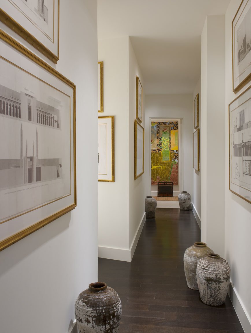
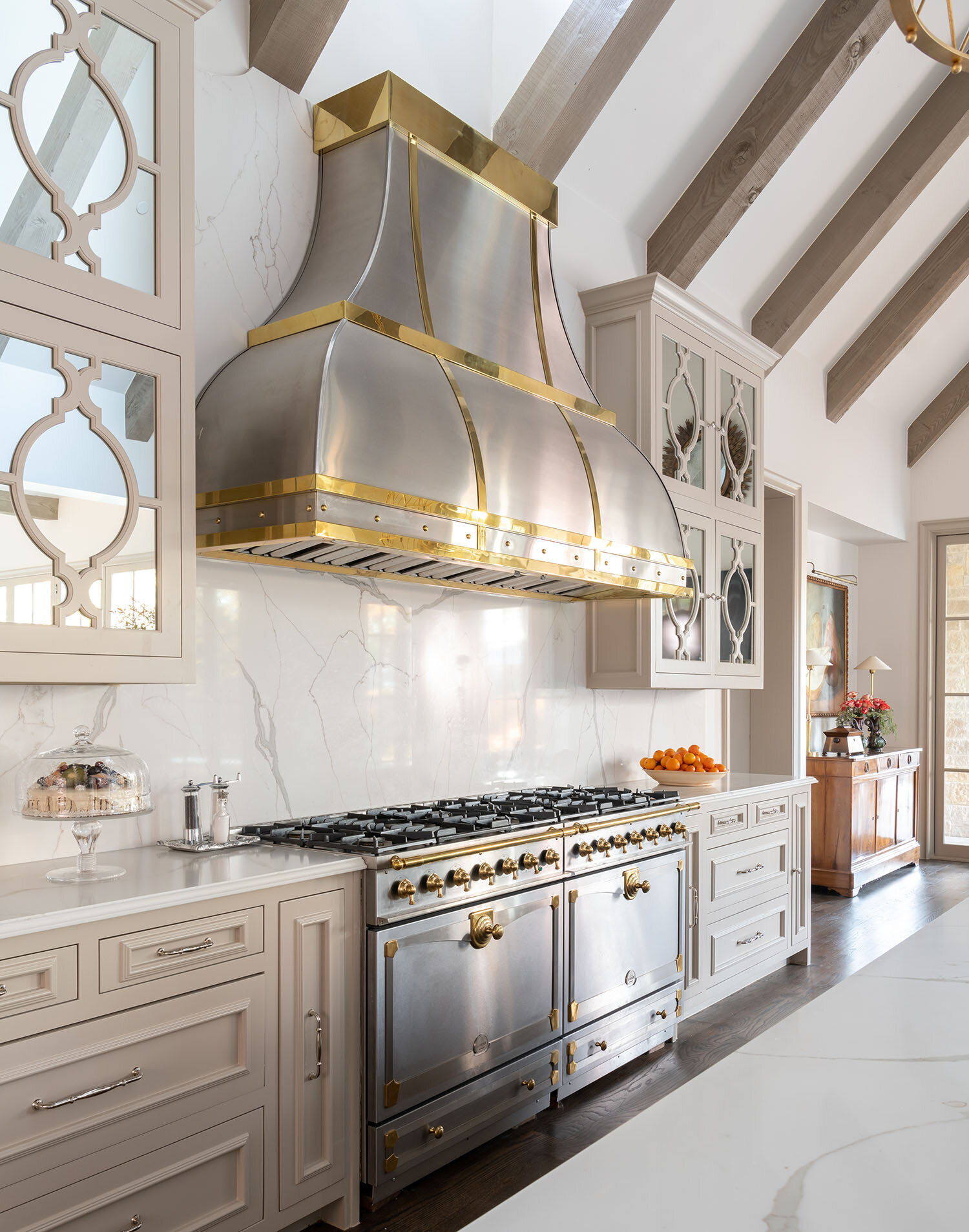
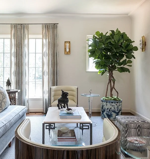
The neutral colors and orange accents in this modern Dallas home complement the light wood floors.

In my last design article, I discussed the different kinds of hardwood flooring available and the pros and cons of each. This follow-up article is aimed at homeowners who already have hardwood flooring but could use some help complementing it with the right décor. If you’ve ever wondered which wall paint colors go best with dark wood floors, which colors are best for light floors, or when to use rugs (and when not to), look no further: I’ll answer these questions and more here.

Start by Identifying Your Wood’s Color Tone

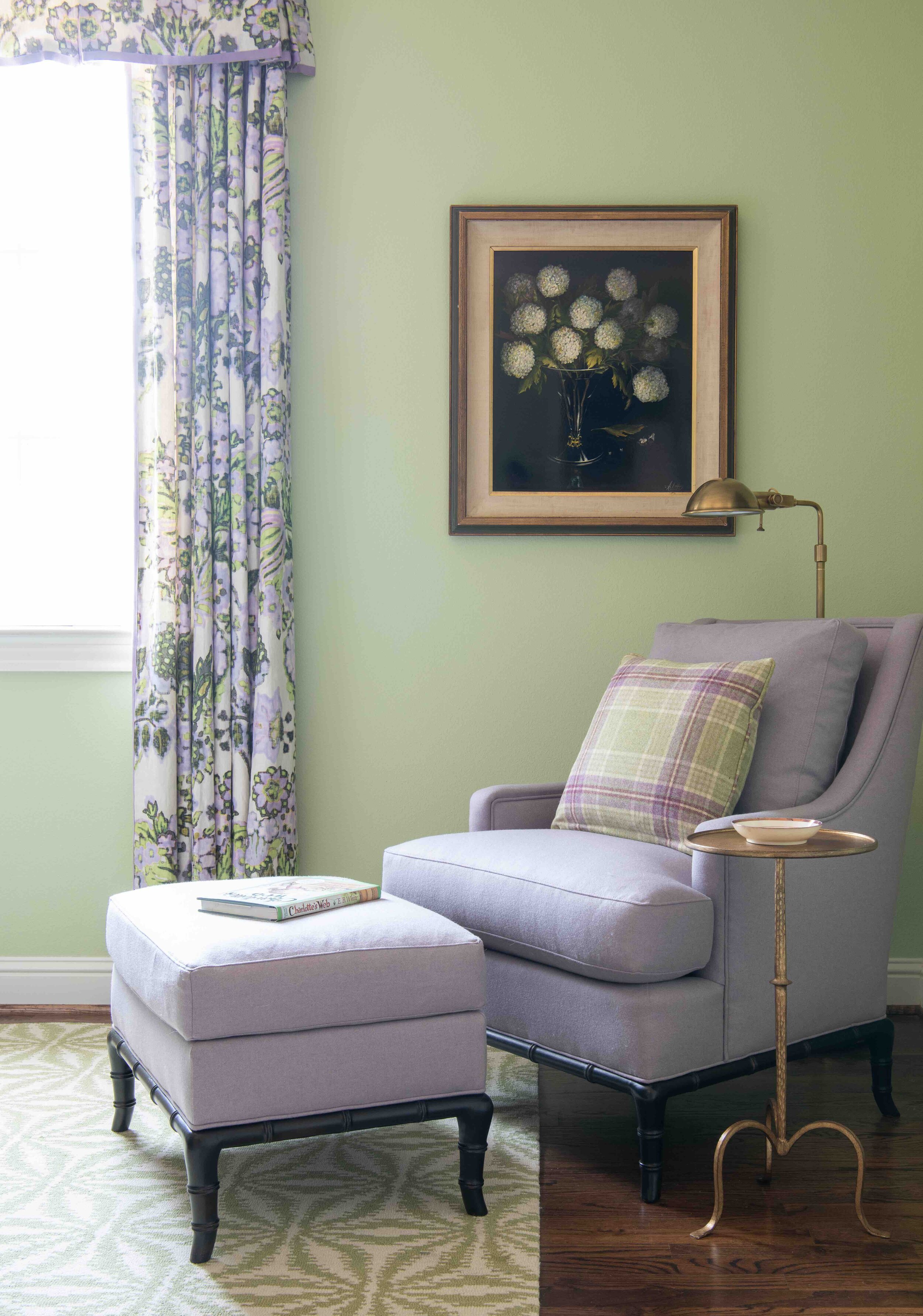
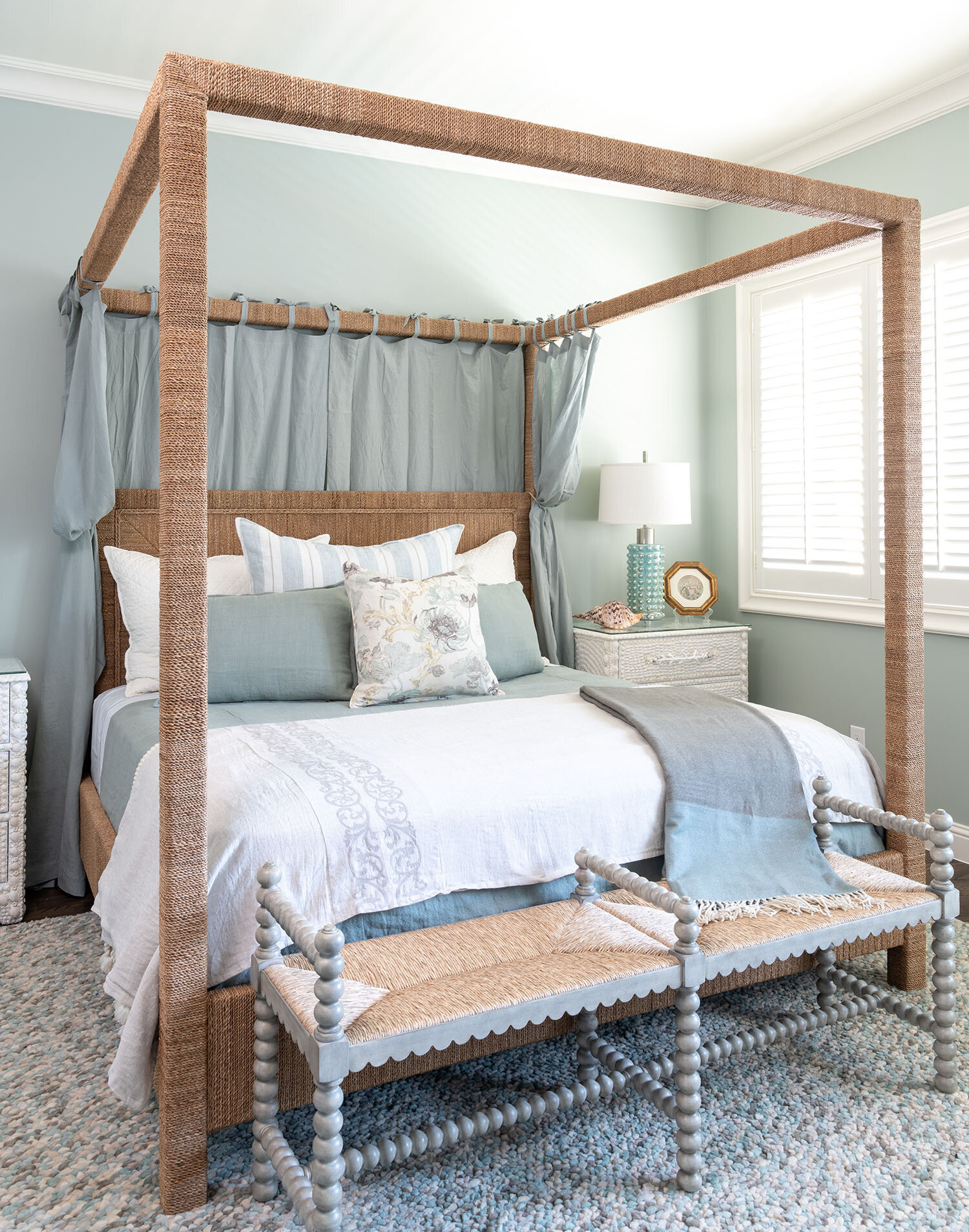
Ideally, the color scheme for a room should harmonize with the wood floor’s undertone color. Depending on its species or finish, wood can have tints of gray, red, orange, or yellow. Oak, for example, can be red or white (I personally prefer white oak because I think it makes a prettier brown). Pastel blue, cream, or apricot are good wall paint colors for a room with red oak floors. Meanwhile, charcoal gray or light gray are attractive wall colors for rooms with white oak floors.

How to Make Dark Wood Floors Shine

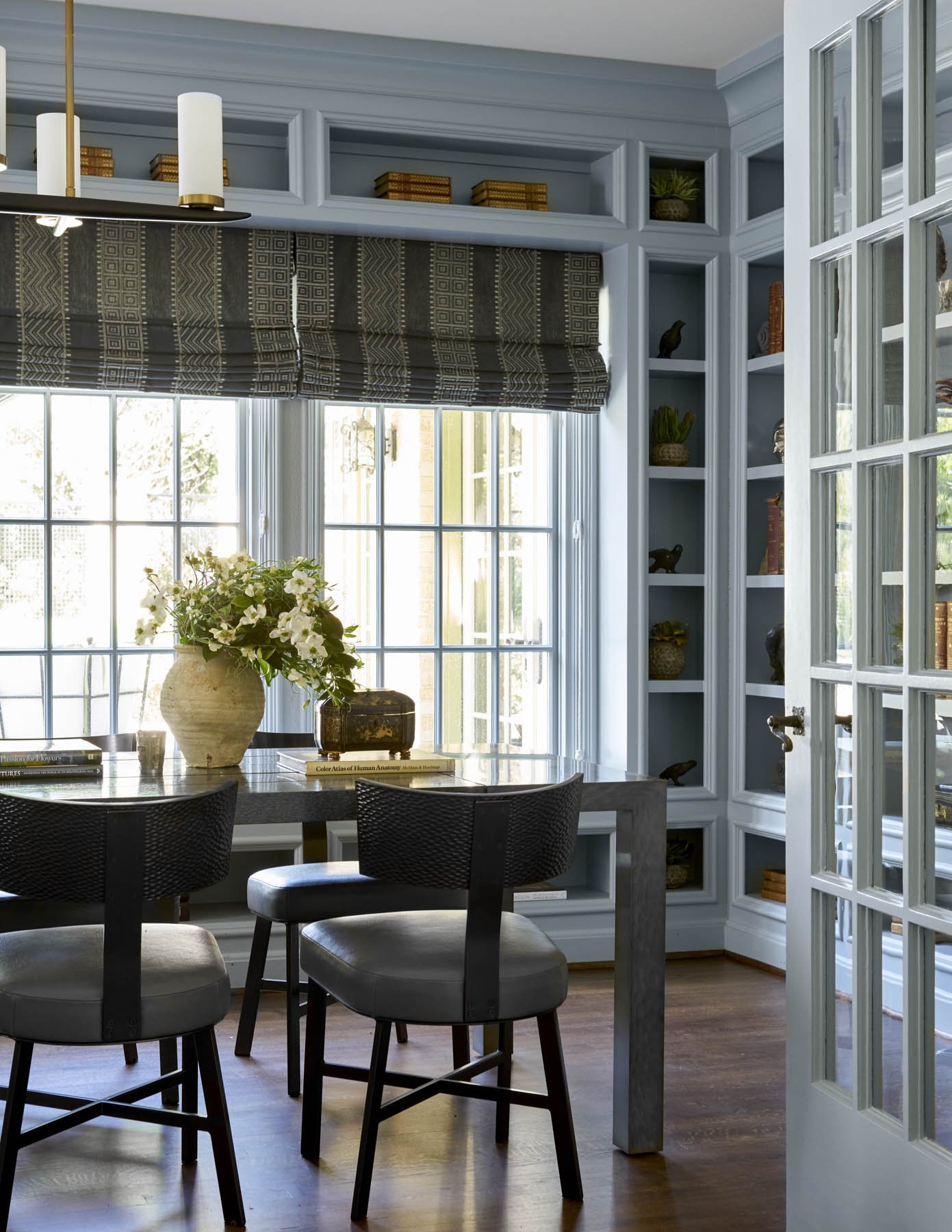
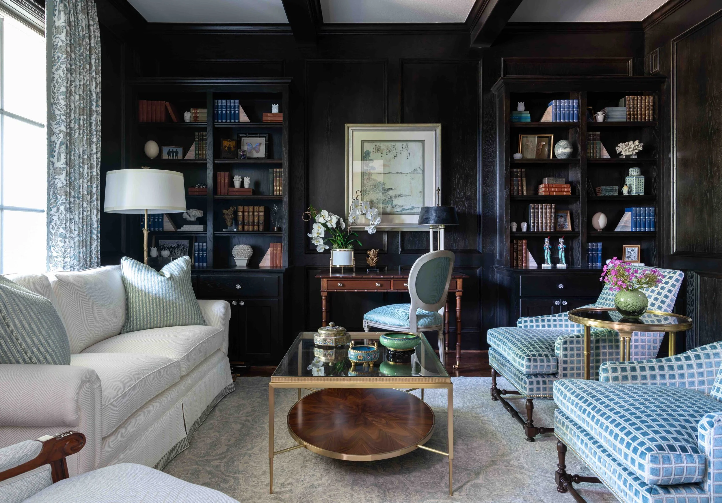
Grey paint, as seen here in the library of a Kessler Park home, is a good wall color to go with dark hardwood floors.

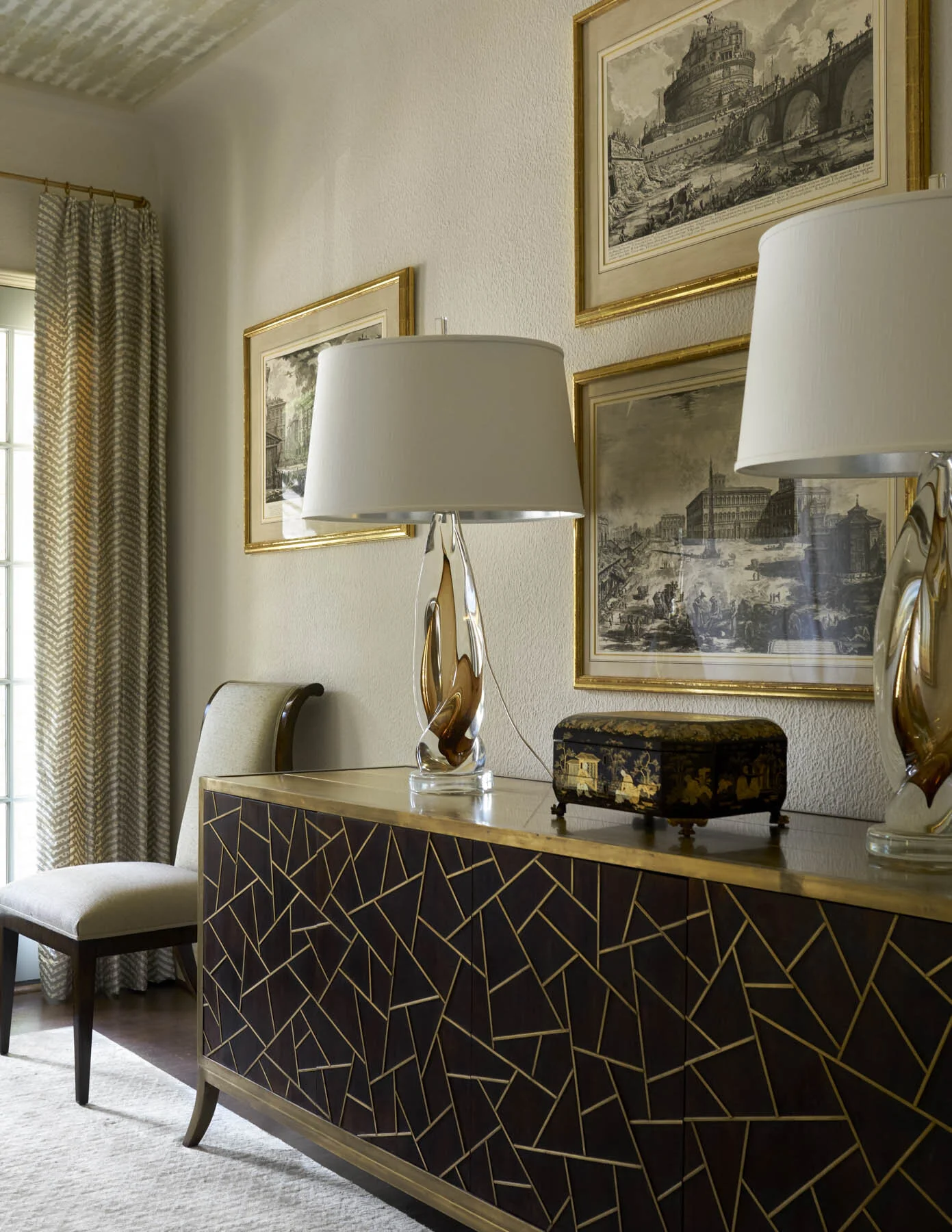
Rooms with dark wood floors need to have light walls to prevent the room from becoming too dark and cave-like. That said, this still leaves a wide variety of paint color options, from cream, to light gray, bronze, light blue, or pale green. Some people will also use painted furniture in light colors to create contrast against the dark floor. A more formal look can be achieved by using dark wood furniture that is a slightly lighter shade than the floors.

Incorporating plants is also a good idea: the bright greenery will really pop against the dark base. Natural light also reflects beautifully against the grain of dark-stained wood, so try to let in as much natural light as possible.

Tips for Working with Light Hardwood Floors

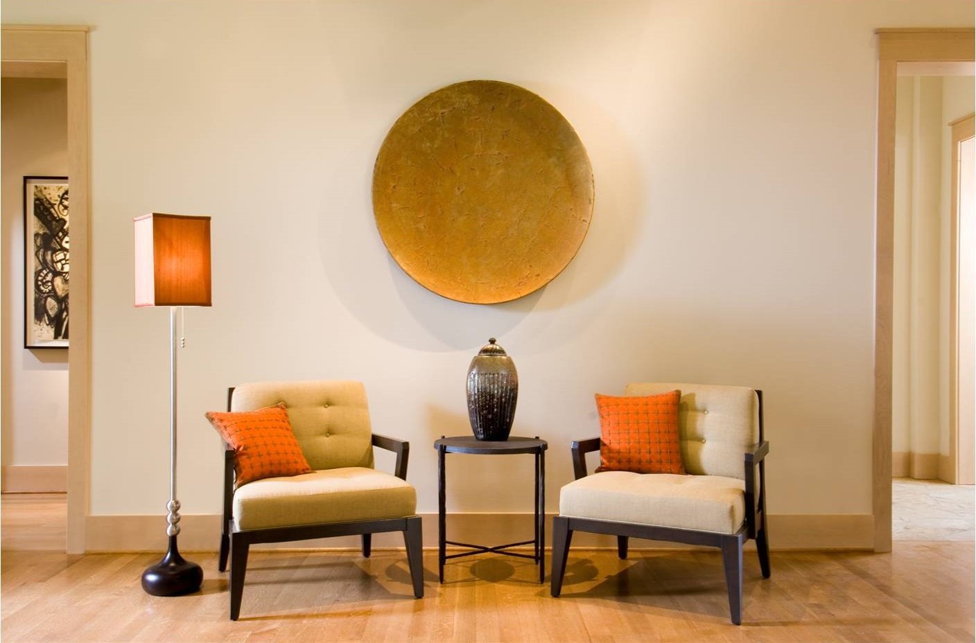
The best wall colors for rooms with light hardwood tend to be neutrals. Off-white will give the room an airy feel, cool gray will create an aura of relaxation, and warm gray will make the room seem cozy and inviting.

White furniture, a sandy brown rug, colorful accents, and gold or silver accessories are a winning combination for light hardwood floors. Some other area rug colors to consider are earth tones, burgundy, and peach. For the furnishings, you could go with grey or black furniture.

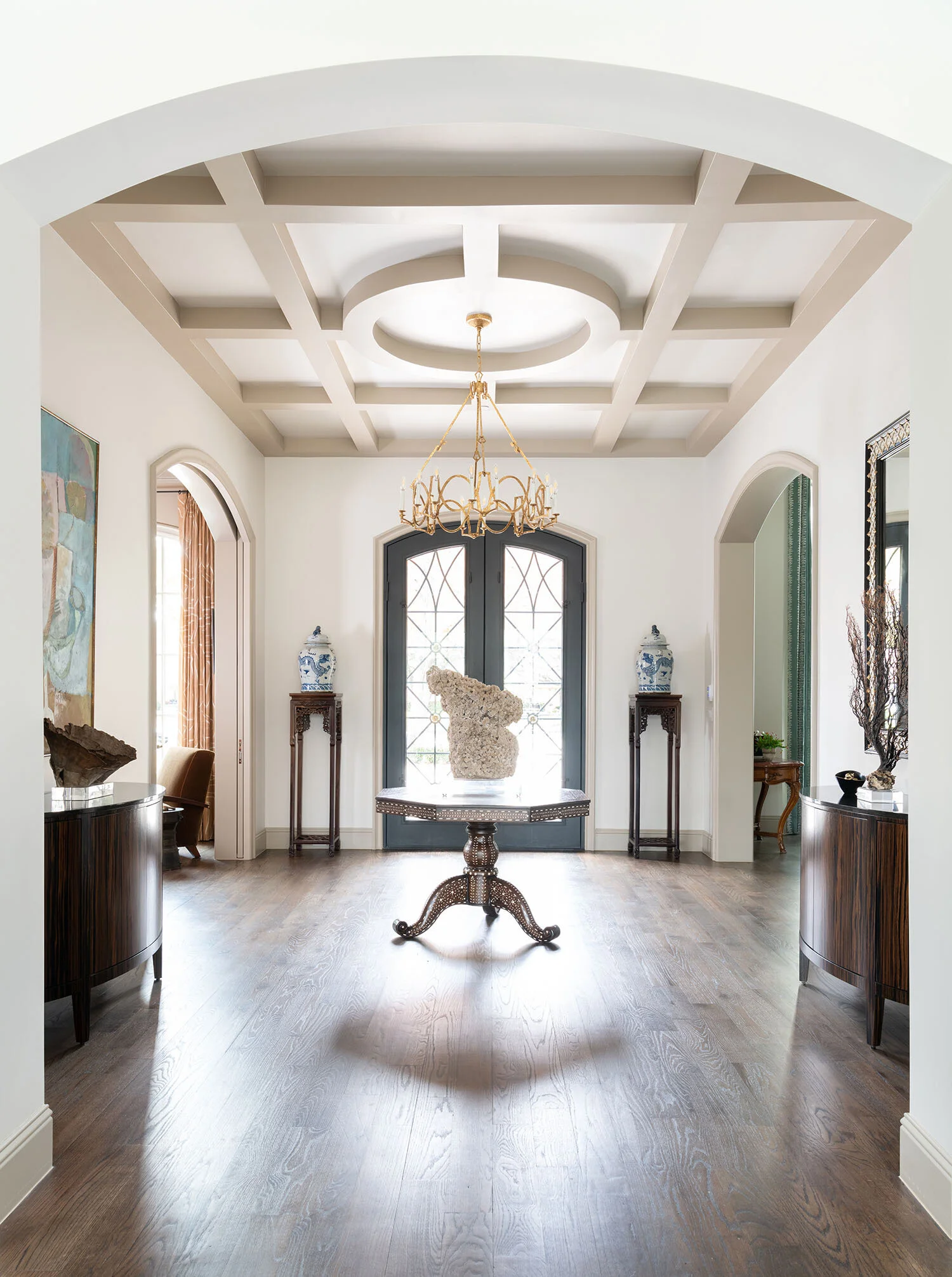
Almost every home with hardwood floors should use rugs.

A Word About Area Rugs

Area rugs are almost always a must for hardwood floors. They protect your floors from daily wear and tear while also softening footfalls. If you have wood furniture that is similar in color or tone to your wood floors, you can use a contrasting rug to create a buffer between them so that they don’t blend together.

Parquet floors are one of the only types of hardwood floors that I wouldn’t recommend using rugs on. Sometimes, the inlaid wood pattern is so busy that it would be overwhelming to break it up even further with rugs.

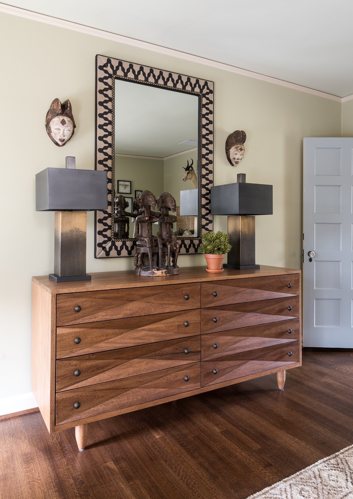
If your home has wood floors, don’t use all wood furniture. You can introduce more variety by including upholstery and pieces made of glass or metal.

Don’t Forget to Mix Up Materials

Though hardwood floors can complement other woods in the same color family, you’ll also need to mix things up by incorporating other materials in the room. Woven fabrics, leather, metal, and upholstery introduce an appealing variety of textures in a room.

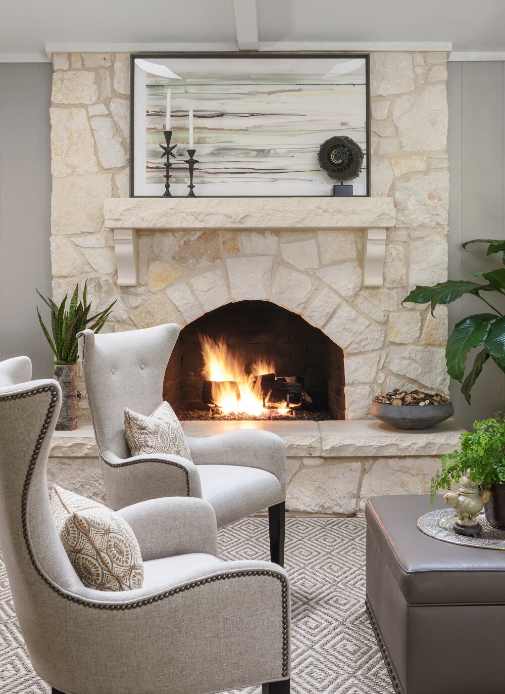
As an example, rich brown hardwood goes well with organic materials, such as a natural stone fireplace. If your wood floor has a bright sheen, you can add some softness into the room with upholstered, curvaceous furniture. Metallics and glass will bring a sleek touch to a modern or contemporary home with white oak floors.

Hardwood is the most sought-after kind of flooring, so if you have it, you’ll naturally want to show it off. By harmonizing your hardwood floors with the right paint colors, furnishings, and fabrics, the process becomes much easier. Those who still find the prospect intimidating would do well to work with a designer.

An experienced designer like myself can take one look at a room with hardwood floors and know exactly which colors and style of furnishings will work best with it and its architecture. If you'd like to work with Chambers Interiors, give us a call at 214-651-7665 or send an email to info@chambersinteriors.com.

RELATED ARTICLES:

Pick Out the Perfect Hardwood Floors with This Five-Step Checklist by Margaret Chambers

Keep in mind that solid hardwood can be sanded and refinished, but some kinds of engineered hardwood cannot.

Hardwood is the preferred choice for flooring among Dallas interior designers and homeowners alike. While tile both looks and feels cold, wood has a sense of warmth, making it a good choice for living spaces and bedrooms. A wood floor with rugs is also more interesting than wall-to-wall carpet, easier to clean, and more hypoallergenic.

If you’re shopping for hardwood flooring for the very first time, you may be experiencing some “analysis paralysis.” Between choosing your wood species, sawing method, plank width, grain pattern, stain and finish, there are a lot of decisions that need to be made. Before you shop, I recommend going over the following checklist to help narrow down your options.

1. Choose between solid or engineered hardwood

Solid hardwood is the more traditional option, but engineered hardwood—in which a thin upper layer of wood is bonded to layers of plywood and composite material—is becoming more and more popular.

The advantages of solid hardwood are that it’s quieter underfoot and has a longer lifespan. If the wood veneer on engineered hardwood is too thin, it can’t be sanded and refinished in the future. The advantage of an engineered hardwood floor is that it is less likely to shift as the wood expands and contracts because different layers of the board create opposing forces on the wood. This makes engineered hardwood the best choice for rooms where moisture can be an issue, like basements and bathrooms.

Seen here are 5” quarter-sawn white oak planks. If you look closely, you can see the irregular patterns of the grain.

2. Choose your wood species

Oak is the most commonly used wood in the US because it is affordable, easy to stain, and durable. Cherry, maple, hickory, walnut and ash are other options, each with their own unique colors and grain patterns. Exotic woods, like Cumaru, Brazilian Koa, and Brazilian Cherry tend to be harder than domestic woods. No matter the species, try to select a wood that is already close to the stain color you want.

3. Choose your cut

Keep in mind that wood planks can also be cut in three different ways, yielding three different grain patterns. The most common and affordable method is plain-sawn, which creates the classic grain pattern with curving V-shaped marks (called cathedrals). A quarter-sawn plank has an intricate pattern of irregular growth rings. The most expensive method, rift-sawn, produces a series of very fine, straight lines.

4. Choose the plank width and pattern

In the past, two to three inches was the standard width for wood floor planks. Today, the latest trend is to use planks that are four to seven inches wide. Wider planks are associated with luxury homes and are an appropriate choice for large rooms. Of course, horizontal planks are not the only kind of wood flooring pattern. I think herringbone patterns go well with entryways, dining rooms, or studies.

The planks in this Kessler Park home are on the thin side, at about two and a half inches wide, which is typical of that period in time.

5. Choose your stain and finish

Dark and light stains are suited for different styles of homes. While light wood floors are a good choice for modern or casual homes, dark wood floors are more traditional and sophisticated. Prefinished wood is already stained with a topcoat applied, so you’ll be able to see what you’re getting. Having the wood finished on-site, however, allows you to choose your own stain color and sheen.

Different finishes can really transform wood flooring. The same wood plank in a mid-gloss, high-gloss, matte, distressed, or wire-brushed finish will look completely different. I suggest staying away from hand-scraped finishes, as they look dated. For high-traffic rooms, I recommend looking into polyurethane coating. It’s a new type of coating that is highly protective and often used for basketball courts. Bona Traffic HD is the brand I recommend: it’s durable but also looks like a beautiful wax.

When we redesigned this 1927 home, we kept the oak hardwood floors but sanded and re-stained them in a darker color.

Do all the different options make your head spin? Try looking at design magazines and focusing on the examples of wood flooring you see. You’ll get a better sense of what stain colors and grain patterns you gravitate towards.

At my firm, we typically use wood flooring with rugs in our projects, so we are very knowledgeable with the different types available and what the latest trends are. When in doubt, it never hurts to consult a professional before you take the plunge! To schedule a free consultation with us, call our Dallas office at 214-651-7665 or send an email to info@chambersinteriors.com.

RELATED ARTICLES:

Stuck on a Room Design? Follow These Four Steps to Find Inspiration by Margaret Chambers

The vaulted ceiling in this Dallas home game room called for extra-large light fixtures.

Do you have a room in your home that you feel “stuck” on? Maybe you have an awkwardly shaped space with unused corners. Or perhaps you made a major purchase, like a dining table, that doesn’t mesh with the surrounding décor like you hoped.

When a client calls me, it’s usually because they’re stuck and afraid to make big decisions. As an interior designer, I like to take the following steps whenever I’m confronted with a challenging room.

Step 1: Make a list of what bothers you the most

Long hallways can be challenging to decorate. We filled these walls with a series of gold-framed antique Egyptian prints.

Take a moment to ask yourself if there are things in the room that you already know aren’t working for you and your family’s lifestyle. Then, put away the majority of your accessories, leaving just your largest pieces of furniture and anything else that you’re absolutely sure you want to work with. Paring a room down to its essentials is one way to encourage you to look at the space in a new light.

If the room feels “off” but you still can’t pinpoint the problem, try taking a photo or a video of the room. There are times where seeing the space in a photo can help you identify imbalances or problem areas that you may have overlooked in real life.

Step 2: Study rooms you love for ideas

At this stage, you’ll probably need some ideas on how to work with your mostly-blank slate. Whenever I’m having trouble with a room, I start looking through magazines and home decorating books for inspiration. I also ask my client to show me their favorite rooms so that I can make sure my design aligns with their tastes.

Although the unusual color combination in these curtains created limitations to work with, we were thankfully able to build a beautiful color scheme around them.

A piece of artwork, a fabric pattern, or something from nature can sometimes give me an idea for a color scheme. In one project I designed in Preston Hollow, the client asked me to use six fabric panels she inherited from her mother. The purple, green, and black colors on the panels created limitations to work with, but they also helped define the colors for the rest of the room. For example, we added a still life and a portrait that belonged to the client’s family, both of which had a lot of black in them. This guest bedroom, with its green wall paint color, purple chair, and black-washed night stands, ended up being one of my favorite spaces in the house.

Step 3: Experiment with pieces you already own

Before you run out to a home goods store, try “shopping at home” first. Take items from other rooms and put them in the blank areas of your problem room. You might be surprised to find that a console from your entryway or a painting from the living room looks even better in a new space.

Don’t be afraid to rearrange furniture into new configurations. After moving furniture around, you should be able to figure out what you can work with, and what will need to be replaced, repainted, or reupholstered.

Step 4: Identify your unique style, and only shop for items that fit it

If you own a lot of multicultural art, you can keep things cohesive by combining pieces that share similar colors.

Sometimes when a room isn’t coming together, it’s because it is filled with heirlooms from different design eras. Now’s the time to decide on what style you want to aim for and buy items that fit consistently into it.

Generally, if you’re going to invest in a new anchor piece, it should be timeless—preferably in a neutral color. Your tastes will evolve as trends change, so you don’t want to splurge on a “trendy” piece and have to replace it again a few years later.

If you’re still having trouble getting your room to look perfect, the next step is to bring in a fresh set of eyes. Have a relative or friend stop by. They might be able to identify the missing piece in your room’s equation. Even better, call in a professional designer. As a designer, I actually enjoy working with my clients’ most challenging rooms. Designing a room is like solving a three-dimensional puzzle, and challenging circumstances often result in the most unique and memorable room in the house. You can reach out to us by calling our Dallas office at 214-232-950 or emailing us at info@chambersinteriors.com.

To fill the high ceiling in this stairway hall in a Dallas home, we used framed, eight-foot-tall wallpaper panels.

Hardware 101: Choosing Styles, Shapes, and Finishes by Margaret Chambers

Always a classic choice for traditional architecture, brass hardware is trendy right now. For this Colleyville remodel, we used brass hardware to bring it up-to-date.

Hardware is often described as the “jewelry of the home,” but it’s more than just an accessory to your interior design. Hardware is something that you’ll be looking at and putting your hands on every day, so it needs to be both stylish and comfortable to use.

However, finding the right hardware isn’t always easy. There are many different shapes, styles, and finishes to choose from, and not all of them will look flattering in your home. Here are some things I as a designer consider when I’m helping a client choose their hardware for a new house or remodel.

Brass hardware and white-painted cabinetry are an appealing combination.

1. Make a List of Everything You Need

To begin, go through and count how many new handles, knobs, pulls, hinges, and faucets you will need in total. Determine your budget and how large you want the new hardware to be. Don’t forget to stop and think about how you want the hardware to feel, too. Whenever possible, try out samples at the hardware store so you can see how they fit your hand. It doesn’t matter how beautiful the hardware is if it’s cumbersome to use.

2. Learn About the Different Kinds of Hardware Available

If you’re updating your interior door handles, your two main choices are levers and knobs. Levers are usually used in contemporary homes, while knobs are great in traditional and transitional style homes. Keep in mind that knobs are more difficult to handle for those with mobility issues, the elderly, and young children. Knobs, unlike levers, can be easily child-proofed.

You should also make a note of which doors will need locks. Passage knobs are for doors that don’t need to be locked. Privacy knobs lock on one side, while keyed entry knobs lock from both sides. Dummy knobs don’t have any moving parts, meaning they don’t turn and click. They’re usually used for closet doors and pantries.

We chose hardware with a satin brass finish (seen here) for this Dallas remodel, as well as a satin nickel finish for the faucets in the main kitchen. This project was designed in collaboration with Helene's Luxury Kitchens.

Photo courtesy of First Showing Photography

As far as style goes, traditional homes usually look best with hardware that has rounded curves and intricate details instead of sharp angles. Meanwhile, simple, angular hardware is suited for contemporary interior design. These days, I see modern kitchens using very long drawer handles. Pot fillers have been a fad the last five years, but I try to steer my clients away from them. They distract from the cooktop and backsplash, so I think they’re a fad that won’t last.

3. Pick Up to Four Finishes to Use Throughout the Home

Believe it or not, it’s perfectly acceptable to mix finishes. The ideal range is three to four finishes in a home, with no more than two different finishes per room. If your heart is set on a door handle finish that looks good in one room but not the next, look into getting a “split finish,” in which the handle has a different finish on either side.

Your hardware finish choices should reflect your home’s style of architecture. For example, I would use oil-rubbed bronze in an Italian home, brass in a French, English, or Federal home, and either satin nickel or chrome in a contemporary home. Brass, by the way, is having a huge comeback. Another trendy finish that designers have been using the last few years is matte black.

To choose a complementary finish for your doors and cabinets, focus on color temperature. If your doors are painted a warm white, you should choose doorknobs with a warm finish, such as brass, polished nickel, or oil-rubbed bronze. If your doors are painted a cool color, like cool gray, I recommend hardware with a cool finish, like chrome. Remember that your hardware should also complement your light fixtures, especially your sconces.

This kitchen is an example of how to combine mixed metals effectively. The hardware is polished nickel, the pendant chandeliers are brass, and the vent hood is made of steel and brass.

Since hardware is situated at the front and center of all your doors and cabinetry, when in doubt, pick a style that is simple and timeless. If this is your first time choosing your own hardware, you may want to reach out to a designer like myself. With almost every job, I have to select and place the hardware, so I have a lot of experience mixing different styles and finishes in a single home. If you're interested in working with me and my design firm, call our Dallas office at 214-232-9501 or send an email to info@chambersinteriors.com.

RELATED ARTICLES:

Four Pointers for Teenage Bedroom Design by Margaret Chambers

Wall art is an important asset for giving a teenage bedroom its individuality.

Designing a teenage bedroom can be an interesting challenge. At this point, the nursery décor your teen grew up with has got to go. On the other hand, you can’t simply decorate the room the same way you would with an adult bedroom. Striking the right balance between casual and formal is key here. Your teen will also want to be included in the design process, so it’s important to keep their interests in mind.

Every teen bedroom should be a unique expression of that teen’s personality. However, there are also some general guidelines that can be applied to any teenage bedroom. Before you begin with your interior design project, keep these pointers in mind.

1. Create Separate Zones for Resting, Studying, and Socializing

Colors like pastel green and purple are excellent alternatives to pink for a teenage girl bedroom’s color scheme.

Chances are, this is the room your teen will spend the most time in. Any teen bedroom needs to be a refuge, a home study, and also a hangout space for them and their friends. Make sure there’s a designated zone for each of these. One thing to remember is that your teen might want to take their furniture with them when they move out, so don’t break the budget on furnishings. 

A comfortable work desk will help your teen stay focused and on-task. If the room is too small for a separate seating area, you could also create a lounging space on the floor with pillows and a rug, or add ottomans to the foot of the bed. For a teenage girl’s bedroom, you’ll probably want to include luxurious fabrics, like velvet pillows, soft blankets and bedding, gauzy curtains, or thick-pile rugs.

Navy blue and brick red are both great colors for a boy’s room, like this one we designed for a Preston Hollow home.

2. Use Your Teen’s Favorite Colors in a Sophisticated Way

One of the easiest ways to differentiate between a child and a teenage bedroom is through color choices. While nurseries usually have pastel colors, and most adult bedrooms are in neutrals, teens tend to gravitate to bold color combinations. Even if the majority of the furniture in the room is neutral, there should ideally be a burst of your teen’s favorite color somewhere.

For teen boy bedrooms, navy blue or warm neutrals (such as warm gray) are popular wall colors. Today’s teenage girls usually prefer green, purple, grey, or blue over pink as the dominant color in their rooms. Purple is a versatile color in that some shades can be whimsical (like lavender) while others are romantic (like deep purple). While touring homes, I’ve noticed that teenage girls’ rooms often have a lot of white furniture.

3. Plan for Plenty of Storage Space

If you have a teen who keeps their room tidy, you have a rare teen indeed. That said, including enough storage space and shelving in the bedroom can go a long way towards helping your teen keep clutter out of sight. The room’s overall design should also be clean and minimal, but not too fussy. Remember that your teen will almost certainly want a room with a more casual and approachable vibe.

A bedside table with pullout drawers is a good choice for adding storage to a small teen bedroom.

4. Design Around Accents and Art that Express Your Teen’s Individuality

Before you begin decorating in earnest, ask your teen if they have art pieces or prints in mind that express their personality. You can potentially use art pieces as a focal point or as a source of stylistic inspiration for the rest of the room. Some other ways to set your teen’s room apart from those of their friends include: incorporating an unusual piece of furniture that makes a conversation piece, adding wallpaper to the ceiling, or wallpapering an accent wall.

Your teen will appreciate having something fun and unique in the room, such as these framed insects on the wall.

Sometimes even when you follow recommended design guidelines, it can still be difficult to bring everything together. In cases like these, your next step should be to consult a professional designer. When I work with clients with teens, I ask my clients to provide examples of rooms that inspire them. An experienced designer such as myself will know how to accommodate both the parents and the teenager’s requests and deliver a result that will wow them and visitors alike. To schedule a free consultation with us, send an email to info@chambersinteriors.com or call our Dallas office at 214-232-9501.

RELATED ARTICLES:

Don’t Let Your Kitchen Backsplash Be a Missed Opportunity by Margaret Chambers

This backsplash around the window in this catering kitchen is made of the same marble that we used for the countertops.

Although kitchen backsplashes have a functional purpose—protecting walls from water, grease stains, mold, and mildew—these days, they are also treated as an important design element. After all, the backsplash is right on the wall, so a visitor’s eyes naturally rest there. Despite the fact that backsplashes can make great focal points, many Dallas homeowners save picking their backsplash tiles for last.

Your kitchen design will look more impressive if you pick your backsplash tile early on and design around it. For those of you who are designing a new home or planning on remodeling your current kitchen, you should find the following tips useful.

A backsplash should cover the wall space between the countertop and upper cabinets above your range. Lately, I’ve noticed that the newest trend is to have the backsplash continue up beyond the upper cabinets, sometimes even up behind the vent hood. To figure out how much square footage of tile you’ll need, multiply the width of your wall by the height. Then, increase that number by ten percent just to make absolutely sure you’ll have enough.

When possible, we like to continue the backsplash behind the vent hood, like in this example from a Dallas kitchen.

Ceramic, stainless steel, porcelain, and stone backsplashes are great against oil and grease. Glass tile is perfectly water-resistant, so if you create a lot of steam when you cook, that’s something to consider. You should also think about how much maintenance you’re willing to accept for your backsplash. Ceramic tile doesn’t need to be resealed, but natural stone will.

Even if you’re saving money on your tile choice, don’t cut corners with your grout choice. You need a high-quality grout to make sure the tiles stay on the wall over time. Most tile backsplashes have a grout joint size of one-eighth of an inch, but sizes of up to a quarter inch are also possible.

Since replacing tile is expensive, you can never be too careful making your choice. Purchase a lot of different tile samples to take home (it’s cheaper than buying a lot of the wrong tile), then tape them to your wall and leave them up for a while. You can see how the color shifts as the lighting changes through the day.

Subway tile, like the gray tile we used in this bar area, is a classic choice for kitchen backsplashes.

Recently, my design firm has been using the same material for both the countertop and kitchen backsplash. Whether you use the same material or not, try not to create too much contrast between the two surfaces. For example, if your countertops are a cool gray, your backsplash should also be in a cool color.

The gray and terracotta colors in this mosaic tile backsplash match other colors we used in this Kessler Park home.

Mosaic tile patterns often incorporate multiple colors, allowing you to pick up on some of the other accent colors you’re using in the kitchen. If you have countertops with a unique pattern or color running through them, it’s a good idea to pick a neutral backsplash tile so you don’t draw attention away from your countertops. Of course, if your countertops are understated, you have more room to be creative and showy in your backsplash tile choice.

Choosing a timeless backsplash is important if you’re planning on selling your house. White subway tile is one option, but also consider penny tiles, picket tiles, square tiles, or hexagon tiles. White subway tile is also perfect for kitchens that have a lot going on, visually. Although it’s normally laid out in a brick pattern, a newer trend is to lay the tiles diagonally or vertically. Another thing to keep in mind is that larger tiles tend to look more contemporary, while smaller tiles feel more traditional.

Although there is no one-size-fits-all solution to finding the perfect backsplash, some tile choices will work in your kitchen better than others. By taking into account your budget, your lifestyle, and the rest of your kitchen’s aesthetic, you can easily narrow down your selections.

We used this fireplace screen with animal figures as a kitchen backsplash. It helps to complete the farmhouse theme.

Designers like myself also have established relationships with showrooms which gives us more leeway to request a tile and then return it on short notice. A designer can be a great resource whether you are just beginning your kitchen design project or nearing the end. If you'd like to work with us, you can reach us by calling our Dallas office at 214-232-9501 or sending an email to info@chambersinteriors.com.

RELATED ARTICLES:

A Designer’s Guide to Selecting the Best Tiles for Your Bathroom by Margaret Chambers

Patterned tiles, like the ones we used in this Preston Hollow pool bathroom, can add a lot of impact to a small space.

One of the reasons choosing tiles for your bathroom can be so tricky is that there are a lot of options, but not all of them will still look current in a few years. And, unfortunately, swapping out tile is not an easy project. The key is to find the right balance between a tile that is timeless but also has some character to it. The most important factors to consider are: the size of your bathroom, your preferred colors, and what pattern you want the tiles to be installed in.

Tile Sizes:

Different parts of your bathroom call for different sizes of tiles. For example, if you have a shower bench, a larger slab will feel more comfortable to sit on than a lot of smaller tiles. At my design firm, we usually use matching slabs of the same material for both the shower seat and the sink countertop.

This shower we remodeled in a Colleyville home has small mosaic tiles on the floor for safety and security.

Mosaic tile has more grout lines, which makes it suitable for shower floors: more grout lines equal better drainage and more traction. Ideally, the tiles should be two inches or smaller. Mosaic tiles are not the only choice for shower floors, however. Slip-resistant ceramic is another safe option.

Tile Colors:

The most popular tile for bathrooms is white subway tile. I recommend choosing a bright white tile if your toilet, bathtub, and sink are also bright white. Sometimes, a warmer white (such as a biscuit color) is preferable, especially in traditional houses.

I personally consider bold accent tiles to be dated. I haven’t used them in my projects for a decade. Instead of having a border of accent tiles in your bathroom, I suggest combining a neutral tile (like white or gray) with an interesting wallpaper or paint color.

These floor tiles are cut in a fresh new version of a traditional pattern. The biscuit white color matches the tub.

Remember the rule of three: a patterned tile should contain no more than three colors, and you should stick to no more than three varieties of tile in the entire bathroom. A good starting point is to pick out a tile you really love and then pick two other tile types that complement it.

Something to note about dark grout is that it shows efflorescence (light grey spots from salts) over time. White grout will show dirt more easily, so make sure to use grout sealer and thin grout lines if you choose white for your grout color.

Tile Materials:

Ceramic is the most affordable tile, so it’s a good choice for covering large areas such as your floor. Porcelain is more expensive, but many people prefer it for the following reasons: it’s more durable, and the color goes all the way through the tile instead of being merely glazed on top. That way, if a porcelain tile is chipped, the color that shows underneath is the same.

Glass tile is great for an accent wall, but it’s also slippery, so don’t use it on the floor. If you’re interested in glass tile, try shopping for it in person instead of online. Seeing it in person helps you get a better sense of its color and shine.

Tile Placement and Patterns:

Tile should be used on every side of the shower except for the door or curtain. I like to encourage my clients to also cover the shower ceiling with tile instead of paint, since paint can peel in humidity.

A common piece of advice is to install floor tiles diagonally to makes a small bathroom feel more expansive. Just keep in mind that attention-grabbing patterns like diagonal and herringbone should only be used with simple tile patterns that have subtle grout lines. The most conservative patterns for tile are “running bond” (which looks like an alternating brick pattern) and “stacked,” in which rows of tiles are stacked vertically from top to bottom.

This floor has small hexagon-shaped tiles that run into the shower, while the shower walls have herringbone tiles.

The right tile choices can make or break a bathroom, so it’s worth your time to research and proceed with caution. After all, it’s a costly mistake to pick the wrong tile. If you’re hesitating between several different options, then it might be time to consult a professional designer. An experienced designer like myself will be able to point you towards options that are both practical and pleasing to the eye. To schedule a free consultation with us, send an email to info@chambersinteriors.com or call our Dallas office at 214-232-9501.

RELATED ARTICLES:

How to Set a Gorgeous Table for the Holidays by Margaret Chambers

The table setting for this University Park dining room is garden-themed. The china has hand-painted botanical and butterfly motifs.

Although certain images and colors come to mind for holiday table settings, there is plenty of room for you to get creative too. In this article, I’ll go over best practices for table settings, so you can dress a great table any time of the year.

General Tips for Table Settings:

Step 1: Laying a Foundation

If you’re at a loss on where to begin, try picking a visual element that you enjoy—such as a color, type of flower, or a pattern—and basing the rest of your design around it. Another good starting point is choosing your tablecloth (which forms the foundation of your design) first. That said, many homeowners today prefer to use placemats and chargers instead of a tablecloth.

This green-and-white ikat tablecloth is custom-made from Vervain Fabrics.

You can also consider if you want to use a table pad under your tablecloth. Table pads protect your table from heat and spills. Your runner should have a color that matches at least one other element in the room, such as the upholstery on the dining chairs or the paint color on the walls.

Step 2: Place Settings

How you set the table depends on whether your event is a casual or formal one. For a formal dinner, there are certain guidelines to keep in mind in regards to silverware and stemware placement. Don’t be afraid to adjust the arrangement a bit if it makes more sense for your table. For example, although bread plates usually go on the upper left, they may look better on the lower left for your table setting.

If you’re buying a new set of dishes, go with a neutral color and an understated pattern. That way, your plates will mix and match with a variety of different tablescapes in the future. Old and new china patterns can coordinate as long as they share the same color scheme.

There are many ways to fold a napkin, the easiest of which is to pass the napkin through a pretty napkin ring. If your napkins have detailing on the ends, make sure that the details will still be visible after folding. Monogrammed napkins are particularly popular right now.

Step 3: Choosing a Centerpiece and Accessories

Most people use a large flower arrangement as their table centerpiece, but it’s not the only option. For contemporary dining rooms, a clay or metal abstract sculpture can be a good alternative.

This ginger jar contains paper lanterns, bittersweet, and willow branches, which add a burst of orange to the table.

A single centerpiece won’t be enough to balance a large table. You’ll want to even things out by scattering small vases or baskets across the table with a variety of greens. Regardless of what you use to decorate the table, nothing should be so tall that it blocks conversation between seated guests.

Decorating with fresh fruits is another way to add something organic to the table. Lemons, limes, oranges, pomegranates, and red currants all make beautiful table decorations.

Design Advice for Holiday Table Settings

By using natural materials, earth tones, and reds, we were able to give this table setting a cheerful autumnal feel.

Your holiday colors don’t have to be red, green, blue, or white—in fact, those colors may clash with the rest of the décor in your dining room. If you’d like to branch out, try jewel tones like raspberry, teal, or deep purple. You can also give your holiday table setting a more upscale touch by including metallic accents. As an example, you can pick a tablecloth or runner with a subtle gold pattern and use bright gold chargers on top.

Adding a woodsy element, like branches or pinecones, is one way to give a Christmas table setting a more rustic feel. Candles are a common table accessory any time of the year, but during the holidays, they’re a must. Stay away from scented candles, however: they can interfere with the aromas of the meal you serve.

Table settings are often one of the last home decorating projects that people do during the holidays. However, there is no need for yours to be a last-minute scramble. By picking your theme and ordering flowers in advance, you can make setting the table a more enjoyable and stress-free process this year.

Need some extra help getting ready for the holidays? Some of my clients ask me to come back and decorate their homes for Christmas, so my firm has a lot of experience with holiday decorating. Schedule a free consultation with us by calling our Dallas office at 214-232-9501 or emailing us at info@chambersinteriors.com.

RELATED ARTICLES:

6 Reasons Why Framed Wallpaper Panels Are Hot Right Now by Margaret Chambers

We hung these de Gournay panels in a rising sequence. The panels add interest to the wall of this high-ceilinged room.

The words “wallpaper” and “trendy” might sound like an odd combination, but as it turns out, wallpaper has been coming back in a big way in Dallas homes over the last three or four years. One of the trendiest ways to use wallpaper is to take individual panels, frame them, and display them as art.

If you’ve never seen framed wallpaper panels in action, you might be wondering why someone would choose them over papering an entire wall or room. Here are some reasons why interior designers like myself recommend them:

  1. They are less of a commitment.

    It’s much easier to remove framed panels from a wall than it is to remove wallpaper from the wall itself.

  2. They are more affordable.

    If you have your sights set on very expensive, hand-painted wallpaper brands like Gracie or de Gournay, you can bring down the costs by only buying the panels you need. They’re also a smart way to add wallpaper to large voids, like in a high-ceilinged room or a staircase. After all, it’s easier to use several panels of matching wallpaper than it is to find several pieces of matching artwork.

  3. Using panels can help break up bold patterns.

    Sometimes a dramatic wallpaper would be too much for your room. But the same pattern divided into visual blocks could possibly fit better into your design.

  4. You can take them with you to your next home.

    Once applied directly to the wall, most brands of wallpaper can’t be reused. Framed wallpaper panels, however, can come with you when you move, making them a wise investment. They’re a great option for renters, too.

  5. Framed wallpaper panels are less hassle.

    Even if you’re planning on framing the panels yourself, this will still be an easier project than putting up wallpaper.

  6. They can add some much-needed interest to plain walls.

    For example, framed wallpaper panels are great for homes without many architectural details.

Sounds appealing, right? If you’re sold on the idea but don’t have much experience with wallpaper, here are some pointers to help you get started.

Before you even pick a pattern, measure your wall space carefully so that you can figure out how many panels you need and what their dimensions should be. Once you have your measurements, then it’s time to decide what color and pattern you want. The dominant color in your wallpaper pattern should be based on at least one other color from the surrounding room, even if it’s just a secondary color.

On the other hand, if you’ve already found the wallpaper you love but haven’t designed the rest of the room, you can use the wallpaper as inspiration for the room’s color scheme. Wallpapers with neutral colors and touchable textures (like linen or painted grass cloth) are another creative option if you don’t normally decorate with bold colors or patterns. “Busy” patterned wallpapers should be used in spaces that are otherwise clean and simple in style. That way, your panels will command attention without making the room feel overwhelming.

We used Gracie wallpaper panels in this upstairs hallway. Although they are part of a set, each panel is unique.

Your choice of frame can have a bigger impact on the wallpaper’s presentation than you might expect, so pick a complementary one. For example, one-inch gold bamboo frames are the perfect match for chinoiserie wallpaper. Your frames should always be small to make them lightweight and keep the focus on the wallpaper itself. Another thing to note is that adding glass will make your wallpaper panels much heavier and more difficult to hang, so I don’t advise it at all.

I myself have worked with framed wallpaper panels on two Dallas projects recently. For one project, we used Gracie panels in the client’s upstairs hallway. On the other project, we hung de Gournay panels in a rising sequence along the wall next to the staircase. If you’re interested in adding this surprising alternative to artwork to your walls, but could use help making measurements, picking the right pattern, and picking the right frame, give us a call. You can reach our Dallas office by calling 214-232-9501, or you can send an email to info@chambersinteriors.com. I personally believe that this is one of those occasional design trends that is classically beautiful enough to stand the test of time.

RELATED ARTICLES:

Professional Tips for Adding Plants to Your Space by Margaret Chambers

Adding greenery helps to soften this white-and-gray den we designed for a Dallas home.

Thumb through a home decorating magazine, and you’ll probably notice that most of the photos have plants in them. Plants aren’t just beautiful: they can filter carbon dioxide out of the air, grow herbs right in your home, make a room feel bigger, and brighten your mood. If you’re about to take a trip to the nursery and are wondering where your plants will go when you get home, read on for some designer tips on incorporating either live or faux plants into a space.

Tips for Decorating With Live Plants:

Begin by looking for any unused corners, shelves, or trays where plants could go. You should also note whether your windows are facing north, south, east, or west. Generally, south-facing windows get the brightest light, eastern and western windows get medium light, and north windows receive low light. This information will be handy when you shop, since nursery plants should come with a tag that lists their light and water needs.

For the most impact, you can’t go wrong with putting a large potted plant or indoor tree in your living room corner. Some other great places to display potted plants include balconies and on tables (such as breakfast tables, coffee tables, and dining tables). My personal favorite containers for plants are blue-and-white porcelain pots and attractive baskets. Keep in mind that your plant containers should match the overall style for your house. While blue-and-white pottery is more traditional, containers made of sleek metal or ceramic are more contemporary. Baskets can go either way.

Sometimes the only plant you need is a tall potted plant in the corner, like the one we used in this Dallas game room.

Once you’ve found the perfect spot for each of your new plants, you’ll need to keep them healthy and looking their best. If you notice a layer of dust collecting on the leaves, wipe them with a soft, damp cloth. Many plants will lean towards the light, so to keep them growing straight, rotate the pot so it leans back in the other direction. Actively growing plants may need to be re-potted either once a year, or once every two years (depending on the size of the plant) to give them more room to grow.

Tips for Decorating With Faux Plants:

If you’re intimidated by the upkeep required with live plants, faux plants can be a great alternative. The only maintenance they require is an occasional dusting. It’s also a smart idea to have faux plants if you travel a lot—after all, there’s nothing more unattractive for a home than a dying plant.

This living area combines rough textures with smooth surfaces, like the flower bowl on the console and the glass vase.

The most important consideration for choosing a faux plant is its realism. Thankfully, the quality of faux plants has improved dramatically in the past ten years. Nowadays, you can buy a faux tree for your home that is made with faux leaves attached to real wooden branches. Manufacturers have also started to vary the size and color of the leaves on these products, which goes a long way to creating a realistic look.

While shopping for your next faux plant, take a close look at where it attaches to its container. A well-designed faux succulent, for example, might have fake rocks at the bottom instead of foam. To make your faux plants even more difficult to distinguish from the real thing, try mixing them in with any live plants you do have, or putting them near a sunny window. Don’t put two of the same kind of faux plant next to each other; the uniformity between the two will be too obvious.

Another low-maintenance option is to buy preserved boxwood topiaries. Boxwood can be specially treated to preserve its texture and color for the long-term. Simply mist the leaves with water once a month, keep them out of direct sunlight, and you’re good to go.

This dining room includes both contemporary and traditional elements. The flower vases are antique porcelain.

Any home will benefit from a few well-placed plants, whether they’re live or faux. There are just as many ways to decorate with plants as there are varieties of plants, so don’t be afraid to get creative!

With every project we do, one of the finishing elements is to add plants and select containers. So, not only do we have a lot of experience decorating with live plants, but we also have great sources for faux plants that are only available through designers. If you could use some help selecting and placing plants in your home, give us a call. We can be reached by email at info@chambersinteriors.com or by calling our Dallas office at 214-232-9501.

RELATED ARTICLES:

Turn Your Home Into a Personal Getaway With Travel-Inspired Décor by Margaret Chambers

A soothing color palette helps to soften the rough, organic textures we used in this Cape Cod style bedroom in Dallas.

A soothing color palette helps to soften the rough, organic textures we used in this Cape Cod style bedroom in Dallas.

With travel restrictions in place due to COVID-19, many Dallas homeowners are wanting to surround themselves with memories of their time abroad. This may be why travel-inspired interior design is one of 2021’s trending looks.

Interior designers like myself often have our own favorite travel destinations and multicultural design influences. Over the course of my design career, I’ve been to Europe twelve times. I’ve also found inspiration in my travels to China, Mexico, and Canada. My business partner, Lea Barfield, and I own an antique buying trip business called Tour Décor, which helps our clients source European pieces for their residences.

When I take on a new design job, I enjoy finding ways to incorporate any antiques or multicultural art that my clients have collected over the years. Below, you’ll find some design tips and tricks for highlighting travel mementos in a sophisticated way.

Getting Started

Pictured is a collection of African milk bowls that we selected for our clients, displayed together on a kitchen wall.

Pictured is a collection of African milk bowls that we selected for our clients, displayed together on a kitchen wall.

One way to begin is by picking out a single piece you acquired abroad and using it as a touchpoint for the rest of the room. Putting together a collection of art from a place you’ve visited, or a gallery wall of travel photos, is another great way to memorialize.

If you’re an experienced traveler with many favorite destinations, you may have trouble narrowing down which styles to incorporate into your home. When in doubt, stick with what will complement your home’s architecture. In a midcentury modern home, you can easily blend in African, Indian, or East Asian accessories. However, if you own a home with Italian, French, or English architectural elements, you should probably stick with European furnishings and art.

If your room is coastal-themed, you can include touches of nautical whimsy, like this mirror with a rope frame.

If your room is coastal-themed, you can include touches of nautical whimsy, like this mirror with a rope frame.

Sourcing New Pieces

A travel-inspired home will naturally evolve over time as you bring home more treasures over the years. Make sure to leave some open space on your wall or floor for new pieces you acquire in the future.

If your favorite places in the world have lots of historic buildings, your travel-inspired room should have a sense of history, too. You can browse local antique shops in Dallas for fine, old antiques. The internet (especially social media like Instagram) can also be a great way to discover and commission artisans around the world.

Using world maps (whether printed and framed or used as a pattern in an unexpected place) is another way to communicate a feeling of wanderlust to guests. On the same note, globes are a great accessory for masculine studies and libraries.

Layering Your Space

Although a gallery wall makes a great focal point, don’t stop there. It’s important to make sure your room looks like a living space and not a museum. The solution is to spread your pieces throughout the space instead of isolating them to one part of the room.

This formal living room is Asian and Indian influenced, with its foo dog statue, incense burner, and Indian patterns.

This formal living room is Asian and Indian influenced, with its foo dog statue, incense burner, and Indian patterns.

For some clients, it’s not about a specific object they acquired, but a feeling they want to recreate. Reference your travel photos to help you get closer to the ambiance you want and identify the colors you associate with that place.

If you’re not sure what will be complementary with your travel-inspired elements, go with safe bets. Place your colorful textiles against a neutral backdrop of tan, cream, or grey. It’s also helpful to remember that natural materials like wood furniture can fit into almost any design setting. For a truly immersive feeling, try using scented candles, incense, or houseplants associated with the region you’re inspired by in the room.

Don’t forget to do some research too, especially if it’s been a while since you visited the country in question. Doing research on the history and significance of certain design traditions is not only interesting and educational, but will also help you learn how to incorporate these inspirations in a tasteful and respectful way.

Earth tones and African art make for a perfect combination in this Kessler Park guest bedroom.

Earth tones and African art make for a perfect combination in this Kessler Park guest bedroom.

There’s no better time than now to learn how to capitalize on the photos and art you’ve collected from your travels and weave a design narrative around them. That said, some people, especially those who are moving into a new home, may find the prospect overwhelming. If this sounds like you, you can reach out to us by sending an email to info@chambersinteriors.com or calling our Dallas office at 214-232-9501. When it comes to editing down your collections, having a professional second opinion is invaluable.

RELATED ARTICLES:

Four Things You Should Know Before You Buy a Chandelier by Margaret Chambers

We put a 1950s Venini glass chandelier in this Kessler Park dining room. It adds a vintage touch to the space.

We put a 1950s Venini glass chandelier in this Kessler Park dining room. It adds a vintage touch to the space.

The earliest chandeliers were used in the medieval period to hang candles up and out of the way, reducing the risk of fire. Today, chandeliers are a mainstay in luxury interior design.

However, care must be taken in choosing the right chandelier. A poorly hung or poorly sized chandelier can throw a whole room off balance. Here are some things I personally take into account before I start shopping for my Dallas clients.

1. How to Determine the Right Size Chandelier for Your Room

I recommend following these equations to roughly estimate the size your chandelier should be.

Generally, the taller your ceiling, the taller your chandelier should be.

Generally, the taller your ceiling, the taller your chandelier should be.

Chandelier Diameter:

  • The length of your room + the width of your room (in feet) = The suggested diameter of your chandelier (in inches)

Chandelier Height:

  • The height of your room (in feet) x 3 = The suggested height of your chandelier (in inches)

2. How to Pick the Right Light Bulbs

These two large brass pendant chandeliers hanging over the island complement a brass range in the kitchen.

These two large brass pendant chandeliers hanging over the island complement a brass range in the kitchen.

Although chandeliers are beautifully decorative on their own, their primary purpose is to add ambient light to the room. The light sources you choose should not be an afterthought. For lumens, a good rule of thumb is to find bulbs that are 300-400 lumens for every 100 square feet of room you have.

Your chandelier also should not be the sole source of light in the room, or else you’ll have shadowy areas. Layer lighting throughout the room with a combination of recessed lights, lamps, or sconces. If you can, get a dimmer-compatible chandelier. Being able to dim the lights is especially important for a dining room chandelier, where high-wattage bulbs could create unwanted table glare.

LEDs produce less heat than halogen bulbs and last the longest of all light sources. These days, they are also available in a wider range of color temperatures. For my clients, I recommend LED bulbs that are in a neutral white, between warm and cool.

3. How to Choose a Chandelier Style That Complements Your Home

Although a modern chandelier can potentially work in a traditional home (and vice versa), it’s possible that over time, the mismatch will look dated. For a truly timeless look, stick to modern chandeliers in modern rooms and traditional chandeliers in traditional rooms. The metal and finish on a chandelier can cause it to lean more modern or more traditional. Many modern chandeliers have chrome or satin nickel finishes; meanwhile, bronze finishes are associated with transitional design.

Crystal chandeliers are great for traditional spaces with lots of antiques, like this Preston Hollow dining room.

Crystal chandeliers are great for traditional spaces with lots of antiques, like this Preston Hollow dining room.

Crystal chandeliers, with their romantic sparkle, are highly traditional. K9 crystal, which is mass-produced, and Italian crystal, which is molded and fire-polished instead of hand-cut, are on the affordable end of the scale. Swarovski crystal, Spectra crystal, and Egyptian crystal are all machine cut, with Swarovski being the finest quality. Rock crystal is the most expensive variety of all because it is formed naturally in ground.

4. How to Hang a Chandelier at the Correct Height

In a dining room, the chandelier should be hung about thirty to thirty-six inches over the table to leave enough room for your centerpiece. It might make more sense to use two or three small chandeliers rather than one if you have a long dining table. Most chandeliers come with three to six feet of chain, so take measurements ahead of time to see how much length you need. Although you can have a chain shortened, you can’t have it added on to.

For this transitional home, we used a lot of glass or crystal light fixtures, like this feather crystal chandelier.

For this transitional home, we used a lot of glass or crystal light fixtures, like this feather crystal chandelier.

If the chandelier is hanging over the open floor, make sure to leave seven feet of clearance over a person’s head. Your chandelier should also have enough breathing room from the surrounding walls—ideally, at least four feet on each side.

By taking your room size, existing furnishings, and lighting layout into consideration, you should have a pretty good idea of what chandeliers will work in your space. However, some homeowners may be dissatisfied with the options they see in stores. If you’re looking for the perfect chandelier but haven’t found the right match, call our Dallas office at 214-232-9501 or email us at info@chambersinteriors.com. Interior designers like myself have access to many more sources than the general public. At my design firm, we also have experience with reproducing antique chandelier designs and customizing them to the client’s specifications.

RELATED ARTICLES:

Five Tips for Picking Out the Perfect Style Lampshade by Margaret Chambers

The patterned lampshade and blue-and-white base seen here are complementary to one another and the rest of the room.

The patterned lampshade and blue-and-white base seen here are complementary to one another and the rest of the room.

Swapping old lampshades out with new ones is a quick and inexpensive way to make your interior design feel fresh again. However, if you normally buy a lamp base and shade together, you may not know what to look for when you’re shopping for lampshades themselves. It’s important to learn which lampshade shapes, materials, colors, and sizes will look most pleasing with the lamp base you already own.

1. Make Careful Measurements

Your lampshade should be almost as tall as the lamp base and twice as wide to achieve classical proportions.

Your lampshade should be almost as tall as the lamp base and twice as wide to achieve classical proportions.

In order for your lampshade to look proportional with your lamp, you’ll want to follow the following guidelines:

Lampshade Height:

  • Needs to measure about three-quarters of the height of the base.

  • There should also be a two-to-three-inch space between the shade and bulb to allow heat to disperse.

Lampshade Width:

  • The shade width should ideally be double the base width.

  • Your shade needs to cover up the light switch and harp—keep this in mind if your lamp will be above or near eye level.

  • For floor lamps, the base diameter of the lampshade looks best when it’s eighteen inches or more.

If you find yourself stuck between two differently sized lampshades at the store, when in doubt, choose the larger one.

2. Balance Your Lampshade with the Rest of the Room

After you measure the bases of the lamps you want to update, take the surrounding room into consideration. Lampshades look best when they harmonize with the proportions of the items around them. For example, the lampshade for a table lamp should be balanced with the other objects on the table. In a narrow room, you might not have room for an end table with a lamp. In this case, I’d suggest lighting the room with two floor lamps on either side of a sofa instead.

The floor lamps in this Dallas area den complement the modern artwork displayed on the wall. We added a modern trim to the top and bottom of the shades.

The floor lamps in this Dallas area den complement the modern artwork displayed on the wall. We added a modern trim to the top and bottom of the shades.

3. Pick a Complementary Shape for Your Base

Different shapes of lampshades complement different kinds of bases. Square lampshades go well with square bases, and rounded shades can be paired with either rounded or hexagonal bases. “Empire style” is the term for lampshades with that classic conical shape. Although rounded lampshades are more popular, square shades have the advantage of conserving table or floor space because they can be pushed closer to the wall.

4. Choose Material and Translucency

As you can imagine, the material of your lampshade influences its overall look and how much light passes through it. Parchment is a good choice for contemporary and modern rooms because of its minimalist, solid-color look. For traditional and classical rooms, I’d normally recommend silk or cotton lampshades with a pleated effect. Linen shades look great in either solid colors or prints.

In some cases, rectangular lamp bases should have boxy lampshades, like these metal square shades from a Kessler Park guest bedroom.

In some cases, rectangular lamp bases should have boxy lampshades, like these metal square shades from a Kessler Park guest bedroom.

Another thing to consider: are you planning on using your lamp to add more ambient lighting, create a reading corner, or highlight a focal point? In any of these cases, make sure you choose a translucent lampshade to let light filter through.

To highlight another object, choose a shade material that is opaque enough to bounce light above and below. Thick parchment, silk, or laminated card are examples. Feel free to choose a darker, thicker lampshade material if your lamp is purely decorative and is situated in an area that’s already well-lit.

5. Use Colors and Patterns That Contrast With Your Lamp Base

If your base has a unique shape that you’d like to highlight, make sure to choose a simple shade so that you don’t draw attention away from the base. On the other hand, simple bases call for lampshades with interesting colors or patterns. Since lampshades have less of an impact on the room than curtains or upholstery do, you have more leeway to use very striking colors or patterns on them.

When we’re working with a client, we take the original lamp with us when we shop. Having the original helps us not only find the perfect new lampshade color and material, but also see how the lampshade will transform.

Plain white lampshades are the safest choice for lamp bases with eye-catching shapes or textures.

Plain white lampshades are the safest choice for lamp bases with eye-catching shapes or textures.

Updating lampshades can seem intimidating at first, but you might be surprised at what a difference a new shade can make. And of course, if you’re starting a major redesign project and need to update all your lamps, our professional interior design team can help make the process a smooth and easy one for you. Schedule a free consultation with us by calling our Dallas office at 214-232-9501 or sending an email to info@chambersinteriors.com.

RELATED ARTICLES:

Four Crucial Steps for Designing an Open Concept Space by Margaret Chambers

This project has an open concept space where the dining room, kitchen, morning room, and living room are all connected.

This project has an open concept space where the dining room, kitchen, morning room, and living room are all connected.

There’s a reason why open floor plans have become so ubiquitous in Dallas homes over the last few decades. Open concept interior design promotes a feeling of togetherness, which is especially attractive to young families with busy schedules.

However, people who are furnishing an open concept home for the first time may be intimidated by all the extra room. How do you make sure that your home feels warm and inviting instead of empty and cold? How do you balance the lighting and ensure that you’re getting the most use out of the space? For answers to these questions and more, read on.

Step 1: Choosing Flooring and Paint Colors

If you’re building a new home or having one remodeled, you should try to use the same flooring material throughout your open concept space. For paint colors, we as designers suggest choosing a neutral color for the walls. Some open concept homes feature an accent wall painted in a different color. Even in this case, I would recommend painting the trim all in the same color (or even the same color as the walls) for a feeling of continuity in the room.

If you have a high ceiling, you might also consider painting the ceiling a darker shade, which helps the room feel cozy and cave-like. Regardless of what paint colors you choose, don’t leave your walls bare: make sure to fill all that open wall space with art and mirrors.

Large windows filter light into this open concept kitchen during the day, while chandeliers illuminate it at night.

Large windows filter light into this open concept kitchen during the day, while chandeliers illuminate it at night.

Step 2: Plan Your Lighting Ahead of Time

It’s very important that your open concept space be well-lit at all times of the day. An open floor plan that is shadowy in spots feels unbalanced and unwelcoming. The easiest way to create an even coverage is by installing overhead lights and scattering lamps across the space. When I design an open concept space, I make sure to plan the positions of the furniture and floor outlets ahead of time. That way, we can plug the lamps in the floor outlets without running the cords across the floor.

Step 3: Furniture Shopping

If you have an especially large open floor, you’ll want to “anchor” it with appropriately sized furniture, such as a large dining table and large sofas. You can then pair your bulky pieces with slender furniture. Whenever you can, include multifunctional pieces. Putting a writing desk in your den area makes that space also function as a home office.

This Dallas living area features the same rust, beige, green, and cream colors that we used in the open concept kitchen.

This Dallas living area features the same rust, beige, green, and cream colors that we used in the open concept kitchen.

It’s generally not advised to push your furniture up against the walls, so keep in mind that your furniture will be seen from all sides. Make sure to buy pieces that you think look great at any angle.

Step 4: Use Furniture and Rugs to Divide the Space

Once you have your color scheme, furnishings, and lighting fixtures ready to go, the next step is to use them to divide the floor into functional spaces. A good place to start is by identifying a focal point in your room and then organizing a seating area around it. Examples of focal points in an open concept space include gallery walls, large windows, and fireplaces.

Seen here is an open concept morning room. The swivel chairs can be turned towards the fireplace or the kitchen.

Seen here is an open concept morning room. The swivel chairs can be turned towards the fireplace or the kitchen.

Rugs are one of your best tools for visually breaking up a large space and marking off seating areas. By having the legs of your furniture touching a single area rug, it helps bring them together. You can also create separate areas in your space by using shelving units, decorative screens, sectionals, or console tables.

To prevent each of these areas from clashing too much, coordinate them by using similar colors and materials in each zone. It’s not necessary to use the same colors and patterns throughout your whole house, but in the open concept space, everything within eyesight needs to harmonize.

Learning how to decorate an open concept space is an important skill even if you’re not currently living in one. After all, most newly built homes these days have a floor that connects the family room and kitchen area, so it’s likely that your next home will be open concept.

By planning the space thoughtfully, or working with an interior designer who is experienced with open concept design, you can create a space that feels spacious but also comforting. If you're interested in working with Chambers Interiors for your upcoming project, call our Dallas office at 214-232-9501 or send an email to info@chambersinteriors.com.

RELATED ARTICLES:

What to Look for When You Shop for Upholstery Fabric by Margaret Chambers

Furniture with curves, like the Art Deco chairs seen to the right, often look best upholstered in solid colored fabric.

Furniture with curves, like the Art Deco chairs seen to the right, often look best upholstered in solid colored fabric.

To work as a professional interior designer, you need to know your fabric. When I take on a new design job, many times my client asks me to reupholster an heirloom piece with beautiful bones but outdated fabric. Although antique and vintage furniture was built to last for generations, oftentimes these pieces need to be reupholstered to fit in with modern day décor.

If you’re thinking of updating the furniture in your Dallas home but have never shopped for upholstery fabric before, you might be feeling overwhelmed with your choices. However, once you know what to look for, you can narrow down your options pretty quickly.

For Heavily-Used Furniture, Look for Durable Fabrics

Before you think about color and pattern, consider durability. Will your furniture get everyday use? Do you have young children or pets? In either case, durability should be your top priority. One easy way to check the durability of a fabric is to look at its rub test score.

Fabric manufacturers test their products by performing a rub test, using a machine to rub the fabric in a back-in-forth motion until it finally shows signs of wear. As you shop, keep the following numbers in mind:

For the most durability, consider using outdoor-friendly fabric brands.

For the most durability, consider using outdoor-friendly fabric brands.

  • 3000 double rubs: Light use only.

  • 9000 double rubs: Medium duty. Suitable for infrequent use, like formal dining chairs.

  • 15,000 or more double rubs: Heavy duty, suitable for frequent use.

  • 50,000 or more double rubs: Suitable for commercial use.

Durable fabrics that are “life-friendly” include Sunbrella indoor or outdoor fabric, faux suede, and Crypton fabrics (which are water and stain resistant). You should also double-check whether your fabric will be fade resistant if your room gets a lot of sun.

For Decorative Furniture, Go for Style

On the other hand, if you’re buying fabric for a decorative piece that won’t be sat on very often, your options are wide open. Silk is a delicate fabric that should only be used in low-traffic areas where messes and spills are unlikely to happen. Tibetan wool and Belgian linen are other deluxe options if durability is unimportant. Bedroom headboards, decorative pillows, and chairs in formal living rooms are great places to use that delicate fabric that you love.

In this Dallas bedroom, you can see an example of an upholstered headboard as well as an upholstered, striped bench.

In this Dallas bedroom, you can see an example of an upholstered headboard as well as an upholstered, striped bench.

Mixing the Right Textures

Texture is something to think about when you’re redesigning a whole room. You can keep things interesting by mixing different upholstery textures in the space: leather, velvet, wool, linen, and cotton all have their own unique textures that can play off each other.

Lots of different upholstery textures play off of each other in this game room we designed.

Lots of different upholstery textures play off of each other in this game room we designed.

For thread counts, generally the higher, the better, as they increase the longevity of the fabric. Long, natural fibers with a fluffy texture are not advised for allergy sufferers because they collect dirt, dust, and pet hairs.

Picking the Best Colors and Patterns for Your Piece

Whenever possible, try to see the fabrics you’re interested in in person, or ask for a swatch. Most designers recommend choosing a neutral color for your sofa upholstery instead of a bold color or pattern. The risk in choosing a trendy color or pattern is that you may tire of it in a few years. You can always add more color and personality to your sofa with patterned throw pillows.

A pair of upholstered mohair chairs provide additional seating in this north Dallas home office.

A pair of upholstered mohair chairs provide additional seating in this north Dallas home office.

Keep in mind that curvaceous furniture looks best with solid color fabric. If you try to get your curvy furniture upholstered with a pattern, especially a striped pattern, it may look “choppy” and flow poorly over the lines of your piece. Solid color fabrics can also help tone down a piece of furniture with unusual shapes and lines.

Dark colors, beiges, and grays are the best colors for concealing dirt. That said, dark fabrics will also fade in sunlight more quickly, so light fabrics are better for sunny rooms.

There’s nothing quite like seeing an old piece of furniture come back from the upholsterer, transformed in its new fabric. Now that you know what to look for, you’re that much closer to finding the perfect fabric for your project.

If you still feel limited by the options you see in the store, you can also work with an interior designer—designers can connect you with a wider variety of fabrics and will know the best upholsterers working in your area. To schedule a free consultation with us, send an email to info@chambersinteriors.com or call our Dallas office at 214-232-9501.

RELATED ARTICLES:

How to Capture the Hill Country Home Look by Margaret Chambers

Exposed wood beams and farm animal art and accessories lend a rustic Hill Country style to this living room.

Exposed wood beams and farm animal art and accessories lend a rustic Hill Country style to this living room.

If you live in a Dallas high-rise but would love to have a second home in the country, you would almost certainly appreciate the rustic beauty of Hill Country style. In interior design, this style is associated with natural materials, simplicity, and old-world charm. Today, it's also popular to blend the more traditional elements in Hill Country with contemporary architecture. Whatever your preference, you'll find this guide to Hill Country basics to be a good starting point.

Seen here is a farmhouse located in Prosper, Texas that we designed for our clients.

Seen here is a farmhouse located in Prosper, Texas that we designed for our clients.

Hill Country design can trace its roots to four different types of architecture. The homes of early German settlers, Spanish colonial missions, O'Neil Ford's simple architectural style, and modernism all have an influence on this style today. The low-pitched roofs, strong horizontal lines, and large overhangs in Frank Lloyd Wright's architecture are also sometimes seen in these homes. Some homeowners prefer the traditional German farmhouse or ranch look for the exterior of their home. A few other architectural elements associated with Hill Country style include breezeways, large outdoor areas, and separate guest quarters.

You can save money—and be environmentally sustainable—by using reclaimed wood from homes and barns in the area. Antique lumber can make great flooring, cabinetry, barn tables, and fireplace mantles. If you're currently in the process of building your second home, you can look for local craftsmen and furniture companies that will reuse these materials for you. By incorporating antique wood into your home, you’ll easily capture the rustic charm that is synonymous with this style.

This project uses a lot of reclaimed wood: the walls of this room came from a corral, and the floors are old pine.

This project uses a lot of reclaimed wood: the walls of this room came from a corral, and the floors are old pine.

Choosing the right fixtures will also go a long way to recreating this nostalgic look. Soapstone sinks, antler chandeliers, wall sconces, and bronze faucets are all associated with Texas Hill Country. Texture is also key: see if you can incorporate cowhide, deer hide, and leather into your furnishings. If a cowhide rug would be too much, consider using a cowhide pillow or throw blanket as an accent. Many Hill Country homes feature exposed wood beams made of cedar or fir, stone floors and chimneys, and iron detailing. For a more modern look, you can choose stained concrete over wood for your flooring.

Country homes should have durable, casual materials so that you can have children or friends over without any worries.

Country homes should have durable, casual materials so that you can have children or friends over without any worries.

Kitchens in Hill Country homes often follow the Arts and Crafts style, which emphasizes functionality and clean lines. When you walk into an Arts and Crafts kitchen, you'll immediately notice the prominence of wood, with different finishes for contrast. Recessed panel doors, mullioned glass doors, and stained glass in windows and lighting fixtures are also common features.

Regardless of where you live, you'll want to bring lots of natural light into the home. Most people looking to live in the Texas Hill Country want to see as much of their view as possible, as if the room was an extension of the outdoors. If you do add window treatments, choose simple and unfussy drapes that won't distract from the rest of your design. Curtains should be light and hang just above the floor. Although you probably picture warm neutral colors for Hill Country, another common accent color is soft blue, which mirrors the open Texas sky. Don't be afraid to add other colors too if you need to break up all the brown wood in the room.

Keep things interesting in your country home by adding pops of color, like the green and white curtains seen here.

Keep things interesting in your country home by adding pops of color, like the green and white curtains seen here.

Just how contemporary, or how traditional, you want your Hill Country home to be is up to you. When in doubt, an interior design firm like ours can also help you find the best use for any traditional and reclaimed materials you incorporate into the home. To schedule a free consultation with us, send an email to info@chambersinteriors.com or call our Dallas office at 214-651-7665. We would love to help you design the Hill Country home of your dreams!

RELATED ARTICLES:

Bring Order to Your Rooms with the Right Focal Points by Margaret Chambers

This double range and custom vent hood, both made out of steel and brass, form a focal point for the kitchen we designed in a Dallas home.

This double range and custom vent hood, both made out of steel and brass, form a focal point for the kitchen we designed in a Dallas home.

If you’re worried that one of your rooms has too much going on, it might be because you don’t have a focal point. The term ‘focal point’ will be familiar to our artistic readers: in a photograph, the focal point is the part of the picture where the lens is focused. In a painting, it’s the point where the viewer’s eye is drawn. Interior designers use the term focal point to indicate the place where your eyes first land when you enter a room. For those new to this concept, here is a set of guidelines for using the things you already own to create new focal points.

The beams of this vaulted ceiling act as one focal point while also leading the eye to another: the round wall art.

The beams of this vaulted ceiling act as one focal point while also leading the eye to another: the round wall art.

One way to start identifying potential focal points is to make note of any architectural features you have. Fireplaces, built-in bookcases, vaulted ceilings, mantles, free-standing bathtubs, oven hoods, and large windows will usually be the focal points for their respective rooms.

When you don’t have an architectural focal point in the room, you’ll need to create one with your decorating choices. Statement furniture, paintings, coffee tables, rugs, backsplashes, collections, or lighting fixtures can all be focal points. Whatever you choose, it needs to be in the line of sight for any visitor stepping into the room.

Coffered ceilings, such as this one, make an excellent focal point for entryways, dining rooms, or formal living rooms.

Coffered ceilings, such as this one, make an excellent focal point for entryways, dining rooms, or formal living rooms.

Ideally, a focal point should contrast with its surroundings and command attention, rather than blend in. Different focal points require different approaches:

  • If your windows are the focal point, don’t crowd them with heavy drapes. Another thing to consider is that unless you’re looking out at a brightly lit city skyline, your windows won’t be visually interesting after the sun goes down. If your room is large enough, add another focal point (such as a piece of art) to keep things interesting at all times of the day.

  • To ensure your mantle will be a strong focal point, decorate it with plenty of eye-catching accessories.

  • In an entryway, the door is typically the focal point. Paint it a contrasting color from the rest of the walls to emphasize it.

  • Possible focal points for the bedroom can be the bedding, the headboard, or the wall behind the bed.

  • In open-concept layouts, you can give each area its own focal point. You may want to add another focal point between the individual seating areas to bring everything together.

  • For dining rooms, a light fixture or a showy table setting can be focal points.

  • Draw attention to your ceiling with a paint or stain color that isn’t seen anywhere else in the room.

Adding accessories to the mantle of your fireplace will help to make sure that it becomes a focal point for your room.

Adding accessories to the mantle of your fireplace will help to make sure that it becomes a focal point for your room.

A large room can accommodate multiple focal points, but a small room should never have more than two. In a living area with a beautiful view, for example, both the fireplace and the windows can be focal points. To balance more than one focal point, establish seating areas or groups of accessories around each of them.

One of the focal points should always be more dominant than the others, so make sure you’re using paint or lighting to ensure that the viewer will look at it first. To make whitewashed furniture pop, put a dark wall color behind it; inversely, put your dark statement furniture in front of a white wall.

You can also try flanking your focal point with plants, lamps, or vases on either side to give that part of the room some “weight.” Height is another way to help your focal point assert itself. If your focal point is an armoire or desk, and there’s open wall space above, hang a tall mirror over it. Patterns often have visual movement, so a patterned rug can actually help “lead” to a focal point when the lines of the pattern are going in the same direction.

If you have a side table that you'd like to use as a focal point for your room, try hanging a tall mirror over it.

If you have a side table that you'd like to use as a focal point for your room, try hanging a tall mirror over it.

Even if a room is filled with the most beautiful objects, without a clear focal point, it won’t feel cohesive. Creating focal points is a skill any interior designer needs to know to do well in their profession. With some of these designer tips in mind, you’re well on your way to giving your rooms a professional touch.

Because this farmhouse kitchen is mostly white, a black fireplace screen with animal figures was used as a backsplash to command attention.

Because this farmhouse kitchen is mostly white, a black fireplace screen with animal figures was used as a backsplash to command attention.

If you have some ideas on how you want to redesign your rooms but could still use some help, feel free to get in touch with us. The best ways to reach us are by calling our Dallas office at 214-651-7665 or sending an email to info@chambersinteriors.com.

RELATED ARTICLES:

4 Things to Know Before You Update Your Bathroom or Powder Room by Margaret Chambers

A few accessories, like a soap dish or some fresh flowers, are all that's needed to complete a bathroom counter.

A few accessories, like a soap dish or some fresh flowers, are all that's needed to complete a bathroom counter.

Bathrooms and powder rooms are woefully overlooked areas in home design. Many people consider designing them an afterthought, or aren’t sure how to work with a small space. But no matter how small your powder rooms are, you deserve to have ones that are thoughtfully planned and tastefully designed. If you’re thinking about giving the bathrooms in your Dallas home a quick update—or an extensive remodel—you’ll surely find these tips useful.

Brunschwig & Fil’s iconic “Les Touches” wallpaper adds a playful touch to this bathroom we designed for a Dallas home.

Brunschwig & Fil’s iconic “Les Touches” wallpaper adds a playful touch to this bathroom we designed for a Dallas home.

2021 Bathroom Trends:

Although grey was a popular wall color for bathrooms the last few years, in 2021 it’s starting to go out of style. Instead, warmth is being brought into bathrooms through the use of gold or brass fixtures and wood accents. Wallpaper has also come back into style. If you do want to put up wallpaper, shop for the vinyl kind that is moisture-resistant.

While you’re updating, take a look into some of the latest developments in bathroom technology. These include smart showers that can be remotely set to start running, voice-activated lighting and temperature controls, and Bluetooth speakers for baths and showers. Heated floors have also been gaining popularity for some time now.

Layout Tips for Bathroom Remodels:

A common bathroom design mistake is to make your toilet the first thing a visitor sees when they enter the bathroom. Choose anything else as your focal point beside the toilet, such as your mirror, your bathtub, or your vanity. The toilet should be out-of-sight from the entrance whenever possible.

This area, with the freestanding tub and large antique mirror, serves as the focal point for this bathroom in Colleyville.

This area, with the freestanding tub and large antique mirror, serves as the focal point for this bathroom in Colleyville.

Bathrooms don’t have to be spacious to be appealing. To make a small powder room feel more luxurious, splurge on a few nice materials and finishes. If you prefer to take showers over baths, don’t take up too much floor space with a large tub.

When we remodeled this shower, we added glass doors, mosaic floor tiles, slabs of Carrera marble, and brass hardware.

When we remodeled this shower, we added glass doors, mosaic floor tiles, slabs of Carrera marble, and brass hardware.

You can maximize elbow room by installing a glass panel or shower curtains instead of a shower door. This way, you also won’t have to worry about your door swinging out and hitting the vanity.

Don’t forget to plan for storage space. Upper vanity cabinets along either side of the mirror are a smart solution for keeping toiletries out of sight. You can even build electrical outlets into the cabinets for plugging in your hairdryers and electric toothbrushes.

Choosing Flooring and Tiles:

There’s a reason why most bathrooms have tiled floors. Carpeting absorbs moisture and can develop mold, and if wood flooring becomes water damaged, it’s costly to replace. If you want the look of wood without the risk of water damage, I’d recommend porcelain tiles with a faux bois grain finish that emulate the look of real wood panels.

Improvements in manufacturing have paved the way for new and improved tile patterns, including chevron, diamond, hexagon, arabesque, and fish scales. I’m starting to see homeowners want to try new patterns instead of defaulting to subway tile.

The Best Lighting for Powder Rooms:

Lighting is always important for home design, and bathrooms are no exception. Older fluorescent light bulbs can cast an unflattering blue hue on skin, while dim lighting makes bathrooms feel small and closed-in. If the color tone of your bulbs is a cool white, update them with a warmer white.

The vertical cabinets in this vanity are great for storing toothbrushes, medications, etc. so they stay out of sight. The cabinets also contain electrical outlets, so everything can stay conveniently plugged in and ready to use.

The vertical cabinets in this vanity are great for storing toothbrushes, medications, etc. so they stay out of sight. The cabinets also contain electrical outlets, so everything can stay conveniently plugged in and ready to use.

As you update your lighting, make sure not to install the fixtures too far above your mirror, or else they’ll cast shadows on your face. Either bring the lights low enough so that they’re almost touching the mirror, or place sconces on either side of the mirror.

To make a bathroom feel light and airy, find a way to filter daylight in. A window to the outside or a skylight through the ceiling are both options. You can always put shutters over the window for more privacy.

We normally use tile in bathrooms, but the client wanted wood floors. To protect them, we added polyurethane coating.

We normally use tile in bathrooms, but the client wanted wood floors. To protect them, we added polyurethane coating.

For your finishing touches and decorations, keep things simple. Instead of cluttering counter space with lots of accessories, buy practical items—such as pretty soap dispensers—that are decorative and integrate into your overall design theme.

If your bathtub is next to a window, you can always add shades for privacy, like this motorized Roman shade we used.

If your bathtub is next to a window, you can always add shades for privacy, like this motorized Roman shade we used.

Many people in Dallas continue to work from home and are thinking about ways they can give their surroundings a facelift. Whether you’re planning a full bathroom remodel, or just want to make better use of the space and layout you already have, the designer tips above will come in handy.

For those of you who are looking to bring in a professional, you should know that Chambers Interiors has a lot of experience a bathroom remodels. To schedule a free consultation, email us at info@chambersinteriors.com or call our Dallas office at 214-651-7665.

RELATED ARTICLES:

Add Serious Style to Your Bookshelves With These Five Steps by Margaret Chambers

It’s important to leave some negative space on each shelf so that the items have “breathing room.”

It’s important to leave some negative space on each shelf so that the items have “breathing room.”

Although shelves are rarely the focal point in interior design, it can’t be denied that cluttered, carelessly decorated shelves will distract from an otherwise immaculate space. If you’re redecorating your Dallas home and could use some help making your shelves look both clean and stylish, try following these five steps.

1: Edit Your Collections

We used a grasscloth wallpaper in the back of this bookcase for added depth, texture, and color.

We used a grasscloth wallpaper in the back of this bookcase for added depth, texture, and color.

To start with, remove all of the items on your shelves and go through them. Edit out anything that you either don’t love anymore or that clashes with the rest of your decorating scheme. This is also a great time to look at your bare shelves and decide if those could use an update, too. I like to add fabric or wallpaper to the backs of bookshelves to give them more depth and flair.

For a professionally designed look, keep in mind that interior designers usually decorate shelves with fewer items than the average homeowner. Cutting down on clutter gives each object more impact.

If you’re starting with a clean slate and could use some shopping tips, look for trays, small bronzes, boxes, antique tea caddies, vases, picture frames, and small art prints in addition to your books. Leaning a framed art print or photo against the back draws the viewer’s eye deeper into the shelf.

Organic accessories, such as petrified wood, geodes, coral, shells, and rattan baskets help give your shelves a variety of textures. Small potted plants (whether faux or live) add some refreshing greenery to your shelves too.

2: Pick Your Main Colors

Bookshelves should have a unified color scheme whenever possible. I recommend picking two complementary colors, adding in one type of metal, and using any number of neutral colors in-between.

3: Place Your Largest Items First

After you’ve narrowed down your selections, place your largest items on the shelves first. These can include stacks of coffee table books, baskets, vases, sculptures and trays. Some of these pieces may be large enough that you can put them on a shelf standalone.

The shelves in this Preston Hollow library are stained black, creating a dramatic backdrop for the clients’ books and objet d’art.

The shelves in this Preston Hollow library are stained black, creating a dramatic backdrop for the clients’ books and objet d’art.

4: Organize Your Books

Next, gather together all the books you’re using. If you have lots of books, you can group them by color.

Experiment with arranging books vertically, leaning them, or stacking them horizontally. A horizontal stack should have at least three books. If any of your books have unattractive spines or do not match your color scheme, turn them around so that the pages are facing out instead.

The blue-and-white china and the books on these shelves are all color-coordinated with the rest of the room.

The blue-and-white china and the books on these shelves are all color-coordinated with the rest of the room.

Some formulas for combining books and accessories include:

·        Putting books, a bookend, and a decorative bowl or basket together on a shelf

·        Setting a ball-shaped accessory against leaning books and adding a vase

·        Holding a set of books upright with a horizontal book stack that has a decorative object on top

5: Add the Finishing Touches

Once you’ve found a place for your large and medium items, use your small items to fill in any awkward gaps. That said, don’t fill out every shelf completely. A little negative space helps give your collections some “breathing room.”

As you arrange your shelves, make sure to vary the heights, pairing tall and short items together. Don’t be afraid to show your personality: shelves are the perfect place for travel mementos, family photos, and collectibles.

Before you finish decorating, take a step back to see how all the shelves in a room work together. It’s important to have some repeating colors or objects evenly distributed throughout the shelves, but it can be tricky to achieve the right balance. For example, if you have two gold objects on two adjoining shelves, you may want to move one of them to a further away shelf to balance things out.

A mixture of potted plants, porcelain jars, books, and picture frames fill these shelves we designed for a Plano home.

A mixture of potted plants, porcelain jars, books, and picture frames fill these shelves we designed for a Plano home.

One way to balance a tall shelving unit is to fill the four corner shelves with similar objects. These corners create a visual “frame” that bring everything together in the center shelves. To style a long shelf, create distinct vignettes that gently touch each other around the edges.

None of these design rules are set in stone, so don’t be afraid to experiment until your shelves feel right to you. And most of all, don’t forget to have some fun too. Shelves are a great opportunity to express a story about yourself. The end result shouldn’t look too staged, but rather, tell the world about who you are.

Having trouble editing down your collections? Getting a professional second opinion from an interior designer is invaluable. To contact us, send an email to info@chambersinteriors.com or call our Dallas office at 214-651-7665.

RELATED ARTICLES:

No Bohemian Room is Complete Without These 6 Elements by Margaret Chambers

The antiqued gold pagoda mirror frame, patterned wallpaper, and warm colors all lend themselves to Bohemian style.

The antiqued gold pagoda mirror frame, patterned wallpaper, and warm colors all lend themselves to Bohemian style.

The French word bohémien originally referred to migrants from Bohemia, a region in the Czech Republic. Nowadays, we might call someone who is nonconformist, artistic, and well-traveled a bohemian. Bohemian interior design style is as free-spirited and unconventional as the people who inspired it.

Those who love Bohemian (“Boho” for short) style are drawn to it because it is colorful, approachable, carefree, and cozy. This is not a style for minimalists or people who don’t like color. If you’ve always wanted to try decorating your Dallas home in a Bohemian style, make sure to include the following elements.

1. Bold Patterns and Colors

When you study Bohemian rooms, you’ll notice that they often combine a neutral base color with jewel tones, earth tones, and metallic accents. The brightest colors can be anything from emerald green to mustard yellow and royal purple. Bright colors have been becoming more popular this year, making Bohemian a very current look too.

We filled this downtown Dallas high-rise with bold colors and multicultural art, especially African and Indian art.

We filled this downtown Dallas high-rise with bold colors and multicultural art, especially African and Indian art.

For a truly Bohemian look, you’ll want some patterns too, especially patterned rugs. Any patterns you choose should fit into your overall color scheme, but don’t worry about mixing different regional styles. This is your opportunity to combine ikats, suzanis, and shiboris with Moroccan, Mexican and Persian patterns. You can even try hanging a tapestry or rug on the wall instead of art.

2. Low-Seated, Comfortable Furniture

Low seating is ideal for Bohemian rooms because it promotes an air of relaxation. As you furniture shop, look for floor pillows, poufs, ottomans, low-backed sofas, and low coffee tables that invite visitors to settle down and unwind.

This north Dallas bedroom combines many different kinds of patterns in the same basic colors (blue and white).

This north Dallas bedroom combines many different kinds of patterns in the same basic colors (blue and white).

Bohemian style is all about mismatched items that tell a story. This is definitely not the place for all-matching sets of furniture straight from the showroom! Pieces that are distressed and have history to them are ideal.

Although this guest bedroom is not colorful, the patterns on the bedding and curtains help to give it a Boho feel.

Although this guest bedroom is not colorful, the patterns on the bedding and curtains help to give it a Boho feel.

3. Touchable Textures

There is no such thing as “too much texture” in a Boho room. Unsurprisingly, organic materials, like rattan, stone, leather, and wood are especially prevalent here. Try to balance soft fabrics (like velvet) with smooth metals and rough textures (like distressed wood furniture and unglazed pottery).

Of course, not everything in your room has to look worn and casual. A touch of glamor is not unwelcome in a Bohemian space, so look into adding an ornate sunburst mirror or a beautiful chandelier.

4. Plants

Plants are another key fixture of Boho style. They can be live or faux, tall or short. Cacti, monsteras, and tropical plants are always at home in this setting, but really, almost any green plant will add some color and life to the room.

5. Ambient Lighting

Since Bohemian is a “light and bright” style, your room should be well-lit at all hours of the day. Layer a mix of different light sources, such as pendant lights, floor lamps, lanterns, and candles to create an ambient glow that is not too harsh.

6. Multicultural Art and Accessories

Boho is an eclectic, well-traveled look where a variety of items create one storied space. Multicultural art is perhaps the most important feature of this style. Don’t travel often? Visit your local antique store to find interesting pieces from around the world. An interior designer can also be a great resource for helping you find the perfect antiques and art.

If you’re designing your living room in Bohemian style, putting a tall potted plant in the corner is a good idea.

If you’re designing your living room in Bohemian style, putting a tall potted plant in the corner is a good idea.

If you like Bohemian but want your own home to look more restrained, it is perfectly fine to just include a few artsy and colorful accents into an otherwise orderly space. Even if you’re going for a very exuberant Boho home, your bedroom should be more pared-down to create a sense of calm.

Here you can see a Bohemian guest bedroom from an Oak Cliff project that was decorated in a distinct African theme.

Here you can see a Bohemian guest bedroom from an Oak Cliff project that was decorated in a distinct African theme.

Although there are no hard and fast rules in Bohemian style, there are certain things that really capture its relaxed, free-spirited atmosphere. By breaking down Bohemian into its basic elements, I hope I’ve helped demystify this style so that you can design with a clear vision in mind.

And of course, if you could use some help sourcing antiques, art, and fabrics for your Bohemian space, working with an interior designer can save you a lot of time and trouble. To schedule a free consultation with us, call our Dallas office at 214-651-7665 or send an email to info@chambersinteriors.com.

RELATED ARTICLES: